05-30-2013, 06:01 PM
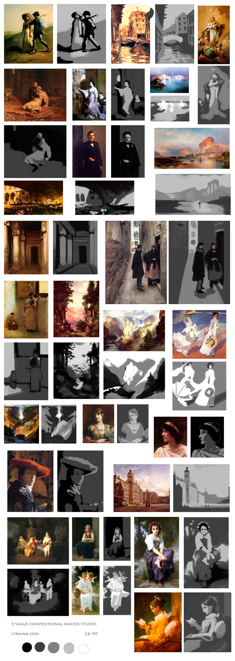
Sometimes three values just aren't enough!

|
Lyraina's sketchbook
|
|
05-30-2013, 06:01 PM
Sometimes three values just aren't enough!

06-02-2013, 05:35 AM
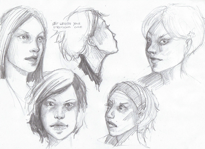
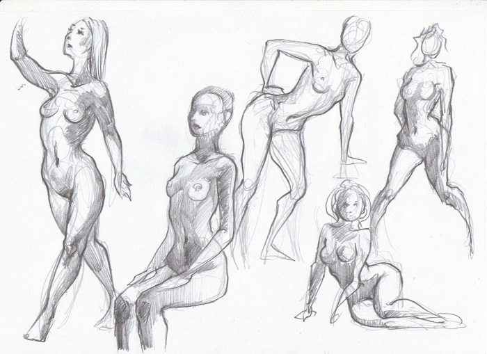
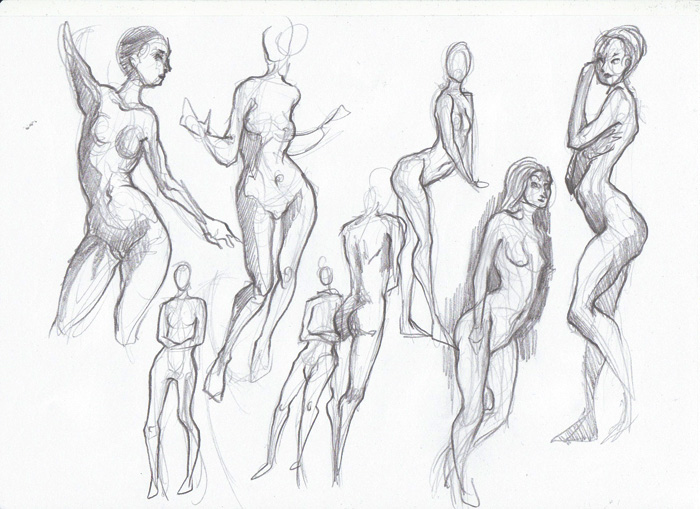
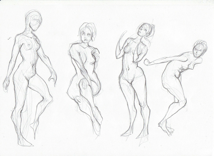
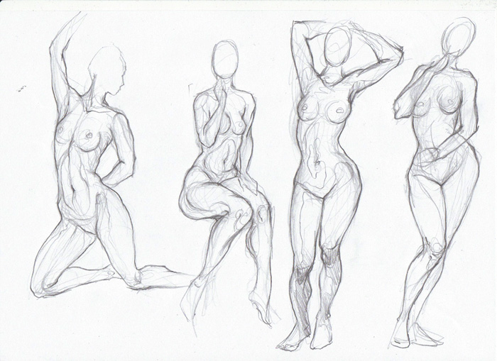
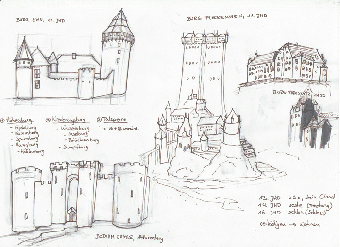
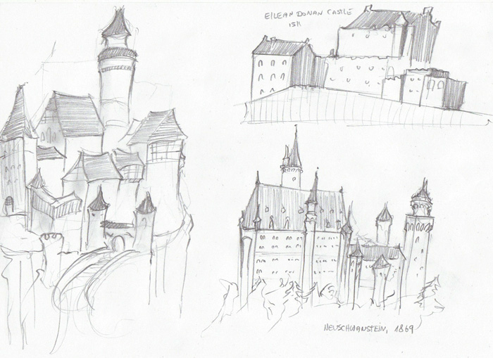
Productivity is spiraling downwards again :( I hate how I just cannot focus when I'm running on low sleep, how am I to find time to draw like this... anyway! Figures from photo, castles for visual library, faces from mind.
06-02-2013, 10:50 PM
More color studies. Now let's put it to some use!
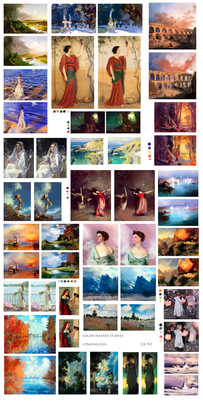 Notes: - Play more with the green-yellow color spectrum - Use more yellows and pinks in clouds - Note how much some artists (Godward, Bouguereau) exaggerate reds in the skintones of hands and faces - Remember using warm vs. cool in shadow vs. lit areas
06-03-2013, 03:10 PM
Thumbnails from imagination. Somehow I only end up with environments with this approach O_o Need to figure out a way to compose other illustrations/character work as well..

06-07-2013, 06:08 AM
More imagination thumbnails. The worse it looks, the more I tried to leave my comfort zone, and the more time it took me :p

06-07-2013, 07:47 AM
Love your Color masters studies. How you work with colors? Do you pic it from original or starts with primary colors and try to mix them to certain effect?
06-08-2013, 09:01 PM
were you playing with warm light cool shadows in the last one? it looks realyl nice and i like it. your colours are coming along nicely. I really think the master studies helped. Most of the time, the abstraction method, which i think you are using is best for environments because its easiest to recognize. if you want to do creatures try the silhouette method, where you make a shape in black then 'add light' to it, focusing on form. this works well for monsters and possible faces as well, due to the symmetrical nature of the body and faces it is hard to come up with figurative work throug abstraction. at least for me :P
06-10-2013, 03:07 AM
Madzia: Thank you! I never colorpick from the original, because I feel like this would miss the point of the exercise... first, I try to decide which color is dominating in the original image and lay it down as a base. Then I just continue from there, choose the next color, lay it down, if it looks wrong I correct it (for example increase the saturation, or shift it more towards warm/cold).
Jaik: Thanks! Well, that does explain why I come up with environments most of the time ;) I will definitely try out your idea of starting with a silhouette and adding form, sounds like a good way to start. Then I only have to figure out how to make good/dynamic composition next..! Thank you! Worked a bit more on one of the thumbnails: 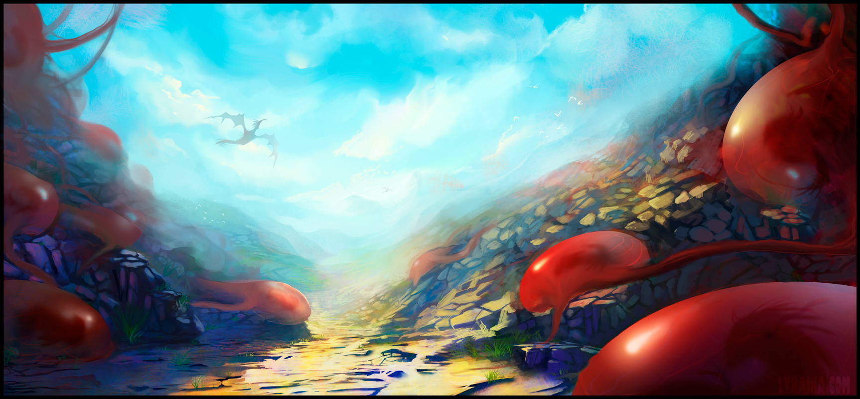
06-10-2013, 03:49 AM
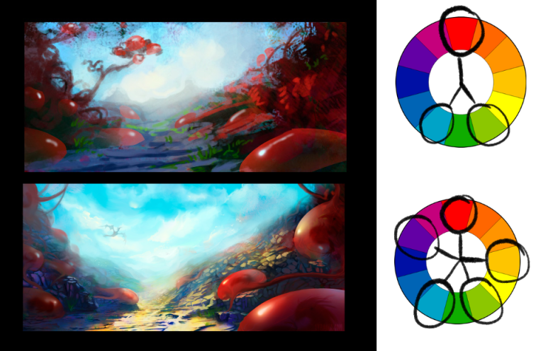 I liked sketch much more cuz it had this nice limited palette only three dominant colors. Later You added yellow and violet and ended with full hue spectrum on single picture. More colors don't make a better color scheme. Besides, colors are relative You can make dull yellow look like grass without using strict green color. Here's good example look at the two palette at right they don't even have green pigment but tree in landscape still looks like 'green' tree :) ![[Image: Gamut_Masking.png]](https://3.bp.blogspot.com/_Eiwce13X738/S8SOyAGYsfI/AAAAAAAAIKc/H3TReGKwTLo/s1600/Gamut_Masking.png)
06-16-2013, 04:14 AM
great work on that last imagination sketch! i can't comment on the colour stuff since I don't know much about it, but that pic really turned out great
06-17-2013, 04:04 PM
Madzia: Oh well, and I was under the impression that my paintings turn out a bit dull and boring sometimes. I thought it might be a good idea to introduce some more interesting light situation. Good to know I went over the top now in the other direction! Thank you for the extensive explanation. Green/Yellow thing is indeed interesting, it fascinates me every time I put down a yellow or grey mark looking green or orange, depending on the context.
aks9: Thank you! :) Mostly visual library stuff for now 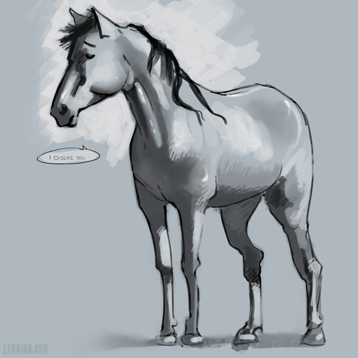 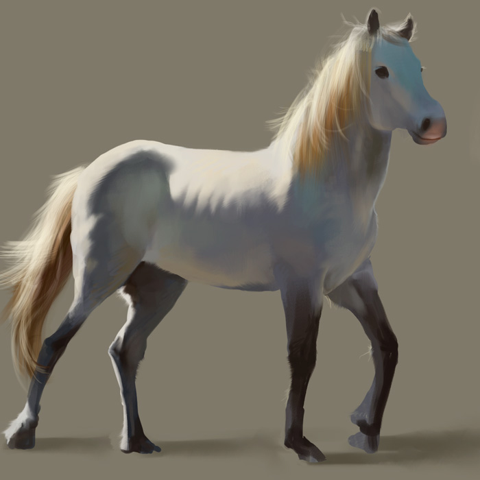 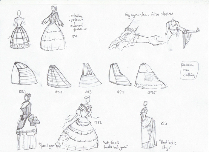 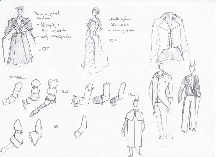
06-22-2013, 10:44 PM
Drapery
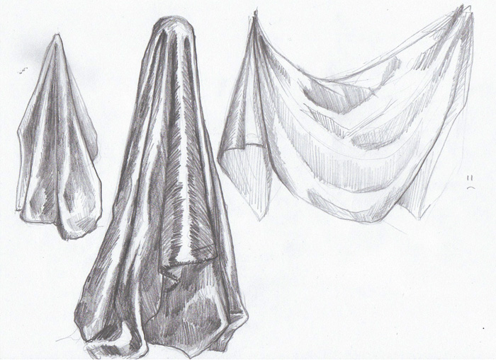 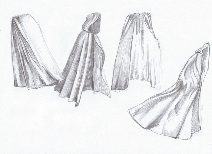 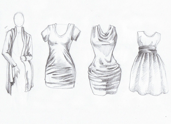 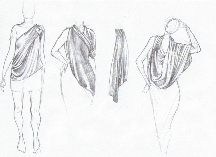 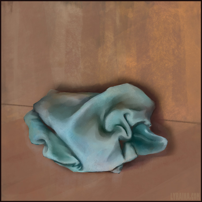 And learning backwards again :/ 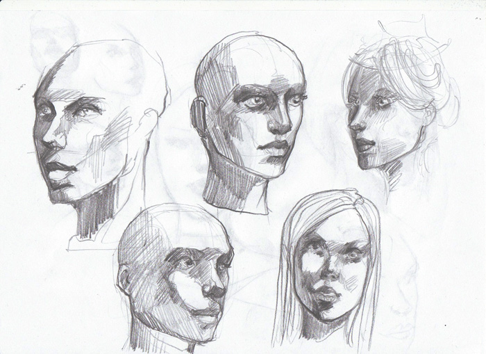 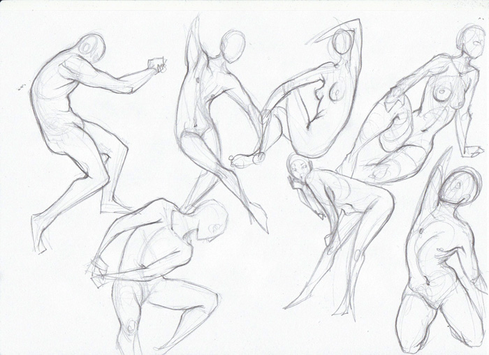 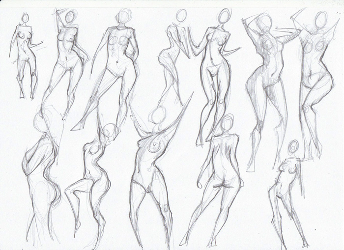 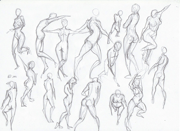
06-23-2013, 10:49 PM
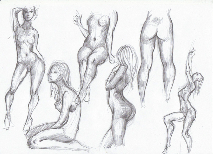
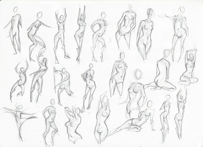
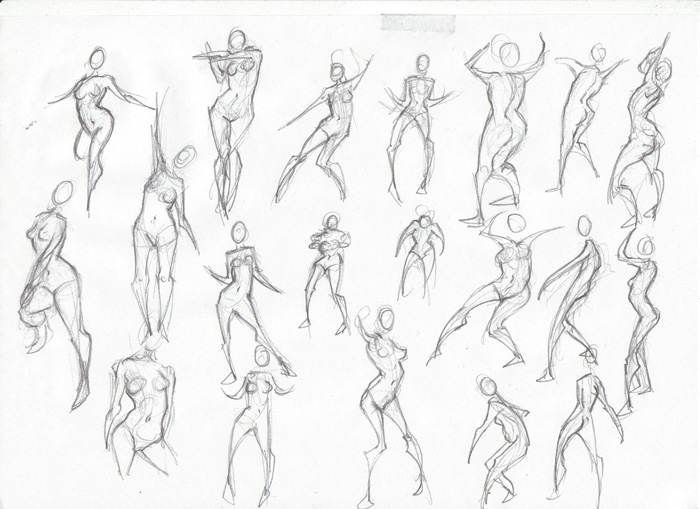
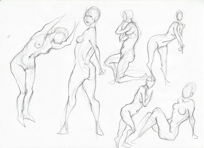
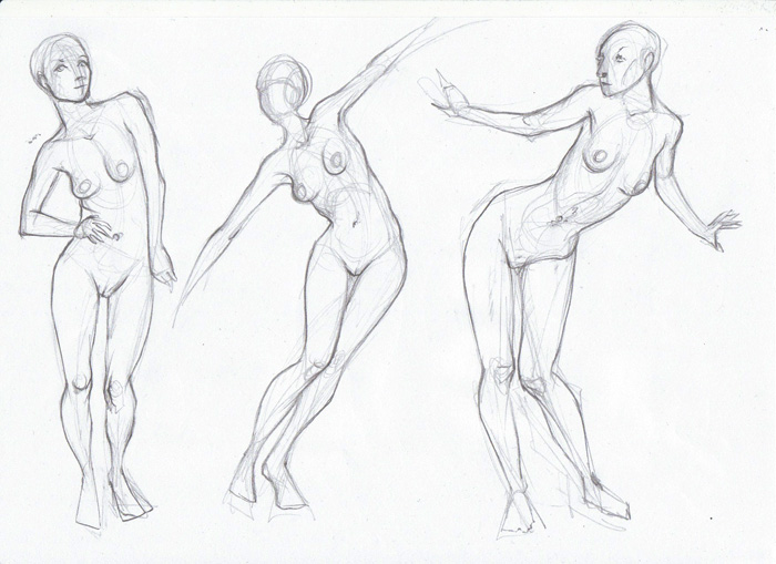
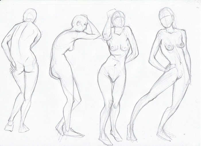
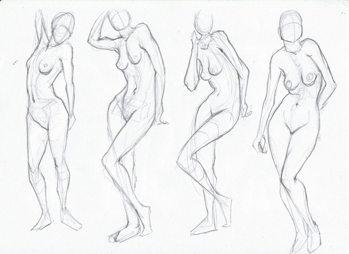
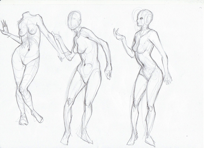
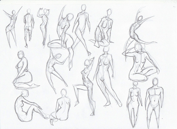
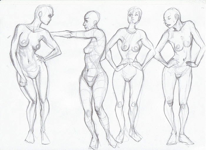
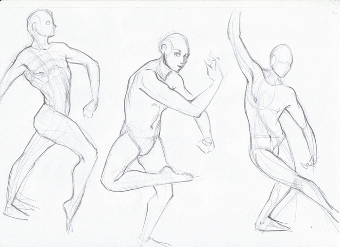
More. Don't know why I'm getting so messy lately O_O I think I need to be careful not to make the legs too long. I actually drew as many men as women this time, but most of them just don't even get scanned ... but hopefully they still help me improve, so that I can eventually show some more :p
06-24-2013, 06:42 AM
Man, your figures are so fluid.. so jealous.. Maybe I should try and do some traditional drawings again... Watch your stomachs and distance between the pelvis and the rib cage though on some of your females. I think you extend it a little too much some time, which makes the upper body longer, and you may compensate for that with making the legs longer, which I've noticed is something you often mention as a trouble spot for yourself.
Good to see you are drawing more males though :) And your drapery is great, the long shirt/dress thing in the third image I really like, its fluid and shows off a lot of the anatomy underneath. Really good job :)
06-25-2013, 01:36 AM
Thanks for commenting on my sb I appreciate it.
Cool thumbnails from imagination, im currently working on similar stuff, and your figures look dynamic and made pretty fast, thats good ( I should do it more often). :0 I see you do alot line drawings maybe you should take some more time and do color study of figures from photos, trying to nail those studies could be great to apply on your imagination stuff later. Keep on it!!
06-25-2013, 03:50 AM
Jaik: Yeah, traditional is definitely easier. While I'm not too fond of pencil drawing per se, it just feels more "direct", while with the tablet, drawing really is a pain for me! On the other hand, I think digital drawing is another skill that's really important to practice...
I'll be more careful with the stomachs next time, thanks for pointing it out. Sometimes I really don't understand what the hell is so hard about just getting these things (proportions etc) right ;) Thanks for the kind words :) Blewzen: Thank you! I actually enjoy painting (instead of drawing/line drawing stuff) a lot more, but tend to concentrate on only one at a time. Especially at the moment I'm glad if I can fit in a bit of drawing every day. But I'll very gladly focus on painting again ;) (Starting with today's post!) --- I really dislike painting (and drawing) noses, so I thought it's time to do something about it. Today: From photo reference 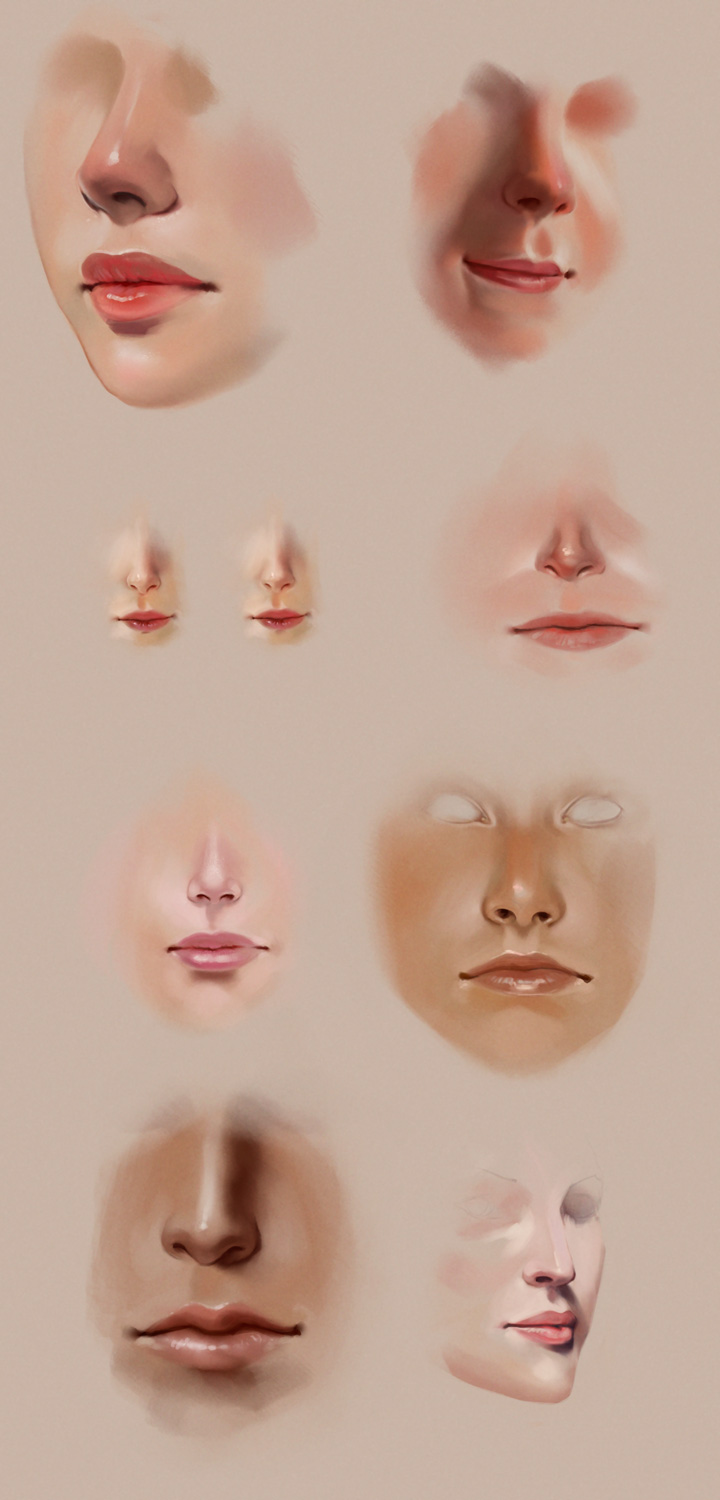
06-25-2013, 04:57 AM
Amazing studies !! Love them :D Really well done!
06-25-2013, 04:14 PM
Madzia: Thank yoou! :D
Today: From imagination 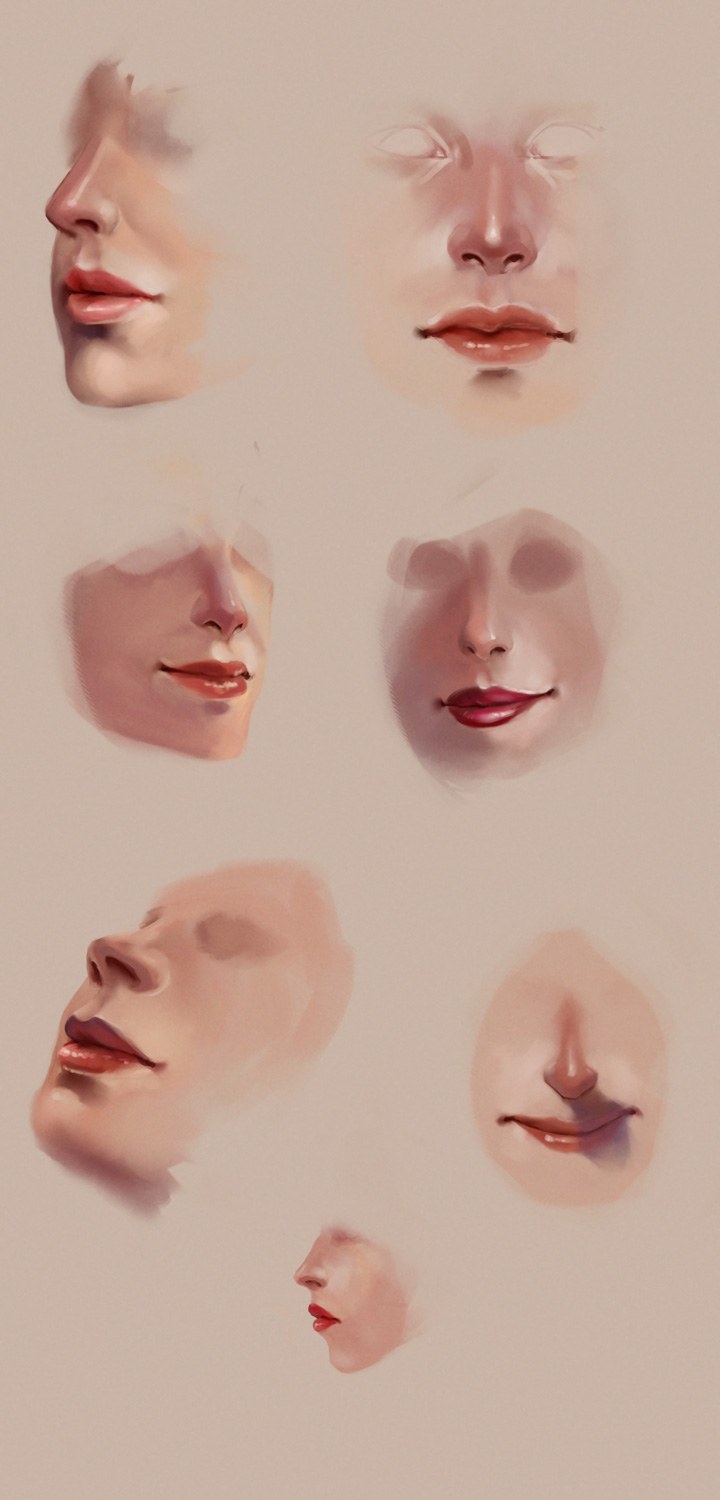
06-30-2013, 06:05 PM
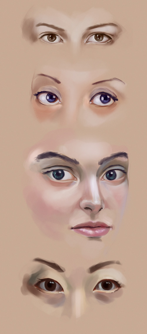
Eyes, from photo
06-30-2013, 06:14 PM
Awesome work. You really seem to apply your studies well, nice to see. Those noses from imagination look great, nailed the skin tones. Just watch that you don't draw the eyes too big, looks like you could be leaning that way. I do the same thing. Eyes are awesome, so we make them bigger I guess ;). Oh, and the skin tones in those eyes studies are great, especially the bottom one. Good job getting the greens and blues in there! Keep it up. :).
Website - www.ohbullocks.com
Blog - http://blog.ohbullocks.com Sketchbook - http://crimsondaggers.com/forum/thread-678.html Working towards 10000 hours at http://10000hourrule.com |
|
« Next Oldest | Next Newest »
|