CC 3 - Brush Noir WIP
#1
Will be trying a different approach. 

First my moodboard:
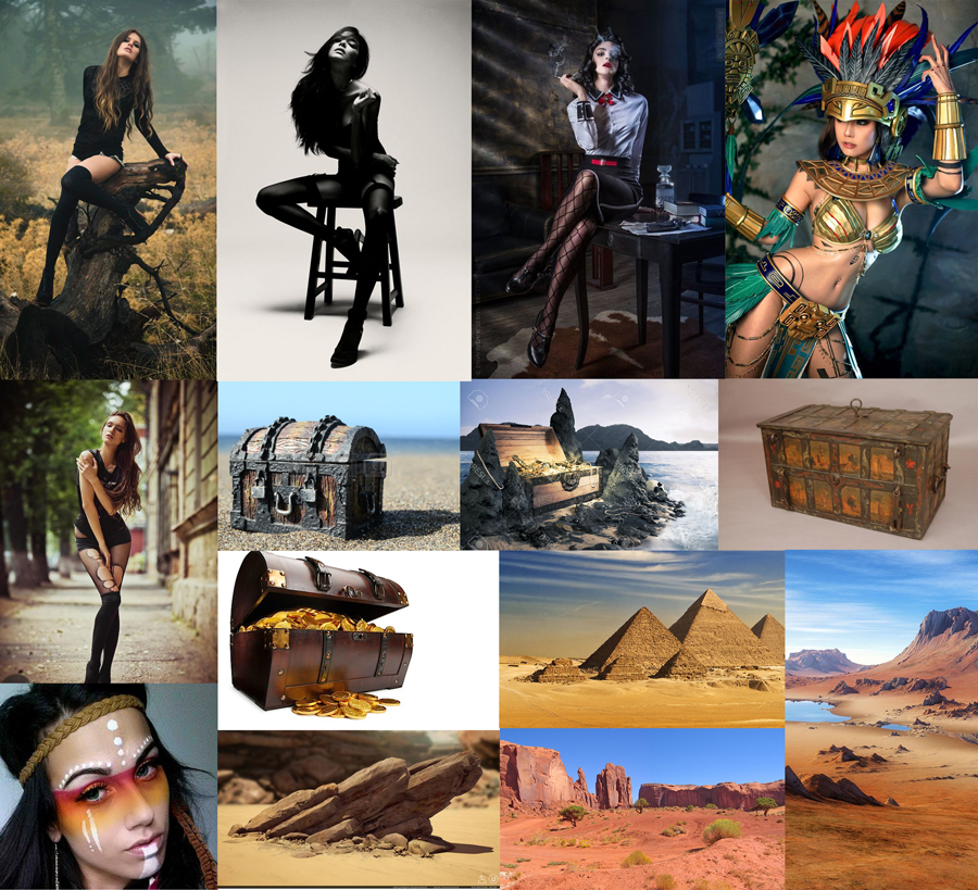


I'm going to add more along the way, I wanted to start with a bit less so I could get faster into drawing instead of guessing what I want into the final piece.

Thumbs:
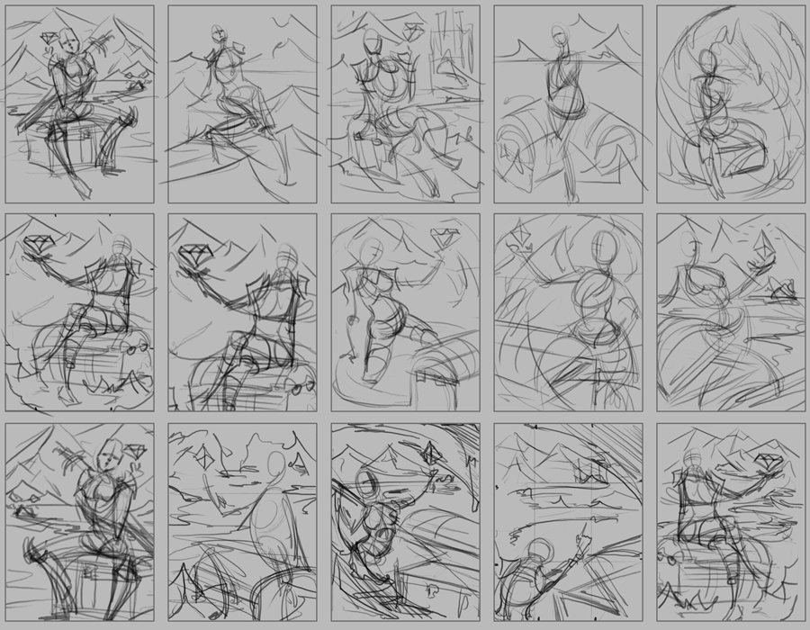


I tried to start quick with the lines and explore through that. This CC I planned to save more time for material/rendering studies since I'm really bad at that. Other studies like small items that I plan on drawing will be done aswell.

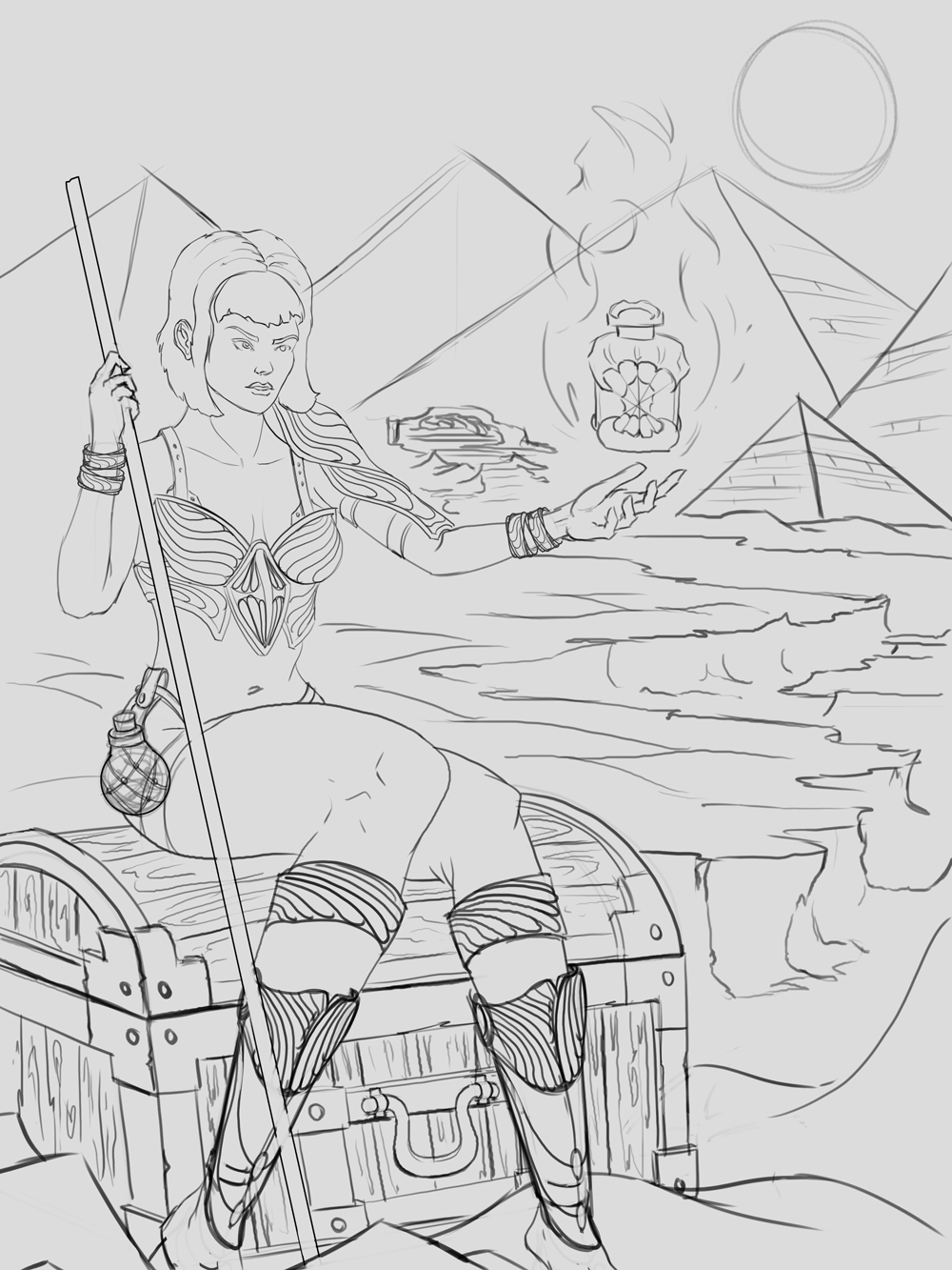
So here is the first WIP of lines


The idea was that she found the artifact and managed to find a safespot from uncharted desertly cave/ruin that you see in the background following the path of sand/rocks.

Reply
#2
Very cool stuff. Good comps, my only issue is she might be sitting a little bit too casually for a find of such significance.

Reply
#3
Hmm yea true that, was thinking more like a moment of relief, but will try some more leg poses and see what I can come up with. Thanks!

Reply
#4
Great stuff....I agree the pose is like a pinup girl. Use relevant reference.  


 YouTube free learnin! | DeviantArt | Old Folio | Insta
Reply
#5
Awesome sketch! I would never think there's something wrong with the pose, but after Amit's and Piotr's comments I tend to agree with them.

Reply
#6
Nice start, diggin those sketches you did along with the prep work (reference gathering).  I would suggest in doing some studies of women faces.  The face of characters always grab attention and if its not done right it can ruin the entire image no matter what amount of detail you have on the rest of the piece.  The pose of the character could use a bit work it is sitting a bit too casual as mention already.  Other than that great start looking forward to seeing this develop.

Reply
#7
Have to agree with others, the narrative aspects needs work, but looking solid so far!

Reply
#8
Thanks all!

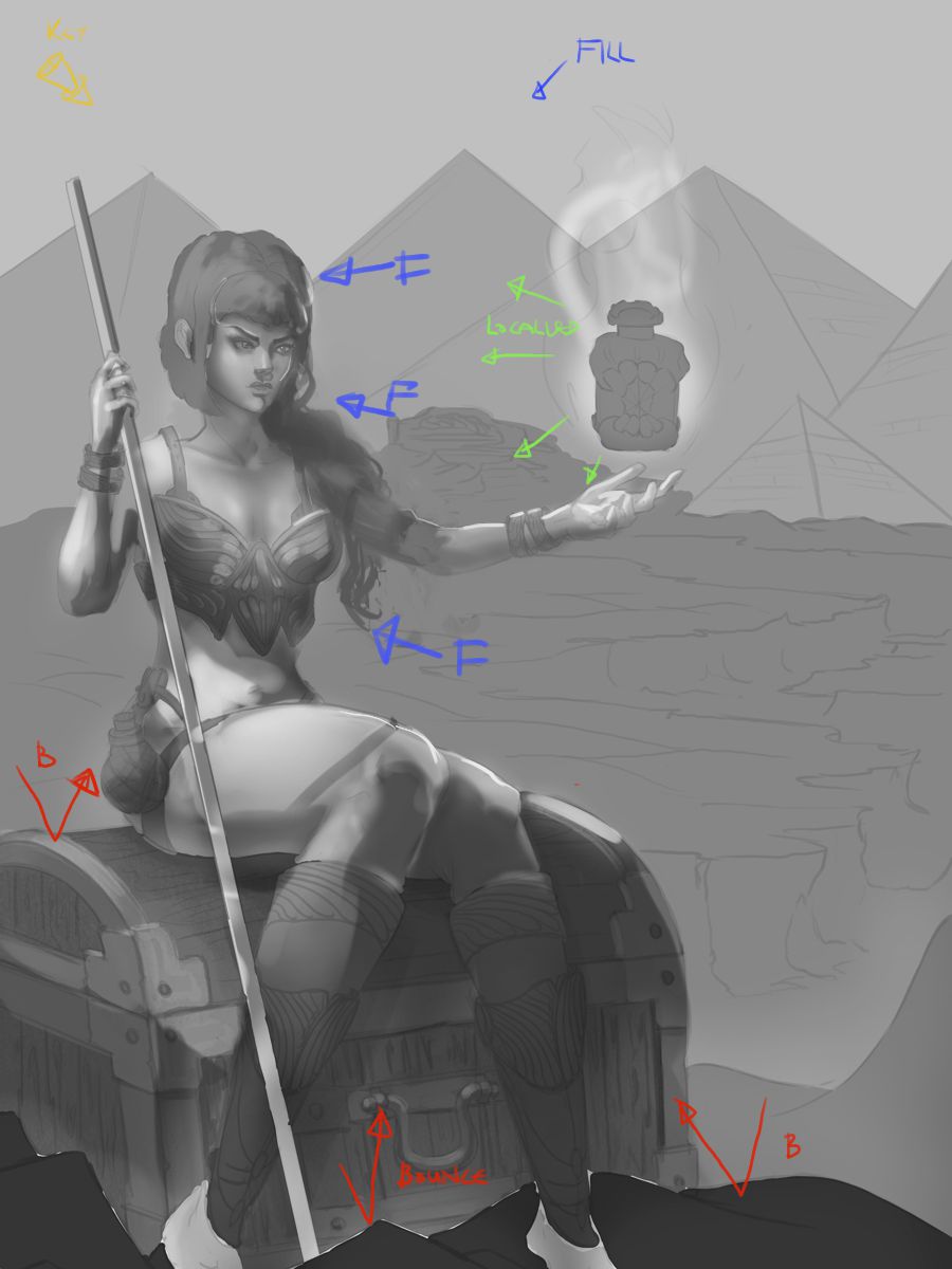
I'm so stuck on the value phase, I have no clue how to tackle that. Looking at step by step from other artists and just can't figure out how I have to approach this.

Anyway here are a few quick head studies/sketches. So far I have not done many studies as I'm really stuck like I said. Like everything went all black lol. I'm looking for a way to learn values/lighting even. I know the ''theory'' plus how to light basic forms like cubes and spheres but when it comes to applying it to a painting it's all crap lol.


sorry for the negativity haha

Reply
#9
Beleive in the me who believes in you!! You got this!

What helps me with lighting is finding a reference image. The old masters didn't dream things up on their own, they had models too!

I would go on DeviantArt and search "lighting" in the stock and resources section. If you can find a photo that matches the sort of lighting scheme your going for, it might be a huge help.

Here's a search I did real quick: http://www.deviantart.com/browse/all/res...+reference

When in doubt or stuck, look up references! That's my solution anyway, haha.

DeviantArt YouTube | My Books and Comics

[url=http://arapersonica.deviantart.com/][/url]
Reply
#10
@Arapersonica Thanks for the search. Even with ref I have no clue what I'm doing. Think I might sit this one out and just think how to get through this horrible wall ://. Or just quit tbh. Once again sorry for the negativity.

Reply
#11
Don't you dare quit! You won't think yourself through the wall, you'll paint and learn yourself through the wall. The values you have so far are actually pretty good for a general rendering of form. You are being a bit hard on yourself.

The main issue I am seeing is a lack of a distinct consistent light source.  I find it helps to think about lighting first in terms of a key light, the major light source. This determines the first pass of lighting and shadows.  Then go onto a fill light (ambient lighting from the sky generally or another source usually from an opposing  direction of the key light to bring more light to the main core shadows).  Then you can start to change things and add any additional localised light sources as dictated by the scene (torches /energy glow etc)  and adding final touches to pop out areas like rim or backlighting only if needed.

This is a pretty rough scheme, so it is pretty sloppy and might not be balanced well (shitty monitor) but I applied the same thinking. You can see it isn't that far off yours...just makes things a bit more distinct, and a bit more contrast.


Small crit on anatomy: Her neck is a little too thick and manly, and her legs are drawn great, but might be a tad too big.

On a compositional note, the urn and her face are on the same horizontal line. You could angle her arm a little lower to get it more on a diagonal
. Then you can make one of the pyramids which has it's point vertically above the urn, make it larger than the others with it's slide going down towards her face. With some lighting focus on it can be a third major shape in the comp. Makes a nice triangle from urn to face to pyramid

*EDIT did a thing. Also cropped the image a bit. Not perfect, or satisfied with the urn, but a bit more focused perhaps.


Come on man, push through it! You can do it!

 YouTube free learnin! | DeviantArt | Old Folio | Insta
Reply
#12
Thanks for the paintover! I'll try to go from this. Get proper ref. Key light first then ambient (I guess it's all reflective lights aswell) and after that all the FX.

Really appreciate the help! Could not do this myself unfortunately.

Reply
#13
Everybody needs a fresh pair of eyes every once in awhile. Everybody. War isn't just the fight itself. There's also regrouping.

If I may suggest anything about lighting references, you can try looking into key stills or concept illustrations from movies and games, and observe how they tackle color and light. Not only fun to look at, but also informational if you break them down.

Such examples: http://theconceptartblog.com/wp-content/...rts-01.jpg
http://www.nag.co.za/wp-content/uploads/...rt_510.jpg

If you're trying to check the values, there's always the Photoshop 'Proof Colors' trick. I'll just put this here if you haven't seen or tried this before: http://www.artofscholes.com/checkingvalues/

You may feel defeated from the battle, but the war is far from over. From my standpoint, it's still anybody's game. Fight to the end! You still got this.

If you are reading this, I most likely just gave you a crappy crit! What I'm basically trying to say is, don't give up!  
----
IG: @thatpuddinhead
Reply
#14
How about you try to add basic colors to your sketch and then render it from that point on clipping masks? (just not as sloppy as I did)

Maybe that would be more comfortable process rather than starting with values (you can still check your values with bw layer).

Edit: sorry I didn't realize there was a sun in the right corner so my lighting is a bit incorrect)


Attached Files Image(s)


Reply
#15
Yep, I second the bread's crit! Just convert your base layers for the various objects that need it, to flat colour and add your lighting on top of that!

You might be interested in checking out the process in this thread http://crimsondaggers.com/forum/thread-3355.html

Based on Devin Platts approach (http://texahol.blogspot.co.nz/2013/05/so...about.html) which is very methodical about separation of layers as well!

 YouTube free learnin! | DeviantArt | Old Folio | Insta
Reply
#16
@Piotr and Amit thanks alot! The texahol blog is something I will be trying out tonight when I get home.

@John thank you for the nice links.

I think I'm overthinking stuff aswell which blocks me.

Thanks for motivating me to keep going! Could not do it without you.

Reply
#17
Oooohhhh snap. Those links were awesome!! Such good resources guys!! :D

I believe in you BrushNoir!! You got dis :)

DeviantArt YouTube | My Books and Comics

[url=http://arapersonica.deviantart.com/][/url]
Reply
#18
@Arapersonica Thanks so much!

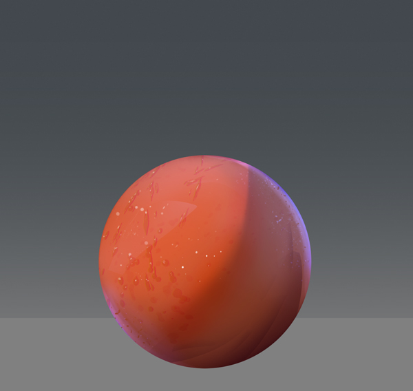
Here is an update. Unfortunately I have less studies but this time I put so much time in finding out a good way to painting/rendering workflow (so one big study in a way hehe)

I bought the Devin Platts tutorial and have to say that I really like his approach so I'm studying that and apply it right away.

I did do a small tryout study to see how it works.


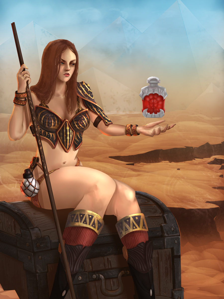
Now I'm working on applying it to the final piece, here is a wip, still a lot to do but I like this ''step by step'' approach, feels more controled.


Reply
#19
Great stuff dude. Gotta say I think the original face was way better, but carry on and make sure you push it through!

 YouTube free learnin! | DeviantArt | Old Folio | Insta
Reply
#20
Yeah I agree on the face, and tried to change it a bit by doing some research along the way. Here is a new wip.


Reply


Forum Jump:


Users browsing this thread: 45 Guest(s)