02-05-2023, 12:40 AM
Great storytelling and panels! My only critique would be the font, I think you can benefit for something less stylized with focus on clarity. Keep it up!
|
Leo Ki's skbk
|
|
02-05-2023, 12:40 AM
Great storytelling and panels! My only critique would be the font, I think you can benefit for something less stylized with focus on clarity. Keep it up!
02-06-2023, 02:01 PM
@cgmythology - Thank you! I'm not great at hand writing balloons on the tablet although I prefer this to using fonts. I'll ponder about it as I do want to be readable :)
Nothing done recently but a few quick poses to hammer off the rust and dust: 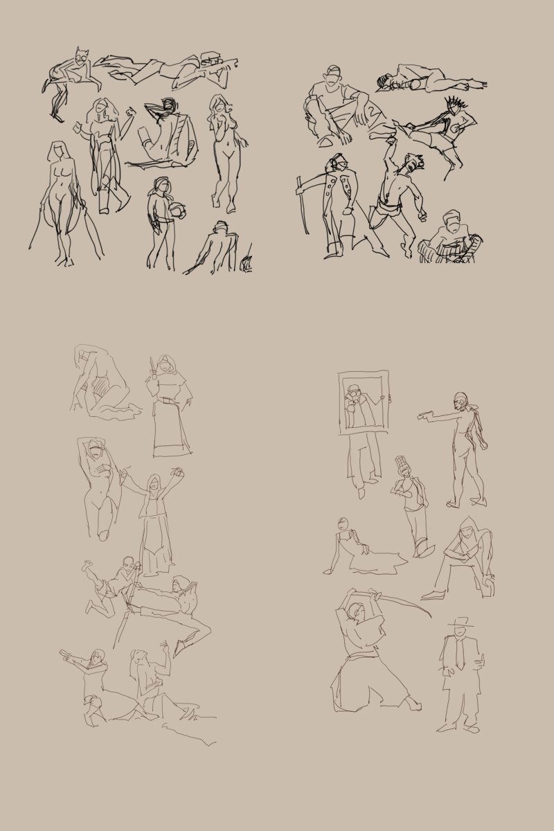
02-08-2023, 02:20 PM
Great stuff, I love the creativity!
If I had to give feedback on your comics, I think you might want to change up the camera angles a little bit (although I'm not a comic book artist so take my critique with a grain of salt). . Although you do have varied camera angles, most of your shots are at eye level, or eye level zoomed in. For example in your most recent comic, perhaps you could draw a birds eye angle of the room (with the character in it) as an establishing shot. I feel like that would better ground the reader into what is happening in the story. It would also be an opportunity to give more character to this guy (is his room messy? Does he have 3 computer screens? Does he have cables all over the floor? Is the room futuristic?) etc etc
02-09-2023, 01:32 PM
@Kilillan - Thank you for the feedback! You rightly spotted that I'm lazy with environments and camera angles. However in this particular case I intentionally avoided using an establishing shot because I wanted the reader to progressively discover how bizarre the settings are with the VR helmet and the AI assistant. I do plan to enlarge the view more as some action happens outside of the gaming discussion.
Apart from the CHOW challenge I only did a bit of random sketching trying to remember how perspective and shadows work. The orange thingy is probably a time machine, by the way. 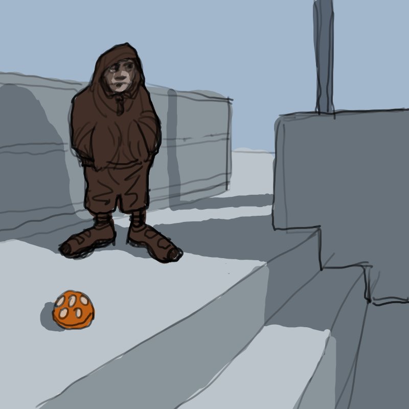 Also, while looking back at some old files, I found something from a decade ago that I decided to make my new forum avatar from. 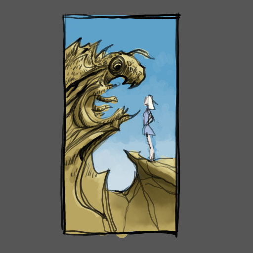 
02-13-2023, 01:19 AM
Nice to see you creating again! The poses on your recent sketches read very well, very clear so great job with that! Looking forward to more updates from you as always.
02-25-2023, 01:07 PM
Hi Leo!
Man are we outa sync my friend. I get busy and stop posting on CD just when you get active again. : ) So I'm likin' the new avatar, the quick poses, the time traveler, and the panels. I found a bunch of OLD Heavy Metal Magazines at a used book store a few years ago and really love some of those loose styles you find there — so with apologies to Sir CG — I really like your hand written balloons. Public Enemy wrote something similar to what you said about finding her strength in this ol' art thang we do. I'm always wondering about that myself but still can't help myself looking for commissions and art jobs. : ? Anywho, not sure how soon I can pop back in — but it's definitely good to see you posting. Cia fer now
02-27-2023, 02:27 AM
Thanks for your recent comments on my sketchbook. Going through your thread I have to say comic panelling and sequential story telling is your strength. It's highly readable and gets the job done. How long have you been drawing comics for? Will you be perusing this further, I think you should. The renderings of Chloe the dryad show improvement in your digital painting, too.
02-27-2023, 08:24 PM
Hey Leo, you've got some great comic work in here. Impressive how you have like these clean but unclean wobbly lines work for you, conveying a lot with so little. I've recently ventured into some panels as well (they are not posted in my sketchbook :D) and found it to be very challenging. My work is way messier than yours. I got lots to learn. Keep hammering of that rust and I hope to see much more from you! Cheers
03-09-2023, 01:58 PM
@CGMyth -
I enjoy doing quick poses but time is unfortunately limited. I should try some gestures too. @Jephyr - Yeah, the Heavy Metal vibe! When I was a kid I used to sneak into the grown-up section of the library to read these wild comics that inspired so many movies decades later. Hope you don't stay away from the forum for too long doing commissions! @Dominicque - I started making comics as a kid, but it has always been an on-and-off thing because I'm interested in too many things for one lifetime. Right now I'm limiting myself to scary stories about the horrendous zombie AIs that are invading the planet. @Cruptic - Ha, these lines are my curse. On a tablet I don't draw, I skid uncontrollably. On your thread you said that you wouldn't post your comic work, it makes me sad... So I'm out of the rush of the CHOW and I experimented with brushes: 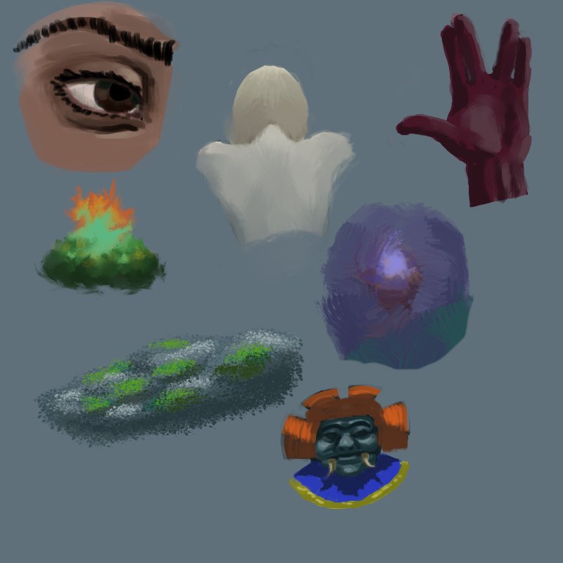
03-11-2023, 01:59 PM
I was trying again the brushes of MyPaint but ended up stopping at the slow ink pen. At first glance it looks like a stabilizer, but the slow tracking feature of the brush engine is slightly different, I'm not quite sure how. It feels like it doesn't cut corners. The drawback is that I tend to do slow strokes. At least I can do clean lines.
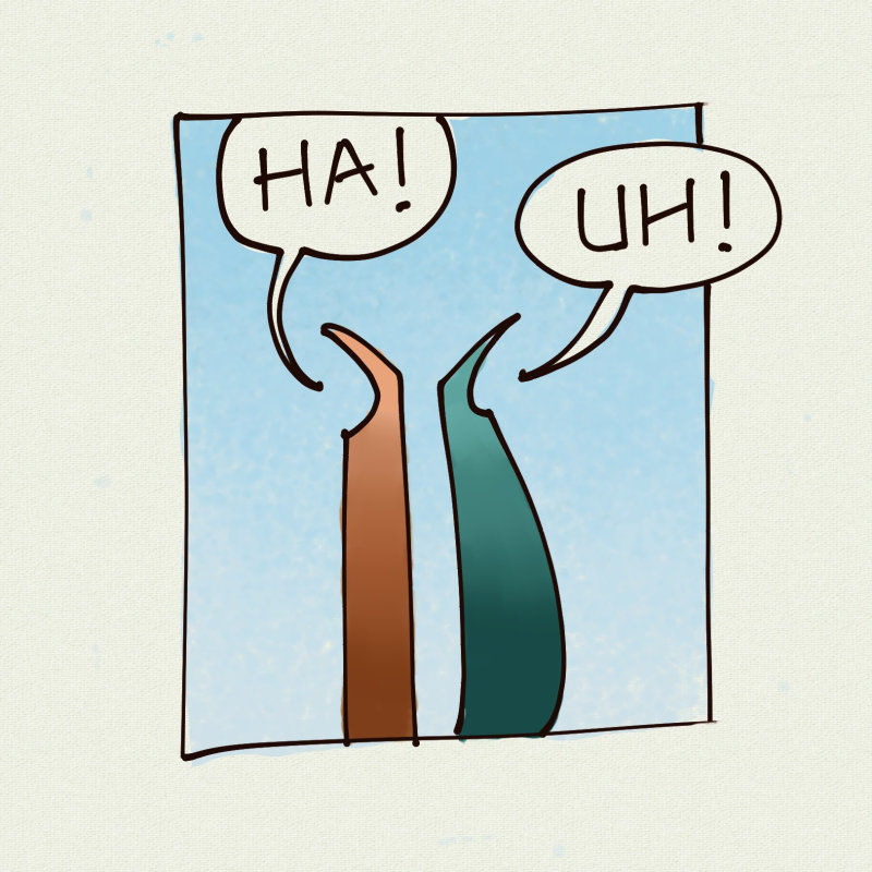 Going back to Clip Studio, feels familiar again but... not comfortable. 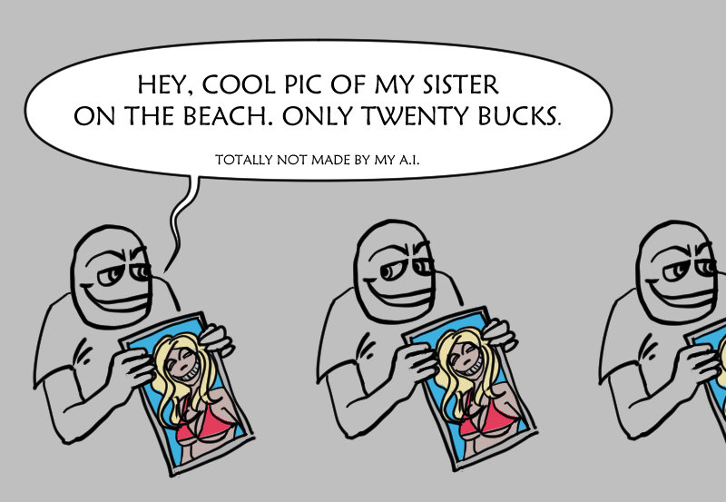
03-13-2023, 05:52 AM
Hahaha fucking AIs, which are artificial but not intelligent nor are able to "learn" anything. xD
I've never heard of MyPaint before, but after your post I'll check it out. The linework looks effortless, and the lettering is pretty good. Thanks for posting about it! --- So, to make myself useful, I've got a tip about doing evident brushwork: Imagine your subject as a lowpoly 3D object. Can you see the planes? Now make the brushstrokes follow them. Evident brushwork works when it's communicating something. Plane changes are the lowest hanging fruit in this aspect, you can hardly go wrong with them. 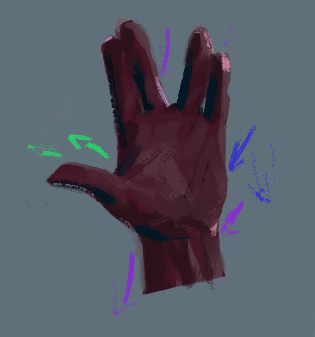 Sometimes they'll coincide with light because light often follow them, but not always. I personally find it easier to solve this plane-dependent curvature with a fill light first, then throw in sharper or stronger sources of light, like the cheating rim light above. You've showed good saturation instincts with that hand by the way. It's be easy to fall into the trap of keeping the same amount of saturation and just up the values in lighter areas, but you went colder by lowering it. This sort of detail suggests an atmosphere and reads better than just piling up color on top of color. Good job!
03-17-2023, 01:08 PM
Knight, you've given me a lot to ponder about, thank you! I realize I wasn't really paying attention to what I was doing, all absorbed into trying to understand what these brushes do. Evident brushwork and brush economy is out of my reach for the moment but I admire those who do it. I wasn't paying attention to the colors either. A light skin in a natural light I would desaturate in shadows (blue ambient light + reddish skin = very desaturated red that our eyes read as bluish), but with this imaginary purple hand I did the opposite apparently. At one point I cheated and looked at my own hand for the contrasts, i wonder how it would have turned out if I hadn't. The whole page was intentionally from imagination.
The two strong points of MyPaint in my view so far are this slow ink brush and some blending brushes that are very soft and watercolor-like. But there are thousands more downloadable brushes that I haven't tried. Yes, I would rather call these AIs what they really are, generative adversarial networks, or Artificial Solipsistic Silicon. One last sandbox playing with Krita's brushes: 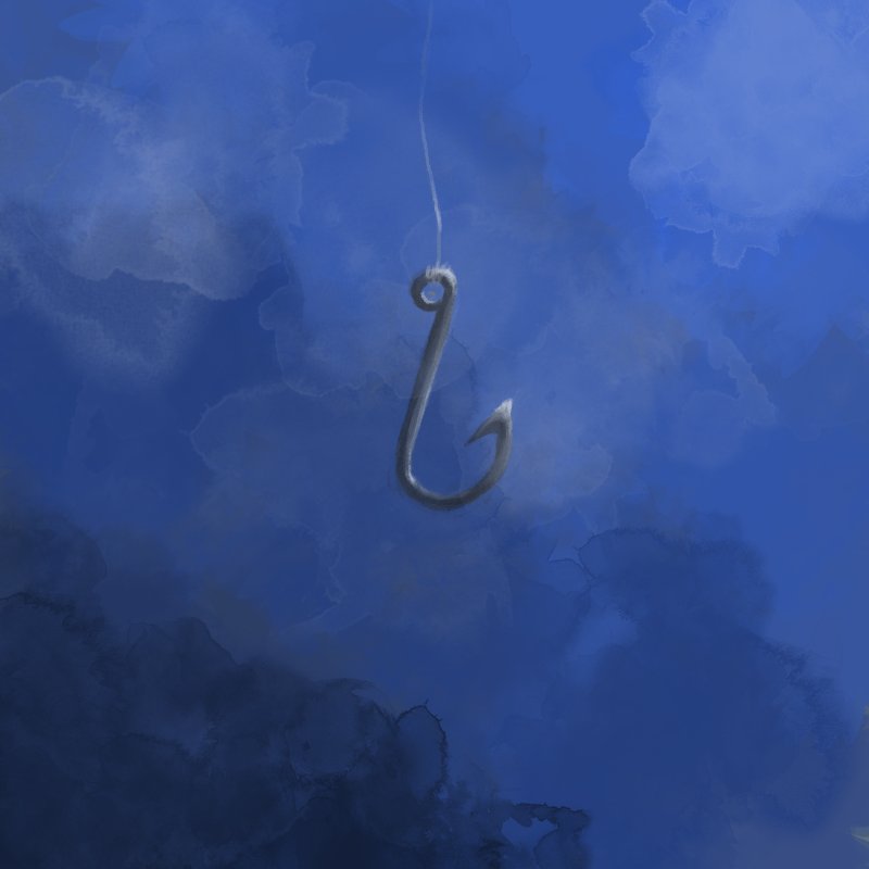 Then back to comics for real now, preparing to redo the first bcorp short story: 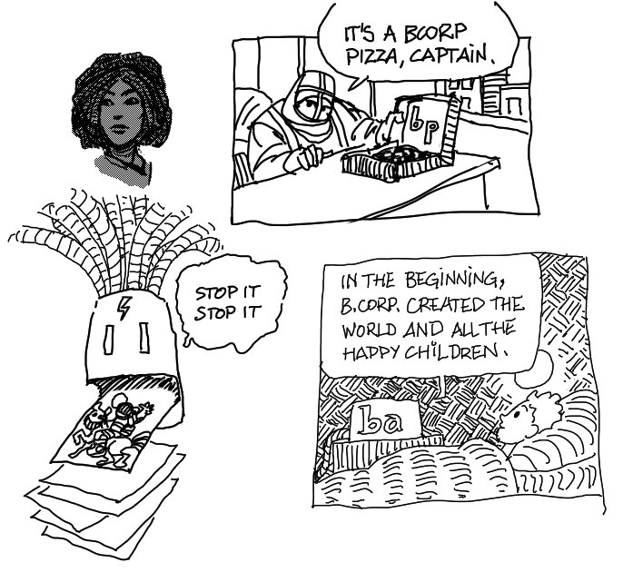
03-18-2023, 02:32 PM
Nice updates! The brushes you're using for the latest painting work pretty well I feel, has a very traditional look and feel which is always a plus. Loving the lines on your latest as well!
03-21-2023, 03:18 AM
The combination of brush and the style in the latest panels looks exceptionally good. It successfully captures the spontaneity of traditional comics very well!
The painting above, though, looks fishy. 
03-21-2023, 01:28 PM
George, thank you! It's a weird ink blot brush, I didn't tweak it any bit, letting myself be surprised. The drawback is I don't control anything at all, it's a hit and miss strategy.
Camila, thank you! Most of it is just a fine liner so I don't have to bother about (and botch) pressure control. Also I didn't make a draft layer in order to preserve the spontaneity. "Fishy", hehe :) Some more preparation for the comic. I'm aware everything is tilted, it's from the time I always had my (physical) paper at an angle on the table. I should just rotate the canvas but trying to grow out of years of bad habits. 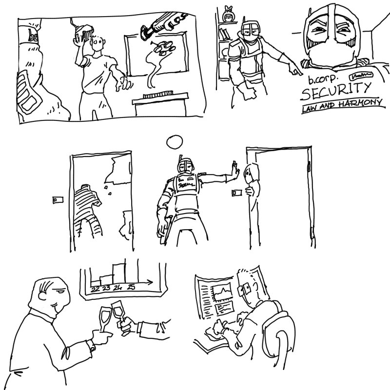
03-21-2023, 03:52 PM
Law and Harmony? Do I get a whiff of dystopia? Whooo, interesting!
03-23-2023, 12:37 PM
Camila, yup, more than a whiff. Nightmare miasma ahead. I'm not into dystopias much (my true projects are more cheerful) but there is this annoying alarm bell banging in my head louder and louder that I feel the need to bounce around.
Some more of the joyful sketches in preparation for it: 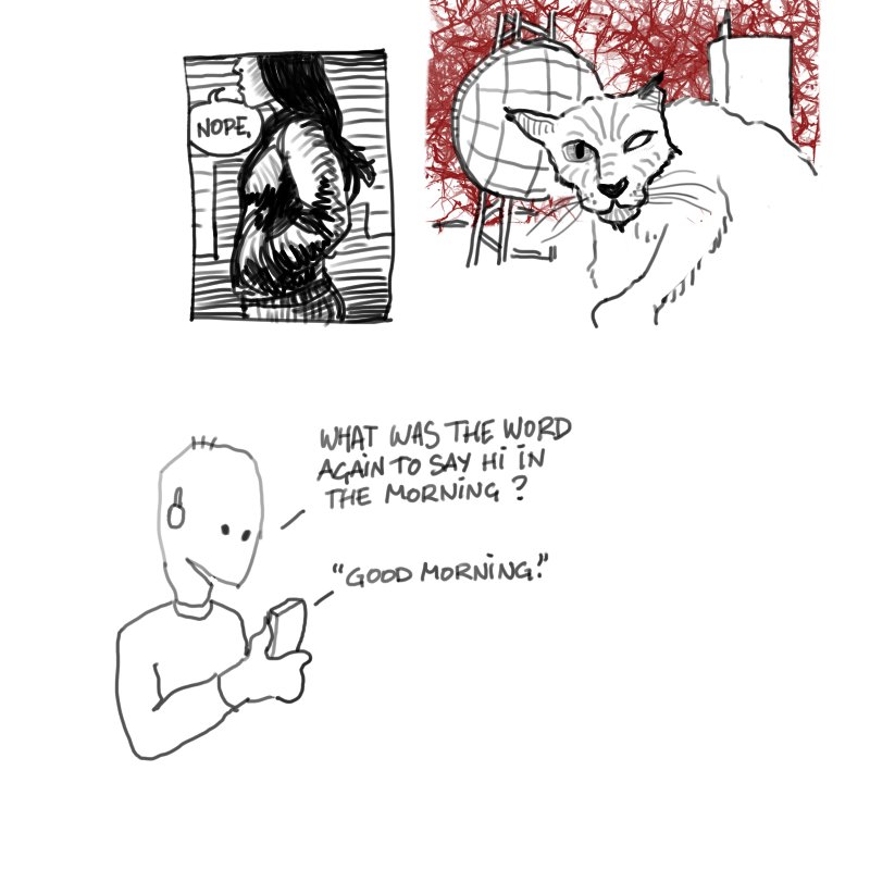 And the MyPaint demon caught me back, trying the buttery Kaerhon brushes (also used them for the new CHOW). The hamadryad is back and possibly lost: 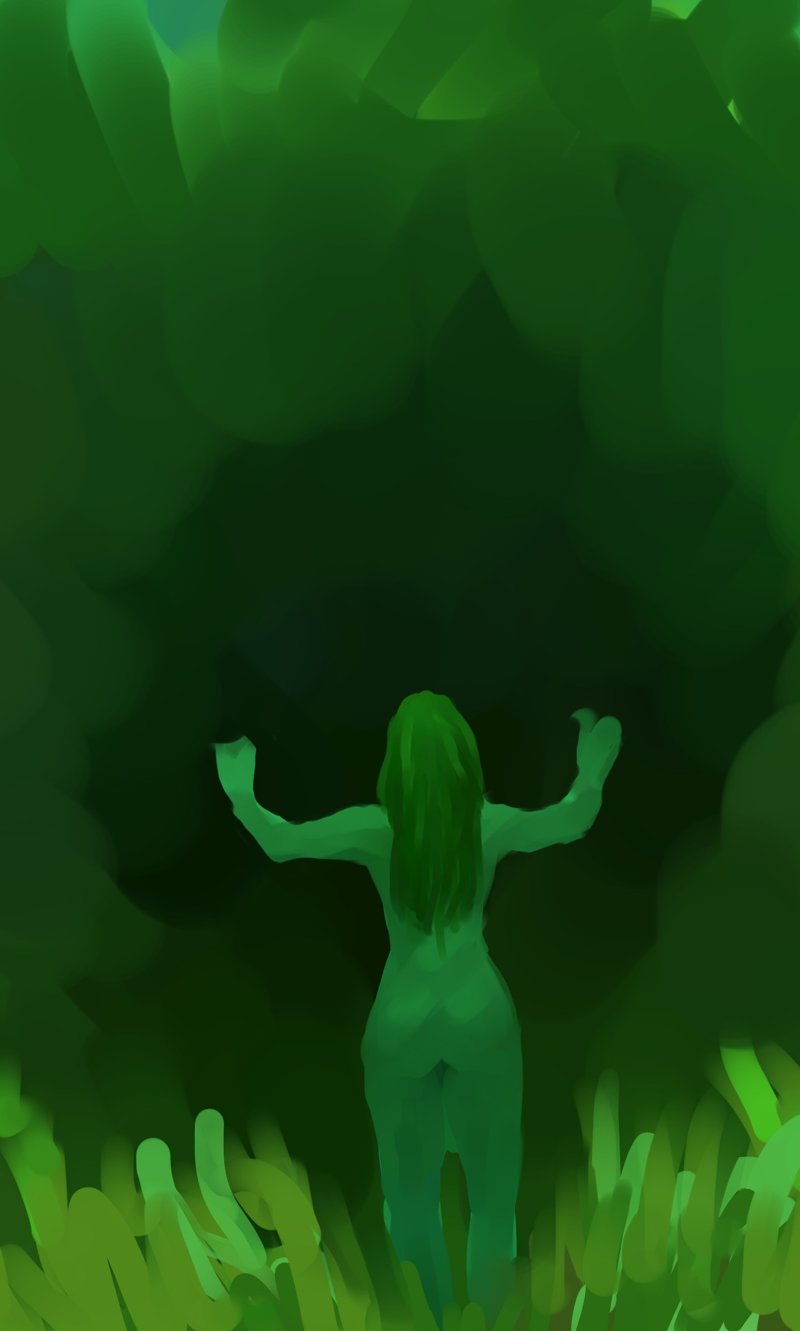
03-25-2023, 10:50 AM
I love myself some dystopia! Curious to see which direction you'll take it.
Probably not your intention, but that green painting reminds me so much of phytoplankton-rich underwater scenes. You'd nail the atmosphere of it!
03-25-2023, 01:40 PM
Camila, now that you say it I can see the plankton and even algae, lol. I may have a go at it although water is my least element of choice after lava.
I'm less and less certain of where the dystopia is heading to because I'm revising my projections every week as "generative" technology keeps leaping onto yet another level of puzzling savant stupidity and abysmal shallowness (if that makes sense) and I'm not sure yet how badly humanity can lose its soul. No, I'm not a grumpy luddite. The below was supposed to be more studies toward it and I ended up trying brushes. Don't mind me... 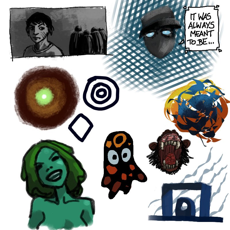 And the hamadryad found her oak! Cheesy version, previous one she was facing a forest monster. 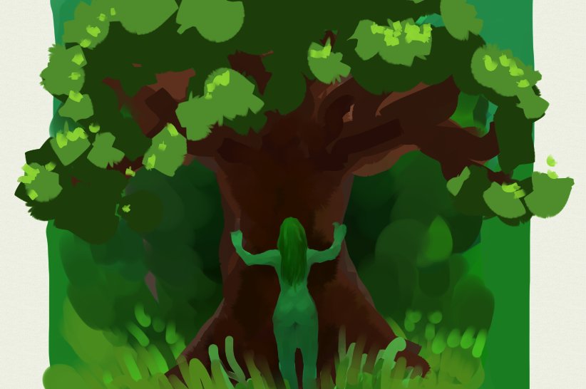
03-26-2023, 11:31 AM
I think you'd fare well underwater. Your atmosphere choices work very well for this kind of scene. Same for mist/smoke filled scenes with a strong light on the foreground.
Don't even talk about ML. I've got a half-written AI sci-fi short story I can't look at in the same way I did a year ago, and while it's all the better for the changes prompted by my new perception of ML, I'm afraid reality will catch up with it faster than I can be assed to finish it. Oh, was it a monster? From this angle her body language is ambiguous, could be perceived as challenging it in calm hands up gesture or worshipping it, while on the new piece it's 100% worshipping just due the mood change. |
|
« Next Oldest | Next Newest »
|