CGMythology's Sketchbook
Hi George, I'm LOVING your latest since I last dropped in! All your efforts at adding dynamic lighting is really paying off! Lion Heart, Rise, and the Venom Portrait are outstanding.

Hope you're doing well!! Have a great New Year!

Reply
Not much to add on technical feedback, but I like the chaotic feeling of your last piece. Definitely captures the craziness of a battle.
Reply
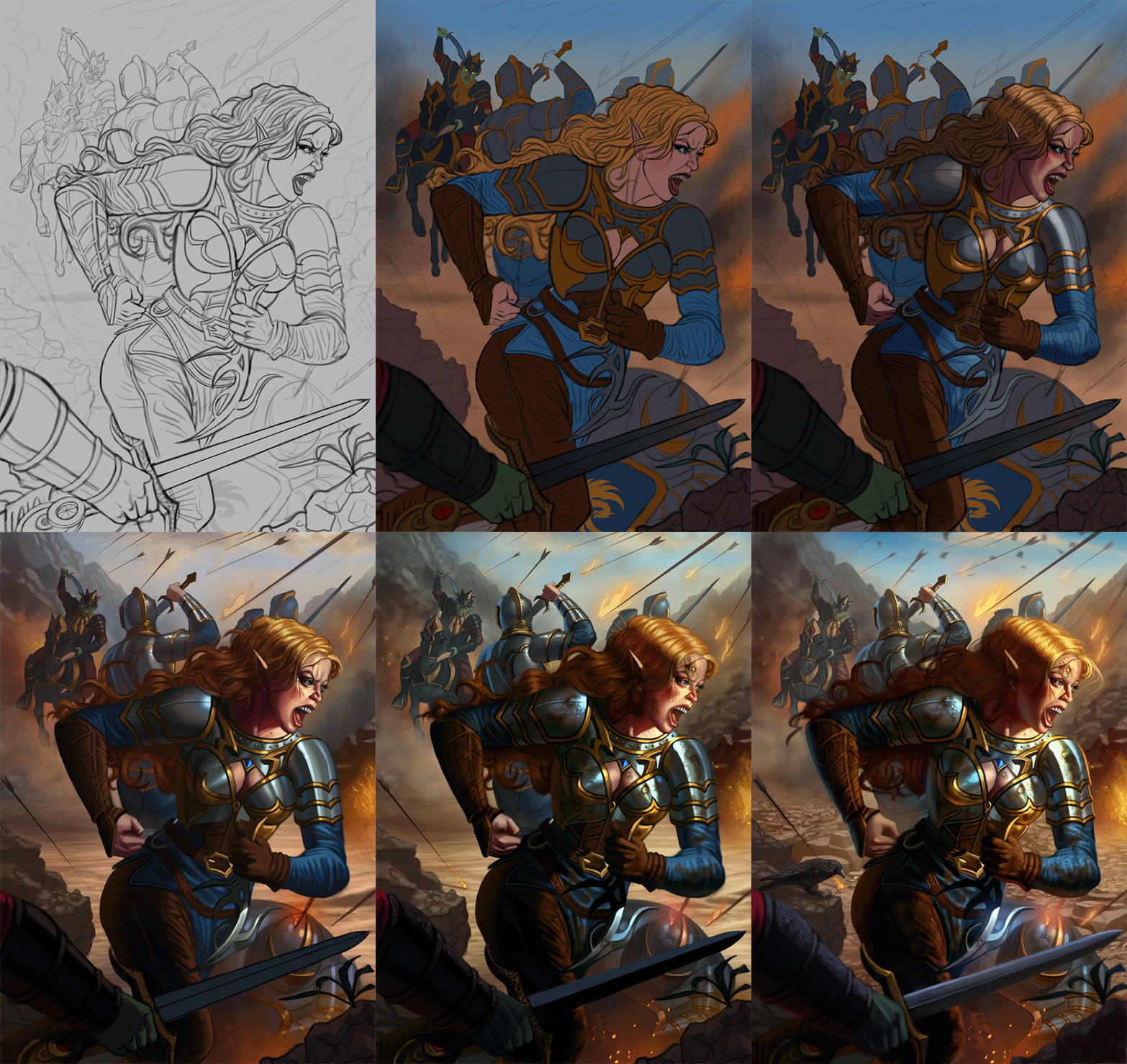
darktiste:  Excellent input as always!  I agree that the figures grip holding the sword could be improved, didn't put much attention to this initially I admit but I just refined it for a more natural look.  Incorporated the rest of your feedback as well and I feel it's an improvement.  Glad you dig the sketch values, I always work in multiple layers when sketching so it's just a simple matter of lower the opacity of the parts I want faded out to the background which gives a nice depth of field effect.

Jephyr:  Thanks for the kinds words!!  Very happy to hear you enjoy the new illustrations, I definitely learned a lot on how specific material handles and lighting in general... Still need to do plenty of more studies though as I feel I can gain a better understanding of light in general.  Happy New Year and keep up the great work as well!

Tango_Mango:  Thanks, I'm really happy to hear that the chaos of the image is expressed already in the sketch as that was something I wanted to emphasize!

...................

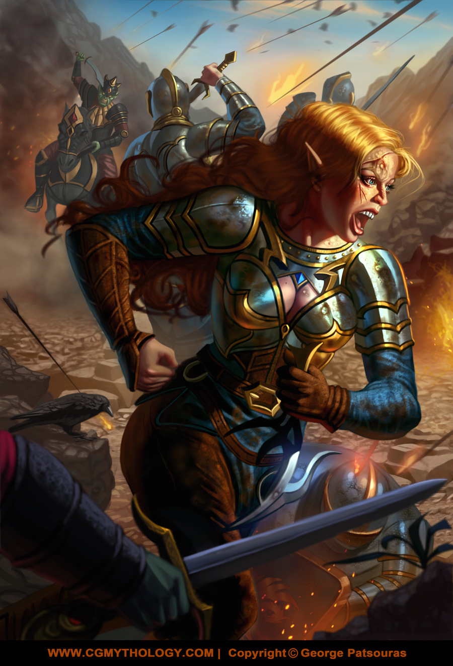
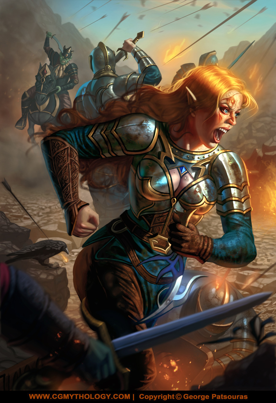
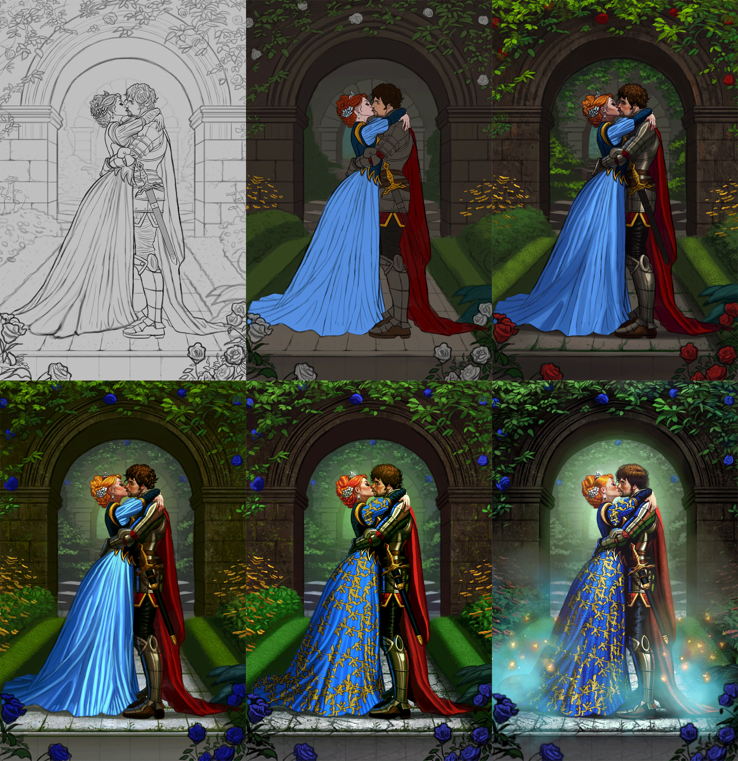
I went ahead and made some changes based on the input received and painted it in.  I'm fairly pleased with the illustration, the feeling of 'war' I think is really expressed nicely which was my main goal here.  I'm still open to input if there's anything that needs tweaking or can be improved, so please feel free to let me know!  Below is the current progress followed by the steps for those interested:


Reply
That looks good! A lot of work has been put in that illustration for sure. I think you have the same problem as me, everything looks too rendered and contrasted (especially on the main character) so it's difficult to guide the eye of the viewer. Also, the facial expression needs more contraction on the muscle that frowns the mouth upwards (I think thats the two zygomaticus ones), so that the cheek is more contracted. Hope that is helpful! That's my first sketchbook ccritique in more than 10 years hehe sorry if I'm rusty!
Btw, many thanks for the reply on my thread! I really appreciate it even though my reply was so short and quick (I post just before going to work).
See you!

Here's my sketchbook thread!
Abrodos' sketchbook
Reply
I feel like the back of the head is to far back like she as some kind egg shape skull.

Also those rock look good in the middle ground but would i be wrong to assume you use photo bashing and cloning stamp? If not this must have taken age to do.Nothing wrong with using clone stamp when it down thoughtfully.

My Sketchbook

Perfection is unmeasurable therefor it impossible to reach it.
Reply
Abrodos:  Thank you!  And yeah, we share a common problem it seems!  I love creating contrast for my paintings and I did push it too far in this one as you stated.  I refined the face as well, I'm going of more of an appealing look as opposed to realism for it, but excellent feedback regardless.  I enjoyed your sketchbook as well, keep up the great work!

darktiste:  LOL I can't unsee that now :D  Excellent point regarding the head.  I think it's the hair's shape that was a problem, tried to make it wavy and give the impression that the wind is affecting it but it made her head look like an alien like you stated, good eye!  The middle ground was a combination of initially  hand painting, then photobashing an image of some rubble at a low opacity, some texture work using custom brushes, and adding the final touches with a hard edged brush.  It took some time but hopefully it was worth it I hope!  Excellent input as always!

.................

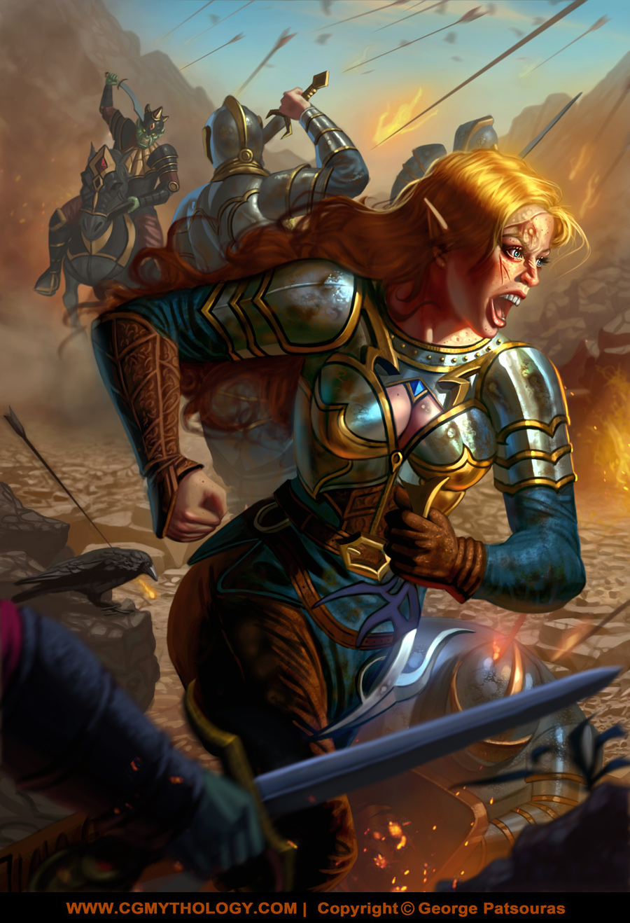
I updated the image based on the input I received and I think it's a significant improvement thankfully.  Calling this one done for now unless there is anything majorly off with it so please let me know:


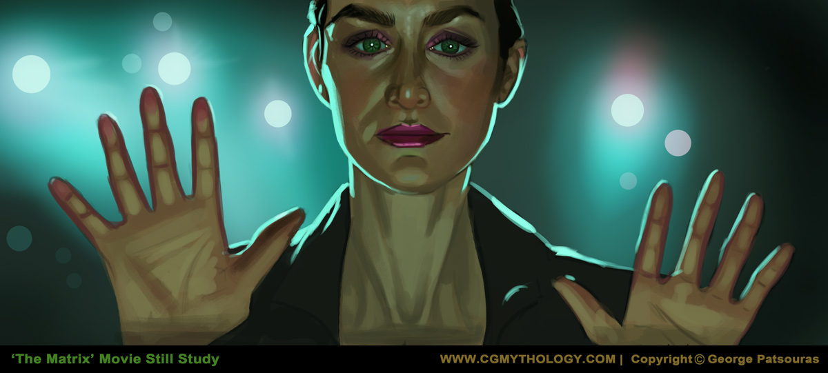
Next up I did a study of a movie still from 'The Matrix', one of my favorite movies:


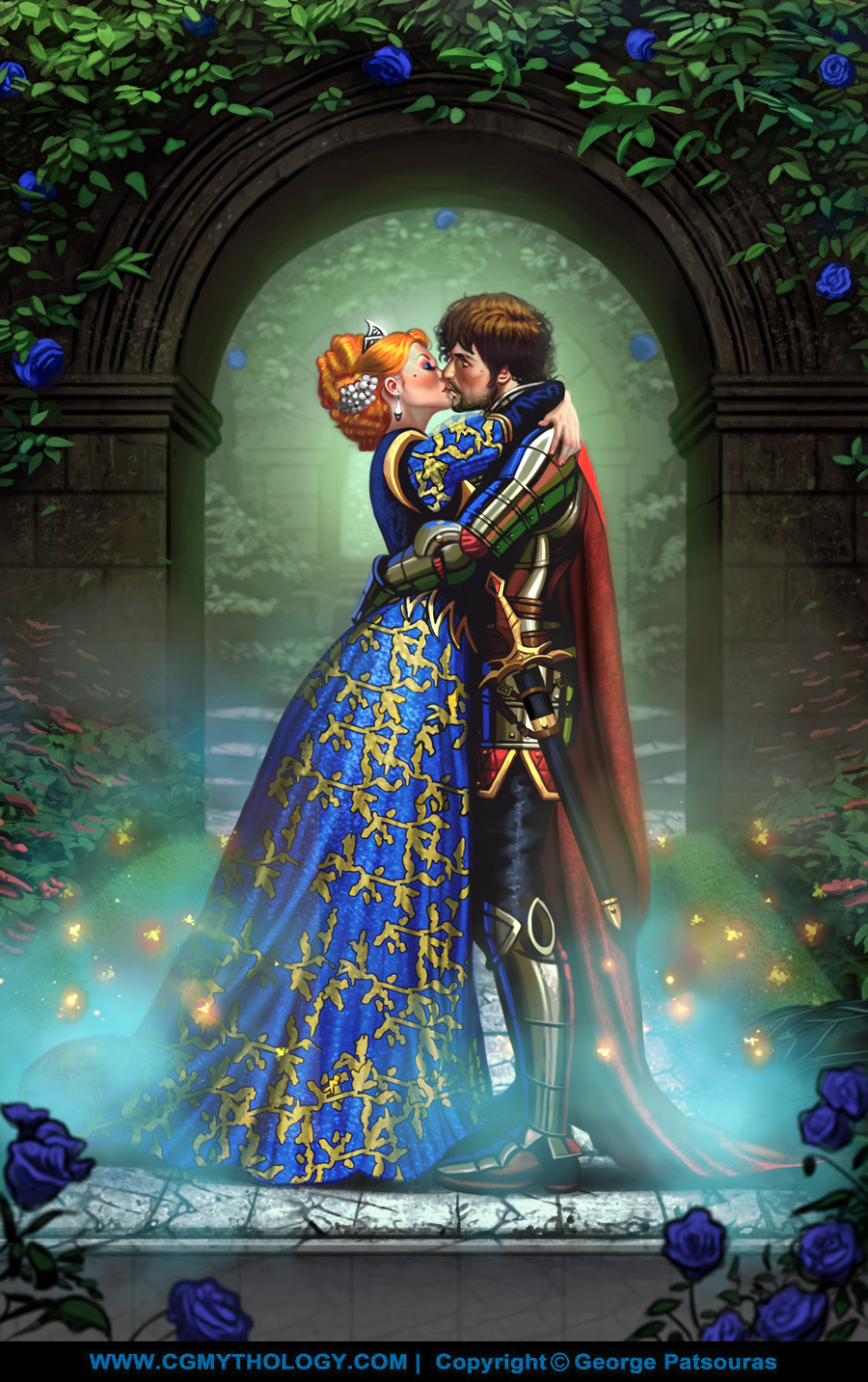
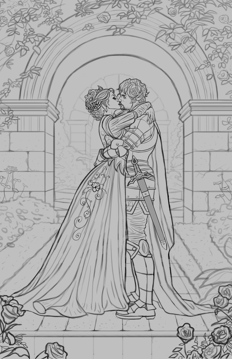
Finally I finished up a sketch for a new personal illustration.  This one took me a while due to its complexity but I'm fairly satisfied with it.  Before I begin painting it in I want to make sure the sketch is solid, so if something looks off please let me know.  The poses were referenced from this stock photo here.  Tried my best to stay close to the general poses while creating some medieval themed attire for the couple which fits the theme I'm going for:


Reply
Those small flatter bush look like rice krisp block right now or is that rough stone anyways that not so import at this stage as long as the render read correctly.

There nothing major to note but the robe decorative element is very flat you could try to deform it to follow the form a little bit more if you not going to give yourself that effort i would if i was you remove it because it just cheapen the piece.

Remember to break up your stone shape to break up the digitally drawing quality of the piece.

The handle of that sword look rather small i would also lengthen that.

For the cloak some of the fold are not passing the test of proper understanding of weight and material propriety. When a cloak as a shift in it shape there is some reason for example when it touch the ground and it to long it might as it hang from it shoulder stack on itself but where the shape will rarely change is at the mid point of the ''weight'' for that to happen you need a thicker material. Fabric is soft it doesn't have the quality of thicker material that mean that when a change in the shape occur it more rounded than it is to be angular specially the further away from the tension point the fold is. If he was on is knee the tension point would have been much lower and therefor the cloak would have fold on itself more dramatically in that case more extreme folding would have occur but still not to angular.

Here the cloak changing shape is some what ok but it the folding in the inside that make no sense like think of how fold in the robe mirror themselves circularly (the fold are deep rather than small)to a certain degree that happen when the shape of the material can flow down freely.

Anyways all that to say that creating believable fold is hard and you should keep studying and maybe if bring attention to it you might catch what i mean. The issue is some of the direction of those fold and how they merge into each other which become very chaotic and unpredictable when the material hit the ground. Also how you fold are some of them do no reflect the tension of weight they are to wavy. A fold that as weight at the top is going down ''straight'' along the form but as it reach the ground it can loose some of that tension.

My Sketchbook

Perfection is unmeasurable therefor it impossible to reach it.
Reply
Only feedback I can give is that it seems the sword is glued to the side.
Reply
Regarding the 'war' scene her teeth don't appear to be the right perspective from that angle there should be a slight curve, with the molars just seen in the background, but instead it look very straight and quite glaring. I hope this image gives an indicator as to what I mean. Not the exact angle, but the closest I could find. I hope that gives you an idea. https://pin.it/CUCQHgrx6

On the latest, great job on making the ref your own. It looks great! I've added that to my 'couples embracing/kissing' bank. I can understand what Tango says about the sword, it doesn't seem well integrated, but I assume that will change once you start to render it out.
Reply
darktiste:  Great points about the woman's dress, made a ton of changes to it for the better.  Hopefully it looks ok now that it's fully painted!  

Tango_mango:  Excellent point!  It's missing some straps but I went ahead and included them so hopefully it looks more natural now!

Dominicque:  Great points!  I refined the image heavily, particularly the expression.  Hopefully it works well enough now but please let me know!

................

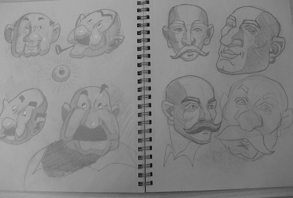
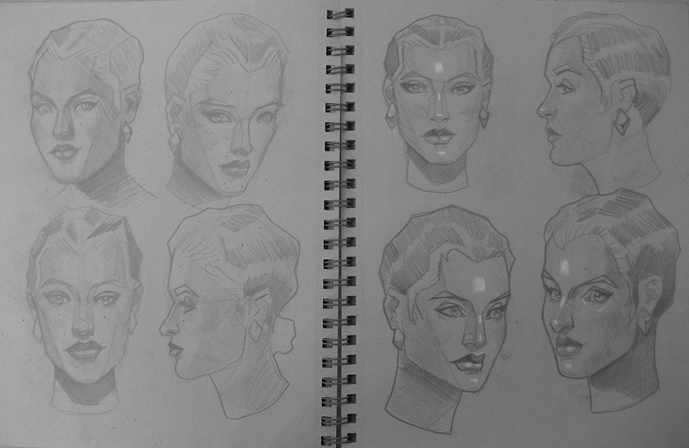
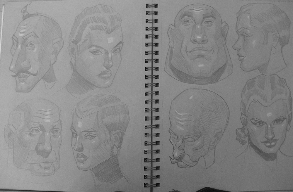
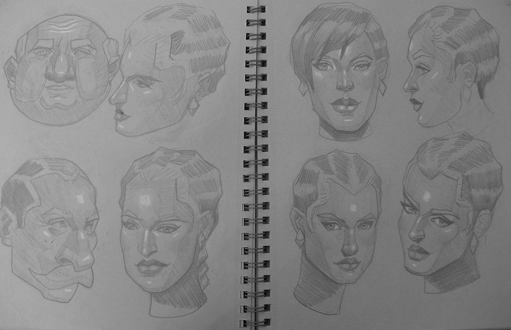
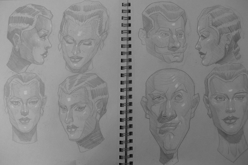
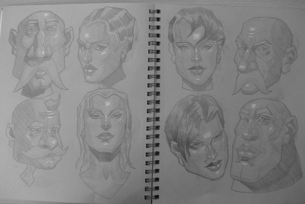
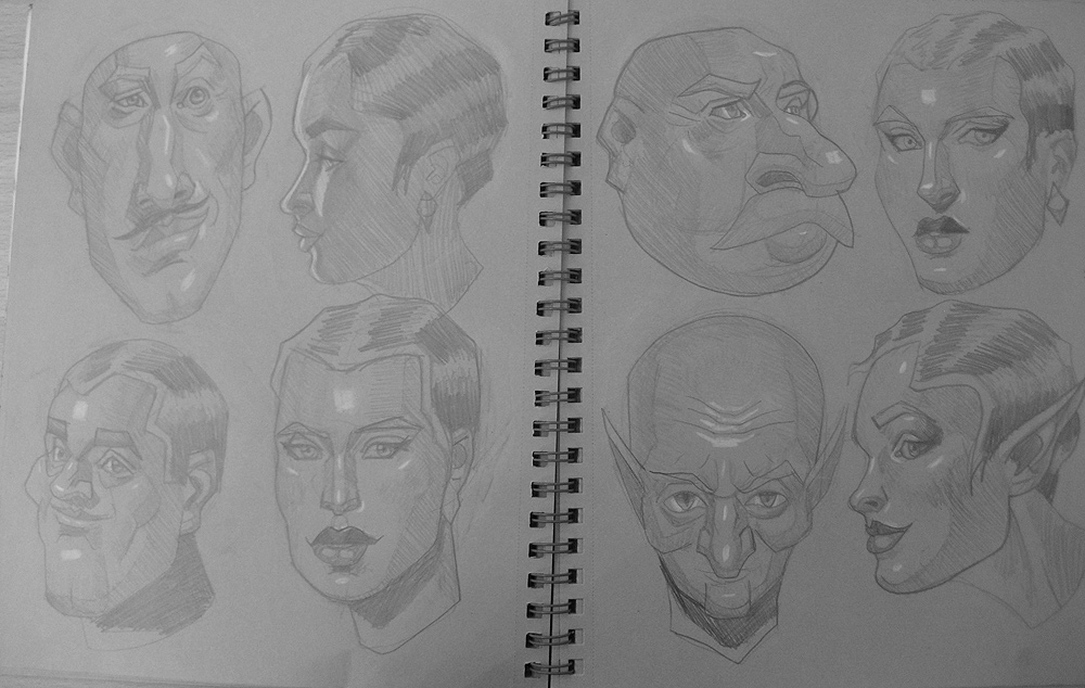
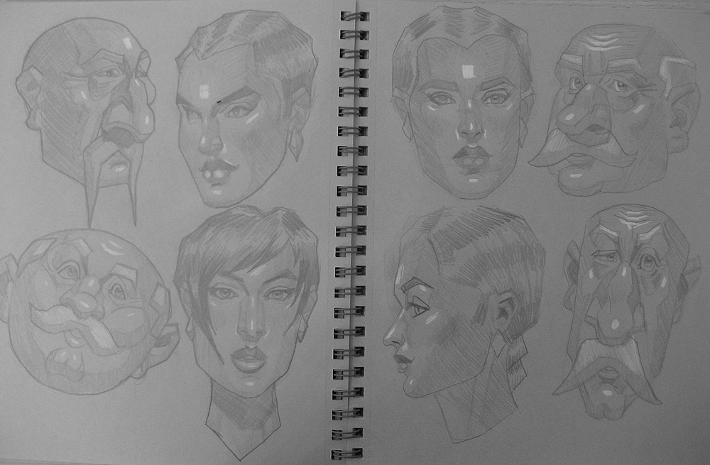
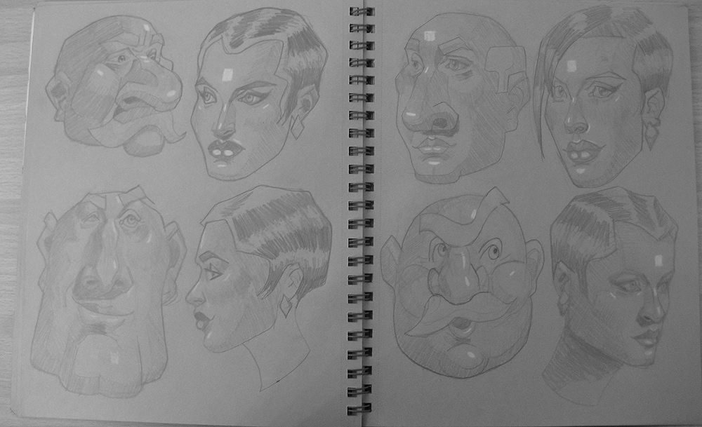
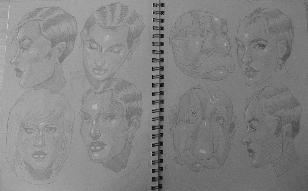
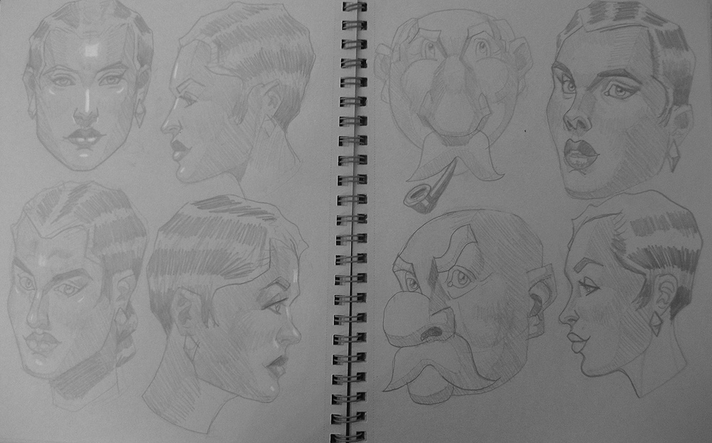
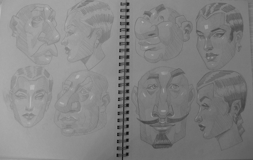
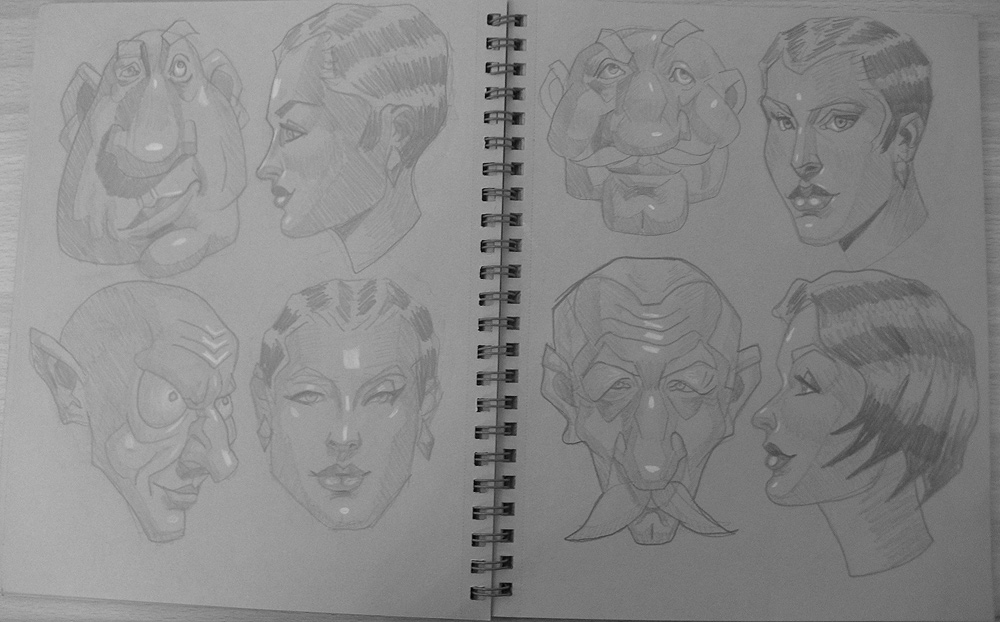
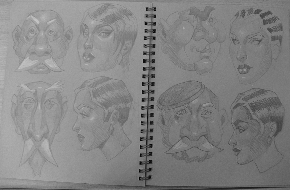
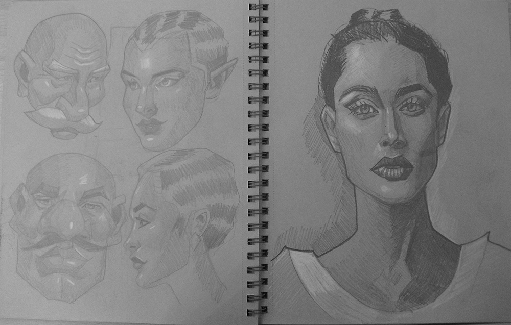
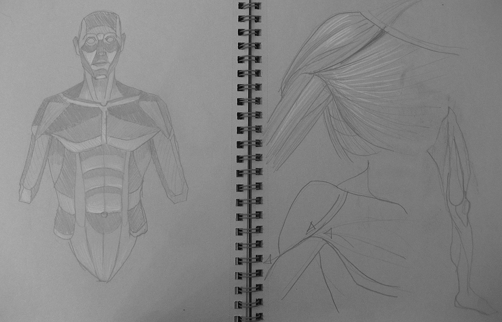
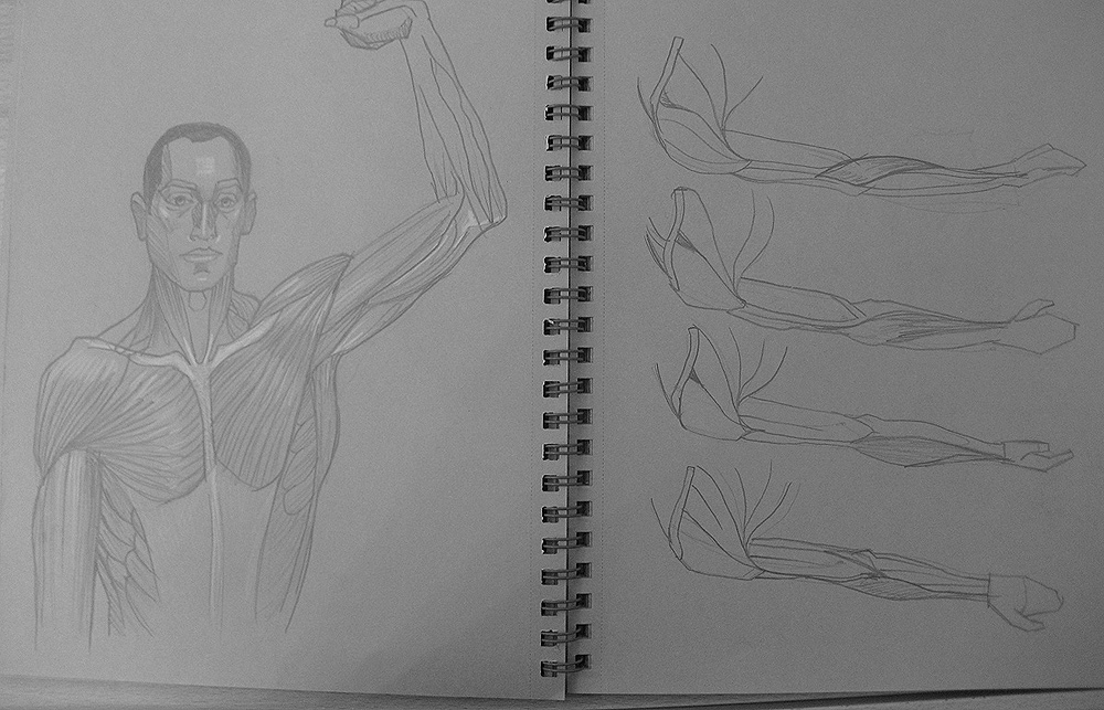
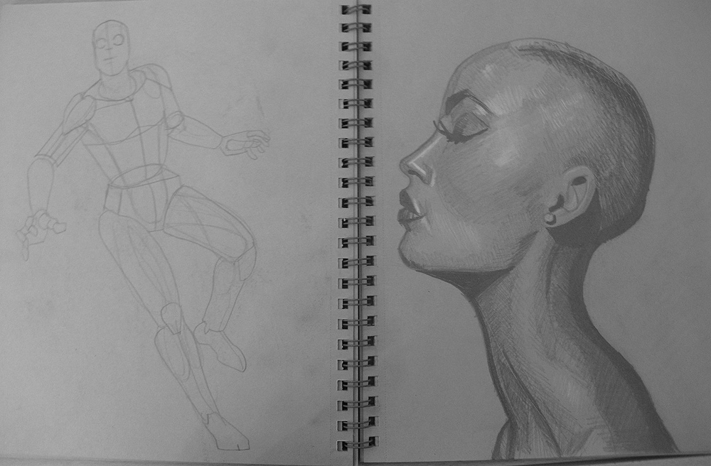
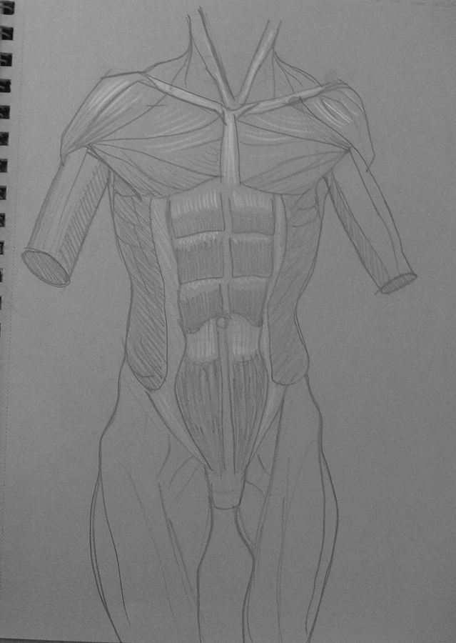
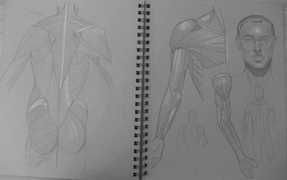
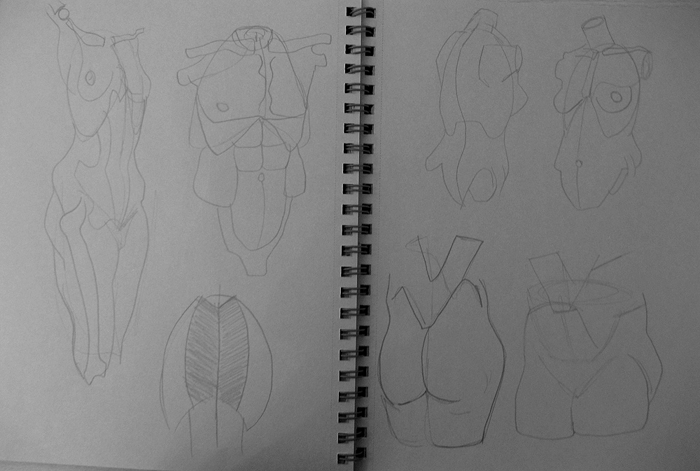
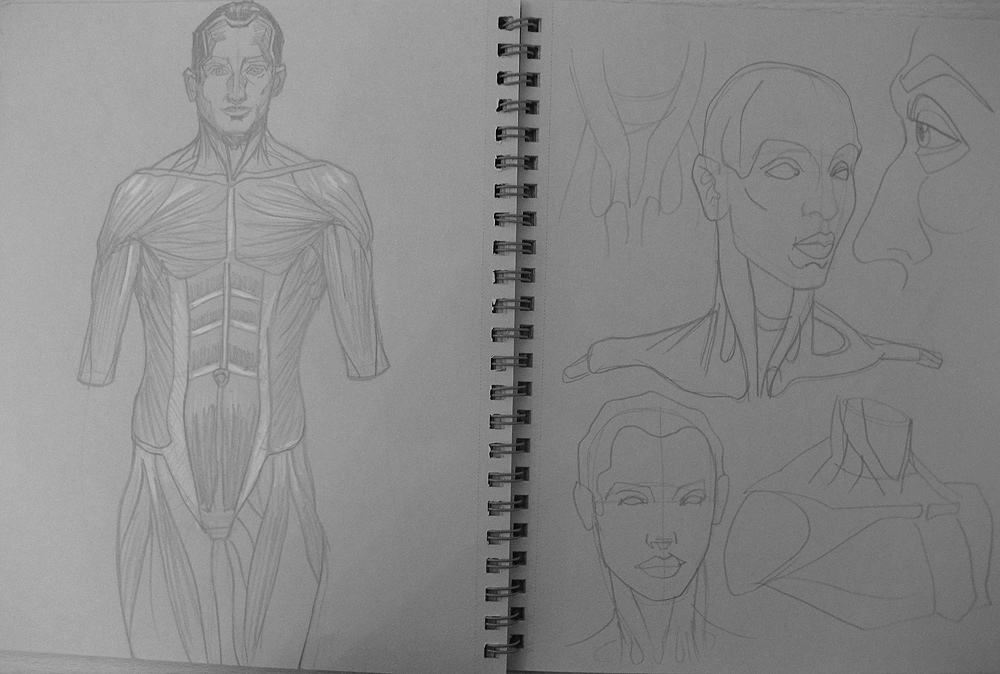
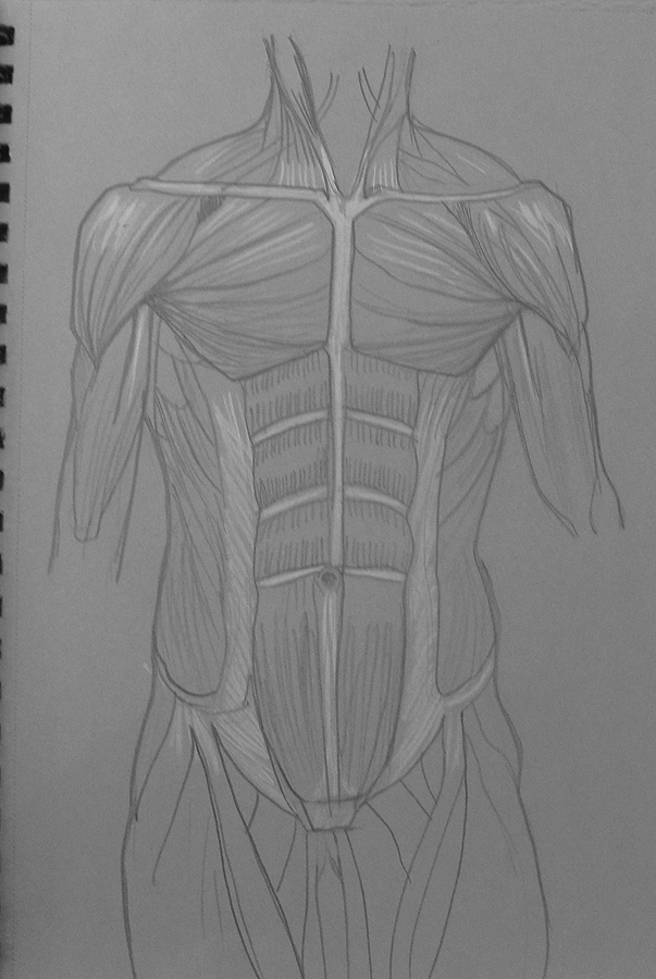
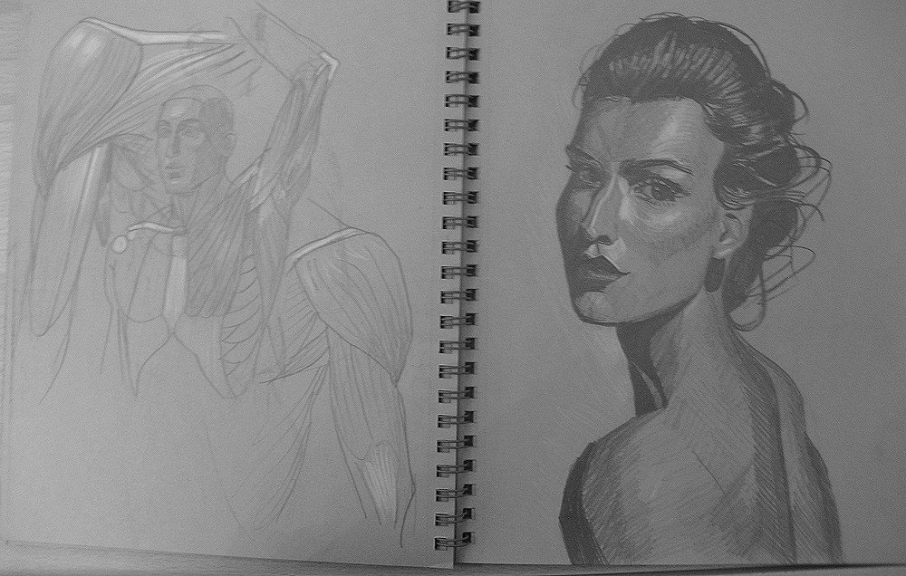
I've got a ton of updates today!  First up is some traditional sketches I completed last year.  I haven't drawn traditionally in years so my skills are naturally a bit rusty, but it was a lot of fun.  I think I'll do the traditional sketches strictly for anatomy studies as I learn more that way.  Lighting I'll handle directly with digital painting since it's so much faster:


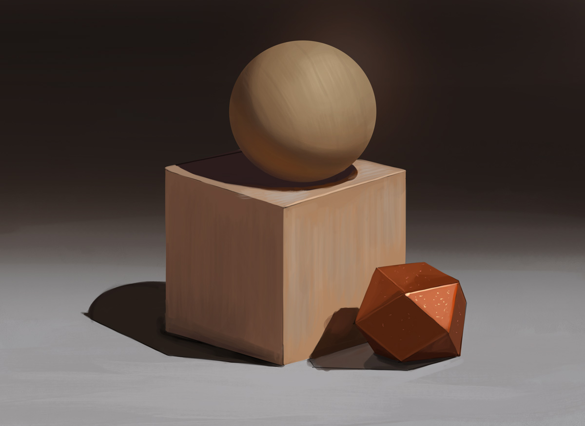
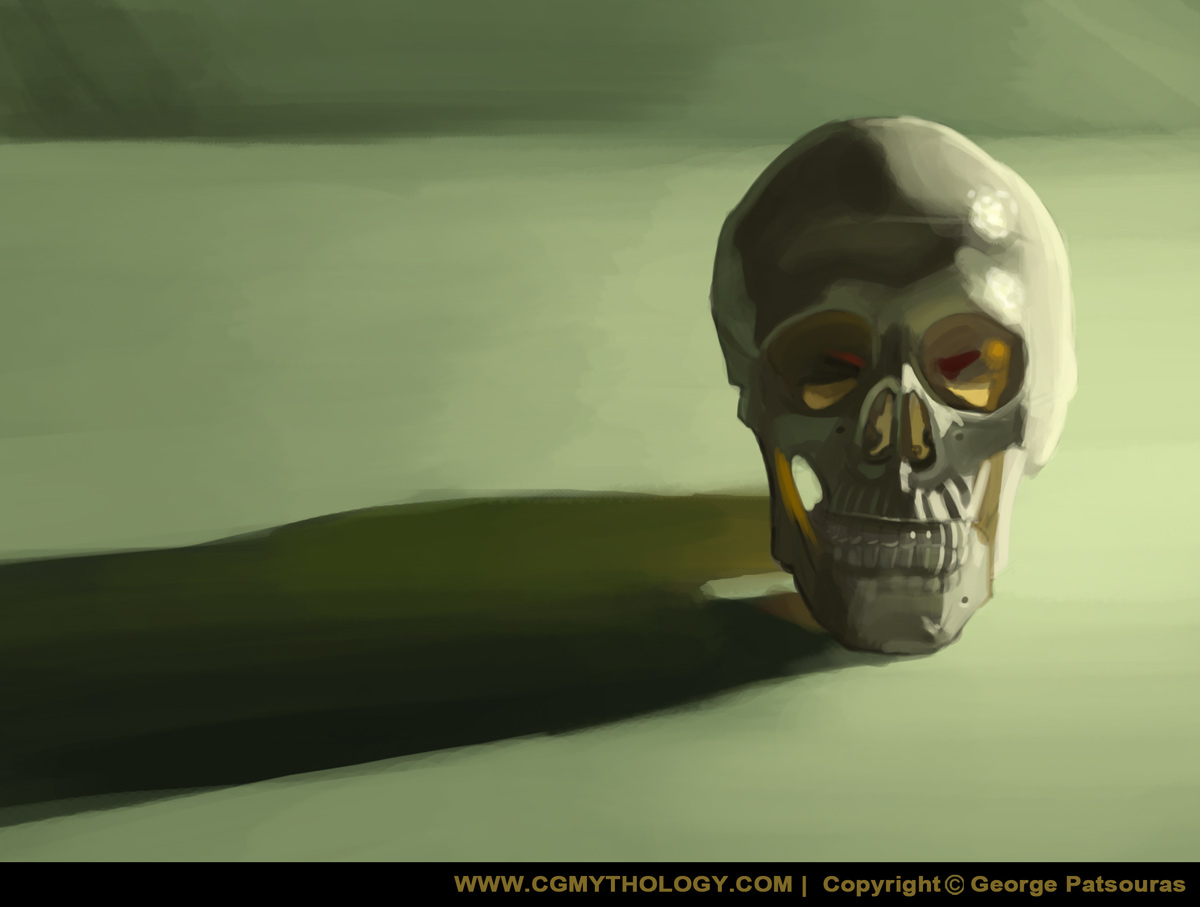
Next up are two studies for lighting:


Next up is an update on a recent painting, refined the expression a bit per feedback.  Hopefully it looks more natural now:


Finally my latest painting, would love to hear any input on this one before calling it final.  Below is the current progress followed by the steps for those interested:


Reply


Forum Jump:


Users browsing this thread: 468 Guest(s)