12-22-2012, 06:04 PM
I really like your coloring, and I see you improving very quickly!
:) gj
:) gj
|
My finished stuff
|
|
12-22-2012, 06:04 PM
I really like your coloring, and I see you improving very quickly!
:) gj
12-29-2012, 01:45 AM
Thank you Yarrnick! I'm so glad people can see improvement :-)
Here comes another; not my best work I think, but at least it's something a little bit diffrent! 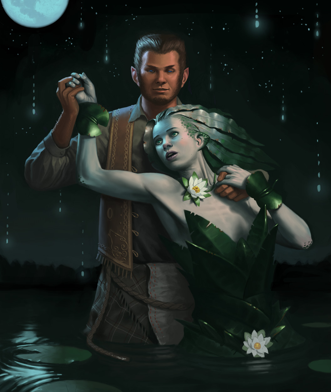
12-29-2012, 02:02 PM
Wow, I really like this! :D! The way the light hits those leaves really stood out to me. Keep up the good work :D!
12-29-2012, 05:47 PM
(12-29-2012, 02:02 PM)Majinpower Wrote: The way the light hits those leaves really stood out to me. Keep up the good work :D! +1
01-06-2013, 04:23 AM
01-08-2013, 11:16 PM
wow!!!! nice paintings!!!!
01-15-2013, 10:21 PM
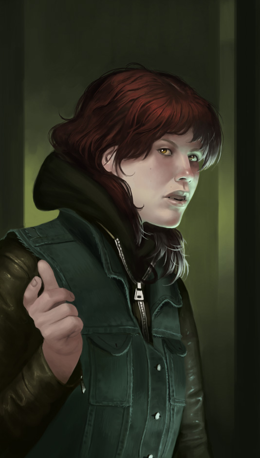
Thank you all nice people :-D I was lazy during the holidays, here is the only thing I produced:
01-29-2013, 06:21 AM
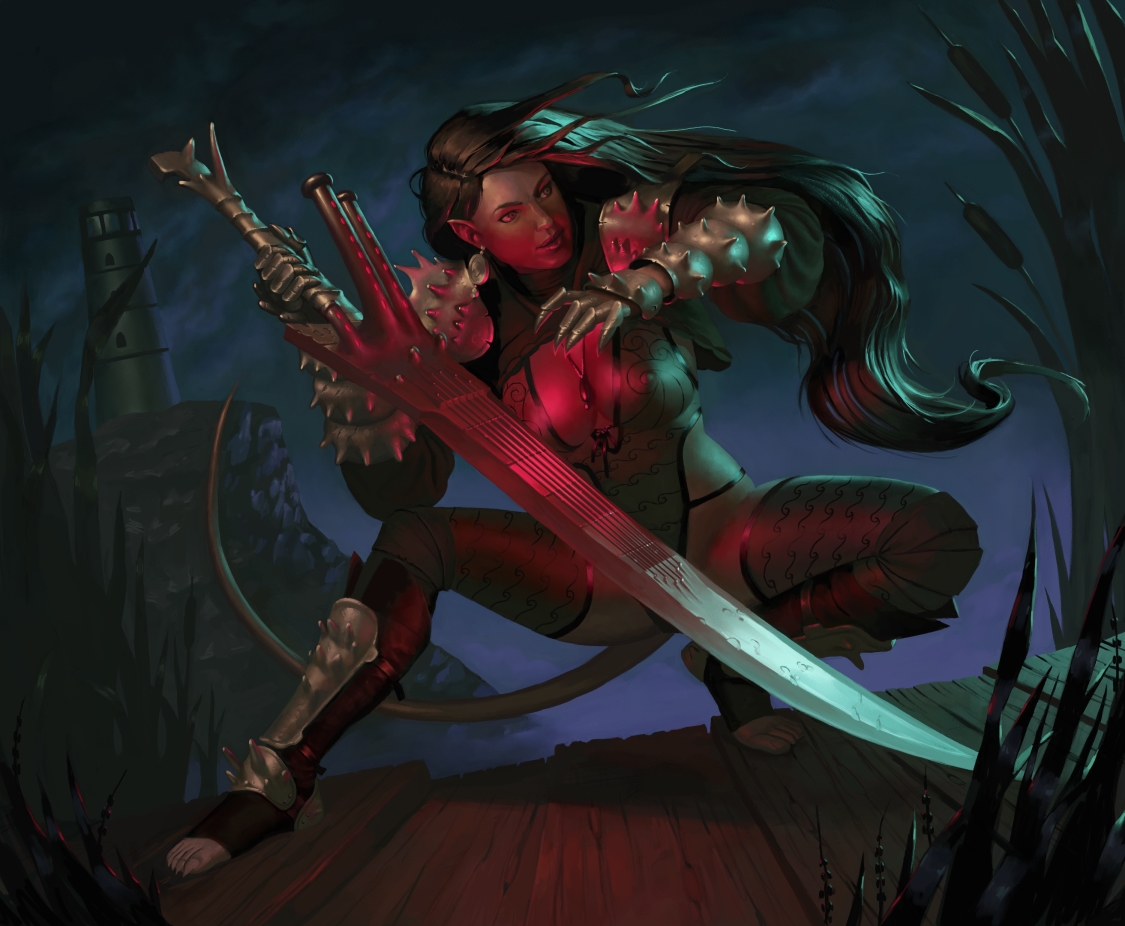
This took a little longer than usual, I went back to using Painter again and had to get used to it! Would be super grateful for any critique on this, I feel like I should have worked a little more on it, but I'm currently at a loss as to what I could improve.
02-01-2013, 02:27 PM
Last one looks amazing!
First thing that jumped out at me though was the end of the tail too close to touching that rocky edge. I think maybe you can add in some mist or extend the tail a little more, or even reposition it. Love the piece though, one of my favorites from you.
02-06-2013, 03:46 AM
Thank you Dennis, I see it now! I will probably adjust it soon!
Here's a new one, again painted in Corel Painter, I feel like my way of working fits much better with this software, it lets me just paint without feeling like I need to use digital tricks or adjustments! Critique very welcome as always, I want to improoooove! 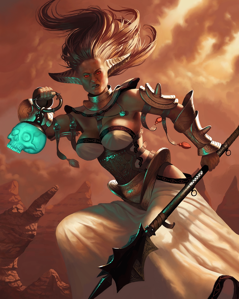
02-06-2013, 06:27 PM
Fixed the tail tip of the previous piece (Thanks again Dennis!) and also made the downsize a little bit sharper to bring out some of the detail lost in the resizing.

02-14-2013, 04:52 AM
love your stuff man, no crits from me, just keep killin it as you are, i look forward to seeing your updates :}
02-20-2013, 01:51 AM
Thank you Warburton! I will push on!
here is the latest finished painting; I livestreamed almost the entire thing at http://www.livestream.com/simonarpalmer ! I made some really bad choices with colors initially, fortunately a friend of minie gave me a critique towards the end and saved the image haha. 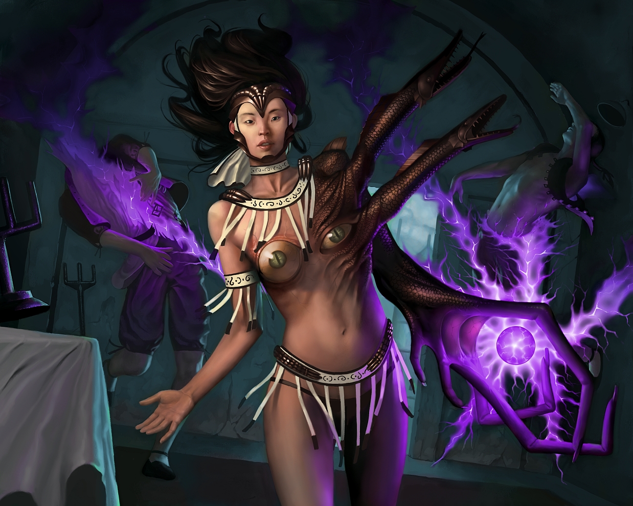
02-20-2013, 03:31 AM
eyeboobs! i love it.
Her design is by far the best on the picture, disgusting, yet beautiful. I also appreciate that your rendering has become even more sharp and accurate.
"Stand tall, and shake the Heavens!"
Tumblr for my comic!: http://rainfallcomic.tumblr.com/ Sketchbook: http://crimsondaggers.com/forum/thread-1227.html Facebook: http://www.facebook.com/eduardogarayart Deviantart: http://eduardogaray.deviantart.com/
02-23-2013, 03:05 AM
Thanks Eduardo!
For this next one I tried something diffrent, I know Sam tried to get me to do this during the mentorship and I saw John Silva do something like this on his stream; basically I started with a very soft brush and did the sketch with big blobs of soft values, and then defined it more and more towards focal areas and allowed other stuff to stay soft and loose. Painting it took about a third of the time it usually takes me so this method saves me huuge amounts of time and I think it actually comes out better too! 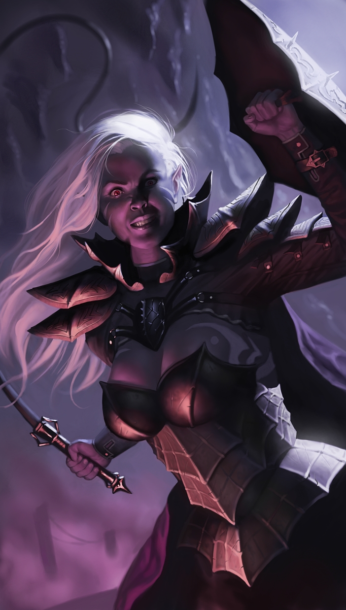
02-26-2013, 06:30 AM
Here is my most recent painting, a dragonkin paladin! Used the same technique as with the Drow, must admit I really like working this way, even though the method is a little bit more digital.
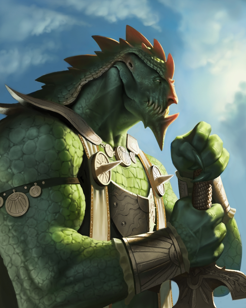
02-27-2013, 03:27 AM
the 'drow' piece came out awesome, some really great work in here man, keep it up!
03-06-2013, 12:03 AM
Thank you JonHop!
I continue to use the same method for this next one, though I try to use some diffrent paper grains to work in a bit more texture :-) 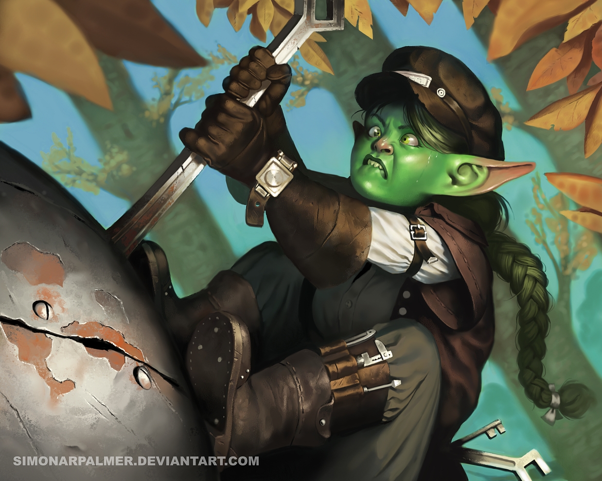
03-10-2013, 05:39 AM
You sure know how to render those materials! Also, I dig the attention to detail with costumes, weapons, armor and so on. Looking forward to seeing more from you!
|
|
« Next Oldest | Next Newest »
|