Posts: 140
Threads: 7
Joined: Aug 2012
Reputation:
6
Thanks Angela! I'll admit I have not thought about my anatonomy for a long time, I can see it's lagging behind!
Yeah Trevor, I work for Applibot, in my dreams each night that is haha. I'm not good enough for that, I actually sent them my portfolio some time ago but my work was not on par with their standard obviously :-)
Posts: 41
Threads: 4
Joined: Nov 2012
Reputation:
3
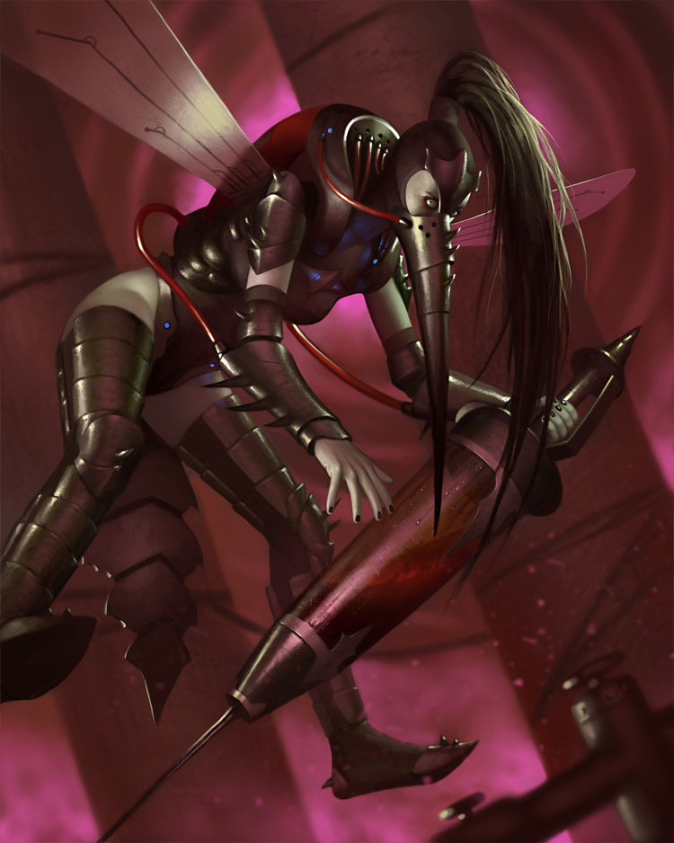
Whoa. Nice. Kinda reminds me of Cryptcrawlers painting style. In the first one I think you should make finger knuckler little more visible, at the moment fingers looks like made of rubber.
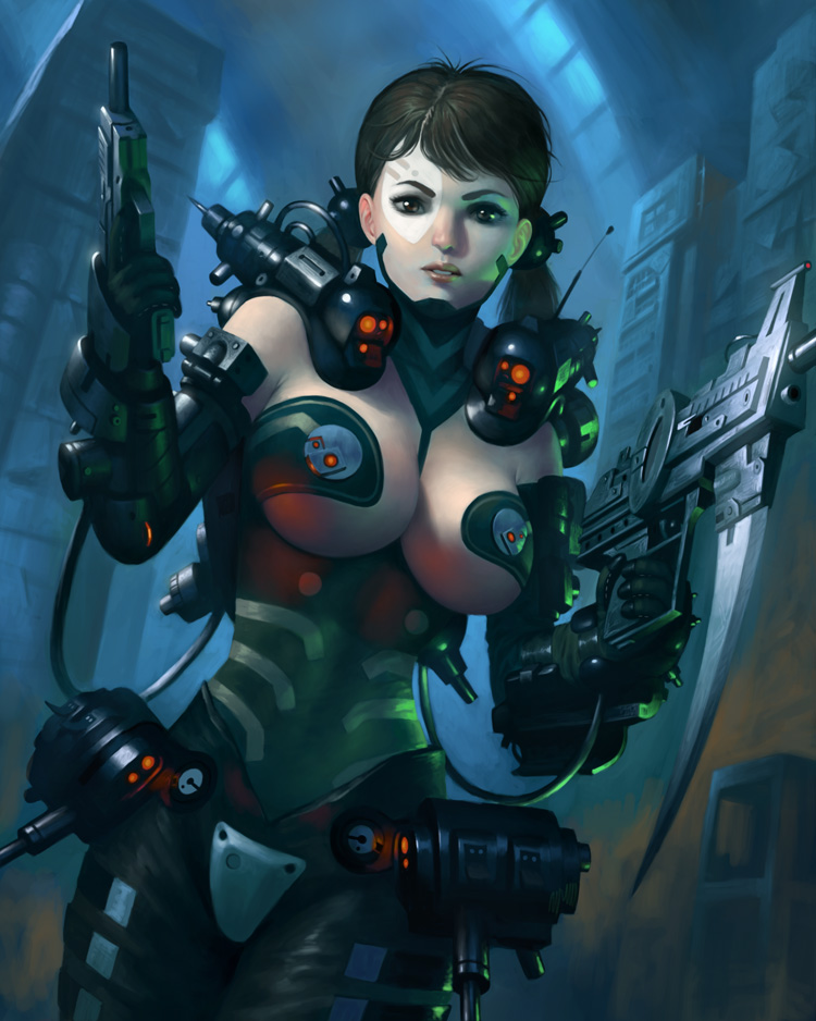
And in the second one I miss protruding elements from buildings. It will fit more to the character.
But.. wow. Awesome art.
fantastic work, i think your more than good enough for applibot. i love your lighting,
You got to work on your anatomy and proportions.
What's up with that sassy black chick's right arm? There's no form between the arm and her breasts/stomach. It's flat. With a bit of more painting over, it can be fixed.
And the snow girl's boots, something's off about it perspective wise.
And your folks' hands are proportionally too small. For example that deer elf boy/girl's hands (nice how he's doing dr evil's pose).
I can still see the same thing happening on this page. The cyborg chick's hands are small, the fingers are stubby, and blends into the gun. That's not a good thing, and her huge rack ain't going to redeem you from that.
Posts: 29
Threads: 1
Joined: Nov 2012
Reputation:
0
Ohmigod, your work is beautiful, and the improvement from last years is amazing!
I love it. :D


