Character WIP
#1
[Image: tumblr_n3lpzyaUMj1sbh1fro1_1280.jpg]

Brief background on the work. My goal's to create a dynamic fanart of a character from a cartoon I used to watch. I've been working on and off this piece since Feb. Some references used; mainly for the gesture, and of course the character design. However couldn't find key detailed/matching references such as anatomy for the pose, or how the fabric flows, etc.

I'm more or less happy with the general style between cartoon and realism of how I want to paint the character; but I'm having trouble bringing the work to a finish.

Having been working on this on and off I'm noticing tham I'm going into a pattern of painting/repainting (lost in noodling). So I've set an internal deadline for myself to consider this work finished and move on. I want to try and get as much improvement as I can into the work before said deadline.

What I'm having trouble with:
- Position and foreshortening of his right arm that's supposed to be in a pre bracer slam pose (short video of the character).
- The bending portion of his left arm.

What I'm uneasy with and could probably use some advice:
- The color composition. I'm still not sure if I'm using the "right" colors as it doesn't feel "alive" enough, or rather it feels "muddy".
- Values and form, I know I'm missing some parts in the pic where the value or form doesn't read well enough and would appreciate help in those areas.
- An impish/eager/excited grin or smile.

What I have absolutely no effin' clue with what I'm doing:
The background. I have zero experience with doing backgrounds. I've mostly done nothing but characters so some suggestions on how to make the bg more dynamic, and properly integrate it and the character would be much appreciated.

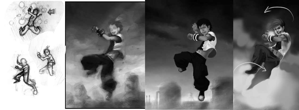
Old studies of the work to give you somewhat of an idea on what I've been trying to go for:
- Gesture/Pose studies
- Color studies(?) of chosen pose

Thanks for giving it a look and apologies for the long post. Suggestions, and paintovers are very much appreciated.

Reply
#2
Don't apologize! This is great how much you prepared for your art. You can be proud!


I love your sketches there were so full of live and energy. I don't know what happened with it later, cuz final pose is stiff and even. Instead of pushing and exaggerating it more it come out flat. I'm guessing that you get lost in details forgetting about overall silhouette. He looks more like standing on his straight leg instead of jumping.
Think about forces working on the character, besides falling down he is also twisting his body (I draw arrow indicating this) hairs and cloth folds will be continuing this directions. And here is the place to push his pose more. Twist more.
I hate backgrounds too :) I love that you organize values in this way that his lighter part is on dark sky and dark pants on lighter bg! This helps a lot in reading character. But I think you could totally crop him. this bg brings nothing to the story and even make it less dynamic. Maybe with 3point perspective and more diagonal lines it could work but the way it is now is just static.
With colors you have to use more hues. You have some reflected yellow light on his blouse, but pants are just flat green, and I don't event want to mention skin :D You can't pick one color for light and draw it on whole body evenly. Also if you plan to add some light effects like on the bracelet, include it immediately, this will change how his face is illuminated and with what color. You will not achieve this effect by just adding some "hard light" layer with green at the end.

Your work methodology with sketches and color thumbs is really good, keep it this way and learn from it. :)

Reply
#3
Thanks Madzia!

I was so concerned with anatomy and proportion for a more realistic feel that I kept cropping and limiting the exaggerations. I'm also wondering if trying to render it too clean takes away from the dynamic feel as well.

I'll try and see how much exaggeration I can slowly bring back into the figure. After your paint over I'm now noticing that I might be able to exaggerate the smile a bit more, will try that first before trying to change the angle of the head altogether.

I previously tried several studies with the shirt blowing the opposite direction, but it didn't lend a good feel to the comp (?). I initially intended of adding a breeze of sorts that blows smoke and debris to justify the direction the shirt is blowing, although I don't think the roughs read that well.

I like the idea of just the hand peeking instead of trying to figure out how fit the whole right arm, I'll try that out.

My experience with color has been limited to cel shaded coloring and I'm fairly new to the concept of different hues with regards to lighting. I was thinking of painting the skin evenly to keep the skin tone consistent, and then slowly brush in hue/light changes at slowly increasing opacities.

I'm open to suggestions of how to improve my ability to judge and pick hues for light and shadow. Right now I'm hoping that my problems with it are mostly due to a lack of experience, and not problems with the process.

Reply
#4
Spent a few hours and played around with the suggestions. Hopefully I'm headed in the right direction bringing improvement to the piece.

[Image: tumblr_n3nidaAeBS1sbh1fro1_1280.jpg]

A bit worried tho that the combination of the bracers green glow, and him looking down gives him a sorta villainous vibe. I'm thinking it's a failure of the composition.

Wondering if anyone has ideas how to make the lighting on the face less villainous. Currently toying with the idea of ditching the lighting from below.

Also is anyone else having a problem where a piece looks significantly darker once brought out of Photoshop? Can't seem to figure out how to fix that and have been doing guesswork with curve adjustment to try and fix it.

Reply
#5
I think it's mostly the eyes that are giving him the evil look.
Also, his mouth is slightly past the point it's supposed to be on the right, fixed that, and that does look a little better

Just noticed this now, but might be a good idea to keep the greens out of the right side of his face.

Watch this video for more dramatic lighting
https://www.youtube.com/watch?v=I1lRbALDiXo


Attached Files Image(s)


Reply
#6
Try making expression in a mirror yourself. I think if you make his eyes more open and brows higher up, it might make him seem more just really excited and pumped about defending what's right, instead of "*laugh* I GOT POWERS!!!"


Focus.
Reply
#7
@DoubleThink Thanks for the video link, will watch it later. Been looking for a nice guide for lighting ideas on YT but keep finding photo/cinema ones focusing more on the setup and equipment rather than theory and effect of diff. lighting styles.

@meat: thanks will give it a quick try. I feel like my earlier (original post) version kinda nailed the determined/fight! look. Was a bit concerned that it "stared into nowhere" so decided to have it focus on the bracer instead. Will probably try a little mix of both, or just bite the bullet and have him look forward again.

I also somewhat recall something I came across before that mentioned "looking down" and lighting from below were common theater tools to make a character appear sinister. (that and the light being green doesn't help Tongue)

Reply
#8
My latest attempt based on feedback so far.

Changed the mouth a bit, softened some of the facial edges a bit, and adjusted the lighting contrast to make it less sinister looking, so far I think it worked.

Seeing some improvement on color, although I'd appreciate any additional input. Still need to see if I fix any more of the forms before trying to polish it into a finish.

[Image: tumblr_n3xdbln1P01sbh1fro1_1280.jpg]

Thanks for the feedback so far, it helps. Insane, ecstatic

Reply
#9
Hey looks better already! May I suggest making a JPEG copy, and then in that small copy, just make a quick edit to make his eye look forward at out-of-frame enemy? If you have just leapt into a serious fight with someone that's real trouble, you'd want to at least keep 1 eye trained on him/her all the time, won't you? But it's ultimately about what look you think works, and not about logic (although some logic is still needed in creating and grounding art, art can't be shacked and burdened by logic).

Also there's a BIG light part at the bottom half, and that would suggest more back light on him, or at least rim light on the back-facing edges. Right now I see a big light source from his back, but his person seem front-and-top-lit (especially the shirt) with no indication of there being out-of-frame light source from the front.


Focus.
Reply
#10
(04-17-2014, 12:28 PM)meat Wrote: Hey looks better already!...

Thanks meat! Will see about adding some rim lighting to indicate the stronger light source/atmosphere below/behind the figure. Also I tried with him looking out-of-frame like in the earlier versions. Either looks fine actually, although at this point without any external cues as to an enemy-of-screen I think it might be better his eyes was focused on something within the painting.

Added more hints of atmospheric lighting, hopefully it came out ok, especially with regards to his white shirt. It's the most problematic part for me at the moment.

Slowly polishing it up, working on blending the values together and saving the edge work for last.

I'm liking the improvement so far, hopefully it'll look better the closer I get to my internal deadline.

Much thanks for the feedback, and more is always appreciated (will try and squeeze in what I can before I'm "forced" to call this one done)!

[Image: tumblr_n4nzdzvMcp1sbh1fro1_1280.jpg]

Reply
#11
Thanks for the feedback and critique guys; really learned a good deal from them.

After having worked on it on and off for the last month I think I'm calling it quits on this particular piece. My brain is going to a standstill on figuring out how to fix the stuff I see wrong with references I can copy stroke for stroke. Blame it on the lack of a big enough visual library and understanding to work with (something I hope to fix in time).

I still appreciate any feedback, or critique you can give that I can bring over on the next piece once I work up the nerve to start working on it.

Thanks!

[Image: it_s_hero_time_by_vagrant_angel-d7ipocr.jpg]

Reply


Forum Jump:


Users browsing this thread: 28 Guest(s)