10-24-2013, 08:57 AM
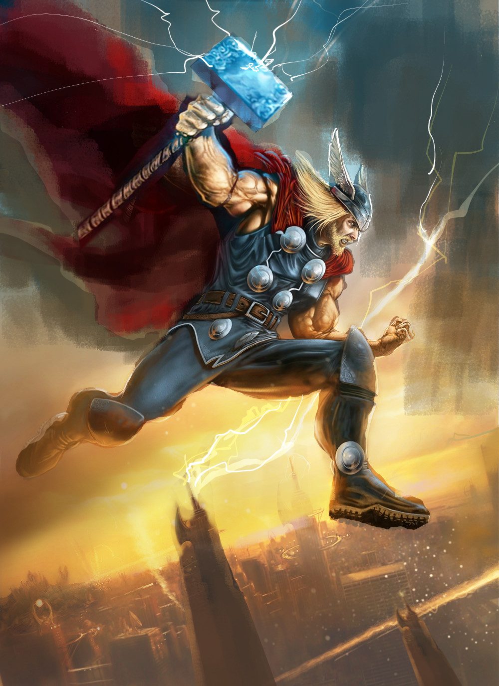
Right so I thiink it is fairly dark overall and can do with a bit of pumping up for contrast especially as it is comic style. I tend to go overboard in POvers so you can always dial it down so it's not so saturated, like in the yellow sky. Most of what I did was obvious. I did tweak the comp a little bit (moved his hammer arm to suggest foreshortening and fix the really disjoint shoulder proportions , just to bring the hammer head into a secondary focal point as you wanted a bit more emphasis on it. I also tweaked larger shapes in the comp, such as his cape,hammer angle, the clouds, building and lightning and overall background value structure to try and accentuate this cool diagonal you have going.
I'd also say use the cape as a compositional element, and render the broad fold structure (using some reference) the folding isn't very accurate and I think doesn't need to show as much detail as you have atm
Useful I hope.

I'd also say use the cape as a compositional element, and render the broad fold structure (using some reference) the folding isn't very accurate and I think doesn't need to show as much detail as you have atm
Useful I hope.


