Massive sketch dump of everything from February to May, from the Pirates of the Stratosphere project. You can see finished artwork for the game
[here] and you can play it for free
[here] (no account needed).

This is how I wanted the style and feeling of the user interface to be like. Also has some projectile ideas on the page.

The big three are studies of different types of ships and their proportions. I kept going until I had enough understanding of how the ropes crisscrossing everywhere connect to masts and different parts of the ship, which was knowledge that I needed to feel comfortable enough to begin designing from imagination. The smaller ships are where I start getting more creative.

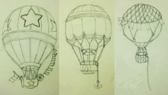
Dirigibles were the most difficult to design. How do you make a dirigible, which has a plain exterior, design wise, look interesting? I gathered lots of reference and lots of inspiration, then made these thumbnails. Lots of thumbnails. Just gotta make enough terrible designs, mistakes, and happy accidents until you have enough options and can use the best parts.

The first balloon I see as a government propaganda balloon, the second as a merchant's balloon, and the third as a lower class civilian balloon. The hot air balloons were the last ship type I designed, by then I was fairly comfortable with the design process. Watch documentaries about the subject you're designing, it helps alot. It gives you historical and functional background about your subject (the reason x looks like this is so it can do y, others tried ones that looked like z and this is why it didn't work...etc) and that knowledge will help you design things that have some basis in reality.

The sky pirate, Fausto! I wanted to have him doing somersaults, backflips, and breakdancing in mid air while being launched from ship to ship in the game. Turns out, that's a crazy amount of animation and there wasn't time... Alas.
![[Image: skull_by_pandamonic-d55a8ga.png]](http://www.deviantart.com/download/311206474/skull_by_pandamonic-d55a8ga.png)
![[Image: skull_profile_by_pandamonic-d55a6ki.png]](http://www.deviantart.com/download/311204034/skull_profile_by_pandamonic-d55a6ki.png)
![[Image: facial_muscles_profile_diagram_by_pandam...55a5qu.png]](http://www.deviantart.com/download/311202966/facial_muscles_profile_diagram_by_pandamonic-d55a5qu.png)
