Nicky Beats His Tablet Up
#1
HEY DAGGERS!!!

how yall doin? figured i might as well begin a new sketchbook on here, well not entirely new stuff, but just the few first images in here may be familiar if you know me, i swear the rest will be new stuff!!!

anyways, im trying hard to improve in all areas of study, as well as improving my work from imagination. so any help along the lines of critiques, advice, paintovers, stuff like that is always appreciated highly! i respect you guys so much you dont even know. so heres a toast to mr David Rapoza for bringing us all together under his warm bosom. haha. thanks buddy!

anyhoo... ahem... heres some stuf to look at...

this one was a study after another artist

a Dune tribute, WIP

and finally some faces from various photos i fund on the web

uhhhh... so no html allowed... orrr......??


Attached Files Image(s)


Reply
#2
heres a really quick 20 min. sculpt in zbrush, trying to get a lot better at 3d this year

[Image: attachment.php?attachmentid=1407767&stc=1&d=1327461469]
[Image: attachment.php?attachmentid=1407768&stc=1&d=1327461499]
[Image: attachment.php?attachmentid=1407769&stc=1&d=1327461529]
Reply
#3
[Image: attachment.php?attachmentid=1416694&stc=1&d=1328532282]
Reply
#4
The zbrush stuff is pretty awesome, those crazy programs never made sense to me.
The current CHOW is looking pretty solid too, kind of reminds me of robocop for some odd reason.
Reply
#5
thanks man!!

[Image: attachment.php?attachmentid=1417693&stc=1&d=1328643945]
Reply
#6
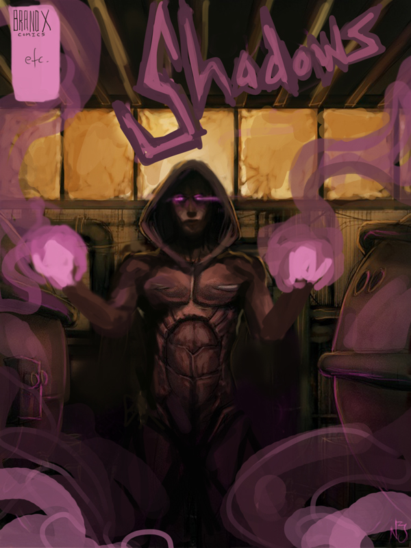
here is a comic cover i did for a school project

[Image: attachment.php?attachmentid=1421140&stc=1&d=1329080017]
Reply
#7
Nicky, hey what up? I really dig what you've got going on so far. I think one suggestion that I would make is to avoid sacrificing form for detail. In that last piece things go awry when you really start crunching down on the forms, going for rim lighting and core shadows etc. If you take a step back, you'll notice that you've got some structural mistakes that need correcting before you start bustin ass on the rendering. The head is definitely to small, and the arms are a bit janky on the anatomy. You need to get in the habit of flipping your canvas too (if you aren't already), there are some symmetry issues that need resolving, especially considering it's a frontal pose. Also, think about your lighting situation, things don't seem to mesh up.

Compositionally, you need to think about the whole page, you have a lot of inactive area that needs to be utilized. Stay away from pre-made typography too. In a comic, you need to hand design a custom title for branding reasons.

I hope you don't mind, but I did a quick draw over to express what I am saying a bid more clearly.

I wish you the best. Keep pushing on!


Reply
#8
damn! thanks man! very valid points! i feel like a turd now, but a turd who has absorbed a solid lesson. i appreciate the paintover, and now that i see what you mean better, you make 100% sense. it looks way cooler this way, and i hated that title at the top anyways.

that being said, i should point out that this was done as a side school project that one of my teachers asked if i could help out some of her other students with there game project. they wanted a little comic to open up their game with. so i agreed. but now she is bitching at me to get it finished, and asking me to give it top priority over my other school work, so i banged it out in one sitting, and probably could have given it more thought and energy, but also didnt really give a fuck about it at the same time.

but your right, and i dont want to make habits of rookie mistakes. i ALWAYS forgget to flip the fucking canvas!! gotta put in the extra effort! GO DAGGERS!
Reply


Forum Jump:


Users browsing this thread: 7 Guest(s)