This is my sketchbook, but since I'm new here I'll start with uploading some works from the last few months or so. I'm not too good, but I'm working hard on improving myself. I hope to get some feedback here.
|
Supermuts' Sketchbook
|
 This is my sketchbook, but since I'm new here I'll start with uploading some works from the last few months or so. I'm not too good, but I'm working hard on improving myself. I hope to get some feedback here.
12-17-2012, 06:36 AM
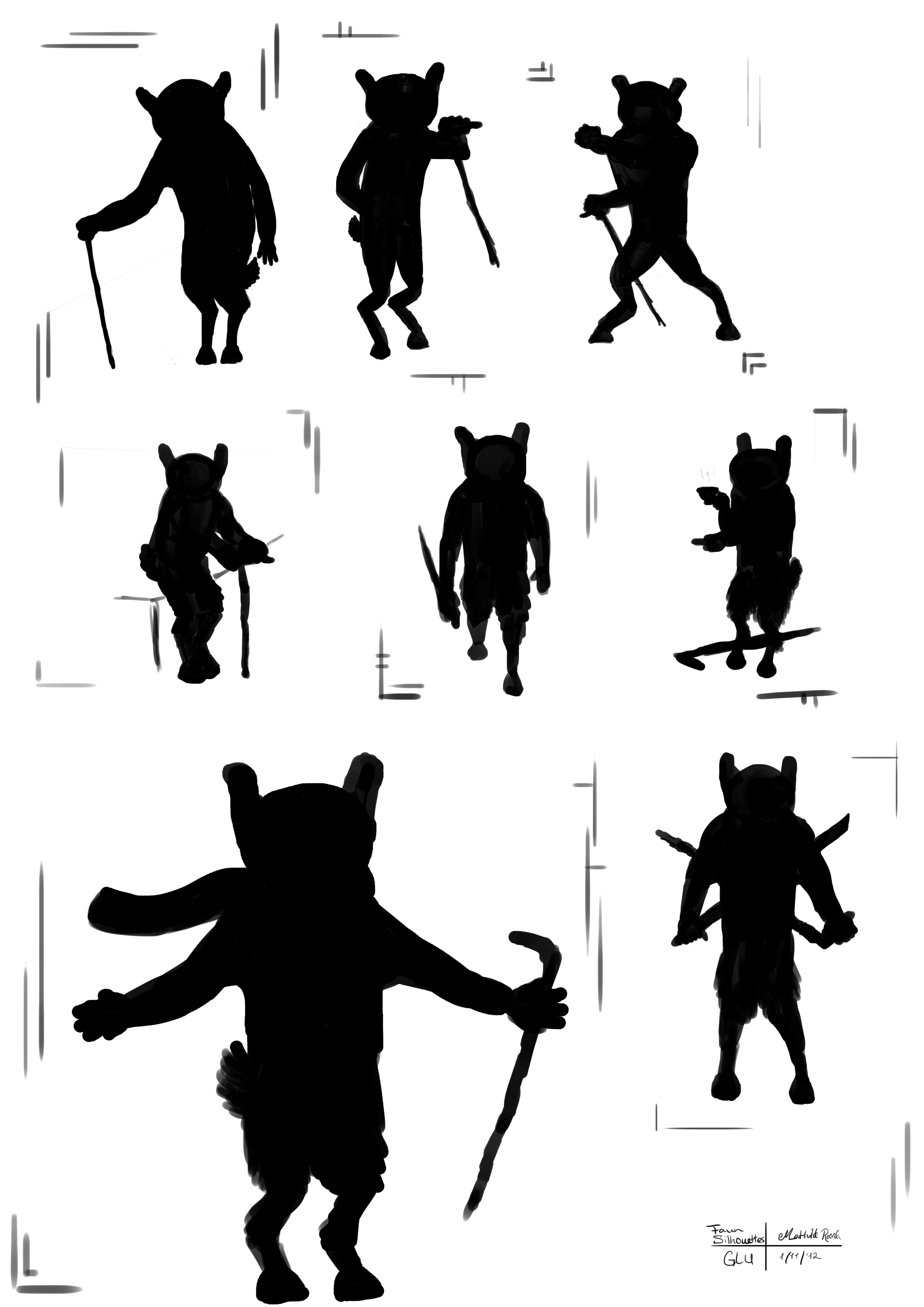
![[Image: zombie_attack_by_supermuts-d5c8xuc.jpg]](http://th00.deviantart.net/fs71/PRE/i/2012/236/a/9/zombie_attack_by_supermuts-d5c8xuc.jpg) ![[Image: don__t_look_back_by_supermuts-d5d2yxx.jpg]](http://th03.deviantart.net/fs70/PRE/i/2012/243/d/f/don__t_look_back_by_supermuts-d5d2yxx.jpg) ![[Image: deviant_id_by_supermuts-d5dzufe.png]](http://fc00.deviantart.net/fs71/i/2012/251/2/5/deviant_id_by_supermuts-d5dzufe.png) ![[Image: yarr_harr_by_supermuts-d5efjxf.png]](http://fc01.deviantart.net/fs70/i/2012/255/f/9/yarr_harr_by_supermuts-d5efjxf.png) ![[Image: enchanted_forest_by_supermuts-d5eg5qa.jpg]](http://fc01.deviantart.net/fs71/i/2012/255/2/6/enchanted_forest_by_supermuts-d5eg5qa.jpg) ![[Image: anatomy_sketches_by_supermuts-d5gnmo8.png]](http://fc09.deviantart.net/fs70/i/2012/276/f/0/anatomy_sketches_by_supermuts-d5gnmo8.png) Some anatomy sketches, I used posemaniacs for this. ![[Image: character_design_practice_by_supermuts-d5hb5ix.jpg]](http://fc08.deviantart.net/fs70/i/2012/282/4/8/character_design_practice_by_supermuts-d5hb5ix.jpg) I tried to make some characters in a style that is more Borderlands concept sketches/Tony DiTerlizzi. The little boy turned out semi-okay, but the rest... I need to practice this a lot more. ![[Image: roman_warriors_by_supermuts-d5heli2.jpg]](http://th04.deviantart.net/fs71/PRE/i/2012/283/1/6/roman_warriors_by_supermuts-d5heli2.jpg) Roman Warriors, though mister Left looks a bit too Asian to be fighting as a legionnaire. ![[Image: artisan_mouse_by_supermuts-d5hk3nb.jpg]](http://th08.deviantart.net/fs70/PRE/i/2012/285/5/5/artisan_mouse_by_supermuts-d5hk3nb.jpg) And then I looked back at it, and I thought: "Wow, he looks really creepy." ![[Image: old_faun_by_supermuts-d5jg6gr.jpg]](http://th03.deviantart.net/fs71/PRE/i/2012/303/4/2/old_faun_by_supermuts-d5jg6gr.jpg) And then this one came along. It's quite tragic, it's supposed to be an old faun. My art teacher thought it was an old lady that had been magically granted goat hind legs. It's probably my fault for forgetting the horns and having a Narnia sentiment that made me give him a scarf.   Yeah, I have no idea why that came out so huge. I attached it, instead of hyperlinking it. It's some silhouette sketches of the Faun, but they made that assignment after I had already finished the piece. ![[Image: anatomy_study_by_supermuts-d5jg7gd.jpg]](http://th06.deviantart.net/fs71/PRE/i/2012/303/6/d/anatomy_study_by_supermuts-d5jg7gd.jpg) A full body anatomy study. Those things are damn hard. ![[Image: swiss_guard_by_supermuts-d5k8ze3.jpg]](http://th04.deviantart.net/fs71/PRE/i/2012/311/4/9/swiss_guard_by_supermuts-d5k8ze3.jpg) A Swiss Guard, from the Vatican. Except for a missing sword, it's almost entirely accurate. Allright, that was my recent work. I'll be posting some new stuff soon :)
12-18-2012, 05:56 PM
Hey Mathilde,
great to have you here and that you already uploaded so much : ) I like that you do all those different characters and give them different poses and attitudes. Maybe do some anatomy studies and they'll be even greater! I'm curious to see more, keep it going : ) And btw, you can resize the pictures in Photoshop, or whatever software you are using.
12-19-2012, 03:00 AM
Hey, Welcome, I agree with what foxflake said, also studying some real life objects in just value, no colour, will help you to turn your forms more making them less flat. Keep posting up your progress :).
12-27-2012, 01:12 AM
![[Image: 723qs.jpg]](http://i.imgur.com/723qs.jpg) I made this for Santa's Workshop, a group on DA that makes art for people and then gives it to them at christmas. This is an OC of someone, he is a Glee member and his name is Brandon. And I've probably made a gazillion different versions before I finally got this one. And even then. I started with realistic, and the versions became more and more cartoony until it finally worked out at least okayish. Still the background doesn't fit with the character itself, but it's Christmas already so my time has run out. I've been working on anatomy, and following classes at school. We started with the skeleton and the muscles, then kept adding more details. Still needs way more work though. And I'll definitely study the values of objects, that seems like a great plan :)
12-27-2012, 02:50 AM
Keep up the hard work! I just wanted to refer you to Loomis in-case you don't already have it.
|
|
« Next Oldest | Next Newest »
|