Sprayah's Sketchpad
#1
Hey Daggers!

I’m gonna try and build a sketchbook here, its sort of my 2013 new years resolution to draw more. I would appreciate your feedback and will try and learn a thing or two :-)

A few resentish studies and imaginative works to start me off:


[Image: iKsVX.jpg]

[Image: MNXMW.jpg]

[Image: JMlwr.jpg]

[Image: WGH3D.jpg]

[Image: DdP8g.jpg]

Daggers!

Reply
#2
Does anyone else's photoshop make weird squares in the image after using the liquefy tool? Is there a workaround?

[Image: 201Av.jpg]

Daggers!

Reply
#3
hey dave welcome to the daggers man

its truely admiralble for a man of your age to still have the desire of self improvement
fuckin-A

few things i want to point out,

you need to push your values, i can see youve grasped local value those two girls both have differnet local values but their not being pushed esspecially in areas were an ambient occlusions occur on the figure were light would have a hard time reaching.

heres a paintover id did of em 45min each

didnt know what kind of ref you used so i winged it from imagination, it showed me i suck at alot of things lool
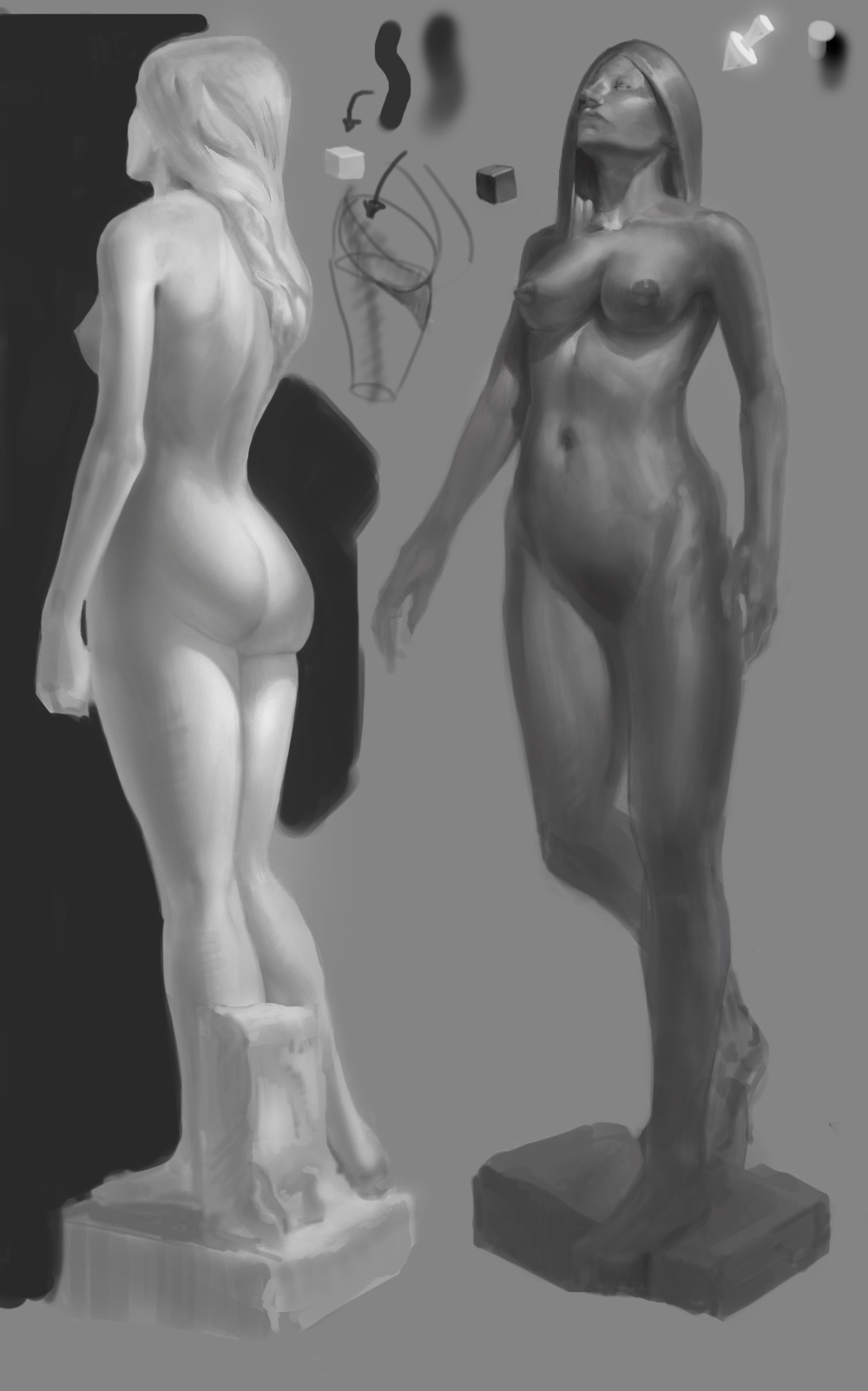


you see how i managed to push the values but keep their respective local tones
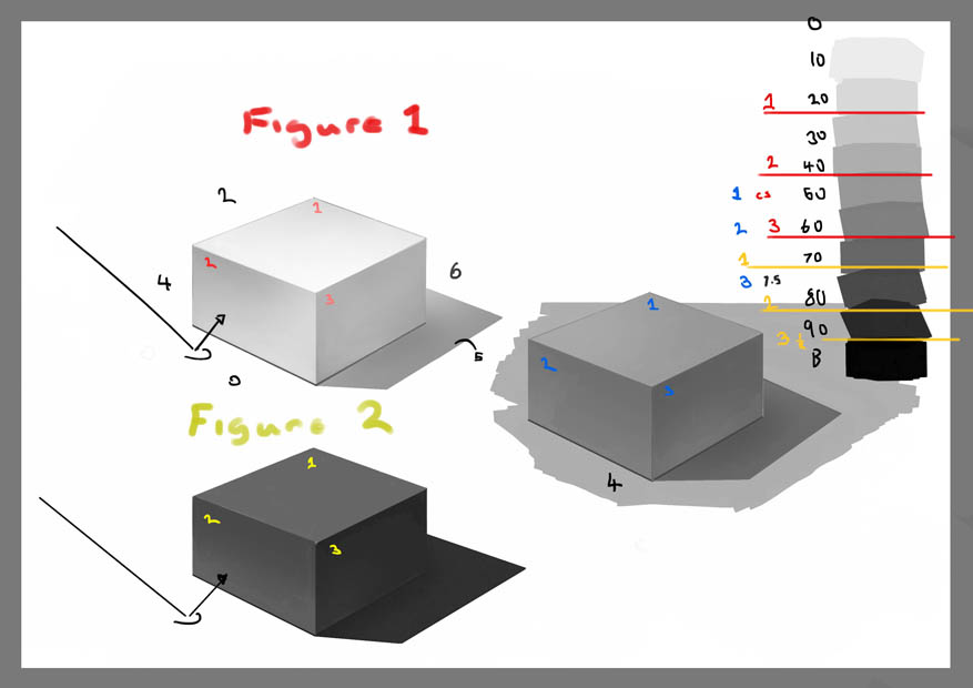
its easy when you think about values as numbers the first figure has a local value of 2 so the maximum darkness you can push for that object without it looking weird is 6-6.5

the second figure looks like a 7 in value so the darkest it get is a 8.5 or a 9 in the occulsions like the armpits or the little spaces around the boobs

the rest is just drawing

use soft edged brushes for soft things and hard edged brushes for hard things... simple right
but alot of ppl when they start out they do other wise, the result is that muddy digital rendering we all should avoid like the plague, this isnt a soild rule you can use just hard bushes but you have to apply a more traditional midset like if you were working with hard media like charcoal, conté and pastels.

Hatching, blending and manualy changing your hue value an chroma , check out Craig mullins for that approach


be mindfull of your facial/body proportions

going for the stylised approach is no excuse for not studing anatomy, once you understand it you can create more powerful stylised work

remember "Style" is the fundermentals skewed to the voice of the individual

look forward to seeing more man

happy painting :)

Reply
#4
Hey Iggytek,
Thanks so much for the paintover and critique. Some really helpful tips!

Your explanation of values makes things abit clearer for me but I have a few questions for you or whoever else is browsing here. Firstly is there a underlying theory for how many steps there should be between the shadows midtones and highlights? Also you gave yourself a wider range of values when working on the darker statue, is there an explanation for this? It seems to me there is a feel for what values looks right that the artist must strive to master but ultimately there is still an amount of guess work.

[Image: oQ5NI.jpg]

Here are my original reference photos. It’s two shots of the same statue lit from a window on an overcast day, taken at the british museum I think. The photos themselves are not great, so Its great that you have the skills and imagination to push the values further. Something I would like to get better at.

You mention the muddy rendering, yeah rendering in general is still pretty new to me, building my skills in this area is why I sought out the daggers. My background is doing web based vector stuff so I am used to seeing flat blocks of colour and mentally implying the gradient.

Do you guys have any tips for to get better at rendering? I guess first off I have to train my eye to see mud and reject it. Maybe I should just work abit cleaner so as to avoid mud in the first place. Also I will give hatching a try, defiantly would help to give abit more variation.

So yeah thanks again, I may be long in the tooth (34 that is like 167 in dog years) but I still have a good eye for composition and design. Feel free to hit me up for a critique/ opinion anytime, that goes for all the daggers!

Daggers!

Reply
#5
Happy to report some increased motivation! Here are some new studies, first in a short series of old dudes, like me :-) . I'm concentrating on describing their wrinkled old forms and also taking the opportunity to caricature a tad just to keep it interesting for myself...

[Image: m0BUn.jpg]

[Image: AIcpb.jpg]

Daggers!

Reply
#6
Happy New Year! Or as we say in Norway: Godt Nyttår

...another old man study...
[Image: Pet8v.jpg]

Daggers!

Reply
#7
Had a go at batch colourizing my old dudes using multiply and overlay layers. Still a lot of tiding up to go to call them finished but usually I prefer how things look with a bit of mess. Each of these has been a tad over 2.5 hours, about 8 hours all up.

[Image: yJYOq.jpg]

[Image: lGMFa.jpg]

[Image: fRDMh.jpg]

Daggers!

Reply
#8
Decided to do a few architecture studies, trying to convey mood through lighting and composition...

[Image: IE5WO.jpg]

Daggers!

Reply
#9
Another old dude study and the ref I have used for the first four. I have learned a lot about rendering and facial lighting :-)
[Image: 1XjbR.jpg]

[Image: A5lLM.jpg]

[Image: n5hQb.jpg]

Daggers!

Reply
#10
Hey Daggers
Just a quick post to show you what Ive been working on in my free time, a commission of Darkstalker Morrigan. Refreshing subject matter after drawing all those old codgers! Not much digital paint as yet, only up to a rough cleanup stage. Im going to get the linework and flat layers super precise and then try to work it up the forms in the artgerm way. Wish me luck!

[Image: SlCeL.jpg]

[Image: CDTa9.jpg]

[Image: ec0JJ.jpg]

Daggers!

Reply
#11
Yo Daggers!

Here are a few odds and ends I have been working on last week.

Firstly some of the speed paintings I did on Sunday along with the Concepteez Sketchathon group : http://www.livestream.com/gdsworld
12 hours of studies, what a bunch of extreme conceptual athletes! I felt these three were the more successful of my efforts. All were 40min-1 hour.

[Image: yFdL4.jpg]

[Image: 9RisS.jpg]

[Image: ZULSU.jpg]


Secondly, still working on a tight Morrigan pinup. Balancing a number of subtle issues, like trying to make her sexy yet tough. I have decided to go in more of a cute manga chibi direction, so I did a study of the proportions of awesome artist Karioks from some of his works on DeviantArt.
http://karioks.deviantart.com/

[Image: DLgU8.jpg]

[Image: Jzxxy.jpg]

[Image: OkEcP.jpg]


Lastly I took a quick stab at Dan Warren's Arthurian art class challenge.
http://crimsondaggers.com/forum/thread-1539.html
This is not meant as a serious entry, as they are still pretty much medieval for one thing. It is an interesting bunch of contrasting characters which looked like fun to draw. I would approach it more like a real job with a tight deadline where you design all 4 on the same sheet to save time and ensure that you can unify the designs.

[Image: 6rO67.jpg]


Daggers!

Reply
#12
Morrigan and Felicia

[Image: McsYrjJ.jpg]

[Image: MXj13f4.jpg]

[Image: x2lne3z.jpg]

A Conan cover WIP
[Image: 9CPAp1z.jpg]

Based on one my original piece that Dave and Dan kindly critted the living shit out of :-)
[Image: xxE5f6J.jpg]

Check out the paintover stream here...
http://youtu.be/AWDyzRxtCjQ?t=59m8s

Reply
#13
Wassup Daggers?

Some more grey-scale studies and the beginnings of a new imaginative fan art piece.

[Image: p7hWyos.jpg]

[Image: 5ziDwQR.jpg]

[Image: 4I15KcO.jpg]

[Image: g3N6Xby.jpg]

Daggers!!!

Reply
#14
4 new studies in the "dudes" category.

Trying to learn to render better whilst stopping before everything becomes too polished for my tastes. Each of these took me around 2 hours for values and another half hour to colour...

Charlie Murphy
[Image: 75tPOl5.jpg]

Tyrion Lannister/ Peter Dinklage
[Image: R0Af1U7.jpg]

I Saw The Devil
[Image: J37rlP3.jpg]

Queens of the Stoneage's drummer Joey Castillo
[Image: boKOJ3I.jpg]

Cheers

Reply
#15
Hey Daggers!

Bloodsports 13 bring it on!

I started with a couple of warm up pages, one fantasy then one sci-fi, just attitudes and gestures to hopefully trigger some ideas for a composition. I think the great thing about old RPG covers is that they MAKE you want to play that game, to step into that world. Often it’s the only part of the adventure the players see, all the rest is in their minds. So that said the cover should be impactful, probably the clearest way to achieve this is to put the charterers in the midst of a fight or some other jeopardy, leaving the audience to imagine how the coming action will be resolved.

So my idea revolves around our two heroes are at the ultimate hurdle in the third act of their quest, chased up a mountain by a horde of unfriendly humanoids and also about to be unwillingly sacrificed to some huge blood god… or not if they can get their time doodad working.

My plan is to fly in and render (my weakness) the foreground action then do a few lizard maw studies to finalise the design of the blood god. Also I might throw in some titles just to make sure the design will still work with overlaid graphics. Colours and lighting effects last…

[Image: v5RK7KR.jpg]

[Image: el7DfRQ.jpg]

[Image: XdEf4tN.jpg]

[Image: weyrrKM.jpg]

[Image: xBqu0CZ.jpg]

[Image: 9YuGiPd.jpg]

[Image: jghBJH6.jpg]

Thoughts and suggestions welcome :-)

Daggers!

Reply
#16
From your original post to now, I can already see improvement so good work :) I really like the tyrion lannister and joey castillo studies.

Reply
#17
Oh man, got stung by this deadline, I thought I had another week! just as well I double checked! So I didn't have time to do everything planned but Ahh well hopefully you get the general idea.

Some lovely stuff everyone :-)

[Image: acqU2zB.jpg]

Reply
#18
Bloodsports 14: Beastmasters…

I’m going to unchain my inner beast on this one! Going full digital for my initial silhouette sketches. I’ve been wanting to do the silhouette mashup exercise for a while, seemed like a good place to try it out. Fairly happy three of the designs, however not sure which one to work up further….

Any suggestions from the daggers?

[Image: tksuHtj.jpg]

[Image: SpEFeEM.jpg]

[Image: oHHO95t.jpg]

[Image: 4NWj5AN.jpg]

Daggers!

Reply
#19
Great work everyone, very inspiring. Watch out Caesar, the daggers are back!
Here are a few more studies, mostly chasing the silhouette around in circles. I started looking at crows, then lobsters then scorpions but now I am leaning towards a praying mantis, mostly because they look less ridiculous in human armour form.

[Image: EDgm4gB.jpg]

[Image: C3QX7hv.jpg]

[Image: 9IcaCwc.jpg]

[Image: dA1SeTJ.jpg]

Daggers!

Reply
#20
I'm still messing with silhouettes! My brain squirms to avoid the dreaded day of rendering :-)

I found this template editor for magic cards called Magic Set Editor.

http://magicseteditor.sourceforge.net/

It is pretty easy to set up and comes with text fields ready to go but it only outputs at rats arse quality :-(

[Image: 2MkmPFv.jpg]

[Image: ssDZSYB.jpg]

Daggers!

Reply


Forum Jump:


Users browsing this thread: 6 Guest(s)