First presentation
#1
Hello there, after saying welcome in proper topic I'd like to present some of my recent work..
The first is the oldest and so on
Critique is welcome

1st - "Stay in the light" i know how the bad composition is.... and to much saturation in some places...


2nd - the "Pharaoh awakes" - struggled a bit with the detail and texture...


3rd - Narrow chimneys - was a fun quick pick i did on christmas


4th- "st george and the dragon"...


5th - the recent one - for drawing jam #86 on chub. "Dovahkiin"


Reply
#2
Update from my part.

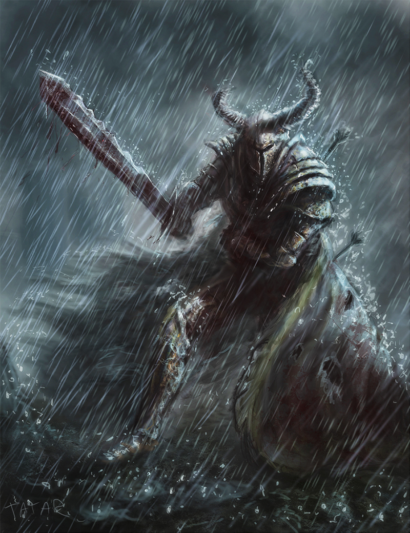
Some knight. It was rather quick.
"No surrender"


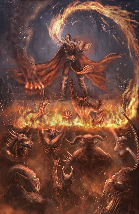
A piece I did for cghub drawing jam

"Demonic Ritual"


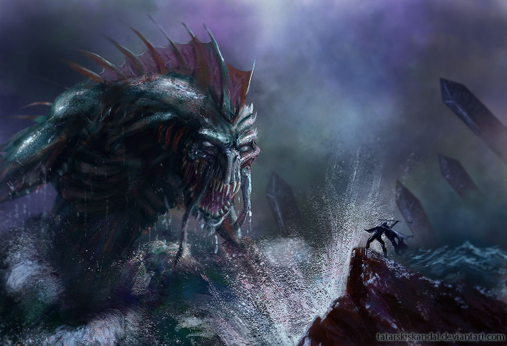
And a piece I just finished. Inspired by "Dagon" novel by Lovecraft.


Reply
#3
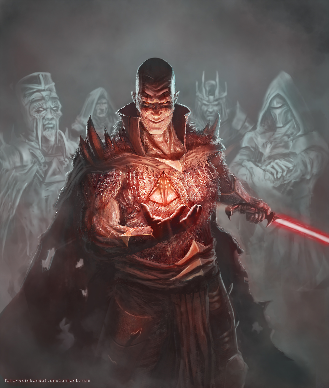
Hey everybody. since all i did in the last couple of weeks are studies (some more succesful than others) i want to share my latest fanart piece from Star Wars universe. Darth Bane of Sith!
Feedback is welcome!


Reply
#4
Wow! That's a huge improvement! Seriously, huge! Your first works have blurry edges, and muddy colors, now it looks so pro!
Really inspiring.

Reply
#5
(11-01-2013, 01:56 AM)Rognoll Wrote: Wow! That's a huge improvement! Seriously, huge! Your first works have blurry edges, and muddy colors, now it ooks so pro!
Really inspiring.

Thanks man! Back to working my ass off:)

Reply
#6
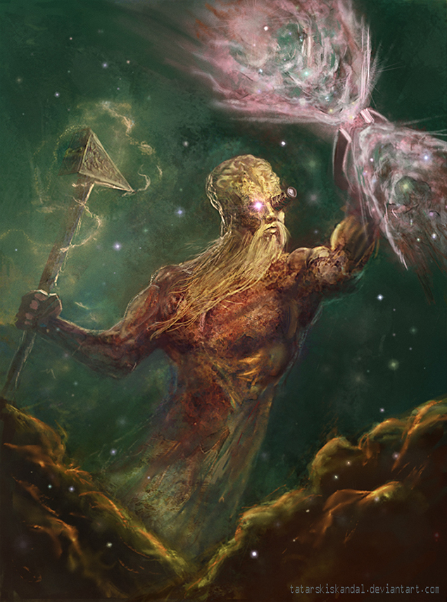
My entry for character forge # 50 on CHUB

The forgemaster


Reply
#7
Wow, you've come a long way! All your images have amazing drama and action. That Darth Bane character looks professional. And seriously evil.

Forgemaster is super creative.

You must never sleep.

_________________________________________________________________________
The best time to plant a tree was 20 years ago.  The second best time is now.  
-Chinese proverb

Sketchbook

Reply
#8
@tygerson - Thank you very much for that. the problem is I am not studying as I often as I want to.... but that will change....
And looking at my old pieces. yeah it feels good to know that i made some progress..


here's my update.

Santa vs Crampus - for drawing jam on CGHub. The texture of Crampus was my main goal....


and dragon with st george ( wanted to know how much progress I made in 1 year).. well
...


Reply
#9
My entry for CGHUB CF# 52
MR Crowley.


Reply
#10
here's a piece that I done couple of months ago. In the near future I'll post some more recent work


Reply
#11
You have a pretty cool eye for texture, and you seem much more comfortable working in higher contrast kind of rendering like metallic surfaces or something getting hit by a direct light. The only thing i'd reccomend is to just keep studying anatomy, especially faces at different angles.

Your Sith piece looks almost professional quality, the only thing really taking away from it are the far less rendered/distracting figures in the background. I think you could maybe just black them out and bring more attention to that awesomely rendered face and hand. (also try to get his loincloth a bit more accurate Thumbs_up that would help a bit)

Your last piece is pretty damn cool too!

only thing that bothers me is that you seem to rely on artificial lighting sources a lot, like red, you know, blue light etc. That definitely works for these monster type characters, but do try and get some life studies in and try to get more natural colors in the pieces

So yea, faces, anatomy, life studies. Looking forward to more buddy!!

70+Page Koala Sketchbook: http://crimsondaggers.com/forum/thread-3465.html SB

Paintover thread, submit for crits! http://crimsondaggers.com/forum/thread-7879.html
[color=rgba(255, 255, 255, 0.882)]e owl sat on an oak. The more he saw, the less he spoke.[/color]
Reply


Forum Jump:


Users browsing this thread: 4 Guest(s)