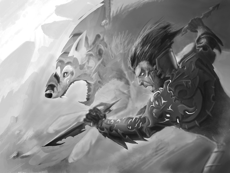
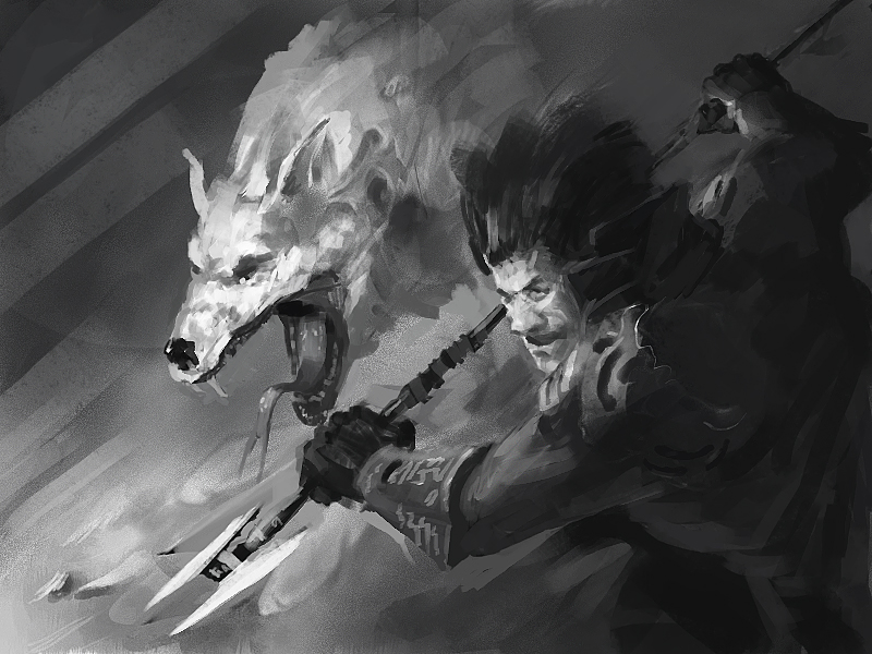
Kinship card...
#1
I was really inspired by the mentoring class SamC did and I learned allot from it... Too bad I wasnt in CD at the time so I watched it in retrospective...

So I figured I will do the mentoring class I want to get (do the job you wanna get... you know)...

I really liked the kinship cad idea so I took that idea but replaced the characters with a rough and a wolf...

So I will be posting stuff here step by step (like in the class) and you guys crit... The more you write the more help it will be... And who knows if I am lucky maybe Sam will leave some comments...

The first step was quick tubnails, so plz help me chose 2 of the best ones and also tell me what I could change to make them better...

[Image: attachment.php?attachmentid=1733802&d=1362306342]

Reply
#2
So far the 3rd and 4th thumb to the right are the best imo, the 4th being my favourite (you should number your thumbs to make it easier for people to refer to which ones are the best and to avoid confusion as to which ones they are actually talking about). The problem I see with the 3rd to the right is that the wold has an intense about to battle look on his face whilst the character is looking up into the sky in the opposite direction, if you take this one I would change the pose so that they both are looking in the same direction like in the 4th.

Hope that helps and I look forward to seeing where you take this.

Reply
#3
I got just one reply :/ so I taught I'd post more thumbnails... plz I really need some feedback at least write two numbers that doesn't take that long...

JonHop:THX! in one of the new thumbnail I did the 3 but with a battle ready pose... also I made one like the 4 but with a not so side view perspective...

[Image: attachment.php?attachmentid=1734986&d=1362395647]

Reply
#4
Hey mate, really loving the pose of no. 7 because youve got the lines of motion in contrasting directions, so the movement in it really comes out. 8 feels too sloping and slanted, it feels like there is no dragging force pulling them back up the hill if that makes sense. Move his right arm back so that it is facing up the hill (in a kind of ezio style way, by his cheek maybe?) and it will help balance it I feel. I like no. 6, i almost feel like he's pulling the wolf back on a chain which is a nice feel of motion, but his pose isnt very obvious. Try simplifying it a bit, and get the lines of motion a bit more sorted out, as i like the way he is weighted with his leaning stance but there doesnt seem to be much support for him, so his grounding appears weak.
Wow... I can talk a lot about stuff that I cant myself do! Andrew Loomis books are really good for this sort of thing, 'Figure drawing for all its worth' is a good start, free ebook download somewhere ( sorry i got it ages ago :/) im sure you can find it if you want.
Really good stuff going on here mate, and looking forward to seeing where you take it ;)
Reply
#5
3 and 4 are the best, I critiqued you on live stream, to view the video and hear what I had to say, go to my channel, next time I'll save the file and not just close the work out...

3 would look better if you changed the angle of the guy to match the birds eye view you gave the wolf.

I go through each of them on the stream if you are interested in hearing more though.
Reply
#6
JonHop, Ward217 and Mike086: Thx for the feedback... Really appreciate the help (especially Mike for taking the time to do it on the stream)...

Based on the crits and some from other sites I made 2 b/w ruffs... I tried to use all the feedback and compile 2 images so I can now pick one witch I will take to a final render...

The wolf and character designs are not shown here. I will be working on them while I wait for feedback... I will make them have matching colors, armor, glowing tattoos etc... It will be obvious that they are a team...

So plz crit these 2 ruffs and tell me witch one to pick for my final illustration... THX!

[Image: attachment.php?attachmentid=1736794&d=1362564165]
[Image: attachment.php?attachmentid=1736809&d=1362568118]

Reply
#7
ok here is the final ruff for the kinship card before I start rendering...
[Image: attachment.php?attachmentid=1745652&d=1363528621]

Reply
#8
Side profiles are difficult to sell, look at Frazetta and Boris for example, they rarely do side profile paintings and when they do it is with purpose, to convey a feeling or mood. Allot of times artist get lazy, it is easier to paint a profile than a 3/4 view. Obviously this is not you but you need to make sure your viewers do not get that impression. You need more emotion in the face and fix the anatomy of both characters. The armor needs to wrap around the body (arms). The wolf needs to have two front legs visible, this will help put the viewer at ease. You might want to remove the back armor from the neck area, you are missing a great opportunity for an interesting shape. Now is the time to get all this straight before you start the rendering, if all this is correct all you need to worry about is color, how fun is that!

A quick paint over to illustrate the ideas.


Reply
#9
IgorIv, good work so far. I hope you don't mind but I made some changes.

1) Composition needs a stronger value pattern (Refocusing the eye to the head's in our case.)
2) Consistent lighting source(s) (Or as consistent as is necessary.)
3) Depth added through 3D forms (Perspective)
4) Direction and motion consistency (Top right to bottom left. Although I feel the composition is a bit unbalanced now, I might fix it by moving some values around.)
5) Weapon and armor design updates.
6) Bigger hands
7) Crop body (Removed the leg because it would not be visible at this zoom level)


Anyhow, I hope it helps. Keep up the great work.
Reply
#10
Thx for your crits very much guys!!! Tried to use as much of it as I could...
[Image: 04.jpg]

Reply


Forum Jump:


Users browsing this thread: 17 Guest(s)