deerheadlights
Unregistered
Hi everybody! I'm on a quest to improve my portfoli, seeing as it has not changed since I applied for school in Jan 2012. I'm working on my second to last week of Noah's Art Camp so I'll be documenting that here as well as my work during the school year! Here's a boring old bust to start us off:

deerheadlights
Unregistered
deerheadlights
Unregistered
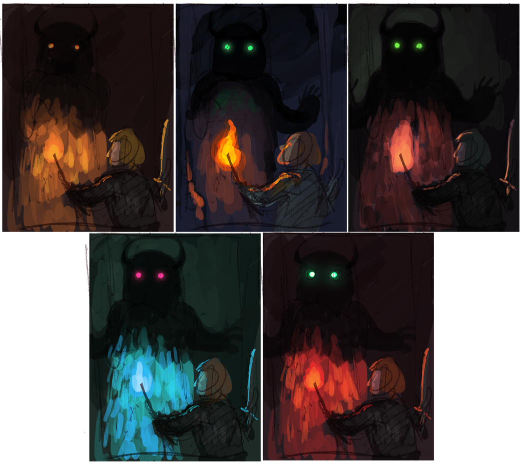
Another color thing

Posts: 80
Threads: 9
Joined: Apr 2013
Reputation:
1
Cool work - Keep up the color studies. I assume these are from references? I like the top left knight on the horse painting!
Posts: 282
Threads: 2
Joined: Aug 2013
Reputation:
3
I am really enjoying seeing your work ethic. It's perhaps something I should do more and show my progress. But that was one thing I was never all that good on in math was showing the working out. lol. But lovely... I look forward to more from you :D
mii
deerheadlights
Unregistered
Thanks guys! I used reference for the lightning colors.
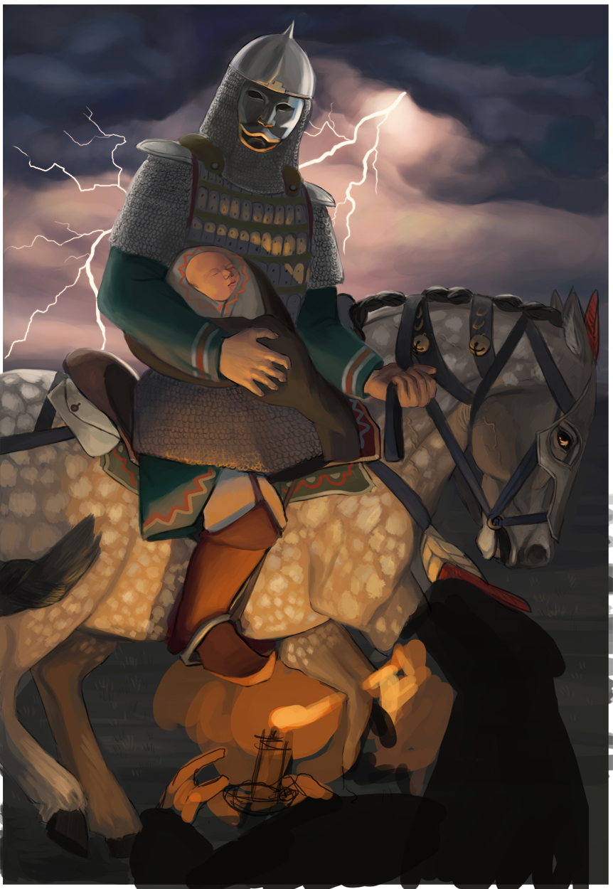
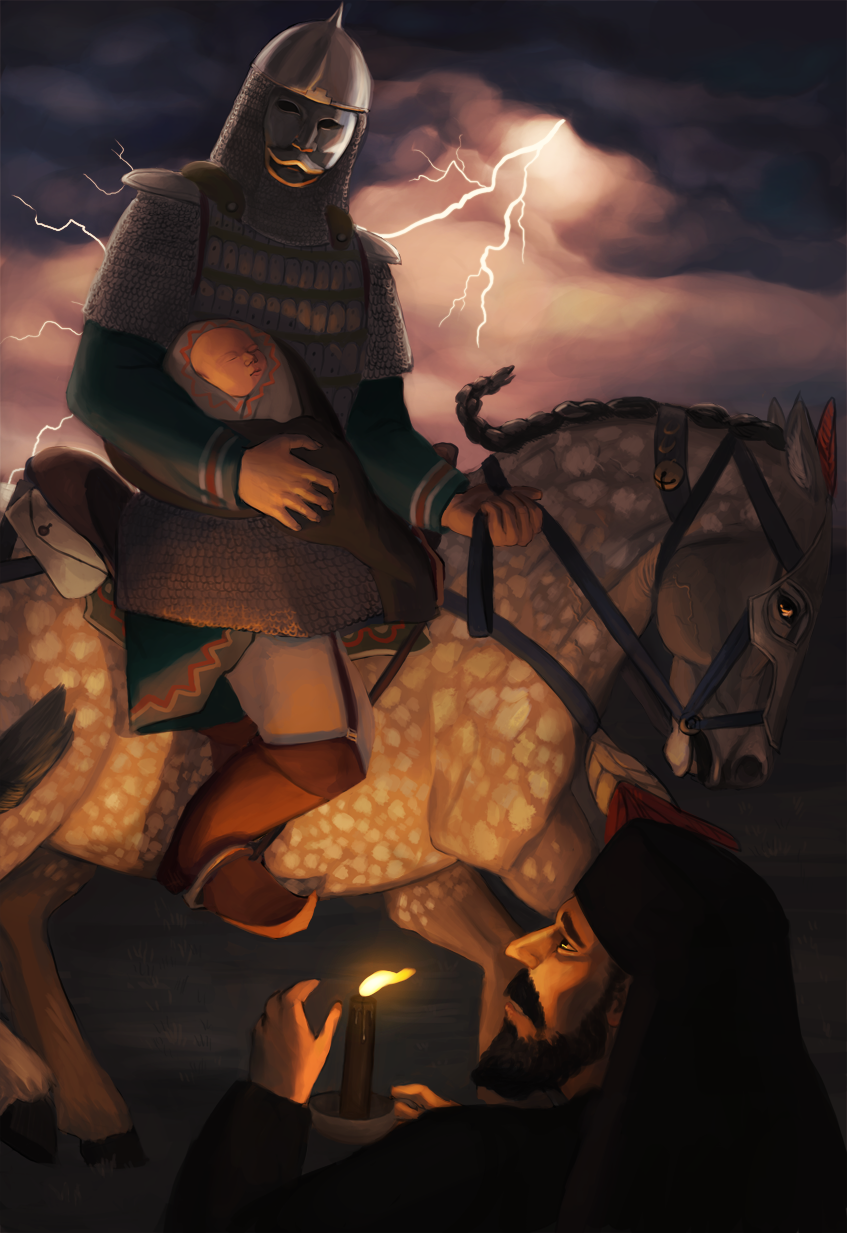
So for the final project of Art Camp, I'm finishing that knight thumbnail into a nice piece over this week, and then it's back to school!
Working back to front since I'm going to enjoy the candle and face the most haha

Posts: 282
Threads: 2
Joined: Aug 2013
Reputation:
3
Fantastic job thus far, especially the horse :D well done you... can't wait to see how this turns out ~ mii
deerheadlights
Unregistered
Thanks mii!
I think I'll have to rework that leg

Posts: 282
Threads: 2
Joined: Aug 2013
Reputation:
3
Oh how fantastic!! You did very well there. The horse is stunning... but I can't do horses so I would say that lol... Not so sure about the 'mask' it just looks off to me. But I'm excited to see how you progress. Also the sky is fab loving how that turned out but (in my opinion) the lightning looks a little to hard edged. I think it want's too be a bit softer in my opinion the blurry-ness shows movement as well as out of focus.. I think the lightning is a bit too focused at the moment and takes it away from the horse and the character. I do like the concept of the baby... and you're really starting to tell a story here with this!! The armor is well done too.. and I'm excited to see what I am hoping is a trampled broken torch (lamp/lantern) on the floor under the horse. But very nice lighting coming from the flames of that especially with the shadow. Keep it up :) :D ~ Just thoughts mii
Posts: 101
Threads: 3
Joined: Jan 2013
Reputation:
0
Wow those colors comps are really neat, I love how the mood changes with each one.
The horse piece is nice, although the horse has really short legs. I'd make them go out of frame
deerheadlights
Unregistered
Thanks guys, I messed with it a bit more, I made the legs slightly longer, as well as giving the poor thing an actual back and not just neck-saddle-butt


![[Image: tumblr_mrw5w6ZY7m1qe0vxio1_1280.png]](https://31.media.tumblr.com/2a9e492a5858fe79a7cd6cd656defe9d/tumblr_mrw5w6ZY7m1qe0vxio1_1280.png)
![[Image: tumblr_mrzytuJQpq1s3r799o1_1280.png]](https://31.media.tumblr.com/3d4174001d9b966d1357f25aa6019307/tumblr_mrzytuJQpq1s3r799o1_1280.png)
![[Image: tumblr_mrw5w6ZY7m1qe0vxio2_250.png]](https://24.media.tumblr.com/a6f866a4486b523989b6a5fab9e56a23/tumblr_mrw5w6ZY7m1qe0vxio2_250.png)
![[Image: tumblr_mrw5w6ZY7m1qe0vxio3_1280.png]](https://24.media.tumblr.com/ec3aa645e99a31743b7a30eb45b97b33/tumblr_mrw5w6ZY7m1qe0vxio3_1280.png)
