Posts: 20
Threads: 3
Joined: May 2013
Reputation:
0
Hi daggers! I'll be posting some of my sketches and unfinished work here and will be extremely happy for any feedback, looking to improve as much as I can!
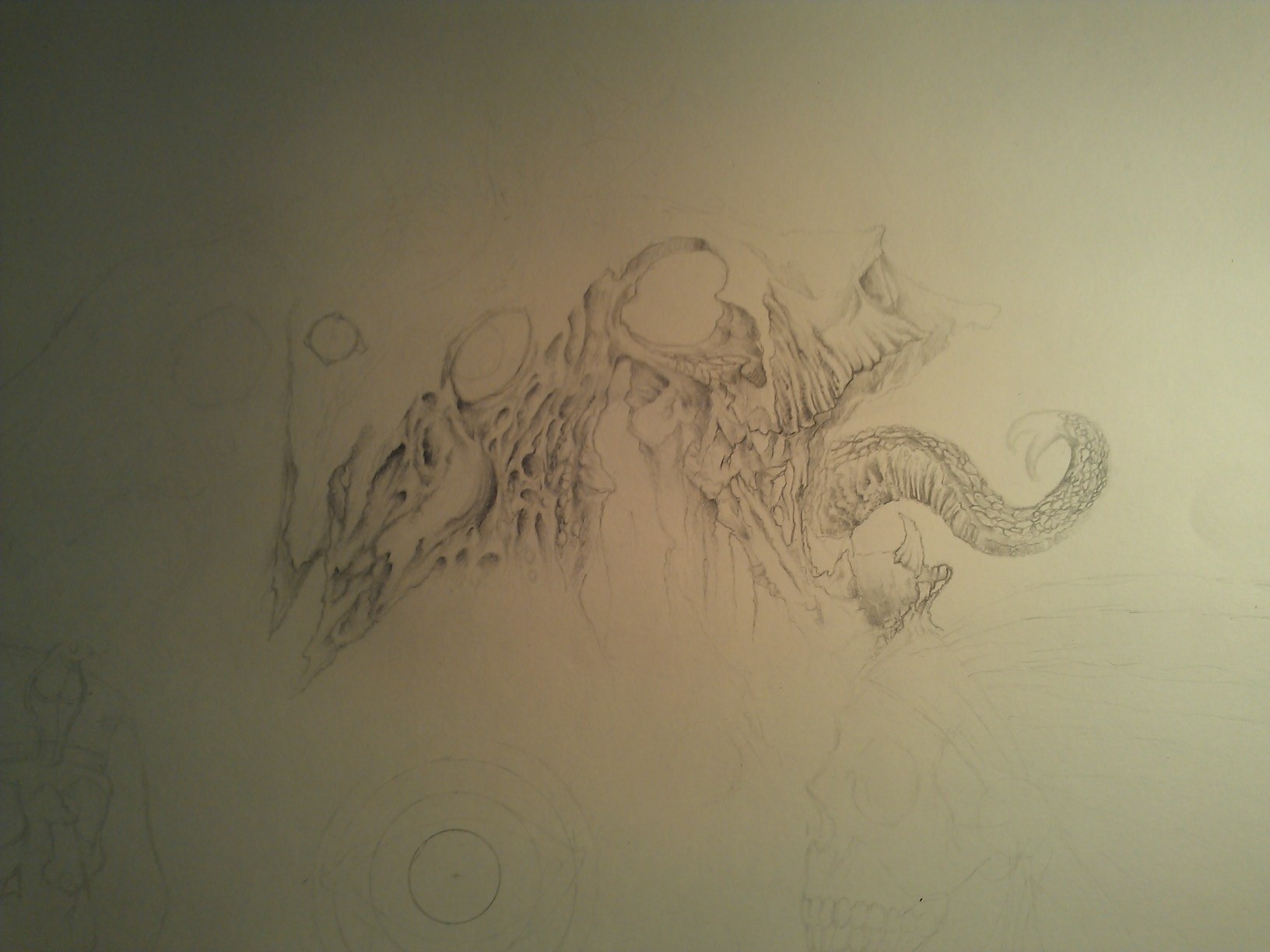
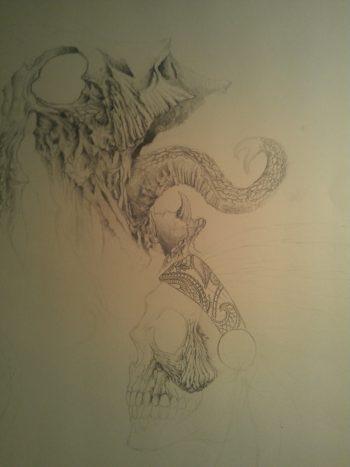
Sorry for the bad quality, here is some pictures of a graphite piece I'm working on:)


Posts: 20
Threads: 3
Joined: May 2013
Reputation:
0
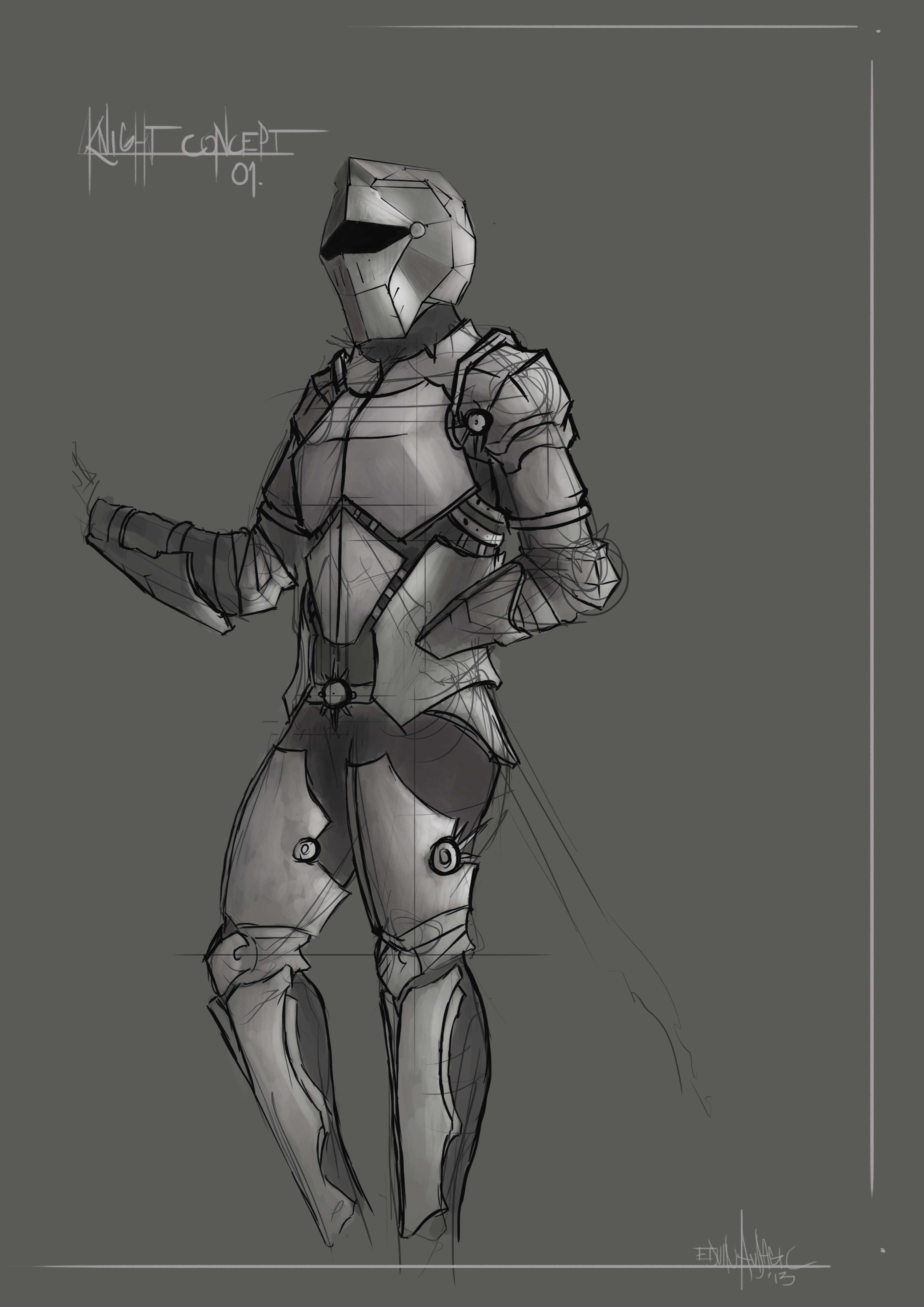
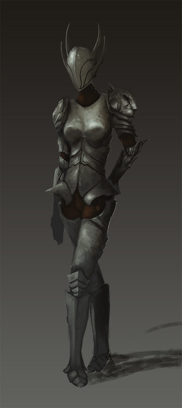
A concept i worked on for a knight, wasn't happy with the initial result so I tried to refine it with some new lines, but never got it finished:(


Posts: 20
Threads: 3
Joined: May 2013
Reputation:
0
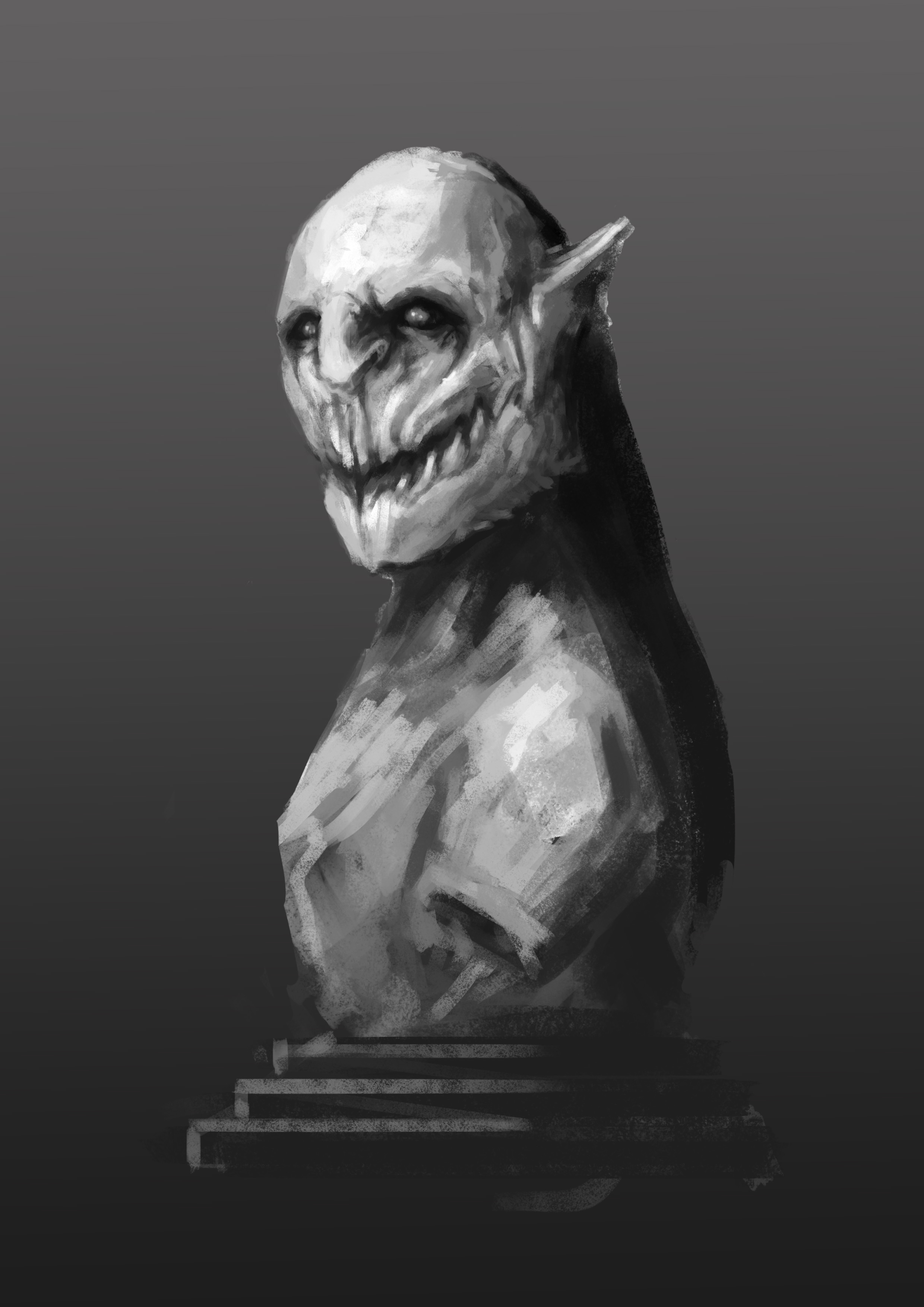
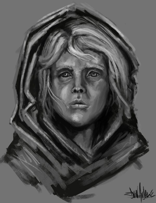
Quick one i did today while taking a break from studying for my finals.

Posts: 38
Threads: 1
Joined: Apr 2013
Reputation:
0
awesome linework!! would love to see more, and hi btw!
Posts: 20
Threads: 3
Joined: May 2013
Reputation:
0
(05-24-2013, 03:21 AM)janvonfrosta Wrote: awesome linework!! would love to see more, and hi btw!
thank you! I'll try to post every day after my finals, right now I'm just painting in between reading:( Hello!
Posts: 387
Threads: 2
Joined: Jul 2012
Reputation:
6
Welcome. Nice start, very rich line quality. Keep them coming!
A bit of advice -make sure to put sb in your signature so ppl can find it easier, as well as resize the jpgs before uploading around 600-1000px wide so it doesn't load forever when you fill the page :)
Posts: 20
Threads: 3
Joined: May 2013
Reputation:
0
(05-24-2013, 03:33 AM)iCi Wrote: Welcome. Nice start, very rich line quality. Keep them coming!
A bit of advice -make sure to put sb in your signature so ppl can find it easier, as well as resize the jpgs before uploading around 600-1000px wide so it doesn't load forever when you fill the page :)
Thank you!
Good idea, don't know why I havent done it yet. Will resize them from now on, having them blow up all over the page is kinda annoying:P
Another WIP, told you guys I hardly finish anything:P

Posts: 20
Threads: 3
Joined: May 2013
Reputation:
0
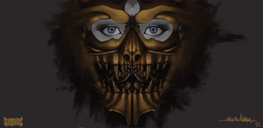
Not a sketch, but I'm gonna sneak it in here, will update it when it's done:) also any feedback would be greatly appreciated!

Posts: 20
Threads: 3
Joined: May 2013
Reputation:
0
Midnight study

Posts: 95
Threads: 2
Joined: Mar 2013
Reputation:
1
hello! I really dig the pencil in your first post. it's awesum ^^
I do notice some things in the wip in post #8
-the left shoulderpad has a bit of a perspective error, it looks like its more at the front of the chest than the right shoulderpad
- the front foot is too small. (and flat) take a look at some pictures of the frontview of some feet, and you'll see what I mean
-the neck area still looks a bit flat, you might wanna take a closer look at that
I hope that's been helpfull (:
cya!
Posts: 20
Threads: 3
Joined: May 2013
Reputation:
0
(05-24-2013, 08:59 AM)Budgie Wrote: hello! I really dig the pencil in your first post. it's awesum ^^
I do notice some things in the wip in post #8
-the left shoulderpad has a bit of a perspective error, it looks like its more at the front of the chest than the right shoulderpad
- the front foot is too small. (and flat) take a look at some pictures of the frontview of some feet, and you'll see what I mean
-the neck area still looks a bit flat, you might wanna take a closer look at that
I hope that's been helpfull (:
cya!
Yes I completely agree, the right side is the second run through on the rendering and placement, so I haven't gotten to that part yet on the left one, planning to remove it completely and redesign it as it looks like a half-eaten rock at this state:P
Feet is one of my many weak areas in painting so I'll definetly look into that, thanks for the tip!
Now that you mention it I also see the issue with the neck, will try to fix that:)
that was extremely helpful and I appreciate you taking the time to give me feedback!
Posts: 95
Threads: 2
Joined: Mar 2013
Reputation:
1
btw, I advice you to do some 60 sec gestures every day. now the poses still look a bit stiff somehow, and doing this practise will definitely loose things up. this is a great site: http://www.quickposes.com/
It'll only cost you 20 min a day, and it helps tons. it's a great habit to have.
but for now, studying for exams, right (:? good luck!
Posts: 20
Threads: 3
Joined: May 2013
Reputation:
0
(05-24-2013, 09:42 AM)Budgie Wrote: btw, I advice you to do some 60 sec gestures every day. now the poses still look a bit stiff somehow, and doing this practise will definitely loose things up. this is a great site: http://www.quickposes.com/
It'll only cost you 20 min a day, and it helps tons. it's a great habit to have.
but for now, studying for exams, right (:? good luck!
thanks for the tip! Will most definetely try to make that a daily habit, I've always struggled with rigidness when it comes to poses.
Thank you!
Posts: 411
Threads: 1
Joined: May 2013
Reputation:
11
Cool designs and sketches, man. As was mentioned before, just be aware of your perspective and constructions while painting. And to push your values, do some quick studies to help inform your rendering decisions.
Posts: 20
Threads: 3
Joined: May 2013
Reputation:
0
(05-25-2013, 06:59 PM)MrFrenik Wrote: Cool designs and sketches, man. As was mentioned before, just be aware of your perspective and constructions while painting. And to push your values, do some quick studies to help inform your rendering decisions.
Thank you! Will be doing a lot more studies from now on:)
Posts: 37
Threads: 2
Joined: Nov 2012
Reputation:
0
Nice work so far! Really digging your metal-work, that lion mask from post #7, and the armor design on post #8 are pretty sweet! Especially enjoying the horned helmet and lion shoulder, cool stuff :D.
|
