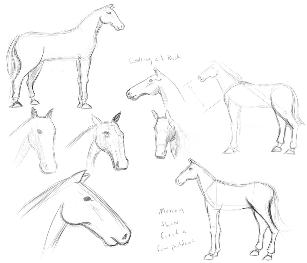
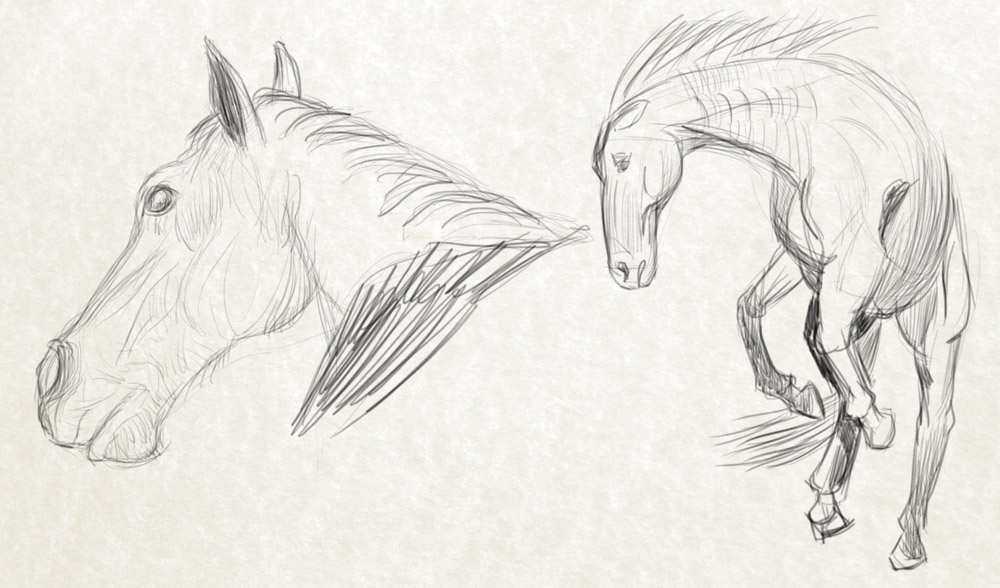
06-03-2013, 04:42 PM
Visual Library Building 5: Horses
This week I thought another applicable topic could be pack animals, more specifically horses. A lot of character illustrations involve knights riding steeds or travelling salesman with his trusty draft horse. These also feature quiet often in environments with a small figure in the foreground often accompanied by a horse for scale.
http://en.wikipedia.org/wiki/Equine_anatomy
![[Image: Horse_anatomy_head.jpg]](http://thinklikeahorse.org/images/Horse_anatomy_head.jpg)
![[Image: 599px-Horse_anatomy_hooves.jpg]](https://upload.wikimedia.org/wikipedia/commons/thumb/f/f6/Horse_anatomy_hooves.jpg/599px-Horse_anatomy_hooves.jpg)
For living topics focus on:
- Anatomy and how they are similar/different to human anatomy. This will help you understand how to create your own, more realistic creatures from imagination.
- Visual Communication i.e. Dogs have their ears back when they are scared, cowed, or the hair on the back of their necks stands up when they are being aggressive. Some things may be subtle, some will be obvious.
- Colour/Patterns It's always good to have a library of natural colour schemes/ideas for patterns to suit the look you are going for. No one wants to see a menacing creature with bright pink plaid patterning...
- Movement because static drawings aren't interesting drawings, even creature concept art can look dynamic, and it really sets it apart from static art.
---
And the boring stuff I will include with every post so that new comers don't have to go searching:
- Each week I will come up with a topic, it can be anything from boots to machinery.
- Find some images to study, but don't just copy them, maybe do some technical drawings, take written notes (I'm not asking you to write an essay, just things worth noting), some specific detail and generally just get a better idea about a topic.
- I think I'm going to put a new one up each Monday (NB: My time, Sunday for the western world.)
- It's not a competition, its really just about sharing knowledge, one person may pick up an interesting detail or a keen observation than another person may have missed. Just building the number of visual cues that can be extrapolated to design something interesting and new when necessary.
- One last thing, the drawings do NOT have to be pretty finished renderings. A quick sketch of a building façade with details marked and notes will have just as much use as a beautifully rendered copy of a photograph. The point is the content and thought behind it, not how well you can render.


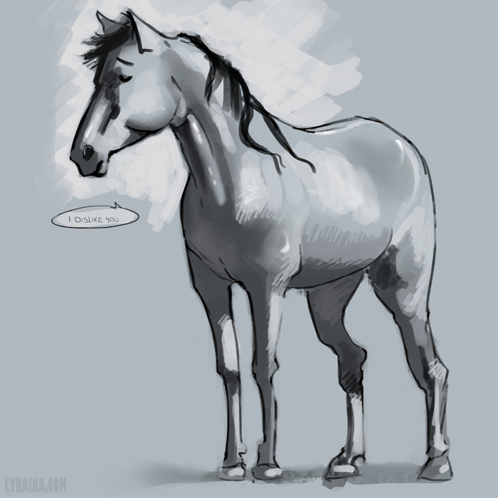
![[Image: tumblr_mntvis5s5I1rw215do1_r1_1280.png]](https://24.media.tumblr.com/d0dcdd0b484ed52f28735ce74eeeb64a/tumblr_mntvis5s5I1rw215do1_r1_1280.png)
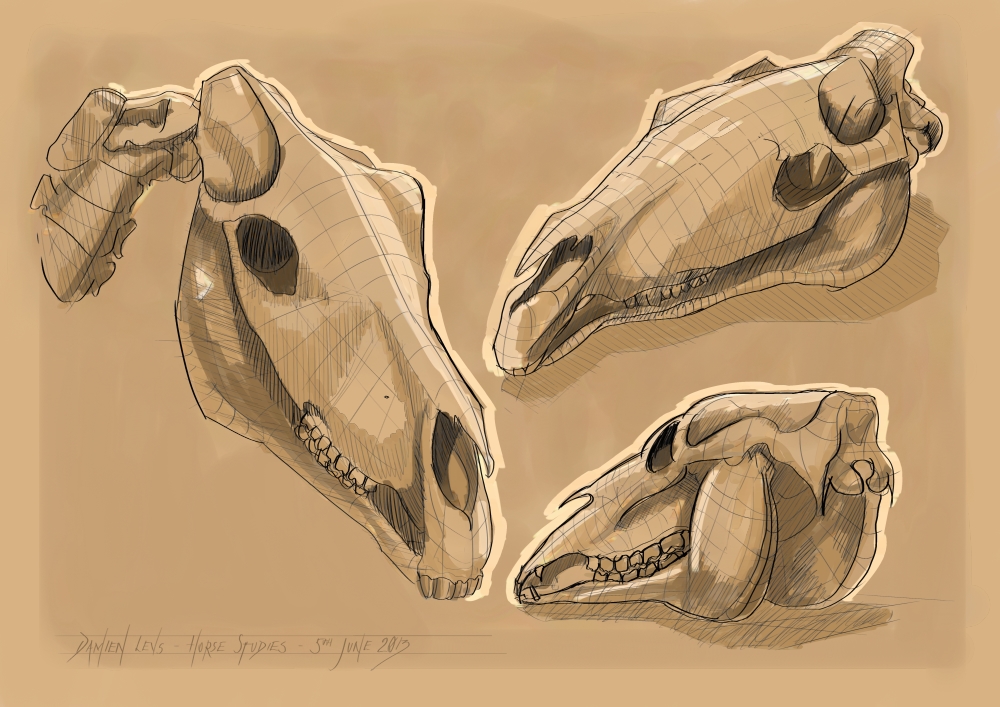
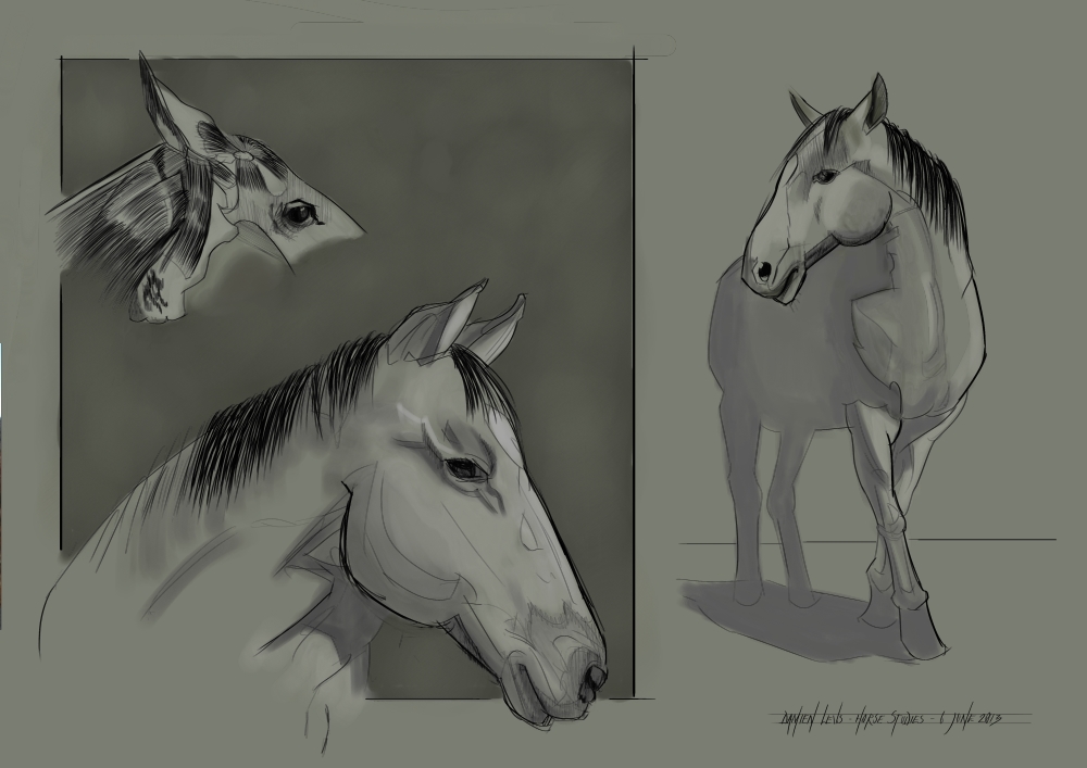
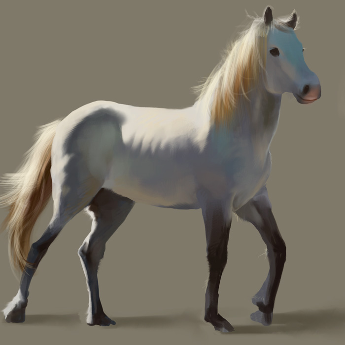
![[Image: 130610-10.jpg]](http://jaikart.com/art/2013/06/130610-10.jpg)
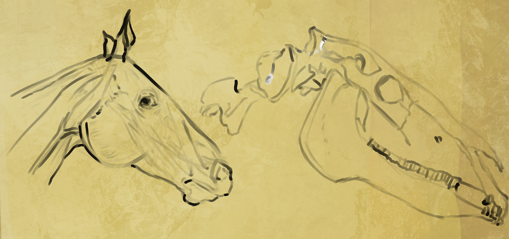
![[Image: 130610-11.jpg]](http://jaikart.com/art/2013/06/130610-11.jpg)
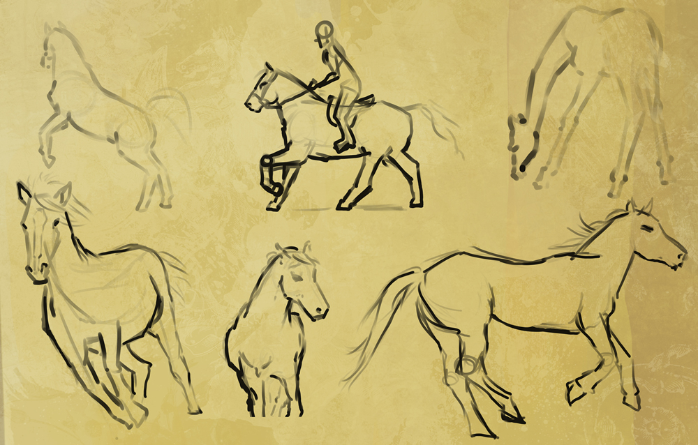
![[Image: 130610-12.jpg]](http://jaikart.com/art/2013/06/130610-12.jpg)
![[Image: 130610-13.jpg]](http://jaikart.com/art/2013/06/130610-13.jpg)
![[Image: 130610-14.jpg]](http://jaikart.com/art/2013/06/130610-14.jpg)
![[Image: 130610-15.jpg]](http://jaikart.com/art/2013/06/130610-15.jpg)
![[Image: Chestnut-Horse_zps0dd3d7ea.jpg]](http://i224.photobucket.com/albums/dd267/dragonwolf14/Chestnut-Horse_zps0dd3d7ea.jpg)
