Posts: 33
Threads: 3
Joined: Apr 2013
Reputation:
0
5 and 2
Though it would be more interesting if in 5 he showed some type of interest in what was going on around him.
Posts: 87
Threads: 7
Joined: Oct 2012
Reputation:
2
Hi Ward,
Thanks for the crit! Nat Martins web site is a good read. You can find the Riddick contest on the deviant art web site, in the search field type in "Riddick, Rule the Darkness". The contest should be lots of fun.
I will post updates as I move along.
Posts: 1,970
Threads: 22
Joined: Apr 2012
Reputation:
243
5 for me too, purely in terms of comp....but as always with competitions, especially da ones, you always gotta tradeoff heroic pose with less interesting action. I'd suggest maybe trying to really depict an actual moment and taking more risks with what you depict. There will be a million heroic pose *stares into distance with intensity entries :)
Michael Syrigos
Unregistered
OK, I don't know about competitions, not quite my thing, however, the ones
that have most prospect for me are 2,5 and 6, but they need adjustment. Here's
my propositions
In 2, the idea of an X-shaped action pose is nice, the low angle accentuates it's
dynamic, which is good. However you need to fix your pose, make it more powerful
and less awkward. What you've done shows the guy with a balance of power applied
in both legs. Make up your mind as to what you want him to be doing and show a
clear difference in power, one leg shifting the weight, putting the force etc, and
the other flinging forward, hanging back etc. This should also be reflected then and
balanced with the upper body. You can get away with more power and symmetry there
but try to give the opposite limb of the powerful lower body an edge in intensity.
Also, try to make the character smaller on your image space and give more "air" for
the sky, give the piece room to "breathe" and figure out a device to make the eye
move out of the image (an open space along the gun shot is good).
5 needs more space on top too, so push the characters back and bring the main
character up a bit, let us see more of him, his shins. Compact the monsters too
and push them back, show us a little of the world too. That's the point of these
types of set ups, to show us the characters and the world.
6 Is the most personal of all I think. This is a tough one and has lots of potential.
The lighting is tricky, you have to look and study the contre jours light set up well.
Work more on the perspective of the character, maybe a little lower too. The
hand holding the knife...use reference! Get up, stand in front of a mirror and
hold a ruler or something, pretend it's that thick knife, feel the weight and get in
the characters' attitude and mood. Think what he was doing a few seconds before
and what he's going to do a few seconds after, then role play the action. Pay
attention to your body language, think of the motion you are going to execute,
make it cool in your mind, the WHOLE motion, and then just STOP at the point
you want to illustrate and look at your arm. Note the posing, how relaxed you're
holding the knife, the tension and relaxation of your muscles, etc. THAT will
make or break the piece in conjunction to the facial expression. Now, the placement
of the ship and the light is a whole other thing, just do what you will with that.
Hope I helped a bit and I hope to see one of these evolve.
Posts: 87
Threads: 7
Joined: Oct 2012
Reputation:
2
Thanks Micheal,
Your crit is very insightful.
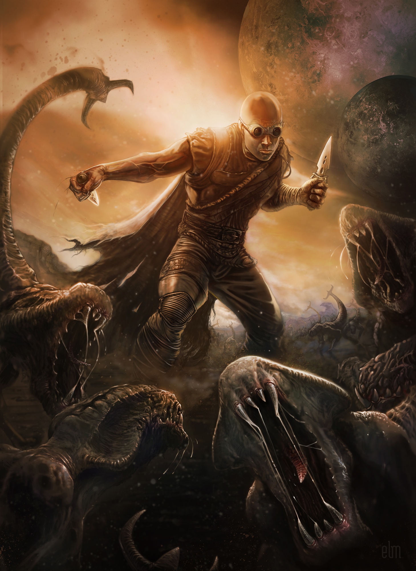
During the comp stage I do not use reference material I am just searching for the composition that best tells the story. Once I choose a comp I research as much reference material as i can get, and "yes" I have been caught posing in front of the mirror, rather embarrassing I must say. The contest ends this Friday. I am making final changes to the piece and will post it here when I am done. I ended up doing more thumbnails and choose one that is not shown here.
Thanks so much for all your time. Great crits!
Posts: 112
Threads: 5
Joined: Mar 2013
Reputation:
6
This is really cool. Good job.


