Posts: 1,098
Threads: 11
Joined: Aug 2012
Reputation:
34
applibot? that armor looks actually useful, thats no good, needs more cleavage. :D
Now seriously, the composition and the character looks good and very suited for the regular version of a card, is this wip or already finished?
If this is finished, i would suggest you rendering everything until you achieve the level of detail and polish you see in most cards.
Pushing the values to make the character pop up more would be great too.
PD: i actually love that armor.
Posts: 280
Threads: 11
Joined: Mar 2013
Reputation:
4
What's the blue light under her hand?
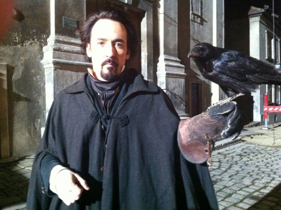
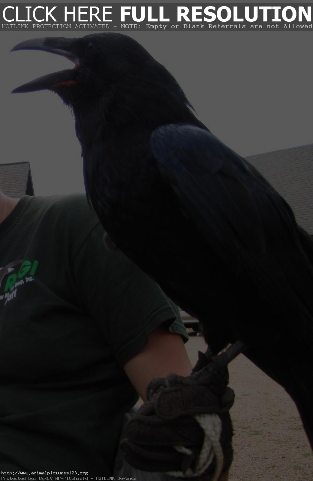
If there's one thing I can complain about, it's the texture of the crow resting on that hand. It looks like it's made of fur as opposed to feathers.
Posts: 112
Threads: 5
Joined: Mar 2013
Reputation:
6
I was going to say the same thing about the crow, it looks like a stuffed toy. Also, ravens are HUGE, that's more like a crow.
Posts: 266
Threads: 28
Joined: Sep 2012
Reputation:
13
You need lighting on the fur collar it should be a little more polished, not too finished, not like the face, but more so than it is now.


