HI Mike,
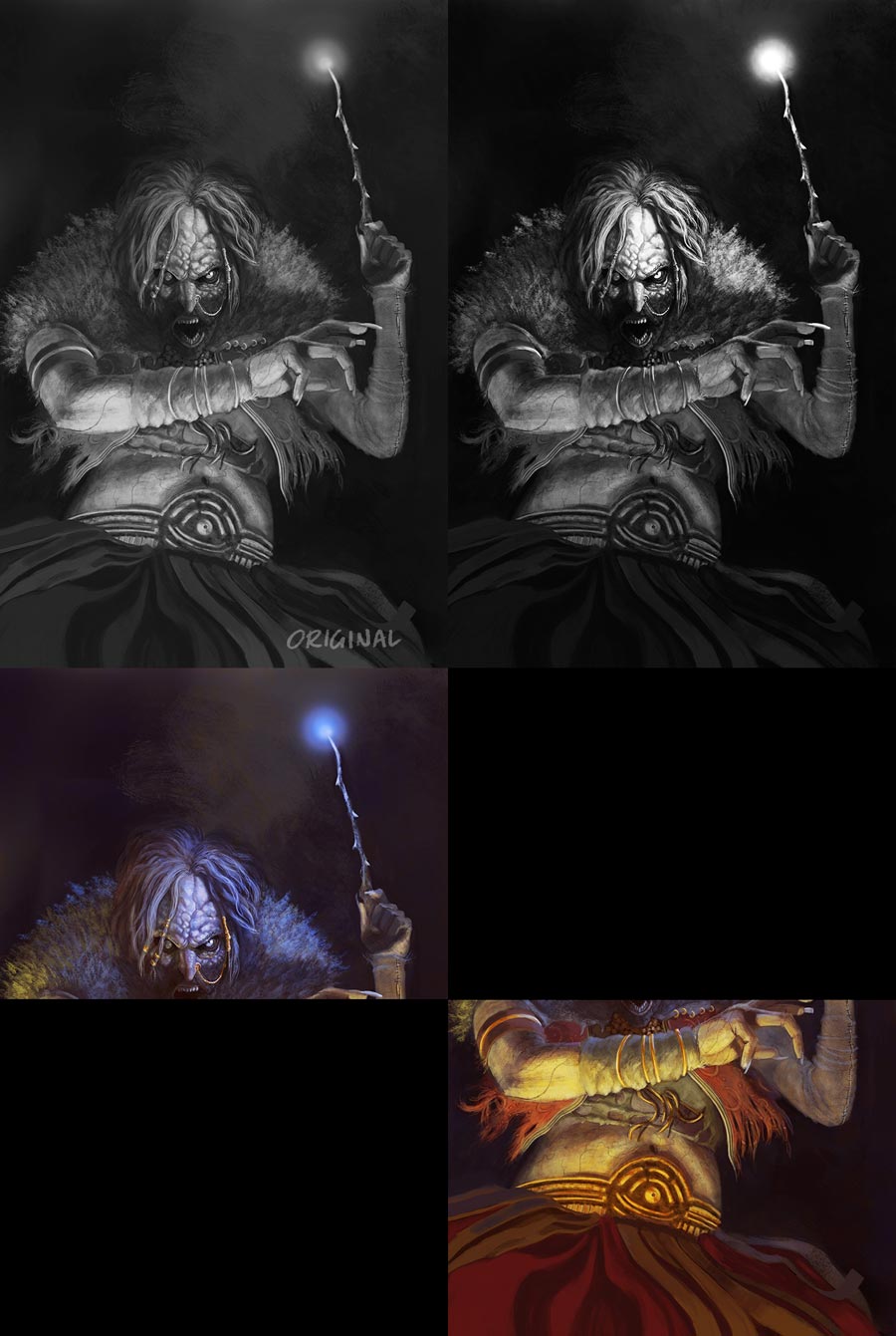
First of all, great image. I watched you paint some of this on Livestream. I think, however, that you've begun rendering details too early, as it seems that your focal point has not been established yet. If you convert the image to grayscale you will see that your lightest-lights and darkest-darks are fairly evenly spaced within the composition. I would suggest choosing a focal point and placing you absolute lights and darks there. Then you can work outwards from that area making all other sections subordinate to this main focal point. I made a levels adjustment to your image to illustrate my idea. In this case I chose the witch's left eye as the focal point. I also made the background darker to increase the effect of the light from the wand.
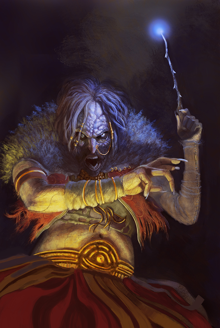
There is also a few issues in terms of composition and storytelling. Currently the witch's arm gesture subtly bisects the image at or near the halfway point. This split in the composition is further enhanced by the fact that you chose to use only cool colors near the top of the image and warm colors near the bottom. (I made a small graphic to show you what I mean.) I would suggest integrating some more reflected light from the wand's glow into the lower area of the image. Perhaps some blue light bouncing off the upward facing planes of her dress/skirt? Also adding some warm dark colors into the background behind her to (a) integrate the warmth, and (b) increase the effect of the 'cold' light from the wand.
I think as a character portrait this image is very good. There are many well-rendered details and the color palette is entertaining. As an illustration, however, I think there are a few inconsistencies. For instance, her posture and attitude could be read as either defensive or offensive. It is difficult to tell for sure one way or another. Also the compositional 'main lines' in the image are very vertical and horizontal (e.g. the arm across the middle, the arm and wand pointed more or less vertically, the head and torso are positioned in a neutral and frontal pose, and the head is located very near the center of the composition); where one would expect more diagonals and twists to emphasize the action and drama of casting a spell.
Drawing and technique-wise this image is great. I think the only refinements needed have to do with value arrangement and the illustrative elements (Who, What, Where, When, Why & How). I hope that this helps in some way. I also just wanted to say thank you for the doing the livestreams. I'm sure there are many people who appreciate the effort as well, they just haven't said so before. Good luck with getting the work you are after.


