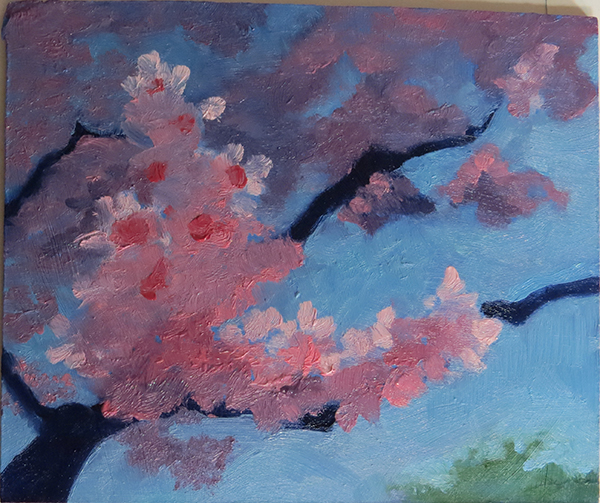
[oil/board] A simple flower painting
#1
This is part 2 of the gift, companion to the larger landscape earlier. So to avoid composition shipwreck, I'll try to get feedback during thumbnail stage this time. This is a little painting about Christmas Card size. Any feedback is appreciated!

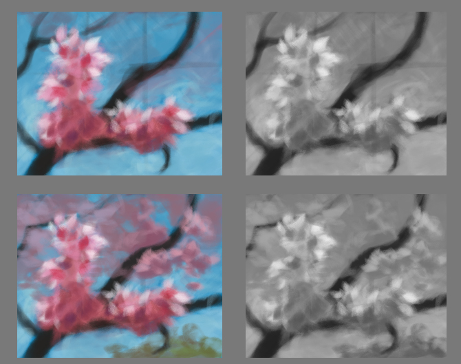
Thumb sketch color and b/w, follow by reference photos:


Focus.
Reply
#2
Perhaps a bit of a nitpick, I don't know if it will be corrected in the final piece...

But in the thumb there is an offshoot of a branch that turns the opposite way from the others, going against the nice left to right flow of the rest of the piece. It then touches the bottom edge of the painting and makes a bit of a distracting tangent. I -do- see it in the photo, but the separation from the main body of flowers appears stronger there and its not slicing the sky in half at the bottom edge of the canvas.

To me anyway. ;)

Reply
#3
(01-03-2014, 08:19 PM)Star Eater Wrote: Perhaps a bit of a nitpick, I don't know if it will be corrected in the final piece...

But in the thumb there is an offshoot of a branch that turns the opposite way from the others, going against the nice left to right flow of the rest of the piece. It then touches the bottom edge of the painting and makes a bit of a distracting tangent. I -do- see it in the photo, but the separation from the main body of flowers appears stronger there and its not slicing the sky in half at the bottom edge of the canvas.

To me anyway. ;)

I wasn't too sure on that little 'tail' either. Seems it's best I let it go and keep the flow constant and simple.


Focus.
Reply
#4
Your thumb is a straight painting, your ref, is half graphic asian design. What are you going for?

 YouTube free learnin! | DeviantArt | Old Folio | Insta
Reply
#5
(01-04-2014, 07:27 PM)monkeybread Wrote: Your thumb is a straight painting, your ref, is half graphic asian design. What are you going for?

Straight painting for now. I can't merge the two style yet.


Focus.
Reply
#6
[Image: attachment.php?aid=40712]

I got nothing to say for myself... bunches of flowers was never my strong point (OS: What is?!)(Nothing... *sob*).


Focus.
Reply
#7
lol...hey man I think you are doing nicely on this. I was a little dubious on your comp, but didn't really have anything concrete to say..(it's hard, it's like flowers on a tree) I guess one thing is the main flower mass is a bit clumpy and could be broken up a little, and the leaves are a little 2d. Also I guess if anything, more naturalistic lighting, highlights, sub surface scattering etc would make the piece pop.

But yeah, flowers on a tree from photos is going uphill already.
 YouTube free learnin! | DeviantArt | Old Folio | Insta
Reply


Forum Jump:


Users browsing this thread: 4 Guest(s)