02-22-2014, 03:13 PM
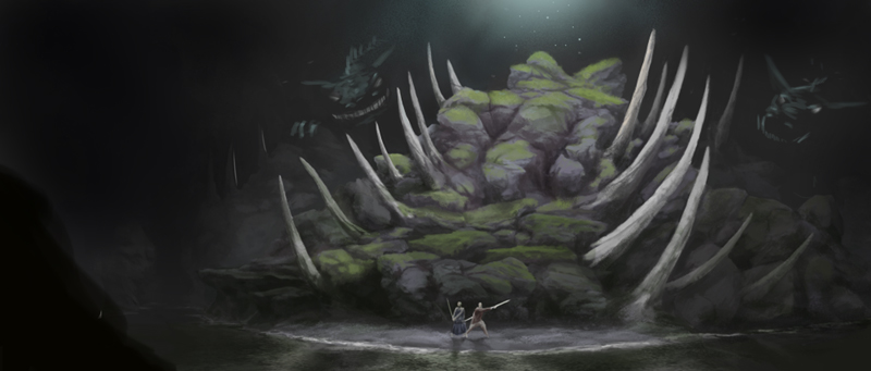
Environment concept
Any advice is appreciated. Paint overs are welcome as well.

Any advice is appreciated. Paint overs are welcome as well.

|
In need of a critique
|
|
02-22-2014, 03:13 PM
Environment concept
Any advice is appreciated. Paint overs are welcome as well. 
02-23-2014, 03:52 AM
I will be very brief and I'm sure others will have tons more advice. But consider what is important in your image. I would tend to think your two characters. Yet, they have the lowest constrast of all elements in the image. The spikes are way more contrasted and so are the luminous dots in the back. Attract our eyes to the important stuff, and consider the color of the light, everything looks very overcast right now, but I don't know if it's what you are looking for.
Fine art www.qitsune.com
Illustration www.chantalfournier.com Blog qitsune.wordpress.com
02-23-2014, 07:28 AM
Thanks for your input, Chantal! Yeah, it's convoluted for numerous reasons, one of which being that I didn't know whether or not to focus on the environment or characters. I guess in the end, I focused way too much on the environment and the characters kind of fell by the wayside. Now they're nothing more than a stigma. I added them in there, hoping to add a bit of narrative to the environment concept, but I evidently don't know how to add narrative correctly, haha. Once again, thank you. Much appreciated. I'll work on the focus a bit more - as well as a million other things, haha.
02-24-2014, 12:11 AM
I feel like it kind of needs a foreground element just to lead us into the painting. I just feel far away. If it's an environment, I wouldn't worry too much about the characters.
I agree that it needs a little more contrast. More darks. But I do think that that kind of smokey, hazy light you have coming from the top is really well done. Great mood.
02-24-2014, 06:05 AM
Thanks, mate! Yeah, I'll throw the characters out of there. As well as the eyes, haha. I added a foreground element early on, feeling the same way, but I scrapped it for whatever reason. I'll put some more time into the foreground.
02-24-2014, 06:44 AM
Well, the characters have the use of telling us the scale of the thing, otherwise, it's really hard to tell., Maybe you could make it look more like you want the characters to be unimportant (more silhouetty.)
Fine art www.qitsune.com
Illustration www.chantalfournier.com Blog qitsune.wordpress.com
02-24-2014, 01:36 PM
Yeah, what Chantal said. I meant I wouldn't worry about focusing on them. I like that they give a sense of scale, but the silhouette idea is good. Then you can play up the values in the environment where you want us to focus.
02-24-2014, 03:48 PM
Mike086 and I did a live stream and did paint overs disusing some changes with your painting, here is mine he will post the video and his as well.

02-24-2014, 04:36 PM
Livestream Crits/Paintovers: www.twitch.tv/mike086
Loomis Study videos: http://www.youtube.com/user/mike086 My Facebook page: MCIII
02-27-2014, 10:55 AM
Mike and CJ:
Sorry it's taken so long to reply, guys. Thank you so much for taking the time to critique this piece, let alone livestream it. All of your guys' assumptions were correct. The dots are eyes and the spikes are bone. I'll take what you guys said and get started on fixing it. Thanks again!!! |
|
« Next Oldest | Next Newest »
|