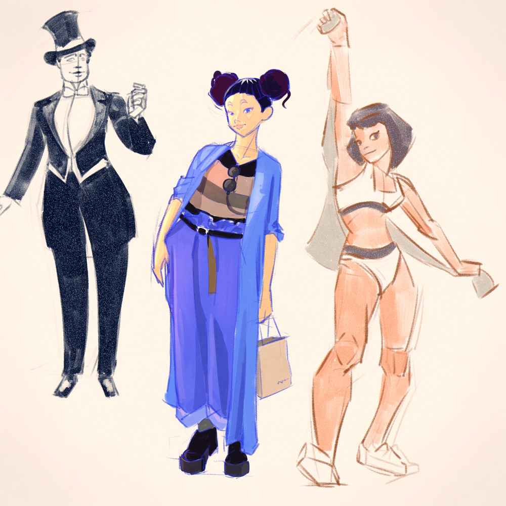
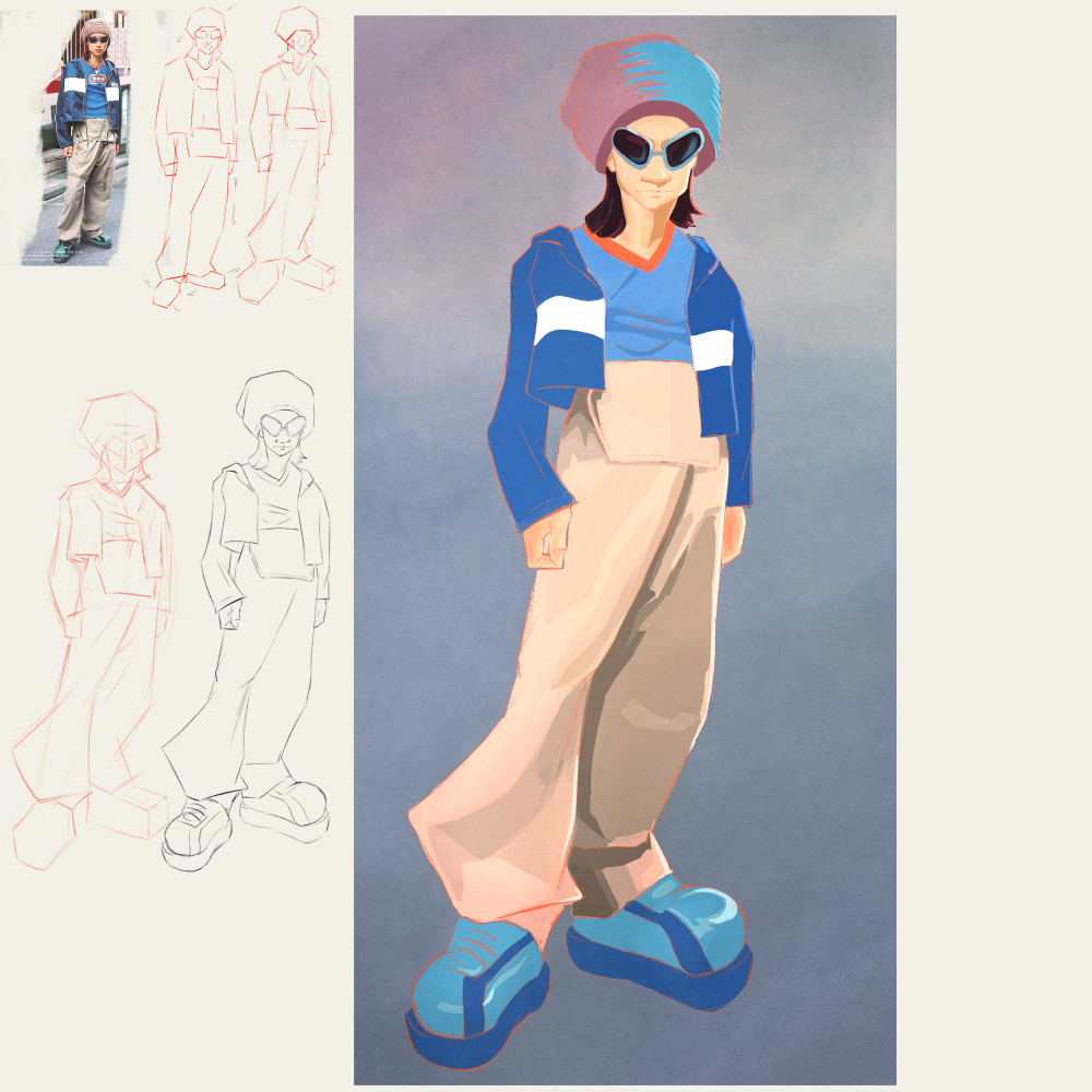
Posts: 1,109
Threads: 18
Joined: Apr 2014
Reputation:
68
Darktiste Thanks for the recommendation! I watched this guy some years ago but had forgotten about him, gonna go and study his techniques a bit!
Got some really good news yesterday, I pitched my Penny Pentagram comic to Macroverse (a new-ish subscription based comic reading app with some big names attached) and have been accepted onto their platform \^_^/ It means I will need to step up production and work on my speed since 6 pages every 2 months is not enough anymore, but is much better pay than the print comic I currently publish in (and I can continue to publish on both). The current werewolf story is already pencilled, but for the next one I am going to attempt to do it in a much more direct way. The art quality may suffer, but it may also improve since there can be more sketch-like energy to it. We'll see how it goes...
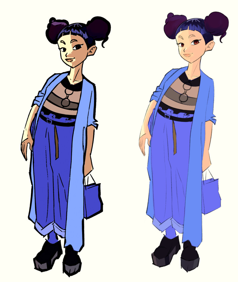
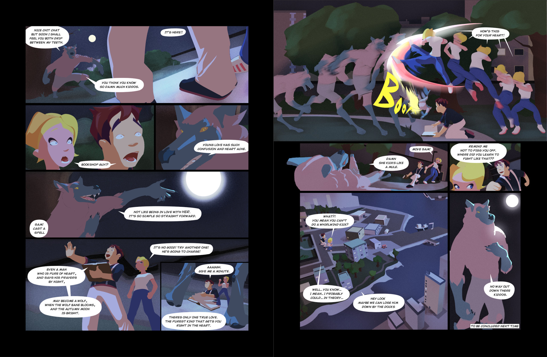
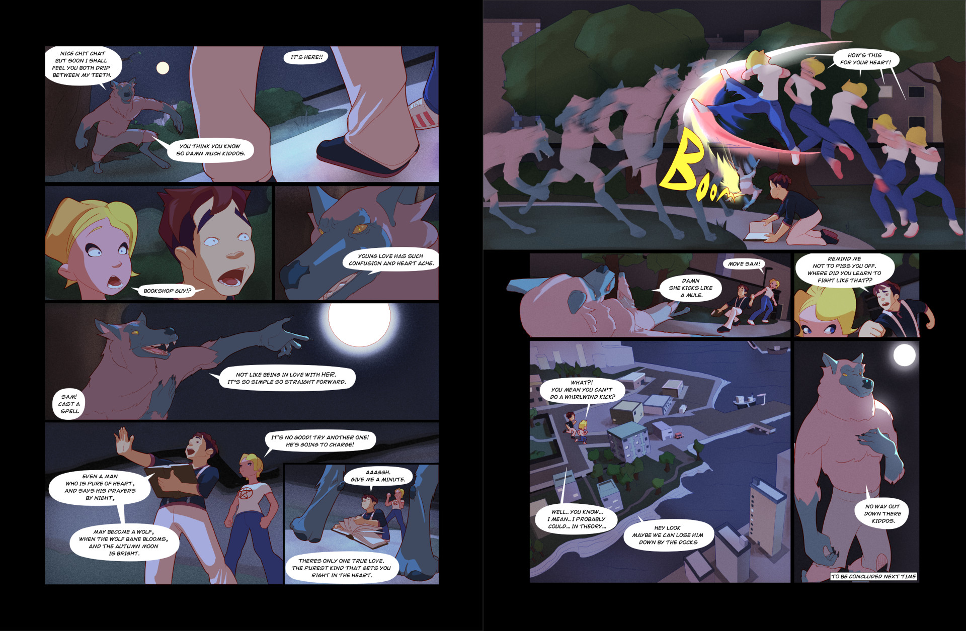
Here's an update on some recent stuff, I finished the final spread for this part of the story. I tried removing the ink lines altogether to leave this vector graphic type look to the characters. Not sure if I only like it cause it's a change from seeing the linework all the time. Let me know if you like the with or without the linework version! If I went no linework I'd have some missing details to add, but maybe it looks better... idk xD
Shape Version:
Ink Version:
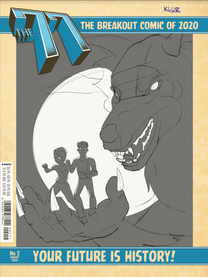
Also have been commissioned to do the cover of the next issue. Not sure if the thumbnail is too small but it's a giant ghostly werewolf holding the characters in the palm of its hand. Haven't got the right pose for the characters yet.
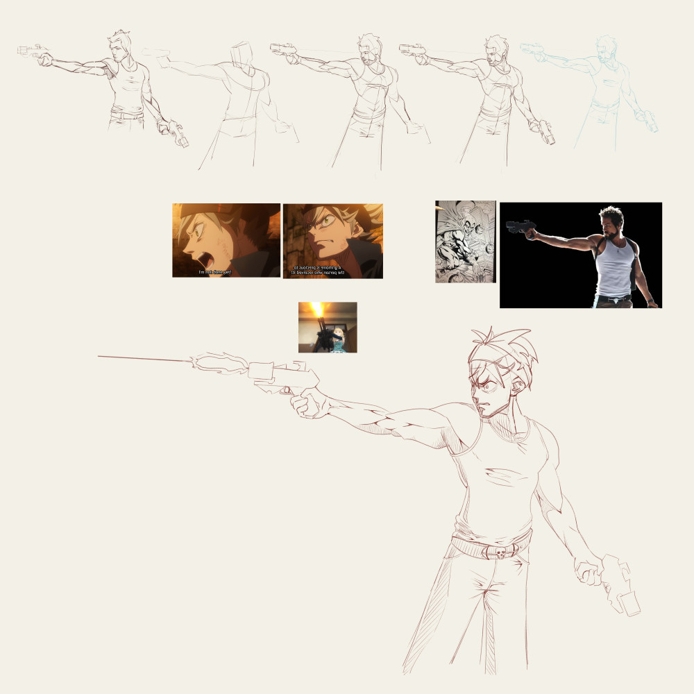
A random WIP of a guy with a gun, going to try out some of Robert Marzulo's inking techniques on it:
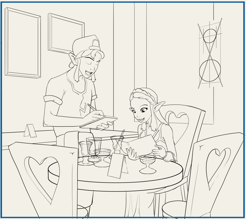
And some progress on my random Zelda fanart cafe scene. Zelda already ate 5 ice creams and is ordering another one. Going to use this piece to practice using solid blacks in the background.
Posts: 460
Threads: 10
Joined: Mar 2016
Reputation:
64
Everything is looking really good, but the Zelda piece is turning out amazing! I really love how well you are able to do the perspective by now! The comic pages must be paying off in terms of mileage! :)
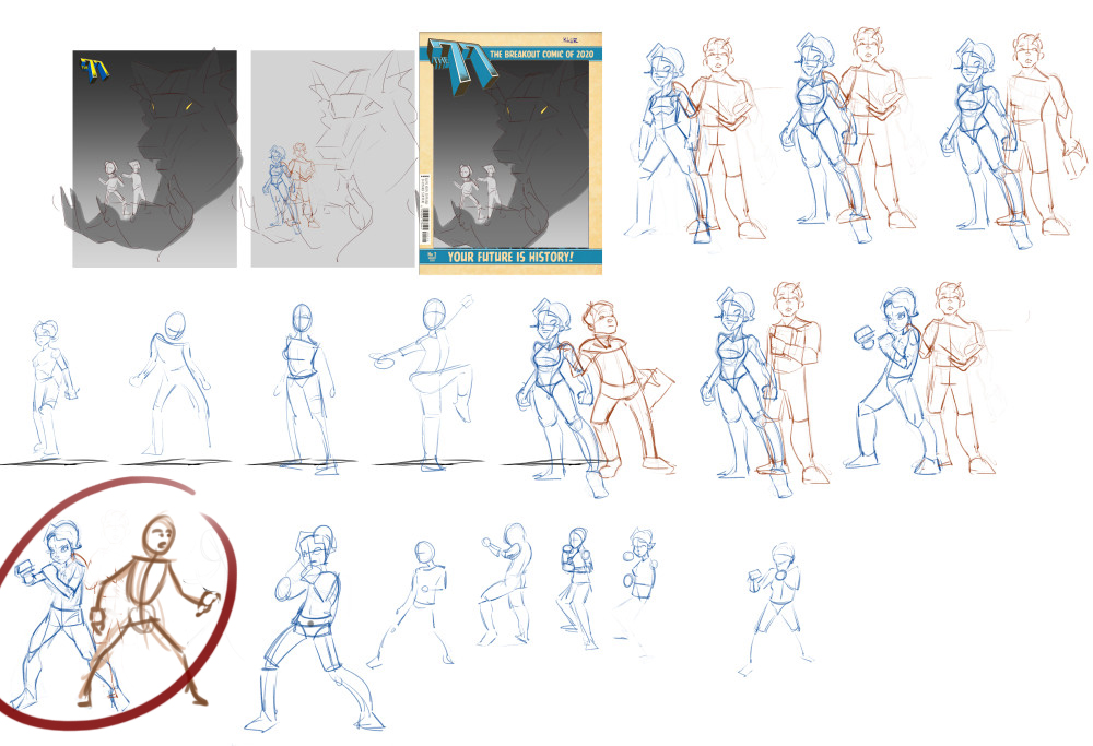
As for the werewolf cover. It's hard to read the shapes because the size is so small, but the poses should IMO have a feeling of "preparing to defend themselves" since the werewolf is portrayed as an ominous, symbolic danger in this cover. I made a small overpaint of the approach I would take:
Keep up the good work and keep posting! 
Posts: 1,109
Threads: 18
Joined: Apr 2014
Reputation:
68
Zorrentos Thanks for the comment/feedback/paintover! I should've posted more progress on that cover since I was further along, but pretty much went the route you were suggesting anyway.
The second character behind her is more subdued to try and be more comedic, like he's doing a double take type of thing while she's 'ready for danger' but totally facing the wrong way.
I cropped out the werewolf a bit, since I thought the character's could be a bit bigger on the page. Making them smaller and the werewolf bigger would make things more oppressive/threatening but I want to show the characters too.
I pretty much hate it at this point >.< feels like there's a ton of opportunity I'm missing out on but not really sure where to focus. I like the character poses, I dislike the werewolf, it feels to me like no improvement on the thumbnail, even that it's worse now I added detail. I like the giant moon/circle shape.
Desperately looking for feedback if anyone has any suggestions ^^
Posts: 364
Threads: 11
Joined: Dec 2013
Reputation:
73
Hey Jyonny,
What gets me about all three characters on the page is they all look close to neural as far as their emotive quality.
the wolf has quite a relaxed looking hand and the face doesn't look too menacing.
the girl is looking the way shes got her guard up, so its as if shes already locked on to an opponent.
by moving her sight angle a bit you can get the feel shes ready but doesn't know where its gonna come from.
My suggestion for the guy is to give him the feel that hes sensed something is behind him but apprehensive to look
you can also make the characters a little bigger on the page to give them more significance and have their expressions read easier.
those are my quick suggestions 
as for the lines or no lines, I think they both can work, the no lines is working particularly well at giving this a night time feel on things like the wolf where clean details would be diminished by the lack of light.
congratulations on the new opportunities beginning, rise to the occasion and make it work, fail fast and often, and learn fast friend.
![[Image: po_for_jyonny_novice_by_andrew_gibbons_d...NR6ClLcGCU]](https://images-wixmp-ed30a86b8c4ca887773594c2.wixmp.com/f/0444150d-aa18-4a8b-98b7-520f91088ed5/de8jdb6-b984661c-20d5-499a-ab33-b5b9fc024cf2.jpg/v1/fill/w_1095,h_730,q_70,strp/po_for_jyonny_novice_by_andrew_gibbons_de8jdb6-pre.jpg?token=eyJ0eXAiOiJKV1QiLCJhbGciOiJIUzI1NiJ9.eyJzdWIiOiJ1cm46YXBwOiIsImlzcyI6InVybjphcHA6Iiwib2JqIjpbW3siaGVpZ2h0IjoiPD04NTMiLCJwYXRoIjoiXC9mXC8wNDQ0MTUwZC1hYTE4LTRhOGItOThiNy01MjBmOTEwODhlZDVcL2RlOGpkYjYtYjk4NDY2MWMtMjBkNS00OTlhLWFiMzMtYjViOWZjMDI0Y2YyLmpwZyIsIndpZHRoIjoiPD0xMjgwIn1dXSwiYXVkIjpbInVybjpzZXJ2aWNlOmltYWdlLm9wZXJhdGlvbnMiXX0.DyIxVhVLRCtjz6LlKc9QBo3P6NFPSQcp-NR6ClLcGCU)
Posts: 1,109
Threads: 18
Joined: Apr 2014
Reputation:
68
Xel Thanks man, that was so useful, really kickstarted me back into this! Got so much from your paintover, can't thank you enough : )
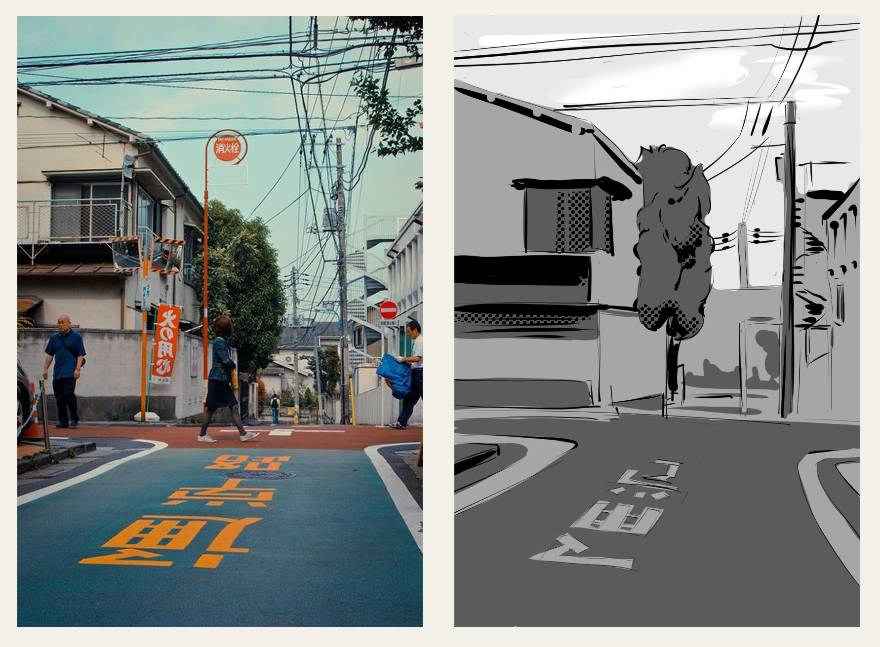
Been doing plenty of studies and work on fundamentals, big weaknesses for me are environments, so trying to get a daily-ish habit of simplifying environments from photos
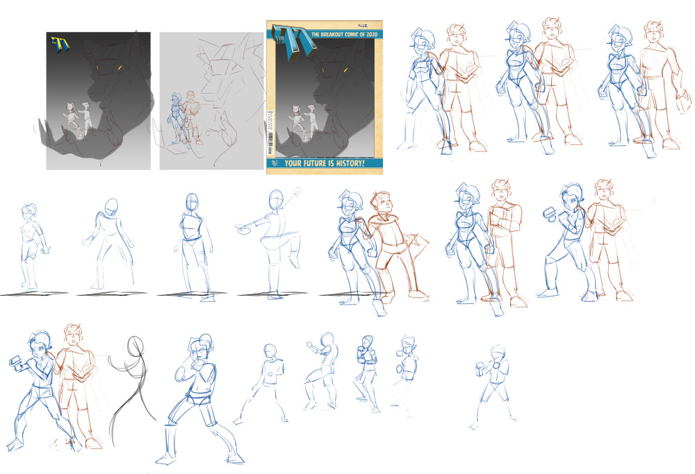
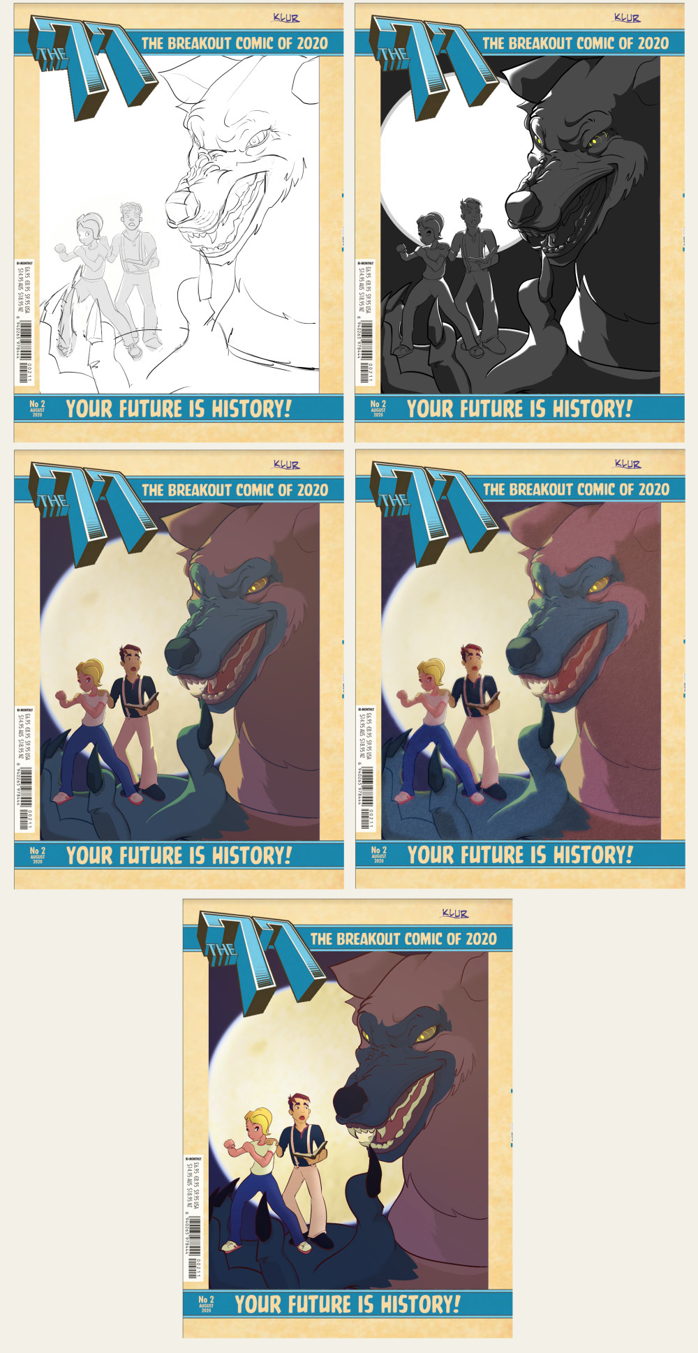
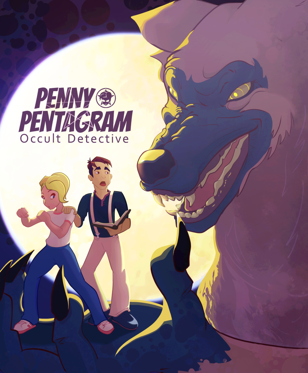
Some more work on the cover, made the more angry werewolf expression as Xelf suggested but then toned it down a little to try and make him more smug, but also dangerous. Pushed the character expressions and poses too. Then have been flailing around trying to colour it. I went too complex I think and toned it back down again in the last image on the sheet below. That's where it's at currently. I feel I can do better though and will keep studying pro's and trying to apply that stuff to my work. Deadline is not til the end of the month so I have time to push it some more.

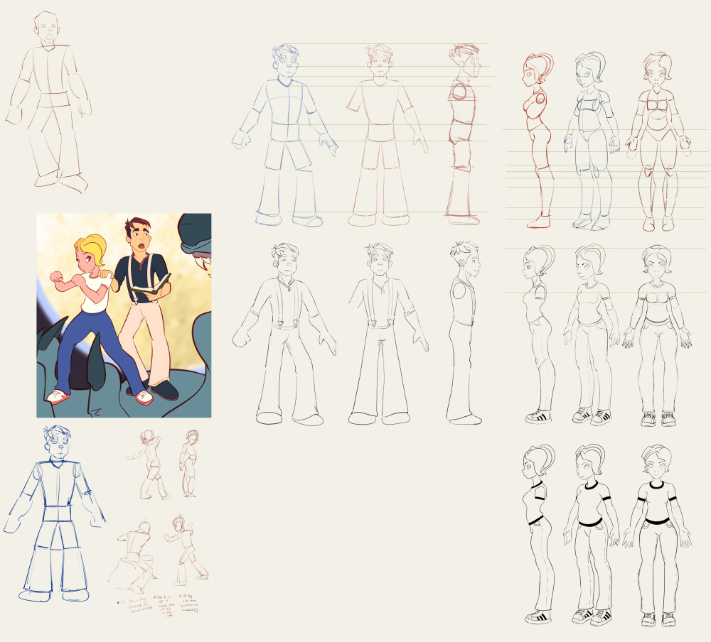
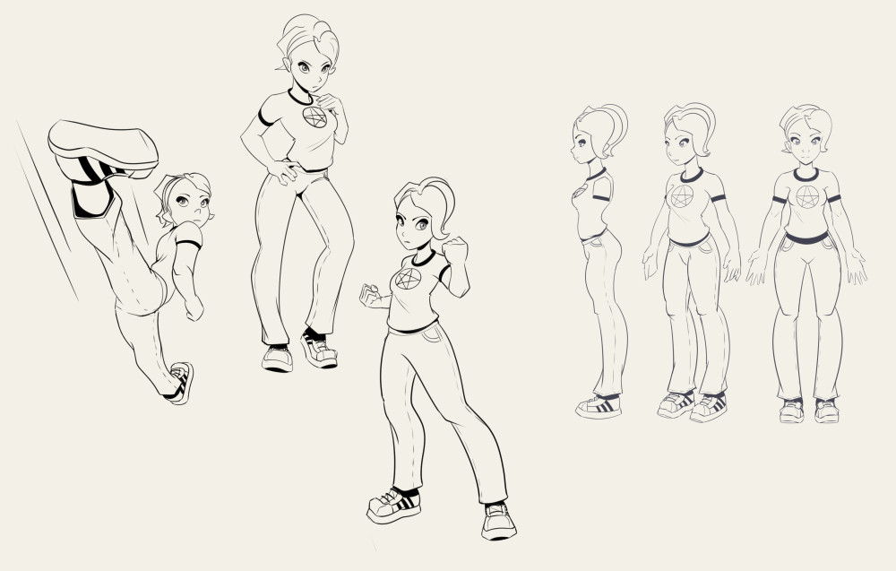
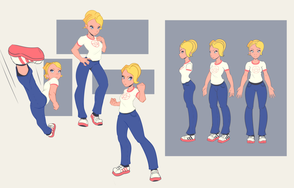
Lastly, I really liked how the characters came out in the cover, and since I need to speed up with the comic pages I decided to redesign them with that more cartoony look, getting the underlying shapes as simple as possible so I can pose them quicker. I'm pretty happy with the man, still need to get a better design for the woman, some more straights against curves, better proportions and shapes overall, but I think it's getting there.
Posts: 1,109
Threads: 18
Joined: Apr 2014
Reputation:
68
Posts: 364
Threads: 11
Joined: Dec 2013
Reputation:
73
came out good, you did well pushing it forwards
Posts: 1,424
Threads: 12
Joined: Dec 2015
Reputation:
139
Congats on the Macroverse deal Jynonny! That sounds awesome - I really hope it takes off in a massive way for you :).
You seem to be building up some good momentum at the minute - I hope you manage to balance it all - don't forget to spend time recharging yourself too.
Your comic work is looking really good - what jumped out at me in particular was the variation in camera angles and your perspective work - it really adds depth and dynamism to my reading experience - great stuff dude!
The question of lines or no lines is an interesting one and it's one I'm trying to answer for myself as well. I dunno - one day I think I prefer no lines and working in shapes and masses - but then the next day I'm loving the intricacies of line!
In either case what I find appealing is where I see well constructed forms and then a good handling of the lighting on those forms. I've been equally blown away by artists who work in shapes and masses as well as those who work in line.
My current favourite comic book artist is Esad Ribic and his work is equally awesome whether he works in masses like this:
![[Image: cafa8a5c05101d9648608af503f04a3c.jpg]](https://i.pinimg.com/originals/ca/fa/8a/cafa8a5c05101d9648608af503f04a3c.jpg)
Or when he works in line, like this:
![[Image: 094946afa08c7b7c11786448eb77e17f.jpg]](https://i.pinimg.com/originals/09/49/46/094946afa08c7b7c11786448eb77e17f.jpg)
Anyway - just my few thoughts on this - probably nothing too helpful but thought I'd share anyway.
Keep it going dude!
“Today, give a stranger one of your smiles. It might be the only sunshine he sees all day.” -- H. Jackson Brown Jr.
CD Sketchbook
Posts: 1,076
Threads: 4
Joined: Jan 2016
Reputation:
43
Really great updates here, I really enjoy your style in general! Love the recent Zelda Fan Art in particular, it's very solidly drawn, has great character expression, and a great style. I'd love to see it in colors so I hope you develop that even further! Keep up the great work!
Posts: 1,109
Threads: 18
Joined: Apr 2014
Reputation:
68
Xelf Thanks man! means a lot ^^
Artloader I hadn't come across him before but I'm an instant fan now. Exploring a range of rendering/colouring styles I guess then is the best way and our personal style should kind of appear on it's own I guess? That solid drawing technique is the most important though, as professional painters are always saying!
CGMythology Happy to hear that my work has some kind of recognisable style to it! I guess it's like seeing photo's of family who look a bit like you, you can never see the similarities yourself. I should definitely finish that zelda piece, I have really bad stamina with personal work... I feel happy about something for a while then get filled with doubt and move on to something else.
Been busy studying and working on the comic, one more batch of 6 pages to finish then a break from it while we figure out the script for the next case.
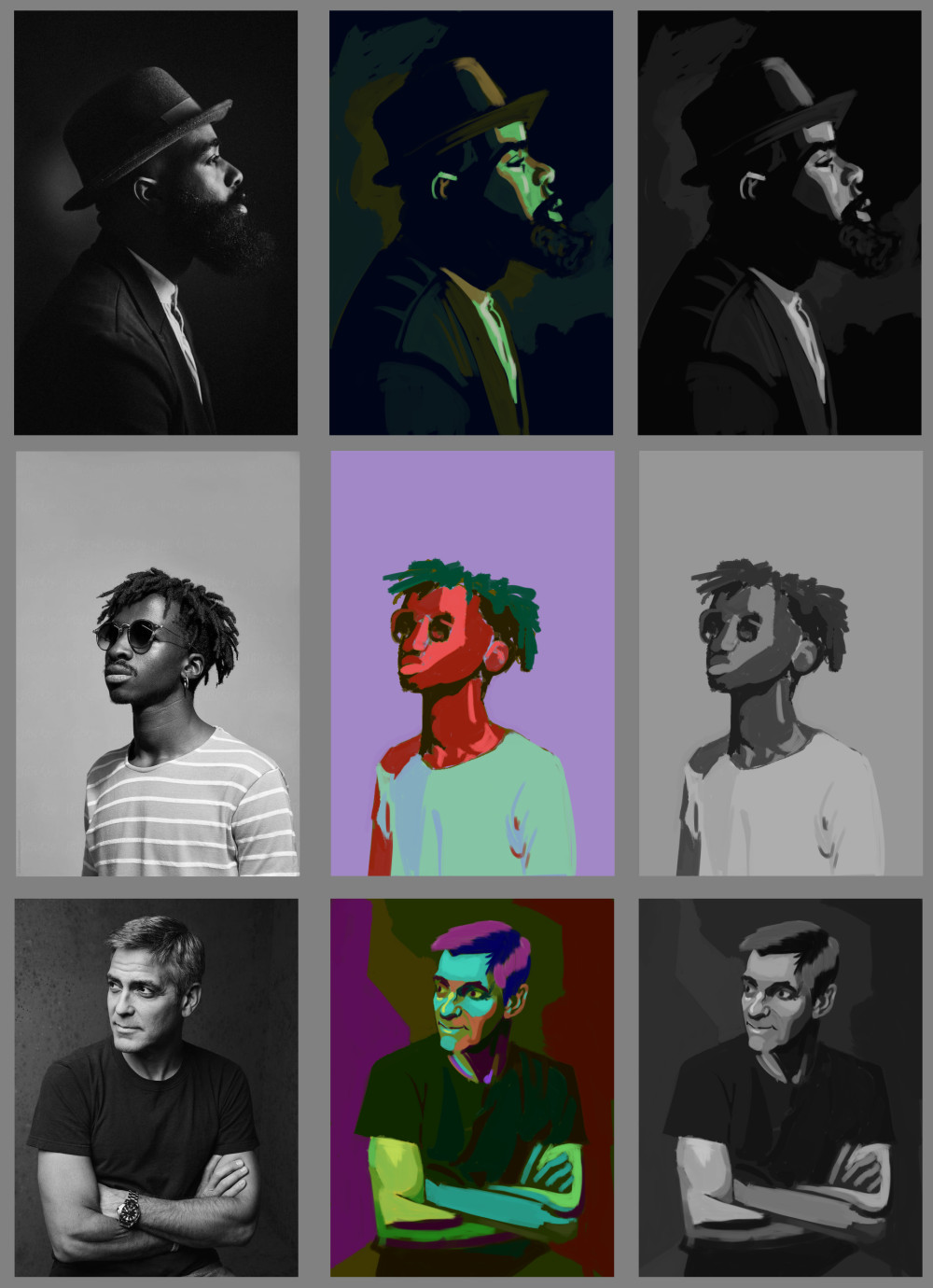
Been continuing with Wouter Tulp's Digital Painting Workout. They're daily 30 minute painting exercises, although when he's finished I continue for a bit, maybe an hour max. Painting along with him is a bit of a struggle, trying to watch him, look closely at the reference and paint myself, so I definitely need to do some of the exercises again from my own reference. It's really helping me get my head around colour and value tho.
The goal for this one was to paint the correct values, but using random, highly saturated colours. The ones on the right are converted to greyscale to see how close I got. It's was a real brain twister but I think a really good exercise:
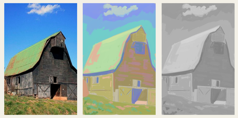
This one is using colours to replicate the value range, but shifting it to a high key. Converted to greyscale at the end to check:
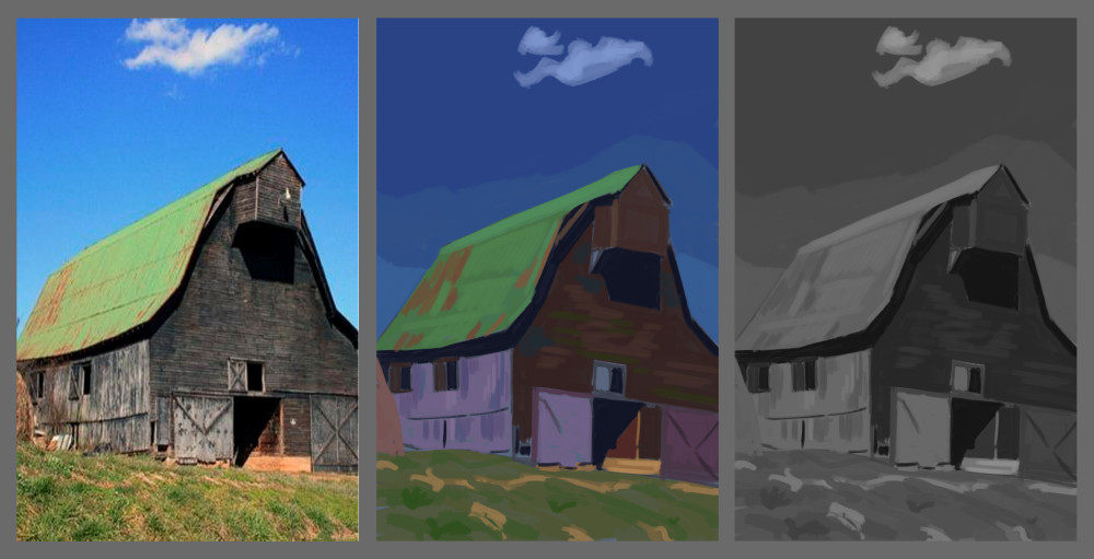
Same as above but into a low key. This one doesn't feel as successful, needed to go a little brighter maybe in the roof and the bright spots on the floor.
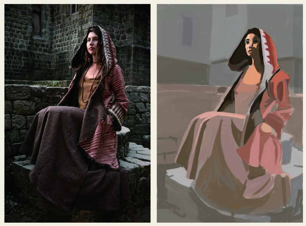
This one was to paint the foreground character with a full value range, everything else in a high key:
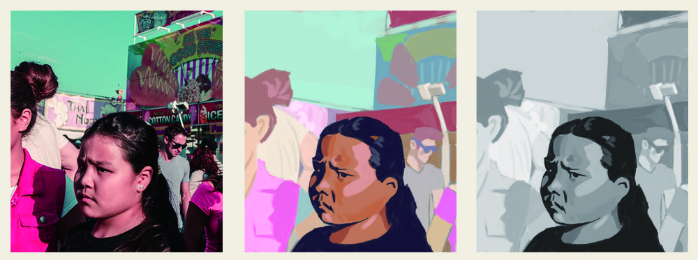
Finally painted the focal point with full range values and high saturation, then fade it off into a high key/low saturation in the surrounding areas.
Some warmup drawings from pinterest feed:
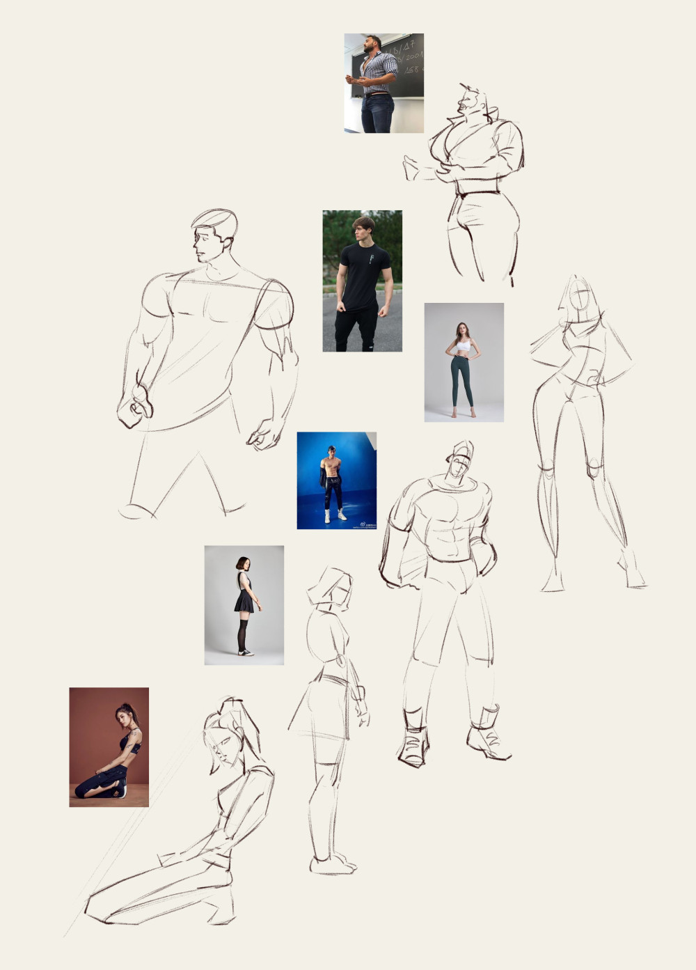
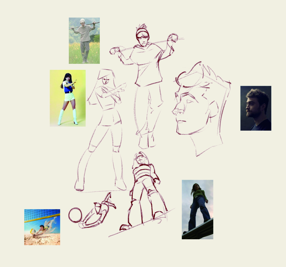
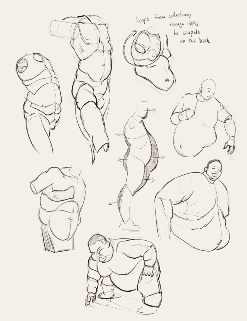
and some various anatomy studies. I bought a few books by Michel Lauricella who has really nice simplified anatomy forms:
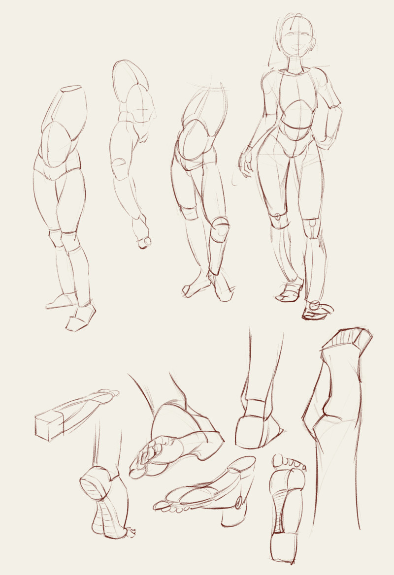
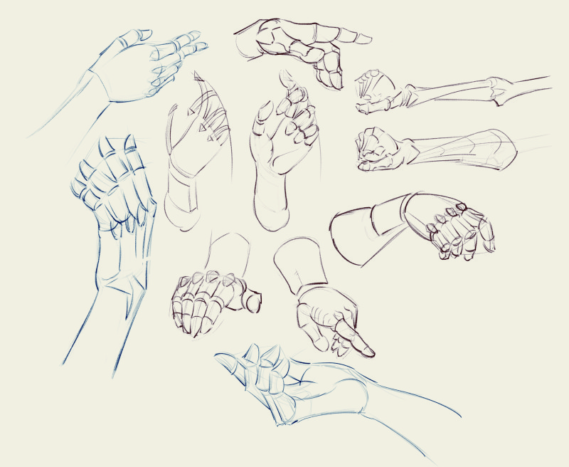
Posts: 1,424
Threads: 12
Joined: Dec 2015
Reputation:
139
Wonderful studies Jyonny - I'm really impressed with those saturated value studies - you've a great eye for value!
I'm also loving those hand constructions - nicely done!
“Today, give a stranger one of your smiles. It might be the only sunshine he sees all day.” -- H. Jackson Brown Jr.
CD Sketchbook
Posts: 1,109
Threads: 18
Joined: Apr 2014
Reputation:
68
Artloader I was really surprised when I made that thing greyscale and it sort of matched... was a really hard exercise, just squinting isn't enough, had to squint so hard I could barely see it and do a lot of test strokes of paint comparing just two colours to judge if it was going lighter or darker. Definitely worth doing I think!
Some more drawing studies/warmup stuff. I am challenging myself to not use any selection/move/transform tools for my drawing studies. I noticed I tend to draw stuff, almost knowing proportions are going to be off, then immediately select and scale/move/transform the arm/foot/head or whatever. This is fine for proper work, but I think it highlights a serious lack in my hand eye connection that I want to correct. So if I draw something wrong, I have to fade it back with a soft eraser and re-draw it. It's been frustrating but really useful, I already feel I am looking at the whole image more, holding back from adding details til the structure is solid and generally feeling more content with the results.
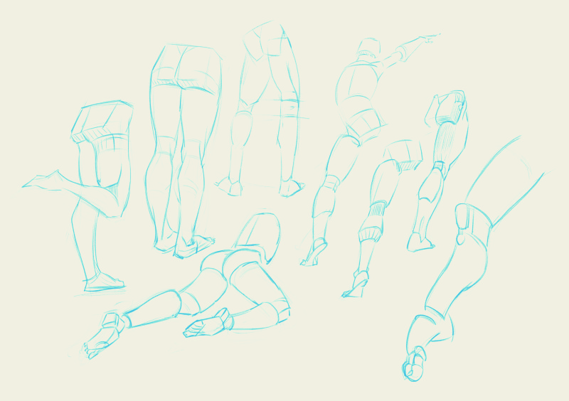
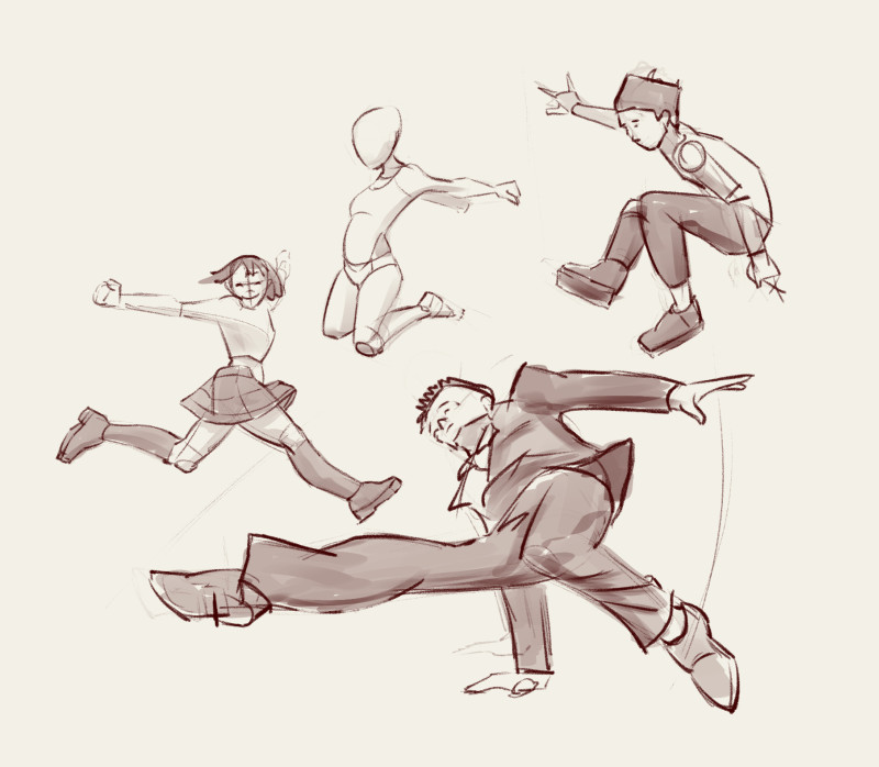
More Digital Painting Workout exercises:
Painting with a very limited value range (just 3% difference from lightest to darkest)
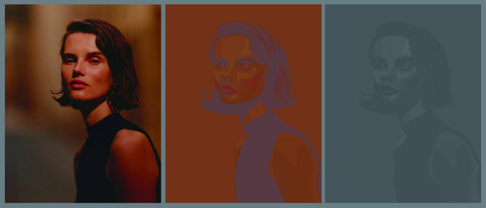
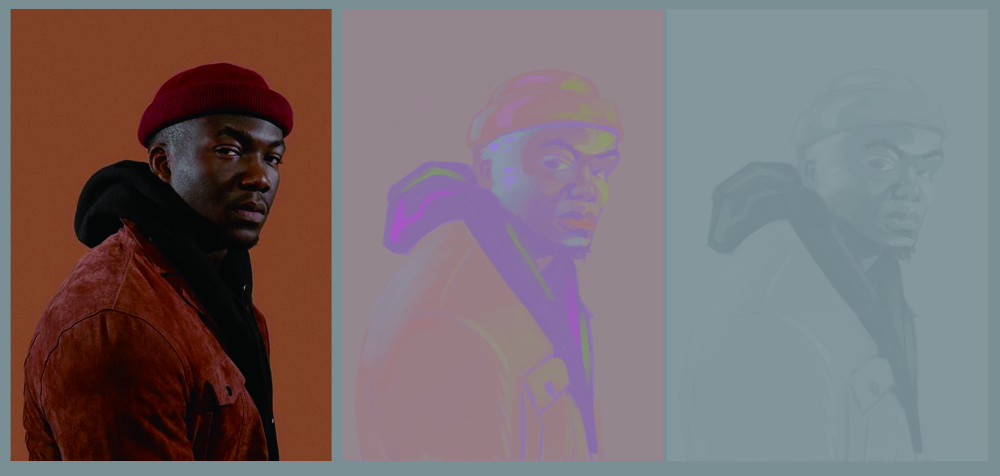
Same limited value range in a high key. I don't think these were so successful, I didn't really understand what he was doing til about halfway through the video on the first one, and for the second one didn't know if I was supposed to be matching the colours or using whatever I liked (excuses excuses!). I need to do this exercise again basically.
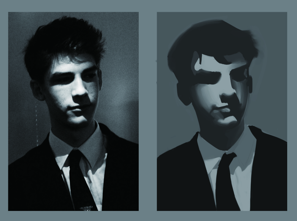
Painting cast shadows with hard edge, form shadows with soft edge
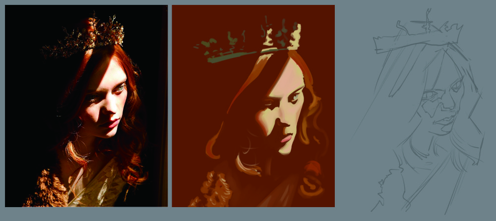
Starting with a red BG and painting only light (no under sketch, the result was intended to look distorted). Trying to be prepared I did the under sketch before pressing play and learning we weren't doing one today xD all good practice tho!
Posts: 124
Threads: 2
Joined: Nov 2020
Reputation:
13
These are some really nice studies, I like the simplification going on
Posts: 3,357
Threads: 37
Joined: Aug 2013
Reputation:
234
Small head syndrome or stylistic choose?
Posts: 1,109
Threads: 18
Joined: Apr 2014
Reputation:
68
Skeffin Thanks! I'm really aiming for the simplified approach, glad it's showing through!
Darktiste I made them tiny on purpose. I tend to draw heads too big usually I think, so drawing them small sometimes, I think, should help.
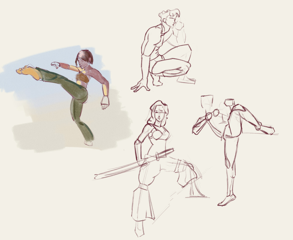
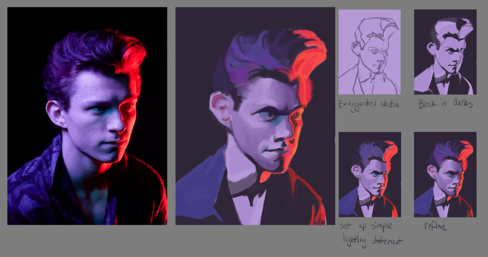
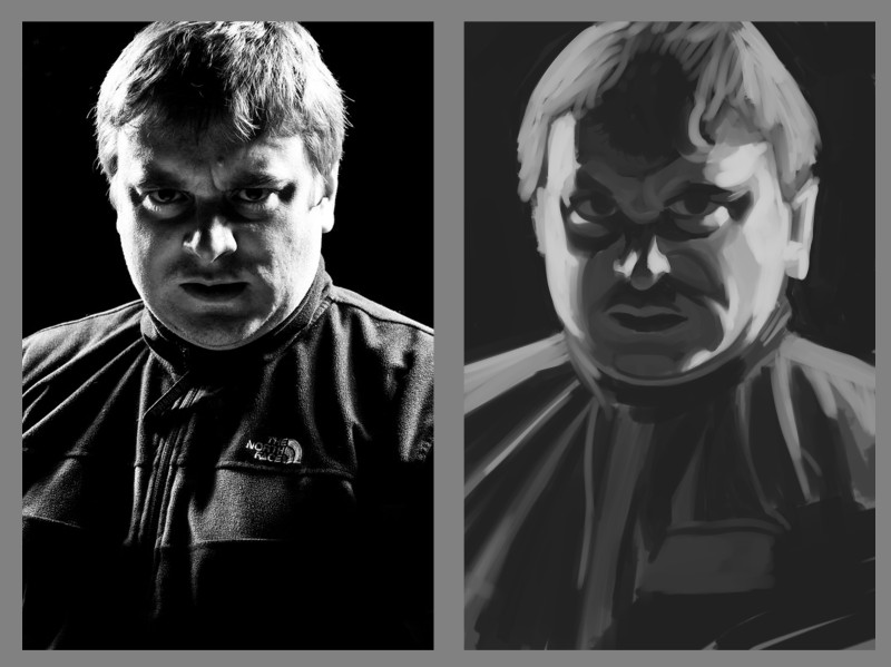
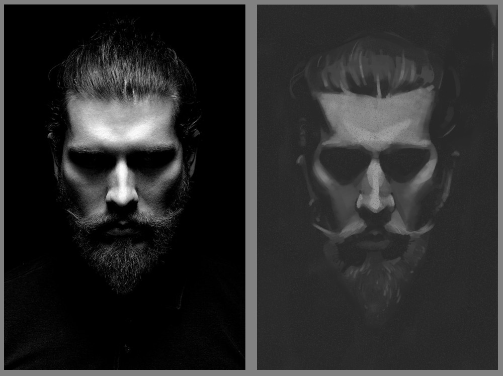
Some recent studies and practice things, my main time is put into the comic which I'll share here too when it's finished!
drawing warmup:
Digital Painting Workout exercise painting coloured light:
light from two sides:
light from above:
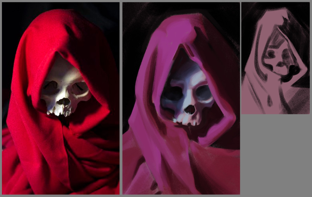
this exercise was to paint the reference as if it was a cool light instead of a warm one, so the cloth goes towards purple and shadows are warm instead of cool and reflected light changes. I felt mostly happy with this one, except for the shadows on the image right side of the skull, couldn't quite get the values/reflected light colour to work as I wanted.
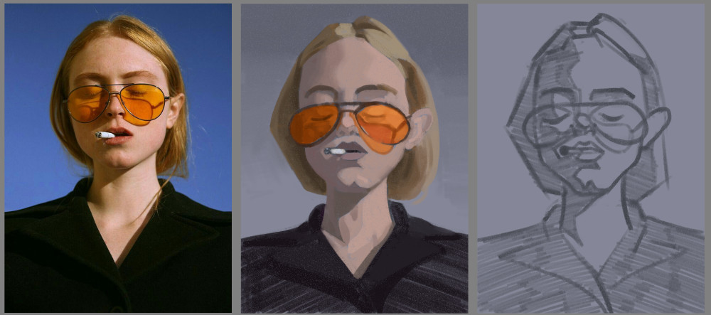
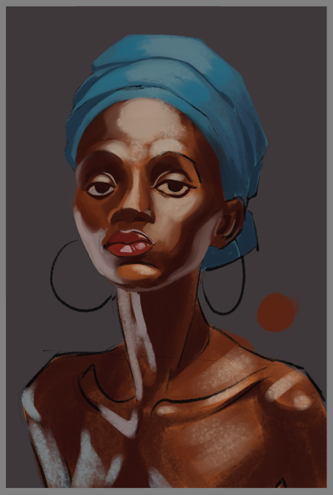
personal studies to get better painting skin:
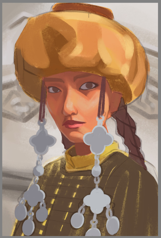
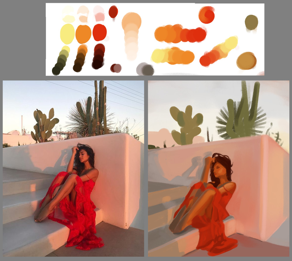
Another exercise. We use a limited palette and mix them on that white rectangle like it was traditional paint. We are allowed to add black and white to any colour too to raise/lower value and reduce saturation. This first one I did with the video, but got all mixed up and the colour palette was way too broad and I don't think it's very harmonious:
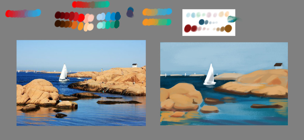
Tried another one on my own picking three starting colours. Choosing red yellow and orange was probably not the best choice, should've had a cooler colour in there but it was nice to paint without worrying about what colour to pick next, just trying out different mixes of my starting colours. I might paint like this for a while to try and get an appreciation of some limited colours instead of just nudging things around on the hue/sat/brightness sliders like usual. The shadows on the woman are not very successful, but on the whole there is definitely colour harmony across the image I think.
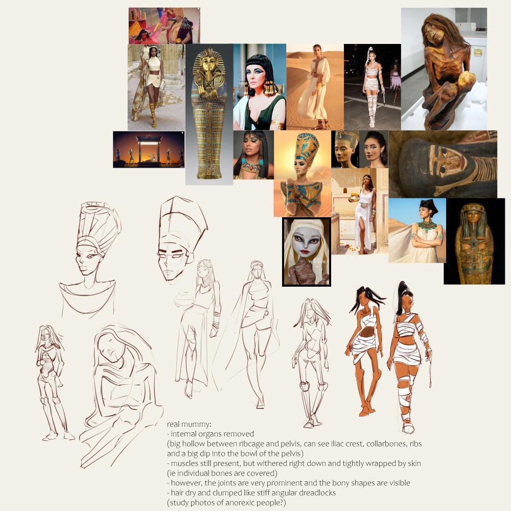
Some initial exploring sketches for one of the next villain characters for our comic, an egyptian mummy/femme fatale type of villain. Will need to draw her in human form in a flashback sequence, as well as Cleopatra, and mummy form for the main action:
Posts: 364
Threads: 11
Joined: Dec 2013
Reputation:
73
some nice study work you've been doing.
you pull off some good stylization and pushing of features but you may benefit from being somewhat more selective in areas, just speaking generally some of the pushed anatomy gets away a little far without the structure to support it.
some of the whole over pushed features can actually work against letting them shine.
kinda how in caricature if you have a big nose and big mouth and big head and big eyes.. you just have a face where nothing stands out really.
please dont take it as a knock to you, youve been doing great by the looks of things
keep it up
Posts: 1,109
Threads: 18
Joined: Apr 2014
Reputation:
68
(12-08-2020, 06:40 AM)xelfereht Wrote: some nice study work you've been doing.
you pull off some good stylization and pushing of features but you may benefit from being somewhat more selective in areas, just speaking generally some of the pushed anatomy gets away a little far without the structure to support it.
some of the whole over pushed features can actually work against letting them shine.
kinda how in caricature if you have a big nose and big mouth and big head and big eyes.. you just have a face where nothing stands out really.
please dont take it as a knock to you, youve been doing great by the looks of things
keep it up
not at all! thanks for the feedback, always looking for places where I'm weak. Are you referring to my little character drawings, paintings or just my stuff in general? I totally agree they could all benefit from more purposeful design. I'm still kind of flailing around a lot of the time just to get something that doesn't suck, don't feel I am really in control of the design yet. I will try to be more conscious of that though (and should probably do more studies from pro's alongside photo reference stuff)
Posts: 364
Threads: 11
Joined: Dec 2013
Reputation:
73
Just in general, some of the pushing of features and soft/hard angles feels bit random and ends up with less aesthetic shape design and feel of structure.
I would suggest trying to do a mental check for balance, like if the poses are stable and able to hold themself up right credibly. also maybe you can try feeling out the pose and have an awareness of the tension vs relaxed state of different body parts.
as far as faces and in some of your studies, i think you could take more away from them by trying to catch a bit more of the referenced expression and thinking about the structure the light is revealing.
It appears to be a copy of light shapes and shadow shapes, that without the structure in mind, can be warped to the point the information take away is reduced and it becomes more of a automatic copying process.
you can also kill a bit of the this is digital painting look by varying up your stroke direction instead of painting this sort of ripple effect that lines every shadow and light shape.
hope this helps,
you're doing allot of great work, i know the comics stuff is really challenging but also a great way to get in allot of drawing mileage. just try to pick up as much information you can along the way so you get bang for your buck
![[Image: dea28cu-99e799fb-8d61-427e-a064-83b55009...FCvwOJHaMU]](https://images-wixmp-ed30a86b8c4ca887773594c2.wixmp.com/f/0444150d-aa18-4a8b-98b7-520f91088ed5/dea28cu-99e799fb-8d61-427e-a064-83b550094e26.jpg?token=eyJ0eXAiOiJKV1QiLCJhbGciOiJIUzI1NiJ9.eyJzdWIiOiJ1cm46YXBwOiIsImlzcyI6InVybjphcHA6Iiwib2JqIjpbW3sicGF0aCI6IlwvZlwvMDQ0NDE1MGQtYWExOC00YThiLTk4YjctNTIwZjkxMDg4ZWQ1XC9kZWEyOGN1LTk5ZTc5OWZiLThkNjEtNDI3ZS1hMDY0LTgzYjU1MDA5NGUyNi5qcGcifV1dLCJhdWQiOlsidXJuOnNlcnZpY2U6ZmlsZS5kb3dubG9hZCJdfQ.X--W9IqJnpyNzt9Xanj4IVhH45_5EpzpfFCvwOJHaMU)
Posts: 1,109
Threads: 18
Joined: Apr 2014
Reputation:
68
I appreciate the follow up and the paintover. I agree the design on that one didn't work, I can't stand to look at his oversized eyes and it looks really digital. The exercise was getting the values to work across the image, which I think was at least somewhat successful. I will continue trying to keep design in mind tho, and start to work on my paint strokes.
I'm experiencing major doubts about all my work, as well as my head filling with excuses as to why things are like that; the paintings are bad cause I set time limits, figures are broken cause they're just warm ups, my comic characters are wonky cause of time constraints. I recognise these as negative forces trying to overwhelm me and need to not give them any energy. I need to make some short term goals to focus on... will be working on those! Hopefully I can get there before the burnout sets in, I can feel it building up :/
Since I'm here might as well post these:
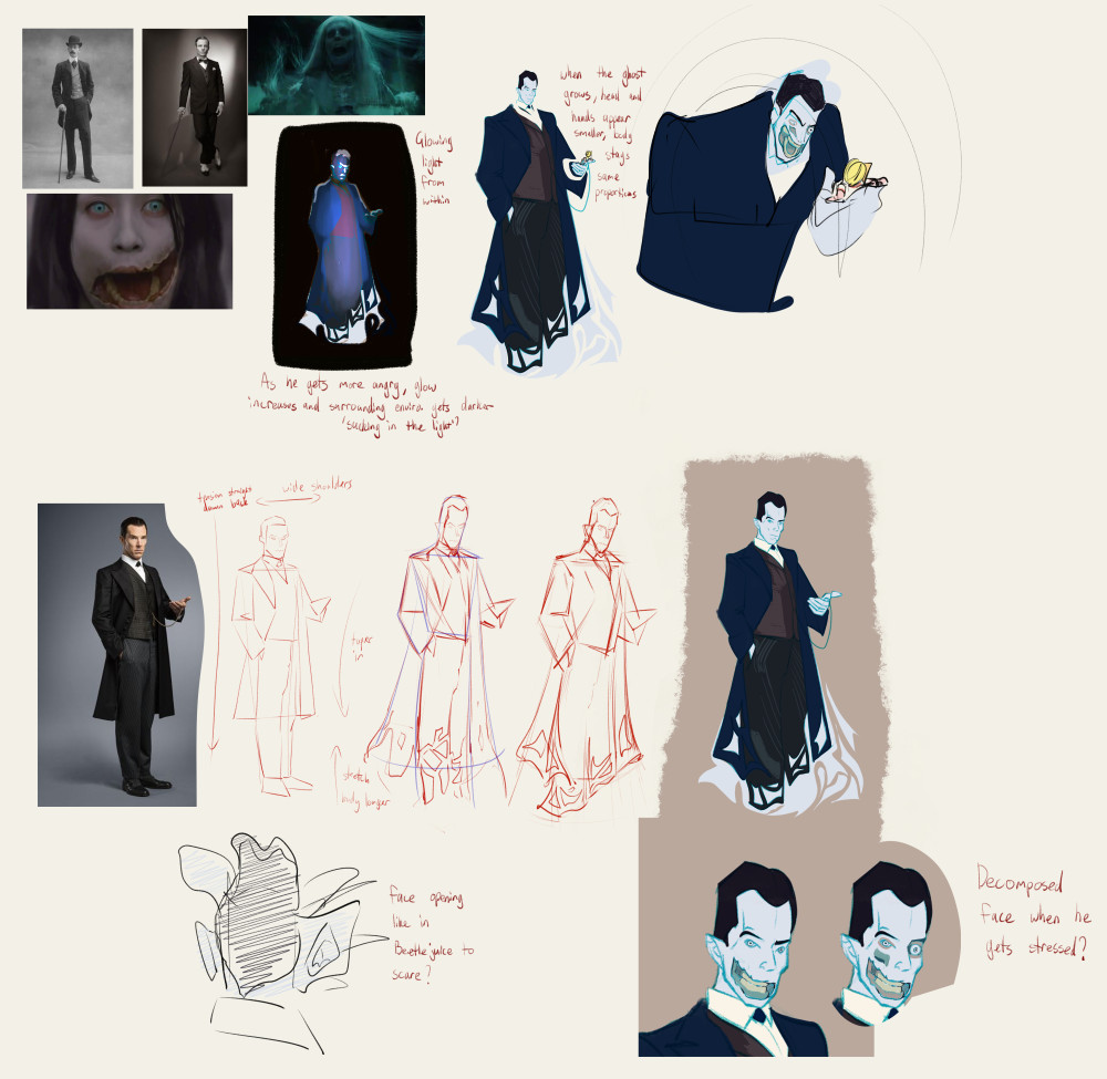
first idea for the ghost villain for the next chapter of Penny Pentagram. Over the course of the chapter he changes and grows in size to giant proportions then shrinks down to the size of a finger when Penny reveals something to him so I need a 'normal' and 'nasty' version that he can gradually morph into.

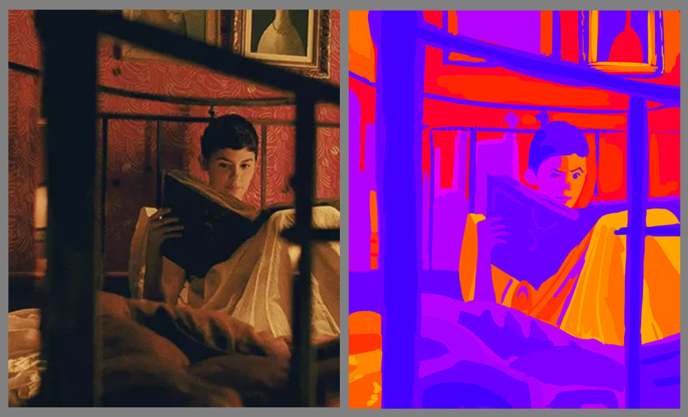
kind of weird painting exercise today; make the painting using only fully saturated colours with 100% brightness. It's basically a value exercise again, the image is kind of painful to look at but if I nudge the saturation down just a little bit it looks ok.

Posts: 1,109
Threads: 18
Joined: Apr 2014
Reputation:
68
Kind of got out of my slump now, if I just keep drawing through it eventually I hit some kind of mini success which gives a good feeling and makes me motivated again. All about those neurotransmitters.
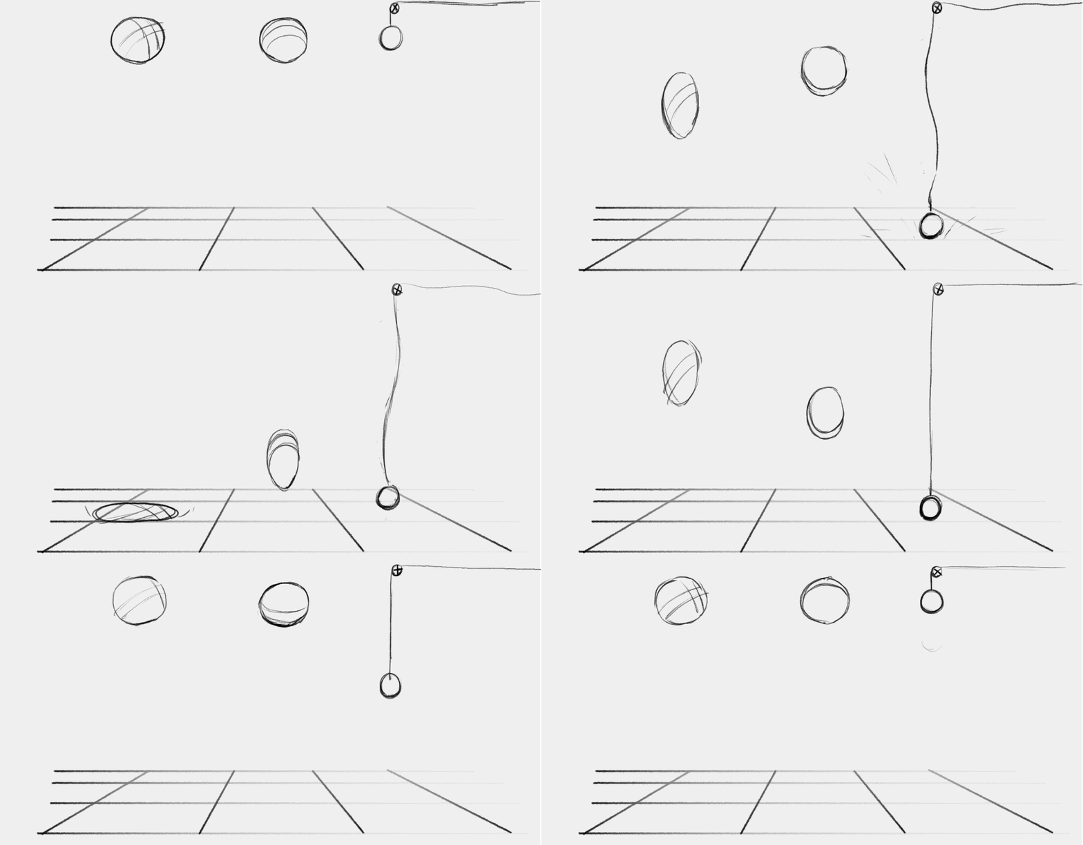
Started learning 2D animation, got a load of new fundamentals to master. This exercise was to do three different types of ball. Looks kind of wacky but I think I met the goals.

Study

Painting exercises
Selective stauration:

Change the hue:

Changes to hue/sat/value

Not getting as much out of these painting exercises as before which the results probably show. Will keep going with them.
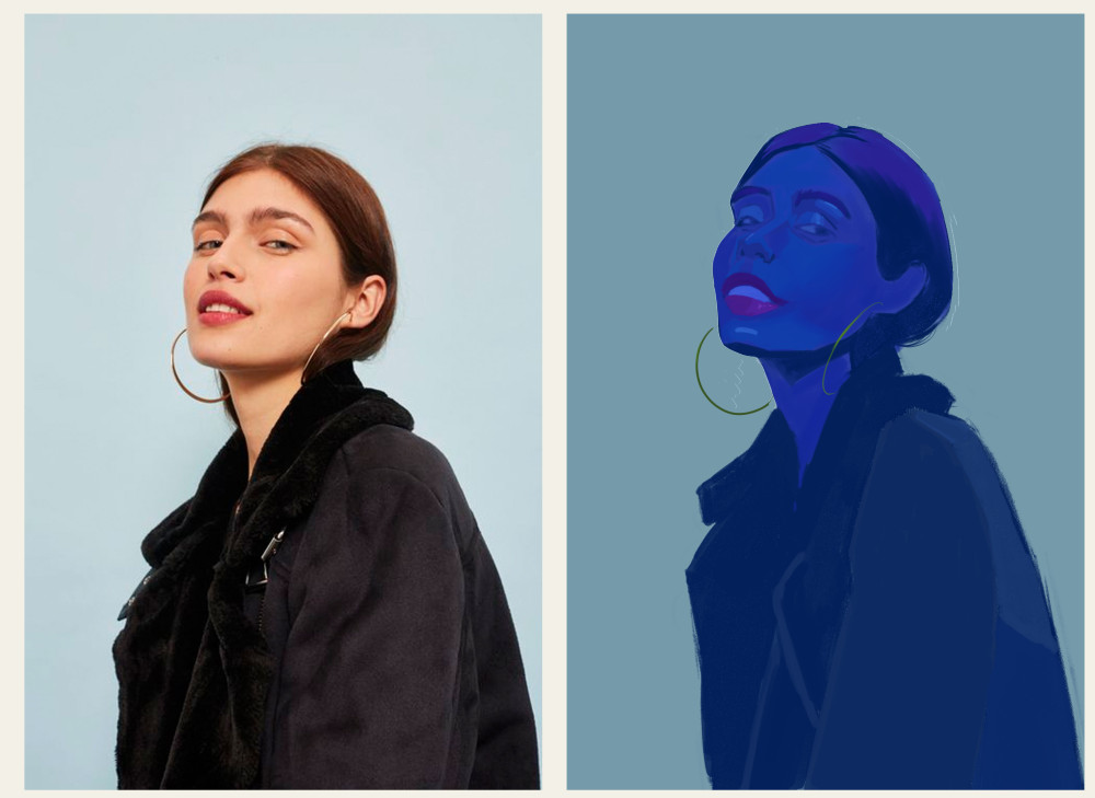
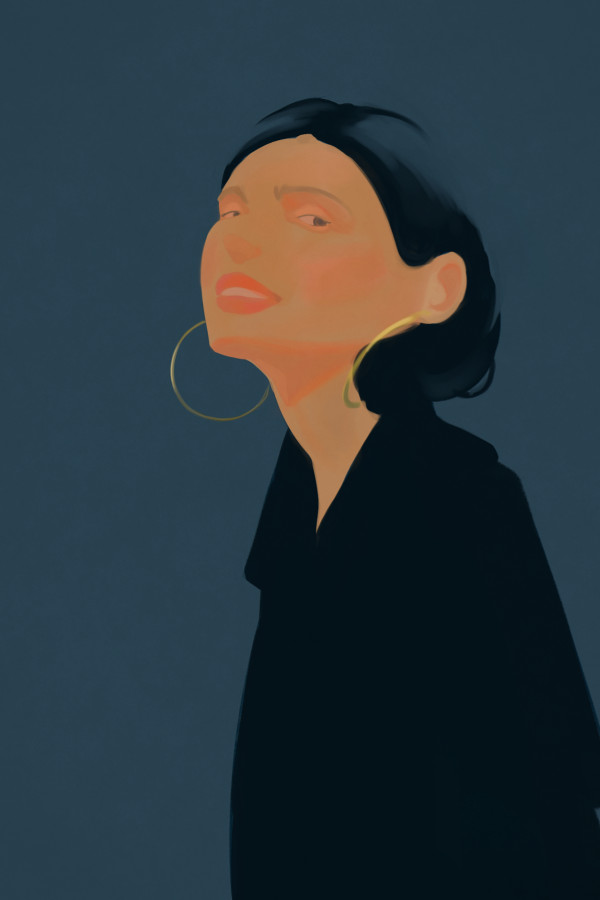
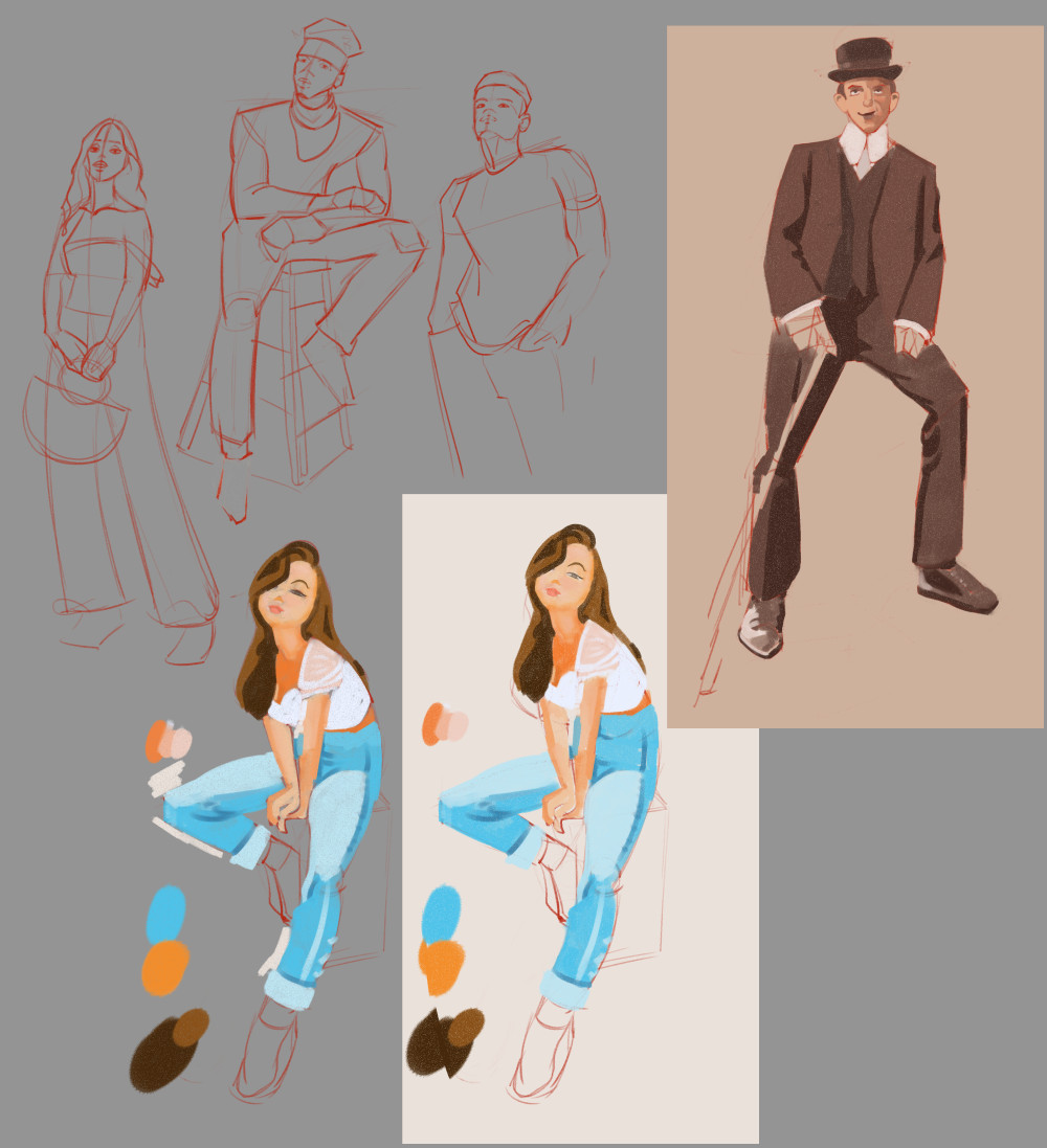
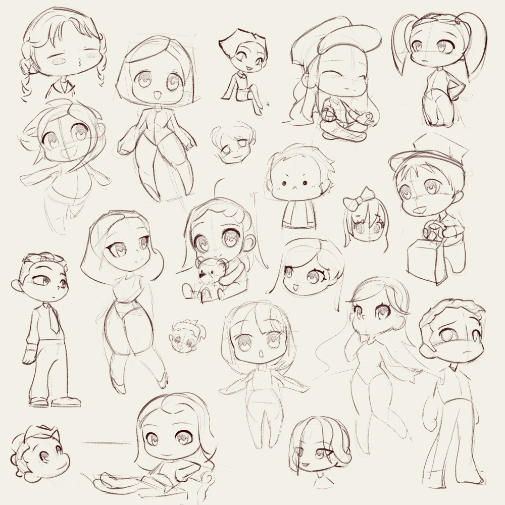
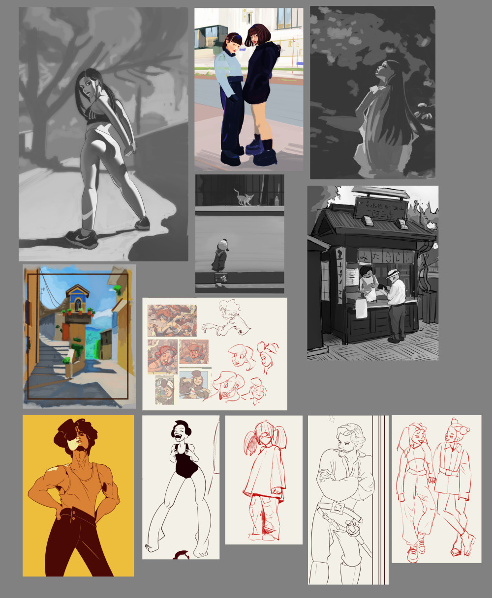
random character experiments and doodles:


|


![[Image: po_for_jyonny_novice_by_andrew_gibbons_d...NR6ClLcGCU]](https://images-wixmp-ed30a86b8c4ca887773594c2.wixmp.com/f/0444150d-aa18-4a8b-98b7-520f91088ed5/de8jdb6-b984661c-20d5-499a-ab33-b5b9fc024cf2.jpg/v1/fill/w_1095,h_730,q_70,strp/po_for_jyonny_novice_by_andrew_gibbons_de8jdb6-pre.jpg?token=eyJ0eXAiOiJKV1QiLCJhbGciOiJIUzI1NiJ9.eyJzdWIiOiJ1cm46YXBwOiIsImlzcyI6InVybjphcHA6Iiwib2JqIjpbW3siaGVpZ2h0IjoiPD04NTMiLCJwYXRoIjoiXC9mXC8wNDQ0MTUwZC1hYTE4LTRhOGItOThiNy01MjBmOTEwODhlZDVcL2RlOGpkYjYtYjk4NDY2MWMtMjBkNS00OTlhLWFiMzMtYjViOWZjMDI0Y2YyLmpwZyIsIndpZHRoIjoiPD0xMjgwIn1dXSwiYXVkIjpbInVybjpzZXJ2aWNlOmltYWdlLm9wZXJhdGlvbnMiXX0.DyIxVhVLRCtjz6LlKc9QBo3P6NFPSQcp-NR6ClLcGCU)


![[Image: cafa8a5c05101d9648608af503f04a3c.jpg]](https://i.pinimg.com/originals/ca/fa/8a/cafa8a5c05101d9648608af503f04a3c.jpg)
![[Image: 094946afa08c7b7c11786448eb77e17f.jpg]](https://i.pinimg.com/originals/09/49/46/094946afa08c7b7c11786448eb77e17f.jpg)


![[Image: dea28cu-99e799fb-8d61-427e-a064-83b55009...FCvwOJHaMU]](https://images-wixmp-ed30a86b8c4ca887773594c2.wixmp.com/f/0444150d-aa18-4a8b-98b7-520f91088ed5/dea28cu-99e799fb-8d61-427e-a064-83b550094e26.jpg?token=eyJ0eXAiOiJKV1QiLCJhbGciOiJIUzI1NiJ9.eyJzdWIiOiJ1cm46YXBwOiIsImlzcyI6InVybjphcHA6Iiwib2JqIjpbW3sicGF0aCI6IlwvZlwvMDQ0NDE1MGQtYWExOC00YThiLTk4YjctNTIwZjkxMDg4ZWQ1XC9kZWEyOGN1LTk5ZTc5OWZiLThkNjEtNDI3ZS1hMDY0LTgzYjU1MDA5NGUyNi5qcGcifV1dLCJhdWQiOlsidXJuOnNlcnZpY2U6ZmlsZS5kb3dubG9hZCJdfQ.X--W9IqJnpyNzt9Xanj4IVhH45_5EpzpfFCvwOJHaMU)
