Posts: 1,342
Threads: 17
Joined: Jul 2013
Reputation:
45
Is there anything that bugs you about this, anything at all?
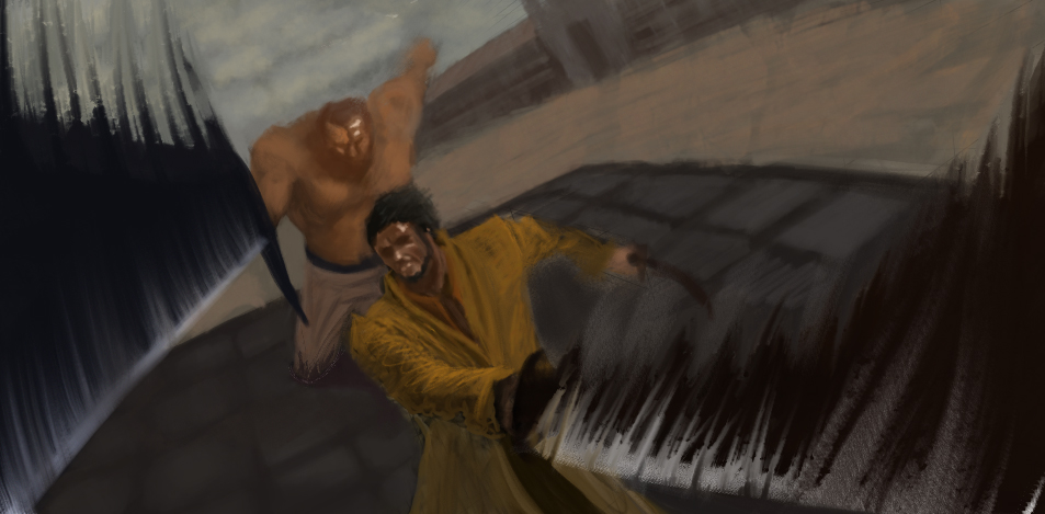
Right now its a wip, I've decided to get some crits before upscaling the image and rendering it out.
Any advice on conveying motion, I know that you should draw motion lines and place white infront of the moving object, but thats about it.
Used a mixer brush for the motion lines.
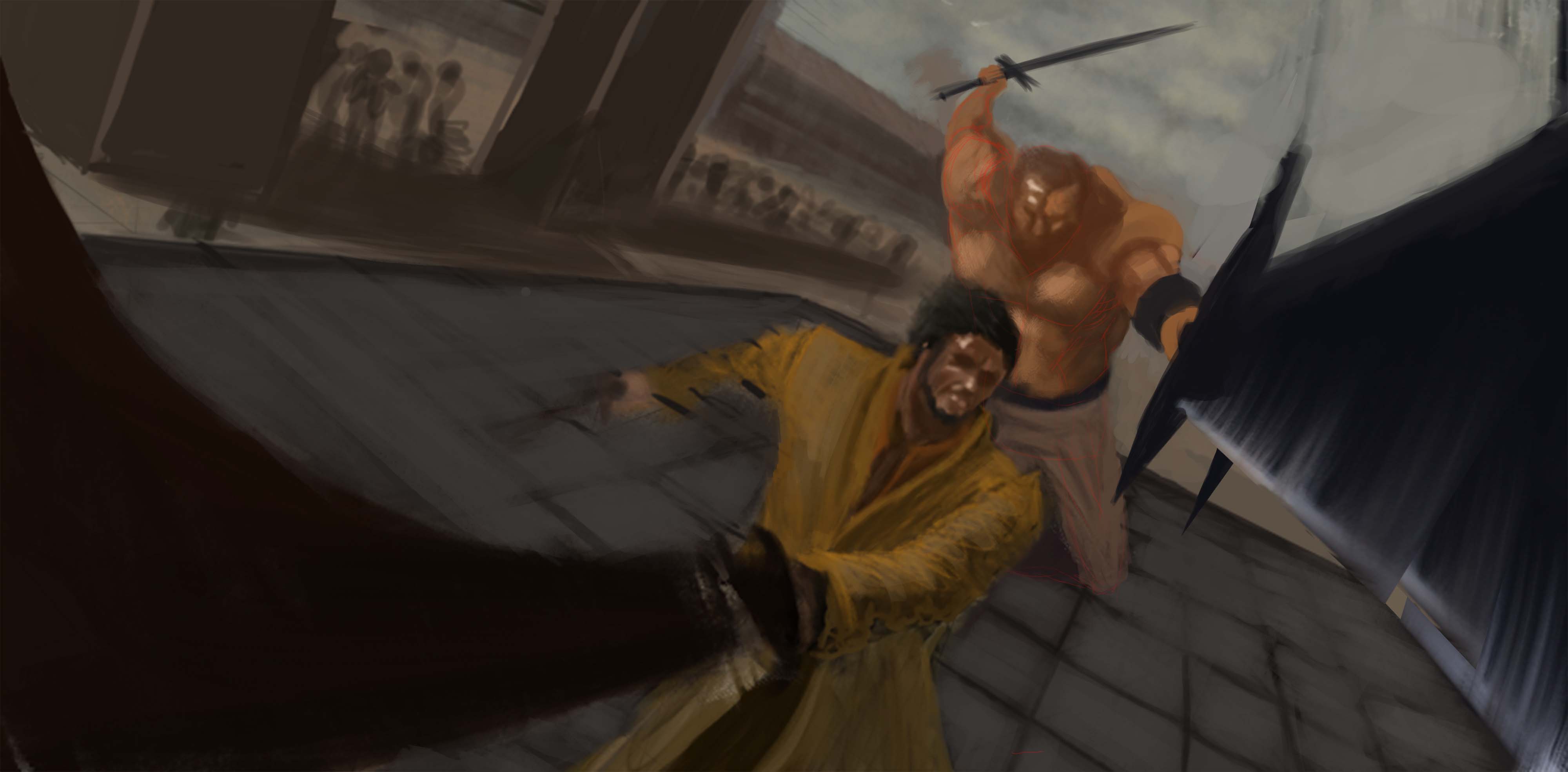
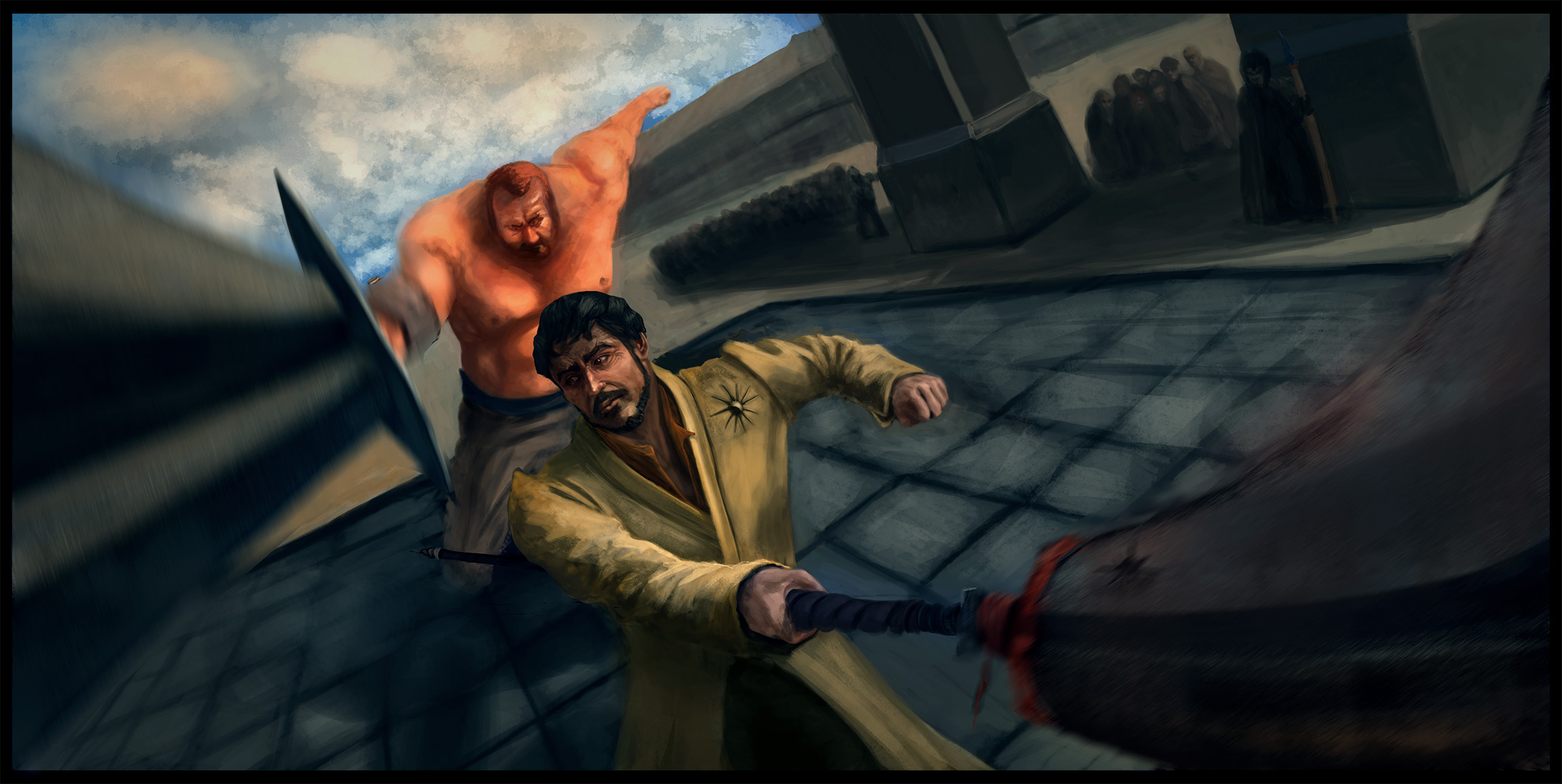
Characters portrayed are "The mountain" and Obyrin Martell. I decided to keep the original GoT designs, might build and tweak them around in the render process.

Posts: 307
Threads: 8
Joined: Apr 2013
Reputation:
33
Cant' say much about conveying motion, but i will say that I think you need something in the upper right region. Right now theres nothing there so it becomes very left heavy. You either need to move the characters around, crop the image differently or add something there ( a crowd, some other characters, buildings, horses tents) anything that balance it out better. I would personally consider rearranging your composition first
https://www.youtube.com/watch?v=CgXboIrbKec
^ That critters episode has two crits (first and last, the tentacle monster and the arena fight) that might be relevant for you, check em out and hope that helps!
Posts: 1,342
Threads: 17
Joined: Jul 2013
Reputation:
45
Thanks man :D
I added 2 pillars and a crowd, I've upscaled the image and fixed the perspective errors. Also trying to fix the foreshortened arm on the mountain.

Posts: 414
Threads: 27
Joined: Jul 2013
Reputation:
8
I'm sorry to say this dude but Oberyn fights with a spear. Or at least he does in the book, I doubt they'll change it.
Other than that, this is pretty awesome. I like the perspective, however I'm not so sure about the swords coming at the viewer. I find it a little distracting, but it's a lot better in the second one.
Posts: 1,342
Threads: 17
Joined: Jul 2013
Reputation:
45
Damn, didnt know that since I havent read the books. I got inspired to make this since watching ep7.
Thanks for sharing your opinion. I thought the swords could act as "lines" that draw the viewers eye in the focal point, also I like that effect it creates. Maybe if I render them out and change the values to be less contrasting it will be better.
Edit: Googled "obeyrin spear" which lead me to saw some promo shots from the trailer (that I never watched) and it was so different.
They had armor on, which I never designed because I pictured the duel kind of differently. I feel silly now.
Added spear on Obeyrin's left hand(where the dagger was) that is in middle of cutting the mountain.
To sum it up: Armorless dudes fighting, being ineffective as hell dual wielding weapons that dont quite fit.
I have to learn from my mistakes, next time I got to put in more research time and think about if everything would work realistically.
Still gonna finish that over the top illustration though.
Posts: 414
Threads: 27
Joined: Jul 2013
Reputation:
8
I think one thing that would help the swords is if you maybe blurred the image around the edges. It would still give it a lot of motion but it wouldn't distract the eye as much.
Posts: 1,342
Threads: 17
Joined: Jul 2013
Reputation:
45
Thanks again ZombieChinchilla(where did you get that name?).
I used selection tool and motion blur, it worked.
Heres the final illustration.

Posts: 414
Threads: 27
Joined: Jul 2013
Reputation:
8
Looks pretty sweet, dude! I think the blur did the trick. :)
And haha, I think I came up with my screename when I was like 16 and just have been using it ever since. Lol.
Posts: 342
Threads: 37
Joined: Jan 2013
Reputation:
13
I think the foreshortening is wrong on the mountain- look at the size of the hilt guard and then look at where you are suggesting his hand is- it would be tiny in comparison. look at the head of the guy on our right (forgot his name) and then the hilt guard size, unless it is genuinely three times the size of his head, something is sized wrong there. even if he was reaching further towards us, his arm wouldnt be long enough, and it would mean he would be hitting the guy with the spear with his hand/forearm instead of the sword.
I dont think the mountains sword would be that close to use even if it was huge, and the sword/spear on our right is looking too flexible- more like a brush at the moment. suggesting movement with bending is a great idea, but if you dont follow it through with the second blade edge it looks like a broom. i'd tone down the bend and follow it through with both edges.
perspective on the pillars as well as the wall is off, as the wall seems to curve towards the mountain (i know hes big but debatable how large his gravitational field is!), and the plane of the pillars facing us seem to be at different angles, like one of the pillars is tilting towards us.
anyways all of that said, youve made a really dynamic composition here, and you have done a great job with rendering faces as well as hands (the most difficult part imo), so you've essentially beasted the hard parts, its just correcting a few proportion errors and perspective errors, which should take long at all. you can make this a great piece so I'll keep an eye on this :D
hope that helps :)
Posts: 1,342
Threads: 17
Joined: Jul 2013
Reputation:
45
Thanks for the in depth crit wardy.
The ridiculously huge sword was inspired by Berserk, but yeah I went wayy overboard with it. :D
As for the perspective issues I was going for a fisheyed perspective and forgot to fix the wall. And I used the third vanishing point below the image, I quess I should have put it above.
Yeah I messed up the spear holding hand and took some refs in real life of me holding stuff at the same angle.
I wont be returning to this illustration(srry), because I kind of hated working on it by the end. There are tons of lighting, anatomy, rendering etc. issues some I dont quite notice but they are there. I did learn quite a bit and went out of my comfort zone so thats a win in my book :).
Posts: 342
Threads: 37
Joined: Jan 2013
Reputation:
13
no worries, yeh big swords are fun!
oh ok fair enough, perspective is a bitch.
dont worry about it mate, i definitely know the feeling of just wanting to put a piece to rest, if you've learnt stuff and gone out your comfort zone then thats an epic win, great work :)
good luck with exams btw! i got 3 left, one tomorrow :S
|
