Posts: 111
Threads: 2
Joined: Jul 2013
Reputation:
7
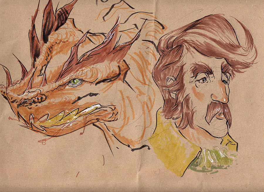
OK going to have a shot at one of these. Hoping the image attachment works.
Edit:
Figured I probably ought to add in a bit of info about me on this first page.
Got serious about practising and improving my art about 2 years ago, but I've always been painting/drawing a bit as a hobby so it wasn't a total jump into the deep end. I'm actually a physics graduate of all things, so doing this was kind of a crazy about turn from that.
Right now I'm working on building a portfolio and of course just kicking my skills up a notch. My focus is characters and creatures but I tend to mess around with organic stuff as whole. Hoping to branch out with experimenting with different stuff like sci-fi, animation or 3D once I have a decent portfolio together too.
Outside of art I enjoy gardening, anime and perhaps the odd videogame too.
/Edit
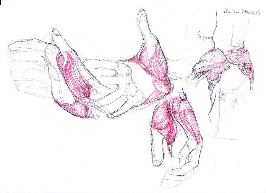
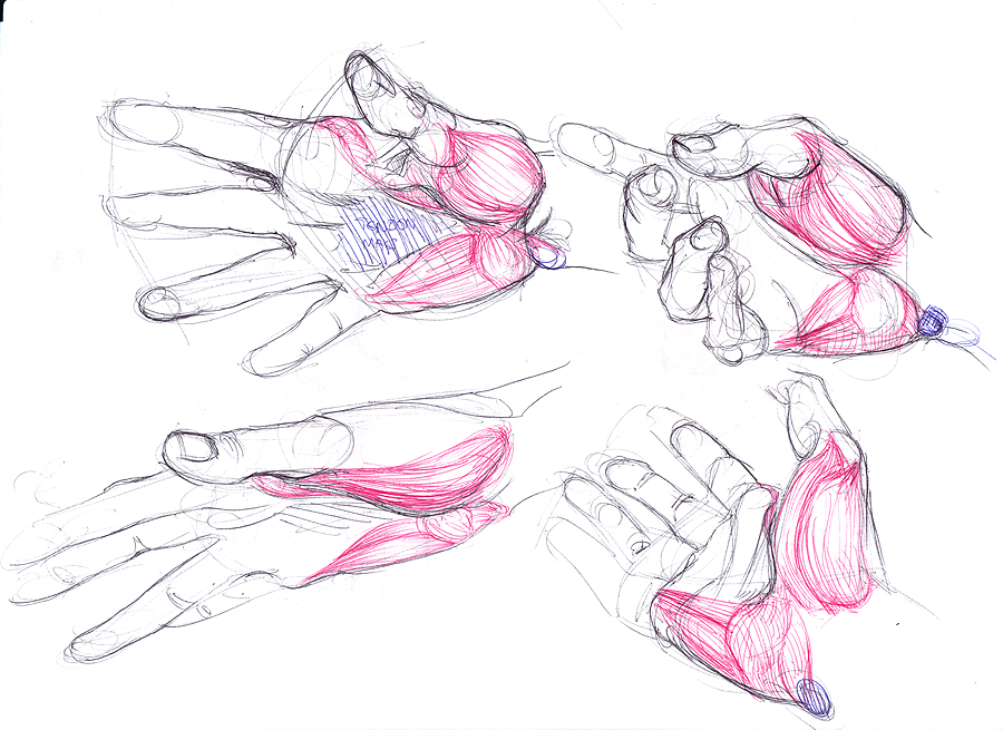
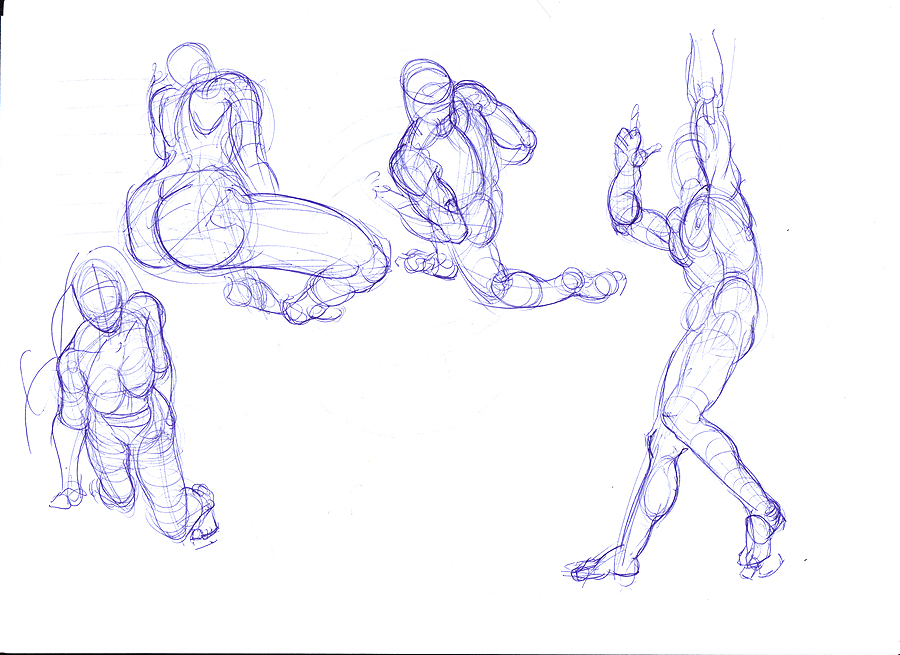
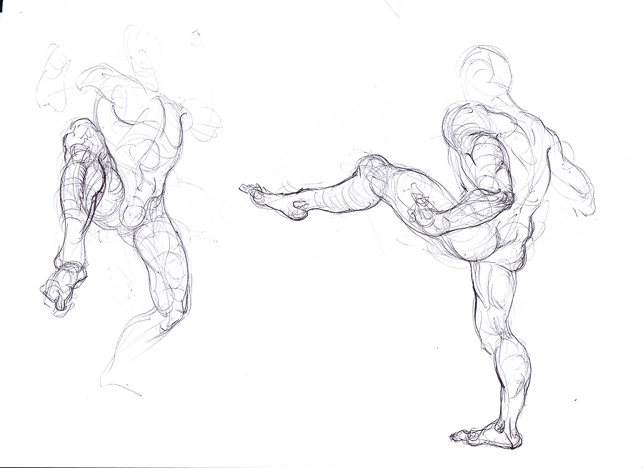
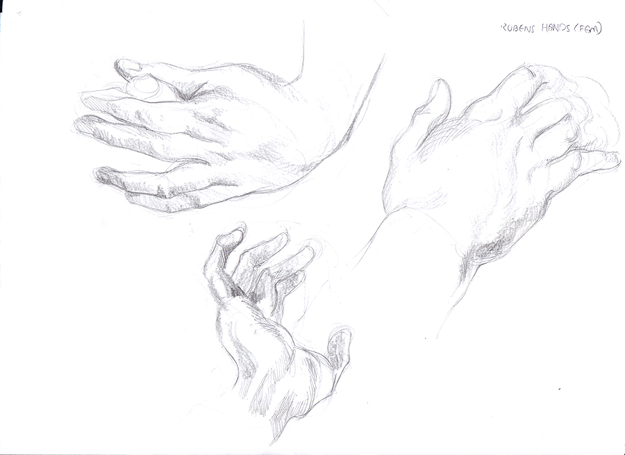
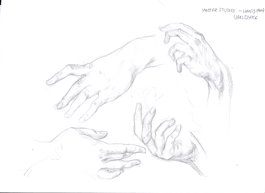
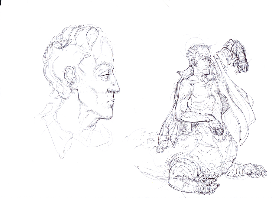
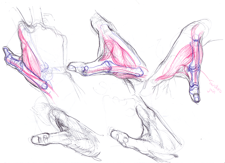
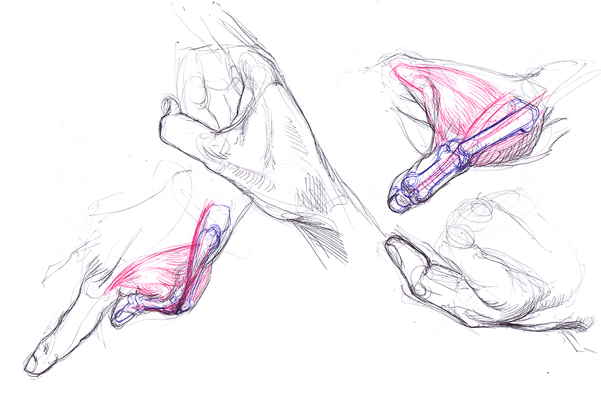
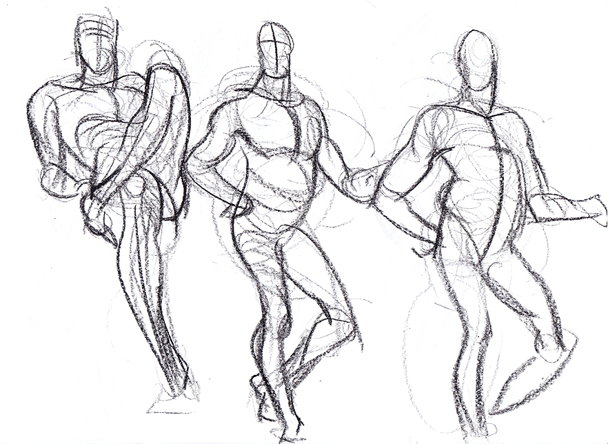
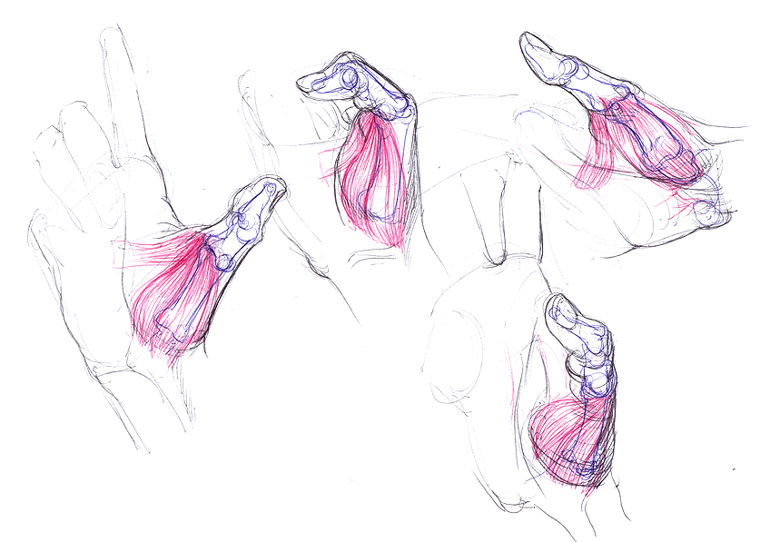
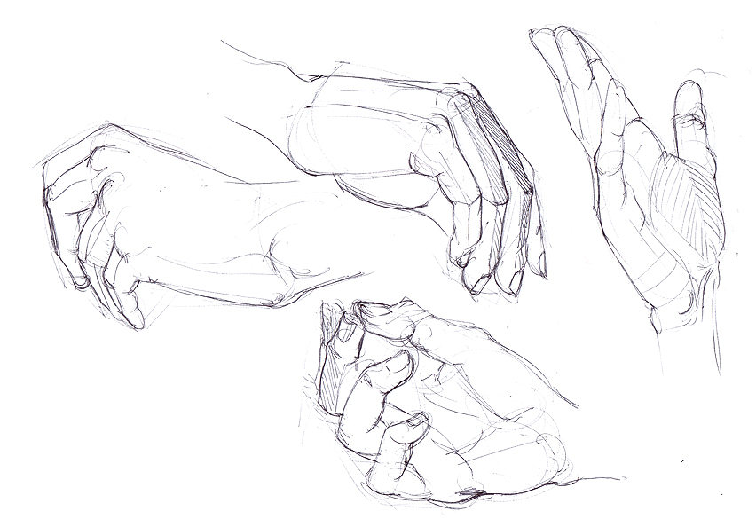
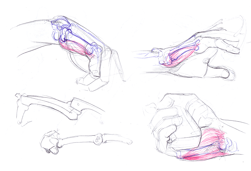
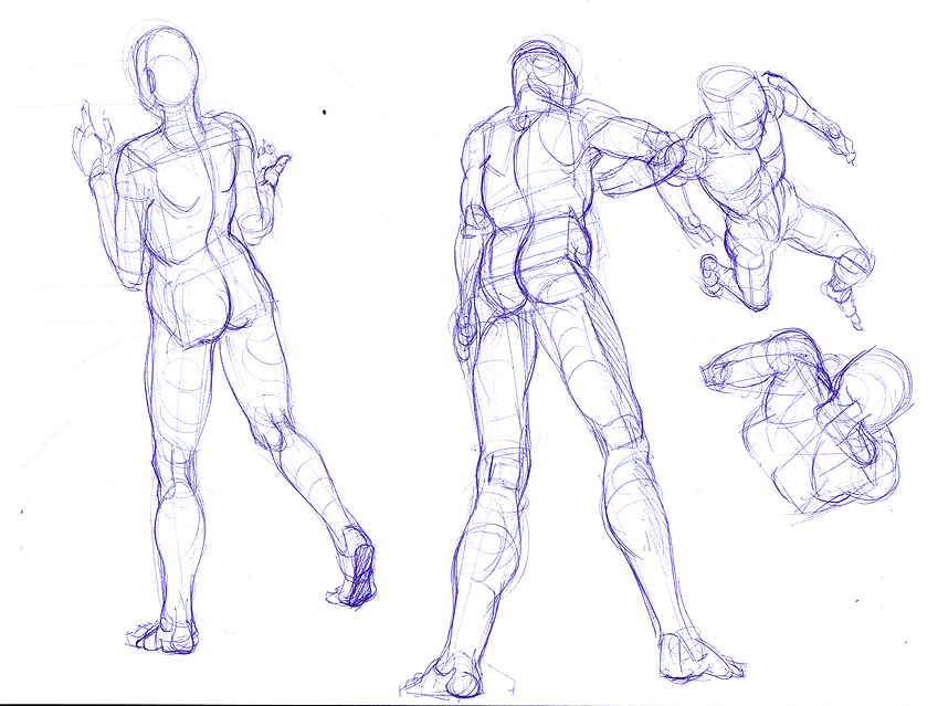
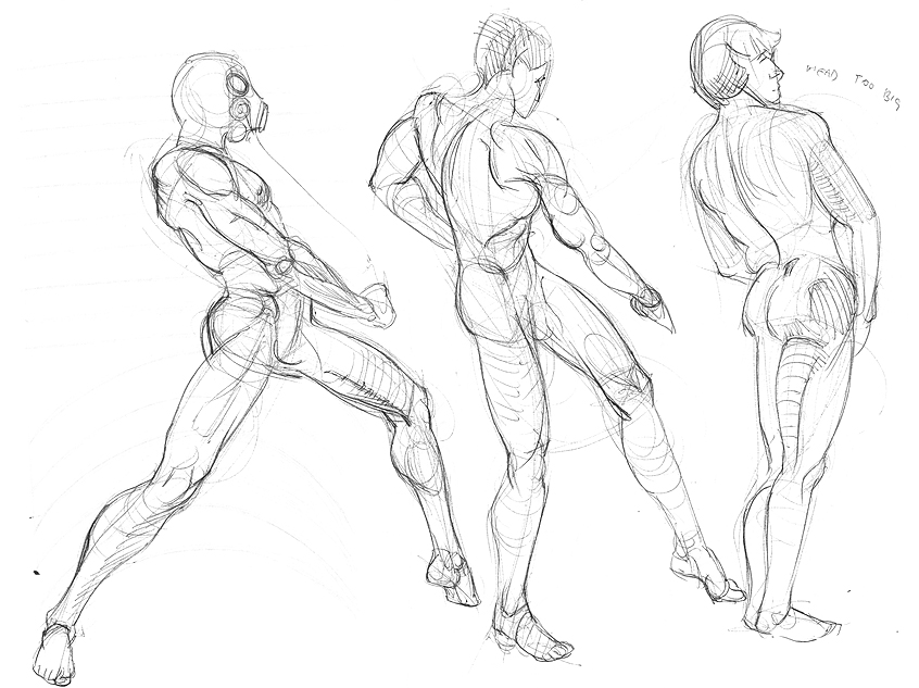
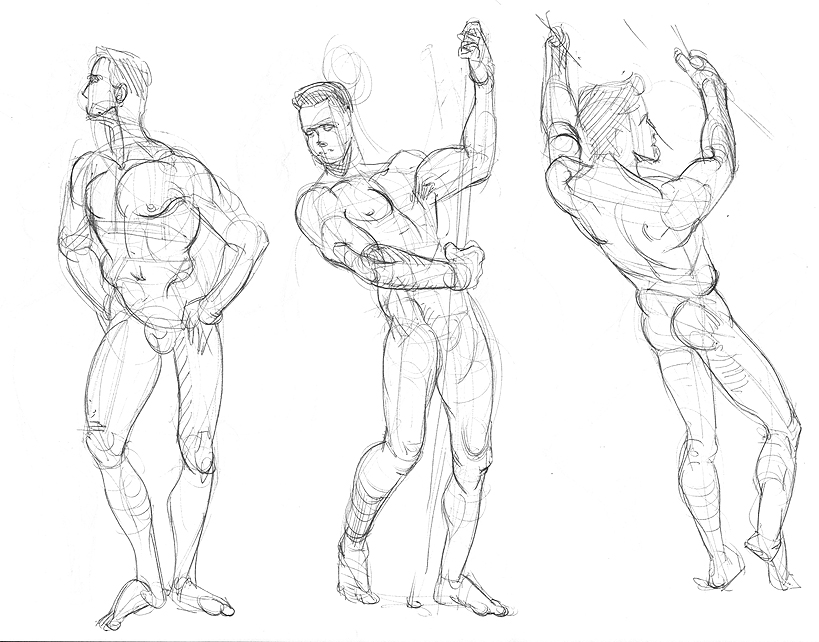
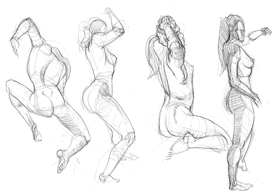
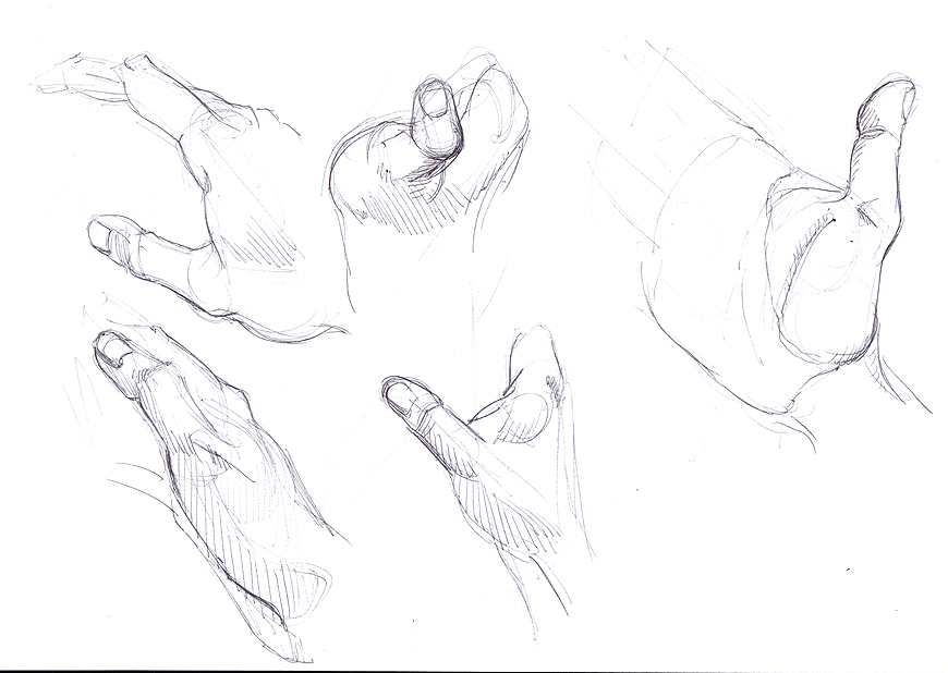
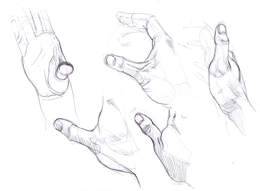
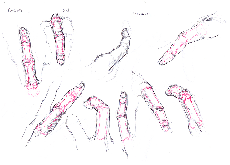
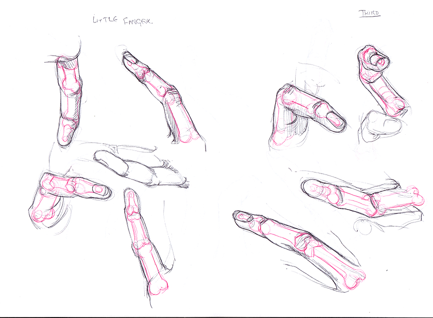
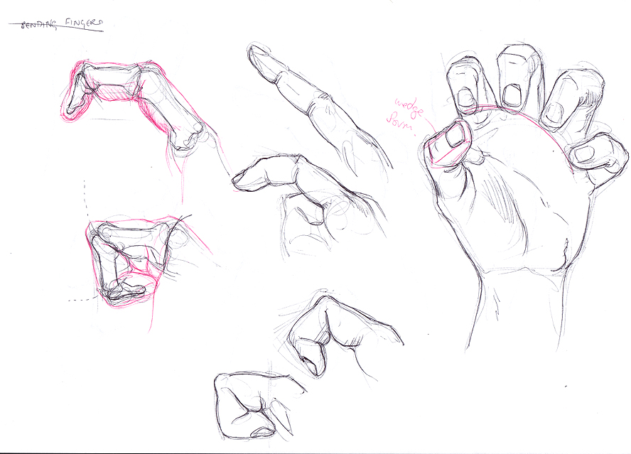
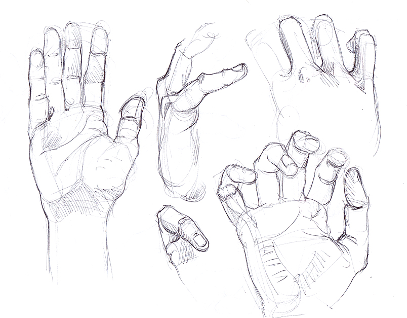
Starting off with some anatomy studies (working from Bridgman as reference to do muscle studies from photos/life, and some memory studies of legs done to warm up). Literally working through the whole book again to do these studies from photos - right now I am up to the hands section so here are some palmar muscle sketches.


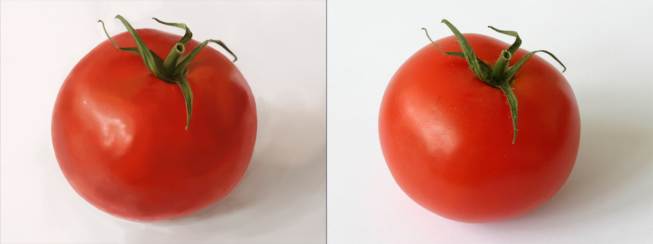
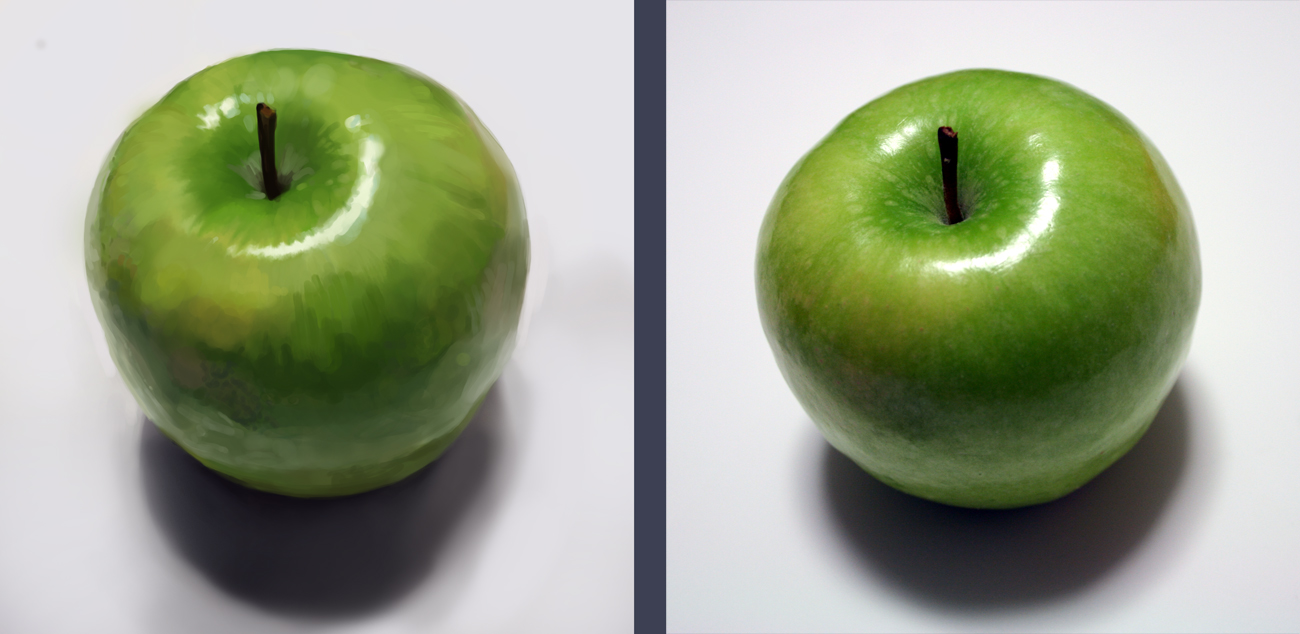
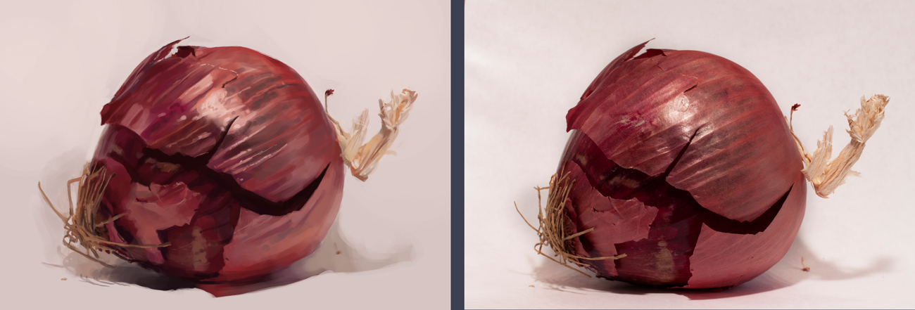
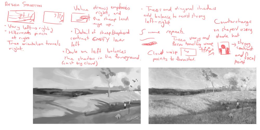
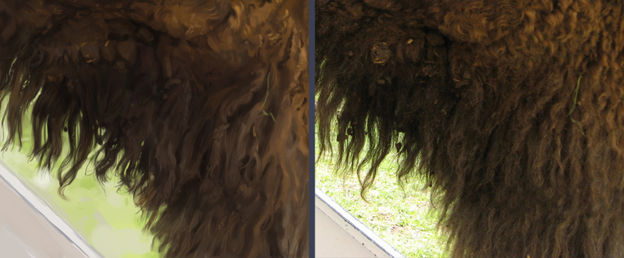
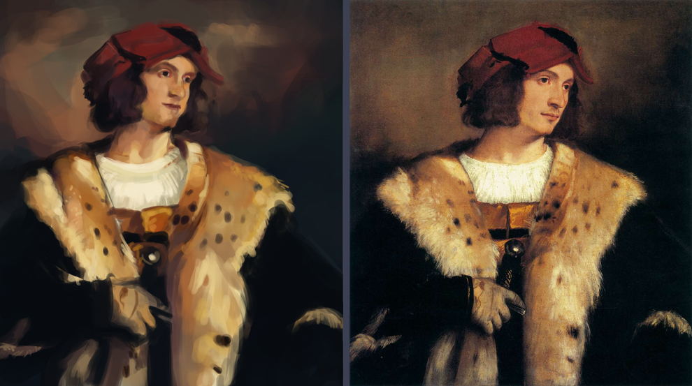
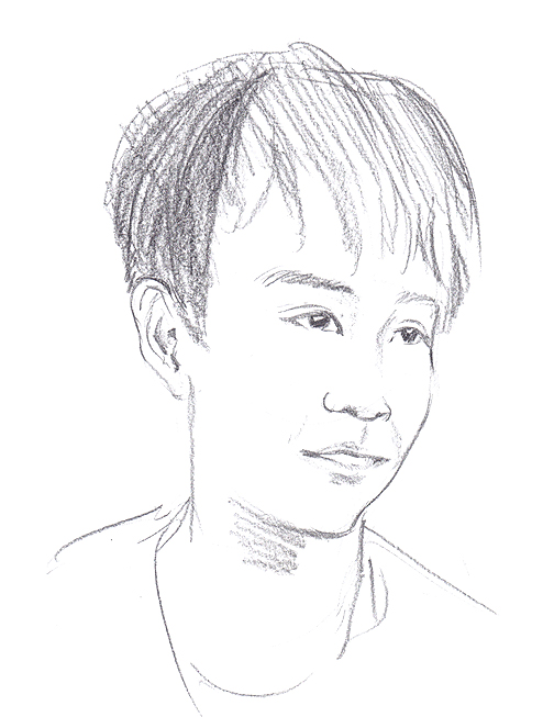
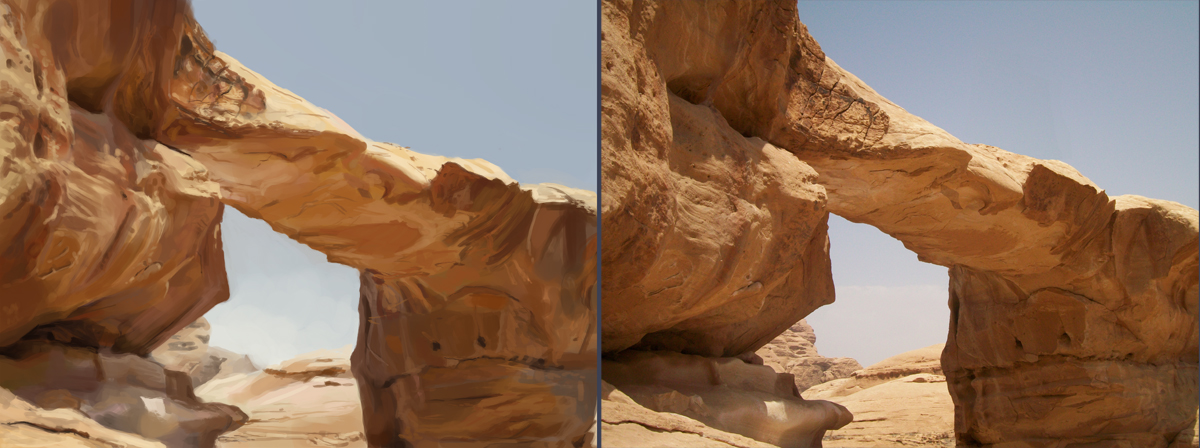
And a few photostudies from the last three days - doing the 2 hour study challenges from the photostudy group on dA. Really need to get back into doing these more often, I am so rusty with the visual measuring.


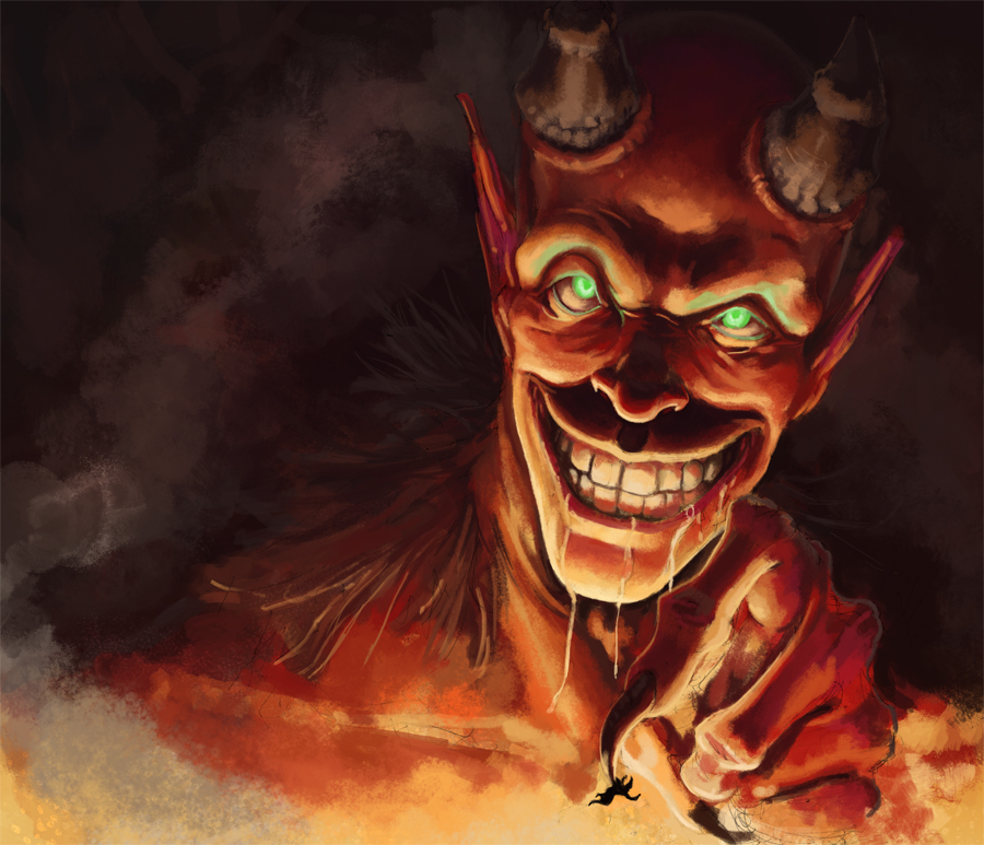
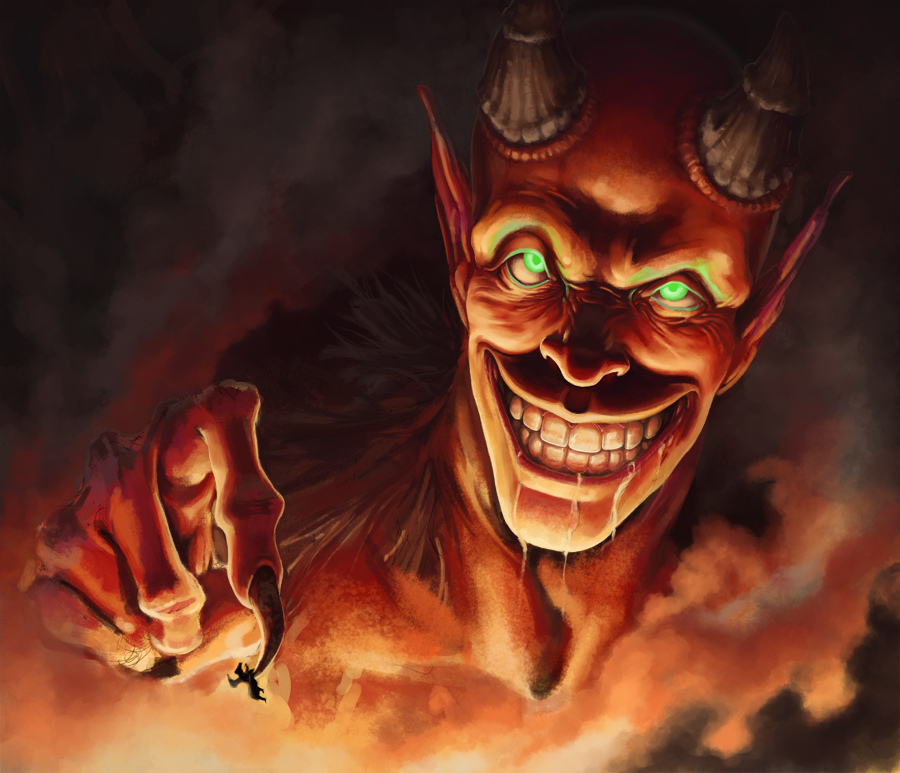
Finally a couple of WIPs of a picture I'm working at. Had a major re-haul of the composition for this today.


Posts: 307
Threads: 8
Joined: Apr 2013
Reputation:
33
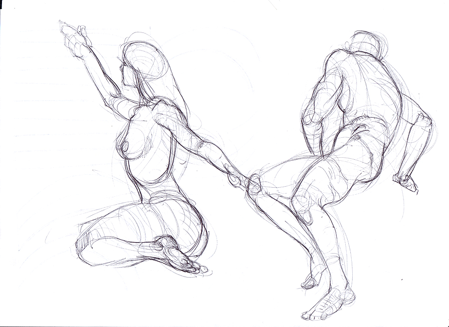
Love your line quality on the figure drawings
Also, I wouldn't worry too much about being 100% precise on the photostudies. Unless its a personal goal to be able to match it almost 1:1, theres no real benefit from trying to be ultra precise. As long as the impression or the important bits are well done (colour, volume, shape etc) , the "likeness" isnt really useful as information.
Posts: 111
Threads: 2
Joined: Jul 2013
Reputation:
7
Posts: 111
Threads: 2
Joined: Jul 2013
Reputation:
7
Posts: 654
Threads: 4
Joined: May 2013
Reputation:
22
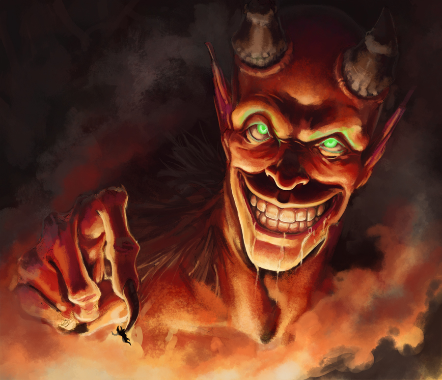
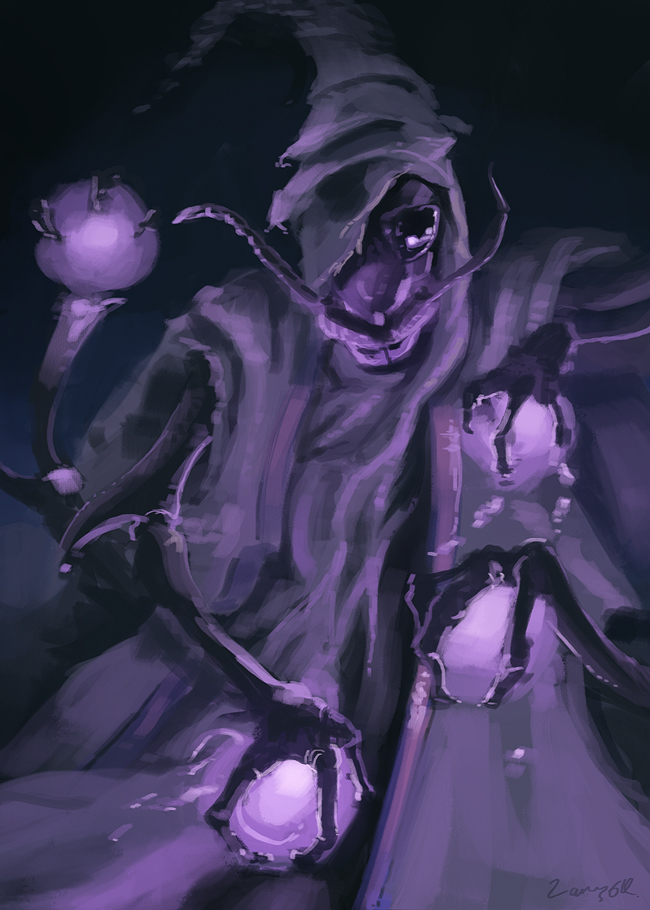
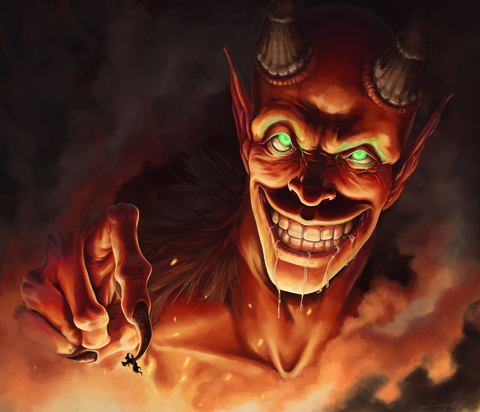
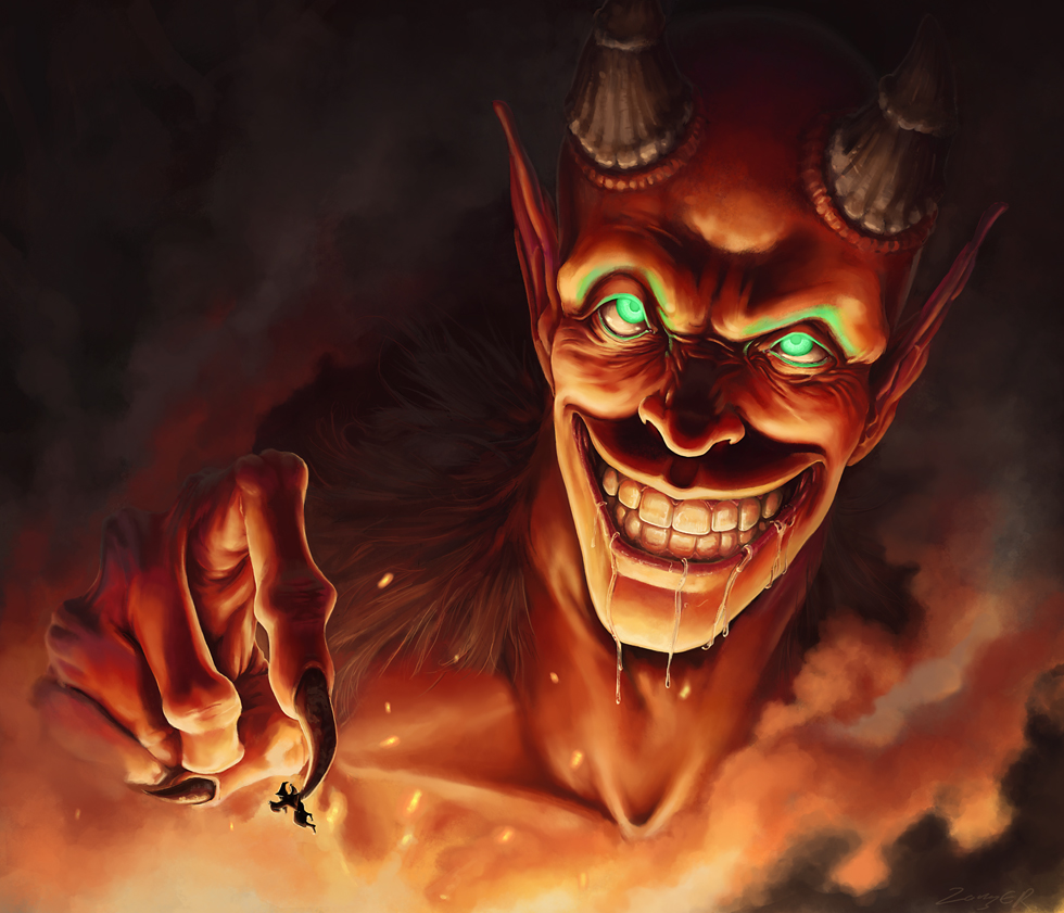
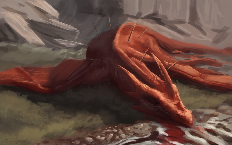
Really awesome stuff here man, I dig the demon picture alot, looks alot better after you changed the hands position.
Posts: 111
Threads: 2
Joined: Jul 2013
Reputation:
7
Posts: 374
Threads: 16
Joined: May 2013
Reputation:
59
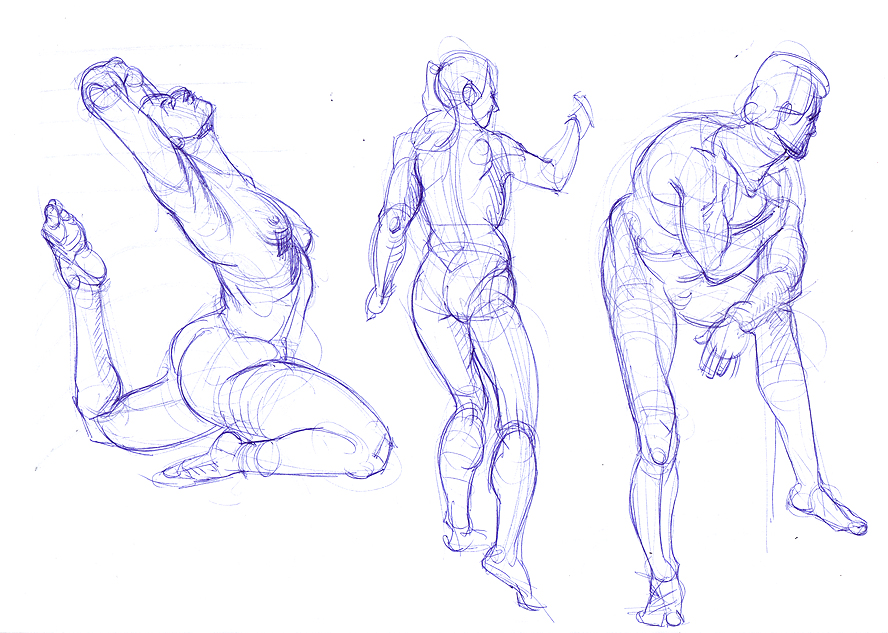
Cool stuff. Looking at your figures, some of them appear a little wobbly. You said you where studying Bridgman so maybe try and apply a bit more his method for constructing the human body to your photo studies. It really comes in handy to simplify things the way he does because it's easier to apply what you've studied to your work from imagination.
Apart from that, just keep on studying! Looks good!
Discord - JetJaguar#8954
Posts: 465
Threads: 2
Joined: Mar 2013
Reputation:
18
Nice stuff! I was gonna say about the same as Tristan, I think building your figures and drawings from simpler shapes like boxes or spheres and cylinders and then drawing the more complex organic forms over them would give you a better result
Posts: 2,817
Threads: 15
Joined: Jun 2013
Reputation:
109
great drawings man; really really solid stuff! i even saw you drew me up there with my buddy the sloth! Keep doin what you're doing, you have some fun ideas as well :)
Posts: 26
Threads: 1
Joined: May 2014
Reputation:
0
I'm sorry of not having had the time to comment before! I really like your ballpoint sketches, especially the hands look very awesome~! You might want to try experiment with textures (and texture brushes), I see in a lot of (photoref) paintings you do, they often lack the variety of textures you might expect. They look really solid and accurate, but giving them more texure would give them a lot more life. I love the sushi painting you did for example.
At last I'd say, regarding your hungry joe picture, I am not sure but the rendering seems a bit off. You might want to push the values some more and define the shapes more? Here and there it got some hard edges where the dark and light planes touch each other without much presence of gradient. Also the absence of a clear foreground and background take away from the depth in the picture. Other than that, it looks really cool, the face is so creepy O:
That's as far as I can mention, I hope it helped you a bit. Can't wait to see a next update!
Posts: 111
Threads: 2
Joined: Jul 2013
Reputation:
7
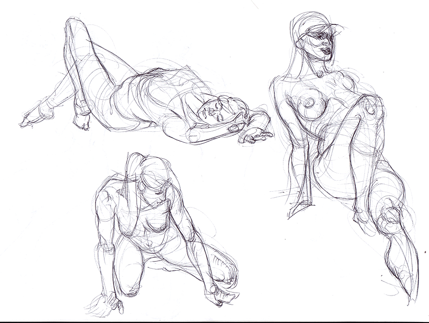
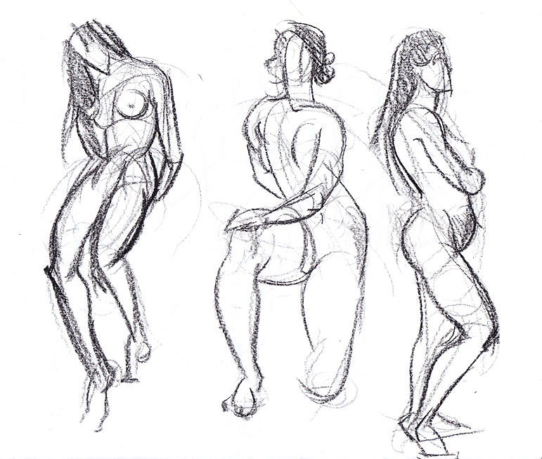
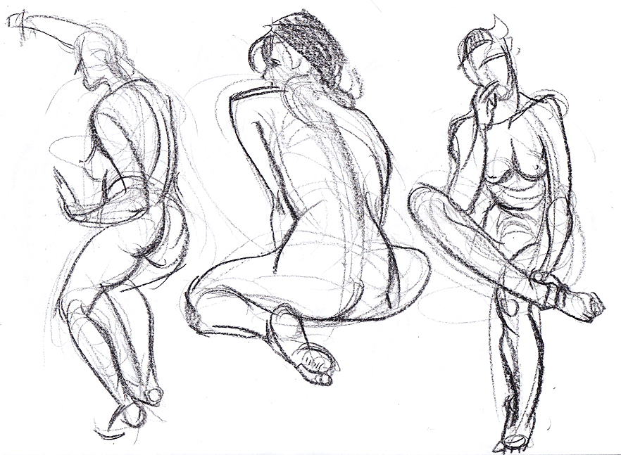
-Tristian Thank you! I've done a few figures in this post with more emphasis on building on large forms.
-Samszym Will do! Recently I've been noticing form is a general weakness in my work, I really need to figure out how to work on it better.
-Fedodika Thanks, haha. Just a matter of combining ideas and practise.
-Eve Thank you! I've been concentrating more on getting colours down, but will definitely try to work on my textures - I think I will have a shot at some longer studies. I also made some tweaks to Hungry Joe. I followed your advice and improved the gradients in the skin, I underestimated the sub-surface scattering I think. So hopefully the forms read a little better. I wasn't really intending to put a background in it, but I have tried to push the depth by forcing his hand further from his body/face using some smoky steam, and pushing the smoke back behind him too.
Not much digital stuff this time. I was up in London yesterday for the doctors and subsequently feeling under the weather today. Hoping to get some good studies and original work done tomorrow.
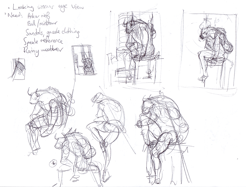
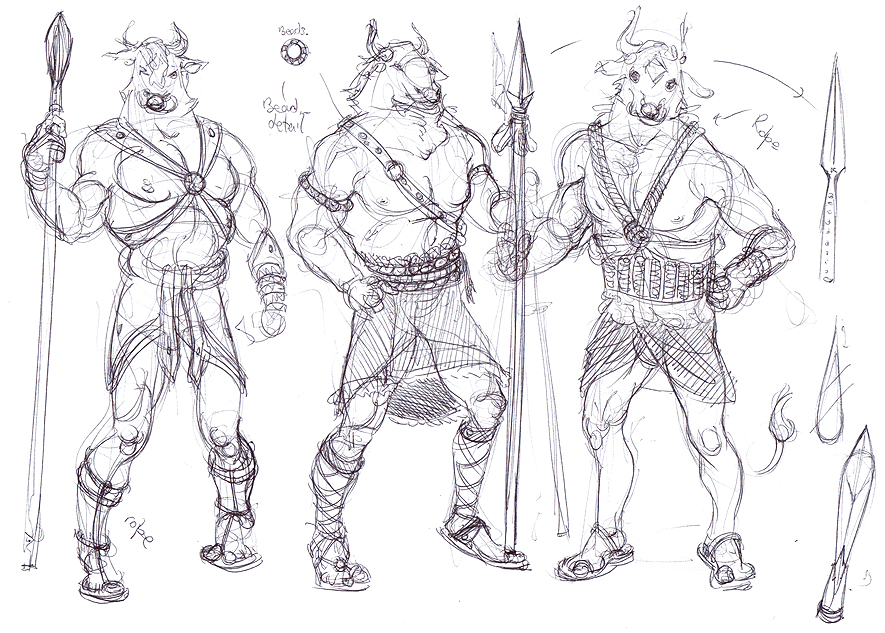
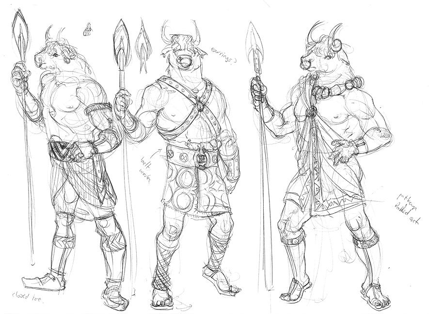
Starting to work on plans for another picture. Going for something with more of an environment this time. Probing some character design too, I think I am going to use some of the stuff further down the post to add to the ideas.


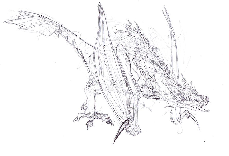
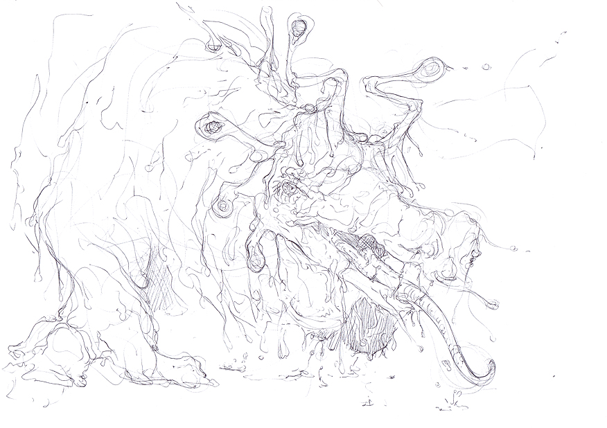
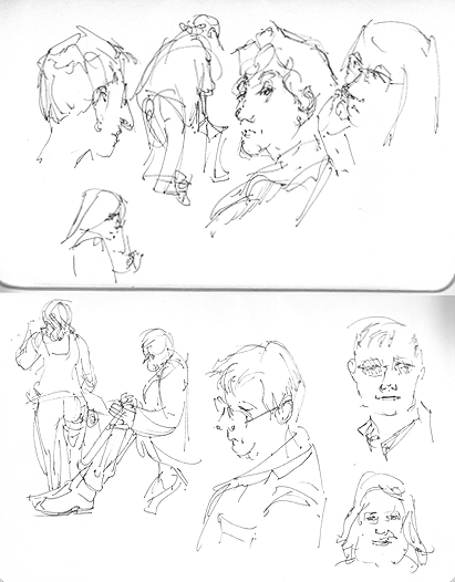
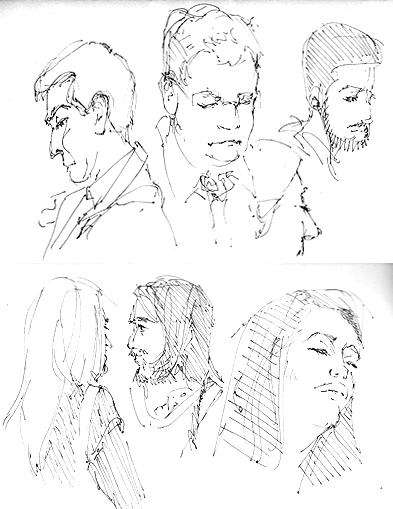
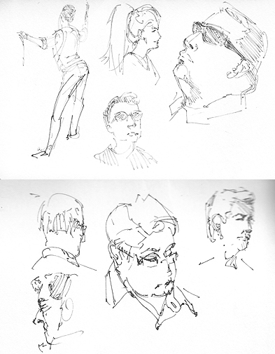
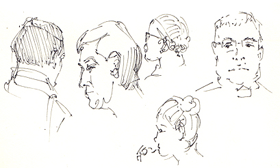
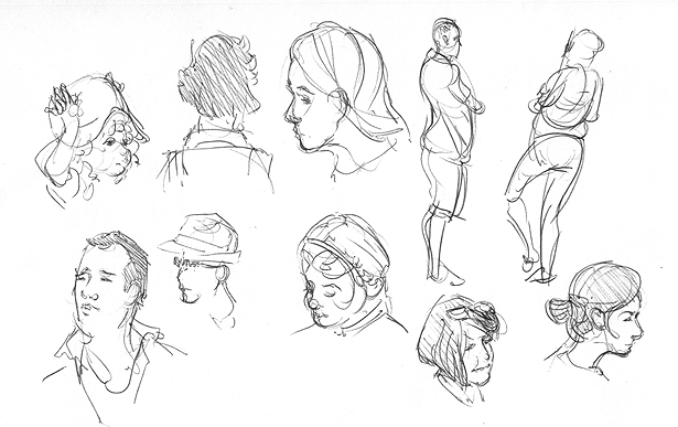
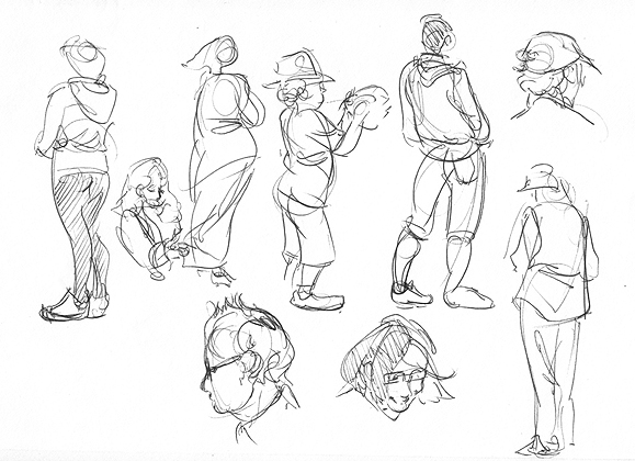
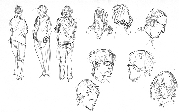
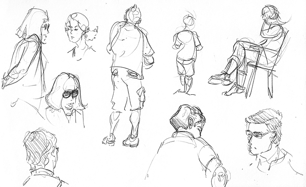
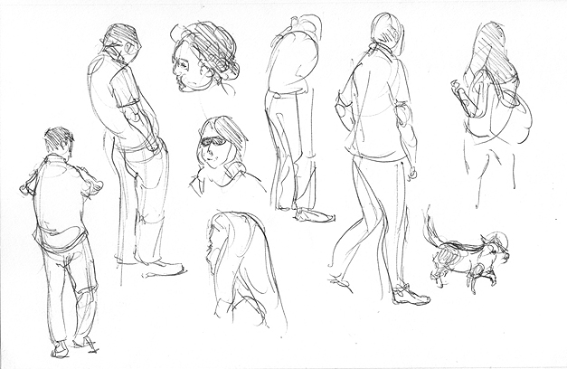
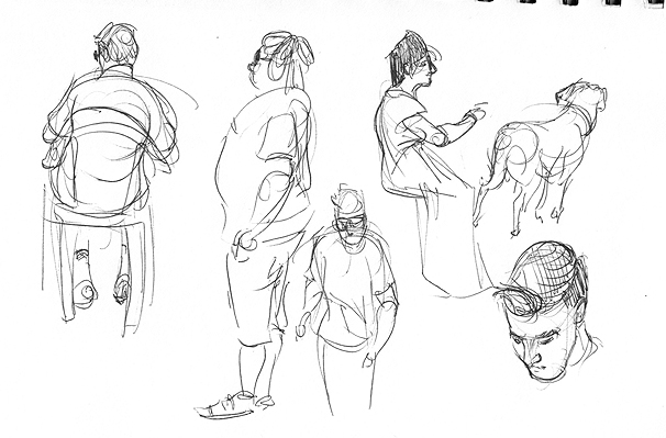
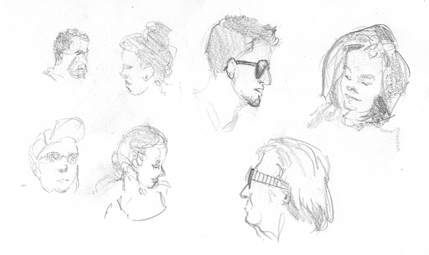
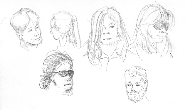
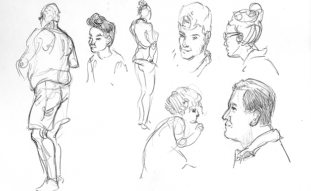
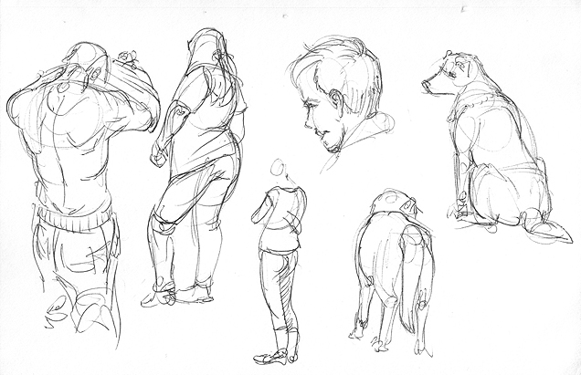
People sketching on the train. Finally made it through my pocket sketchbook. And run out another pen.


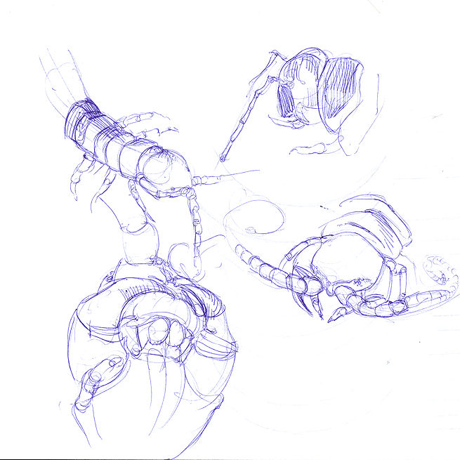
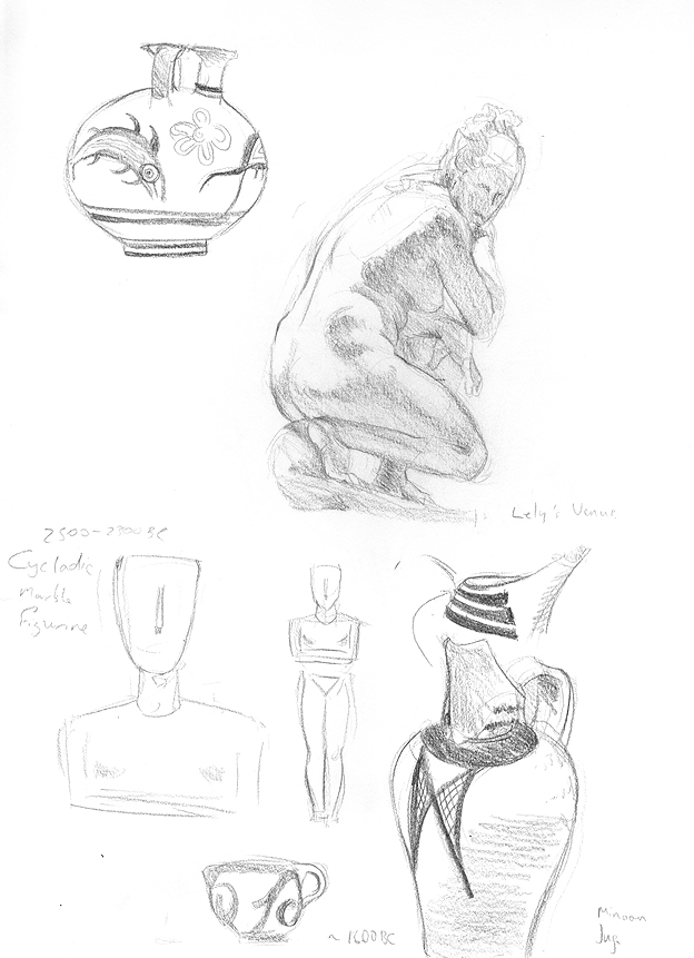
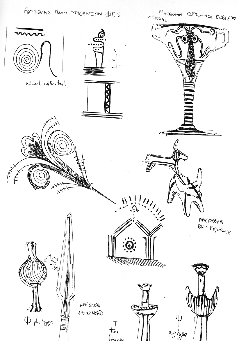
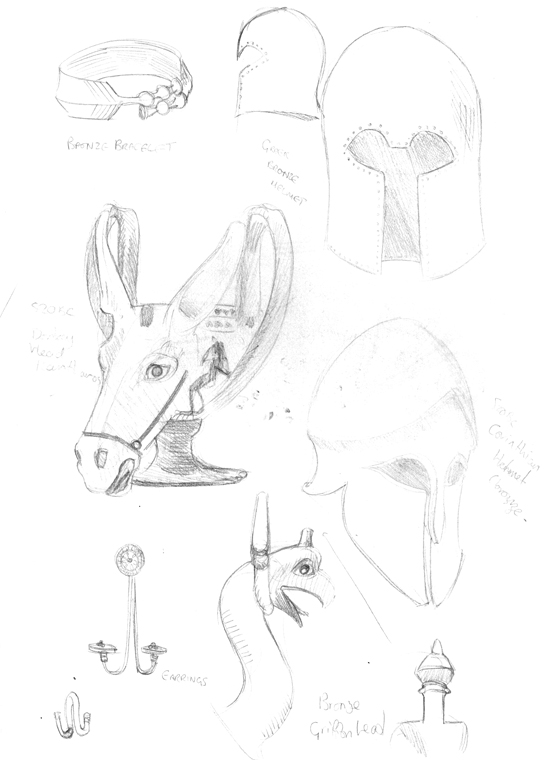
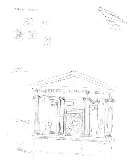
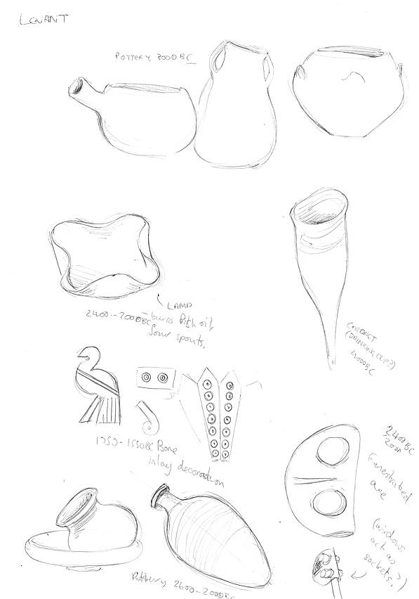
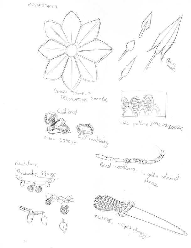
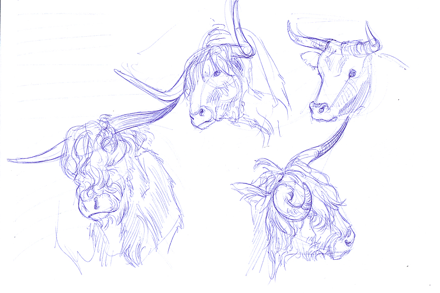
Sketches from the British Museum! Mostly doing these for visual library building (and to get ideas for that design up top), I mainly hung around the Greek and Mesopotamian areas and snatched up patterns/designs. Not the cleanest sketches I'm afraid. Also that donkey cup was creepy as hell and I love it.


More Bridgman


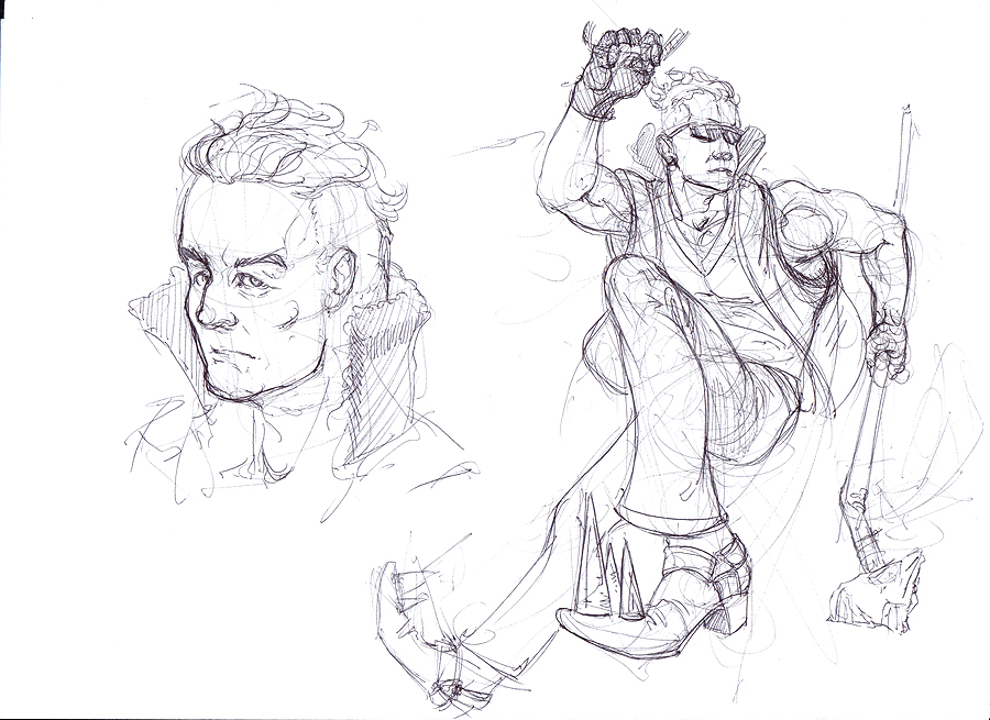
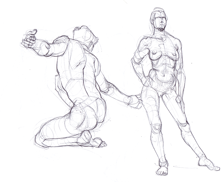
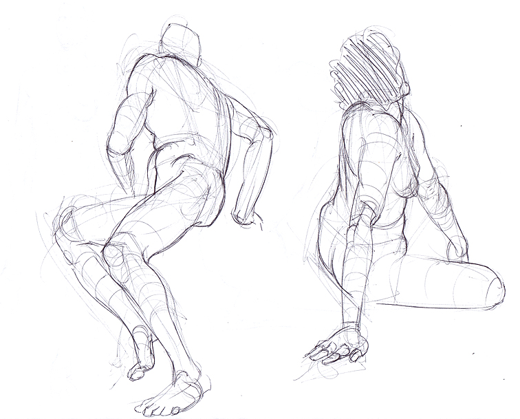
Figures, with more thought put into solid forms.


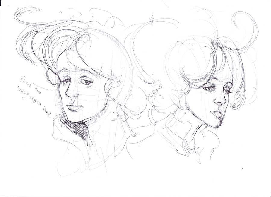
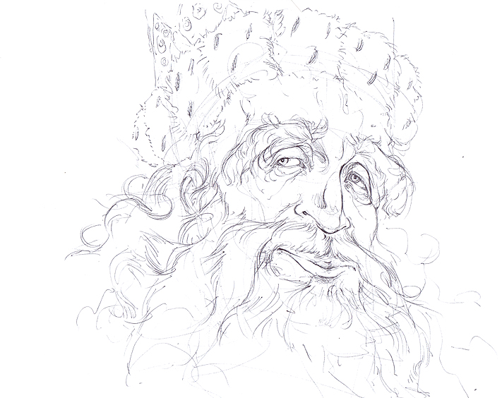
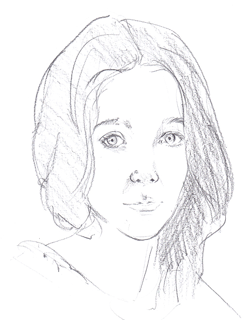
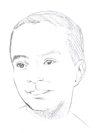
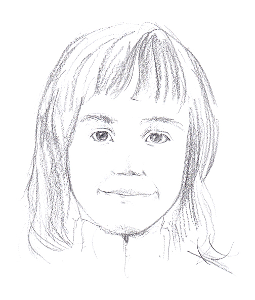
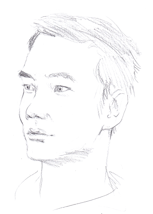
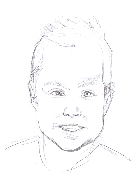
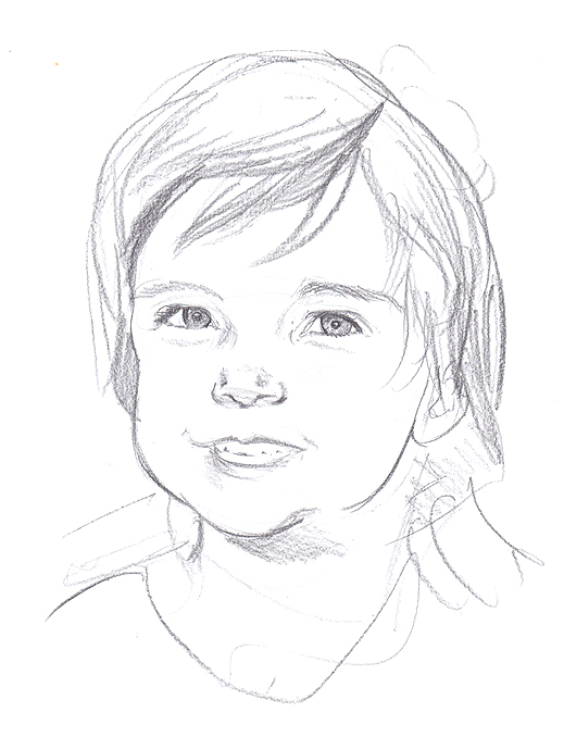
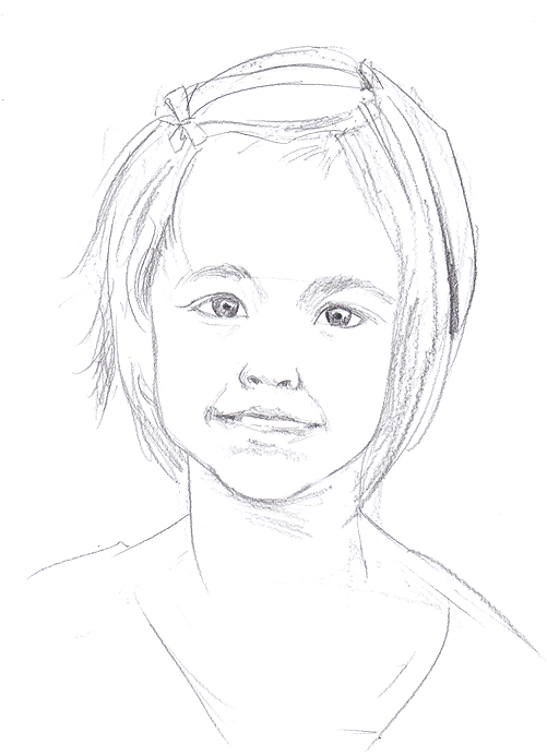
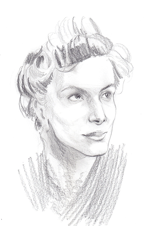
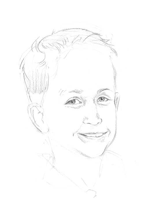
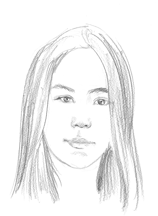
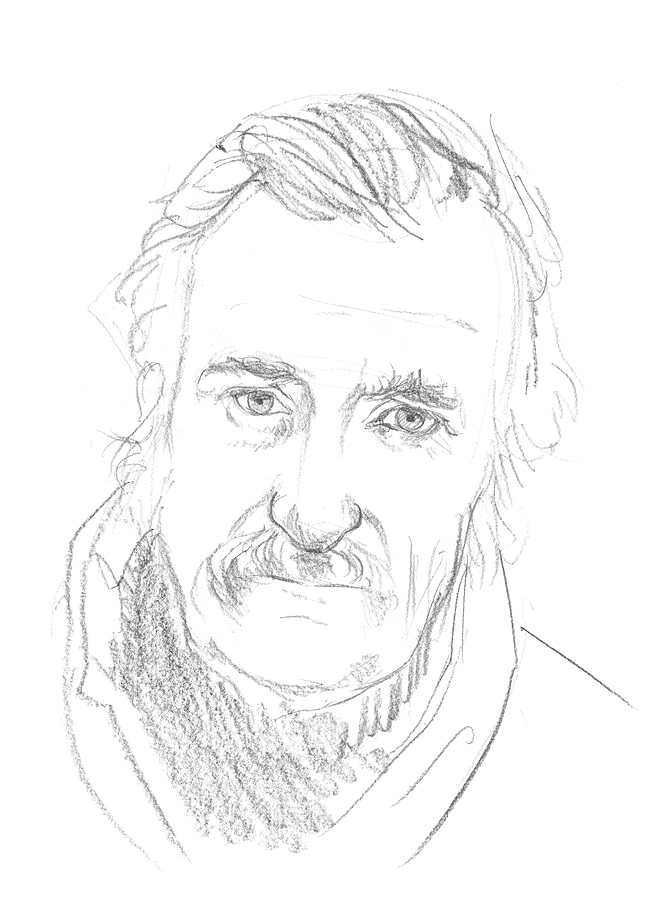
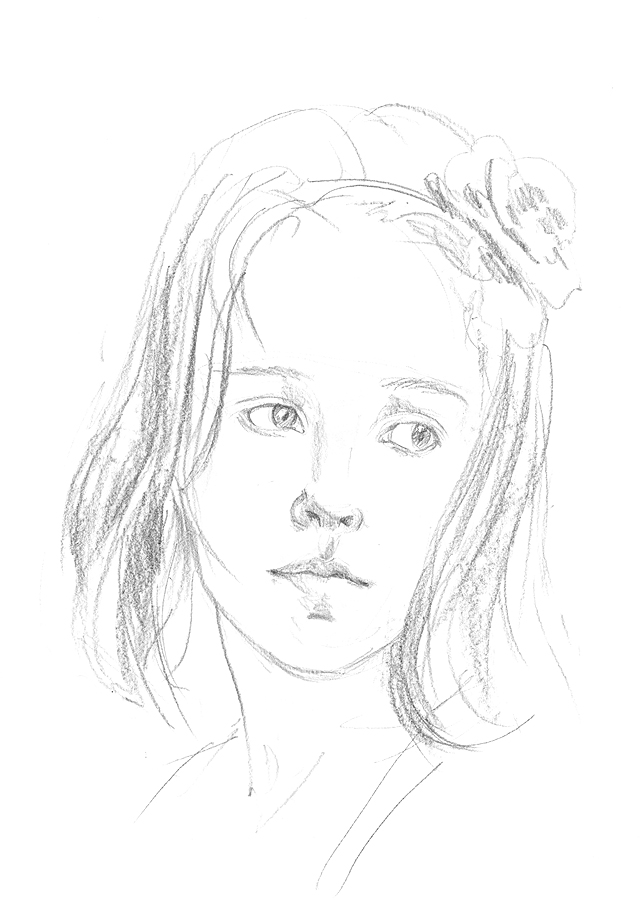
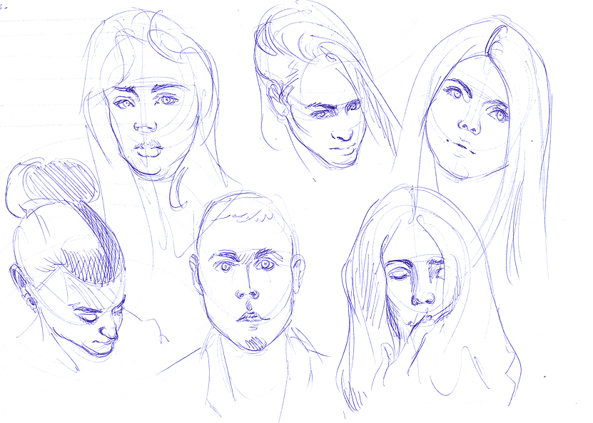
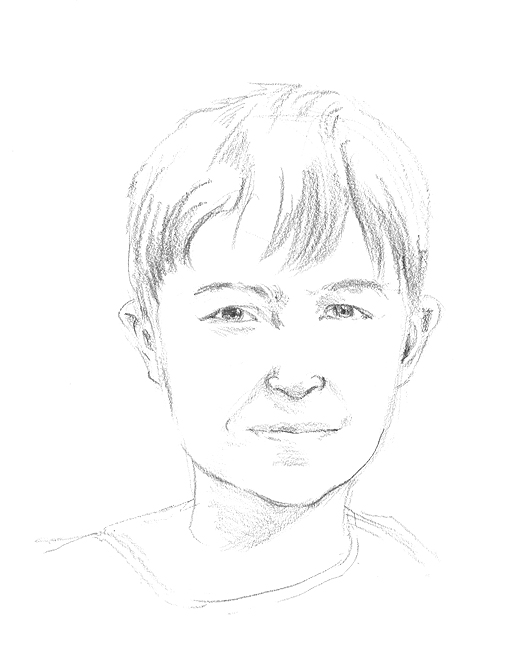
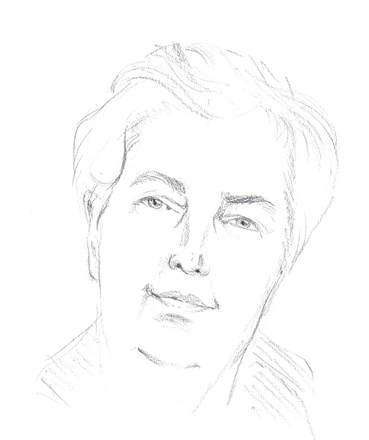
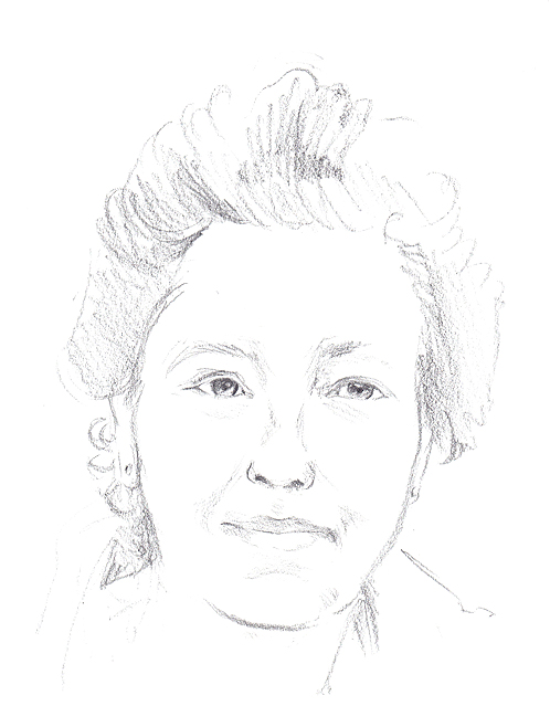
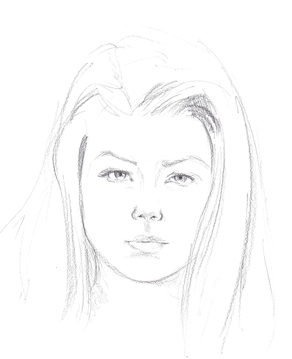
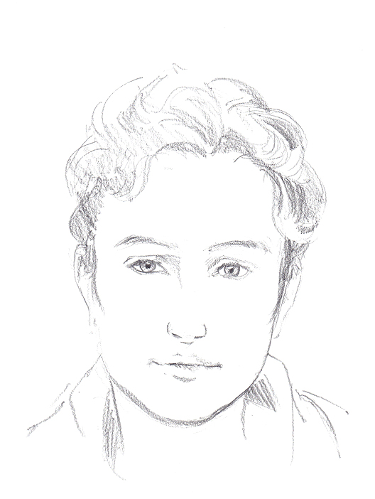
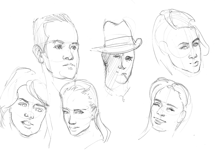
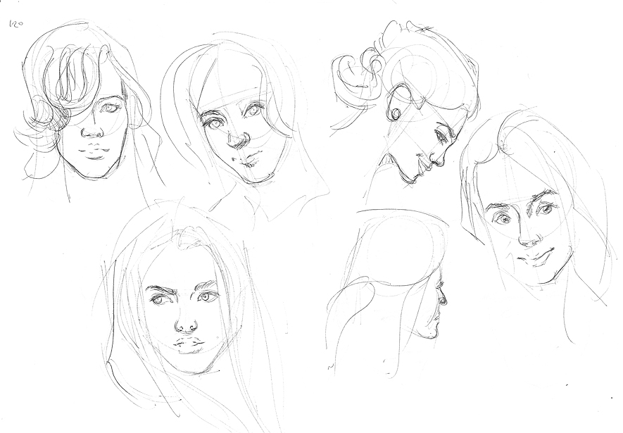
More portrait practises. 3 ten min sketches, and an hour one that went horribly wrong in terms of rendering and measuring. I tried to practise building it from forms though - the construction sort of got rendered over.


And finally the updated Hungry Joe picture! Many thanks again to Eve for the crits. I also tweaked the eyes so they're cooler and they seem to fit better.

Posts: 465
Threads: 2
Joined: Mar 2013
Reputation:
18
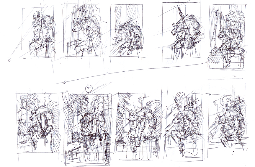
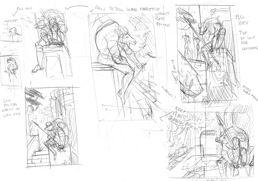
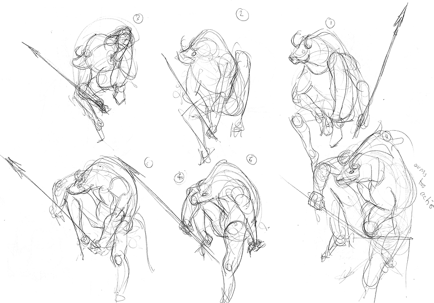
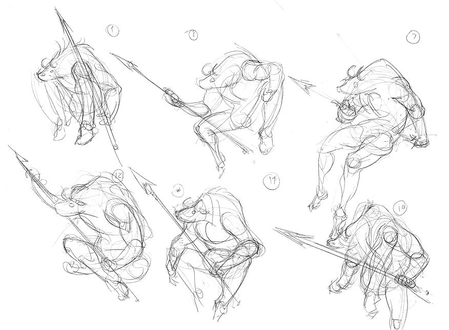
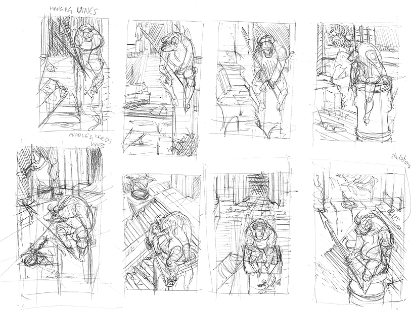
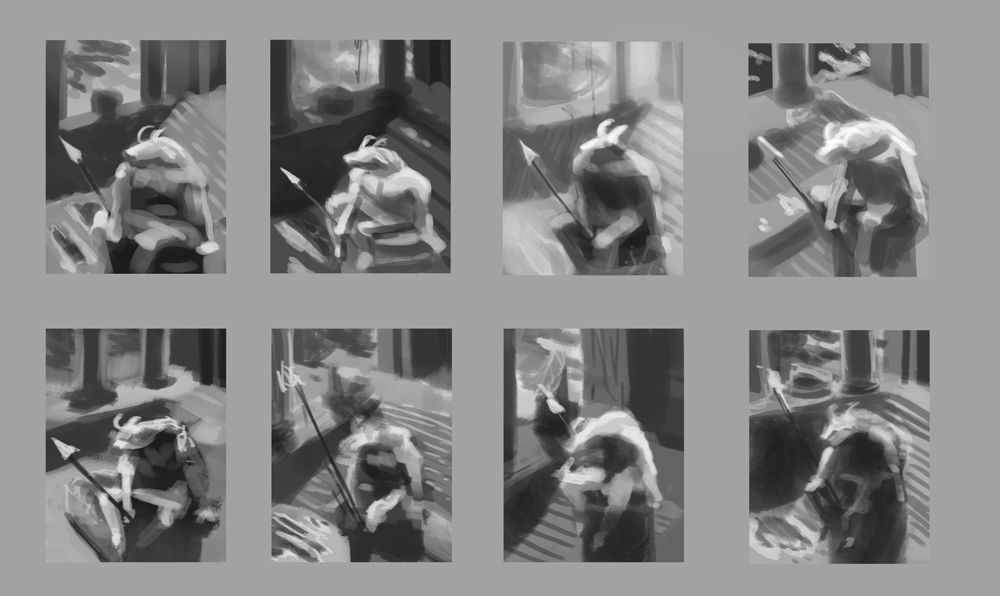
Those thumbnais you've done don't have much variety to them, I think if you experimented with changing the minotaur's pose and moving the camera around and how close/far away the camera is you might land on an image you like more. In my opinion thumbnailing is all about experimenting with the composition and trying to land on an image better than the one you had in your head, so you should try to make the thumbnails all pretty different from each other.
Posts: 176
Threads: 2
Joined: Mar 2013
Reputation:
2
Thanks for coming by!
That demon piece is awesome and I really love your gestures.
About that minotaur thumbnails I do agree with Samszym. Your thumbs look alot the same with very little variation. Even if you like and want the minotaus dude sitting why not try out some other perspectives or start playing with different composition element f.e. the spear etc? :)
Posts: 111
Threads: 2
Joined: Jul 2013
Reputation:
7
Posts: 429
Threads: 0
Joined: May 2012
Reputation:
7
Damn dude you're really pushing for it. keep going! Thanks for the criticism by the way, that helped so much.
Posts: 905
Threads: 39
Joined: Sep 2013
Reputation:
51
Your figures look like they're really sitting in space, whereas mine just look flat... Do the photo studies help? Are you picking the colors from ref or eyeballing it on the color wheel? I was told color picking doesn't help in studies as much as if you try to match it by eye when you try to plan your own paintings.
Posts: 111
Threads: 2
Joined: Jul 2013
Reputation:
7
BenFlores - Thank you, and you're welcome, I'm glad to be of help.
meat - Thank you, it has actually been rather difficult for me to make figures look volumetric and am still working on it. I've been getting better results concentrating on the primitive shapes (cubes etc) building them, like Tristian said. Another easier thing that helps that is getting a feel for overlapping edges/shapes.
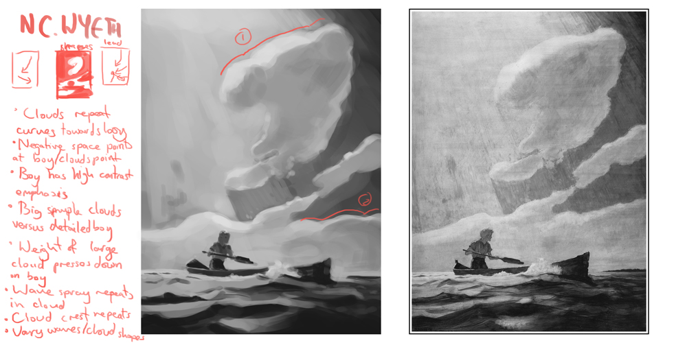
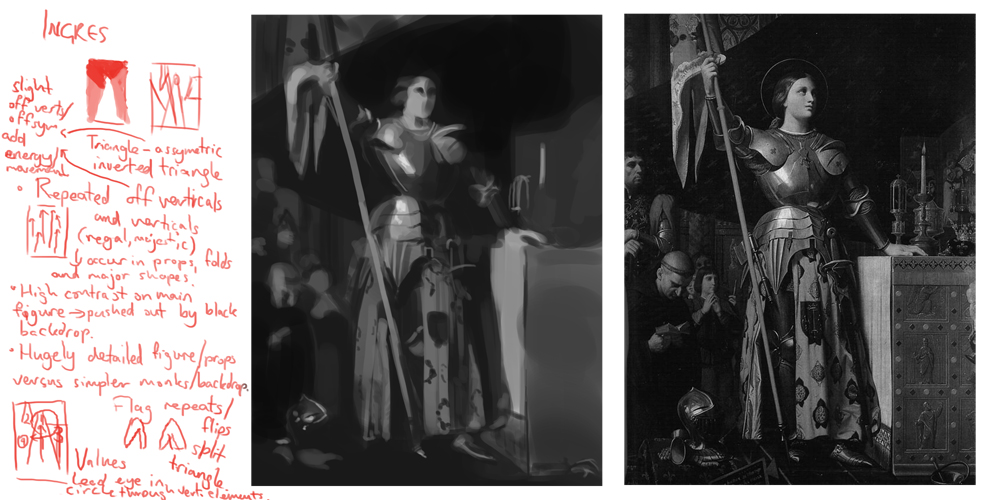
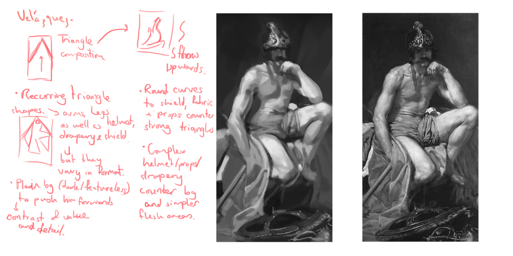
The photostudies have really helped actually, particularly with judging colour and being more aware of light sources and texture. I don't pick the colours on them (you're right that it doesn't really help much), it is basically eyeballing on the colour wheel and mixing colours on the canvas. When I started doing them and found myself totally stuck at the start, I'd open the colour picker and look at some of the colours before starting - but then would reset my brush colour to white without putting anything down so I'd have to remember from the general idea I'd had. Because it was really hard to do at first, I started out with doing master thumbnail studies to help see large areas of colour, because it was a bit easier (for me at least) to see relative colours.
---
Continued Bridgman stuff


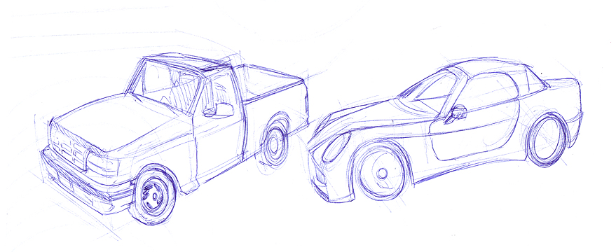
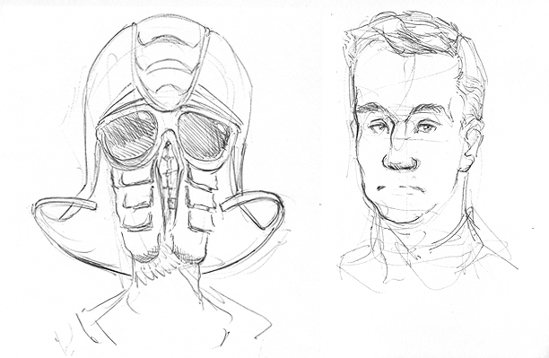
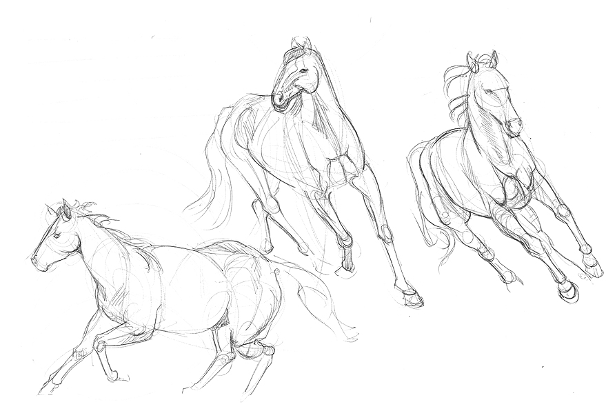
Morning warmup sketches. Focusing on some form drawing with the cars (need to construct those more I think) and bodies, and some 2 minute faces.


Ten minute portrait practises (doing another fair this weekend)


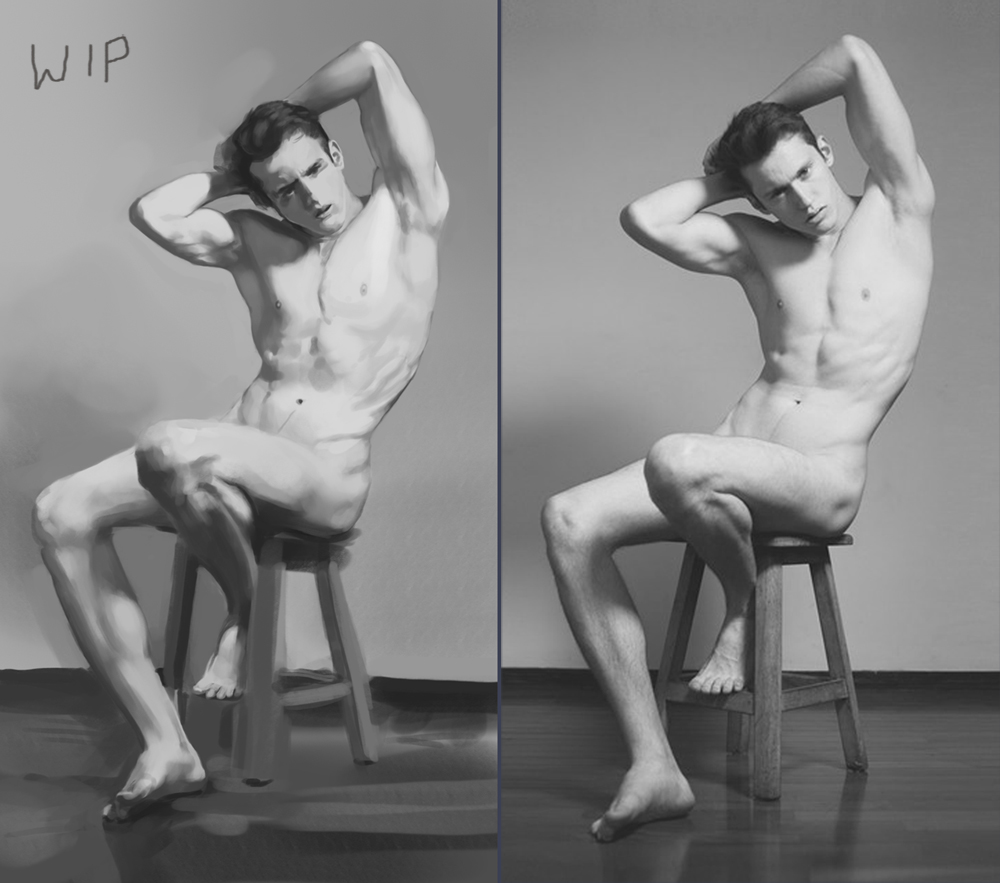
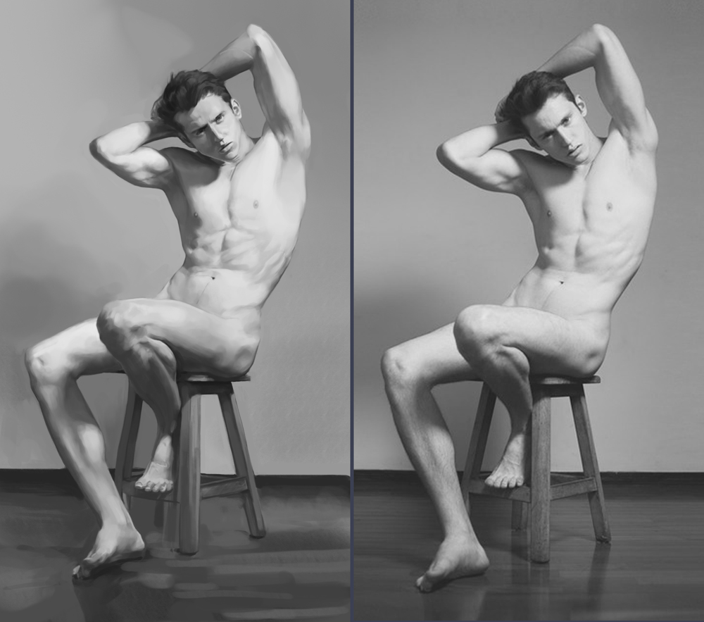
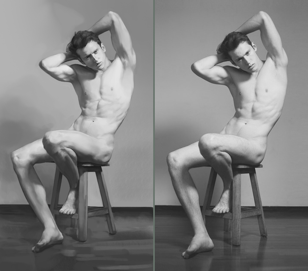
Still working on that nude study. Really learning a lot about edges and form from this one though.

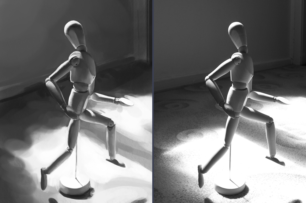
2 hour photostudy... that looks really wonky, wow.

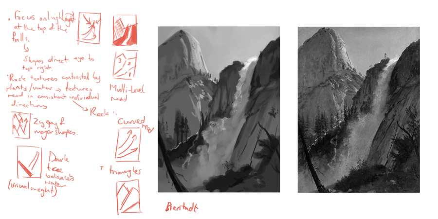
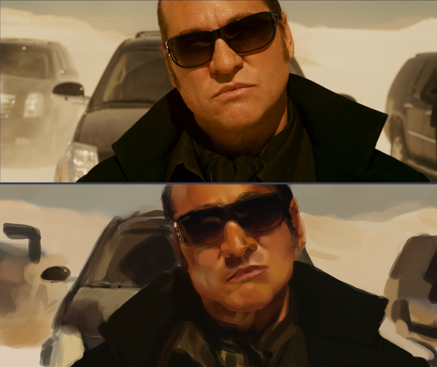
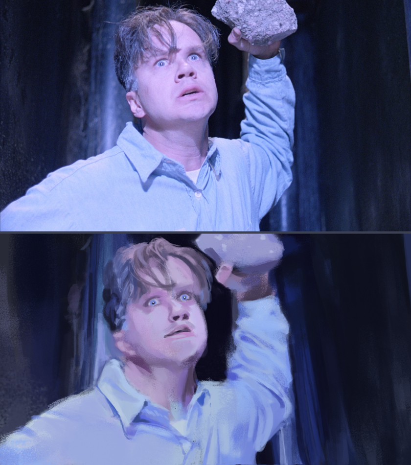
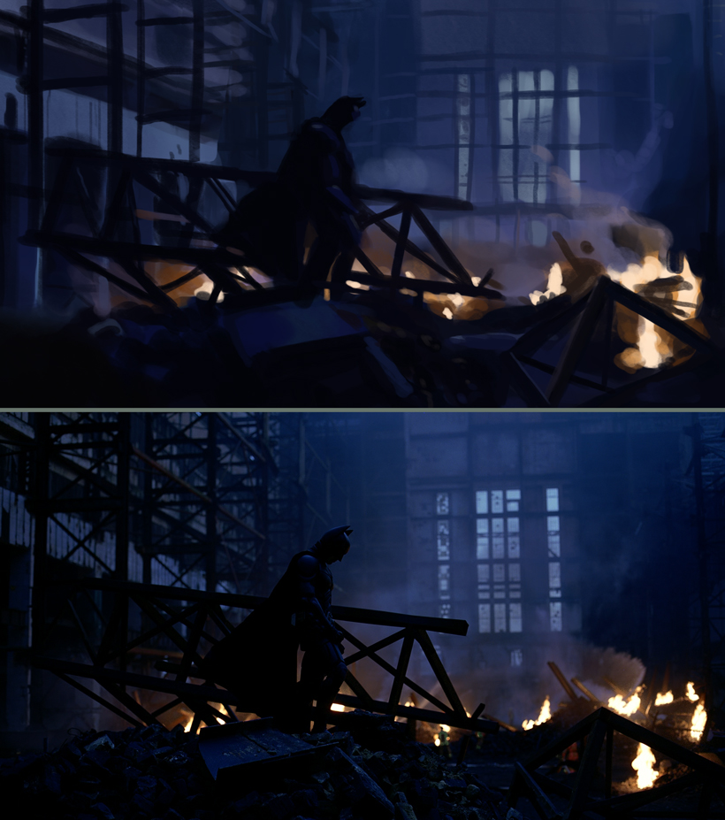
1 hour film studies. I've seen a lot of people suggest these to learn about lighting and colour. They totally kicked my ass! I have no freaking clue what is going on with the lighting with these, they're crazy challenging. Going to keep at them, and maybe try some longer ones when I can get basic light schemes down.


Another photostudy, done to help me (I hope) with the minotaur picture.

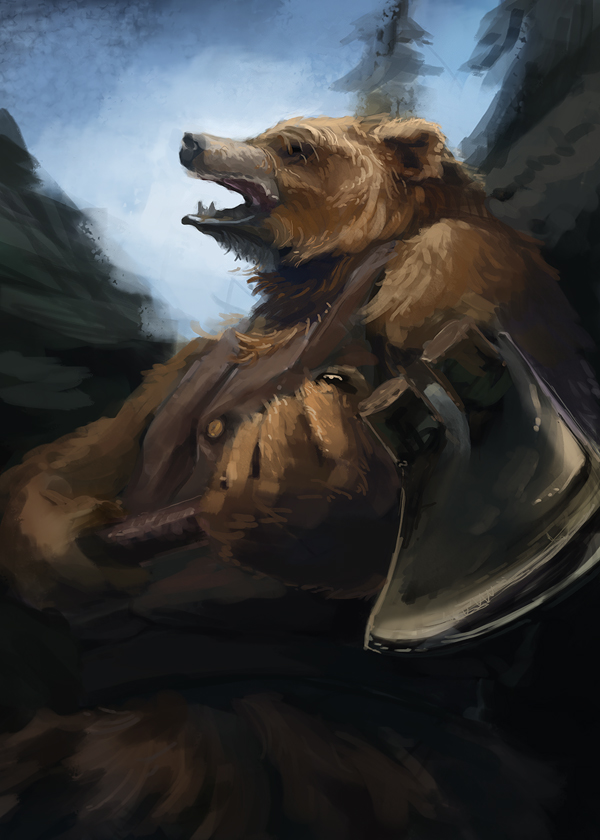
Speedpaint, probably about 90mins - 2 hours. I just really wanted to use that axe head I saw in the museum. Only you can prevent forest fires!

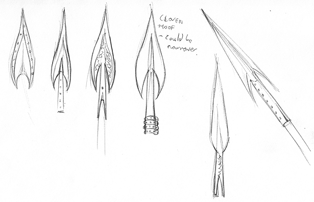
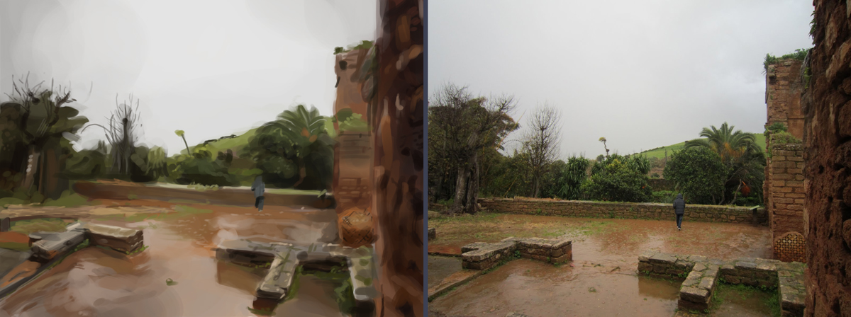
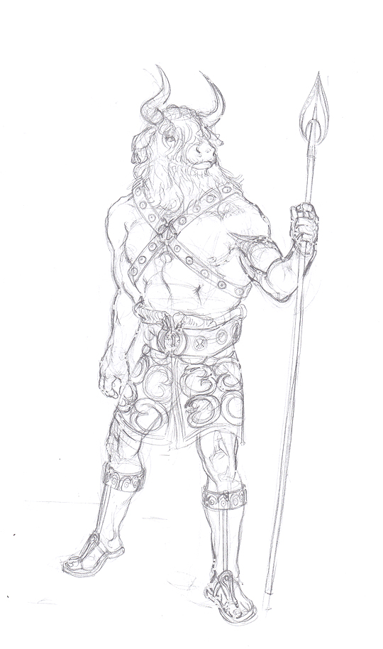
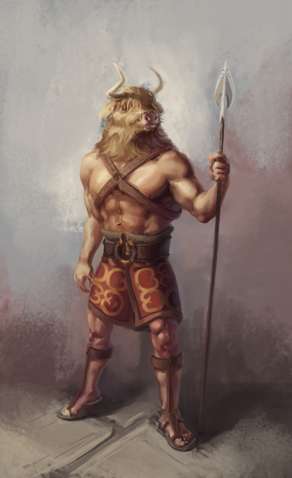
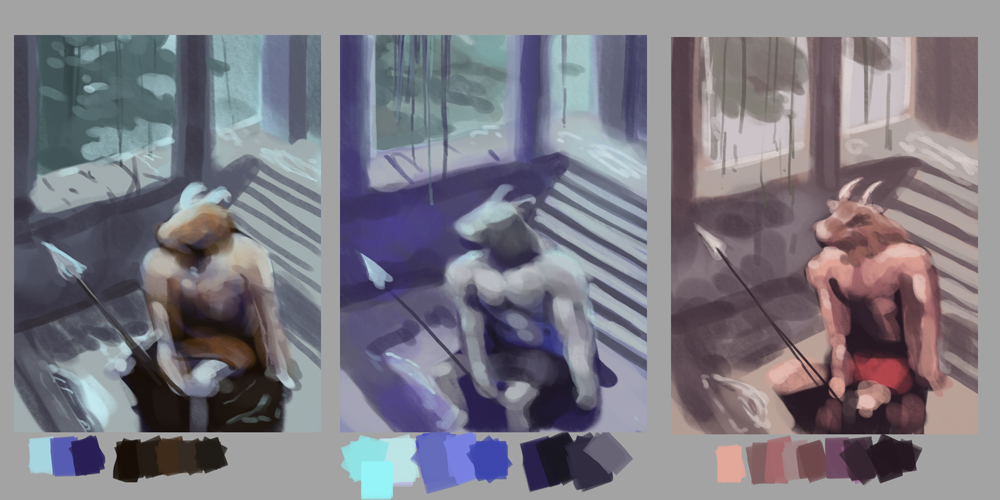
Work for the minotaur picture. This has been a particularly detailed planning process for me, but I'm hoping it will mean I can just flay away at painting it next week. Plus I really need to practise my planning because my thumbs are terrible.
Anyhow, looking at value set ups and trying to get the weather/mood right, since it will be a rainy/overcast scene - so I went for the paler background. I don't care much for the colour comps at all, though the orange blue one seems to work best, probably the warm-cool mix. Might try doing some more rainy scene studies to get some better ideas. The colour picture of his costume needs a bit of tightening still, so it is basically a wip - though other than being a handy costume reference when I paint it has little other purpose.


Posts: 905
Threads: 39
Joined: Sep 2013
Reputation:
51
Thanks for explaining that to me! I will do more master studies. The professors did suggest that and had us do one back in undergrad, but I didn't follow through because I thought "I don't wanna waste expensive oil paint and canvas and storage space on making copies I can't do anything with!" Bad. Idea.
For the movie screen studies, there is a webpage somewhere out there full of screenshots of Raider of the Lost Arc. That film is full of strategic lighting, and I'd recommend it. It's one of the things on my artistic To-Do list, and that I never got to so far. I think if you're going to do screen studies, might as well go for films with well-done lighting. But of course if you dislike Film Noir, you won't be studying them no matter how well their lighting was done...
For the Minotaur, might I humbly suggest some fur elsewhere on his body? I know he's supposed to be a man with ox head, but some fur other than on the head might contribute to continuity of a being overall, and avoid the risk of him looking like he's wearing a mask.
Posts: 111
Threads: 2
Joined: Jul 2013
Reputation:
7
meat - Yeah, I bet those oils would add up. At least thumbnails keep usage down if you go with them, I suppose. (Between cost and space issues, I can't really do traditional painting, so I just do loads on a canvas in photoshop).
Well, I've been using Cinemasquid for film stills so far. I just checked out Raiders of the Lost Ark on there, they do look really good, so I think I will be doing a few from that film next, Thanks for the recommendation! Honestly I've been going fairly randomly at these (trying to go for blue palettes a bit more since I find them harder though).
As for the extra fur, I will definitely give it a go (I really like painting hairy things haha). Perhaps working in more down the shoulders merge the head in better with the shoulders with some mane or something.
--
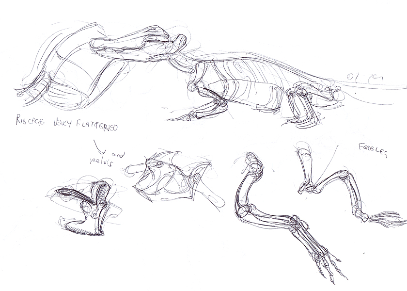
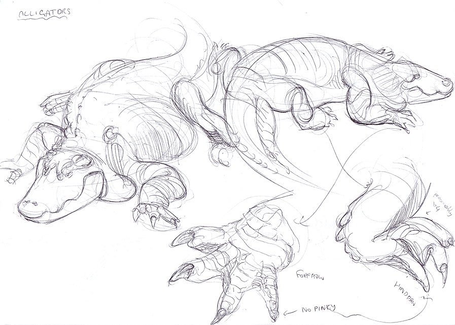
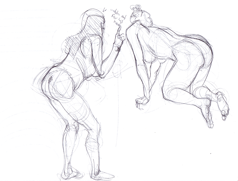
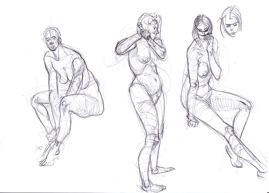
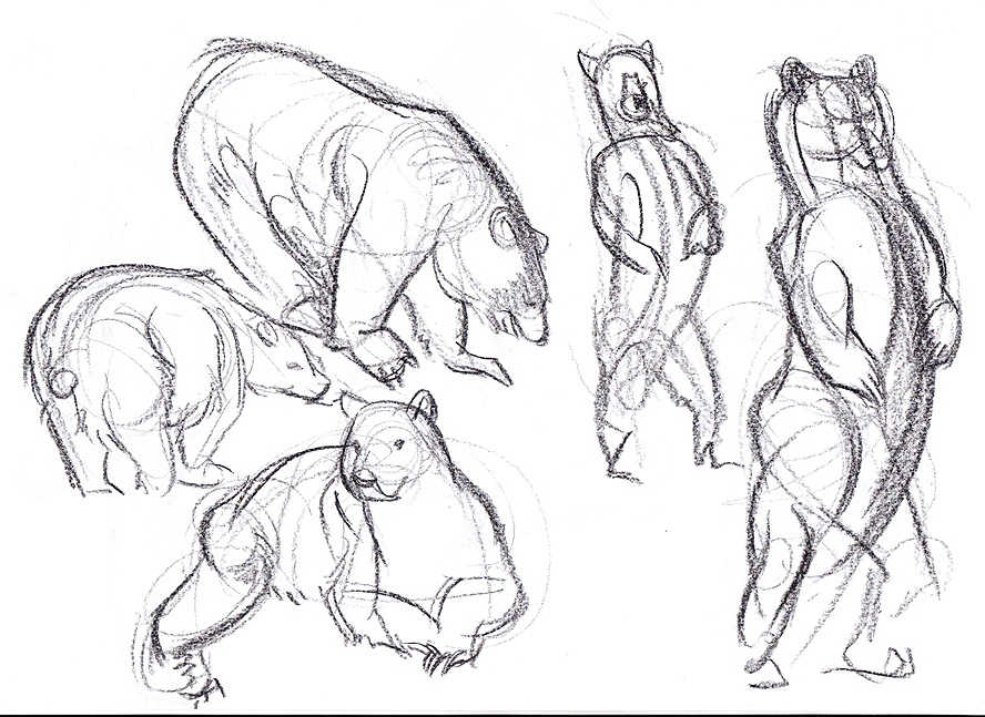
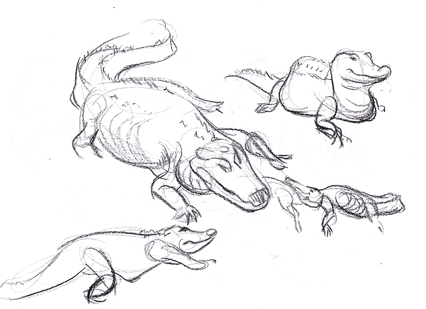
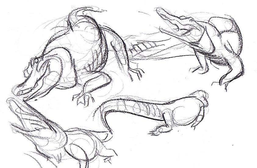
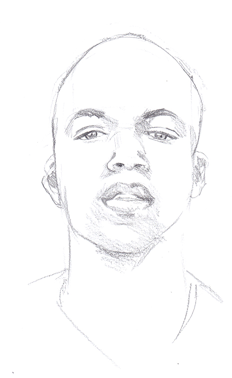
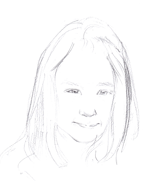
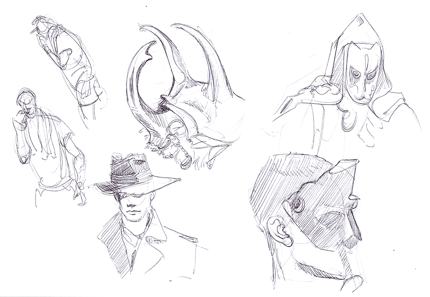
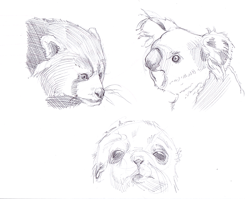
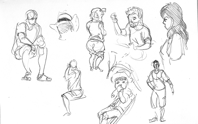
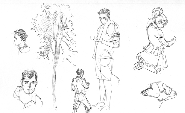
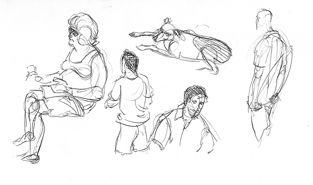
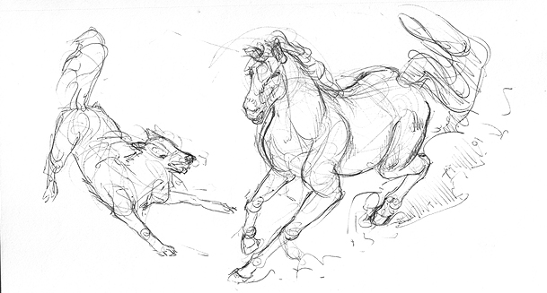
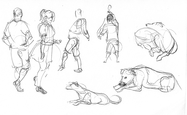
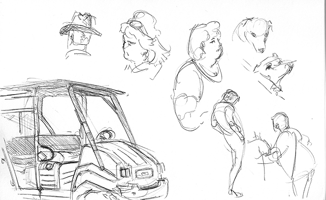
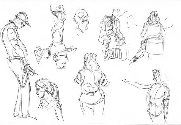
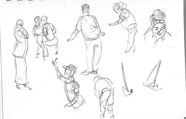
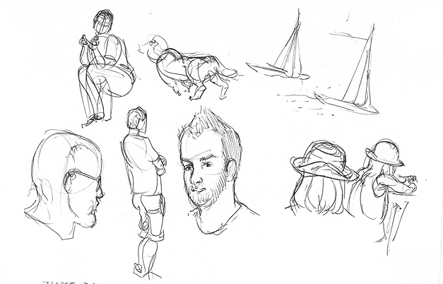
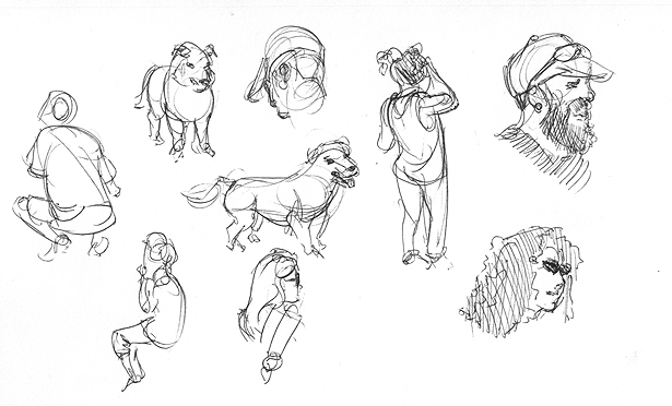
Mostly sketches today. I spent the whole weekend at a fair drawing portraits and gradually cooking in the sun, but I did a bit of people sketching and doodling in my sketchbook. Plus some morning warm-up sketches and a bit of stuff from Friday.
Sketchbook sketches - a couple of pages are imagined stuff and the rest is just straight out catching passers by. Lots of kids to practise, man I couldn't even get them down a few months back.


Morning warm-up sketches


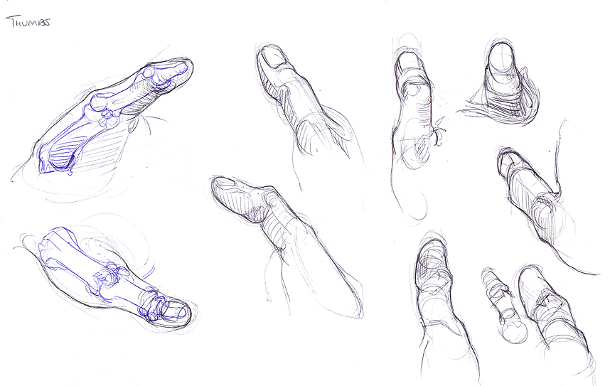
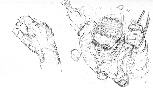
Hand studies with my old friend Bridgman. Mixture of life and photo.


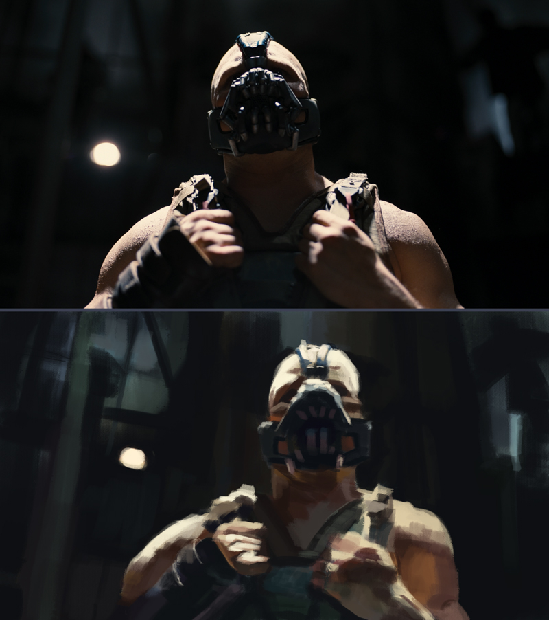
Another 1 hr film study. Actually felt like I learnt from this one haha. Even if I forgot Batman's shiny muscle highlights.

Wrapping up this study too, I think it racked up something like 6-8 hours. Really worthwhile, learnt a lot about form rendering.

Posts: 49
Threads: 2
Joined: Sep 2013
Reputation:
0
You're really pumping out the work! I haven't used Bridgeman before, I've mostly used Loomis, but your hand studies look brilliant. I must check it out.
|
