06-04-2014, 12:30 PM
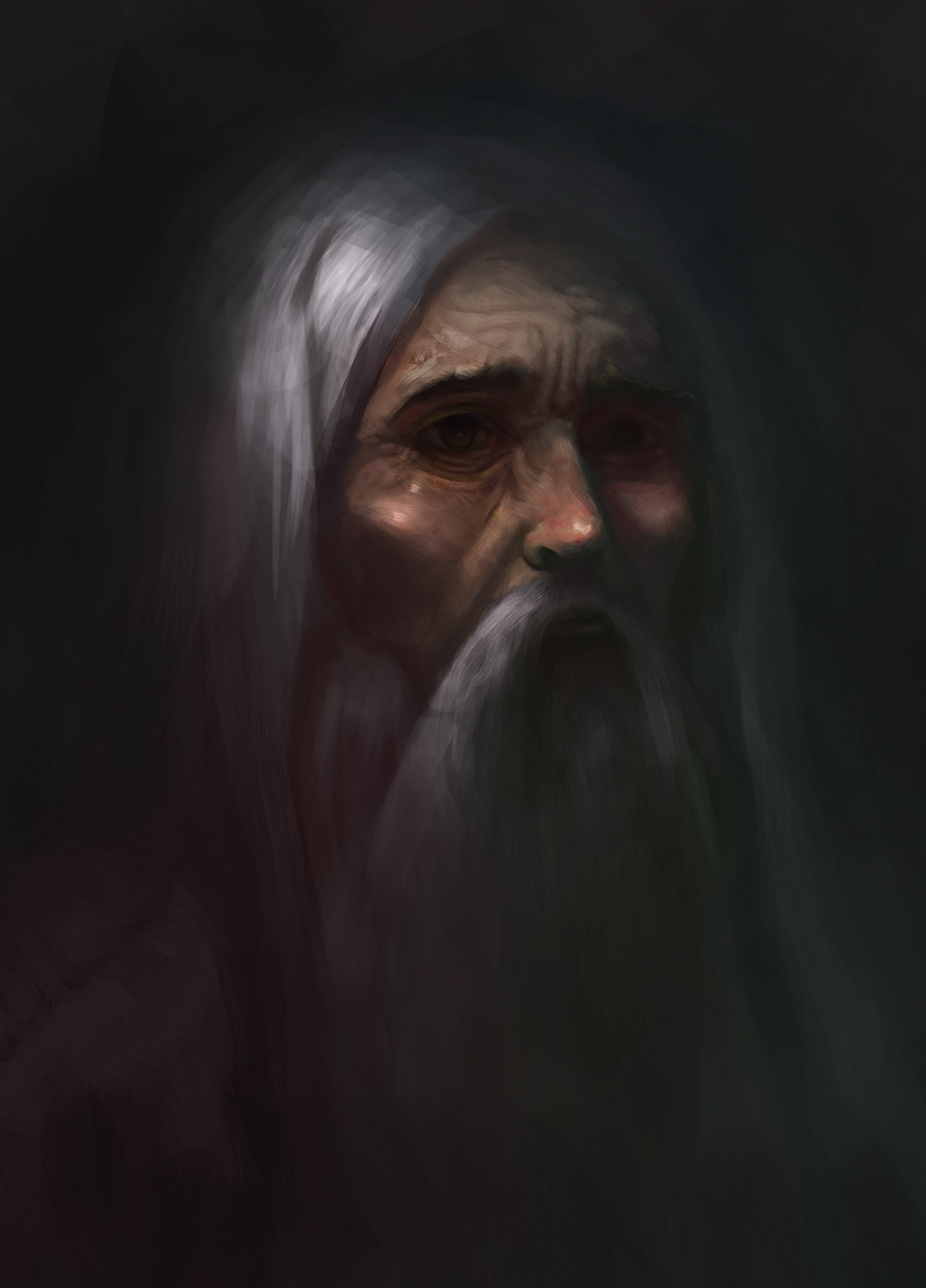
Tried out a new way of rendering and working with colors. Any feedback?


|
Portrait critique
|
|
06-04-2014, 12:30 PM
Tried out a new way of rendering and working with colors. Any feedback?

06-05-2014, 06:44 PM
Out of curiousity, is this done from a reference or imagination?
The large shapes building up the image are pretty strong and give the portrait a bit of visual flow. The way you have pulled the nearest eye out in terms of value and detail contrasts is effective too, it gives the portrait a clear focus. There are some proportion/construction issues, especially prominent around the eyes and lips. What jumps out most to me is that the eyes feel too large compared to the nose and lips. So with the eyes, eye sockets sink in alright, but the actual eyeballs are flat. I think this stems from the iris being slightly too large (or the eye itself), and a lack of form rendering on the eyeball. If you are working from photo reference and it is just oddly lit, it might be worth just adding in a bit yourself, since it is not uncommon for photos to get awkward lighting on the eyes. The issue I see with the lips is that they're just a touch off centre. It is quite tricky to get them looking correct under a beard, but here it looks a bit like he is extruding his lower lip out and to the right a little. I rather like how you treated the cheekbones, making them so sharp indicates his age. Colour variation in the skin is looking nice, clear zones to face. Also I like how the hair has clear warm-cool tones and yellow greens worked in in the shadow behind the nose. Pay attention to the shadows in the nostrils though - if you think of why reds appear on the face, it is due to subsurface scattering with capillaries. Light passes through the flesh rimming the nostrils, so it is common to see them as deep red. (Especially since the rest of the reds indicate a strong light and abundance of capillaries.) Finally, take care with your brushstrokes, as they look a bit overworked around some of the facial planes. I can see you are trying to sculpt the forms with them in places though, so I think you are probably on the right track - just try to use bigger brushes where you can. The lost edges in the shadows give the image a nice atmospheric effect as well. You might want to balance them out with some (sparingly used) tighter rendering on focal points, but that is in part a stylistic choice for you to experiment with.
06-05-2014, 09:12 PM
Thanks a lot Clockodile!
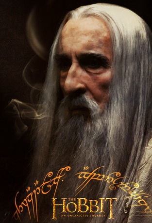
Its heavily based on a ref I'd say. Also I used Rembrandt's portrait as a reference for the nuances he does in colors and strokes. I did deviate from the ref and kind of broke my anatomy. The large eyes are again from Rembrandt's portrait. As for colors I tried to deviate from realistic approach and just see what I can come up with. Yeah gotta work on dem strokes. Perhaps get some variation in my painter brushes, Im currently only using only one.(Its that Shaddy brush) Heres the ref. One of the most badass men ever. 
06-06-2014, 08:25 AM
I totally see the Rembrandt influence now you mention it - the way you used that contrast on the eyes was niggling in the back of my head. The misty feel he has is there too.
Brushes aren't everything, and I wouldn't get hung up on them, but they're fun to play with for sure (I love to make my own) and they're definitely an effective way to get from the crisp, digital look if you are more into a painterly feel. I totally recommend making your own painting brushes to suit how you work. Generally I find that using a minimal number of brushes is best as well - too many different types going on can cause a bit of a distracting inconsistency in strokes. It helps to slow down and consider strokes you want to make, especially when working big planes - but don't over-obsess on it. Make sure you really get the anatomy and structure down first. Because of how staged and harsh the lighting is in your ref (not that it is bad - he has great contrast and colour giving him that intimidating feel, and creating a catchy poster) I think you were right to try to deviate from it and improve the light and colour for you own purpose. It is a worthwhile thing to try (and nothing new - old masters would copy and improve/experiment with other older masters) as a learning experience as long as you consider what and why you deviating. |
|
« Next Oldest | Next Newest »
|