Some quick feedback for you guys. Great job finishing in time!
@smrr. I know you rushed it so I won't be too harsh. The car is overwhelming everything. It is the star and the driver is the bit player. The car seems overly long and some persp issues as well. Can't say too much about the character becuase she so small yo. Nice job cranking it out.
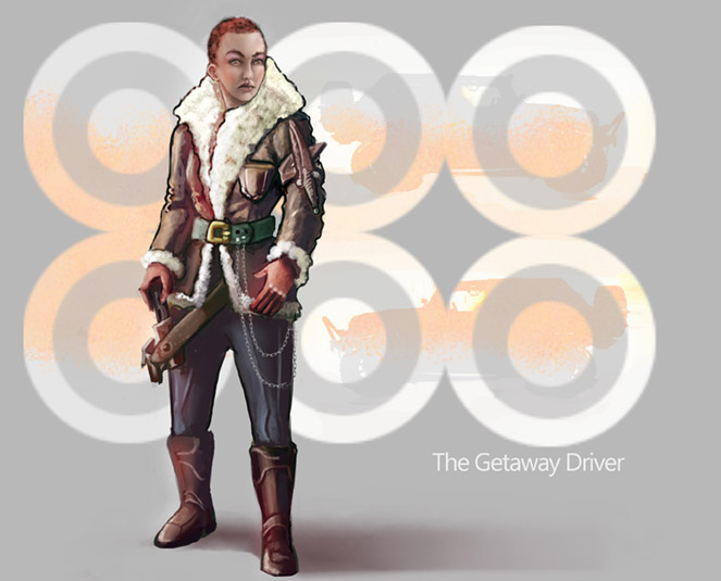
@ Cricketts, love your execution, but as a character design...this doesn't say anything about her being a driver. That bomber jacket and old school gun, makes me think first world war if anything, which would have been a really cool take, a "driver" of a biplane...jumping in and out of raids on moving trains or something. But you didn't capitalise on the opportunity.
Watch the hand poses as well. They show expression, you don't want them to be stiff
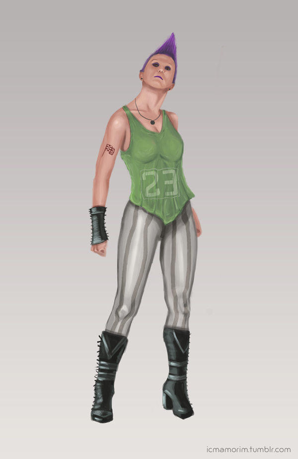
@iamorim: Nice job. If you are presenting a figure like this, might want to ground them with a shadow. I think some study of the figure in different perspectives would help a lot. Your torso is great, but anything that deviates like the head or the fore leg/boot, seems to not be right. Watch out for the cut and paste look that can often occur when you are designing clothes on top of a figure model. You really need to wrap the forms well.
Again, as a design...nothing about her suggests driver.
EDIT: Sorry just saw the flag tattoo. Ok one point extra for that. :)
@Jakofmaanyheadz: Frikkin love the pose. Attitude! This is Penelope Cruz as we have never seen her before! It might be a tad bit #supermodelvogueing, but it seems to fit ok in this case. Digging the modern cyber punk look. Of all the concepts I think your's probably has a hint of driver about her....not sure why to be honest, because there isn't anything contextual in the design really. Maybe because she is on the phone, getting a pickup call? Then again, maybe she is putting the challenge down to that b(&(* Salma Hayek, so might fail the "Shows character without the text" test.
General stuff, now this is where I whip all your asses. Character DESIGN. DESIGN people. You have to show us why they are what they are without any text. The pose matters, the accessories matter, the attitude matters, their context and suggestions of backstory matter. If you keep this all in your head only, all you will get is generic concepts of a certain style.
I would think the first thing to add would be car keys, or perhaps driving gloves, or maybe a handy holoGPS map for the cyberpunkers. Perhaps they could be holding a detachable racing steering wheel, or furry dice hangers turned into a necklace, tattoos or t-shirts with maps or driver-related slogans and sayings, to think of the most obvious cliches I can. With some creative thinking you can push it further! How about using shape language of the zig zag tread in tires into the design somewhere indirectly, or car logos or something else in there? Not obvious but all adds to the feel.
C'mon peeps, take this up some levels, don't half ass design.
One bonus though, you all picked women! That already was thinking out of the common box, but you can push it even more!
Great job, Now FIRE IT UP!!!!
![[Image: 200.gif]](https://media0.giphy.com/media/wblNwJ8C1A4hy/200.gif)


![[Image: 200.gif]](https://media0.giphy.com/media/wblNwJ8C1A4hy/200.gif)