10-21-2015, 02:08 AM
I just finished assignment 03 ! Keep it up guys!
![[Image: 9pROFyY.jpg]](http://i.imgur.com/9pROFyY.jpg)
![[Image: 9pROFyY.jpg]](http://i.imgur.com/9pROFyY.jpg)
|
Environment Design Rocks!
|
|
10-21-2015, 02:08 AM
I just finished assignment 03 ! Keep it up guys!
![[Image: 9pROFyY.jpg]](http://i.imgur.com/9pROFyY.jpg)
10-21-2015, 02:39 AM
Week 3 finished! I'm pretty satisfied with the final result. I thought I'd struggle with this week. Separating layers in groups and sections.. It saves you so much time later and makes your workflow easier and faster. And using references is quite quite helpful.
![[Image: jTyE7Dy.jpg]](http://i.imgur.com/jTyE7Dy.jpg)
10-21-2015, 07:44 AM
All done.
It was magic. I really liked doing the value thing and also the colour. I'm still reading "Colour and Light" by James G. but I'm improving. Well done the rest! Can't wait to see more of your assignments! ![[Image: ilzJm5i.png]](http://i.imgur.com/ilzJm5i.png)
would you like me to improve? check my SKETCHBOOK!

10-21-2015, 03:27 PM
Here's my week 03 submission. I was worried that I wasn't going to have enough time to get it done because I just started a new job - but I did it with time to spare! Excited for next week. Had to shrink this way down to attach it, but the original size will be submitted.

10-21-2015, 03:40 PM
Painting with color is so hard and stressfull...qwq
But I think I am finally getting more comfortable with it (after pulling my hair off for many many days), though I still have no idea what I am doing. As soon as I apply color, I cannot maintain my original designs even if it's to save my life... ![[Image: OC6z8cL.png]](http://i.imgur.com/OC6z8cL.png)
10-22-2015, 02:06 AM
This was a very fun excersise, i've never done anything like this, and it definitely helped a ton looking at reference.
![[Image: OF7jm7V.jpg]](http://i.imgur.com/OF7jm7V.jpg)
10-22-2015, 02:17 AM
Hey guys! I hope you're all well. Good studies i see (no i'm not Yoda) : )
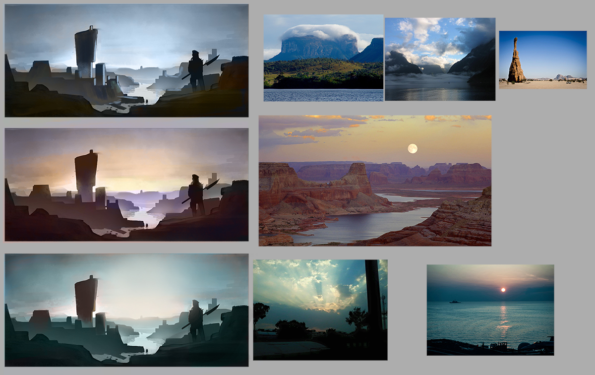
Here, i turn in mine for week 3. I tried to do some atmospheres experimenting as well. Okay, bye for now Cheers ![[Image: AumesRonoy_week03.jpg]](https://4.bp.blogspot.com/-MgWOJFB04Hc/Vie3fjPODXI/AAAAAAAADbE/dHRL-Xe1B8Y/s1600/AumesRonoy_week03.jpg)
10-22-2015, 01:57 PM
Awesome work guys! Looking forward to going through these.
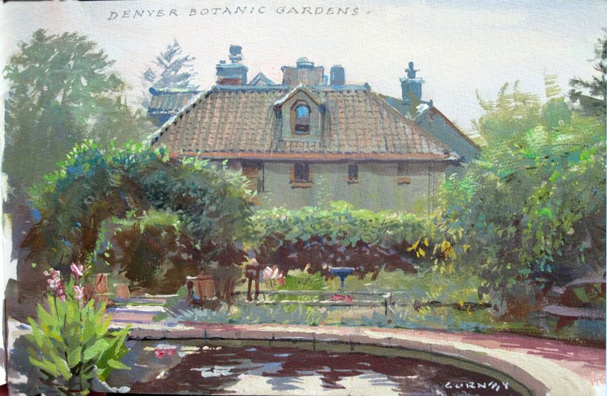
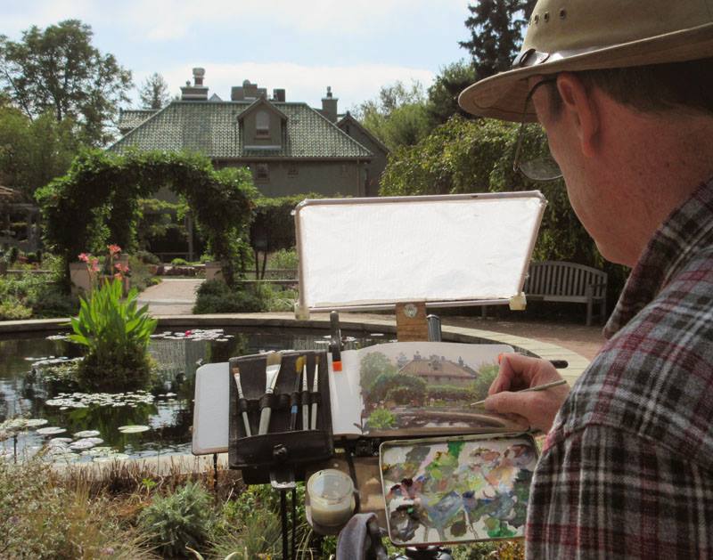
Aumes that's beastlly. Great stuff. Did you do a painting based on those photographs as well, or just observe and take notes? Here's something that really shows what the optional assignment is all about, from Gurney's facebook. Just look at how lifeless the photograph is and how it doesn't capture that atmosphere and sense of light in his painting. The ironic thing is that it's still a photo...of a painting!  
10-23-2015, 12:14 AM
I hope everyone is alright and not as busy and hectic as I am. I swear when I signed up for this class I didn't anticipate that my end of the year would be as busy as it is.
My assignment feels kind of rushed, because I was missing the weekend again because I've been out of town for work and I don't have a laptop any more. In general I felt okay while doing it and thought the hardest part is finding references, but now that I'm finished I feel that everything looks the same. And I don't know anything about light sources orz Also I changed the local colour of the things from pic to pic and I'm not sure if that was the intention of the assignment.........so basically...I'm very lost. Also, although I edited the basic sketch after Amit's suggestions I still feel that it's too dark...Gotta pay close attention when I work on the next pieces, in the end nobody can see anything because it's all dark. ![[Image: edc_assignment_week03_by_cyprinusfox-d9dz0e4.jpg]](http://orig14.deviantart.net/fcd9/f/2015/295/1/1/edc_assignment_week03_by_cyprinusfox-d9dz0e4.jpg)
10-23-2015, 12:28 AM
(10-20-2015, 02:57 PM)Broadway Wrote: Hey @Xiaogabe, looking great so far! Since you requested paintovers I gave it a shot! You're the man, Broadway! Thank you so much. I have kept working on this image on and off, but you definitely cleared major doubts I had. I absolutely loved the tree you added on the right side as well. Framing images is another thing that I'm not great at, and it definitely added that one thing I was missing. There are many things I had thought about, but forgotten, and somehow made it back in your paintover, but also many new things. I look forward to seeing your pieces soon. Thank you!
10-23-2015, 03:32 AM
Woooh this was really challenging seriously, also great work everyone! i to be honest feel like i should add more to it if i'd be given time.
im still struggling with coming up with my compositions that make sense and getting the "easy read", i couldve gone with my value sketches from the previous assignment but i felt that i could make something better. i think i still need to work on actually knowing how to make convincing light and shadow patterns after i put the overall shapes down. as you can see i have struggled locating where shadows and light are supposed to go. in order to improve this i should paint more from life like from the optional assignment. which i wasn't able to do here. i learned alot in this weeks assignment though. like how i can incorporate refs into my own piece by color picking it. i realized the power of the adjusment settings in photoshop. i also abused the color dodge filter as you might notice. so yeah i wish i couldve done better but this is as far as i could go in terms of my skill level at the moment. im gonna be a little bit busy in next weeks because we are moving. unfortunately i might not be able to participate within 2 weeks because thats how much time it will took to relocate my internet connection apparently. as much as i would be excited to participate in the portfolio week (wich is one of the most crucial week for me) i might just follow along after i get my connection back. without a crit of course but the other members crits will do i think. BUT i might be able to go to an internet cafe and watch the streams from there. though i dont know if ill be able to go to one because of timezone conflicts we'll just have to wait and see. ![[Image: JeremyKurt_week3.jpg]](https://dl.dropboxusercontent.com/u/222190207/JeremyKurt_week3.jpg)
10-23-2015, 04:15 AM
Hey ,
First of all thanks Amit for your time! I didn"t expect to finish the assignment for this week but I finally did it ! this week I had some issues with brush modes for texture . I work with photoshop : first I use "color mode" like you did (it doesn't make texture for me because it's too soft , I use it to fill In the area with the base color ) then I change to "overlay mode "( in this case it's too dark but at least it makes texture ) to make it softer I use "screen mode "( too illuminated) and return to normal mode if necessary. I've done it by trying all the brush modes and I found this way the most helpful. Am I doing it the wrong way ? How do you guys do texture in photoshop ?
10-23-2015, 05:16 AM
All finished! It was actually...easier than expected. I think I abused the textured brushes, though.
![[Image: zombiechinchilla_week03%20final_zps0myot8wd.png]](http://i233.photobucket.com/albums/ee268/Charlie342/zombiechinchilla_week03%20final_zps0myot8wd.png)
10-23-2015, 06:59 AM
Oh, uhm... the deadline is in twelve hours, not right now, is it????
![[Image: Z8Gm0LV.jpg]](http://i.imgur.com/Z8Gm0LV.jpg) ![[Image: PRDIIRt.jpg]](http://i.imgur.com/PRDIIRt.jpg)
10-23-2015, 07:10 AM
Phew. Just wanted to make sure, I had a little shock there for a second...
10-23-2015, 07:37 AM
This one was difficult, don't seem to make them work well. This part of the process makes me confused and the sketch falls apart, don't know why. #frustrated ~ sadfrog
P.S. Also I tried the optional assignment today, went out in the morning, it was pretty cold and screwed up majorly. But I started to value that exercise and next time will do it more prepared! 
10-23-2015, 09:04 AM
Looking at all of these amazing environments-- I'm embarrassed... But, hey, never really tried before, soo... I guess it's okay.

10-23-2015, 12:39 PM
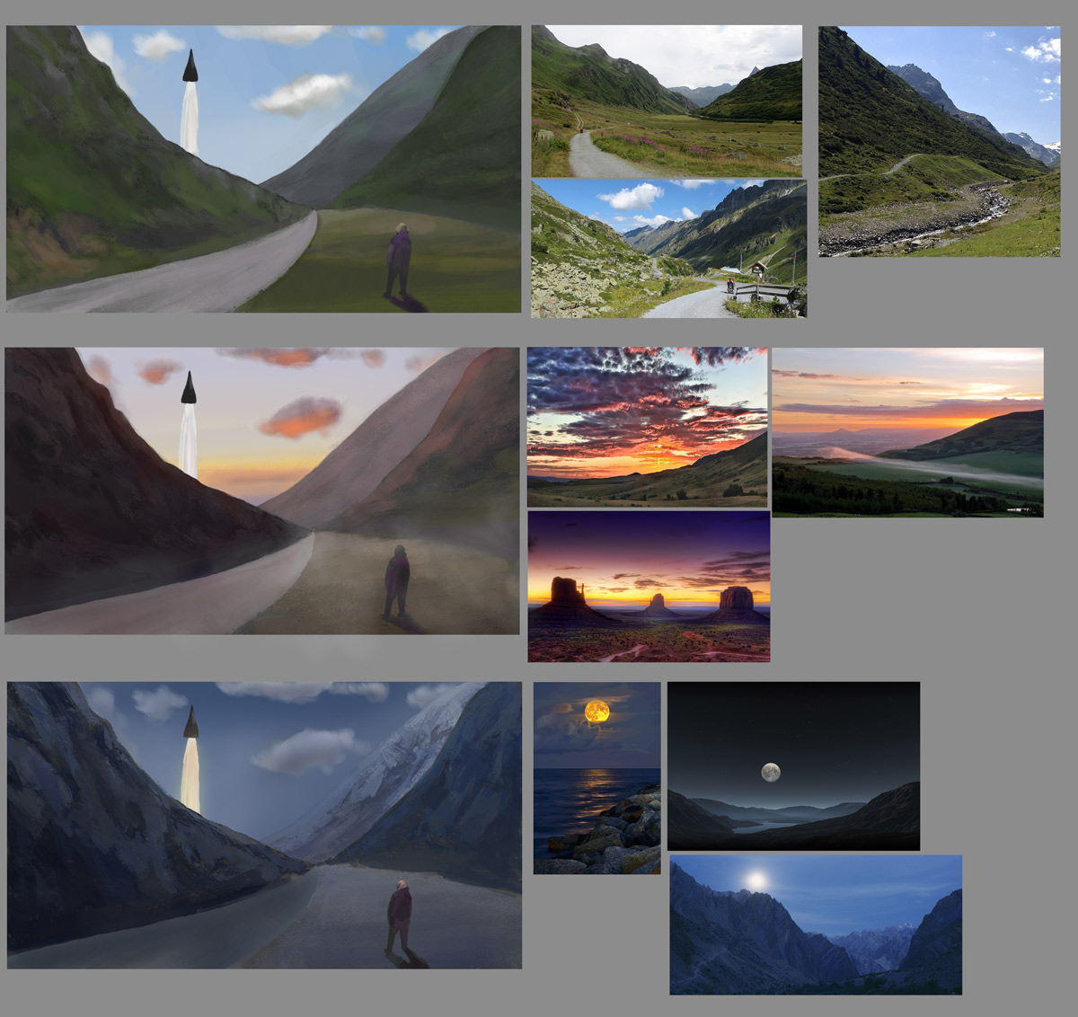
Ok here's my attempt. Pretty simple composition, haven't done many colored pieces yet so these 3 took ages.
Not really happy with how all the elements sit together, but hey gotta keep going.  |
|
« Next Oldest | Next Newest »
|