Posts: 205
Threads: 4
Joined: Oct 2015
Reputation:
7
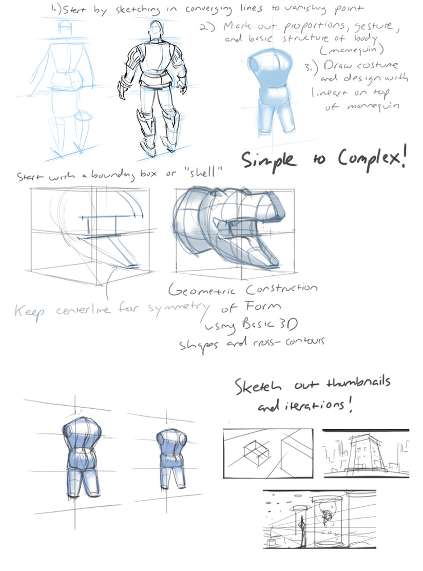
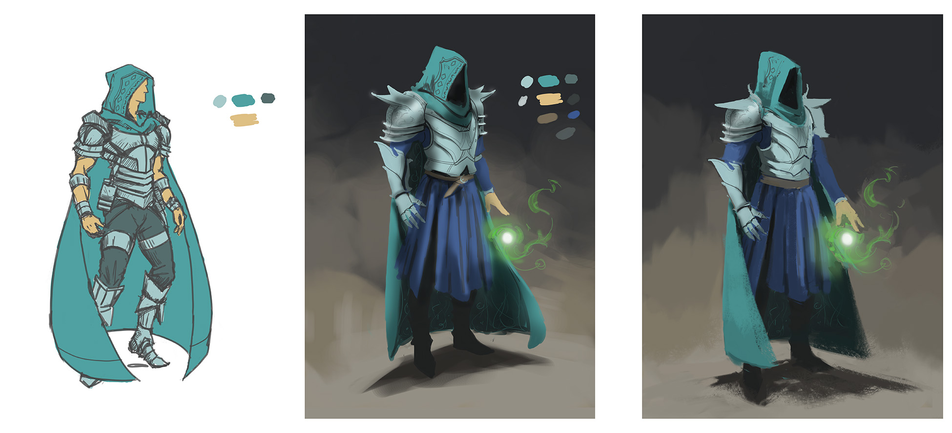
So I'm looking at other artists like Alex Negrea and Marc Brunett and realizing that I really need to be more methodical with my process.
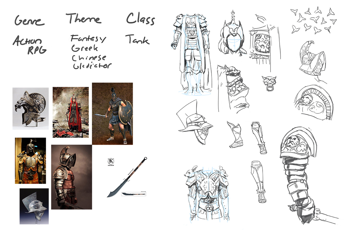
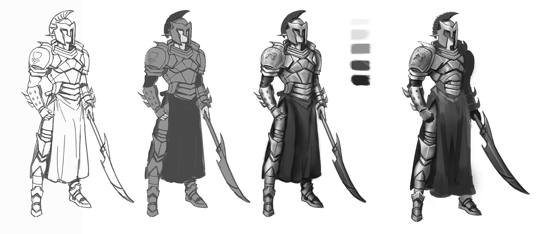
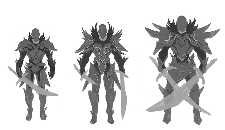
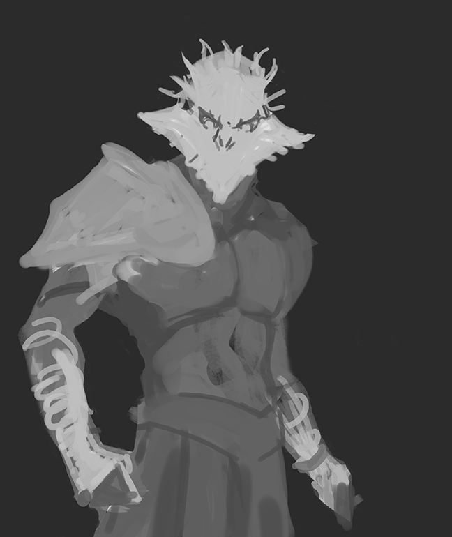
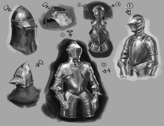
I started with really specific, RELEVANT studies to the design, followed by a breakdown of lineart, local values, lights, ambient occlusion, then finally color. I based my design off of Chinese and Greek armor although you can't really see the Chinese influence in the final design.
Time taken was about a whole day, maybe eight hours or so, and I painted everything from imagination, putting the reference away after the initial sketches and form studies.


Posts: 205
Threads: 4
Joined: Oct 2015
Reputation:
7
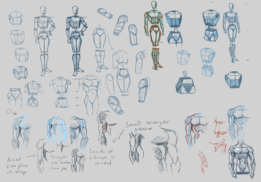
Started off the morning with some figure studies.
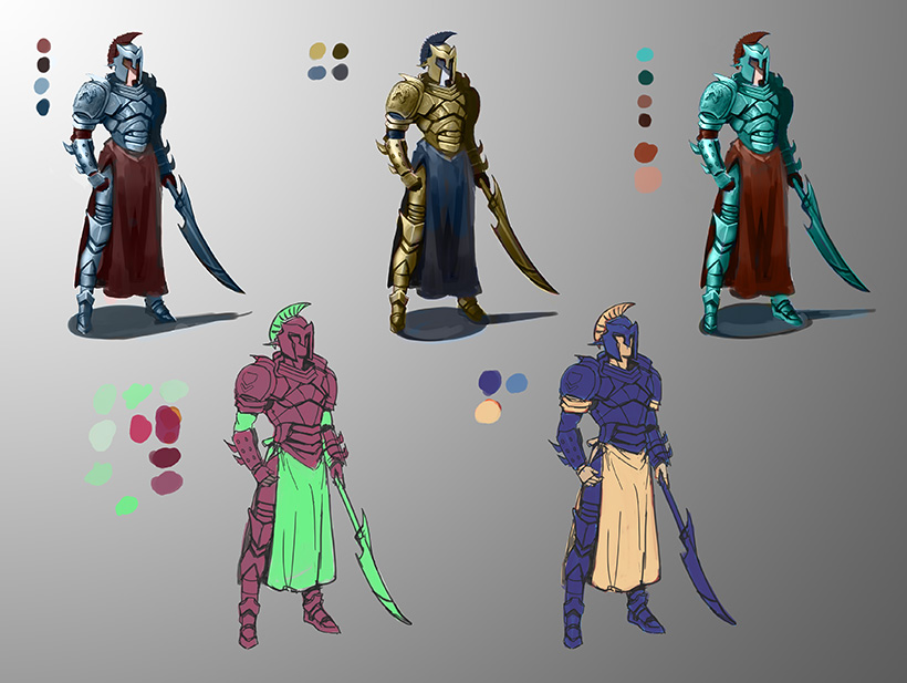
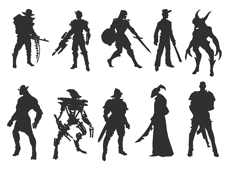
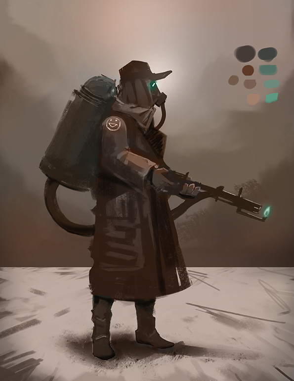
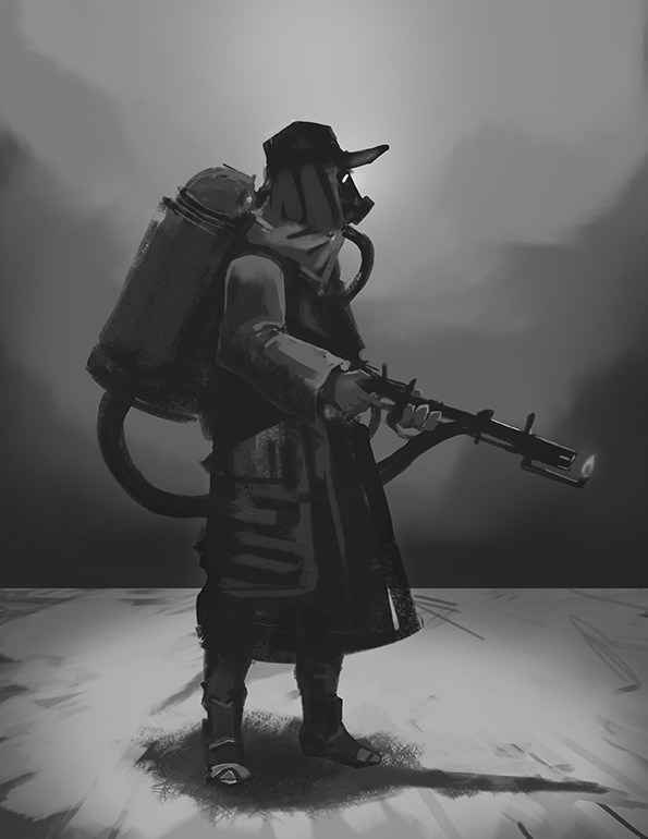
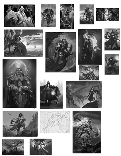
I'm continuing painting these character concepts in color, just trying to get closer to that finished look.
Also, I'm trying to step outside my zone of purely fantasy design and armor dudes with swords.
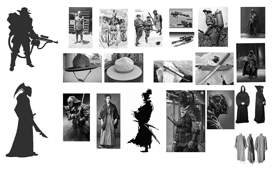
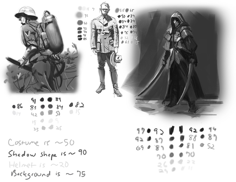
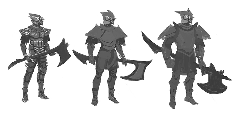
From my thumbnails I picked the forest ranger-flamethrower guy and a robot samurai , then grabbed some reference and did some value studies. Going to do the full paintings tomorrow!


Posts: 205
Threads: 4
Joined: Oct 2015
Reputation:
7
Posts: 205
Threads: 4
Joined: Oct 2015
Reputation:
7
Posts: 205
Threads: 4
Joined: Oct 2015
Reputation:
7
Posts: 205
Threads: 4
Joined: Oct 2015
Reputation:
7
It's almost done, just needs a bit of polishing, some rendering on the armor and birds in the background, maybe some details on the rocks in the foreground

Posts: 205
Threads: 4
Joined: Oct 2015
Reputation:
7
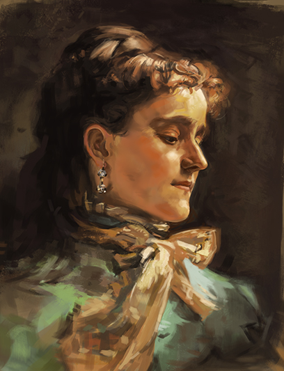
Studying Sargent

Posts: 205
Threads: 4
Joined: Oct 2015
Reputation:
7
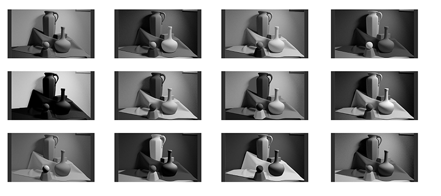
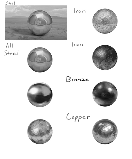
Some studies for metal reflectivity, gotta learn how to paint that shiny armor!


Posts: 184
Threads: 9
Joined: Jun 2015
Reputation:
3
Great studies :), just keep pushing man, it definitely makes me want to work harder.
Posts: 389
Threads: 2
Joined: Jan 2013
Reputation:
13
I love how focused your studies are. They also conjoin with your interests nicely.
A lot of sketchbooks on this forum are shotgunned with too many different things; a perspective study, an anatomy study, animal study, medieval design study, architecture study, exclusively studying from photos, exclusively drawing from imagination ALL. WITHIN. A. FREAKING. WEEK.
It's cool to have many interests, but FOCUS is important as hell, especially when it comes to improving as an artist.
Good work; many people can learn a lot from these 2 pages.
Posts: 205
Threads: 4
Joined: Oct 2015
Reputation:
7
(04-18-2016, 09:28 PM)Jaktrayter Wrote: I love how focused your studies are. They also conjoin with your interests nicely.
A lot of sketchbooks on this forum are shotgunned with too many different things; a perspective study, an anatomy study, animal study, medieval design study, architecture study, exclusively studying from photos, exclusively drawing from imagination ALL. WITHIN. A. FREAKING. WEEK.
It's cool to have many interests, but FOCUS is important as hell, especially when it comes to improving as an artist.
Good work; many people can learn a lot from these 2 pages.
Thank you man, I absolutely agree with what you're saying about focus. It's easy to get caught up in the panic of wanting to get better at everything at once; perspective, anatomy, form, light, color, narrative, materials, character design, environment design, and so on forever. At some point you have to just sit down and figure out what you want to do professionally and do JUST that thing and exclusively the studies that will get you better at specific pieces and specific projects, otherwise it's just studying for the sake of studying.
Focus is definitely the key.
Posts: 205
Threads: 4
Joined: Oct 2015
Reputation:
7
(04-18-2016, 08:50 PM)yangdaniel027 Wrote: Great studies :), just keep pushing man, it definitely makes me want to work harder.
Thank you yangdaniel027, pushing harder its what we're all about on this forum!
Posts: 205
Threads: 4
Joined: Oct 2015
Reputation:
7
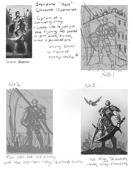
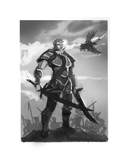
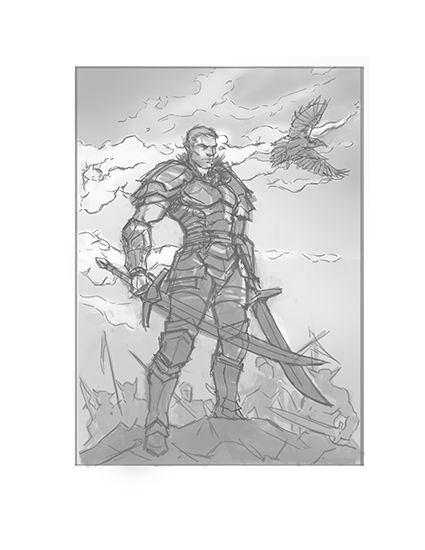
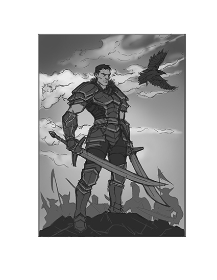
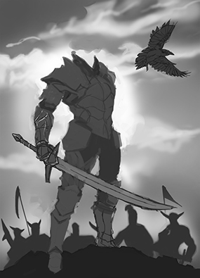
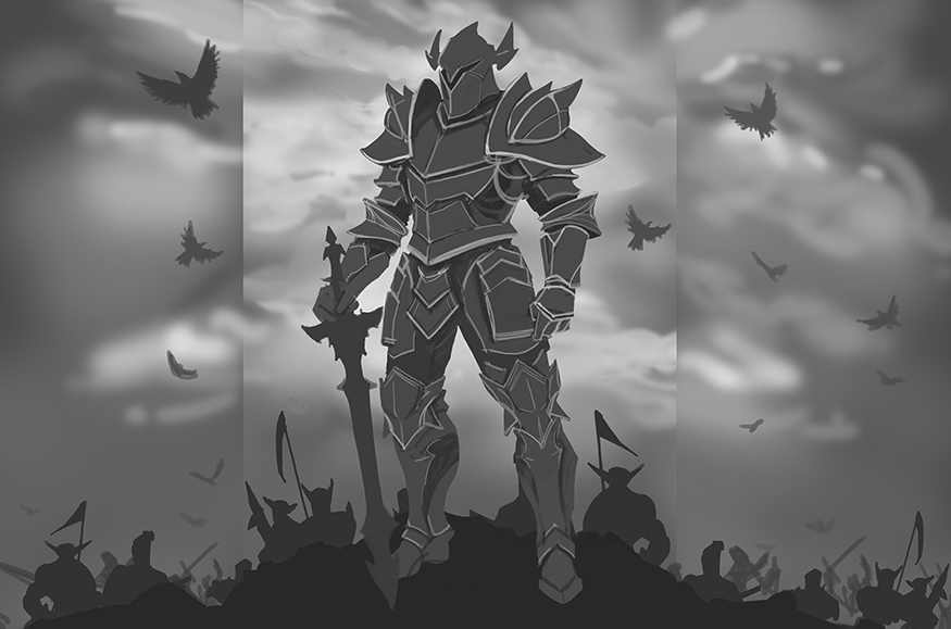
Progress from the current piece. I beefed up the armor design and expanded the composition to make the central figure look a bit more "heroic" .
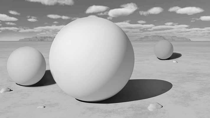
The background needs a lot of work, gotta study some clouds. Also, I think his legs might be too long now? Hmmmm

Posts: 654
Threads: 4
Joined: May 2013
Reputation:
22
Nice sketchbook man.
Yeah I think the legs are looking a bit too long on the figure, also maybe try moving the figure and the pile he's standing on to the left or right, moving it off centre even slightly can make for a more interesting composition sometimes.
Posts: 205
Threads: 4
Joined: Oct 2015
Reputation:
7
(04-20-2016, 03:31 AM)Triggerpigking Wrote: Nice sketchbook man.
Yeah I think the legs are looking a bit too long on the figure, also maybe try moving the figure and the pile he's standing on to the left or right, moving it off centre even slightly can make for a more interesting composition sometimes.
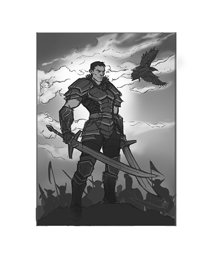
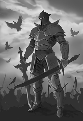
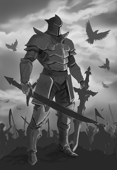
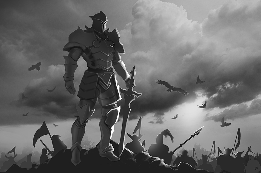
You're absolutely right man. I took your suggestions and made the legs shorter and moved the figure and pile of rocks over to the left. I also changed the background and the lighting setup to push the mood further. Thanks so much dude!

Posts: 205
Threads: 4
Joined: Oct 2015
Reputation:
7
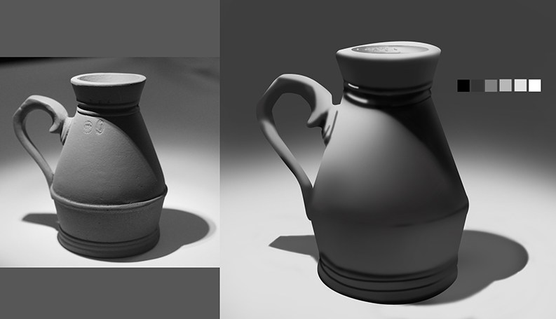
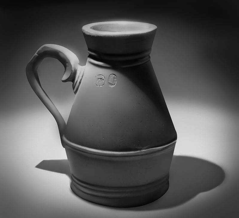
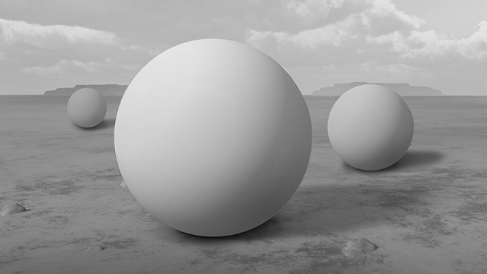
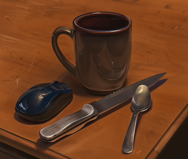
Trying out digital painting from life for the first time, thought I'd do a still life with some shiny things around my house.

Posts: 205
Threads: 4
Joined: Oct 2015
Reputation:
7
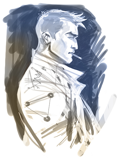
A sketchy guy

Posts: 205
Threads: 4
Joined: Oct 2015
Reputation:
7
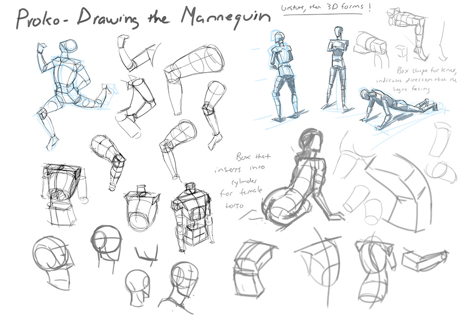
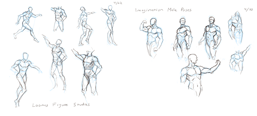
Just doing some figure studies from Loomis today

Posts: 1,342
Threads: 17
Joined: Jul 2013
Reputation:
45
Damn you do some nice imagination poses. ALSO DRAW THE LEGS AND FEET, I have the same issue where I neglect them and then when I do draw them they are subpar quality.
Posts: 205
Threads: 4
Joined: Oct 2015
Reputation:
7
(04-23-2016, 02:47 PM)crackedskull Wrote: Damn you do some nice imagination poses. ALSO DRAW THE LEGS AND FEET, I have the same issue where I neglect them and then when I do draw them they are subpar quality.
Ha ha thanks dude, you're right I need to stop ignoring the damn legs and feet! Also hands. A common weakness among us figurative artists
|
