Your new soldier piece is looking very cool. I'm on a computer right now that I don't trust color-wise — so I'll have to bow out on offering my opinion about that.
I must say though — I do love the scene, pose — and as always you are a master of expression. The details you put into those weapons is fantastic!
I'll make one suggestion that his right leg seems a bit short. I used the red lines which are the same length (duplicated layers) to scope it out and did a quick paint over by just using the lasso tool and a quick fix to missing background lines.
Otherwise everything looks very good — can't wait to see what you do with it.
-----------------
Your self portrait turned out truly AH-MAZING! I think in many ways it's your best piece so far. I'm gonna go to school on the way you painted the eyes! The colors POP — and I love the way you added the texture to the background.
If you've moved on from this one I understand — you did make an improvement to the chest muscles for sure — but I'm still not convinced by your stylized take. Your original sketch has a more convincing collar bone and shows more muscle definition.
As I thought about it I had an idea — and I'll share my ROUGH paint-over and some pics to illustrate what I'm on about.
I was thinking — since you kinda went stylized in that area — to combine your sketch with the final painting and make a kind of 'Roman portrait bust':
I think your portrait is so strong and will make an excellent portfolio piece — and maybe I'm just being nit picky — but I think some additional attention to that area will pay off for any art directors or folks looking to commission you.
Either way — I hope you understand I'm just meaning to help if I can.
You are continuing to amaze with each new piece!! Keep up the GREAT work!
darktiste: I might do that regarding the concrete/rock. I want it to look like rubble so hopefully it does by the time I'm done with it. I'm trying to sell the idea of rubble and debrit, so I do need to have some smaller shapes here or there, but I'll do my best to keep interesting!
I was considering a space ship as well during the sketch phase, perhaps I should implement it after all? I'll probably keep it subtle though, probably in the back with the other two planets to not detract too much attention from the figure. Excellent points regarding both sci-fi and post apocalyptic work... What I'm going for is something gritty but notably sci-fi, so I'll try to make this more obvious as I progress with the image.
Thanks again for your input and suggestions, always very helpful!
Jephyr: Hello! Great point regarding the leg, just applies your input to the image so hopefully it looks more natural now.
The statue bust looks really great actually! I don't think I'll implement it into that particular image as it's done and I don't want to rework it heavily... but I think I'll do a statue bust in the future, already have a solid idea for it so we'll see where that goes. Great suggestion!
Thanks again for your positive words and support, really appreciate it!
.................
I resumed the painting process and decided to combine both color palettes of A and B as I feel those two worked best. The image has already come quite a long way, and I'm particularly pleased with the colors... Very natural looking while avoiding oversaturation so I'm very happy in that regard! Any input would be appreciated as always!
(08-09-2022, 04:23 AM)cgmythology Wrote: Jephyr: Hello! Great point regarding the leg, just applies your input to the image so hopefully it looks more natural now.
The statue bust looks really great actually! I don't think I'll implement it into that particular image as it's done and I don't want to rework it heavily... but I think I'll do a statue bust in the future, already have a solid idea for it so we'll see where that goes. Great suggestion!
Thanks again for your positive words and support, really appreciate it!
.................
I resumed the painting process and decided to combine both color palettes of A and B as I feel those two worked best. The image has already come quite a long way, and I'm particularly pleased with the colors... Very natural looking while avoiding oversaturation so I'm very happy in that regard! Any input would be appreciated as always!
Hi CG! Always glad if any suggestions I make are helpful!. IMO that leg does look better too.
I understand calling an image 'DONE' and moving on. As I wrote, that portrait is one of your best.
It'll be cool to see if you can implement a bust concept into a future work.
This monitor isn't calibrated and colors look really awful on it — but I can say the soldier concept is looking sooper cool. Love the 'fresh' explosion look with burning embers and debris scattered around.
On the weapon to the left the ellipses are a little off. I know those are hard to get right — but I'd suggest a little more work on them if you're so inclined.
Otherwise — looks like you're going to have another fantastic piece. Looking forward to seeing how you polish it up!
Jephyr: Glad to hear it! I already have a good idea for a statue bust, although I probably won't tackle one until a few months since I just recently finished a portrait already. Great point about the ellipses, I revised them a bit. Not sure if they're perfect but I hope they work well enough! Thanks again for your support!
.............
I resumed work on the image and it's come a long way, pretty much done at this point! I'm calling it done for now unless there' something major that's not working, so any input would be appreciated as always!
''I love the jean of the future ''... gotta be a bit more creative i think if you are going for full futuristic but you throw in a element that seem out of the era.Meaning that even those i said post apo mix two era you gotta try to put in element that can survive the catasrophy(they might have survive that not for me to decide)I just think that someone who look like he as the mean to be equip with the best equipment probably wouldn't wear pant in a wars zone he would be wearing something a bit more appropriate.This remind me of the equivalent of women armor in video game.It cool but it doesn't make a lot of sense.Find the balance.
One thing that doesn't work for me also is i would say is that you should be thinking more about how they use those weapon and how they transport them.Right now he doesn't have a pistol hostler nor does he as a gun strap for the heavy minigun which seem to make sense to have.Just detail i think help make them feel more functional that help also the viewer relate because those thing exist in were timeline.
One thing i don't like is how flat the stuff he is sitting on look that to much of a separation in my opinion in value and saturation(i fix that in the pov*).
Also the pose look unbalance in term of weight distribution.Might be good to keep pushing gesture study.
1.Here a few thing i tried i darken the overal scene
2.I put some smoke in the foreground to harmonize the subject with it environnment and to decrease noise at the bottom of the piece.
3.I desaturated and ajusted the contrast to reflect how i see the light scenario work in such a smoky environnement.
Other than that you are without fault because you try to work those problem out most of the time.
That looks GREAT, George! Congrats on another fine image.
Those ellipses are much improved and the 'depth' in this one is so cool.
I do agree with dark that a little of that smoke in the foreground would be a nice touch.
Even though he's taking a resting pose it's still has a very intense feel because of the explosion 'aftermath' and his expression. The muscle definition on that suit across his arms and chest is quite good!
Another great piece!
A few small nits minor fixes if you're still open to them on this one:
I don't see any shadows under his feet.
And you have mixed edges on the ones under him - some have sharper edges and other are more diffused (which seem better IMHO).
Last nit (and I hope I don't drive you mad with all these late suggestions) but his LEFT foot looks a bit small (meaning the one to our right). Sorry I didn't notice that before.
An easy fix would be to give it a little more length and extend it behind his weapon.
Here's a hand foot comparison I found on an image search. It doesn't give measurements or dimensions but it'd give you an idea of what I'm going on about.
Anyway, each image you post is better than the last — and my small crits aside — this one is no exception.
I see you improving so much and I just what to add another set of eyes to your progress and help you on your way if I can!
darktiste: Great point about the costume design, I'll try to be more practical in the future in that regard. Thanks for taking the time to do the paintover as well, very helpful. I incorporated your suggestions to the final image.
Jephyr: Thank you! I agree about the smoke so I added it in. Added some contact shadows on the feet as well. Finally I made his foot a tad bigger as suggested. Thanks again for your input and support, always very much appreciate it!
..............
I made some final adjustments to the image based on the input I received and finalized it. I'm calling it done for now, here is the final image:
..............
Up next is another take on the Greek Goddess Athena. The image was inspired by a recent photo from Grafit Studio that I recently purchased, so I did my best to recreate the general pose while taking some artistic liberties on the costume design. Also went for a complex environment this time, which was very time consuming as it took me 3 times to get right, but I'm quite happy with the sketch I must admit. Any feedback before I begin some color tests would be most welcome!
I tried doing the hand pose and let me tell you i can't do it even if i try really hard.The little finger move with the finger next to it when it bend this much.Try it yourself.Not saying it wrong just saying that from a anatomical stand point this would be wrong.This is an example of why i think it always good to try and do the pose yourself before drawing anything human related.
The top left corner seem very confusing to me right now perhaps simplify anyway you don't need or want the attention to be there i think.A few ellipse should be rework i am think about top left.
The soldier turned out way cool! Gotta add high marks to you for being willing to take suggestions and implement them when you agree. That will come in handy for commissions and demanding art directors. KUDOS!
The Greek goddess pic is looking great! Love the dynamic pose and dutch angle background.
Although Zeus seems a little cramped back there — so one solution would be to reduce his height/size to give him a little more room.
I have so much trouble with non-organic things — so this suggestion is from THAT guy.
Her helmet seems a bit wonky. The head part too small and the decorative tuft thingy too large and off plane.
I found a helmet pic that approximated her head view and did this photo bash thing-ma-bob:
Here's the original - sorry I was in a hurry and can't credit the creators of ref images because I didn't note where I found them < Bad Jephyr - BAD!
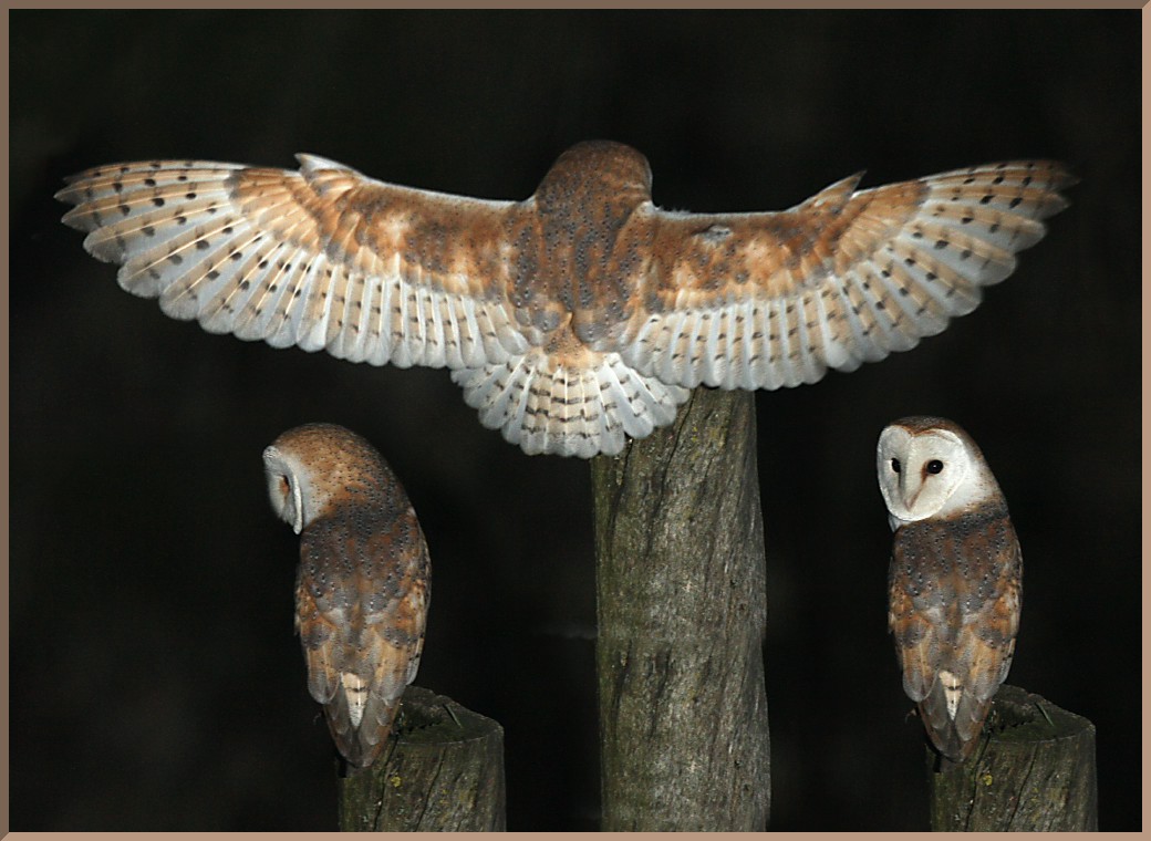
On the owl I'd suggest the following:
I know you were going for a stylized look on the tail feathers but I found that a little distracting instead of enhancing.
George — I KNOW you're going to turn this into another FANTASTIC piece of art and I'm looking forward to seeing your progress.
I'm going to stop apologizing for offering ideas (unless you tell me to stop) because I hope you'll always know I have your best interests in mind!
darktiste: Excellent points! I refined those elements for a more natural look, hopefully it works better now.
Jephyr: Thank you! Excellent suggestions as always. I revised the sketch heavily and incorporated all your feedback and it's much improved as a result, so I'm very grateful for your input!
..................
I refined the sketch a bit further and improved many aspects of it all around thanks to the feedback received. I began painting it in, had a very clear vision of the colors I wanted to use so I didn't bother with the color tests for this one. I'm keeping things fairly desaturated at this point for a more natural look. Still has a long way to go but I'm pretty pleased with the progress. Below is the current update:
Well now that you ajusted the picture it seem one of the pillar isn't supporting anything.Also one question why is there two color for the pillar?
One other note is how the elbow curve when it should be more angular.
I think i would get rid of the plant behind her they don't serve much of a purpose atleast for me and the cast shadow nearby could be a nice way to add flow to the image.
The space between her nose and top lips seem extremly small almost as if she had excessive botox injection.I think pulling down the mouth with the lasso or redoing it might be a good idea.But i think this would more of a nitpick it minimal since the amount of detail in the piece is high enough that it can go under the radar.But personally i think we would see more of the mouth than you shown us.
darktiste: Great input. I adjusted the pillar. I went with two colors to make the image more interesting, there's a lot of white going around in the image so I wanted to break that up a bit. I adjusted the mouth a bit so hopefully it looks more natural now!
Jephyr: Thanks you, and excellent suggestions as always! I implemented all your input!
..............
I finished up the image finally. Pretty pleased with it overall, but I'm open to any final suggestions if something is off so please let me know! Below is the final image followed by the steps for those interested!
No really a critic but some minor ajustment of value that help create more visual hierarchy.
1.I darken under the wing of the olw
2.I adjusted the color of the golden part on the left arm
3.I gave the back a bit more of roundness to it
4.I added some shadow to the white cloth
5.I tone down the sharpness of the shadow on the chin and cheek and neck region.
6.I tried to push the boundry of storytelling by using a brush to give it almost the feeling as if we are looking at a old mural but it also help frame the important element i splash on a few place where i felt there was to much detail that competitioned for attention
darktiste: Excellent suggestions! I incorporated everything you mentioned except the sand texture. Although it helps with the values I lose a lot of detail I spent quite some time on, ultimately I don't feel it's worth the sacrifice.
..............
Updated the image based on the suggestions, I'm calling it done for now. Thanks to everyone who commented and gave their feedback, it was really helpful and made for a better image in the end!
And kudos to you for finishing two complete paintings in a month. Determination and patience are the keys to success as you demonstrate. Looking forward to your next painting.


.jpg "Filename: proxy-image (3).jpg
Size: 146.3 KB08-18-2022, 01:08 PM")


