03-18-2016, 02:12 AM
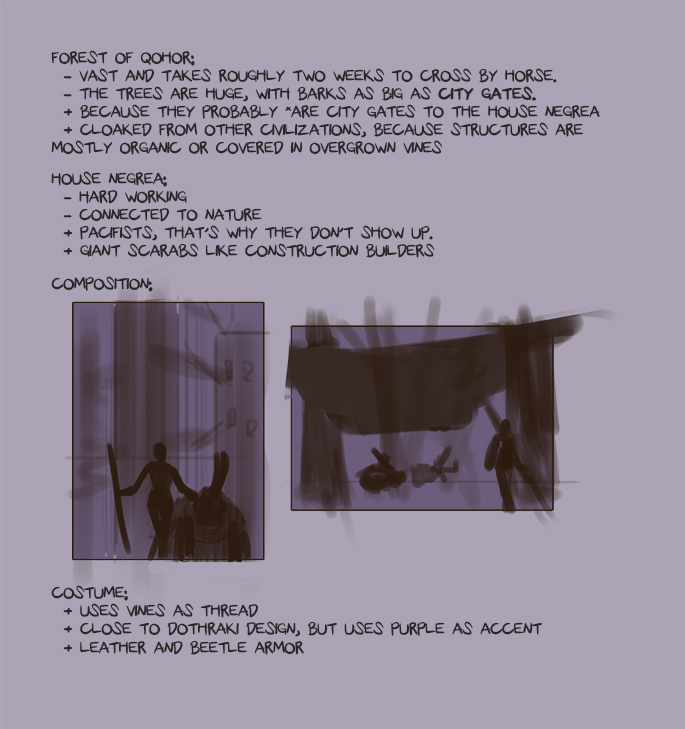
To be continued.
If you are reading this, I most likely just gave you a crappy crit! What I'm basically trying to say is, don't give up!
----
IG: @thatpuddinhead
----
IG: @thatpuddinhead
|
John CC 1: GoT Game?
|
|
03-18-2016, 02:12 AM
 To be continued.
If you are reading this, I most likely just gave you a crappy crit! What I'm basically trying to say is, don't give up!
---- IG: @thatpuddinhead
03-18-2016, 03:00 AM
Good start. IIRC you didn't watch GoT so some small things I'd like to point out:
- I believe Qohor is not in Westeros (another continent) - GoT is not a high fantasy, besides few dragons, warewolves and crows there are no magical creatures (at least to my knowledge), so giant scarabs might be a bit of a stretch. - as house Negrea is supposed to be from Westeros, you should probably design it so it'd still match that medieval european culture. Of course you can expand the design incorporating other cultures elements but it still should be recognizable as house of Westeros. I like all of your other points. Keep this up! Sketchbook | Gallery | Twitch
03-18-2016, 04:47 AM
(03-18-2016, 03:00 AM)Piotr Jasielski Wrote: Good start. IIRC you didn't watch GoT so some small things I'd like to point out: ![[Image: what-the-f-tom-delonge.gif]](http://www.reactiongifs.com/wp-content/uploads/2013/06/what-the-f-tom-delonge.gif) Ooh boy, I nearly screwed the pooch on this one. I'll look and see if I can salvage some ideas. Thanks!
If you are reading this, I most likely just gave you a crappy crit! What I'm basically trying to say is, don't give up!
---- IG: @thatpuddinhead
03-18-2016, 05:06 AM
No worries. House Negrea is our imaginary creation so you can add an imagynary land to fit it in (just as a part of Westeros), so pretty much all your points are still valid. And instead of living huge beetles you can always implement some statues.
I think my post might seem like a strict warning, but it was more of a slight suggestion :) Sketchbook | Gallery | Twitch
03-18-2016, 01:56 PM
^ Just a helping hand for sure <3
From what I've read so far, I really like your ideas. And ideas are honestly everything when it comes to kickassery in art. Can't wait to see what you're cooking up, John!
sketchbook | pg 52
"Not a single thing in this world isn't in the process of becoming something else." I'll be back - it's an odyssey, after all
03-19-2016, 10:00 AM
@Piotr I am sticking with your suggestions. I read up more about Westeros and checked out the lore and you were right about me going off tangent. Thanks!
@smrr Just trying to keep up with you and everyone else! I didn't get to save the old iterations, but I ended up with this. 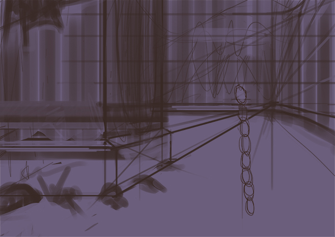 And I'm figuring out how the character will look. 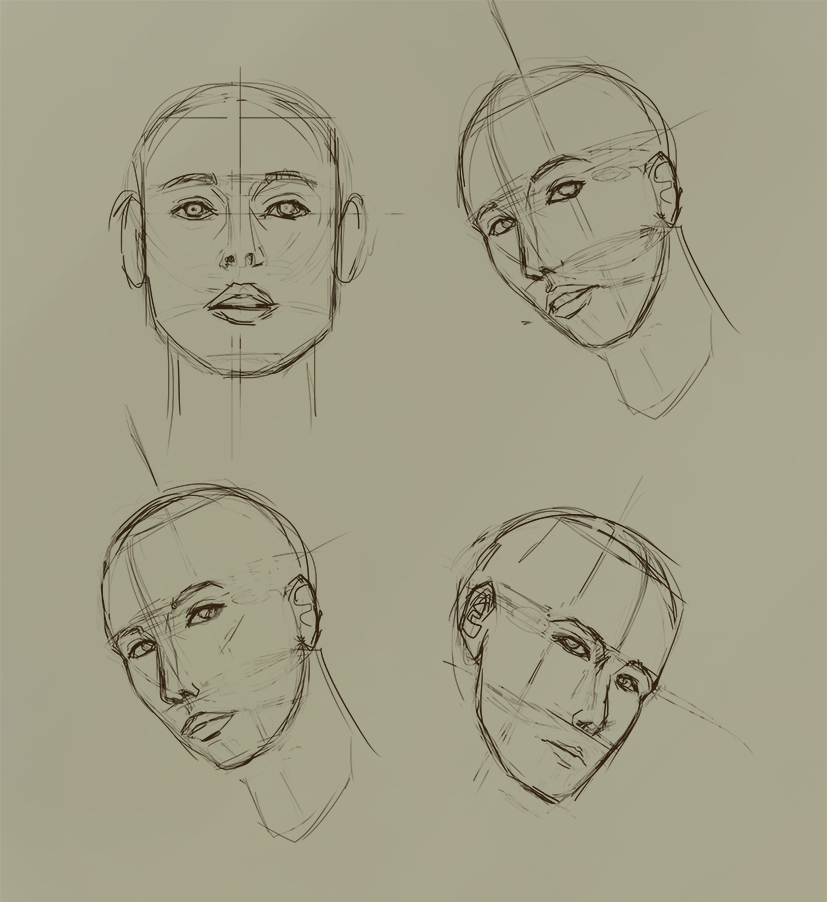 I know it's not much. I haven't really dived into the design aspect. To be continued. Again!
If you are reading this, I most likely just gave you a crappy crit! What I'm basically trying to say is, don't give up!
---- IG: @thatpuddinhead
03-19-2016, 10:26 PM
Helmet design:
Tried to put the beetle element. Will tweak it a little bit more since it looks oriental than European. 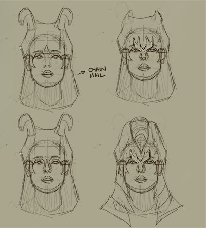
If you are reading this, I most likely just gave you a crappy crit! What I'm basically trying to say is, don't give up!
---- IG: @thatpuddinhead
03-19-2016, 10:35 PM
I like the fourth helmet, has some cool shapes in it, will that be chainmail aswell?
03-20-2016, 08:12 AM
Ok im gonna comment on your last thumbnail composition where there are perspective lines, It looks to me you're much more concern of getting the perspective right. what I recommend is to go do a thumbnail where you're much more concerned of how the value and the shapes work more than perspective, because perspective can be built on top of a well composed image by that I mean ( good shapes , rule of thirds and value). I hope I'm making sense right now.
I do hope that , thats what you've been doing and I'm looking forward to your wips.
03-21-2016, 07:11 AM
@BrushNoir: Probably metal! Maybe some animal hide. Definitely not chain!
@KurtJeremy: It does make sense, in the way I've seen people do it the way you described. The technique is efficient, fast, and loose enough to even surprise the artist who's working that way. Here's the big but. I tried to start pieces that way before, and I never got the results I wanted. In an experimental piece, I'd probably go that route to start a piece. But I am hoping to get critiqued and judged with my best foot forward and knowing what I know. And I hope to get the shit kicked out of me at my best from a critique. I don't want to give myself any excuses. Don't get me wrong, I look up to people who works with shapes and values right off the bat. Are you familiar with Stjepan Sejic? I watch his videos and try to emulate how he does things. It makes we want to chuck my tablet across the room and cry in the corner. We may disagree with the process but I totally agree with always having a good composition in mind. Judging by my last thumbnail, you are correct. It is not strong enough of a composition. I will rectify that. Thanks! I will be more mindful! --- Armor designs. Just so I don't forget the direction I want to go. 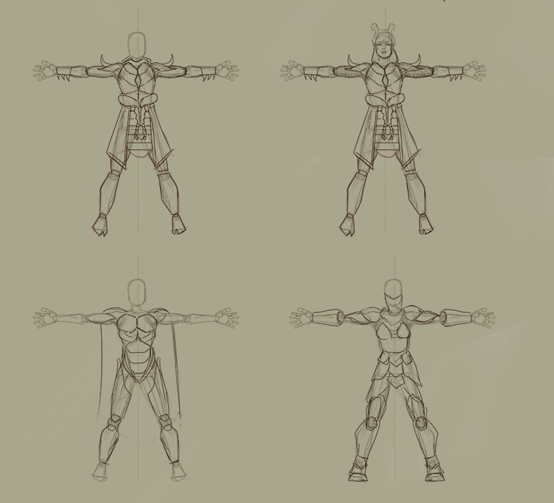 To be continued!
If you are reading this, I most likely just gave you a crappy crit! What I'm basically trying to say is, don't give up!
---- IG: @thatpuddinhead
03-21-2016, 09:55 AM
Hey man, looking good! The armour designs have that beetle flavour in them, maybe something like a big beetle shell could push it further? either as some kind of back armour or as a shield. Keep going ^^
03-22-2016, 09:37 AM
@BrushNoir Got it! I mixed the elements of the first and the third one. Probably going to change after I get a fresh eye.
@Jonny Good thing I read your comment before I started working. Yes, now I am trying to incorporate that back armor thing. Won't be as prominent because I'll be having the subject shot facing the camera. Thanks! 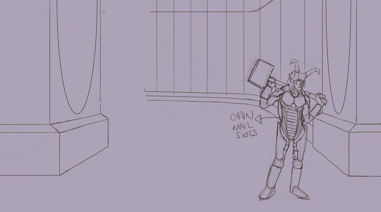 Adjustments! And coloring later!
If you are reading this, I most likely just gave you a crappy crit! What I'm basically trying to say is, don't give up!
---- IG: @thatpuddinhead
03-24-2016, 07:58 AM
Updated the armor. Probably will update it again from the waist down. I cropped the piece because the other side looks like a huge mess.
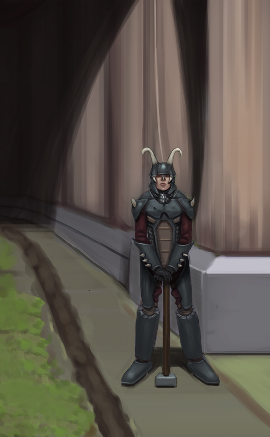 To be continued!
If you are reading this, I most likely just gave you a crappy crit! What I'm basically trying to say is, don't give up!
---- IG: @thatpuddinhead
03-24-2016, 11:41 AM
Oh this is really nice! That helmet turned out great.
03-25-2016, 05:43 AM
@BrushNoir Woot! Thank you!
Thank you Piotr! I really took that statue tip to heart! 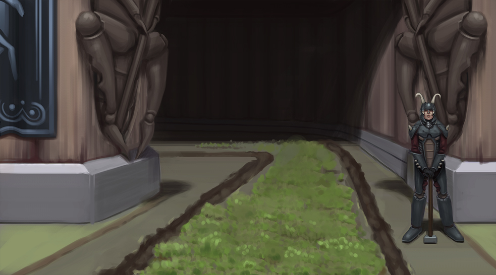 Still not there. But I still have a few things up my sleeves. To be continued..
If you are reading this, I most likely just gave you a crappy crit! What I'm basically trying to say is, don't give up!
---- IG: @thatpuddinhead
03-25-2016, 06:00 AM
Hey, looks cool. Although the character seems a bit lost. Maybe make him bigger and put in the center?
Sketchbook | Gallery | Twitch
03-26-2016, 01:28 AM
@Piotr It does bother me too. I thought it was just me and could get away with it. Your comment definitely is a wake up call. I'll see what I can do. There will be big changes. I totally appreciate this.
---- Crap. I lost my high res file for being careless. Which is probably a blessing in disguise. Now that I don't have to soften the character back to the background.. Time to make changes! Haven't drawn a horse in my life. Quick study. 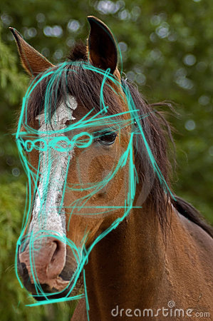 Quick planning 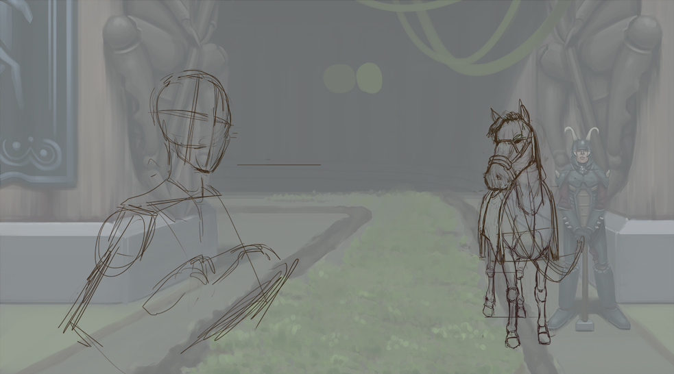 To be continued.
If you are reading this, I most likely just gave you a crappy crit! What I'm basically trying to say is, don't give up!
---- IG: @thatpuddinhead
03-26-2016, 10:51 AM
Coloring soon, and going to fix a lot of the background later.
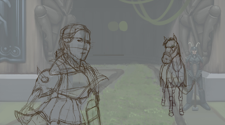 To be continued. I hope I wake up early!
If you are reading this, I most likely just gave you a crappy crit! What I'm basically trying to say is, don't give up!
---- IG: @thatpuddinhead
03-26-2016, 06:07 PM
Looking freaking sweeeet! Loving the shadows in the background there, and also the green walkway grass carpet and stuff. And those reliefs! So good!
I do think the horse's head is a bit large, though... it looks a little fish eye perspective-y. Also, I've owned horses and draw them a lot, so I thought a quick redline would help with the head anatomy faster than an explanation, haha! 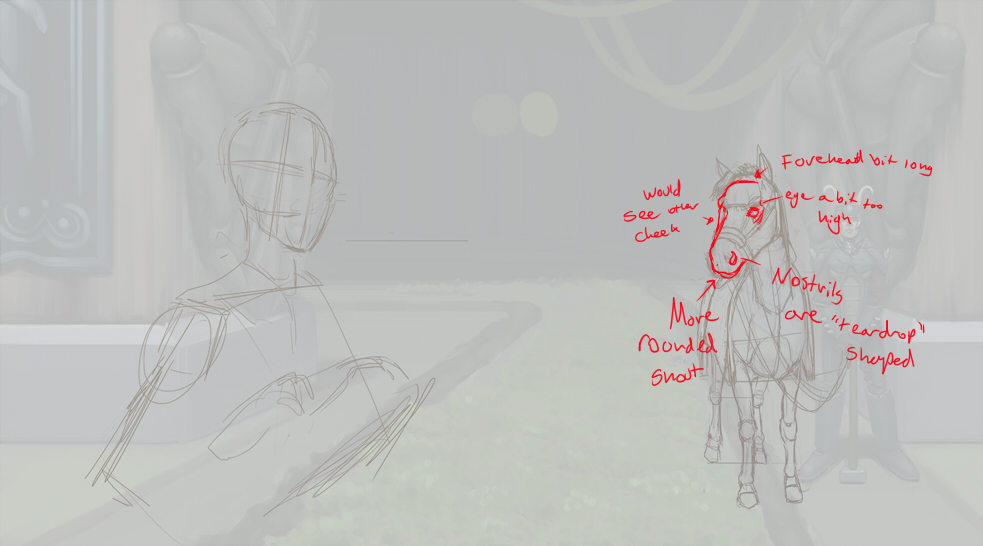 Hope this helps!! |
|
« Next Oldest | Next Newest »
|