04-25-2016, 01:01 PM
Composition designs, creature designs, and final line drawing. STILL working on final
|
CE RL's CC 2 WIP: LATE
|
|
04-25-2016, 01:01 PM
Composition designs, creature designs, and final line drawing. STILL working on final
04-26-2016, 06:33 AM
(04-25-2016, 03:18 PM)Piotr Jasielski Wrote: It's great you do this! Good luck :) Final, Late, but glad it's done!
04-26-2016, 02:18 PM
Hey here's a quick crit and paintover!
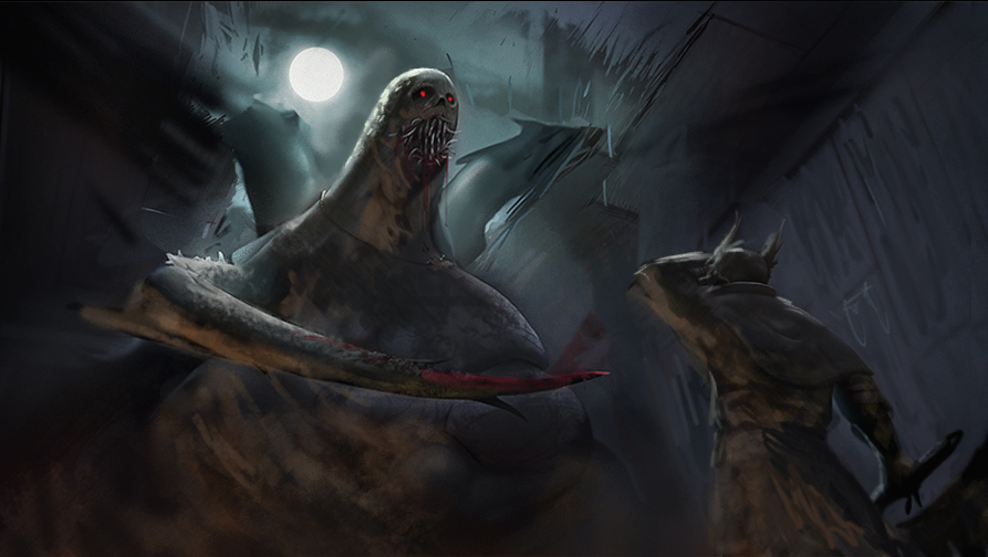
First thing that jumps out with your image, is everything is very smooth, as if it's all made of the same material. so I added some quick texture on the creature. I enlarged the creature to make him appear more terrifying, and follow the rule of thirds a little better. unified the lighting and added a secondary warmer light source to help define the forms in shadow and add cool vs warm contrast. Also darkened the moon and sky around his head a little so the creature stands out - light on dark dark on light. Also may bay a little goofy but I added some red eyes just to push the monster as the focal. 
04-26-2016, 04:03 PM
Looking at it again, his pose also doesn't represent a hunter or the situation very well, it's like he's looking out at a beautiful view covering his eyes from the sun.
Gotta think how you'd react to some disgusting giant monster just crashing through the roof, unless you're a psychopath you're gonna be startled, and you'll likely jump into a defensive stance.
04-27-2016, 07:28 AM
Thanks for the crits, man. I really think enlarging the monster, changing the pose of the protagonist, adding a warm light, placing an eye catching element on the monster face, and developing the texture are GREAT suggestions.
I'm working on integrating your points ASAP!
04-29-2016, 02:51 PM
Definite improvement! happy to see you applied them!
04-29-2016, 06:18 PM
I'm so stoked you finished this even though you didn't submit a final!!! I would say the environment is a bit abstract, and could probably be given more of a Bloodborne context with some shape language work...but yeah, great stuff man. Finishing after the fact is hard and you did it!
04-29-2016, 07:59 PM
Whoa that looks great! I like your color choice, it's what I keep struggling with after the CC2. And that sweet texture on the creature's belly! I agree with Amit that adding some more detailed environent would be good, some gothic architecture. And maybe making a piece of another hand of the monster visible would make it more beleivable. Thumbs up for finishing your submission!
|
|
« Next Oldest | Next Newest »
|