06-22-2016, 05:23 PM
tl;dr
.
.
Sketchbook | Gallery | Twitch
|
Monkeybread's Dribblings
|
|
06-22-2016, 05:35 PM
I included pictures for people who can't handle words.
06-23-2016, 12:48 AM
I would definitely brush up on them faces for future endeavors. There are some small technical problems with all of these that aren't all apparent at first glance or easy to point out, and a bit of inconsistency from a stylistic point of view. Some also seem more rushed than others.
I think consistency here would've overshadowed any inexperience. I wish they were all done in the same style as "soldier 02" which I think is the best of the bunch. Having a flat colored bg for all of them, having their portraits zoomed out at "soldier 02" level, and keeping all of the values somewhat similar.
06-23-2016, 04:21 AM
Wow thanks for the honest story. I don't even think these portraits are that bad but what do I know. I really love the variety you put into them.
I once had a small freelance job where someone asked me to paint a crowd of football fans, let's just say I underestimated how tough it is to paint and excited crowd. I felt really embarrassed with my final product. Oh boy... Worst feeling ever. The guy still paid me but never contaced me again eventhough I knew there were other artist who got more steady work from him. I was just to shitty... :( Haha
06-23-2016, 02:29 PM
@Dennis: Thanks man I totally agree. I did more face construction studies and have a more consistent approach now, but still working on it!
@zipfelzeus: No worries. Yep it's a terrible feeling to deliver poorly, especially if you have no one to blame but yourself, just realise that it's through those failures that you learn! Client: FFG Price: 100USD a card! (ugh). Though now they have raised starting rates to 200. No kill fees, no upfront payment. Shittest contract ever. Great ADs These were my first cards for FFG, and the only ones I can show yet. Had a month to do the two cards. The process was fine, delivered on time, they seemed really happy with the results. I wasn't but haha, what else is new. First images are the sketches I sent, followed by revisions and final. Now I work differently. I only send value sketches first. Colour comes later. The last shows half the card template I was given to work within. Each card series will have a different template that you will have to work within when creating the work. Apologies for the shitty quality 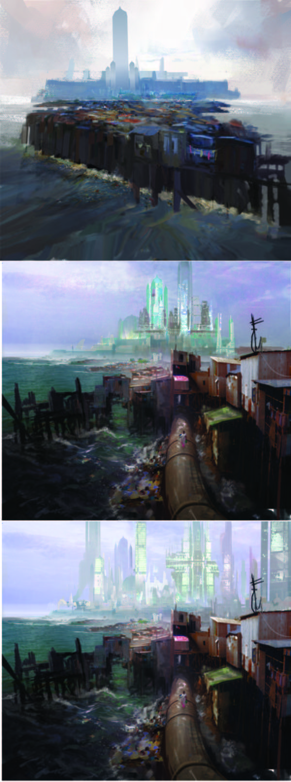 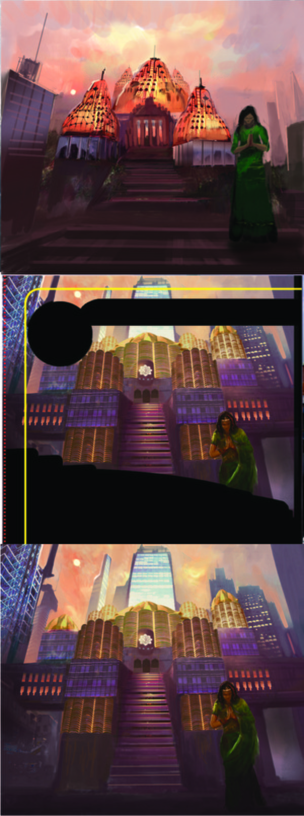 Just received my first contributor copy of these over a year later! I cringe at the artwork but so nice to see the product. 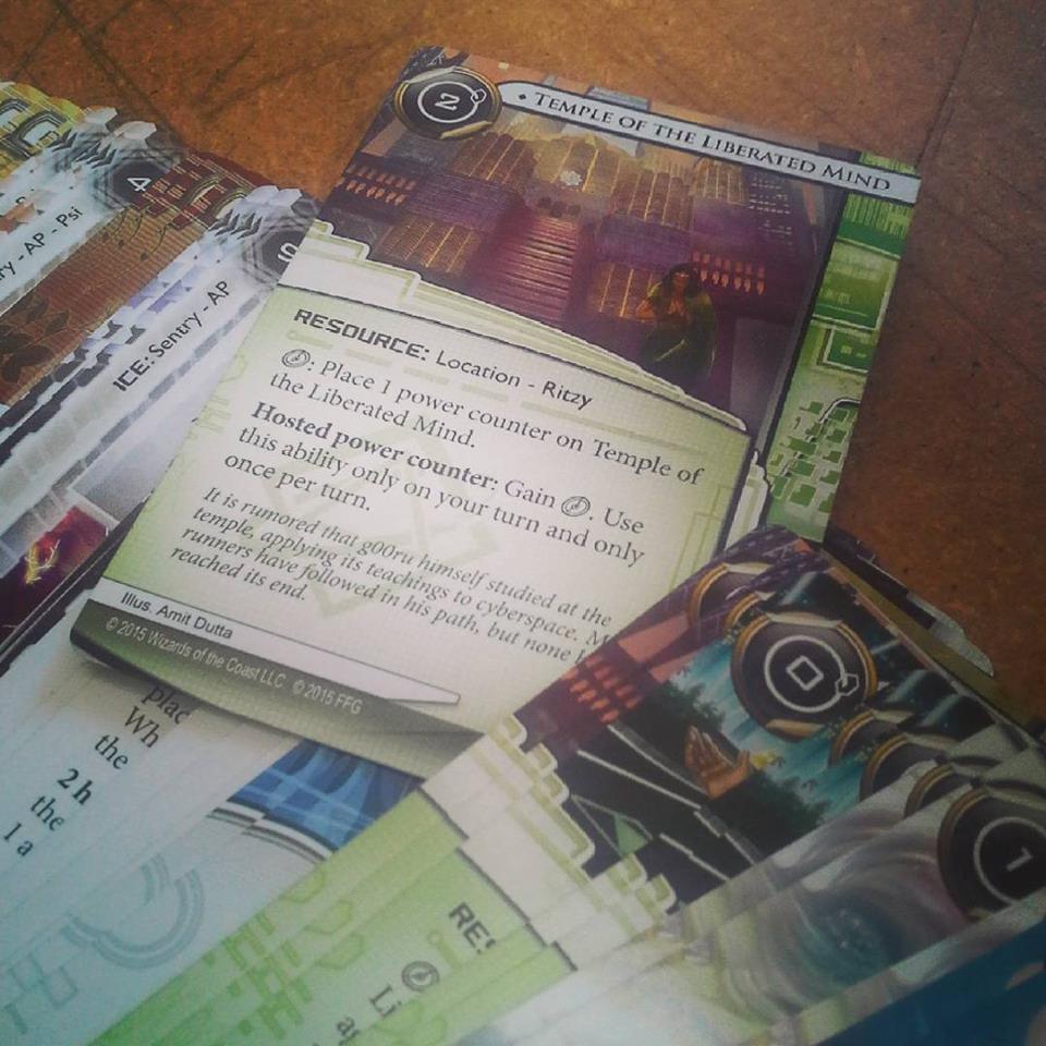 Learnings: It was good to do work for a well known company. The money was abysmal for the amount of time it took. I boycotted FFG after this for that reason, but now I am doing work for them again at 200 a card. Lol. Freelancers have to be beggars sometimes. The principle of not working for hire and being paid fairly is one with lots of merit, but the reality is sometimes you have to swallow your pride and do what needs to be done to survive. It was great experience and I'm glad I did it. Also realised that the AD is beholden to their own work programme and a hierarchy chain. I would wait days for feedback while my work got propagated up and then down the chain, so MEET their deadlines or it's not only your ass, but their ass that is on the line. You want the AD to love you because you delivered for them and made them look good. Your reputation is everything in this game, your skills are only half of it. That's why the Crimson Crucible is such good practice. If you can't produce one illustration in 3 weeks on top of other stuff...forget freelance.
06-24-2016, 03:27 AM
I wouldn't pay $5 for this crap. >:]
The first ones are nice though. Sketchbook | Gallery | Twitch
06-24-2016, 04:29 AM
You don't have 5 dollars, so it's all good :3
06-25-2016, 09:10 PM
Hey man, i think you are on the money for your self assesment from the head job.
Though i will throw in a bit of a crit for how to move forward maybe. ![[Image: 4g70J8.jpg]](https://snag.gy/4g70J8.jpg) It seems that in your focus on environments you haven't developed the skill to effectively turn planes with value, you seem to be trying to communicate form with large soft gradients rather than flat values as you should. it's a hard concept to really grasp and use but when you have a direct light on the same material. If the value changes then it communicates a form change. I'm still unsure of the best way to teach this, but i found that subdividing forms with a hard round with no blending is a good way to practice it. Drawing out of perspective is like singing out of tune. I'll throw a shoe at you if you do it.
Sketch Book
06-26-2016, 01:35 AM
@Muzz. Thanks dude. You're right. That was over a year ago so I've been working on planes/construction etc..but yeah still suck balls at it.
Just a quick sketch tonight 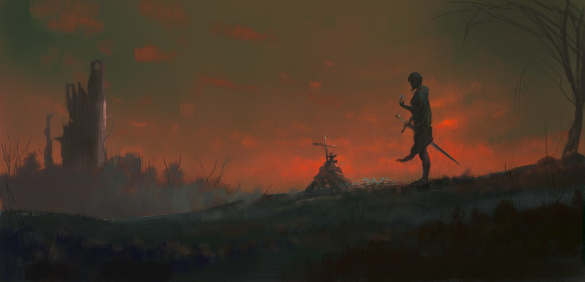
06-26-2016, 03:28 AM
Haha if you post year old work, you are probably gonna get feedback on old work.
Drawing out of perspective is like singing out of tune. I'll throw a shoe at you if you do it.
Sketch Book
06-26-2016, 04:12 AM
You might have missed the bit where I mentioned I was backtracking on my year of freelance and giving a run down on that side of things including my learnings, so others can get a sense of what freelance might be like just starting :)
This ain't no study grind sketchbook anymore....I personally find it utterly pointless to post that stuff
06-27-2016, 07:40 PM
About your head shots piece, how did you come up with the Ambassador design? What's the thought process behind it?
If you are reading this, I most likely just gave you a crappy crit! What I'm basically trying to say is, don't give up!
---- IG: @thatpuddinhead
07-12-2016, 05:17 PM
@John. Well the description was the main inspiration. A translucent alien with antennae translator device on it's head. I mostly got the design from fish reference when I was looking up translucent skin. it was probably the one I had least issues with, since it wasn't a real face haha.
This is my latest client piece. Very different from the usual. Always pushing the comfort zone, and tried to delve into a new/old style I used to enjoy using silhouettes and texture and lots of implied detail ala Flaptrap, but nowhere near as good. Not satisfied with the outcome, but there are some fun bits in it and things I learned. Process shots on the left. The first one at top is what I sent to the client for comp approval. It's so basic but it gets the idea across. I often send very basic silhouettey/notan stuff now, rather than more detailed value sketches at the comp phase. I think I screwed the final a little bit by changing things around so some things got a bit less powerful from third to the final I think. sigh. Always check back! Always. And I really need a better monitor....might take Piotr's lead and start stripping for money. 
07-12-2016, 06:32 PM
Hey Amit! :-) Yeah, that's a bit different for you. I like the energy in the painting. Reminds me a bit of Marta Nael's work. I can see where you've worked a penis into the design, subtle man, subtle. ;-D Yeah, I know what you mean about monitors–I definitely need a new one, and soon, once I get into painting in a big way. And I need to build myself a new computer box.
Of course, no new equipment can make you a better artist–only practice can do that–but a digital painter does need a good monitor. I have my heart set on an NEC Multisync, they are apparently awesome and Linux compatible! I found this discussion about specific requirements for painting monitors. The guy seems to set his standards quite high, but there are definitely some things to think about here. Unfortunately really high monitors are quite pricey, but I decided that I am willing to invest in something that will hopefully last me for years and contribute to my work. Again, though, no equipment will improve my skills so I'd better get back to drawing hundreds of boxes and plants and things. ^^
"Drawing is a skill like hammering a nail. You might not be great at it yet, but there is nothing stopping you from gettin' down and hammering away." -Irshad Karim
Sketchbook!
07-12-2016, 07:01 PM
Really interesting piece. Those big battles illustrations are always a challenge no matter what your comfort zone is. I do like that these very vibrant reds and oranges create a really violent mood.
I think.... and that's just a maybe right here but I think a bit of the dynamic is lost because in the third process shot the focus lies on the person lying on the ground and the rest are just shapes around here which creates the sensation of looking at a fallen soldier in the midst of battle. In your final comp, there seems to be two focus points. One on the person on the ground and then the otherone on the axe whielding guy on the left. And since you're still on progress the main focus point hasn't been established yet so the eye kind of shifts between the two of them which might be a bit confusing. Anyway this isn't my speciality take my suggestion with a grain of salt.
07-16-2016, 08:37 PM
@Mech. Thanks for the links, I have already done a lot of research on monitors. It's just about the money now. High end monitors only truly become important once you are doing pro work for print or sharing collaborative work with others. Otherwise you can get away with a lot.
@ Zip. Thanks! I think it's more the different placement of the dead guy and the change in the dynamism of the figures (especially the foreground ones) between the two sketches and the fact that the silhouettes in the sketch were stronger. The two focal point thing was a conscious change. Thanks for the feedback Couple of notan-ish sketches 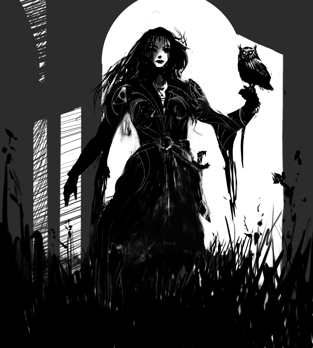 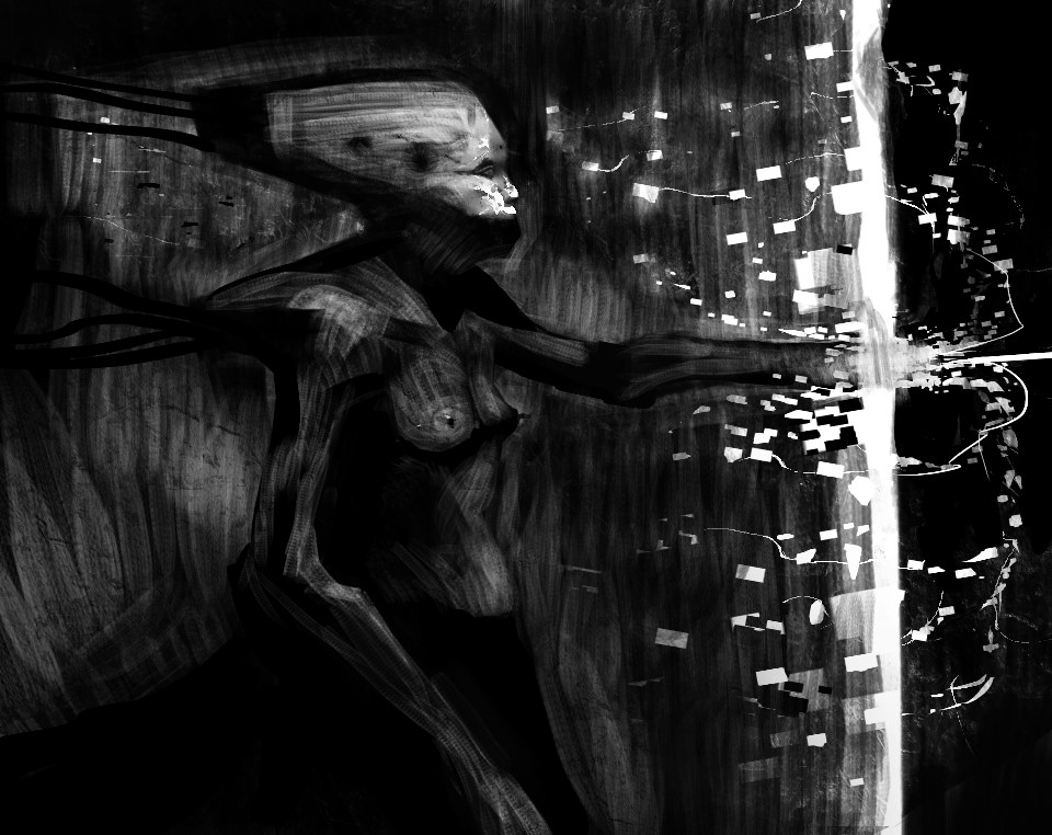
07-20-2016, 08:12 PM
Public service announcement. There is a Notan Study group started by Piotr. No idea what I'm talking about? go check it out
http://crimsondaggers.com/forum/thread-7701.html Some very recent client design thumbs I did for creature design. I know NOTHING about creature design, won't stop me trying. used the aforementioned notan technique to iterate several dozen ideas before sending these to the client. They picked B but loved them all. I don't know why. I think they are objectively quite shit. *Shrugs. 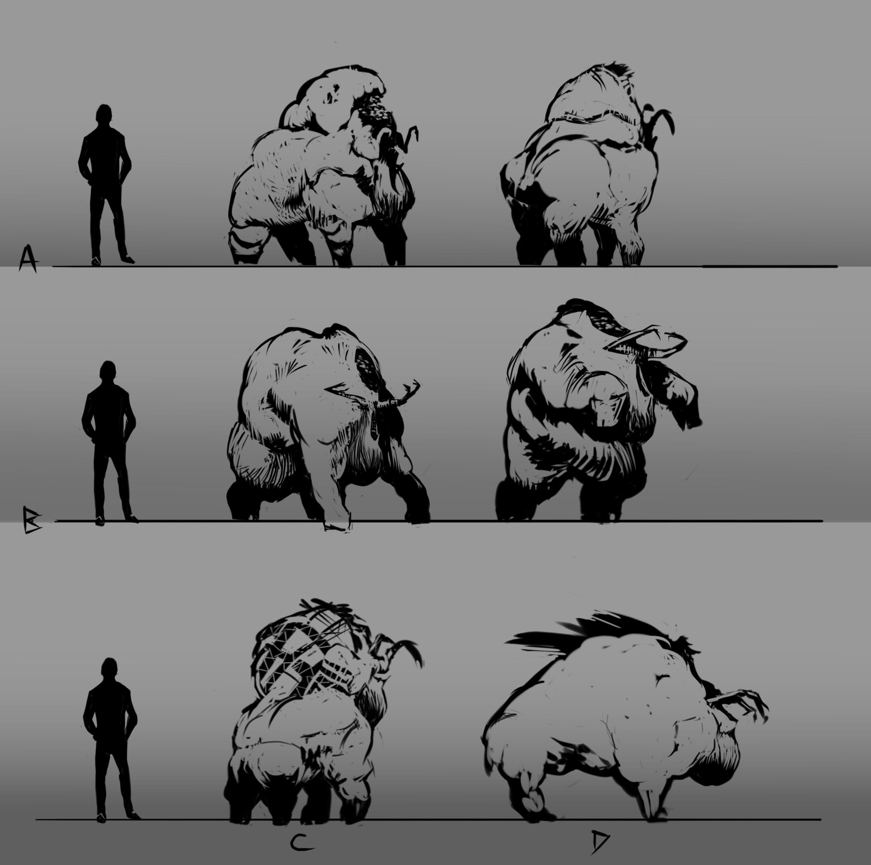 Trying to do daily sketches restricted to no more an hour or two max, and I often incorporate the notan technique to make things simpler. .04 and .05  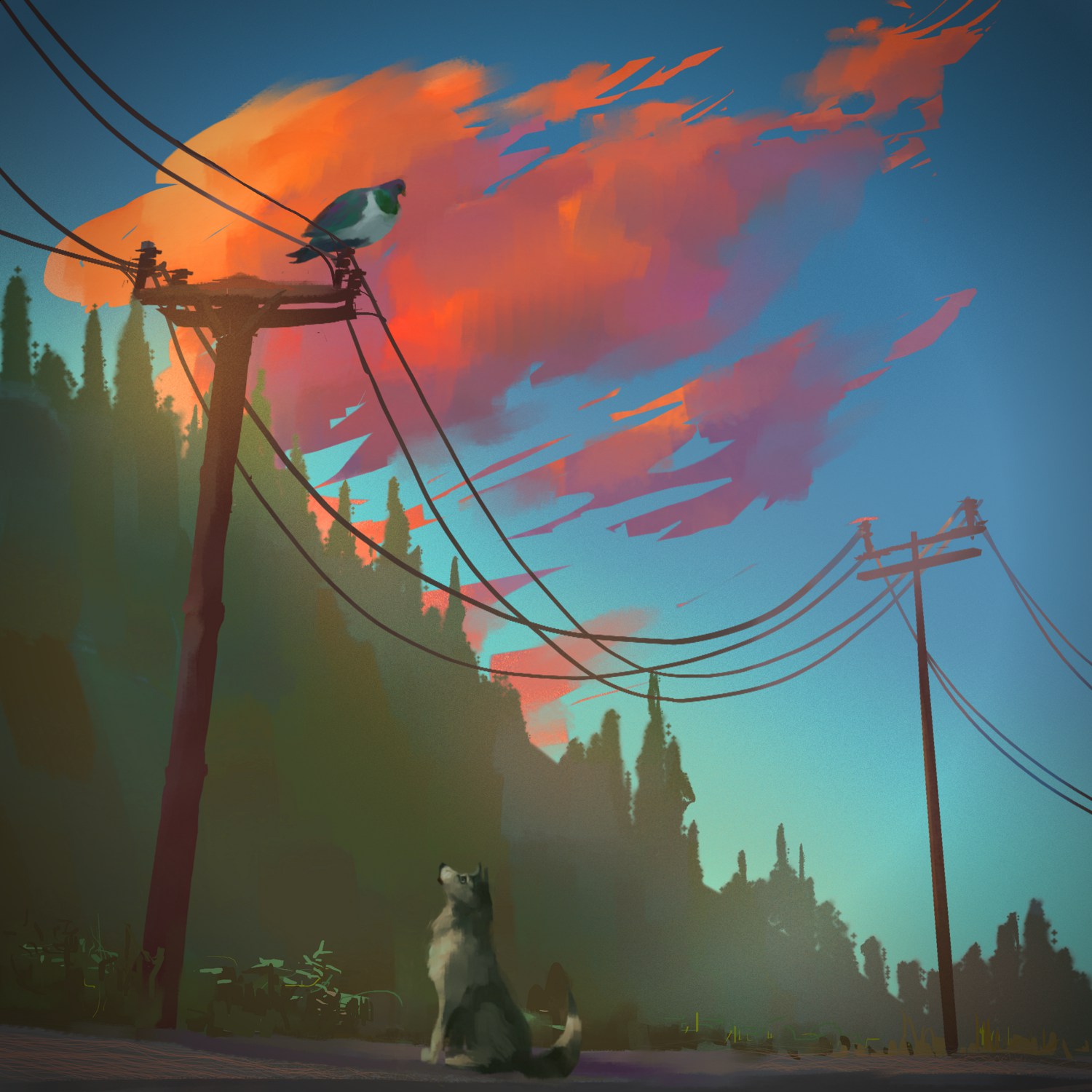
07-20-2016, 09:27 PM
The last one is really cool. Although the pole is too shor and the pigeon looks huge.
Sketchbook | Gallery | Twitch
07-20-2016, 10:04 PM
Thanks! Actually the poles were much shorter IRL as they were down the side of the valley from the road but I raised them a bit. You haven't seen the wood pidgeons we have here...they are like mini jumbo jets!
|
|
« Next Oldest | Next Newest »
|