Posts: 39
Threads: 1
Joined: Aug 2015
Reputation:
6
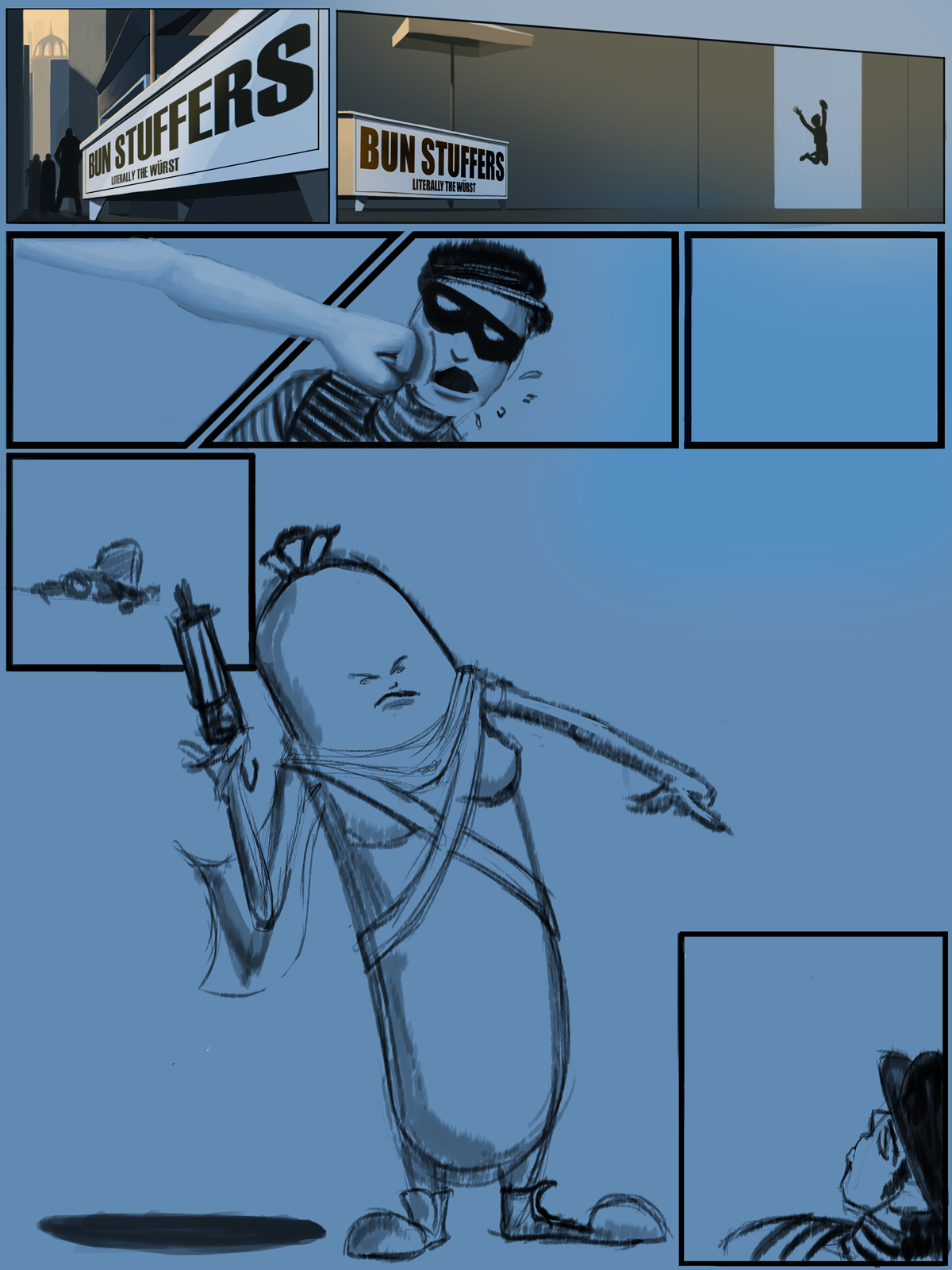
Hey, been quite a while since I've spent any time here, but I'm throwing in my hat for this challenge! Watched the stream and immediately had an idea of what I could do for this one. I'm just looking forward to getting my ass kicked by some crits. :)
Seriously, be brutal.
As far as 'studies' go so far, I finished reading Framed Ink and I've read a couple of trades/researched one page comics on google.
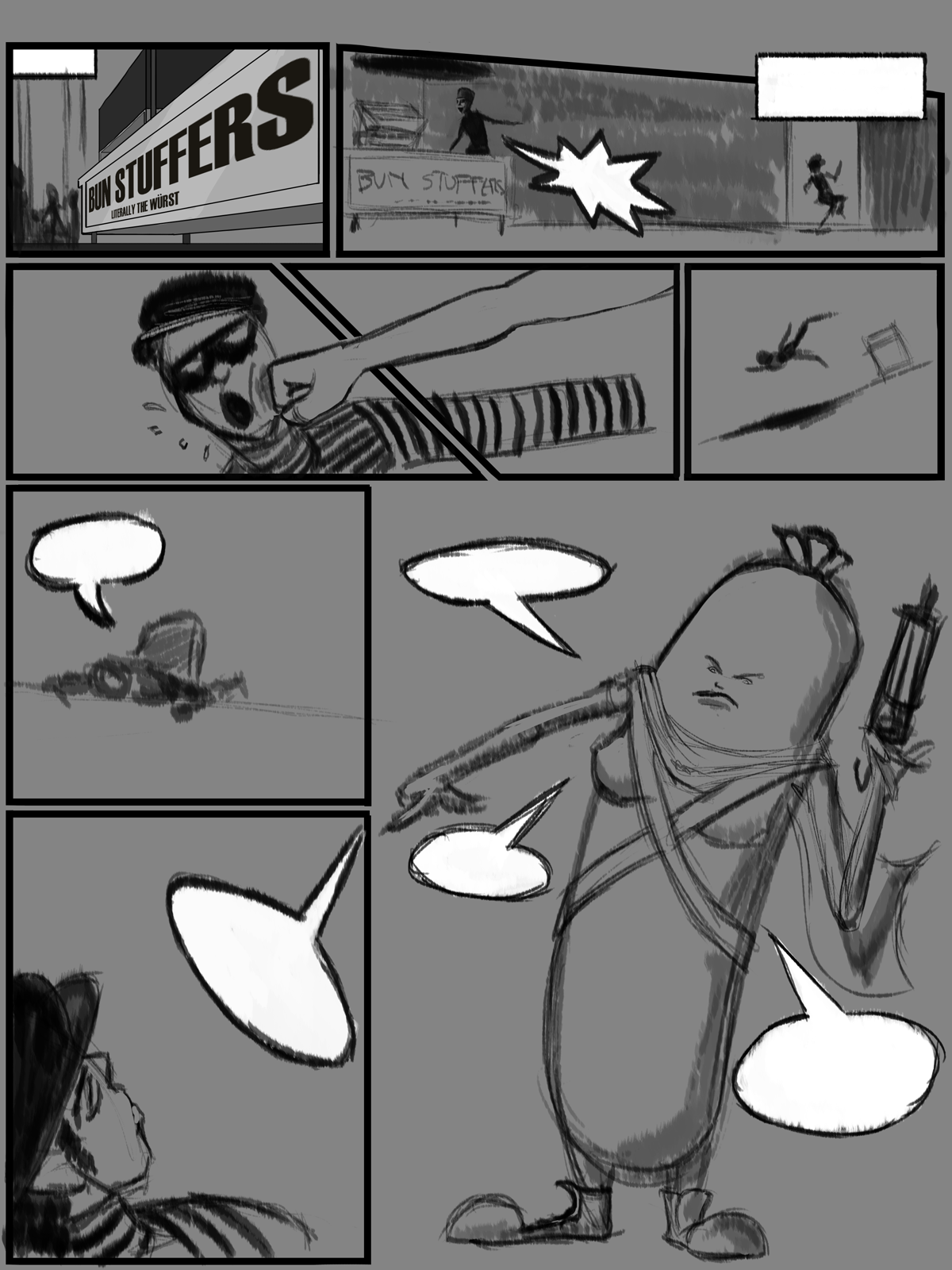
I don't have everything totally set in stone yet, but here's my rough of the page:
Posts: 1,109
Threads: 18
Joined: Apr 2014
Reputation:
68
Looks interesting! I like the pun at the start, and the hotdog character looks cool. Looking forward to seeing it with the dialogue!
Posts: 39
Threads: 1
Joined: Aug 2015
Reputation:
6
(06-14-2016, 01:53 AM)JyonnyNovice Wrote: Looks interesting! I like the pun at the start, and the hotdog character looks cool. Looking forward to seeing it with the dialogue!
Thanks! Does the general narrative read without the dialogue so far? Any problems with the flow of the panels from what you can tell?
Posts: 140
Threads: 3
Joined: Aug 2015
Reputation:
7
Hahaha! Bun Stuffers! that's great! I think the narrative reads pretty well. I think the compositions of the top 5 panels are working well, But i'm not sure if the bottom ones are. maybe try out some different comps for the lower half of the page. I feel like they are not flowing as well as the top half. I'm also not 100% sure on how to read the last two panels, what order do you read them? i'm wanting to read to the right of the 6th panel because you have a horizon line on the 6th, which leads me to the right. But i'm not sure if i'm supposed to read it that way, because the wiener seems to be suggested as a final panel. My advise would be to figure out some cool compositions that have a nice flow and that also read well. But overall really cool idea imo. looking forward to seeing it develop!
Posts: 1,109
Threads: 18
Joined: Apr 2014
Reputation:
68
I think the narrative works ok - the thief is sneaking into bun stuffers, gets punched and knocked down, then we see the one who punched him is that big hot dog. The reading order of the last few panels feels a bit unclear to me too but, I believe its the small panel > big panel > small panel since the way the horizon line then the hot dog's pointing hand. If that's the intended way, I think it's ok, since the dialogue will make sense and the reader won't get confused.
But it could be a good idea to storm a few more anyway, because you create something that you like much more, after digging deeper into your mind ^^ Have a look at some comic reference for ideas too.
Posts: 39
Threads: 1
Joined: Aug 2015
Reputation:
6
thanks guys! I will definitely work on it!!
Posts: 39
Threads: 1
Joined: Aug 2015
Reputation:
6
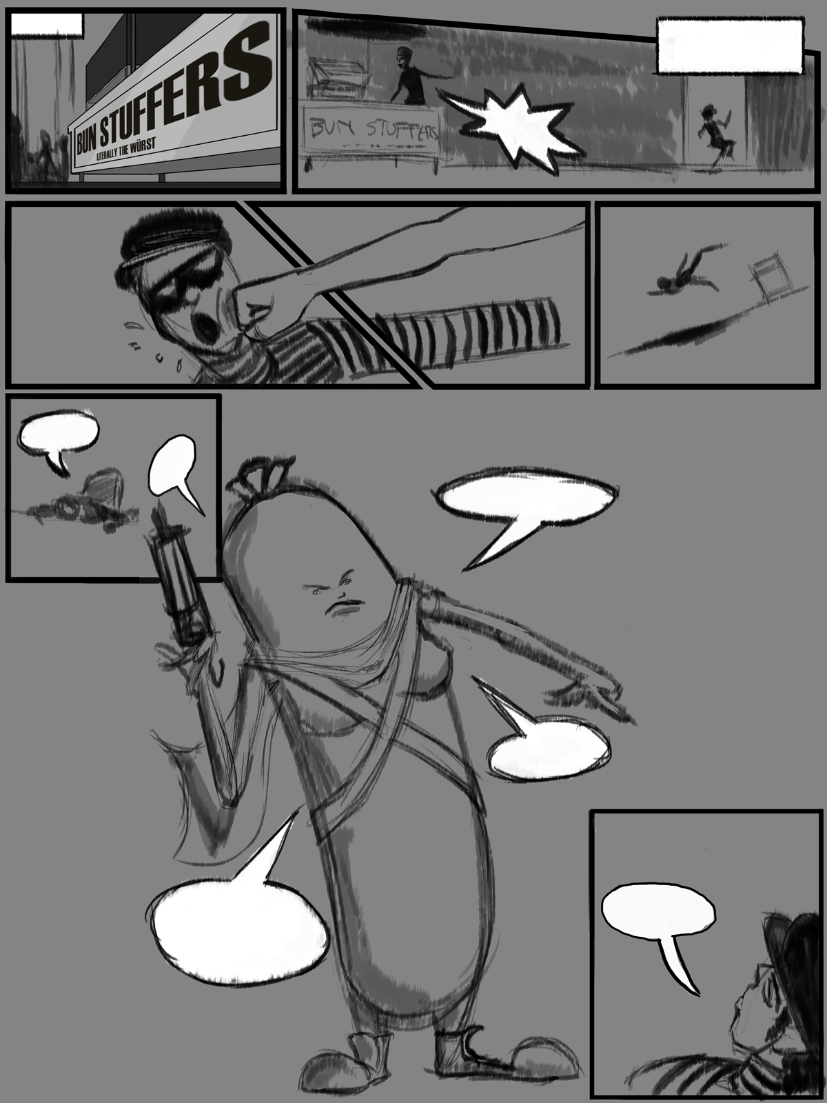
Meant to post this up sooner! I think this layout reads a bit better.
Posts: 1,970
Threads: 22
Joined: Apr 2012
Reputation:
243
Hey man, cool :) I like that update, the flow does work better!
Posts: 1,109
Threads: 18
Joined: Apr 2014
Reputation:
68
hey dude, didn't seem to notice it before but that second row it feels like the action is going the wrong way, you could try flipping the panels horizontally so we 'read' down the arm into the punch and flow through into the panel where he's being knocked over. Just a thought, might be worth to try ^^
EDIT Realised what you're trying to do with the fist coming down and his arm going across to make a zig zag. I think the angle between his arm and the punching arm is too shallow, increase it a bit and it could work better (just my opinion though, could be bad advice!). You can also use his eyes to push the viewer back across to the right, just have him looking even a little bit to the right and it'll work - I think as human's, a character's eyes can override a lot of other directional cues.
Posts: 39
Threads: 1
Joined: Aug 2015
Reputation:
6
(06-19-2016, 11:24 PM)JyonnyNovice Wrote: hey dude, didn't seem to notice it before but that second row it feels like the action is going the wrong way, you could try flipping the panels horizontally so we 'read' down the arm into the punch and flow through into the panel where he's being knocked over. Just a thought, might be worth to try ^^
EDIT Realised what you're trying to do with the fist coming down and his arm going across to make a zig zag. I think the angle between his arm and the punching arm is too shallow, increase it a bit and it could work better (just my opinion though, could be bad advice!). You can also use his eyes to push the viewer back across to the right, just have him looking even a little bit to the right and it'll work - I think as human's, a character's eyes can override a lot of other directional cues.
To be completely honest, the zigzag effect was unintentional, the main reason I had the punch coming from the right originally was because when the character is revealed, he was facing the left. Now that I flipped the character reveal, it would make more sense to have it coming from the other direction.
I had completely forgotten about that, so thank you for mentioning it! I will work on changing it. :)
Posts: 1,109
Threads: 18
Joined: Apr 2014
Reputation:
68
oh yes, I see what you mean - also with him entering the in panel 2 with him travelling right, then the punch is coming from the right - it's a subconscious cue we don't notice but is important. If the punch was flipped, it'd 'cross the line' in movie terms and might not work out. In the transition in the last panel it's kind of ambiguous since we can't see his eyes, but depending where you point them it could work or not.
If you don't know what crossing the line is, I made some really quick notes, hope they make sense.
![[Image: cYLWy2x.jpg]](http://i.imgur.com/cYLWy2x.jpg)
in brief: 'the line' is determined by the characters line of vision, an invisible line is drawn extending out and behind them oriented on the direction they are looking. Whatever side of that line the camera is on, it should stay on that same side in the next shot.
Have to be careful with how you handle it else you get a reverse shot that feels uncomfortable for the viewer (but can get away with it more in comics than on TV).
Posts: 39
Threads: 1
Joined: Aug 2015
Reputation:
6
(06-22-2016, 02:08 AM)JyonnyNovice Wrote: oh yes, I see what you mean - also with him entering the in panel 2 with him travelling right, then the punch is coming from the right - it's a subconscious cue we don't notice but is important. If the punch was flipped, it'd 'cross the line' in movie terms and might not work out. In the transition in the last panel it's kind of ambiguous since we can't see his eyes, but depending where you point them it could work or not.
If you don't know what crossing the line is, I made some really quick notes, hope they make sense.
![[Image: cYLWy2x.jpg]](http://i.imgur.com/cYLWy2x.jpg)
in brief: 'the line' is determined by the characters line of vision, an invisible line is drawn extending out and behind them oriented on the direction they are looking. Whatever side of that line the camera is on, it should stay on that same side in the next shot.
Have to be careful with how you handle it else you get a reverse shot that feels uncomfortable for the viewer (but can get away with it more in comics than on TV).
Thanks for this, man! Super helpful!
Posts: 39
Threads: 1
Joined: Aug 2015
Reputation:
6
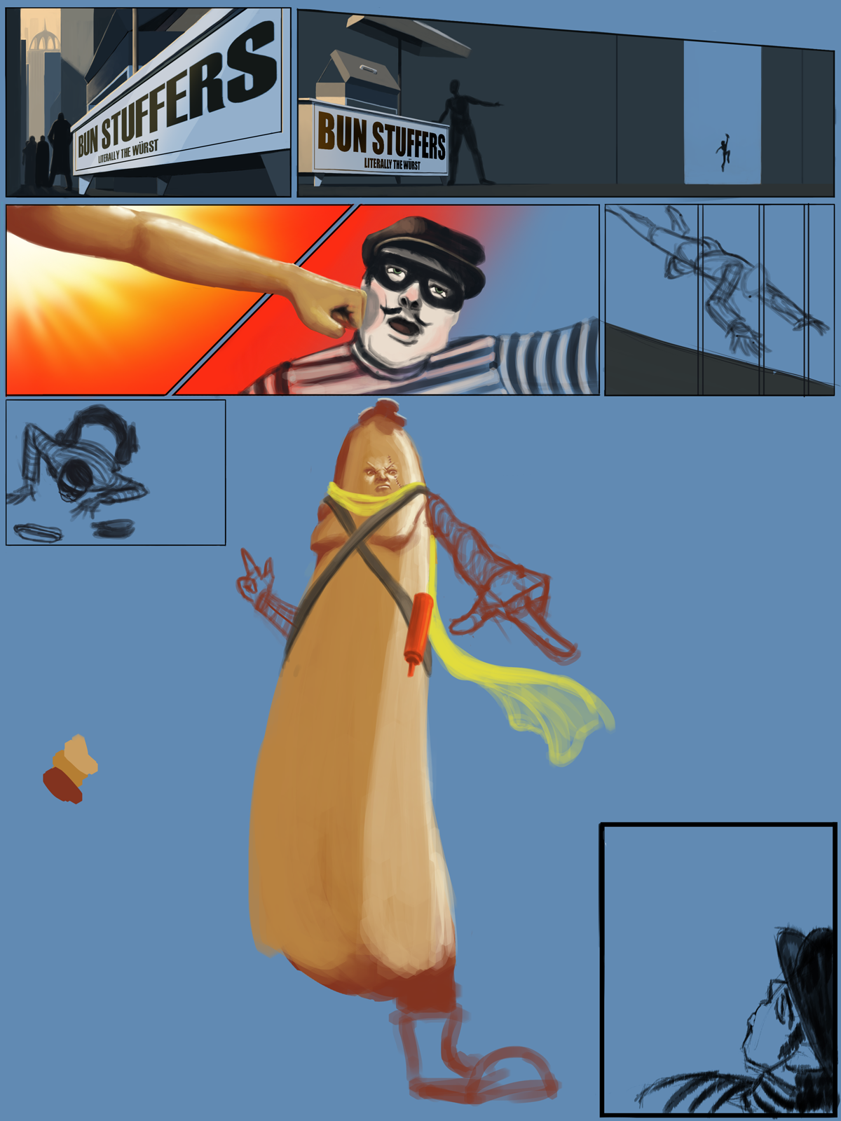
Working on finalizing the panels. Pretty happy with the general direction of it at this point.

Posts: 39
Threads: 1
Joined: Aug 2015
Reputation:
6
I regret the choices I've made.
Home stretch, though! Lots of work to do tomorrow. Gotta buckle down and finish this bad boy.

|


![[Image: cYLWy2x.jpg]](http://i.imgur.com/cYLWy2x.jpg)
