07-01-2019, 05:30 AM

mmmeh
|
Toranja Draws!
|
|
07-01-2019, 05:30 AM
 mmmeh
07-01-2019, 06:56 AM
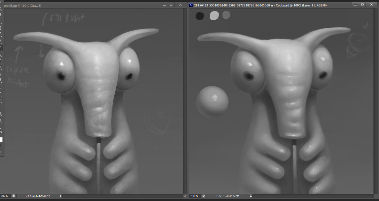
The thing i would say is that there a softer transtion on the original on is body left side.Your as a defined 2 value edge.The left eye is also crooked.Apart form that good study depending on your speed but that just come over time.Value and form are looking good.
07-01-2019, 07:50 AM
Yeah, on the body as well as on the trunk I made the dark values on the edge a too extreme. Although I can't understand yet why it looks good on the original when the eyes have much harsher transitions. Maybe it's supposed to be reflected light.
The shape of the whole creature is crooked cause I barely spent time on the drawing, since it was not the focus. Also this wacom is great for rendering since photoshop is much handier and my back gets to be straight but I can't draw on it at all, if I'm not looking down at what I'm drawing. I really need to look into an upgrade. Anyways I think I need to purposely start setting myself some time limits cause I do too much noodling and start daydreaming easily. If I'm gonna get faster I need to make sure I push it. My mind feels like it's not there sometimes.
07-02-2019, 11:22 PM
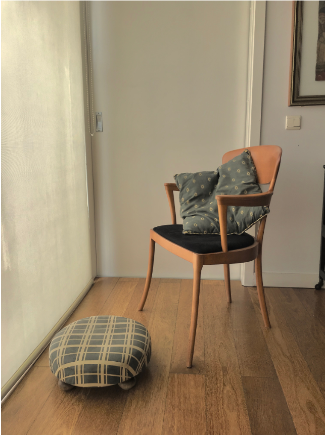
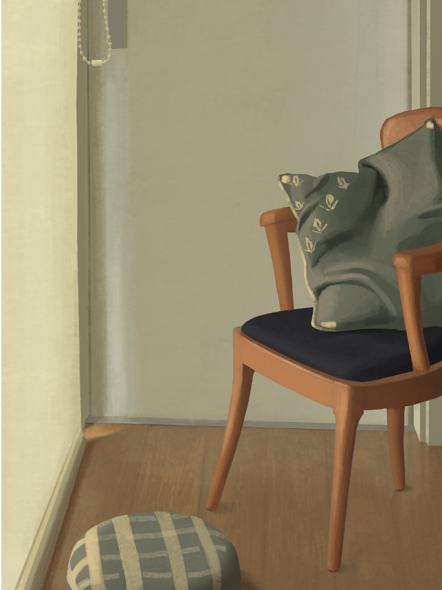
  Contrast in the photo is too great but I tried to adjust it to the tone. The chair doesn't seem to fit in the painting though. Hm.
07-03-2019, 01:54 AM
When doing study that as fabric think of the flexibility of material for more realism.For the wood floor i think you want to have a strong contrast to bring out the grain of the wood.I would say the wood of the chair would be a lighter than you did and the floor item catch more light on the surface center of those square like pattern to bring out more of that fabric texture goodness.
11-03-2019, 02:06 PM
You are too hard on yourself. I’m not sure why you disagreed with dark on the saturation levels on the 2nd page even if it was too far. Maybe somewhere in between would make sense I think because it looks a bit desaturated and values too close to my admittedly unpro eyes. Are you posting somewhere else?
|
|
« Next Oldest | Next Newest »
|