Posts: 852
Threads: 6
Joined: May 2018
Reputation:
116
These are some good studies! I like the recent head drawings, and the vanderpoel copies look really good. You should take your time on the Lepage copy. It's a complicated piece, I would expect it to take many hours to finish. My worry with it at this stage is that the tonality is going to generally end up too light, though you were saying you want to make parts brighter. I know it depends on how you take the photo of the painting, so i can't compare the reference to your painting directly. But I do see that in the fabric of her blue shirt, the shadow is quite a dark brown/grey stroke, almost black. If that's given, it would key down a lot of what you have painted. That's just what I'm guessing will need to happen.
Your drawings make good use of separate, distinct shapes of shadow and half-tone. It is good to have things clear and well defined, but you could make use of more soft edges as well. Making things too soft and mushy is a common problem, but you are nowhere close to being in danger of that! Especially just coming out of your shadows you tend to jump rather abruptly to the lights, sometimes putting a crisp line between the two just to make sure they don't mix. But that kind of prevents it from turning the form into shadow. But yeah, just something I've noticed.
Posts: 485
Threads: 2
Joined: Feb 2017
Reputation:
5
Darktiste - That was the plan :) At my weekly life class we usually start with a 5 min pose and work up to 20 (doing a 10 and 15 inbetween) and even then I usually limit myself to 5 mins on all poses as I find anything about that to be abit too long for a gesture, even if it means I draw the same pose 2-3 times (which I suppose isn;t bad).
Joseph - Hey man great to hear from you again :) I'm trying to spend as much time as necessary on it whilst not being unreasonable, just trying to get the overall impression and not bog myself down with a perfect 1 to 1 copy as that would be counter productive. Think I've spent about a week and a half so far, maybe slightly more? Thanks for the imput, noticed the same myself actually once it had dried. Just waiting for the drapery to dry so I can paint on top like you said and go darker in my shadows.
Yh I can't seem to shake this hard edge issue I'm having, definitely aware of it and have had it pointed out by my tutors but it still plagues me even though I make a conscious effot to go softer. I was thinking of trying a slightly different approach and leave my darkest darks to the very end and slowly build up to them once I have my halftones and highlights established, see if that helps make it click in my head, unles you have another suggestion?
Posts: 316
Threads: 3
Joined: Sep 2019
Reputation:
23
Hey,
Looked over your last page and it's great to see someone working in traditional media — and I was really impressed with your dedication and studies. etc.
Love your soft touch w graphite & charcoal — and you're very good about getting likenesses.
Keep up the great work
Posts: 852
Threads: 6
Joined: May 2018
Reputation:
116
(01-13-2022, 06:32 AM)Peter Wrote: Yh I can't seem to shake this hard edge issue I'm having, definitely aware of it and have had it pointed out by my tutors but it still plagues me even though I make a conscious effot to go softer. I was thinking of trying a slightly different approach and leave my darkest darks to the very end and slowly build up to them once I have my halftones and highlights established, see if that helps make it click in my head, unles you have another suggestion?
Yeah, easy. Just remember, every time you make an edge too sharp, a kitten dies.
Your idea seems good. Just try and go in the other direction, see how soft would be too soft, and walk it back a little. And also I would say just reframe how you are thinking about shadow shapes. They aren't just shapes in your composition, it's describing a form. The relative softness or hardness of the gradation out of the edge tells the eye how soft or sharp that corner is. You don't really need to worry that much about losing a shadow or getting it confused with the lights. When the light turns away a certain amount, it becomes shadow. Whatever happens happens, in life and in your drawing. You need the shadow shapes to be a result of the form turning. Not just a shape. I think you are focused more on designing interesting and intricate shapes for your composition, which is not a bad thing. That's my impression looking at your drawings anyway. The shape is keenly observed, but it doesn't necessarily feel like it's merging with the form of the subject. So I'm just saying look at it from a different standpoint, essentially.
i could point out the pectoral on the graphite figure. It seems like you don't want to lose the shadow shape, hence the outline, but probably it should be nearly lost because that is what makes sense with the form. One thing that has helped me is noticing places in the reference, or nature, where I'm not sure where the shadow is and I have to think about it. This happens probably at least once per drawing. If I have to actively try to figure it out, then that tells me it's a really soft edge there and I need to make that halftone quite dark.
Posts: 485
Threads: 2
Joined: Feb 2017
Reputation:
5
Jephyr - Hey thanks man :) thought there where a few of us on the forum here that work traditionally? maybe not haha.
Do you think? tbh I feel like I always fail to get a good likeness, better when I'm working from a photo ref but it all seems to fall apart when I work from life. Might be the time constraint though.......
Joseph - (nervously looks at my cat) oh god............
Huh, never thought of it like that. Think you are definitely right about me putting too much of an emphasis on my shape design, always found my design sense to be rather stiff and ugly so I have been conscious of trying to improve upon them, from the sounds of it maybe abit too much.
I have definitely come across that issue you describe (really like how you put it into words actuallly). I'll try and keep your words in mind going forward, see if I can get it to click on my head. :)
Posts: 485
Threads: 2
Joined: Feb 2017
Reputation:
5
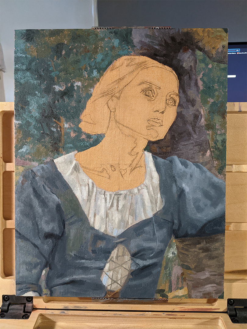
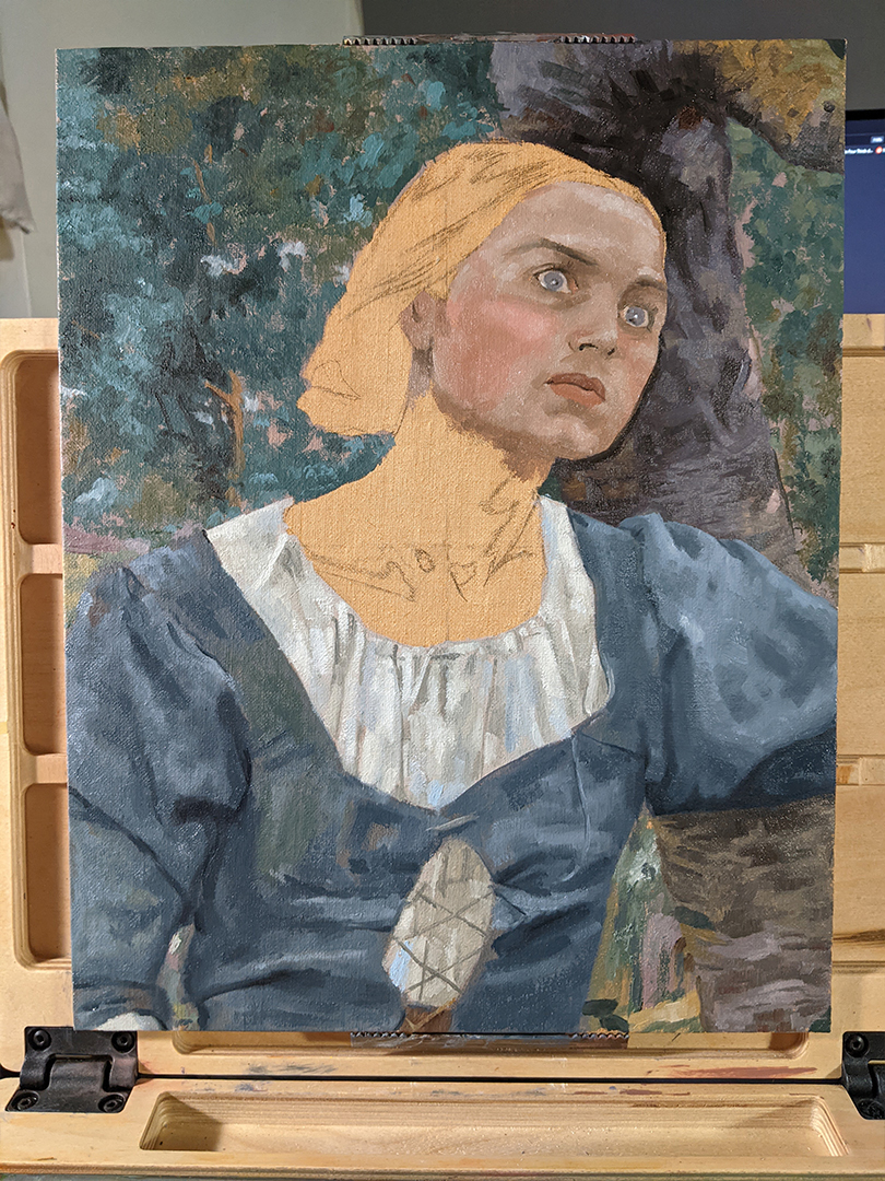
Update on the master study.
Didn't quite make as much progress as I was hoping. Took Josephs advice and reworked the drapery some more (thanks for pointing out btw). Not sure if the differences show aswell on my phone photo or not? Still needs abit more work, particularily her shirt.

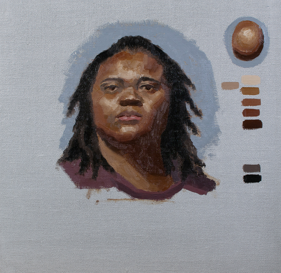
Started painting the face, definitely a challenge! especially those tight value transitions. Spent an entire day yesterday and that was as far as I could take it. Think some of my darks are a tad too light (mainly the shadows in the eyes) but it might be a few weeks before I can finish it as my classes start this week.

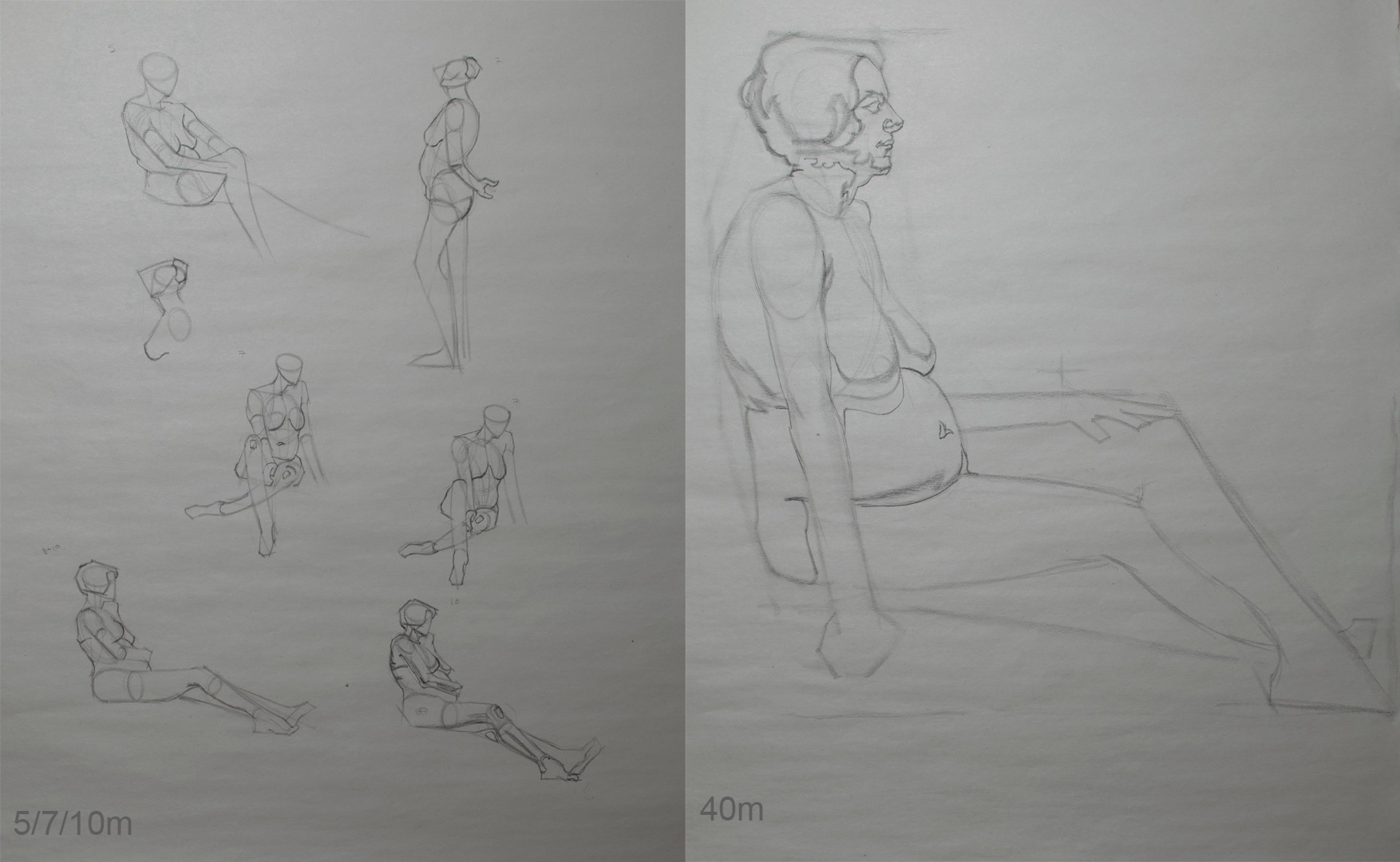
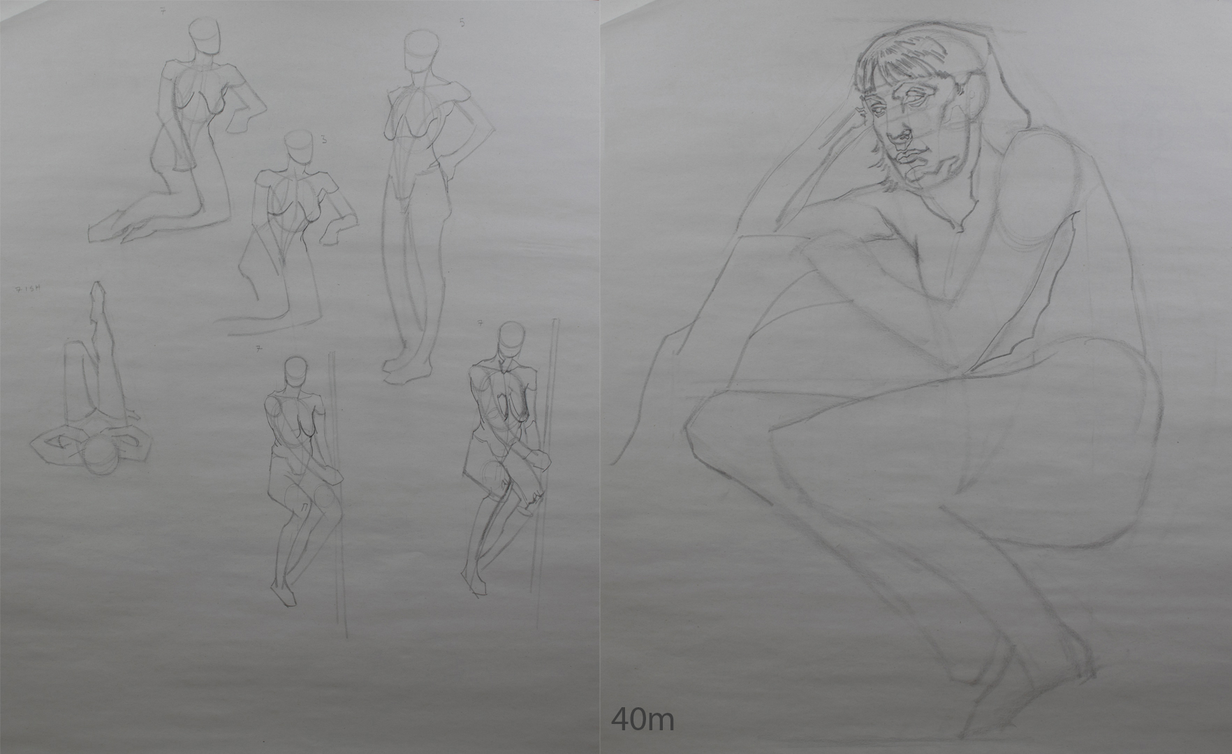
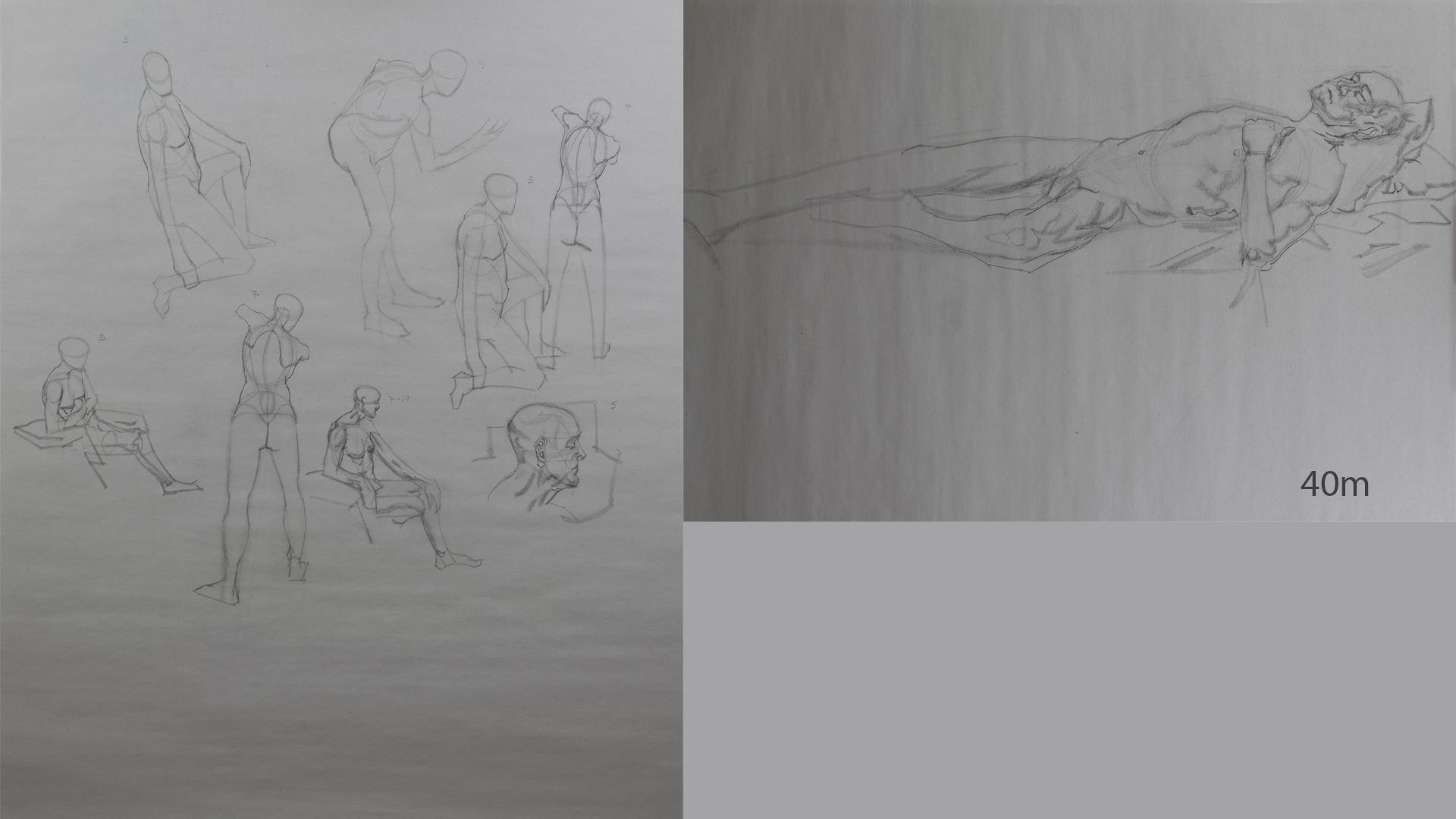
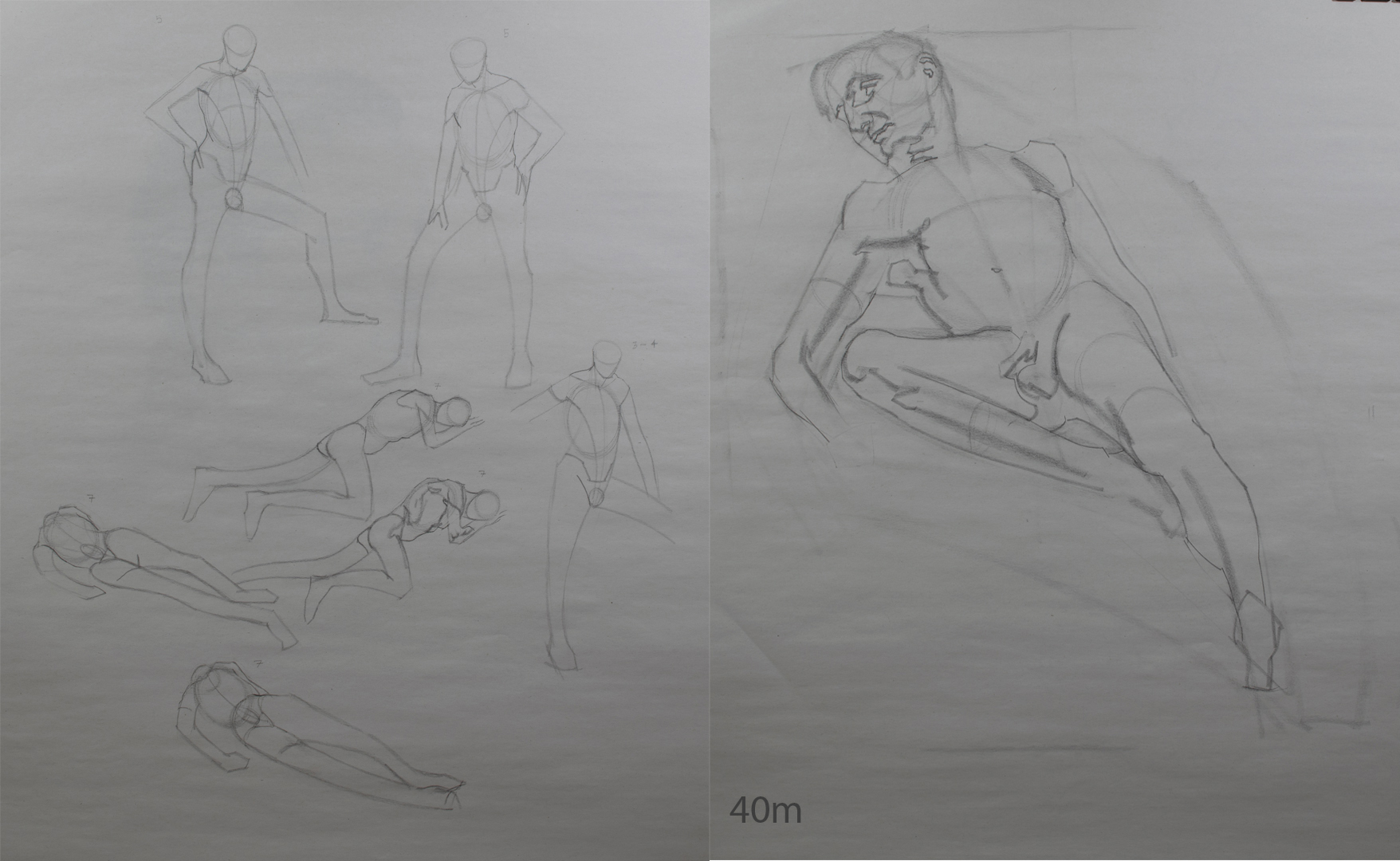
Life Drawing
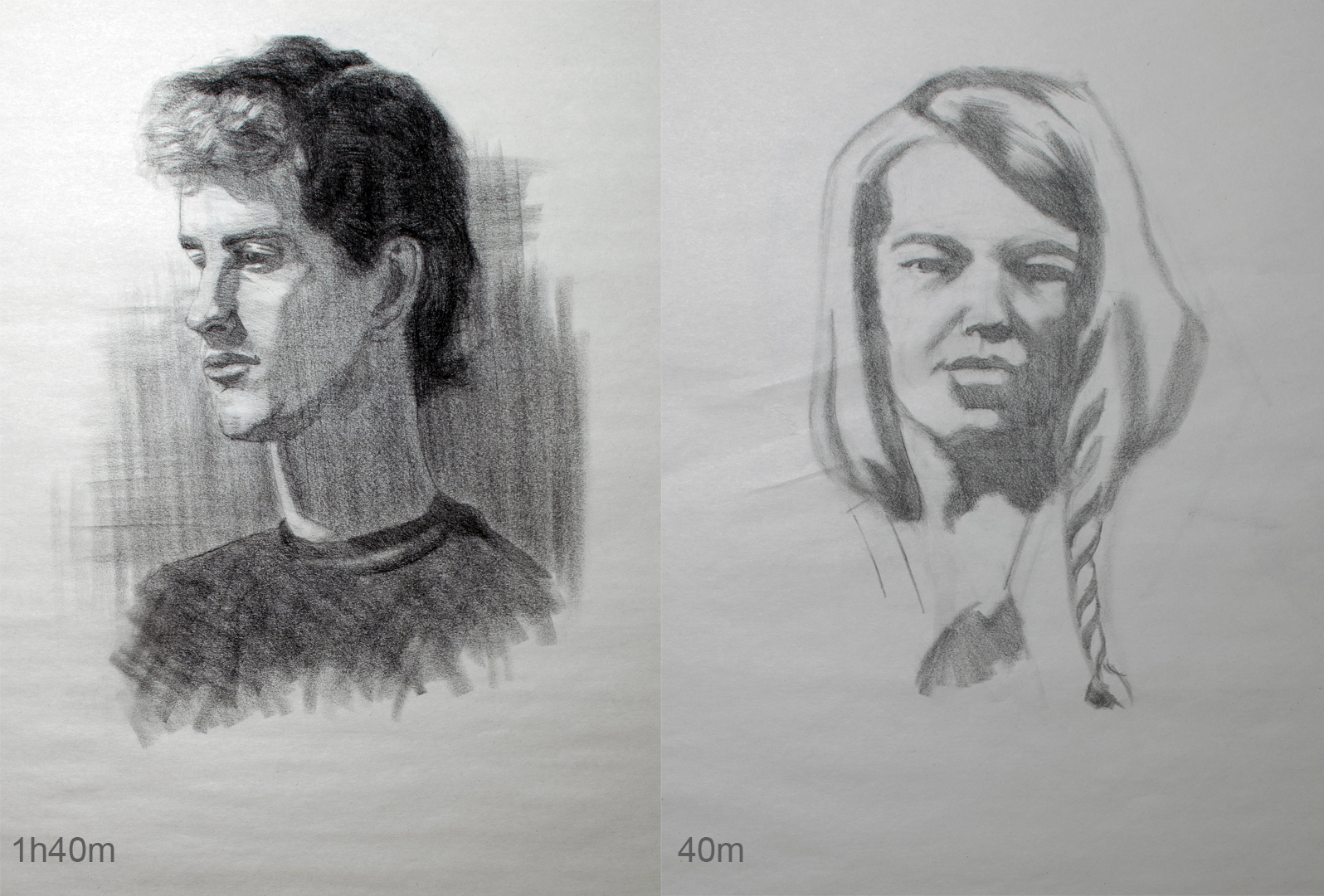
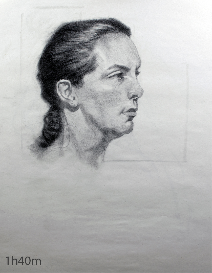
A mixture of some portrait and life work from the last few weeks
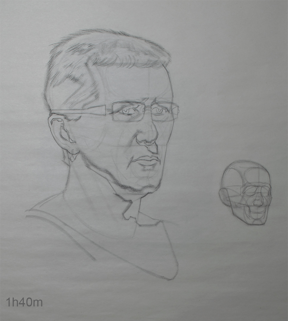
Portrait
I've been trying an approach recently of loosely blocking in the overall shape first and then applying some loose construction, and once that looks ok start doing my shadow mapping and simply designing what I see (as per Erik's appraoch from last term).

Felt like going back into some construction last week.

Life


Still really hate how my work from life keeps turning out, just think it looks really ugly most of the time. I'm guessing it's mainly due to the time constraints of the class as they are only 2 hours total and for the live streaming classes I'm spending 3 hours on my drawings and they look alot better. Still I'm hoping that diving back into studying next week I'll start seeing some much needed improvements.
Posts: 83
Threads: 2
Joined: Apr 2020
Reputation:
4
just stopping by to say I really admire your traditional studies!
Spend a bit flipping through and I can see you are very consistent. Keep em coming!
Posts: 485
Threads: 2
Joined: Feb 2017
Reputation:
5
(01-17-2022, 09:38 AM)_spec Wrote: just stopping by to say I really admire your traditional studies!
Spend a bit flipping through and I can see you are very consistent. Keep em coming!
Thanks man! I'll try my best :)
Posts: 485
Threads: 2
Joined: Feb 2017
Reputation:
5
Had some difficulties logging in last week. My interent browwer was acting up and randomly forgot alot of my log in info and couldn't remember my password for the life of me, thankfully got it all sorted.
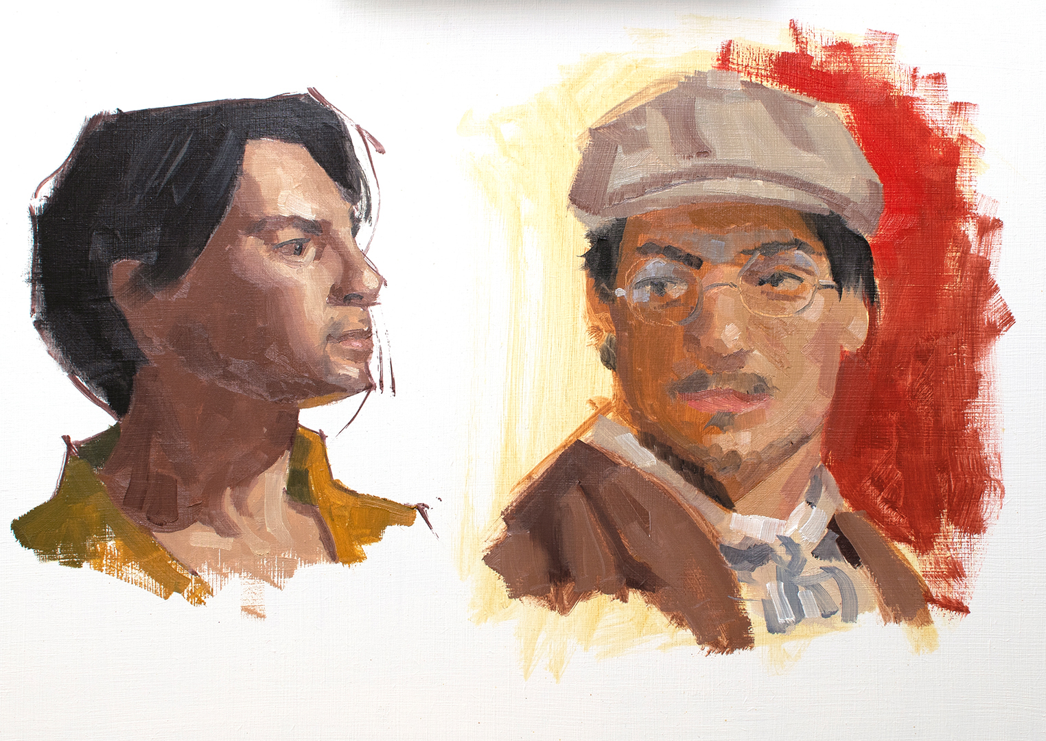
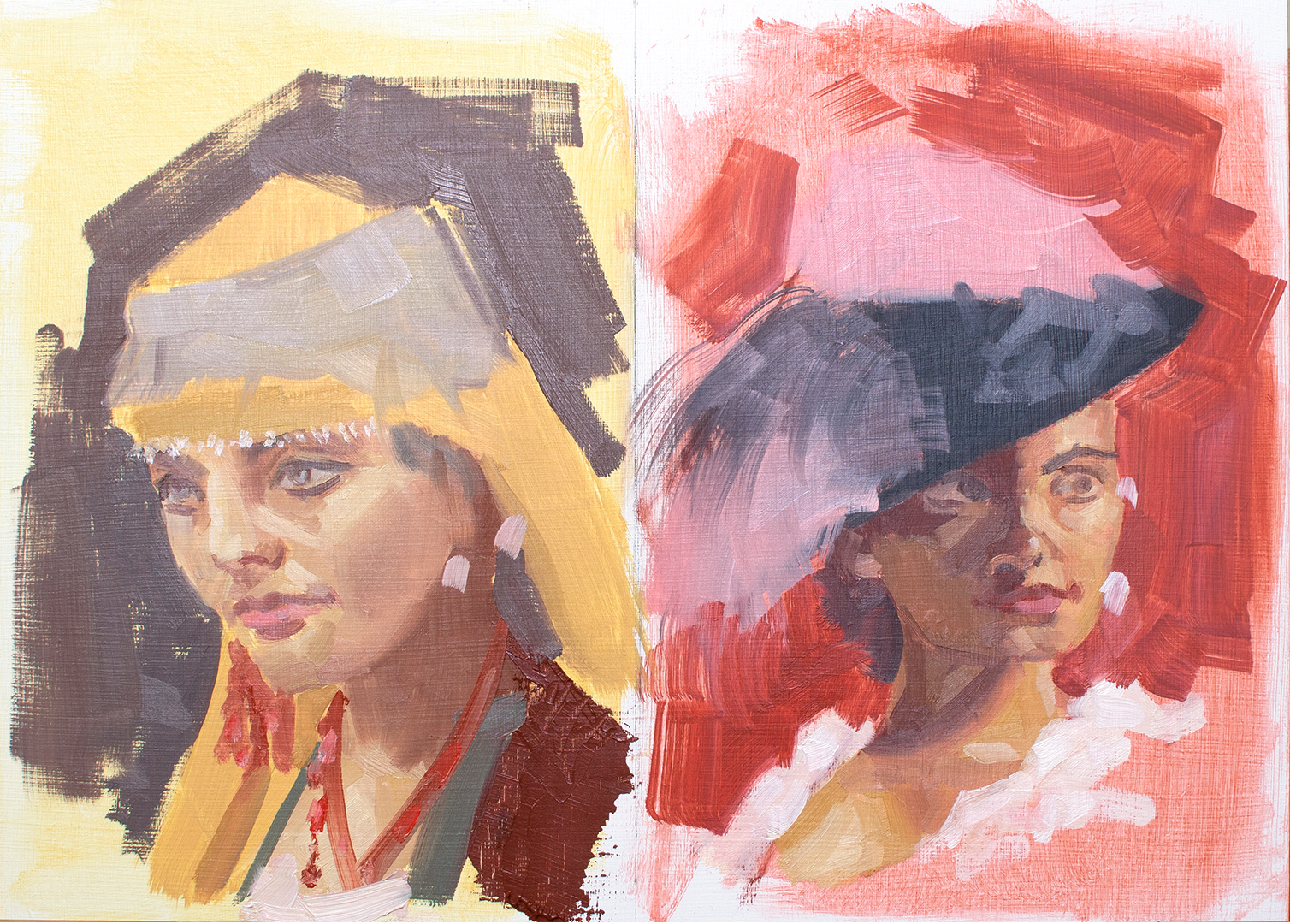
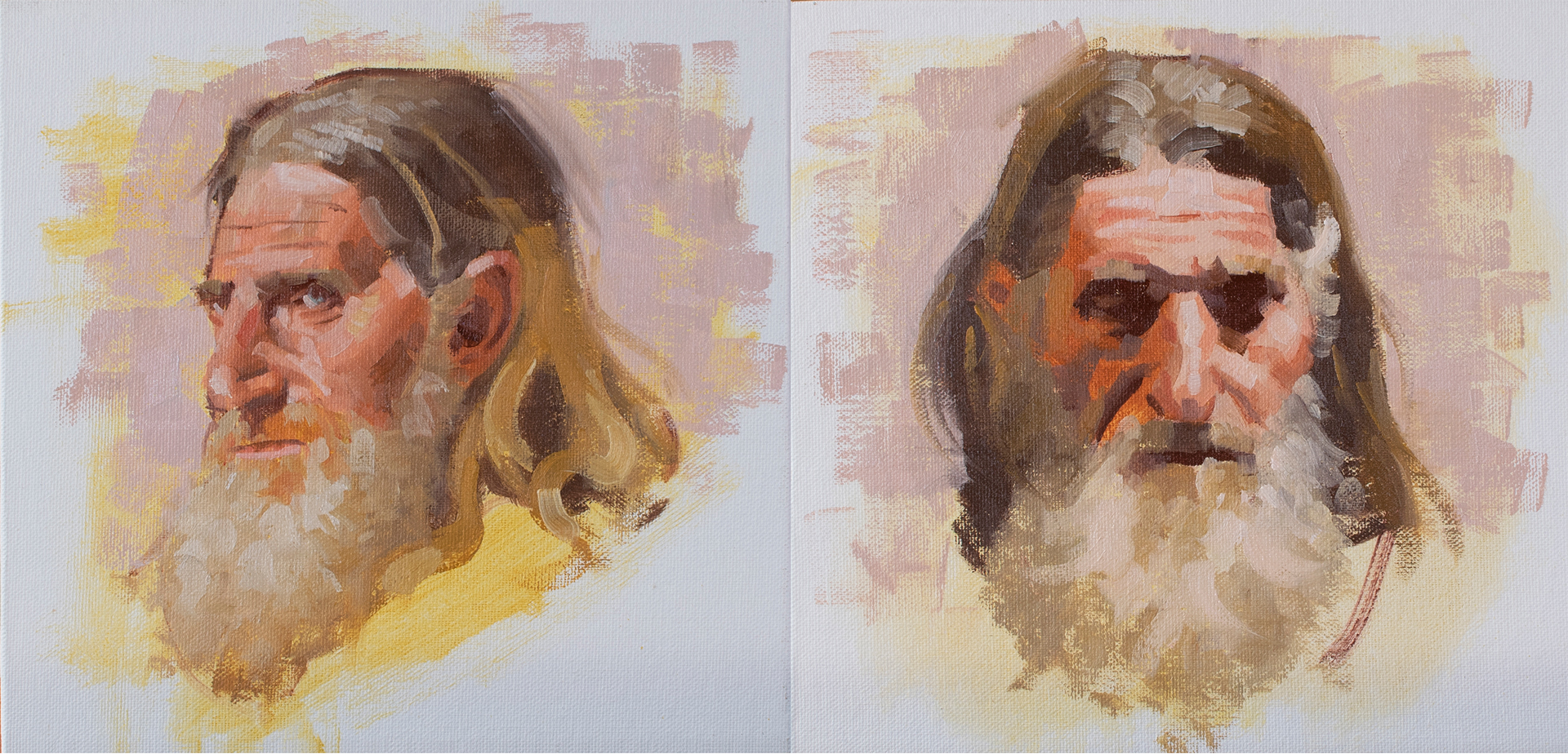
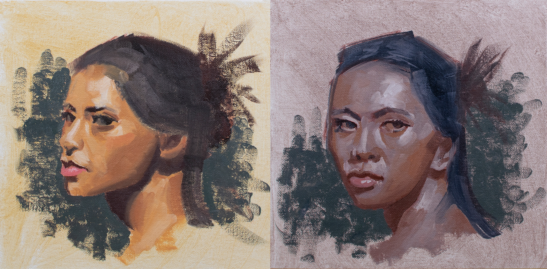
Gesture Painting
Currently taking a gesture painting class. Trying to work on my efficiency in drawing with paint and simplfying.

Spent an hour each on these. Stuck to a structured approach for the one on the left and a more tonal appoach for the one on the right and forgo doing a lay-in altogether which clearly shows.........
Ref

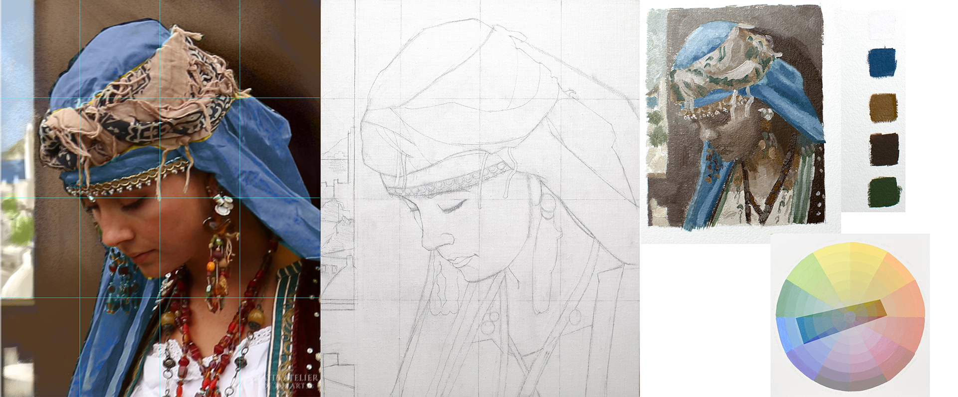
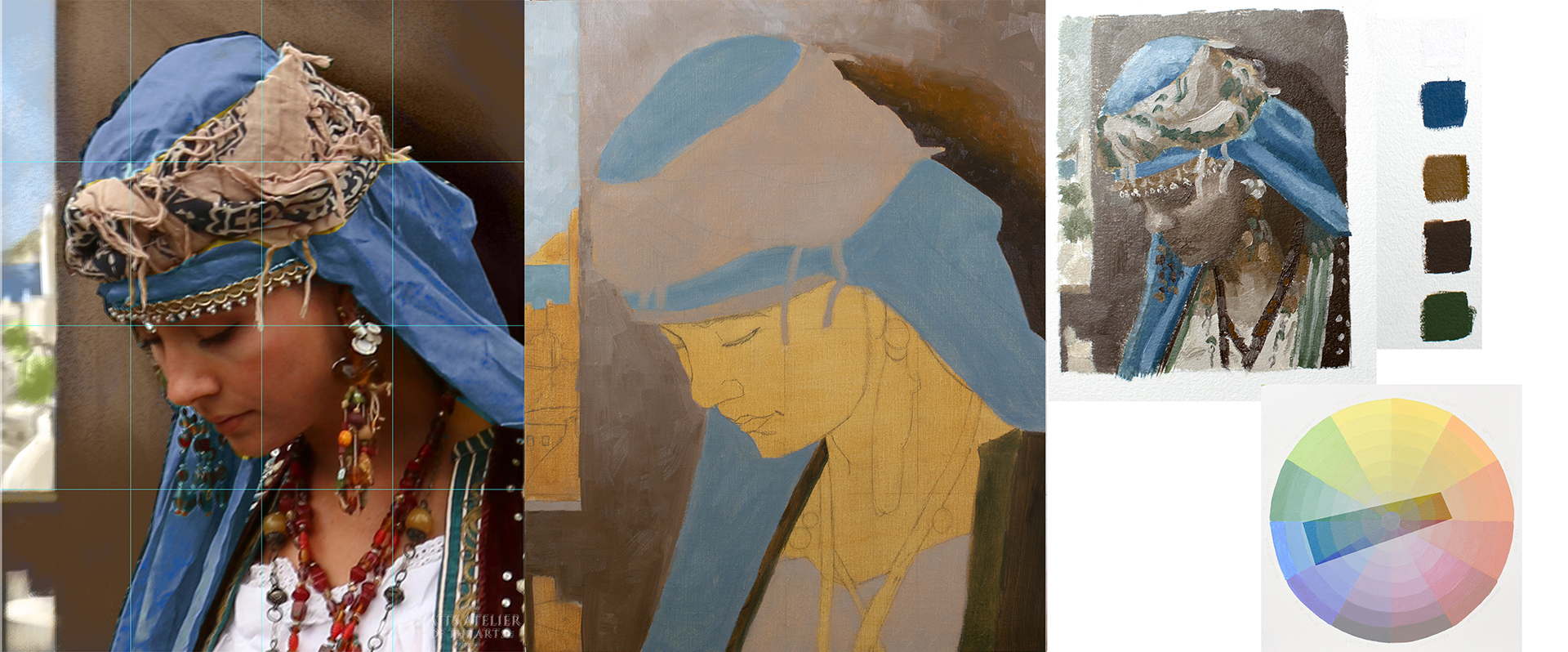
Costumed Portrait Painting
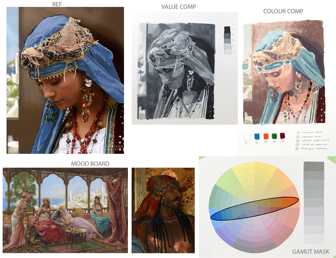
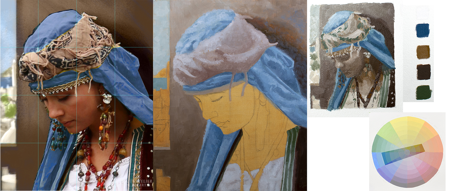
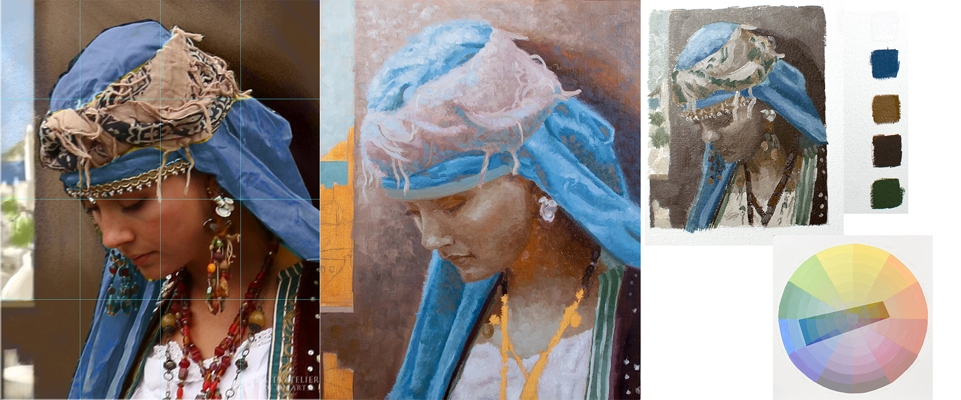
Also taking a costumed portrait class aswell. Thought it would be doing studies each week with different types of drapery but looks to be a studio painting class, so working on one long effort instead.
Anyway here is my prep work for the first week. Made some changes to the ref image provided, mainly adding in this invented background to make it more of a illustrative piece. Wanted to show a nice balance of a warm exterior against a cool interior, didn't quite manage to capture that in my colour comp so I'm working on another one that better captures that feeling.

Got some feedback to post aswell as some gesture drawings which I'll try and post tomorrow, save making this one massive post.
Posts: 316
Threads: 3
Joined: Sep 2019
Reputation:
23
(01-17-2022, 03:46 AM)Peter Wrote: Jephyr - Hey thanks man :) thought there where a few of us on the forum here that work traditionally? maybe not haha.
Do you think? tbh I feel like I always fail to get a good likeness, better when I'm working from a photo ref but it all seems to fall apart when I work from life. Might be the time constraint though....... Yeah there are a few that do — but maybe because I used to do a lot more traditional media it seems to stand out when I see people working with 'em.
Since I tend to work at a slower pace I can relate — I was going to point out some that I thought you'd done pretty well with on the previous page — but it's loading very slowly and I don't have much time right now.
Those recent quick life-gestures look very good! Keep up the good work
Posts: 485
Threads: 2
Joined: Feb 2017
Reputation:
5
(02-05-2022, 01:59 AM)Jephyr Wrote: (01-17-2022, 03:46 AM)Peter Wrote: Jephyr - Hey thanks man :) thought there where a few of us on the forum here that work traditionally? maybe not haha.
Do you think? tbh I feel like I always fail to get a good likeness, better when I'm working from a photo ref but it all seems to fall apart when I work from life. Might be the time constraint though....... Yeah there are a few that do — but maybe because I used to do a lot more traditional media it seems to stand out when I see people working with 'em.
Since I tend to work at a slower pace I can relate — I was going to point out some that I thought you'd done pretty well with on the previous page — but it's loading very slowly and I don't have much time right now.
Those recent quick life-gestures look very good! Keep up the good work
Makes sense, feels like everyone here works digitally so I always seem to miss all the tradiitonal stuff everyone else posts.
Haha no worries, I'm always strapped for time, wish I had more time so I could be more involved on the forums but oh well.
Cheers :) Really enjoying doing them, even if they are hit and miss haha
Posts: 485
Threads: 2
Joined: Feb 2017
Reputation:
5
Got sidetracked last week so didn't get time to post.
Anyway as promised :)
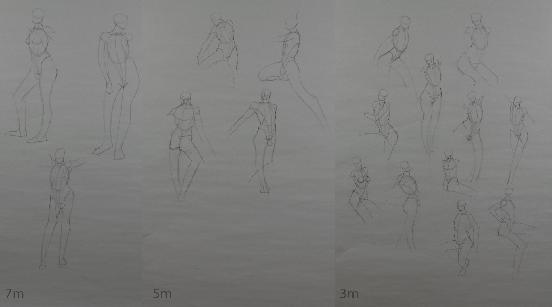
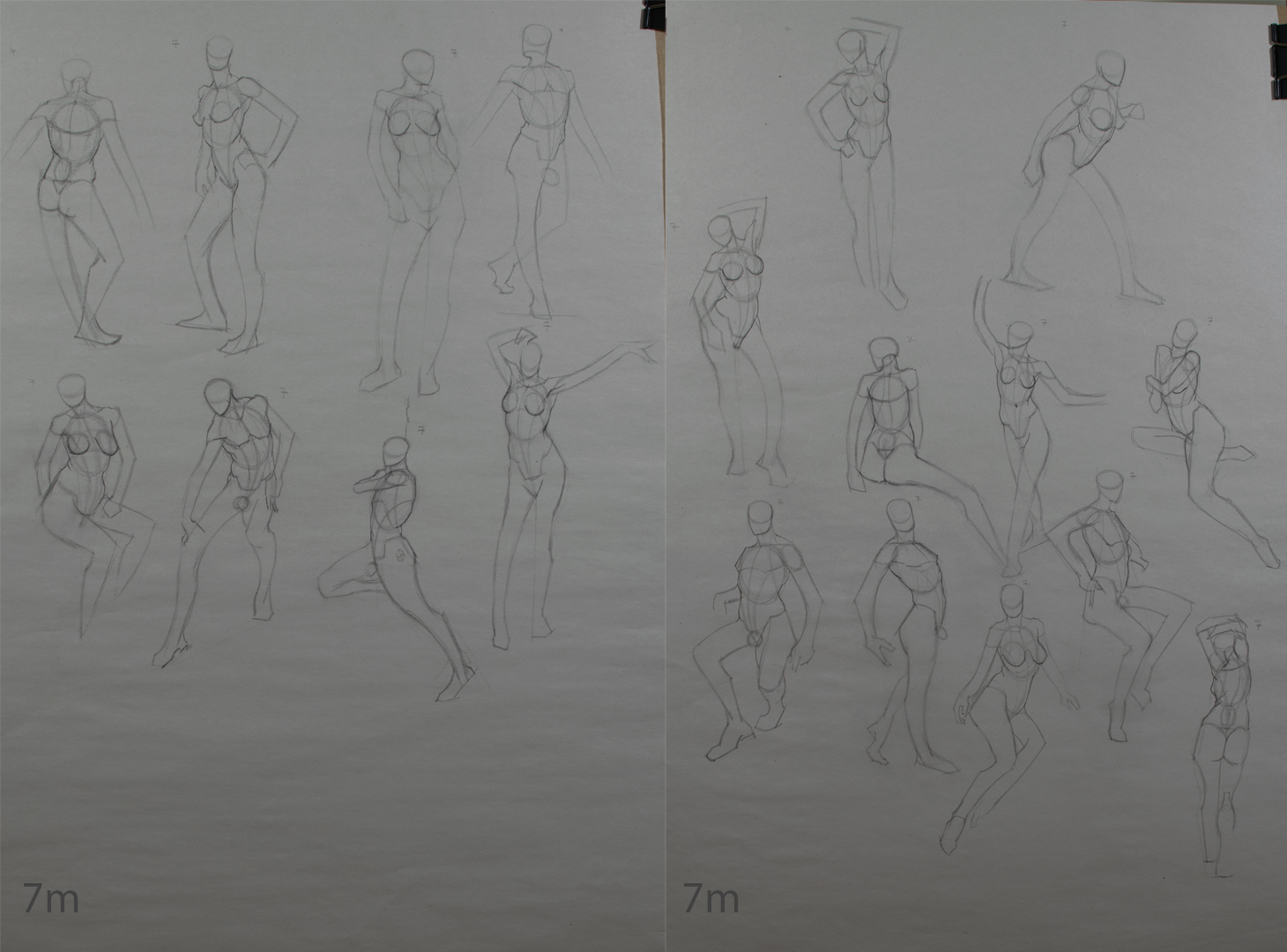
Gesture Drawing
Going through the fundamental QS course over on Watts again. Started by copying the tutors drawings in the same time frame per the instructions for the course.

Afterwards I started to work through the same provided ref and attempt them myself without the aid of the instructors drawing.

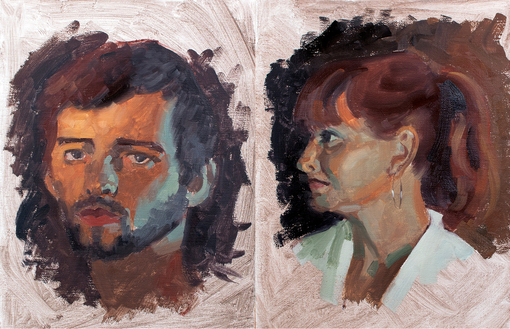
Gesture Portrait Painting
Had a really bad time last week, think it was a combination of having an off day coupled with the added difficulty of painting drapery, seemed that things just kept going from bad to worse......
Again stuck to 1 hour for each of these.

Costumed Portrait Painting
Not awhole lot of progress last week, decided to do another colour comp based on the feedback provided and made sure I had a solid drawing so I could start painting this week.

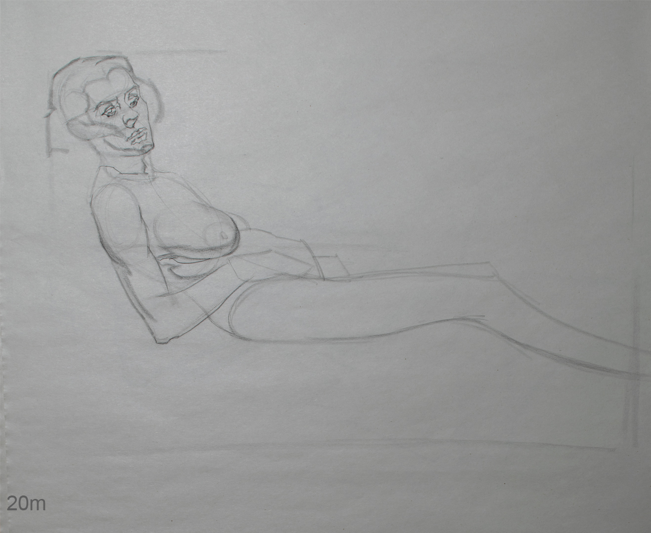
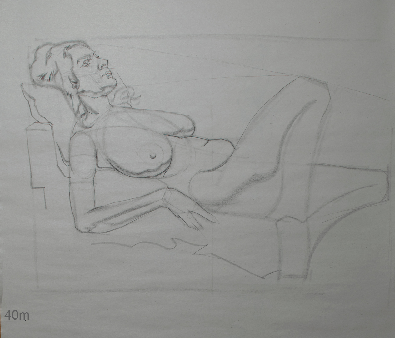
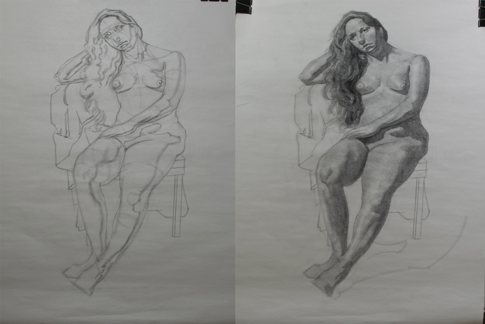
Life Drawing
They started 3 hour classes again in my life drawing club, single pose for 3 weeks (so 9 hours total). Didn't get the chance to make it to the first week but managed the last 2.
Tried applying Joseph's feedback from the other weeks in regards to soften my rendering, hopefully this is a step in the right direction?

Posts: 852
Threads: 6
Joined: May 2018
Reputation:
116
Yeah that's better for sure. There's a lot of good things. Rendering wise parts like the right arm and left leg are definitely softer. The right leg has like a flat shape for the shadow with no outline, and a pleasantly softer edge, however I still think there's not quite enough transition there, still too hard. You don't really need a lot of the shading across the legs, I would argue that is actually making it look flatter because it's not really going with the round form. The big gradation of light is what you really need to make it look round, just that transition really.
Studying drawings has been kind of confusing to me because there are dozens of ways that people have modeled form, and some, especially very old artists, barely even have real shapes of shadow, and others have hard shapes of shadow with no gradation at all. Some just line, obviously. But the expression of form is apparent across the board. So I hesitate to say you need to make your shadows a certain way, because i don't think that's really the point. But It's more looking at a certain form and just asking yourself like, what form is this reading as? What are you trying to say, versus what is your drawing actually serving up? That's how I tend to evaluate it, and it's easier to do that if you think of each part as an abstract form, like just a sculpture, or just something other than what it really is. If you think does this look like a boob, or an arm etc. you probably gonna be less critical of it. And you can express that any number of ways as long as it makes sense to the eye.
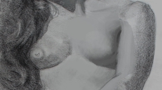
For example, her right breast, you still have that outline thing goin on. I don't doubt that there was a distinct shape of shadow. But a tone can be in a distinct shape, and yet have a soft edge. But in terms of that harsh, objective evaluation of what form you are serving up: It's a corner. I feel like it would be more like this with more transition. The tone is just bridging the shadow and light together:

I wish I could paint in a way that was more like drawing so it's a better comparison, but hopefully that made some kind of sense.
Posts: 485
Threads: 2
Joined: Feb 2017
Reputation:
5
(02-08-2022, 04:13 PM)JosephCow Wrote: Yeah that's better for sure. There's a lot of good things. Rendering wise parts like the right arm and left leg are definitely softer. The right leg has like a flat shape for the shadow with no outline, and a pleasantly softer edge, however I still think there's not quite enough transition there, still too hard. You don't really need a lot of the shading across the legs, I would argue that is actually making it look flatter because it's not really going with the round form. The big gradation of light is what you really need to make it look round, just that transition really.
Studying drawings has been kind of confusing to me because there are dozens of ways that people have modeled form, and some, especially very old artists, barely even have real shapes of shadow, and others have hard shapes of shadow with no gradation at all. Some just line, obviously. But the expression of form is apparent across the board. So I hesitate to say you need to make your shadows a certain way, because i don't think that's really the point. But It's more looking at a certain form and just asking yourself like, what form is this reading as? What are you trying to say, versus what is your drawing actually serving up? That's how I tend to evaluate it, and it's easier to do that if you think of each part as an abstract form, like just a sculpture, or just something other than what it really is. If you think does this look like a boob, or an arm etc. you probably gonna be less critical of it. And you can express that any number of ways as long as it makes sense to the eye.
For example, her right breast, you still have that outline thing goin on. I don't doubt that there was a distinct shape of shadow. But a tone can be in a distinct shape, and yet have a soft edge. But in terms of that harsh, objective evaluation of what form you are serving up: It's a corner. I feel like it would be more like this with more transition. The tone is just bridging the shadow and light together:
I wish I could paint in a way that was more like drawing so it's a better comparison, but hopefully that made some kind of sense.
Sorry for the late reply man, saw this when you originally posted but thought I'd reply once I had more work to post, but as you can see I'm abit behind.....
That paint over is more than enough to illustrate your point, actually really helped to make what you were saying click in my head haha so thanks :) I'm starting to realise now that my edges are still far too hard when i'm mapping out my shadow shapes, I thought I was laying it in softly, atleast that was my intention, it looks soft in the lay-in stage but as you pointed out once I've filled in my tonal shapes they are still way too hard.
I definitely need to interpret what I see rather than trying to depict it as it actually looks. Take the breast for example I drew, I remember there being a firm edge but as you pointed out perhaps that wasn't the best call, I should of thought more about the form the shadow is cast upon (i.e a soft circular form) and gone with a very soft transition rather than trying to depict what I was seeing, even though technically that was right? If that makes any sense?
Posts: 485
Threads: 2
Joined: Feb 2017
Reputation:
5
Fallen behind again on updating. Better late than never.......
Anyway here is a dump of some work from when I last posted.
Gesture Portrait Paintiing
Week 3

Week 4

Week 5

Costumed Portrait Painting
Week 3

Week 4

Week 5

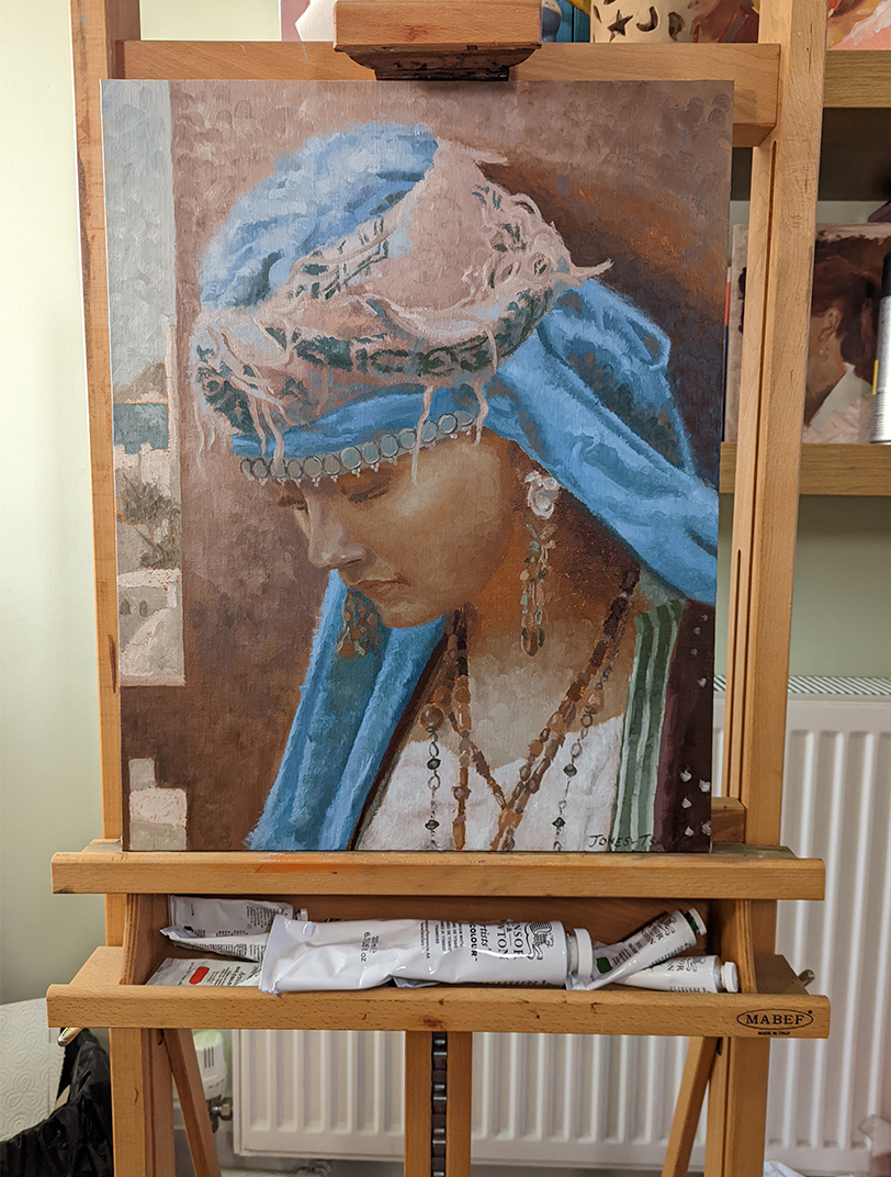
Current Progress

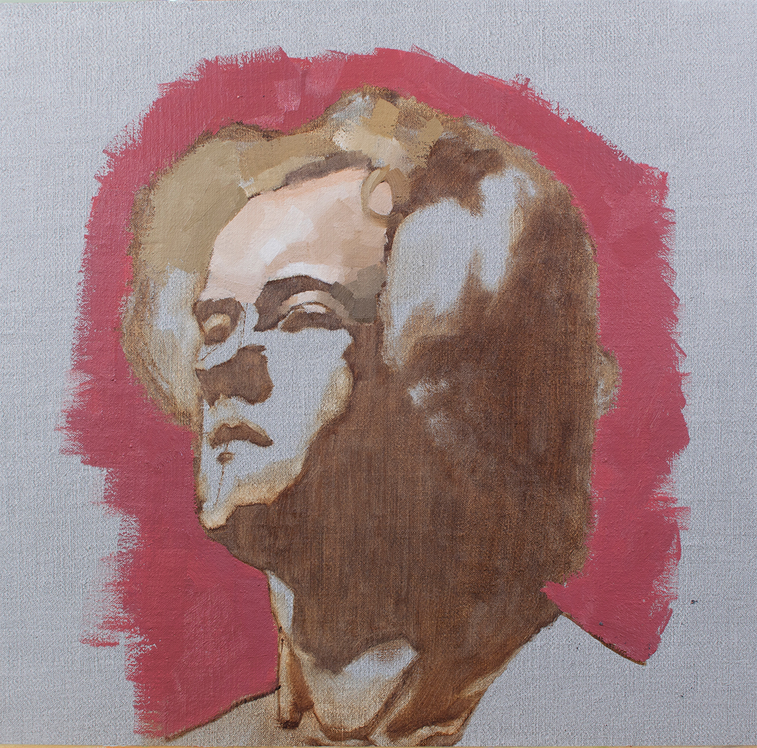
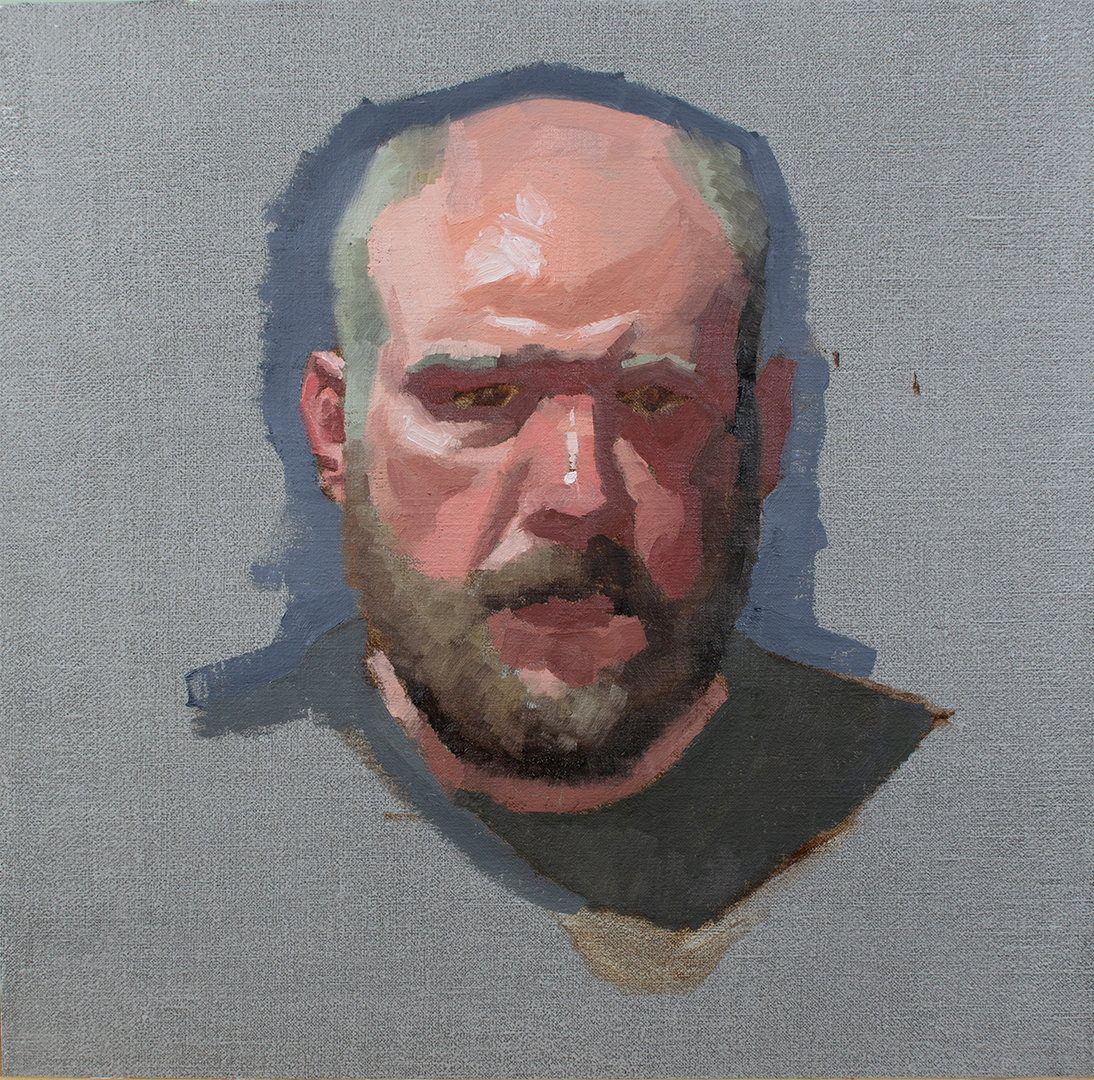
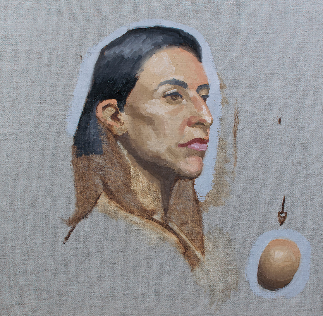
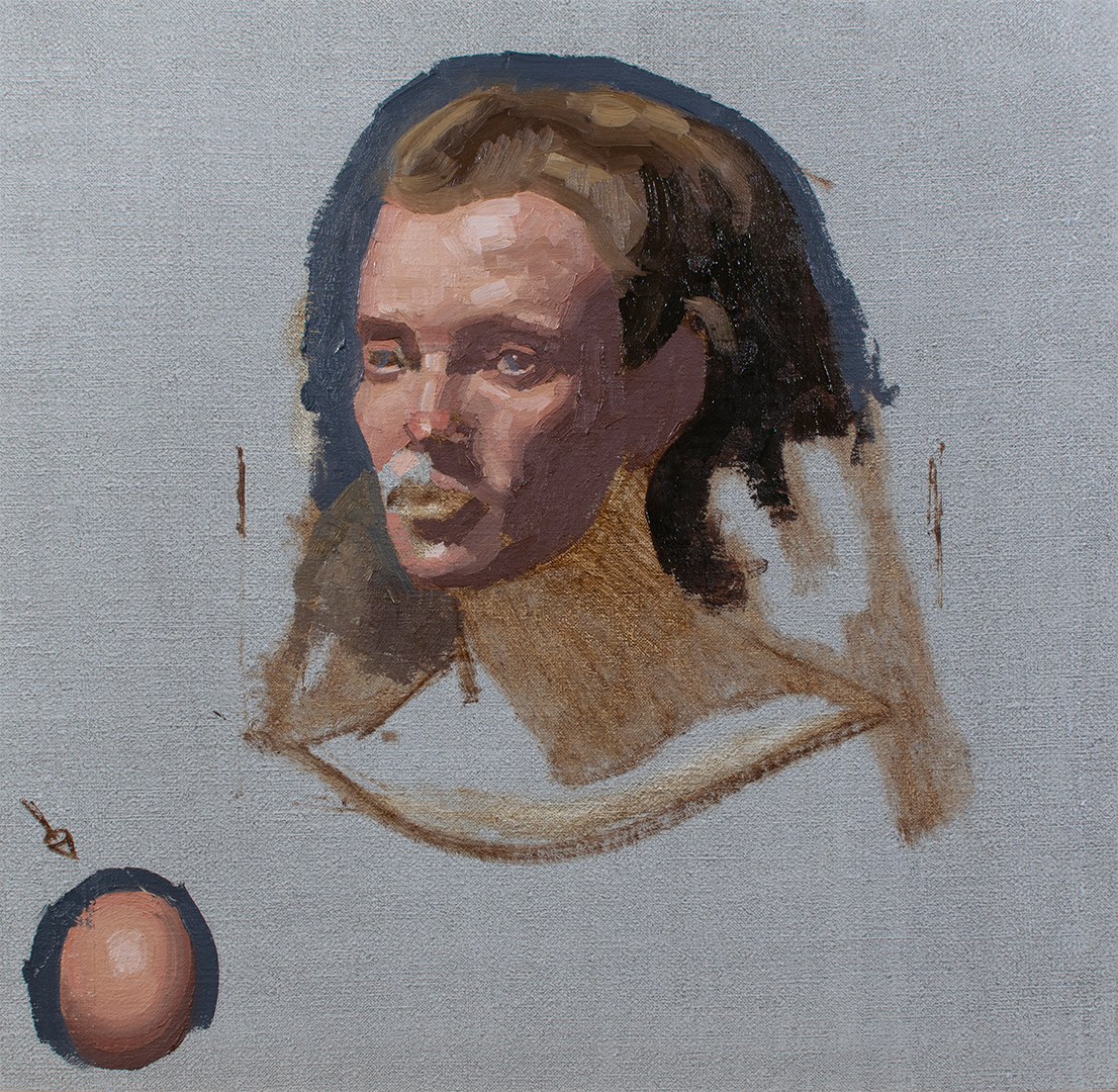
Pretty much have the painting finished. Plan on correcting some of the shadows on the face, mainly some of the cool notes on the face in the shadows since they don't look right and need to be warmer. Saw that there are some painting competitions open for submission so I was planning on submitting it once I've done these corrections. There are definitely areas that I can improve upon but I thought what the hell, I'll see what happens.
Life Drawing
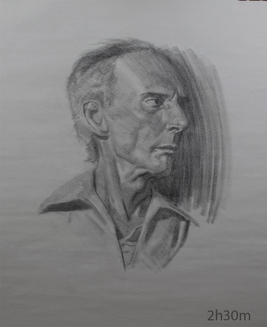
Portrait


Figure


Still feel like I'm in abit of a rut. I'm still practicing daily whether it be taking these critiqued classes or drawing from life but it feels like forever since I've just focused on a specific area and just grinded and got better. Think I said a month or so ago I wanted to start tackling my problem areas starting with construction/lay-ins. Plan on tackling those next month and take some classes that focus specifically on it and just grind away. Hopefully that will get me out of this rut.
Working on an illustration atm, stll in the early stages so not alot to show but I'll post once I have more to show.
I'll be taking a painting workshop next week with Patrick Byrnes which is an alla prima protrait painting workshop so I've been busy prepping for that. Hoping to learn alot from it so I'm really excited. Planning on taking lots of notes so I'll post them here if anyone is interested. :)
Posts: 485
Threads: 2
Joined: Feb 2017
Reputation:
5
Back from the workshop. It was a load of fun and a really good experience! My paintings didn't turn out very well, think I got too bogged down trying to emulate his approach and way of thinking which in turn affected my paintings. Weird how the slightest change in mindset/approach can mess with you so much, felt like I was starting again from sqaure 1 with how bad my block-ins where but my main goal was to work on my colour mixing which I felt really did improve as the days went on so for that alone the course was worth it.
Day 1

Day 2

Day 3

Day 4

Day 5

Made a whole bunch of notes aswell, not sure if I can attach them here as pdf's to download? There are alot of pages overall so don't want to clog my sketchbook with them.
Illustration
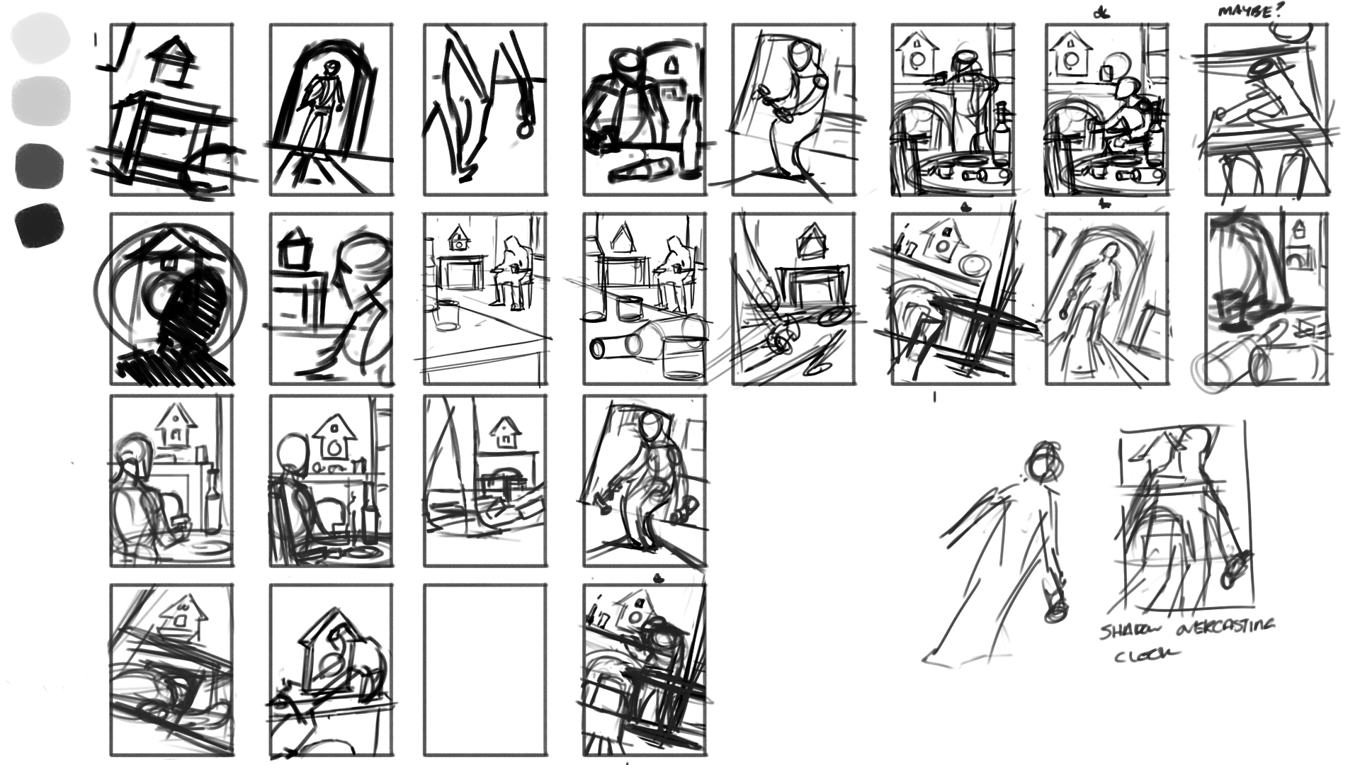
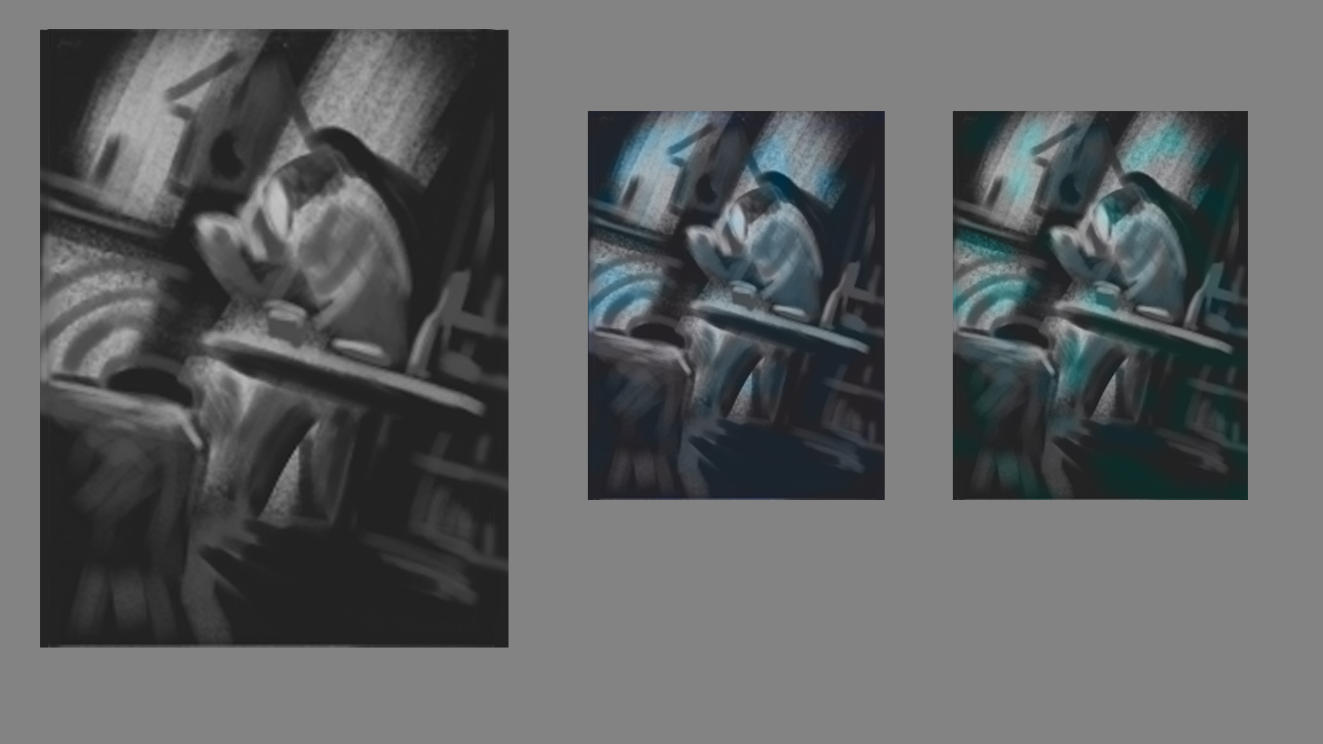
Made some headway with an illustration idea I started before I left I've been reading alot of short stories with the goal of illustrating 1 during the breaks from my live streaming classes. First one is based off "Byond the Door" by Phillip K Dick.
Rough Comps

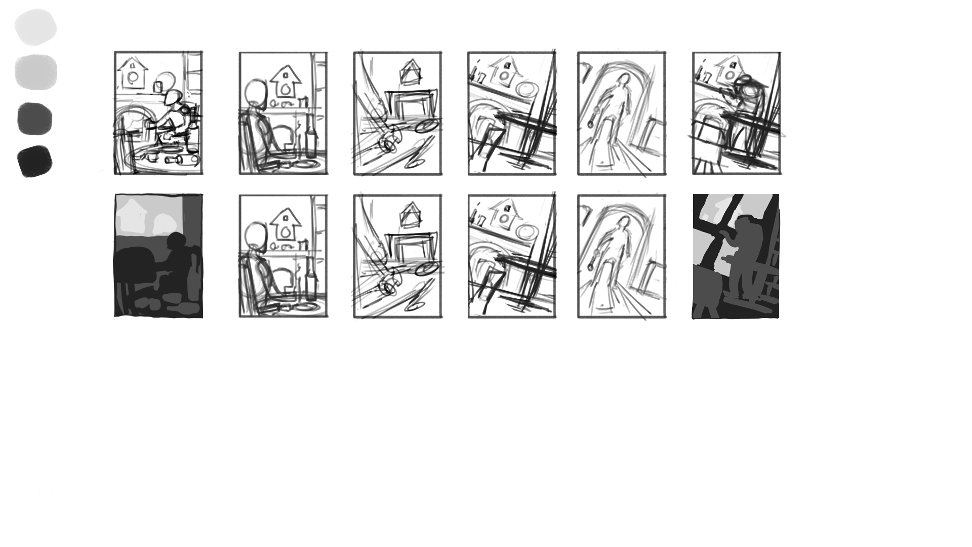
Rough Value Comps


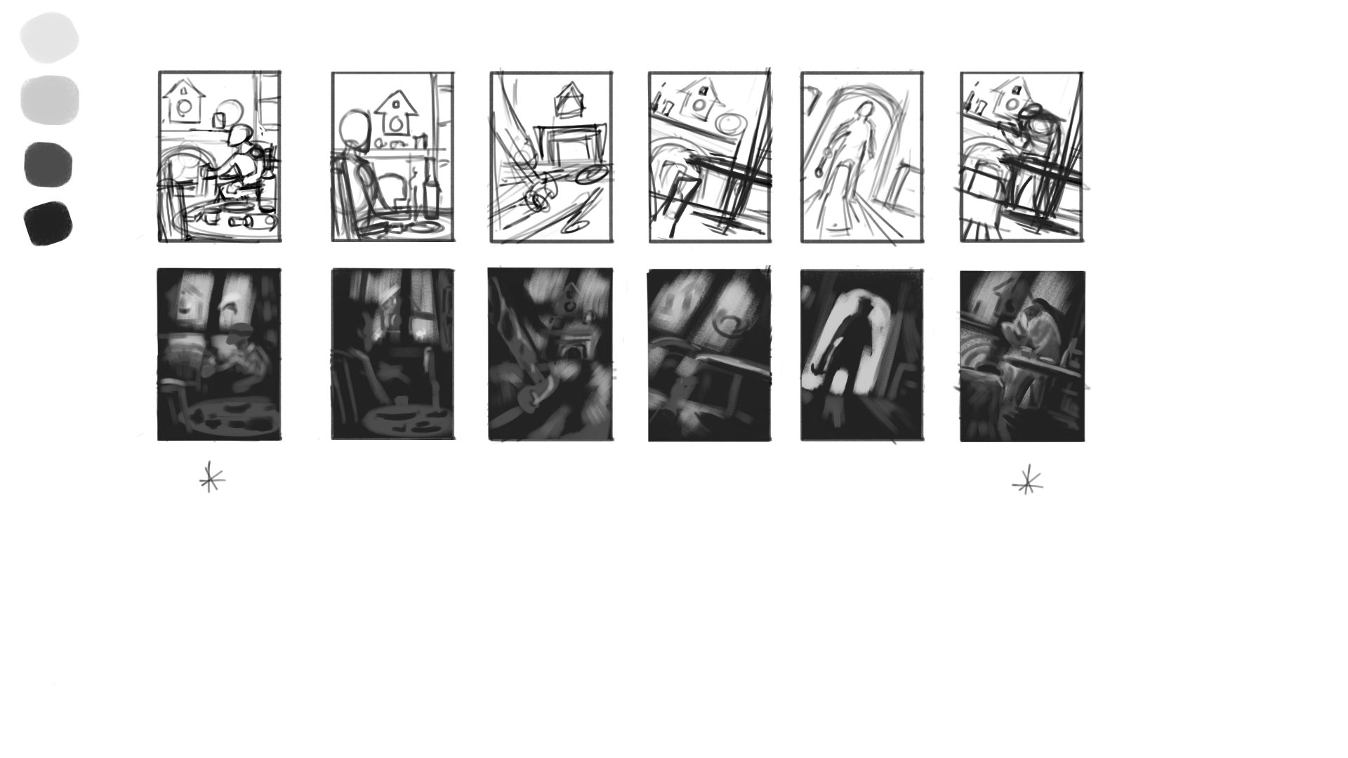
Final Rough

There's abit in the story where the main character starts going abit crazy and talking to a cukoo clock which is the scene I ended up going with above. As far as colours are concerned I've been looking at some duotone illustrations which I think will work well here, just can't decide if my third colour should be ultramarine blue or viridian. Next step is to take some reference photos and complete are more finished colour comp in oils.
Posts: 852
Threads: 6
Joined: May 2018
Reputation:
116
Peter Wrote:I definitely need to interpret what I see rather than trying to depict it as it actually looks. Take the breast for example I drew, I remember there being a firm edge but as you pointed out perhaps that wasn't the best call, I should of thought more about the form the shadow is cast upon (i.e a soft circular form) and gone with a very soft transition rather than trying to depict what I was s
eeing, even though technically that was right? If that makes any sense?
Sorry I totally missed this. I think that definitely makes sense, but in this case I don't know that the solution is to edit what you see, maybe to just look for what you don't see. I feel like what is happening is that the edge in reality really is more gradual. It just seems like it isn't because the light is bright and the shadow is hard. But we know that there simply must be values between light and shadow if the form is round. there are infinite planes that are facing in all directions, so it's physically impossible for there not to be a transition on a round form, even if it only takes up a hair's width. I have found that there's kind of are values that are 'invisible' in a sense. Like they really are there but you can't pick them out because the gradation is so tight. You just notice if the they are gone.
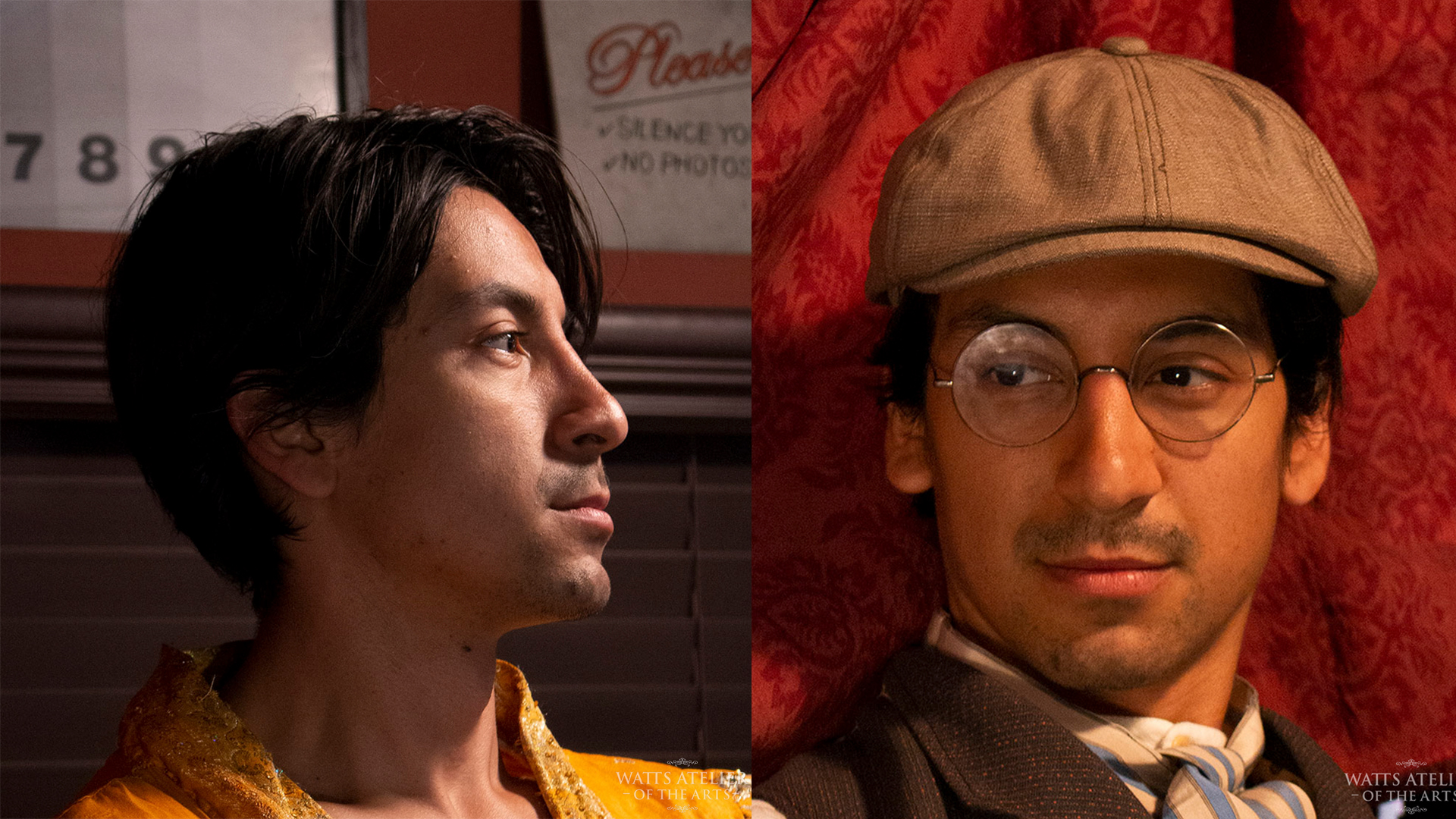
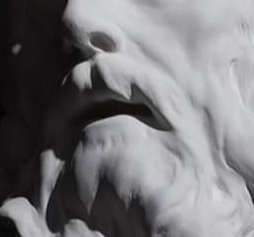
For example the shadows on this form are so incredibly distinct, that is seems like there's no round edge there. Especially on the side of the mouth.

But if I remove some of the halftones I think you see it looks wrong. It looks like someone carved sharp corners into the form. So there was a descent into those shadows, but the halftones fit so gradually and perfectly into the larger mass of light, that you don't really notice unless they aren't there.

Posts: 852
Threads: 6
Joined: May 2018
Reputation:
116
YOur new work is looking good! There's definitely some solid volume going on in those portraits. Interested to see where you go with the illustrations, the story sounds very edgar allen poe-like, or something. I know it's not by him but that's what it reminds me of.
Posts: 60
Threads: 2
Joined: Nov 2020
Reputation:
4
Really digging the illustration ideas as well. Sounds very promising!
I'm getting some old 50s radio show or Twilight Zone vibes.
Also really admiring your committment and all the thumbnails/roughs you did for this and I think the shifted perspective will go very well with your theme.
-------------------------------------------------------
SKETCHBOOK // INSTAGRAM // WEBSITE
-------------------------------------------------------
"Losing all hope was freedom."
Posts: 485
Threads: 2
Joined: Feb 2017
Reputation:
5
(03-29-2022, 01:13 PM)JosephCow Wrote: Peter Wrote:I definitely need to interpret what I see rather than trying to depict it as it actually looks. Take the breast for example I drew, I remember there being a firm edge but as you pointed out perhaps that wasn't the best call, I should of thought more about the form the shadow is cast upon (i.e a soft circular form) and gone with a very soft transition rather than trying to depict what I was s
eeing, even though technically that was right? If that makes any sense?
Sorry I totally missed this. I think that definitely makes sense, but in this case I don't know that the solution is to edit what you see, maybe to just look for what you don't see. I feel like what is happening is that the edge in reality really is more gradual. It just seems like it isn't because the light is bright and the shadow is hard. But we know that there simply must be values between light and shadow if the form is round. there are infinite planes that are facing in all directions, so it's physically impossible for there not to be a transition on a round form, even if it only takes up a hair's width. I have found that there's kind of are values that are 'invisible' in a sense. Like they really are there but you can't pick them out because the gradation is so tight. You just notice if the they are gone.
For example the shadows on this form are so incredibly distinct, that is seems like there's no round edge there. Especially on the side of the mouth.
But if I remove some of the halftones I think you see it looks wrong. It looks like someone carved sharp corners into the form. So there was a descent into those shadows, but the halftones fit so gradually and perfectly into the larger mass of light, that you don't really notice unless they aren't there.
No worries :) It's so easy to overlook something so no biggy.
Thanks again for the visual aid, infinitely more useful compared to simply writing it out so thanks for taking the time.
Ok I see what you mean now, not gonna lie it took me a few seconds to pick up on the differences in the second image haha, guess my eyes really do hate seeing edges!
I think some longer more controlled lighting studies might be the best way for me to put this in practice as my life drawing sessions aren't always the best lit, or particularily long........
Regarding the illustration, the story was a fun little read, definitely not as dark as Poe's work! Just so I don't give you the wrong impression haha.
|


