Tea illustration
#1
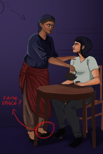
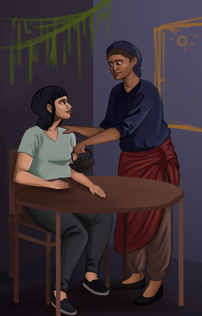
Hey, everyone. I know I've been posting here a lot asking for crits, but I'm in crunch mode for my senior thesis and I'm getting a little worried! This is an illustration I'm doing for it, showing two of my characters drinking tea together. The main thing I need help with it is the table and chair the person is sitting in. The perspective has completely stumped me and I would love some help!

[Image: painting1wip_zpskllzorcf.png]

Thank you guys sooo much!!
Reply
#2
About the perspective: extend the rear legs of the table until they are the same level with the ground floor. You could go back to the construction stage and rechek if no objects are ocupping the same space (seems to be the case of the left woman's leg and one of the table's legs). Use the cast shadow in the floor to explain the perspective of the scene; it's too much non descriptive atm.

One last things is to make sure the values / colors in the painting are describing the surfaces correctly.
The table, for example, is too light in the top. Tone it down a bit and it will look more like wood. If you add a bit of brilliance to the skin rendering, the material will also look more realistic.

Here's a super lazy 1 minute overpaint to sort of show what i mean


Reply
#3
Hi, 

Let`s see what I can bring to the table:

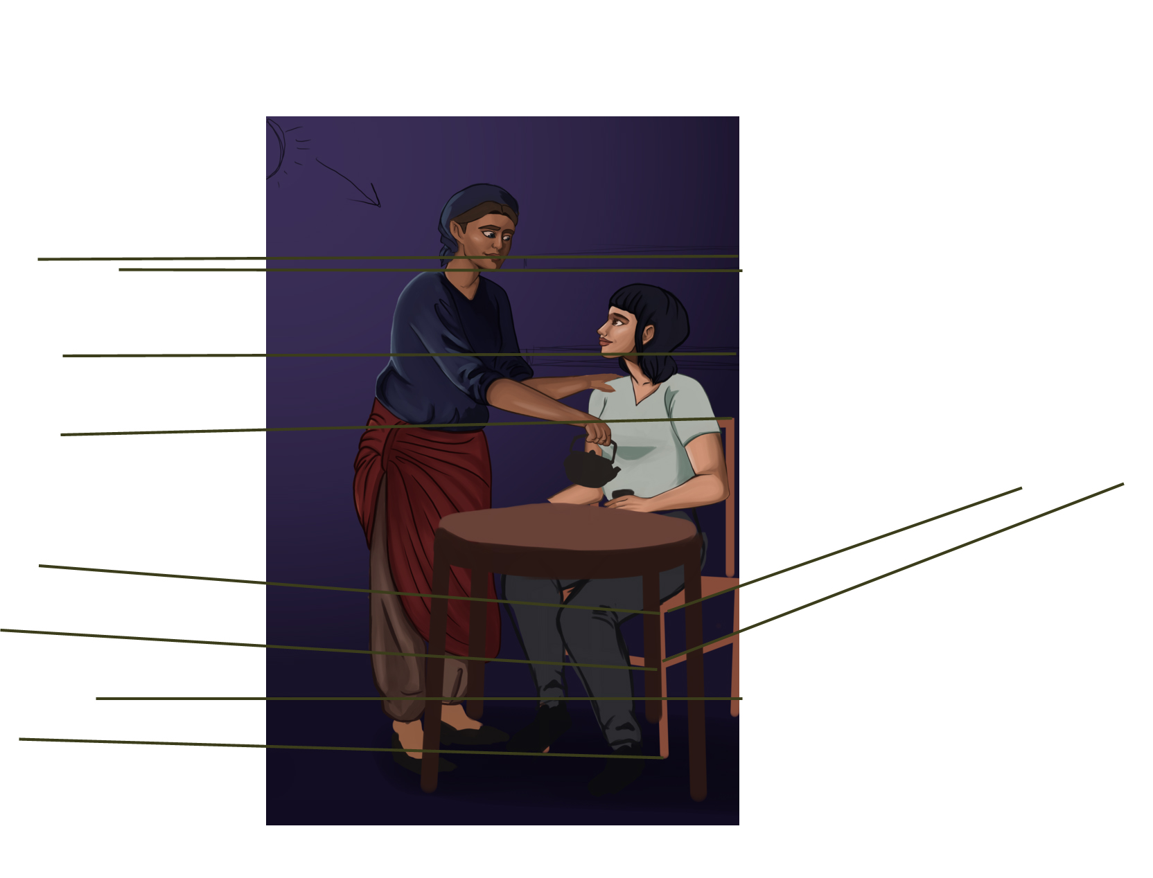
1. About the perspective: it is really hartd to tell what perspective system you are usin . There is a one point "feeling" to the scene but some objects (the chair and the shels) are two pointish.. Be more careful when setting up the scene and place your vanishing points more thoroughly. The table seems to float around.


quick overpaint


2. Avoid tangents: the chair and table appear strangely joined together.


The perspective problem is still there but you could use this Model (pm me if you need the SU file). 

preview: 


Cheers
Reply
#4
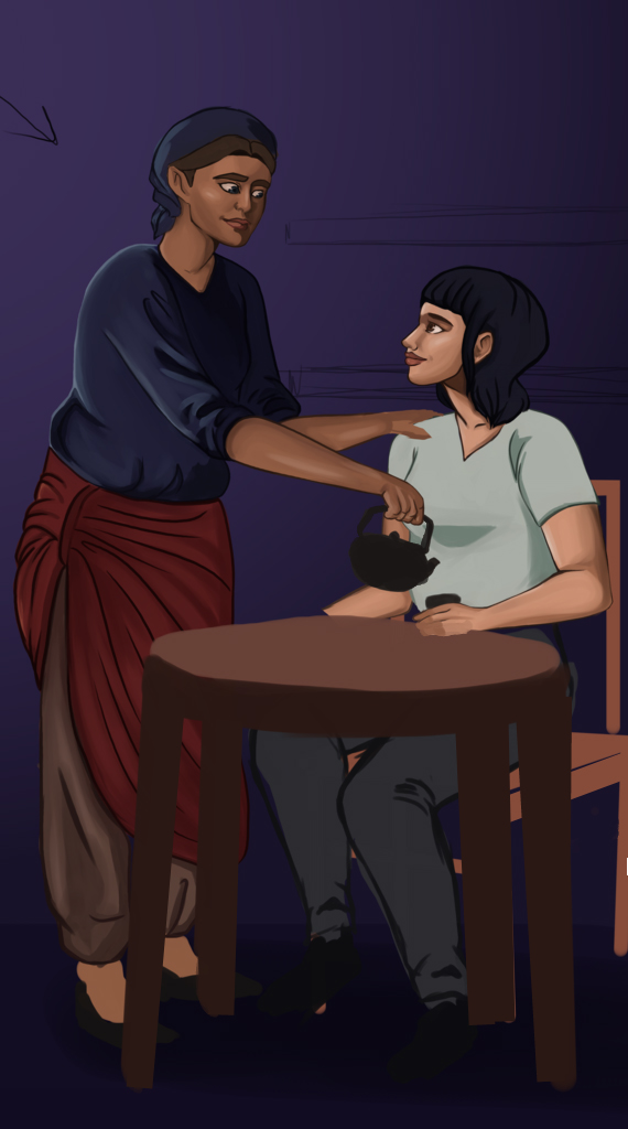
Thanks for the tips, guys! I think the main issue was the perspective, I tried to do it in one point but it was almost impossible, so I redrew everything. Then I realized that the floor was in one-point, so I changed that too. I don't think it's perfect, but it's much better. I'm not sure if I want to add the bookshelf now, though, since it'll be above the horizon line and may look off. Do you think I need it?

[Image: painting1wip2_zpsjzjzoswa.png]

Reply
#5
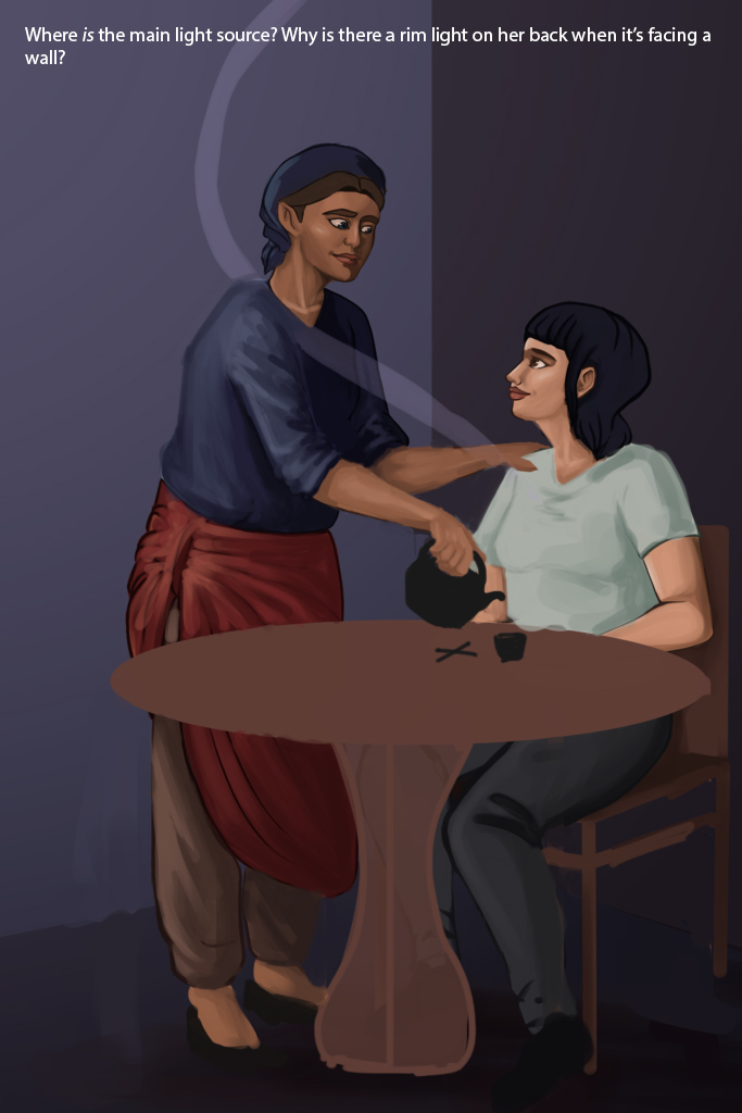
Didn't see the newer image! So I made this based on an older version... what I mainly notice is the different sizes of the left and right arms, and the too-deep chin. So anatomy. Second thing is where are the light sources? Usually a rim light happens when there's a strong light source coming from behind the object, but in this case it's a wall behind her, so either there's soemthing about rim lights I don't know yet, or that rim light is not working there. Then I tried out a new table foot to avoid solving that foot-on-foot issue :P


Focus.
Reply
#6
Thanks so much for the awesome paintover, meat! I think I'm mostly done with this? I really need to wrap it up and move on. I'm planning on adding some hanging herbs in the background, along with possibly a window? I think the table looks pretty okay, or should I still move it around?

[Image: painting1wip3_zpsoenx5jf0.png]

Reply
#7
Cropping window like that feels weird 'cos it emphasize the empty wall even more, so I'd suggest putting the window into the view more. 


Focus.
Reply
#8
Thanks for the tips, meat. I think it's finished? I don't totally love the window, it's lacking a lot of details but I also don't know if I want to add anymore. ¯\_(ツ)_/¯

[Image: painting1wip4_zpsevelkzql.png]

I also thought I'd add in two other illustrations I'm doing for thesis. The first is one that's based around a witch getting in contact with a childhood friend who recently died. I still need to add the details the the ouija board and fix the glasses and tears.

[Image: painting1wip1_zpspbpbyhs9.png]

And this is the book cover. I don't love it yet, and would love some help. It's a wrap-around, and the gray box on the left isn't going to stay, it's just there to keep track of what's going on the back and what's going on the front. So the half on the right will be the cover, and I want to add a box with the title towards the top. I still need to play around with it.

[Image: coverwip1_zps3ipofp8j.png]

I'm almost done with all this! I can't wait to post it all together for you guys!!

Reply
#9
Just a general comment on the table and chairs in the first image. If you are going for a wooden table, those legs on both are incredibly thin and make me focus on them in a negative way. i would also suggest to use an elliptical selection to get the tabletops neatly edged if your style is clean lines, otherwise it looks a bit sloppy.

If you aren't drawing with or know how to construct perspective grids and then place basic objects in that perspective , you're gonna get that feedback a lot in the future, so start filling in gaps in your knowledge. True especially if you want to do comics in general, you need to nail this aspect down. The last image is much more solid perspective wise though there are many small issues.

 YouTube free learnin! | DeviantArt | Old Folio | Insta
Reply


Forum Jump:


Users browsing this thread: 10 Guest(s)