Posts: 1,109
Threads: 18
Joined: Apr 2014
Reputation:
68
Hi guys! I am taking this (unpaid) commission for my barber shop, they will put it up on their wall (presuming they don't hate it!) and maybe I can get some business out of it. I'll toss in the reference photo's too, although I have not really drilled in to capturing the likeness yet, so they still don't look exactly like themselves yet - when I get to painting with value I will put my effort into getting the likeness exact. Mainly looking for any crits about the composition, shapes, character designs or any ways I could improve the idea and make it funnier. (or anything else I didn't think of!)
![[Image: mhf6FuK.jpg]](http://i.imgur.com/mhf6FuK.jpg)
![[Image: BHuWxQO.jpg]](http://i.imgur.com/BHuWxQO.jpg)
![[Image: cQRqisy.jpg]](http://i.imgur.com/cQRqisy.jpg)
I started off having the big guy turning to look at the camera, and whilst not looking shaved a massive bald stripe down the clients head, but I could get it clear enough so I changed to him holding the massive gardening shears. Right now I'm having the lady hold a blowtorch, since it looks a bit like a hairdryer, and there is a gas pipe and the cannister tucked under the desk. I'm going to try today to change her pose and have her holding the blowtorch up and squeezing the trigger to jet some flame from it buuuut, I'm not sure about the blowtorch thing altogether (she is the owner of the shop, I want it to be funny but don't want to do something too extreme with her!)
Thanks for looking!
Posts: 1,109
Threads: 18
Joined: Apr 2014
Reputation:
68
oh yea, here is a recent caricature I finished to show my current level, I'm aiming to take the one above to a similar kind of finish (but push it a bit more of course)
![[Image: 9SlFb2X.jpg]](http://i.imgur.com/9SlFb2X.jpg)
![[Image: Cw06iDT.jpg]](http://i.imgur.com/Cw06iDT.jpg)
Posts: 1,109
Threads: 18
Joined: Apr 2014
Reputation:
68
Little update on this, I ditched the blowtorch idea, it was too aggressive and the connection between blowtorch and hairdryer wasn't so obvious.
Instead I just gave her boxing gloves, since she did this charity boxing training + match last year, and just changed her pose a bit to look less stiff.
![[Image: koBfYLp.jpg]](http://i.imgur.com/koBfYLp.jpg)
Gonna start to work on a tighter sketch next.
Posts: 905
Threads: 39
Joined: Sep 2013
Reputation:
51
LOL I think it looks great! Don't forget to put your name there too! Are you thinking of adding hair clippings on the ground, and the many different bottles of stuff they put in hairs in the background?
Posts: 15
Threads: 2
Joined: Dec 2016
Reputation:
3
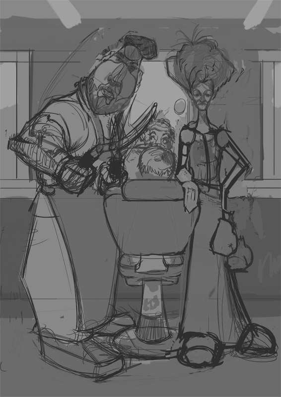
I feel like you could make their faces much more expressive.
Also maybe I'm hallucinating but something about the way the guy holds his head looks a bit stiff.
Maybe you can make him jut out his chin or give the head a bit more tilt like so:
Disclaimer: I don't know anything about caricature and you clearly do so make of this what you want.
Cheers!
Posts: 1,109
Threads: 18
Joined: Apr 2014
Reputation:
68
Meat Thanks dude! I didn't think of the hair clippings, maybe I'll add a severed ear amongst the pile as a subtle detail, and mustn't forget my name no xD I did on the previous one >.<
Yenchi Thanks for the crit, I have moved that head around a little bit, something didn't feel right to me either, still not sure! Will try a more extreme tilt like you suggested! I've found caricature to be sooo useful for all kinds of character work, and especially helpful in learning the forms of the face - I struggled with portraits for ages, getting so bored and frustrated, but with caricature you can study the same stuff but have fun, and don't have to end up with something proportionally accurate! I definitely recommend it, Proko has a course running on his youtube channel for free.
Bit more progress today, tightening things up, not happy with the perspective on the garden shears - probably gonna have another go at that next time and do a full construction on it.
![[Image: ki1p4my.jpg]](http://i.imgur.com/ki1p4my.jpg)
Posts: 291
Threads: 13
Joined: Dec 2013
Reputation:
5
Hey jon this is looking really good already, Compositionally and comically!
Now I'm not a master of composition yet but when you start painting don't forget about the 1 2 3 read with your Values , other than that I really like what you got here, except maybe add a bit of visual interest below their faces? like elements that will guide the flow of the image pointing in their faces?
btw, you must be in good company among these people when they let you paint a severed finger on a painting that they will hang on their wall
Posts: 1,424
Threads: 12
Joined: Dec 2015
Reputation:
139
Been meaning to get round to this for a while.
Hey Jyonny your caricature painting skills are pretty damn good now dude - you really captured the likeness of your pal there.
And I think it's great how you're being proactive at drumming up business for yourself. Sure this one is free but it will get your work out there.
Your piece is coming together nicely so far, I just had some ideas for you to take or leave if that's OK.
I totally got the blow torch thing and thought it was a clever idea but it's your call whether to use it or not.
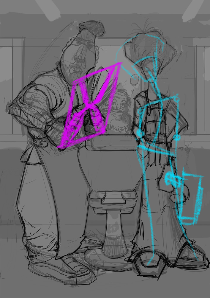
I think you could loosen up the lady's pose a little.
And agree that the shears need a bit of perspective work.
Here's a quick draw over - hope it helps - take it or leave it - completely your call:
Keep going dude!
“Today, give a stranger one of your smiles. It might be the only sunshine he sees all day.” -- H. Jackson Brown Jr.
CD Sketchbook
Posts: 1,109
Threads: 18
Joined: Apr 2014
Reputation:
68
Kurt Thx dude! I'll work on the values and read
Artloader Thx! I'll give that pose a go see if it fits! Thx for the perspective guides, I'm currently struggling with a super complex construction to try and get the hands and shears spot on... finally found a use for the 'mirroring rotated and tilted planes' in Scott Robertsons book XD
Posts: 1,109
Threads: 18
Joined: Apr 2014
Reputation:
68
here's an update, haven't worked on this for a little while but going at it full on now til the finish:
![[Image: FFbeq21.jpg]](http://i.imgur.com/FFbeq21.jpg)
I think the main characters are ok now, the shears seem to work in perspective (in the end I use a 3D model to get the perspective right, it was too complicated for me by hand!).
There are problems with the guy in the chair; proportion / scale / something is off about him and / or the chair but I keep fiddling around, stretching and adjusting parts and can't seem to figure out exactly what is off... any advice would be much appreciated!
Thanks!
Posts: 1,109
Threads: 18
Joined: Apr 2014
Reputation:
68
hey guys, back to working on this one after a break. Trying to get good values and lighting going on - I'm going for a film noir esque interrogation room light. Any crits are greatly appreciated!
![[Image: tz6iJ0v.jpg]](http://i.imgur.com/tz6iJ0v.jpg)
The plan is to get all the values in roughly the right places, then go carefully and overpaint everything focussing on edges and likeness and stuff.
Posts: 129
Threads: 1
Joined: Dec 2012
Reputation:
11
Is the composition set in stone?
I find it busy, too many heads and faces and that arm that is a character on itself :)
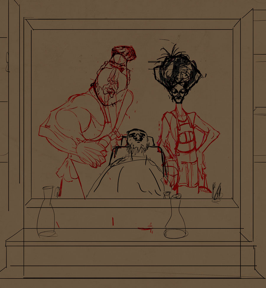
I had an idea. What if we use a 1st person camera. We are the customer looking at our reflection in the mirror and see these 2 tough guys behind our chair. Scary huh.
We should be sit far back like dentist chairs. Making an unconfortable situation for us to be at the mercy of these 2 tough guys. The funny part.
Posts: 1,109
Threads: 18
Joined: Apr 2014
Reputation:
68
haha that's awesome, I love it, I could never get the back of the customers head and his reflection to feel right, so this would solve that problem. Just a case of redrawing the customer and background and I could leave the main characters as they are. Thanks a million AlfonsoX!
Posts: 1,109
Threads: 18
Joined: Apr 2014
Reputation:
68
I had a go at changing the image like Alfonso suggested but, to get maximum use of an A4 sheet of paper I'd have had to redraw quite a lot or end up with it cropped in a not so good way. However, I believe I solved the problem of too busy / too many heads. I think the lighting looks ok now, values ok... maybe xD let me know what you think of these two, A or B.
A: Lower contrast, more detail in the darks
![[Image: bdQYhbE.jpg]](http://i.imgur.com/bdQYhbE.jpg)
B: Higher contrast, crushed out some detail in the darks
![[Image: VXsnuT3.jpg]](http://i.imgur.com/VXsnuT3.jpg)
I like B but can never be sure if I am pushing the contrast just a bit too much. Feedback much appreciated!
Posts: 1,109
Threads: 18
Joined: Apr 2014
Reputation:
68
This thing has taken so long to complete, but I think I might be nearly there! Let me know anything you think I could improve.
![[Image: MAgrYeN.jpg]](http://i.imgur.com/MAgrYeN.jpg)
Posts: 364
Threads: 11
Joined: Dec 2013
Reputation:
73
![[Image: paintover_05072017_by_andrew_gibbons-dbf56rr.jpg]](http://orig09.deviantart.net/49c5/f/2017/185/2/7/paintover_05072017_by_andrew_gibbons-dbf56rr.jpg)
Hey brother, Just trying to help out if i can, made a few quick changes in the direction i would go.
just trying to alter the values so the characters stand out a bit more, made the guy look at the customer so he looks like that muscle kinda scary guy trope, the girl looks boss as already. changed the feet positions a bit to what felt better to me. added his reflection on the snipers for added comedic value. hope there is something helpful here.
good luck, caricature is hard!
Posts: 1,109
Threads: 18
Joined: Apr 2014
Reputation:
68
hahaha! friggin awesome, never thought about the reflection on the scissors and the looking direction really changes things a lot. Thanks so much!
|
![[Image: mhf6FuK.jpg]](http://i.imgur.com/mhf6FuK.jpg)
![[Image: BHuWxQO.jpg]](http://i.imgur.com/BHuWxQO.jpg)
![[Image: cQRqisy.jpg]](http://i.imgur.com/cQRqisy.jpg)
![[Image: mhf6FuK.jpg]](http://i.imgur.com/mhf6FuK.jpg)
![[Image: BHuWxQO.jpg]](http://i.imgur.com/BHuWxQO.jpg)
![[Image: cQRqisy.jpg]](http://i.imgur.com/cQRqisy.jpg)


![[Image: 9SlFb2X.jpg]](http://i.imgur.com/9SlFb2X.jpg)
![[Image: Cw06iDT.jpg]](http://i.imgur.com/Cw06iDT.jpg)
![[Image: koBfYLp.jpg]](http://i.imgur.com/koBfYLp.jpg)


![[Image: ki1p4my.jpg]](http://i.imgur.com/ki1p4my.jpg)

![[Image: FFbeq21.jpg]](http://i.imgur.com/FFbeq21.jpg)
![[Image: tz6iJ0v.jpg]](http://i.imgur.com/tz6iJ0v.jpg)

![[Image: bdQYhbE.jpg]](http://i.imgur.com/bdQYhbE.jpg)
![[Image: VXsnuT3.jpg]](http://i.imgur.com/VXsnuT3.jpg)
![[Image: MAgrYeN.jpg]](http://i.imgur.com/MAgrYeN.jpg)
![[Image: paintover_05072017_by_andrew_gibbons-dbf56rr.jpg]](http://orig09.deviantart.net/49c5/f/2017/185/2/7/paintover_05072017_by_andrew_gibbons-dbf56rr.jpg)