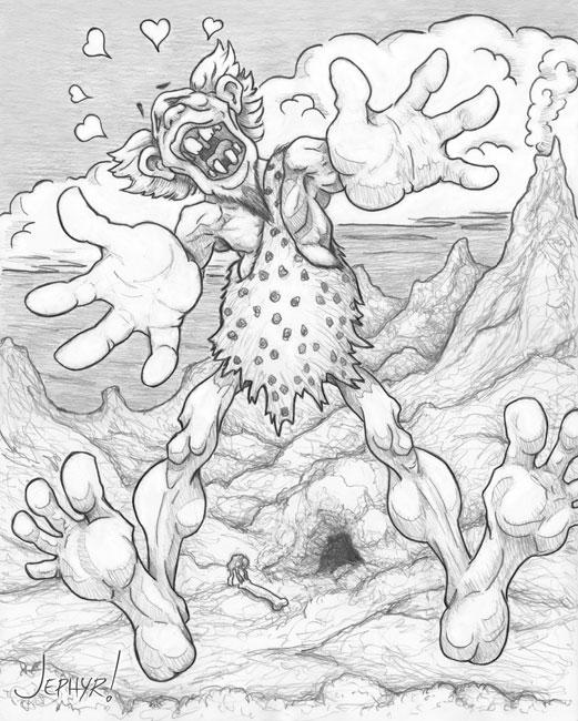
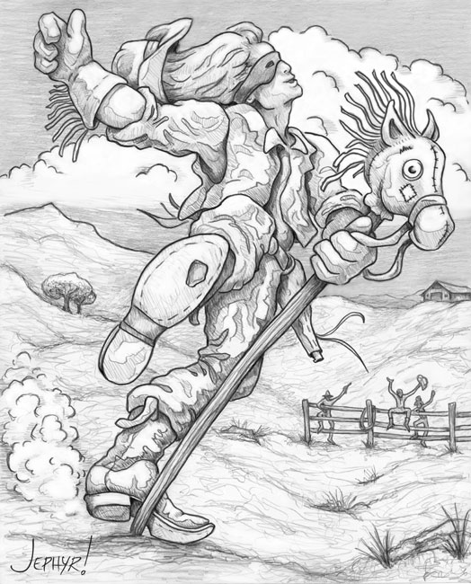
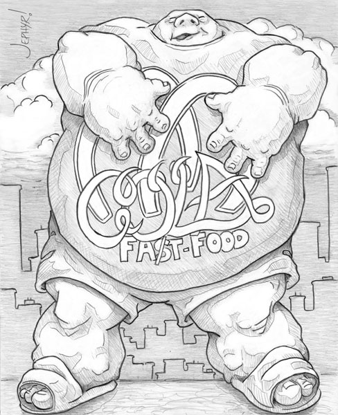
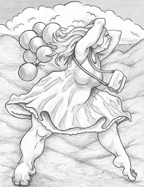
Look what the Sonoran wind just blew in!
#1
Was just going through another site and they listed concept art forums—and here I am.

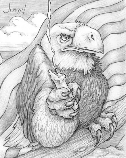
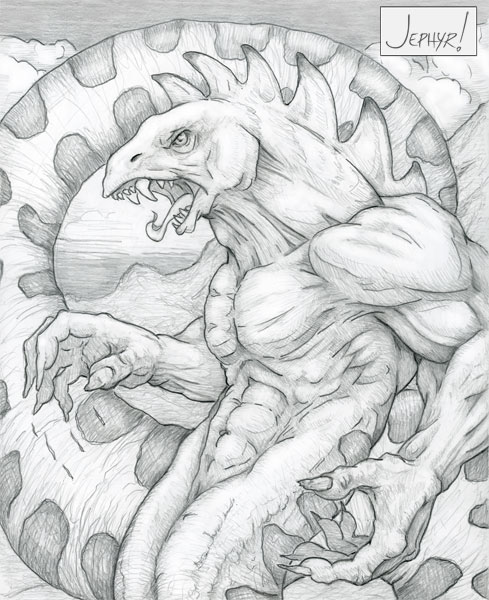
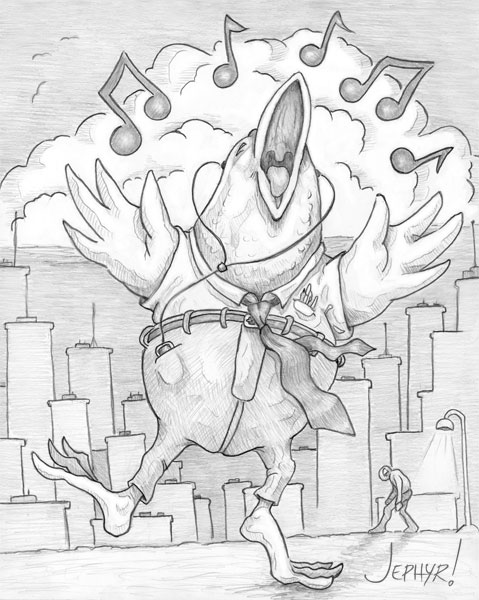
Anywho—here's some recent sketchbook stuff.


Reply
#2
Some more recent sketchbook schtuff


Have you heard about Lubomir Arsov?  His art is awesome/social commentary—and he did a very cool composited animation using it.

Check it out here.

Cya next time

Reply
#3
alright jephyr my man, glad you stopped by the forum... I took a look at your site and i think i can write up quite a substantial critique of your stuff 

So its gonna consist of a few things, Ill go through a few  sections on your site and critique the work. the overarching critique of your work i think is your choice of shape design, which is a personal thing, sure, but may be more outreaching than just me. I could imagine an art director for a large project seeing these shapes and not seeing them as all too promising.

For digital paintings 

http://artistjeffcurtis.wgd-entertainmen...tHome.html

The anatomy is pretty good, but the water is very... fake looking in comparison to the figure. shore water on the beach becomes more transparent near the shore, youd see browns coming through from the  sand underneath, and the hills near her are  covered in fog despite being quite close. The overall image is so blue, and nothing feels like its harmonizing, almost like the figure was copied and pasted into the scene

Despite that, this is probably the best piece on your site, mainly because it  lacks the goofy whimisical shape design.

http://artistjeffcurtis.wgd-entertainmen...eller.html

For this one, the rendering is okay, but the caricature is more uncomfortable and strange looking than funny or clever.  So i googled "robert mueller caricature, and this is a better example of an attempt at it

https://live.staticflickr.com/894/392647...68f0_b.jpg

So you made muellers eyes bigger, which arent the most prominent feature of him. He has a larger jaw and big nose. Generally when you caricature men, you want to emphasize things other than the eyes, and focus more on the jawline, heavy brow ridge, since thats more prominent in men and big eyes are more prominent in women and small children. Also your rendering of the hair is blocky and weird. Hair has lots of soft edges in a painterly look, but if you render hair full on with max realism, it'll look more crisp and sharp like the above picture. Yours kinda looks like a gray sponge , and the hairline is hard, which is also unrealistic.

Some of your anatomy studies are pretty good like this 
http://artistjeffcurtis.wgd-entertainmen...Study.html
and this 
http://artistjeffcurtis.wgd-entertainmen...gnment.htm
(your life drawings are in the right direction, albeit some fatal proportional errors and the whimsical shapes creeping into things, harming their natural beauty.) 

Then when i see your imagination work, its really whacky and goofy and unnappealing. For example:
http://artistjeffcurtis.wgd-entertainmen...oogie.html
This creatures legs are unlike that of a crocodile/alligator. In fact i cant really think of any animal on the earth that has legs like this, which are skinny in the middle and large and tumorlike in the foot with reptillian toes.  When you cartoonfy, try to think of function, cut and carve to make it work. 

Sure mickey mouse has big feet, but its balanced with other shapes that are also unbelievable like his simple ball as a torso, ball as a hands. With your gator here, his chest is like a realistic male chest with realistic bone structure, it hits the uncanny valley, which is present in almost all of your drawings. 

Cartoonists avoid the uncanny valley by simplifying, like stephen silver. He uses basic forms to make things flow together. Even a study you did
http://artistjeffcurtis.wgd-entertainmen...Cowboy.htm
You can see all the shapes on this dude are lanky and long. big top/ big bottom/ lanky in between. 
http://artistjeffcurtis.wgd-entertainment.com/Brawk.htm
This is a seemingly square shaped dude, but every contour is rounded,  you seem to turn every straight line into yet another circular shape, which gives everything this potato like quality. 

or this 
http://artistjeffcurtis.wgd-entertainmen...Rodeo.html
The hair is blocky and strange, the foot is smack dab tangenting the pants, the hands are so big, the depth is  just... theres so much wrong with it i dont even know where to start 

http://artistjeffcurtis.wgd-entertainmen...heAir.html
This character is disturbing looking, but i suppose its supposed to be funny or endearing? His feet are alienlike and his tiny thighs just feel so strange

I cannot find even one face on your site that is attractive/pretty or handsome, Every face is bloopy, old, wrinkled, poorly drawn, weridly stretched etc. its mainly from always using round shapes in  just about every contour

http://artistjeffcurtis.wgd-entertainmen...ertie.html
http://artistjeffcurtis.wgd-entertainmen...evour.html

It really really reminds me of burne hogarthes work and i see now why alot of people warn against using  him as a reference too much as his balooney shapes are not appealing. maybe you also like tom richmond from mad magazine? He has that vague of element of goofy design, but he knows how to make things appealing with straights and curves, as well as how to draw beautiful women and men, then exaggerate them. 

Ultimately i think youd benefit from analyzing master artists who have more of an angular style like JC leyendecker or andrew loomis/jeff watts/erik gist. They curtail their shapes to be more suited for attractive drawings and people. Im not saying you have to draw pretty people to be successful, people like max verehin draw hideous monsters but his shapes are just more appealing and articulate, which makes them go further. 

Watch this, to see what i mean about nice shape design
https://www.youtube.com/watch?v=zKfsZaNrmzM&t=10458s


Maybe im missing something, im not sure, it seems youve been doing this a long time and in my opinion, developed a lot of fatally bad habits. I used to draw in a similar style to this around page 50 or so in my sketchbook and it took a long time to unlearn it, and i cringe to the depths of hell thinking i thought that style would get me anywhere.

Im hope im not being to hard on you, i went through a similar struggle. Maybe you do well for yourself, i have no idea. Anyways, welcome to daggers and feel free to keep us updated
70+Page Koala Sketchbook: http://crimsondaggers.com/forum/thread-3465.html SB

Paintover thread, submit for crits! http://crimsondaggers.com/forum/thread-7879.html
[color=rgba(255, 255, 255, 0.882)]e owl sat on an oak. The more he saw, the less he spoke.[/color]
Reply
#4
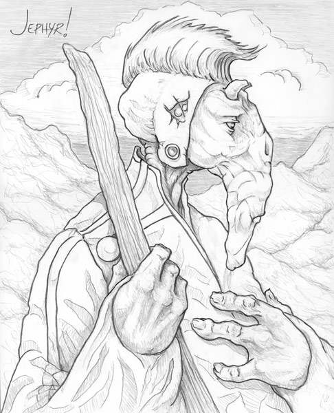
I can imagine the Shepherd and the Aspasaurus living in the same world and a story to tell, is it the case?
http://crimsondaggers.com/forum/attachme...served.jpg

Thank you for the link to Lubomir Arsov's In Shadow, a true masterpiece.

Reply
#5
Big Grin 
Hi again.

Don't know how all the html code wound up in this post.  Oh Well.......

I'm migrating my old and much used hard-drive to a new HD/OS and am taking a lot of time to go through clean up nearly a terabyte of files and programs etc.

Anywho—I've managed a bit of art and will share that and some older stuff below.

Thank you so much [b]Leo Ki.  I do indeed envision a specific world inhabited by my characters and there is a thread running through all of my original  sketchbook concepts, creatures, and peeps.  I'm very pleased you picked up on that.[/b]

[b]I loved In Shadow too.  It's awesome to hear you call it a Masterpiece! [/b]

Fedodika:  Thanks for the welcome and thorough critique. 

"Attractiveness" and what people respond to is obviously a matter of taste. 

For example I can't stand a bunch of art that a lot of people seem to love.

As I wrote to Leo Ki above—I'm creating a specific fantasy "world" that suits my tastes—and I really enjoy—and most of the artwork I respond to is odd, different, strange, unique, and so on. 

Think Carlos Huante, Dali and other surrealists, add a dash of old heavy metal magazine style art, and a cup o'Frazetta, super-exaggerate it all, mix it together,  and bake on medium for 40 minutes. 

[Image: biggrin.png]

With that said—I'll consider your thoughts—and see what I can take away from them.  For example it's easy to dismiss your comments about my Mueller caricature and other characters of mine as a matter of personal taste—but I will think about having too many rounded shapes and balancing them with angular forms.

BTW—I studied for several years with Leyendecker's grand niece who is a GREAT instructor and not a bad artist her own se'f.

Thanks again

------------------------

Here's sum art

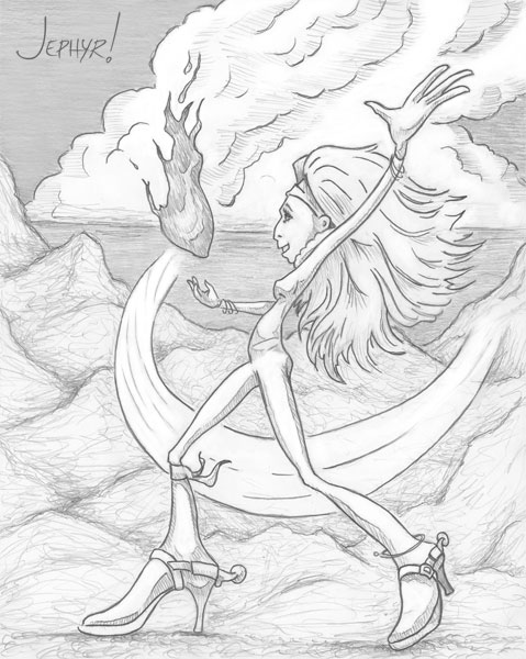
Pastel pencil


Had a blast making this character's feet/boots as crazy big as I could and super-exaggeratin' her pose and form. 


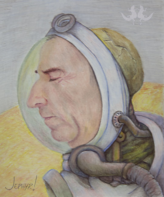
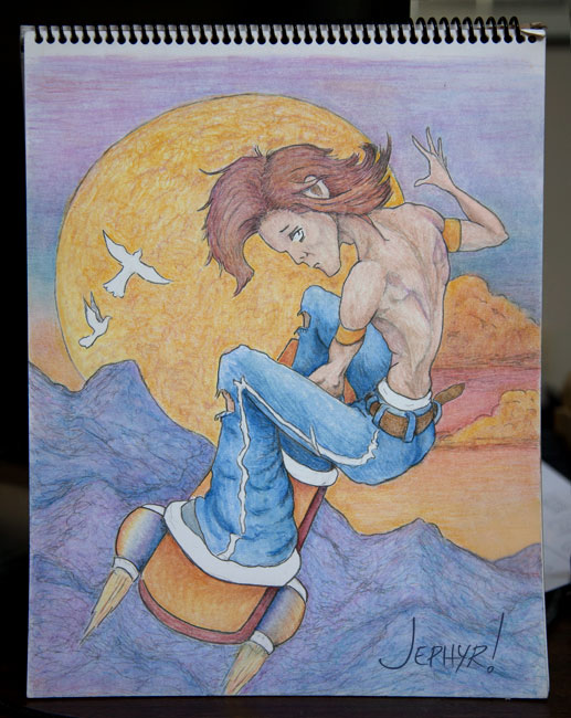
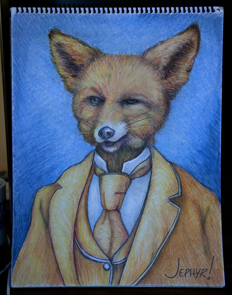
Color pencil


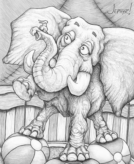
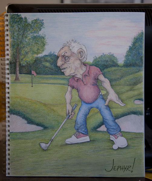
A sketch I drew for my niece's kids


A digital photo study using some custom brushes I made after watching a tutorial about making them


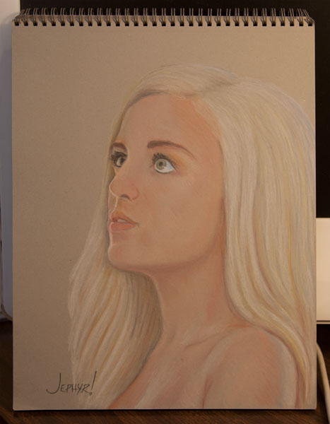
And just for Fedodika—some more "attractive schtuff:

A photo study I did with pastel pencils of a purty  girl


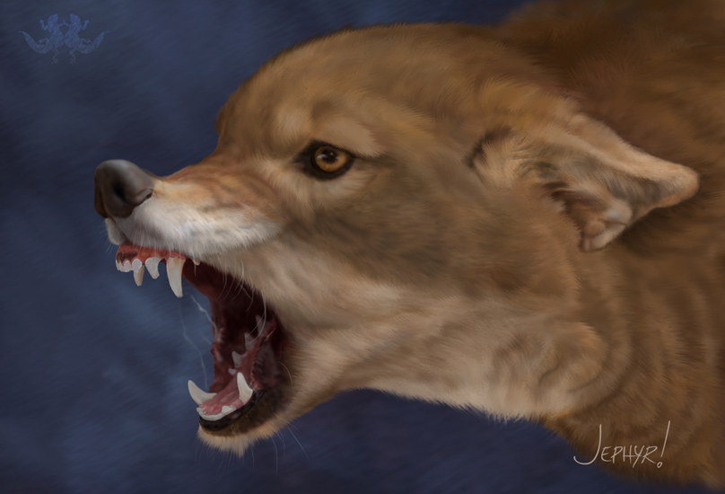
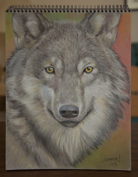
And a wolf photo study


--------------------------------

Just updated my sketchbook on my website with tons of old and new stuff.
[/url]
[url=http://artistjeffcurtis.wgd-entertainment.com/SketchbookDrawings.htm]http://artistjeffcurtis.wgd-entertainment.com/SketchbookDrawings.htm


Thanks for having a look at my thread and work.

See ya next time.............

Reply
#6
Heya! Thanks for commenting over my sketchbook!
So I checked your website since it seems it has way more of your artwork besides what you have in here. And man! I feel what you do is the stuff that always escapes me, mostly horror, surreal, dark humor, or depression/sadness themes! But in comparison to what I'm used to see on others, you seem to spice them up with comedy, softer shapes, curves and sometimes a friendlier look. I guess surreal does fit as the right category.

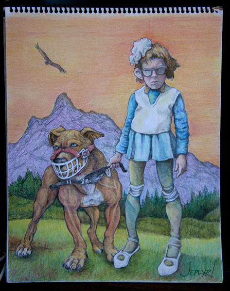
I especially like this girl with her pitbull! The color does make the difference, it has that 80-90s hard rock/metal vibe to it! Although I don't know much about that topic itself. I personally really liked the boar with the gnome hat and the tissue or handkerchief waving bye!
2018/2017 sketchbook I think you had a grittier design than you have now. More mischievous? I liked those!
Hmm, have you tried inking? Maybe punching those blacks can make all the difference. I think though your pastels is what is catching my eye more, damn color! Ha, have you tried watercolors? I know almost nothing about traditional media, so I was wondering about why did you decide to use them? Convenience or are you going for a certain look on your pieces?
Anyhow! Keep it up!
Reply
#7
So do you write stories for your characters and scenes, or is this on the back of your mind as a guideline?
The texturing on the elephant piece is wonderful, you niece's kids must have been in awe.
Is the astronaut helm some kind of a symbolic mask?

Reply
#8
I think the brush is fantastic for fur but i heard in texturing video that you don't necessarily want all that noise texture brush can bring.It about suggesting texture rather than apply all over the surface. Basicly suggesting fur with the round brush more than with the texture brush itself it more important to imply texture via the silhouette and inside the form in area where there plane change inside the texture and where a change between light and shadow occur.The trick is to start on a dark tone flat of the color of your fur and use a similar lighter tone of that same color for the texture on top to simulate depth in the fur.Of course not all fur are the same length and thickness when i think about it.For the tooth there something that tell me they should be more hint that there saliva on those teeth i don't have the reference you had so i can't say if there dry or wet but i see saliva so i would assume there would be wetness on the teeth creating a stronger highlight due to liquid coating the surface.


Attached Files Image(s)


My Sketchbook

Perfection is unmeasurable therefor it impossible to reach it.
Reply
#9
Just bopped in to make a quick comment in Leo Ki's sketchbook but saw the comments here and wanted to say a quick thanks.

I hope to be able to post some more work soon and reply to each of you—and return with a look and comments at your recent additions to your SBs.

Until then thanks again

Reply
#10
Big Grin 
Yello,

Thanks so much RotohailI LOVE surreal art and am very glad you see that and the Heavy Metal influence.  The warthog with the hanky was a lot of fun to create.  So glad you like him and Rex and Molly too.

Adding color is something I've just gotten back to more recently and feel a bit rusty but agree it adds a lot!

You are spot-on about the change in my sketchbook.  This year I reconnected with my niece and her kids and thought about them as I sketched and ended up printing out and sending them a lot of my new sketchbook stuff to color.  It's very cool you picked up on  that change.

I used to do some inking and got outa the habit.  I know what you mean about punching up the blacks—which I find difficult to do with just graphite pencil.  There's so much I always want to do.

LONG ago I tried water color but wasn't very good at it.  Maybe I should give it another go.  

As far as traditional media:  I think my interest grew out of doing a lot of digital art and feeling like I wanted to create something tangible.  That, and I get a LOT of requests for real-world portraits etc—and working with traditional media helps keep me sharper for that.

Thanks so much for your comment and encouragement.  I'll stop by your sketchbook to see what you've been up to asap.

Leo Ki:  I definitely have stories in mind but haven't yet gotten around to putting anything together or making panels like you do.

Thanks so much for your elephant pic comment.  That one was fun and I think my nieces and nephews did like it.  ☺

The astronaut guy was just something from my imagination and also a mash-up of several reference photos I had.

Yes—most everything I do now is kinda from that surreal point of view and usually has some kind of symbolism attached to it.  In this case it's kind of related to modern technology turning humans into machine/humans.  Kind of my take on what Lubomir Arsov does without his mastery.

Thanks again.

darktiste

I agree so much with your advice. Thank you.

I'd just learned how to make those brushes and things got away from me as I painted that one.  ☺

Have you see the Blaise tutorial on making and using them?  His technique totally mirrors what you wrote about using fur brushes and I'm afraid I got off into the weeds.  

Your observation about the teeth is very good.  The reference I used didn't have any of that — so I added what I thought looked right—but hadn't considered what that would do to the teeth.  
BTW—that wolf is AMAZING!!  Is that one of yours??

Thanks again for all the tips/advice!

--------------------------

Here's a few new pics and some old stuff from the archive.

Start with new pastel pencils. 

This one was created after I saw the animation X-STORY

I've not been much into anime—but loved X-Story and when I sat down to draw it had made an unconscious impact on me.


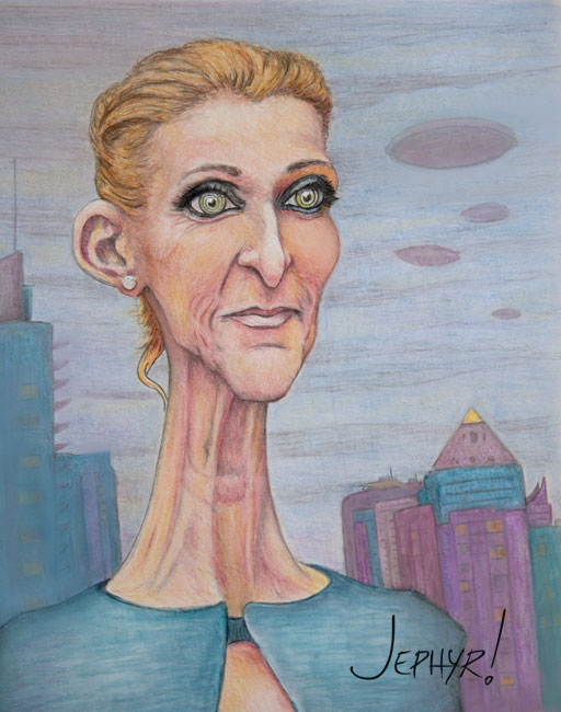
Saw a photo of Celine Dion and her neck looked like a giraffe's (well almost) and I knew I had to try my hand at a caricature of her featuring it along with some other symbolic elements thrown in as well.


One of my first recent efforts with the pastel pencils.  This one is kinda wonky but I kinda like the character. 

Has anyone else seen the previews for Arctic Dogs?  The character designs look like Tracy Butlers but I don't find any reference to her on iMdb etc.


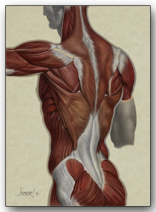
The back muscle study Fedodika referenced


That'll do it for today.  I'll check in on everybody's threads soon.

Thanks again!

Oops.  The final pic was supposed to come above my close but I don't know how to move it up. 

It's a digital study of an old pic of a guy watching beer being poured out during prohibition.  Wonder what he was thinking.....


Attached Files Image(s)


Reply
#11
Yes i watched the blaise tutorial on fur and i use is brush pack.But to create fur you should also try to erase from the fur and use a round brush to create highlight.The wolf is not mine i tried fur a little will ago but it much worst than this.You can find my attempt here http://crimsondaggers.com/forum/thread-3...ge-20.html post #383 as you can see the brush won't do all the work you have to create layers of fur and finish with playing with the contour of those clump.Most of the drawing is about setting the undertone right if my understanding is on point.One other secret i would say is to understand the anatomy under the fur to make it follow the form.

My Sketchbook

Perfection is unmeasurable therefor it impossible to reach it.
Reply
#12
Poor Celine... XD I'm scratching my head about the symbolic elements around and I realize I don't know much about her...
I remember watching X-Story a year or two ago. So you mention on your blog that you tried a few animations; this is storytelling! Are they online?

Reply
#13
(11-05-2019, 11:21 AM)darktiste Wrote: Yes i watched the blaise tutorial on fur and i use is brush pack.But to create fur you also need to erase from the fur and use a round brush to create highlight.The wolf is not mine i tried fur a little will ago but it much worst than this.You can find my attempt here http://crimsondaggers.com/forum/thread-3...ge-20.html post #383 as you can see the brush won't do all the work you have to create layers of fur and finish with playing with the contour of those clump.Most of the drawing is about setting the undertone right if my understanding is on point.One other secret i would say is to understand the anatomy under the fur to make it follow the form.

Yeah that makes sense about the undertone.  After I made the brush—I started using it over a painting I already had well under way—and as I experimented with it I pushed and pulled things around—and it started to get mushy.  Althougn in the end I kinda thought it added movement to the dog—so I left it as it was and called it a learning adventure.  ☺

Reply
#14
(11-08-2019, 11:55 AM)Leo Ki Wrote: Poor Celine... XD I'm scratching my head about the symbolic elements around and I realize I don't know much about her...
I remember watching X-Story a year or two ago. So you mention on your blog that you tried a few animations; this is storytelling! Are they online?

☺  Poor Celine indeed.  

I kinda like the idea of letting people draw their own conclusions about any symbolism that I include—and sometimes will hear people give elaborate interpretations which are quite different from what I intended.

Here are a few links animations done years ago:

This one is combined live action and Maya 3D (you'll need flash player to view it)  Visitation

And that same character in another 3D only video sketch.  Puppet Master

This one was just a combination of scenes from a Maya tutorial that I edited together and added a storyline, voice-over and sound efx  The Forgotten Toy

I've done some 2d animation as well—but as far s taking original character and story ideas—I haven't taken that further yet. 

------------------------

Here's a new sketch based on a character concept w/ pastel pencils.   I tried using a toothier paper which gave me better results with t


Reply
#15
I had overlooked the animation section of your blog, oops! Great music choice in Visitation - and you composed some of the music too!? Also some epic moments but maybe a bit slow at times. The narrative I liked the most in what I watched so far on your Youtube channel is that of Jack in the box, it's constructed like a tale, very well done!
One thing you may add to this last pastel is some reflected green on the puddles/pools - unless these are not pools? And today I learned what 'footwedge' means when looking at the image file name, lol.

Reply
#16
Here's sum mo' stuff:


Attached Files Image(s)


Reply
#17
(11-20-2019, 09:21 AM)Leo Ki Wrote: I had overlooked the animation section of your blog, oops! Great music choice in Visitation - and you composed some of the music too!? Also some epic moments but maybe a bit slow at times. The narrative I liked the most in what I watched so far on your Youtube channel is that of Jack in the box, it's constructed like a tale, very well done!
One thing you may add to this last pastel is some reflected green on the puddles/pools - unless these are not pools? And today I learned what 'footwedge' means when looking at the image file name, lol.

Leo —

Looking back I see I never responded to you — sorry 'bout that.

Thanks for checking my videos out.  I did use some of my original music on some of them.  Glad you liked Visitation and The Forgotten Toy.

Those are actually sand traps rather than pools.  Yeah - foot-wedge - cause we all need a little help from time to time.  : )

Thanks again!

Reply
#18
Using Krita for some of the digital stuff and really like it


Attached Files Image(s)


Reply
#19
Welcome to CD Jephyr! You have some very neat stuff here! I really like to see old-school traditional artworks on CD. It's a breath of fresh air from all the CGI-stuff we all produce.

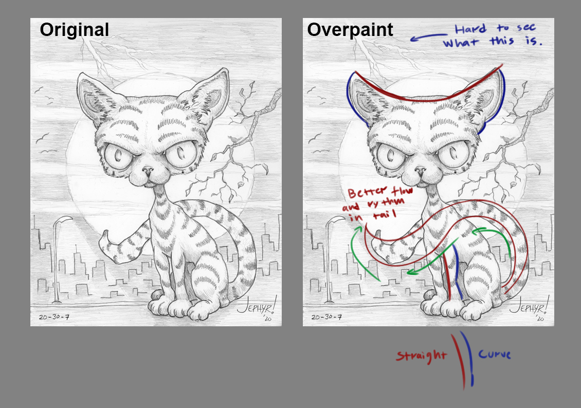
I think you got some solid pieces in your portfolio, however, there are some stuff I think you could improve on. I did a small overpaint/suggestion of your cat piece that I think showcase what I have in mind.

You have a sort of "lumpiness" in your artwork that I think pulls down the whole impression. Basically, you don't seem to keep in mind the rhythm and flow in some of your shapes. For example, in the cat's legs, we have two curves facing each other on separate sides of the form. A curve looks better against a straight.


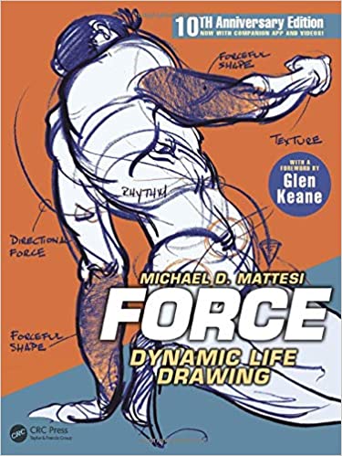
Here's a good book on the subject: 


Hope this small suggestion helps! Keep up the good work! :)

Reply
#20
(02-05-2021, 05:00 PM)Zorrentos Wrote: Welcome to CD Jephyr! You have some very neat stuff here! I really like to see old-school traditional artworks on CD. It's a breath of fresh air from all the CGI-stuff we all produce.

I think you got some solid pieces in your portfolio, however, there are some stuff I think you could improve on. I did a small overpaint/suggestion of your cat piece that I think showcase what I have in mind.

You have a sort of "lumpiness" in your artwork that I think pulls down the whole impression. Basically, you don't seem to keep in mind the rhythm and flow in some of your shapes. For example, in the cat's legs, we have two curves facing each other on separate sides of the form. A curve looks better against a straight.


Here's a good book on the subject: 


Hope this small suggestion helps! Keep up the good work! :)


Thanks for stoppin' by and for the welcome Zorrentos.


I do like using traditional media when I can — it does make a nice change of pace and I think is a little more challenging than digital (no undo or saving multiple versions for example).


Thanks so much for the advice and for the paint over too.  Very good suggestion regarding smoothing things out and thinking about rhythm and flow.  I've read bits of "Force" and will have to look into getting a copy.


I'll stop by your sketchbook asap to see what you've been up to.


Thanks again


------------------------


Here's sum new schtuff all done in Krita which I'm loving. 

For the last image I watched used Marc Brunet's techniques from his color tutorial and kinda liked the result (although I hafta admit I deviated quite a bit from following it to the letter):


Attached Files Image(s)


Reply


Forum Jump:


Users browsing this thread: 11 Guest(s)