Critique for my Graphic novel pages
#1
I am making a graphic novel.

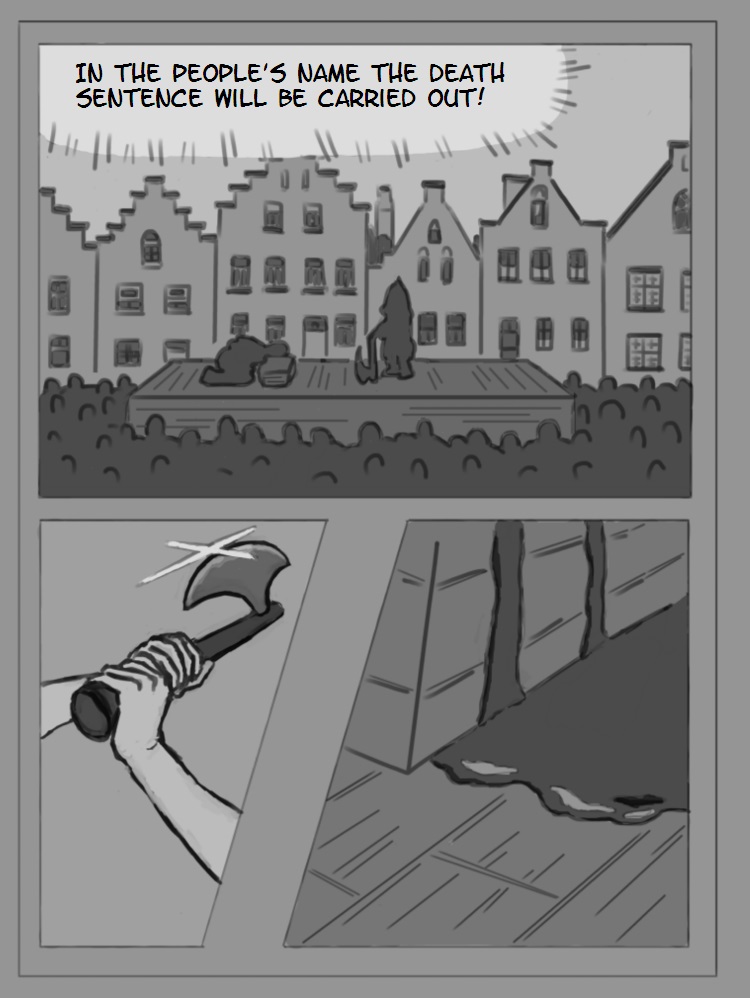
Here is my first page.

Please tell me, if you see something, that I could improve in the next pages.


Reply
#2
Hello graphicnovelist. I know less about how to draw comics than most people on this forum, but I think your framing and composition is generally OK. The page flows well and is easy to understand.

It would be easier to give a critique if you tell us about what sort of style or effect you're aiming for. But even then, it may be most productive to closely examine the works of whomever your favorite comic artists are, and see how they handled similar scenes.

Then, if something is bothering you about your works still, it most likely means that you just need to improve your fundamental skills overall in order to create the kind of art you want. Just keep practicing!
Reply
#3
Hi Graphicnovelist, I agree with Pubic Enemy that the page flows well and the surface plot is easy to understand - someone is being executed in the people's name. Although I did have to look twice to realise the grey mass around the platform was supposed to be a crowd of people - at first I thought it was shrubbery - maybe consider adding a little more detail to the crowd?

Also it's not clear who is shouting "In the people's name ..." is it the executioner or someone off panel?

Just a few questions to help your process hopefully.

Good luck and keep going!

“Today, give a stranger one of your smiles. It might be the only sunshine he sees all day.” -- H. Jackson Brown Jr.

CD Sketchbook


Reply
#4
(06-16-2020, 08:08 AM)Pubic Enemy Wrote: It would be easier to give a critique if you tell us about what sort of style or effect you're aiming for. But even then, it may be most productive to closely examine the works of whomever your favorite comic artists are, and see how they handled similar scenes.

My biggest inspiration is that I watched several Animes and in each I found some things, that are very cool, and some things sometimes not so good. And I thought: I could make something that has something cool to it, too.

And since I think I could not easily produce a whole Anime by myself, and since (i believe) most Animes started out as a Manga-Version of it, I start with that, too. But I dont really know if doing it from the right to the left is good, so I didnt call it Manga, but Graphic novel, so I can do it in the western way of "from-the-left-to-the-right".

But yeah, I see it a little bit as the Script for an Anime.

The most important "effect" I would like is that the viewer thinks "omg! what happened?! I want to see the next episode/volume!"
(like I did in some Animes)

Reply
#5
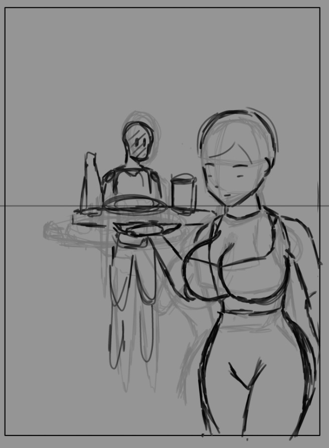
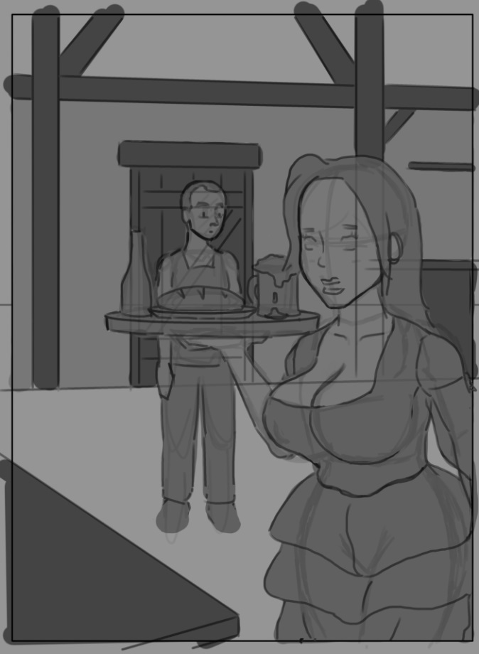
this is a sketch for a way later page.
But before I sketch out anything any further, can you already see how to make (the composition or anything) better?

(its a guy seeing a sexy waitess transporting a meal, duh)


Reply
#6
I am new to the whole "leading-the-eye-scene".
Do I have to do it more? lead it more to... something?


Reply
#7
I think you have to be aware that not every sequence as to be perfect but rather clear enough so that there in no in unexplain gap between sequence that create confusion.

For example let say you make someone end there speech in one sequence but in the next there in a other kingdom and there no way to explain how they got there your missing part of the action

Let take an other example someone just defeated a dragon and there using a potion to heal there wound but you forget to show that there using a potion how will the viewer understand how they healed.

What important is the clarity of the action not necessarly how perfect it done but pratice make this easier to achieve don't stress over it

Leading the eye is specially important in scene that are busy(lot of element)or noisy lot of texture where element are fighting for attention.Always think about the size of your element compare to one and other also take notice of there value value and how they overlap this impact how much attention is going toward certain object.It would be hard to explain all this theory if you never have learned thos principle in the first place but i got a solution for you.

Go to https://www.ctrlpaint.com/library
and watch the section 4) Composition Basic
It gonna teach you some composition principle if you never touch them before.

My Sketchbook

Perfection is unmeasurable therefor it impossible to reach it.
Reply


Forum Jump:


Users browsing this thread: 1 Guest(s)