Posts: 11
Threads: 3
Joined: Nov 2015
Reputation:
0
![[Image: oYAIpM.jpg]](https://snag.gy/oYAIpM.jpg)
I'm a bit stuck on this. I like the softness of the light and colour, but I still feel like it is lacking in colour. This has been an area I'm aware I struggle in so now comes the improvement. I think it's mostly in the skin that I'd like to add more colour but how would I implement them and using it to create a more magical, soft atmosphere? (I've already tried on the face with the reds and blues but it might be too subtle) Also, another area I'd like to address is the background; I often use a solid background but this time I'd like to tell a story of sorts. My question in this is how would I structure/create a background?
Any help would be greatly appreciated. Thanks.
Posts: 742
Threads: 28
Joined: Jan 2012
Reputation:
44
Hey. First thing try to apply a smart blur filter to the reference, so it would soften the skin but keep the edges. This should help you see the sublte color transitions.
You might try an overlay layer with low opacity to add some more intense saturation.
As for background, search for some reference that might fit the character, keep the prespective and experiment until you get something that you like.
Posts: 671
Threads: 8
Joined: Feb 2016
Reputation:
113
(Hi Katt, hope you don't mind me hijacking the thread for a little while!)
Hey Piotr, awesome advice. I hope you could clarify how the overlay layer method works?
Does that mean, Slap on an overlay layer on top of everything, paint with more intense color of your liking on top of where the colors look desaturated?
If that's the case, what's the difference of that between that and just painting on top of it on a normal layer and just choosing a more saturated version of the same hue?
If you are reading this, I most likely just gave you a crappy crit! What I'm basically trying to say is, don't give up!
----
IG: @thatpuddinhead
Posts: 742
Threads: 28
Joined: Jan 2012
Reputation:
44
(10-16-2016, 11:49 PM)John Wrote: Hey Piotr, awesome advice. I hope you could clarify how the overlay layer method works?
Does that mean, Slap on an overlay layer on top of everything, paint with more intense color of your liking on top of where the colors look desaturated?
If that's the case, what's the difference of that between that and just painting on top of it on a normal layer and just choosing a more saturated version of the same hue? It might be a bit hard to explain with words alone, but I think you got it right (more or less). The basic difference is that overlay (and other light layers) can give you more vibrant color variations because the blending is dependent on what is underneath - it will react differently to dark tone or light tone. you can try experimenting with differnet variations and see the results. It's pretty good with midtones and especially useful for that under skin red glow at the borders of shadow and light.
Of course you can paint with just normal layer but it might get you differnet results and you have to know exactly what color you wnat to use, while with overlay you can easily adjust the opacity.
Posts: 11
Threads: 3
Joined: Nov 2015
Reputation:
0
(10-16-2016, 10:16 PM)Piotr Jasielski Wrote: Hey. First thing try to apply a smart blur filter to the reference, so it would soften the skin but keep the edges. This should help you see the sublte color transitions.
You might try an overlay layer with low opacity to add some more intense saturation.
As for background, search for some reference that might fit the character, keep the prespective and experiment until you get something that you like.
Thank you! I will keep those techniques in mind and play around with it further.
Posts: 4
Threads: 2
Joined: Oct 2016
Reputation:
3
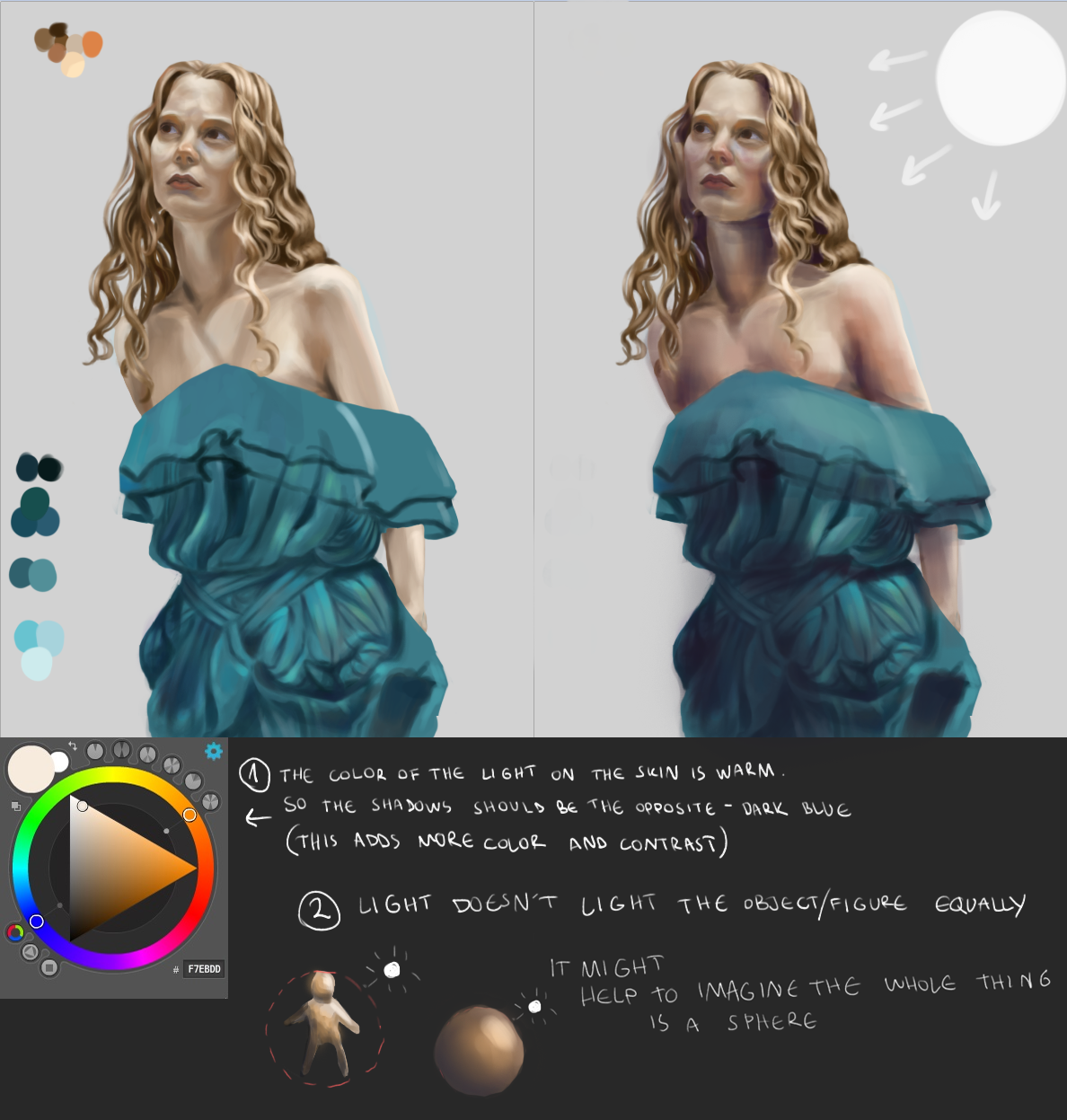
Hey, Katt. I made an overpainting trying to explain a few things that might help you.

I think your colors don't look good to you because they're more on the muddy side. This is why I suggested using a shadow color that is more bluish so it can add more interesting tones to you image.
Also the skin itself is full of different colors. You could try to remember that where the skin is thinner (around the cheeks for example) you can add redder tones. You could also find a lot of useful tutorials online on painting lively looking skin.
The 2nd tip I added is about the overall lighting. Lighting is one of the most important things in a painting so you should always pay attention to it. If the light source is coming from the top right then the top right part of the figure should be lightest since it's closest to the source. On the other hand, the bottom left should be the darkest because it's furthest away. This is a thing I noticed recently and I think it's pretty cool.
When it comes to the background I agree with Piotr. When looking for a reference image maybe you should also think about what kind of mood you want to create and about the fact that you have warmer light in the picture (so its best to choose an environment with a natural light)
I hope my advice will be useful to you ^^
Posts: 11
Threads: 3
Joined: Nov 2015
Reputation:
0
(11-03-2016, 07:18 PM)linay Wrote: Hey, Katt. I made an overpainting trying to explain a few things that might help you.
I think your colors don't look good to you because they're more on the muddy side. This is why I suggested using a shadow color that is more bluish so it can add more interesting tones to you image.
Also the skin itself is full of different colors. You could try to remember that where the skin is thinner (around the cheeks for example) you can add redder tones. You could also find a lot of useful tutorials online on painting lively looking skin.
The 2nd tip I added is about the overall lighting. Lighting is one of the most important things in a painting so you should always pay attention to it. If the light source is coming from the top right then the top right part of the figure should be lightest since it's closest to the source. On the other hand, the bottom left should be the darkest because it's furthest away. This is a thing I noticed recently and I think it's pretty cool.
When it comes to the background I agree with Piotr. When looking for a reference image maybe you should also think about what kind of mood you want to create and about the fact that you have warmer light in the picture (so its best to choose an environment with a natural light)
I hope my advice will be useful to you ^^
Hey sorry for the late reply
Thanks so much! The colours look awesome!! I didn't know what I was doing wrong until I saw your painting :)
I'll definitely look more into lighting and colour and maybe do a couple studies to get it rooted
Aahhhh thanks so much again :)))
Posts: 162
Threads: 6
Joined: Aug 2014
Reputation:
10
@Katt
Check out Practical Light and Color by Jeremy Vickery. It'll give you a really in depth look at how bounce lighting and scene lighting work, so you can avoid dull colors forever.
...oh shit! It's out of print O_o
Whatever you do, don't click this link here
Posts: 65
Threads: 5
Joined: Jan 2012
Reputation:
1
I really recommend Mike Azevedo's gumroad video on how color works: https://gumroad.com/mikeazevedo#
Also the book Creative Illustration by Andrew Loomis has a great section on color.
Basically, if you have a warm light, you will have cooler shadows in comparison, and vice versa (in most situations). So if you have a warm orange sphere, that doesn't mean that you want to use a pure blue in the shadows, but rather that you'll want to make the orange cooler in the shadows (usually by desaturating it and shifting it toward the cooler colors slightly you'll see a difference, but it all depends on the bounce light etc.)
So the thing to do is to learn this color and light stuff and then do these studies and you'll gradually start to see color more clearly.
Hope that helps!
Posts: 146
Threads: 3
Joined: Dec 2016
Reputation:
13
Alright, just in case you might be interested in this stuff :) or any other around. The reason why this is happening, that is why we have warm lights & cool shadows in "most situations" which is basically another way of saying "the usual sunny day" is... physics.
The sky is blue due to something called reyleigh scattering, that is, small particles & molecules (which are in majority in the atmosphere) scatter blue, ultraviolet and all that part of the spectrum better than other colors. They also scatter in all directions more or less equally, regardless of the incoming light (sun light in this case) angle to the particle. On the other hand there's this other thing called mie scattering which is scattering on larger particles (less in atmosphere compared to the small particles/molecules) and this is more affecting orange/red/infra-red spectrum and interestingly enough, the incoming light that hits these larger particles gets scattered mostly... in the same direction, small diagram:
..................................\ /
incoming sun light ----> O ---> reflected light (yeah... following the same line as the incident light)
................................../ \
This is the reason why we have a blue sky with an bright (yellowish) sun light. The reflected light from the diagram is also more reddish as previously mentioned.
This is also the reason why during evenings we have an orange/red sky. Because sun light travels a larger portion of the atmosphere, interacting with more larger particles and mie scattering takes over reyleigh scattering and the sky appears orange instead of blue (also in reality sky is mostly violet/ultra-violet but our eyes aren't sensitive enough to pick that up).
So for painting now, what this means is that shadow area receives light more from the environment (this being mostly sky) so it appears blueish, while the bright parts which are in direct sun light appear yellow/orange/red because they are directly influenced by sun-light, so not so much by the sky & environment bounce light.
So obviously this describes the typical sunny "usual" afternoon. On mars for example it's exactly the other way around, the sky is usually orange/red due to the high concentration of larger particles in the thin atmosphere that it has, also because of their chemical composition of course and natural color. And during evenings the sky is usually blue-ish, when reyleigh scattering becomes more important. The blue part surrounds the sun and gradually goes towards orange/red, so it's not as strong as the mie scattering on earth for example, during sun sets. So in your typical "usual" afternoon on mars you'd have mostly orange/redd-ish shadows and the sunny parts will have a very very slight blue tint in it.
Of course, on top of all this, there comes in stuff like sub-surface scattering, muscle color, vanes, the way our eyes perceive boundaries between hot/cool colors etc. And just to drive the point across, this *only* happens during the typical sunny afternoon. In other settings such as garages for example, you'd have to take in account the color of the neon light (cool usually) and think about the bounce light (say for example is the subject near a colorful red/green/whatever car?) and so on :).
Hope this was helpful or at least entertaining :P
|
![[Image: oYAIpM.jpg]](https://snag.gy/oYAIpM.jpg)


