Posts: 38
Threads: 2
Joined: Apr 2025
Reputation:
1
Hey there, art homies!
I've been doodling for a while now but mostly kept it as my personal hobby.
Anyways, here are my most recent drawings and a couple-month-old painting study thrown in for good measure.


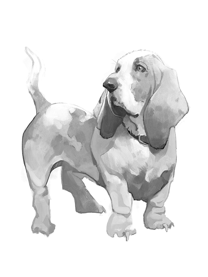
I'll try posting every other day or more often, any critiques/feedback are much appreciated!
Really looking forward for that grind yo.
Posts: 201
Threads: 3
Joined: Jan 2021
Reputation:
3
Your lines are so clean and that water colour beagle looks gorgeous!
Posts: 38
Threads: 2
Joined: Apr 2025
Reputation:
1
(04-18-2025, 05:09 AM)Dominicque Wrote: Your lines are so clean and that water colour beagle looks gorgeous!
Thank you so much!
The beagle one was done in Krita - it has a lot of fun brushes to mess around with.
Here's today's sketch:

Posts: 201
Threads: 3
Joined: Jan 2021
Reputation:
3
Nice daily momentum. I had krita ages ago, but just when I get used to the interface and which brushes I like and how to store them. Along comes an update, that just messes everything up. I flipped to Clip and never went back (along with my tablet just no longer working with the program), but that watercolour brush is tempting me.
Posts: 38
Threads: 2
Joined: Apr 2025
Reputation:
1
(04-21-2025, 01:27 AM)Dominicque Wrote: Nice daily momentum. I had krita ages ago, but just when I get used to the interface and which brushes I like and how to store them. Along comes an update, that just messes everything up. I flipped to Clip and never went back (along with my tablet just no longer working with the program), but that watercolour brush is tempting me.
Yeah. 95% of the time I just stick to old PS.
Some XCOM 2 fan art:
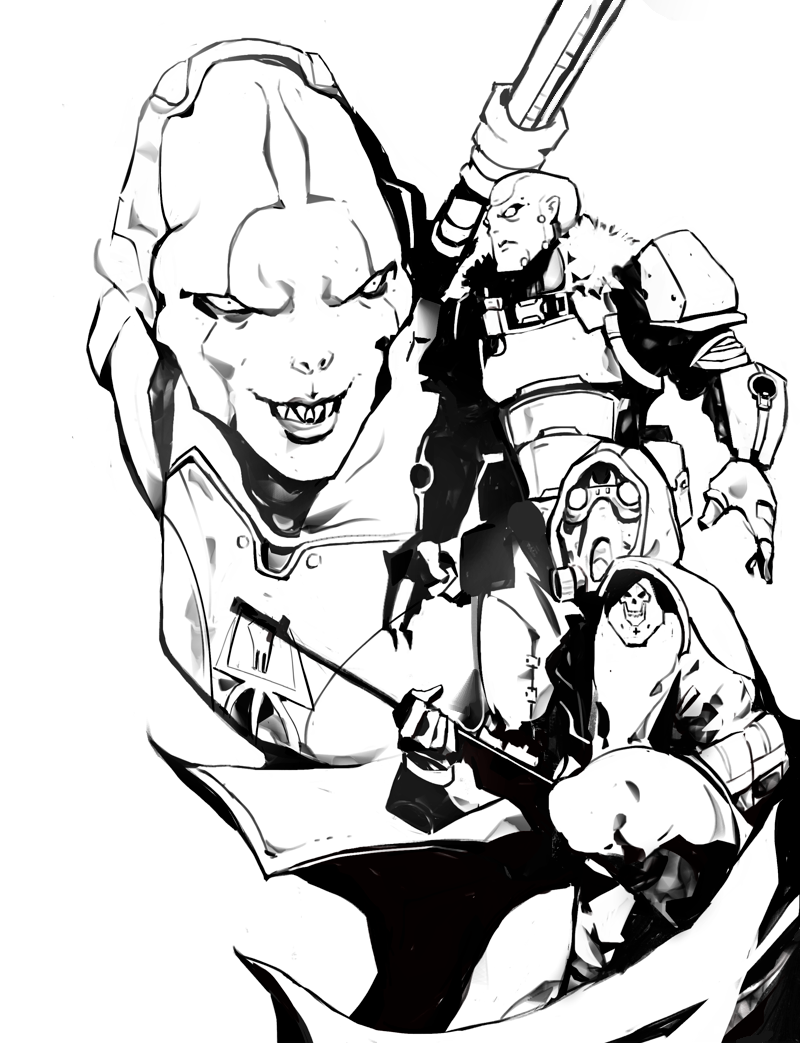
Working on my comps.
Tried that one brush that Dave Rapoza uses in Krita.
It took me way longer than I anticipated to finish this thing. It was fun, though!
Posts: 3,348
Threads: 37
Joined: Aug 2013
Reputation:
234
The arm holding the rifle with the cape and the white pant of the alien behind this area is value problematic to create proper read also the use of 3 big line to describe the bottom part of the arm kinda clash with the rest of the piece this stylization is not found anywhere else so it kinda flatten thing in that part compare to the more complex form you shown elsewhere i am not getting the same ''weight'' or quality to the material. My idea to get away with that would be to transform that arm into a cybernetic one(remove the sleeve) or at least just show the hand being somewhat robotic this way those sharp angle look somewhat more robotic anyways that my 2 cent.
Very cool to have black and white with 3 overlapping object that take some skill to pull out.
Did you took off opacity with an eraser or did you play with pressure sensitivity to get the semi black almost atmospheric perspective feel?
Posts: 38
Threads: 2
Joined: Apr 2025
Reputation:
1
(04-24-2025, 06:20 PM)darktiste Wrote: The arm holding the rifle with the cape and the white pant of the alien behind this area is value problematic to create proper read also the use of 3 big line to describe the bottom part of the arm kinda clash with the of rest the piece this stylization is not found anywhere else so it kinda flatten thing in that part compare to the more complex form you shown elsewhere i am not getting the same ''weight'' or quality to the material. My idea to get away with that would be to transform that arm into a cybernetic one(remove the sleeve) or at least just show the hand being somewhat robotic this whay those sharp angle look somewhat more robotic anyways that my 2 cent.
Very cool to have black and white with 3 overlapping object that take some skill to pull out.
Did you took off opacity with an eraser or did you play with pressure sensitivity to get the semi black almost atmospheric perspective feel?
A bit of soft brush erasing.
You are absolutely right, that whole area felt extremely messy.
And that arm, oh boy, it looks all sorts of funky. For whatever reason I didn't notice it until I was done, lol.
.png)
Probably a better pose, not as awkward at least.
Thank you so much for the feedback! Will definitely keep this in mind for future work!
Posts: 3,348
Threads: 37
Joined: Aug 2013
Reputation:
234
I even feel like puttting the gun in this new position that make a interesting ''framing'' that kinda link the second character it like ''flow''. But again you get the problem that the gun Shoulder piece which i see you mark as black as to ''read'' against the shadow of the cloak.I think it really about finding those value grouping in the thumbnail stage .But for that you need to practice your eye and also working alone really play against you because you don't get to have a second opinion on readability during thumbnail review if you ever get the chance to even have review at that stage. The obvious solution would be to go with 3 value but then it doesn't have the same energy anymore that black and white as which to me is the power of ''merging of shape"".Maybe here the best choose would be one of design (simplification of cloth that add to much overlap)but in some case the character is part of a comic or existing ip and it mean respecting design so ''removing isn't an option.Also let be honest a cloak add so much flow to a piece it criminal to suggest removing it.But i think you don't need 2 side to flow you could have the foreground part of the cloak just to indicate flow and the other side would just drap down ''less dynamic'' but added ''readiblity'.
But then you get a pretty empty spot and now where the cape was before intentionally or unintentionally hide the character behind it now you ''get new shape'' like is feet or the bottom of the torso of that back figure.
So easier said then done when it come to giving suggestion on how to problem solve my solution for black element from different depth that would normally merge would then be to use the atmospheric different to separate those shape have black but with that remove opacity so it not a grey really but black with a gradient where you want to add separation(if it work because something that ''atmospheric'' separation just doesn't make sense).
I hope this was helpful i think doing just those critic is even helping me a bit to find solution that if i was caught up drawing i wouldn't even be think about... so i think i also encourage you to come back to your own drawing after they are done if you can afford to and look at them with a fresh eye(i specially recommend that during thumbnailing and if you aren't thumbnailing at all i do recommend incorporating more of those into your practice.
The important thing at the end of the day is that you enjoy drawing pressure free no matter how much i got to say about small detail.
Posts: 316
Threads: 3
Joined: Sep 2019
Reputation:
23
Welcome! Loving your line work and concepts.
'Mad' and 'Duelist' are especially tasty
Posts: 38
Threads: 2
Joined: Apr 2025
Reputation:
1
Darktiste thanks again dude, great suggestions.
Lack of planning totally screwed me over on that one. I'm still a bit rusty, especially when it comes to digital. Haven't been on a serious art grind for quite a while.
(04-26-2025, 07:21 AM)Jephyr Wrote: Welcome! Loving your line work and concepts.
'Mad' and 'Duelist' are especially tasty
Thank you! Really means a lot.
I'm glad forum still exists (starts to reminisce about conceptart.org and old deviantart days)
I really don't know what to say about this one. Just some faces. This is what comfort zone and procrastination look like:

Will try to post more often.
Posts: 1,076
Threads: 4
Joined: Jan 2016
Reputation:
43
Awesome updates! Really loving your line work on all of these, very refined and dynamic!
Posts: 38
Threads: 2
Joined: Apr 2025
Reputation:
1
(05-06-2025, 04:52 AM)cgmythology Wrote: Awesome updates! Really loving your line work on all of these, very refined and dynamic!
Thank you so much!
Posts: 168
Threads: 2
Joined: May 2022
Reputation:
6
DAMN!!! your sketching style looks so good
must see more!!!
Posts: 38
Threads: 2
Joined: Apr 2025
Reputation:
1
(05-07-2025, 09:43 AM)Crowbit Wrote: DAMN!!! your sketching style looks so good
must see more!!!
Thank you! I really appreciate it.
Today's doodle:

Really not a fan of how it turned out, I feel like the rougher sketch at least had more energy.
tbh I'm just not feeling the whole thing.
Also, them legs look shaky. Looking at it now, looks like he's desperately trying to find his footing (poor guy).
Should work with some color next cause the whole page looks so gray and depressing, lol.
Posts: 168
Threads: 2
Joined: May 2022
Reputation:
6
He does look like hes about to take his first few steps XD
the forms look really solid though
Posts: 3,348
Threads: 37
Joined: Aug 2013
Reputation:
234
An example of where Structuring the approach would pay off this would be fix my a 3min gesture just finding where the few major ''mass'' sit in relation to the center of gravity of the character and how the weight is counter balance by the limb how far the torso and head is compare to the pelvis for example those a just simple question to help find out where the leg bearing leg.
Rushing is were worst enemy(specially because of tunnel vision) a quick way to spot imbalance in the pose is to do a quick flip of the canvas in the horizontal axis specially in the gesture stage.
Posts: 38
Threads: 2
Joined: Apr 2025
Reputation:
1
Darktiste I do tend to flip a canvas like a madman, though.
Started as something Ayami Kojima inspired, devolved into god knows what.
Those snakes turned out so goofy looking...
As a side note, I kinda like the face on the top bloke.

edit: No colors yet!
Posts: 168
Threads: 2
Joined: May 2022
Reputation:
6
Looks sick!
top guy is giving grey skull energy XD
Posts: 1,076
Threads: 4
Joined: Jan 2016
Reputation:
43
Sublime line work as always, hope you paint some of them as they're really incredibly done!
Posts: 38
Threads: 2
Joined: Apr 2025
Reputation:
1
Crowbit, ye lol, I can see that xD
CGmythology Thanks! I most likely won't, lol. But going forward I'll definitely try some more ¨painterly approach¨
Speaking of:

I'm really not quite sure if I like it or not; it's been ages since I've painted something digitally.
I know that those big black chunks probably look ugly as all hell, but just bear with me, it's something I'm trying to figure out.
Also - that counts as a color, right?
|


.png)


