Posts: 671
Threads: 8
Joined: Feb 2016
Reputation:
113
neopatogen: It's Abnormal's study! I'm just leeching off of his studies haha!
Hobitt : Heya Hob! Thanks!
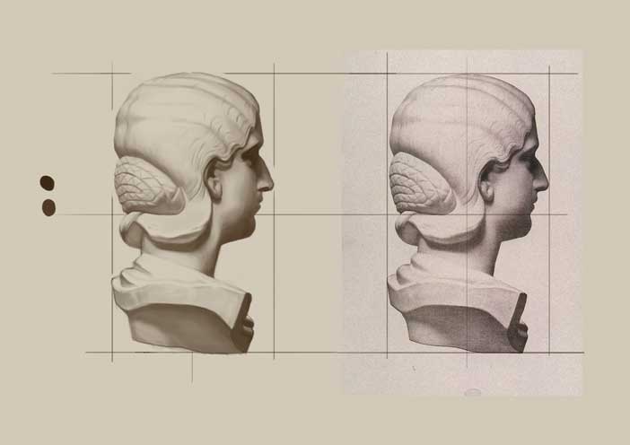
Plissken : Can I start off by saying that I love you from the 'Escape From' series? Yes! I love Bargue studies. I should scale back from too much grid placements.. Overwatch looks and plays awesome from what I've seen. That's what I do these days. When I get the itch to spend money on a game and play the crap out of it, I'd just draw them.. Cold turkey!
---
Hand Gestures:


Personal:

Hmm.. I get a feeling I'd be ahead of schedule with the portfolio piece. Man I hope I do finish early. CC4 looks super tempting!
If you are reading this, I most likely just gave you a crappy crit! What I'm basically trying to say is, don't give up!
----
IG: @thatpuddinhead
Posts: 178
Threads: 6
Joined: Jul 2015
Reputation:
18
It'd be great to have you participate in CC4!
Your hand gestures are improving. Going with those blocky simplifications can be really helpful for thinking about forms, and it seems to be working out for you. You seem to favor flat angles with the palm of the hand or the back of the hand being at a 90° angle to the viewer a bit too much though. It's noticeable that your 3/4 views, sideviews and dynamic angles look weaker than those flat angles, and I think that tendancy of not doing them as much is part of the reason.
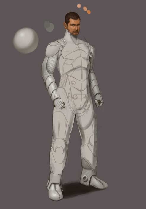
The arms of the figure you posted seem questionable. Sure, there's foreshortening going on, but the way they are angled, the width of the lower arms, and the way the shoulders connect to the torso still feel really awkward. Besides that, it bothers me how normal-looking the character is. It's a personal piece. Go do something a little more crazy! Other than that, it's a good base to work off of.
Posts: 671
Threads: 8
Joined: Feb 2016
Reputation:
113
Lodratio: Thanks for the kind words! About the hand references for the gesture, there are poses I feel more comfortable and there are poses where I spend more time scratching my head. Just so we are clear, I get these by random. I am not favoring any poses. I get what Quickposes throw at me! I hope there's a feature where it just throws me the references where I draw my shittiest hands!
The arms do look awkward. Probably still is. I posed for this and it seems to look right on the photo yet it looks off in execution. I'll stop noodling with the line art and start coloring, this will take forever to get it perfect. I do much of the changes in the coloring process anyway! Thanks for the feedback!
---
Hand gestures:

Personal:

If you are reading this, I most likely just gave you a crappy crit! What I'm basically trying to say is, don't give up!
----
IG: @thatpuddinhead
Posts: 488
Threads: 10
Joined: Jun 2013
Reputation:
38
Looking good. Might wanna scale up the head a bit though. You did that on the dude before as well.
Drawing out of perspective is like singing out of tune. I'll throw a shoe at you if you do it.
Sketch Book
Posts: 671
Threads: 8
Joined: Feb 2016
Reputation:
113
OtherMuzz: I just probably give her more hair.. I love female subjects, easier to cover up!
---
Personal:

Forgot to warm up. Crap.. I'm getting complacent and lazy.. Got to get my act together!
If you are reading this, I most likely just gave you a crappy crit! What I'm basically trying to say is, don't give up!
----
IG: @thatpuddinhead
Posts: 671
Threads: 8
Joined: Feb 2016
Reputation:
113
Hand Gestures:


Personal:
Urgh..

When stuck, make other redesigns! Gave him a more gruff look!

If you are reading this, I most likely just gave you a crappy crit! What I'm basically trying to say is, don't give up!
----
IG: @thatpuddinhead
Posts: 1,424
Threads: 12
Joined: Dec 2015
Reputation:
139
Nice character design work and painting on the girl Dr John!
Just a thought and feel free to go your own way but - maybe try a more symmetrical pattern on her face paint?
Keep going dude!
“Today, give a stranger one of your smiles. It might be the only sunshine he sees all day.” -- H. Jackson Brown Jr.
CD Sketchbook
Posts: 31
Threads: 2
Joined: May 2016
Reputation:
10
Hey Dr. John!
I love the hand gesture studies. I need to definitely do it, too. Great work so far, keep going!
Posts: 429
Threads: 0
Joined: May 2012
Reputation:
7
I love seeing the steady progress you're making in here. The 2 characters are looking great, my only crit is that some of the construction comes out looking stiff.
Can you upload the images bigger next time? There is a weird dither going on in the background of the girl and I'm not sure if that was on purpose or you're having problems saving the images.
Posts: 671
Threads: 8
Joined: Feb 2016
Reputation:
113
Artloader: That's actually a good idea! First thing I'll do when I go back to it! Thanks!
zest : Knowing you, I'd like to think I'd get a good bashing if I took your compliment! You're not going to pull the football away from me this time Lucy!
BenFlores : Hi Ben. I'm trying not to look at it for a few days, so I can look at it with fresher eyes the next time and hopefully solve the rigidity. About the dithering, I save on a lower quality setting so images can load faster! I think I got too frugal that time! Thanks for the comments!
Mariyan-Hristov: Crap! I forgot to do my hands! I wish I had more time to do them..
Thanks guys!
---
Not much update today.
Personal:

Fired the old actor and hired a new one. And giving the character a new suit of armor!
If you are reading this, I most likely just gave you a crappy crit! What I'm basically trying to say is, don't give up!
----
IG: @thatpuddinhead
Posts: 671
Threads: 8
Joined: Feb 2016
Reputation:
113
Personal:

Just a little more! And on to the next one!
If you are reading this, I most likely just gave you a crappy crit! What I'm basically trying to say is, don't give up!
----
IG: @thatpuddinhead
Posts: 205
Threads: 4
Joined: Oct 2015
Reputation:
7
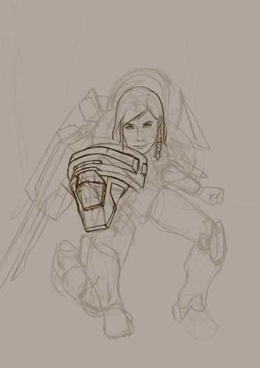
Sexy hands and sexy girls John. My only critique is that the pose on the last character is pretty stiff, although it looks like you're more focused on the structure and form so I get it. I like how clean and readable the design is though.
Posts: 158
Threads: 4
Joined: Feb 2015
Reputation:
12
Hey John very cool stuff here. I don´t know if you know these artist but it may be some inspiritation;
http://www.artofmitch.com/characters/
http://johnstaubart.portfoliobox.me/
Don´t know if it´s your cup of tea, but dedinitely it has helped me, i´ve done a few value studies of their awesome work to see where are the strenghts of the pieces.
Cheers!
Posts: 742
Threads: 28
Joined: Jan 2012
Reputation:
44
Quick crit: palms are a bit too small (in the last one). Good work btw.
Posts: 671
Threads: 8
Joined: Feb 2016
Reputation:
113
DQ_Nick: Seeing the stiff comment for at least the third time makes me want to re-evaluate myself for the next piece. Hey man thanks!
RickRichards : Not my cup of tea?! Leave the entire pot! Thanks Rick! I had them bookmarked! Btw, where'd you find them?
Piotr : I feel like a dumb dumb. Gotcha! Fixing them before it reaches anywhere. Thanks!
---
Bargue:

If you are reading this, I most likely just gave you a crappy crit! What I'm basically trying to say is, don't give up!
----
IG: @thatpuddinhead
Posts: 671
Threads: 8
Joined: Feb 2016
Reputation:
113
Hand Gestures:


Personal:

On to the next piece!
If you are reading this, I most likely just gave you a crappy crit! What I'm basically trying to say is, don't give up!
----
IG: @thatpuddinhead
Posts: 1,424
Threads: 12
Joined: Dec 2015
Reputation:
139
Nice Bargue study - had trouble working out which one was the original! The design on the personal piece is really cool too - good work mate. Is she from a world you are building?
Keep up the hard work!
“Today, give a stranger one of your smiles. It might be the only sunshine he sees all day.” -- H. Jackson Brown Jr.
CD Sketchbook
Posts: 671
Threads: 8
Joined: Feb 2016
Reputation:
113
Artloader: Oh Loader... always so pleasant! The personal project is a character redesign for a Marvel character named "Echo". I gave her a more, sqinty, native Indian look!
---
Hand gestures:

Personal:

Hmm.. I should stop doing armor illustrations after this..
If you are reading this, I most likely just gave you a crappy crit! What I'm basically trying to say is, don't give up!
----
IG: @thatpuddinhead
Posts: 155
Threads: 9
Joined: Mar 2015
Reputation:
5
Hey John, cool to see you are keeping at it man. :-) But those hand gestures look a bit blocky and stiff to be true "gestures". When I first saw them, I thought they were about breaking hands down to basic shapes. Looks like you are getting something out of it, though, keep practicing.
And yes, draw more armor!
"Drawing is a skill like hammering a nail. You might not be great at it yet, but there is nothing stopping you from gettin' down and hammering away." -Irshad Karim
Sketchbook!
Posts: 1,970
Threads: 22
Joined: Apr 2012
Reputation:
243
Composition on the recent character is a little dull, perhaps too much foreshortening, overall silhouette is like a big egg? Watch the foreshortening on that left leg (our left) It's stumpy MCStumpy atm. :) Suggest doing more general gesture drawings to show off more of the character. I am going to suggest with this one, get some props and get someone to take a photo of you or a female conspirator for reference. make it right to start with.
I want to see more finished shit from you man! Also where's your folio at? Gimme so I can destroy you.
|


