05-24-2016, 05:03 AM
I like the value studies! For the rectangles with cross sections, I can recommend adding an ellipse inside them. It will help a lot with drawing ellipses and see how they function in planes.
|
The Sketchy Sketchbook of ....Sketchyness!!
|
|
05-24-2016, 05:03 AM
I like the value studies! For the rectangles with cross sections, I can recommend adding an ellipse inside them. It will help a lot with drawing ellipses and see how they function in planes.
09-30-2016, 04:47 AM
Yo what up my Glip glops!!
It's been way to long since I posted, probably the longest I've ever gone without doing so, I lost internet access for a month when moving and I kinda just fell out of the habit of posting plus I've been finding it difficult to draw much for the last few months. Gonna try and get back in the groove of things and start posting every friday. Eyeliana: Thank you, it's been a while since I did the drawbox stuff but I think drawing ellipses inside was the next assignment, I've done it before and yeah it is useful. ____________________________________________________________________________________ Alright here's some stuff from the last few months. Just finished this yesterday, been trying Istebrak's 14 day challenge again, this is day 6. 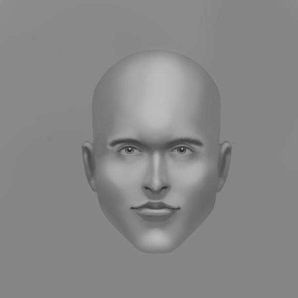 I've been messing around with colored pencils fan arts , i'm really having a lot of fun with them, think i'm gonna get a brand new set of them soon and try and see how good I can get with them. btw yes the second girls breasts are ridiculously large but...honestly the character has huge tracks of land in the game she's from so i'm just keeping it faithful to the original design XD. An assignment for istebrak's class, first real attempt at a traditional environment, I like it but goddamn I heavily over detailed it, got to remember to keep it more simple next time. And some fan art paintings of midna and samus I did a while back, I need to figure out a good working process for painting, I usually end up having to just throw down brush strokes until it works, when it comes to portraits I've mostly got that process but entire bodies and backgrounds for some reason just throw me completely off.  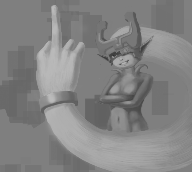 Good to be back daggers :D
10-06-2016, 08:08 PM
Hey everyone.
Another update, I'm gonna start trying to draw 6 hours a day again, though i'm gonna take the Saturdays off drawing completely, I think 36 hours a week is a pretty good amount and I think I work best with a rest day, been doing it almost a week and so far I've managed to be pretty consistent with it. started doing the Proko tutorials again, anatomy tracings are extremely useful.  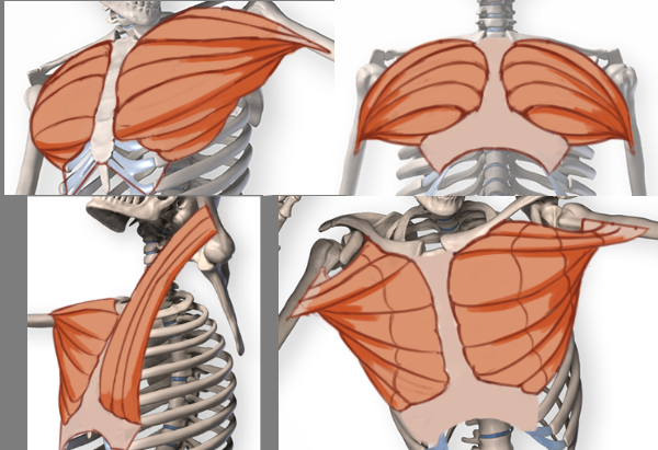 Next 14 day challenge head....is it just me...or did I paint John Cena XD. I tried to be a bit more aggressive with the hard brush this time, I think I've been overusing the soft brush, also tried to get the proportions perfect on this one.  Started out as figure drawing practice from ref and I ended up turning it into samus aran....."fanart". 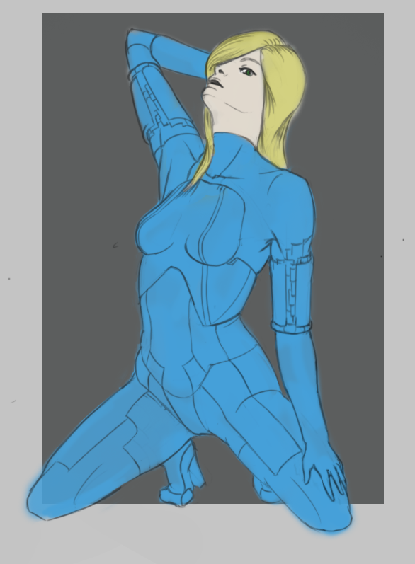 And a sketch for a new piece i'm working on, having hell with this, I've moved it over to traditional because I thought it'd help me focus(that's 3 hours of work there, erasing over and over again haha), but instead all I have now is some very VERY broken paper, it's mainly trying to get the features right and the gun that's causing me problems. It's fanart of this character http://wallpoper.com/images/00/17/86/71/...178671.jpg and the gun especially is just... http://4.bp.blogspot.com/-vio3irpKDO4/UL...e+027U.jpg look at it!, I can't barely draw guns in general and for some reason I thought it'd be a good idea to try drawing a complex designed gun FORESHORTENED XD. 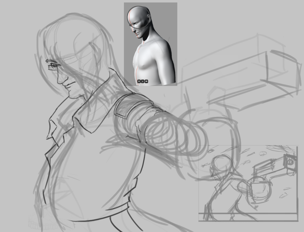
10-13-2016, 07:14 PM
Hey guys another update.
Haven't got too much to show this week, most of what i'm working on is still W.I.P. Getting back into gestures, trying to get used to drawing longer ones 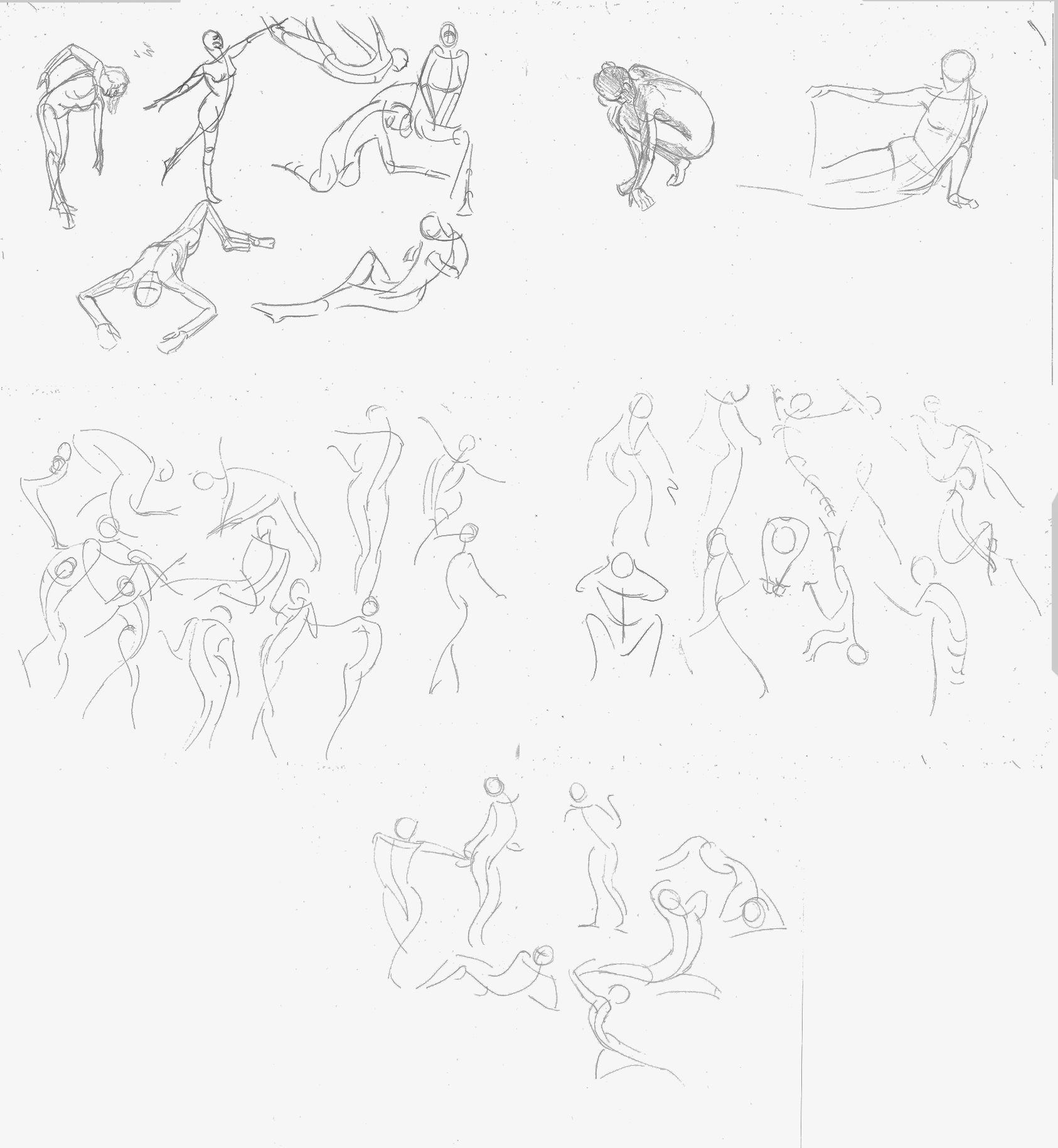 Work for the proko breast assignment, having a lot of trouble with it. 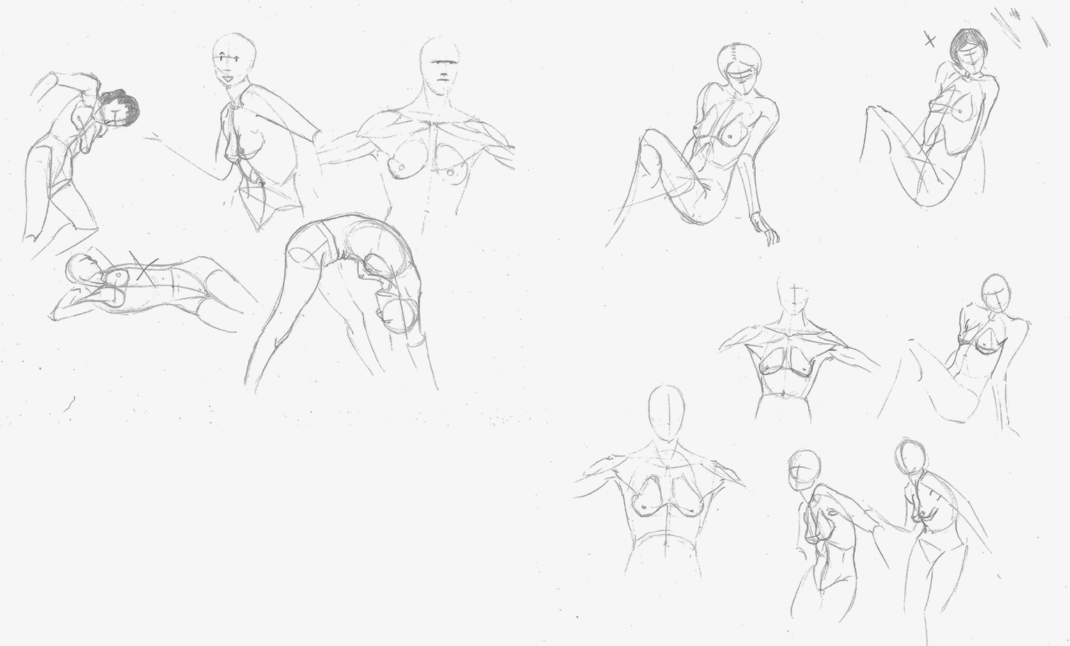 Slighttly fixed version of my last 14 day challenge head. 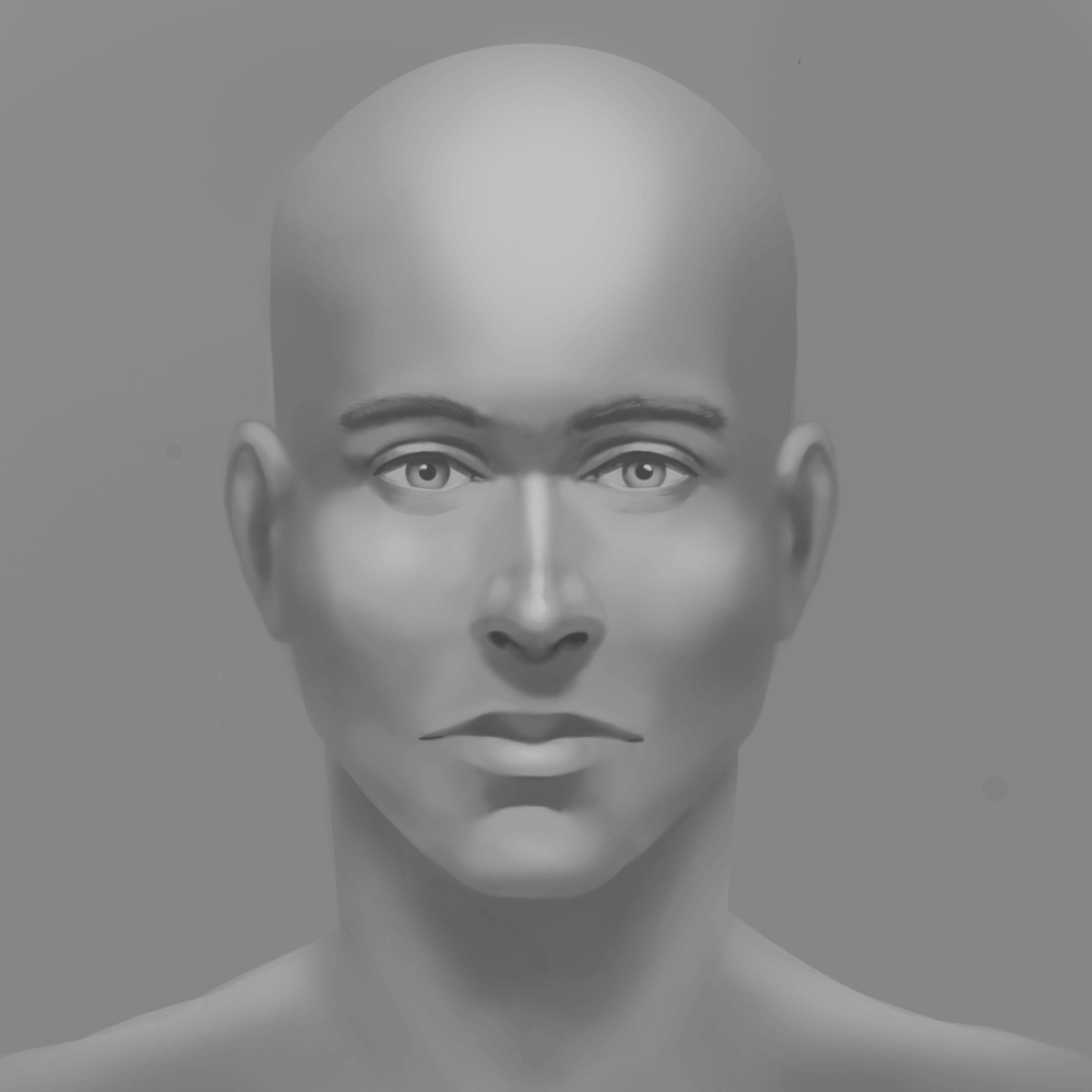 Did this a few months back but forgot to upload it, fanart of best waifu from demons souls ;P 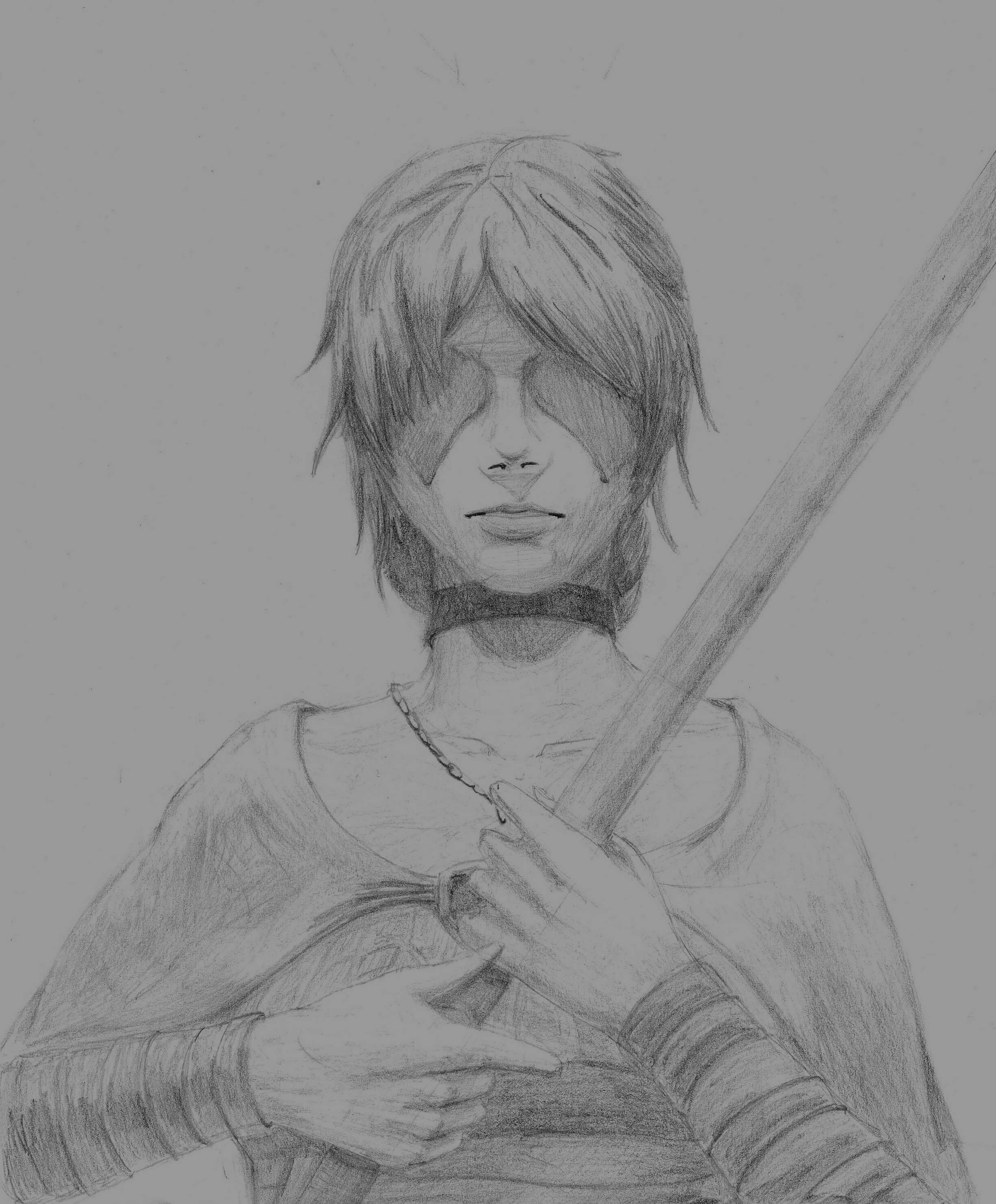 And finally SANNES! Thinking about spending more time on this and making it into a fully painted piece. 
10-13-2016, 10:26 PM
TAG UR IT!!!
70+Page Koala Sketchbook: http://crimsondaggers.com/forum/thread-3465.html SB
Paintover thread, submit for crits! http://crimsondaggers.com/forum/thread-7879.html [color=rgba(255, 255, 255, 0.882)]e owl sat on an oak. The more he saw, the less he spoke.[/color]
10-19-2016, 08:58 PM
lol
________________ Not much to show for this week, I've given up on that piece I was working on and this is the result, couldn't get the gun right or the foreshortening even with ref and I've just grown bored of doing it over and over again. And secondly some creature designs for an Istebrak challenge, I love how the lower right one turned out.
10-26-2016, 08:38 PM
Update time.
I also did a bunch of traditional studies but I honestly can't be assed to upload them right now. Firstly an eye study, been having a lot of trouble painting eyes and eyebrows. I'm gonna try and post my process for my work now, think it might help me see where I've inevitably fucked up :P 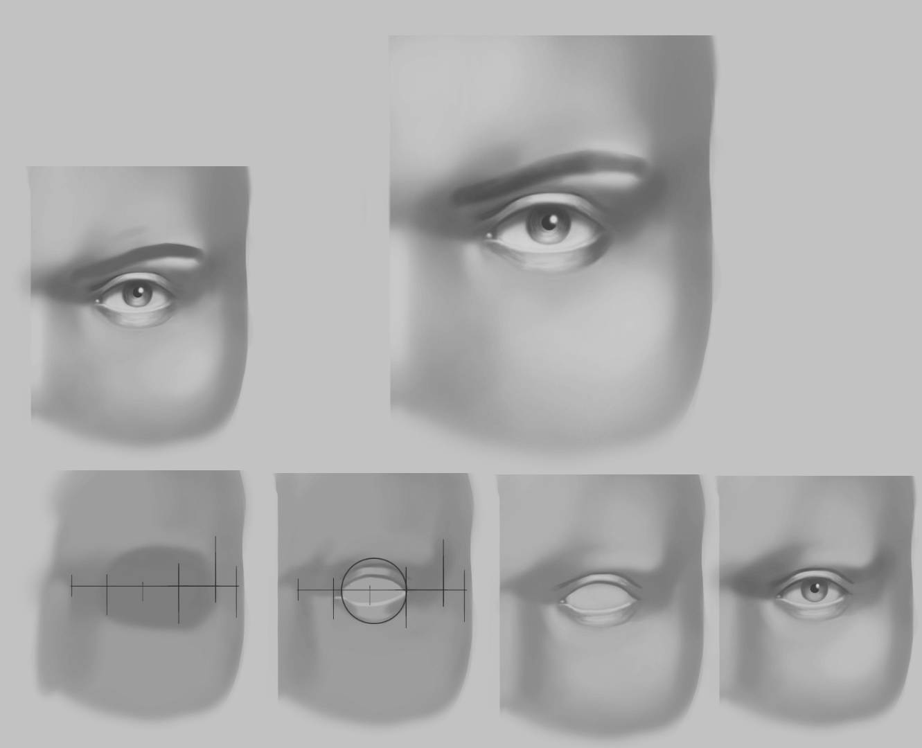 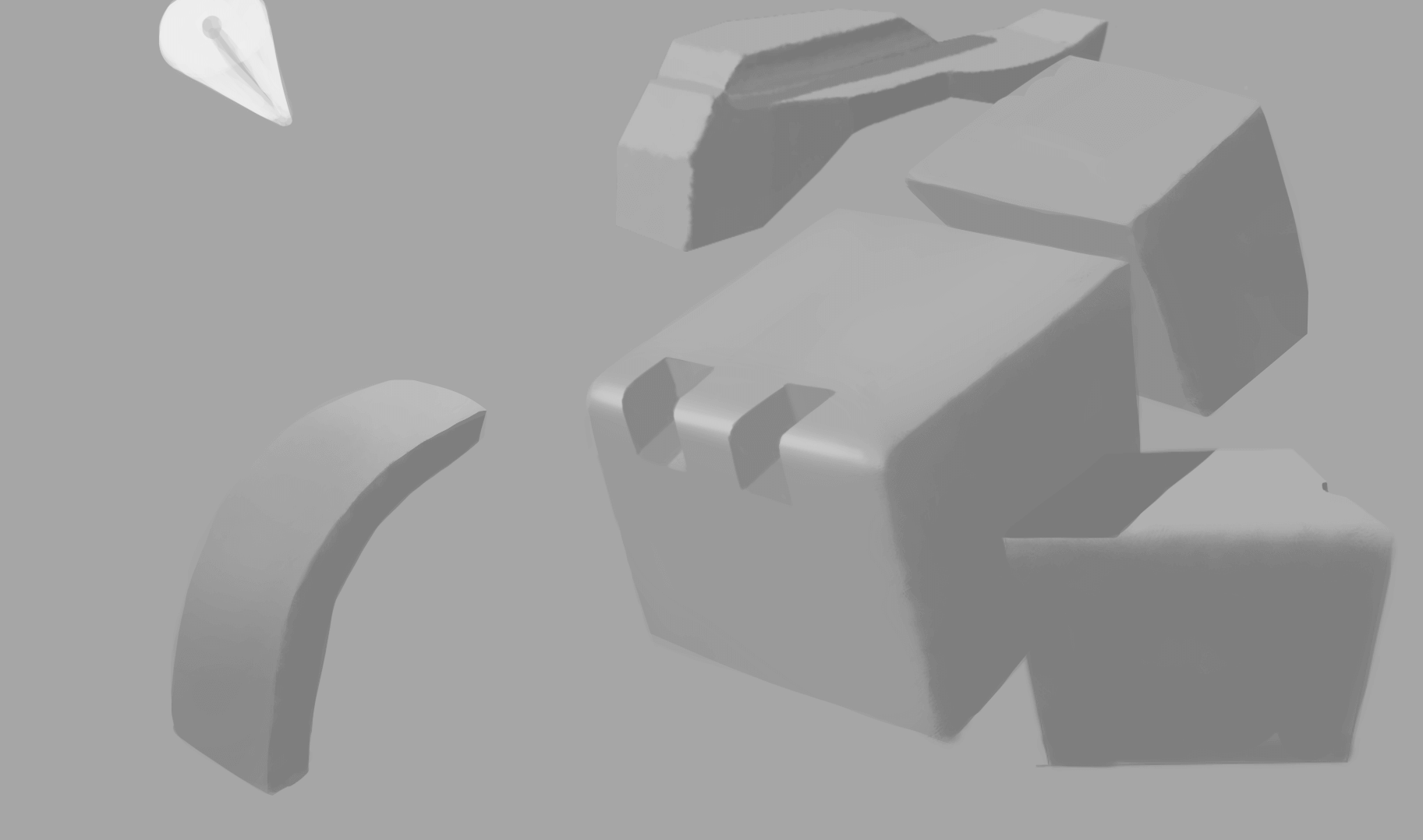 9th 14 day challenge head, I tried to stay zoomed out for the majority of this though that became difficult when it came to painting the eyes, i'm gonna try and make doing so into a habit there's some downsides to it and I need to figure out when is the best time to zoom in but for the most part this looks a lot better then my last attempt. https://i.gyazo.com/639a0e04ab5c8ffbf7c9...a45d5c.png  And just some fun undertale sketches I did recently. 
10-30-2016, 09:07 PM
Hey, nice stuff in here
I know how you feel about wanting to zoom in when doing eyes, that's because they pack a lot more detail and you gotta learn how to simplify all that. I see you're using a lot of curves and soft edges, those might describe the organic quality of the face, but it doesn't really allow you to think in terms of planes. Look at the Asaro head, start from there, chisel the features, block them in with hard edges and then, once you got the planes figured out, start thinking about the shadows and the roundness of forms. The beauty of portrait painting is in the subtlety of how forms transition between being quite sharp edged (the nose for example) to being very soft, like the corners of the mouth. A beautiful example of that transition is the lower lip, while it usually has a very sharp edge on the middle, it softens a lot on the sides and sometimes you can't even distinguish the plane difference, where the lips ends and where the upper chin portion begins, if it wasn't for the reddish color. So a helpful method I find works pretty well for me is stick to a big brush. Not too big so you can't draw any details, but not 1px either so you'll have to go put in every detail. Using a big brush forces you to simplify. A lot. For example, if you aren't able to paint an eye properly because you can't zoom in and get those tiny details, then think of it as a sphere and just draw a ball that's lit accordingly. Try to get references where the planes are visible, where there's a clear difference between light and shadow, that way you'll spot those planes a lot easier. I can suggest this tumblr: http://veraxvoltus.tumblr.com/ though some have more subtle shadows, so you gotta know a lot more about planes of the head. Let's say this image is a pretty decent one: http://veraxvoltus.tumblr.com/image/112343280309 So think about the shadow shapes that the brow ridge creates over the sphere of the eye, the angle of the brows and so on. When you see a complex shape and you're not sure how to put in down on canvas, just try finding corners, simplify. The more corners you have, the more structured it is. I can also recommend watching as many videos you can about head drawing, like maybe this Steve Huston 3h video if you haven't already: https://www.youtube.com/watch?v=2T7cDY7YDsg Maybe also check Proko's portrait videos and of course, look at old masters like Sargent, you can learn a ton just by seeing how they simplified it. Hope this helps you, cheers!
11-02-2016, 10:28 PM
Cheers for the crit dude, I tried to approach the next one differently, since before I was using a soft brush a lot, the 14 day challenge doesn't allow reference(basically you need to get each head critiqued and maybe study reference outside of when you're painting the head) but I've started using an Asaro head now to figure out the basic planes.
________________ Firstly did a quick fan art of mob psycho, wasn't really sure where to go with it since I painted the body first and due to how I painted the light source kinda fucked up the background I had planned, Wasn't sure what I was doing with it but eh, it's not terrible and I had fun painting it. If anyone knows of any good tutorials for painting anime like this, I'd be really appreciative if you could post them. 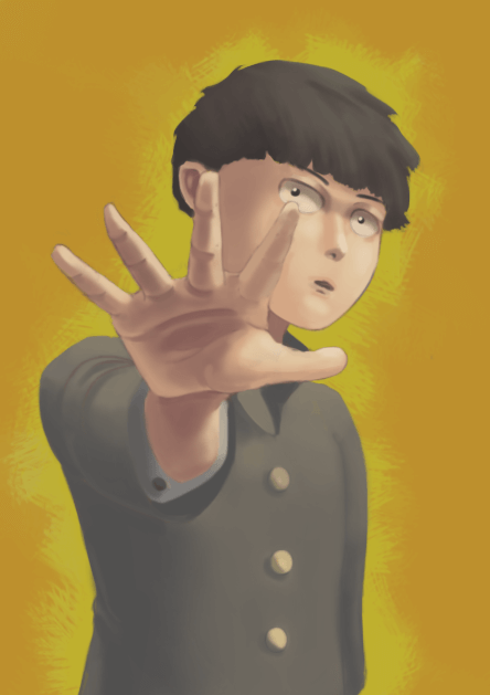 Some form and eyebrow studies. 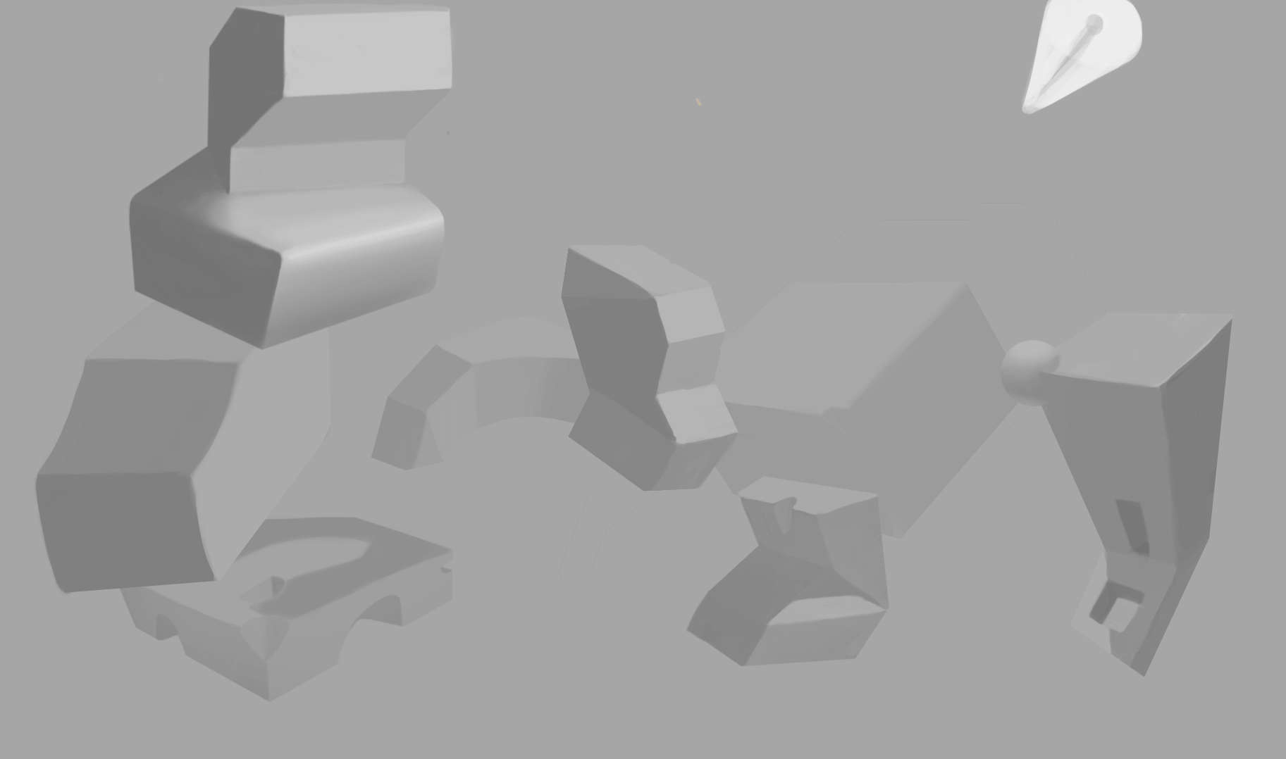  And the W.I.P of the 14 day challenge head, normally I wouldn't post wips of these but I really want to make sure i'm getting the planes right this time. 
11-17-2016, 09:12 AM
Update time, I honestly haven't gotten much done the last 10 days, mainly because a lot of that time was spent trying to get photoshop to work right...and now it's broken...again...fuck you adobe.
Now i'm having issues with it starting a process called CEP HTML a million times in the process manager completely killing any chance of me being able to use the bloody program and of course, adobe support forums are useless. So in the meantime while I decide if i'm even gonna pay for the piece of shit anymore or just go right back to one of the extremely older versions I'm gonna do some more traditional stuff for a while, annoyed that I probably won't be able to finish of my 14 day challenge for a while though. Managed to finish of this head before it went crazy on me and also some head plane studies.
11-18-2016, 09:26 AM
Working on ribcages.
I'm having a really hard time building the figure so i'm gonna study this pelvises then do a ton of figures ignoring the arms/legs and just drawing the head/ribcage/pelvis.
11-24-2016, 05:10 AM
quick update, w.i.p in the next 14 day challenge head.
11-30-2016, 10:12 AM
Quick update, switched over from Photoshop to Krita, just can't be done with Photoshop's shit anymore, so far Krita is pretty cool though, some stuff such as selections are a bit more difficult then Photoshop but it makes up for it with a lot more ease of access in other area's and some neat features such as mirroring and other things, highly recommend people check it out if they are sick of Photoshop.
11th 14 day challenge head. 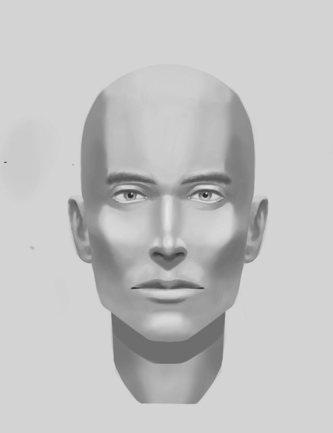 Did some form studies to help myself learn Krita. 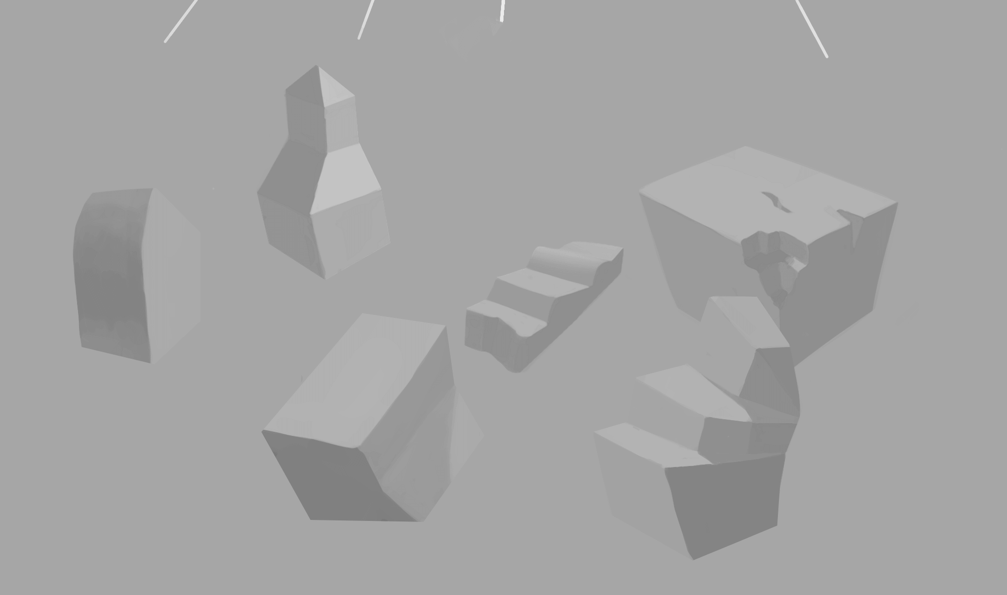 And some fan art of Valkyria Chronicles, I didn't manage to finish this fully up to how I wanted it but I haven't been able to work on this for ages due to Photoshop and I kinda lost interest. 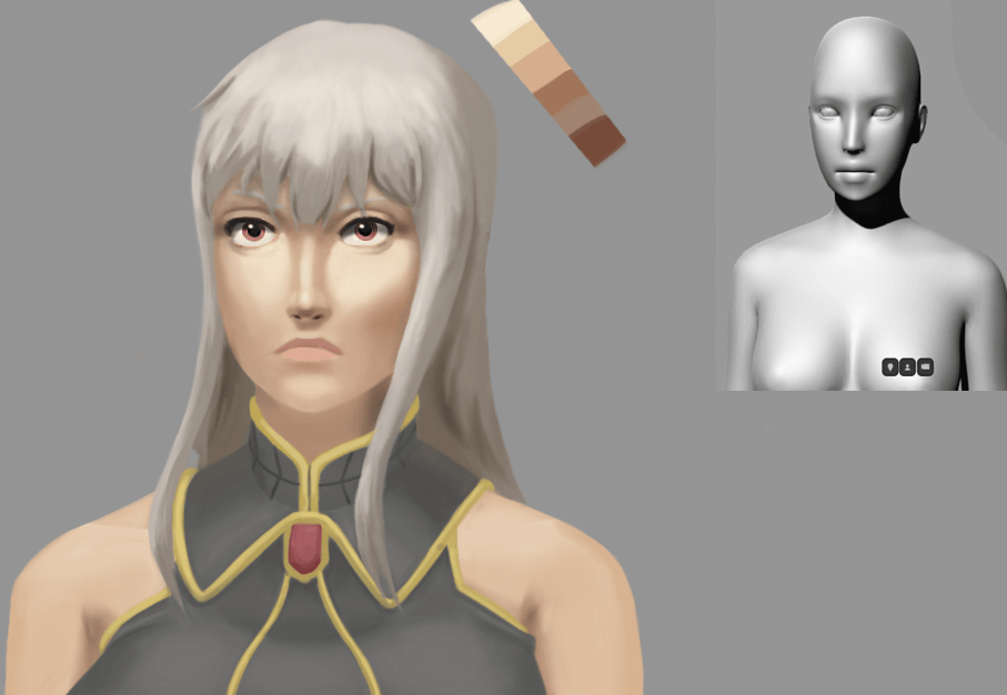
12-10-2016, 10:55 AM
Update time
Firstly my 13th 14 day challenge head only got one more. I have been wanting an opinion on the planes of the lower cheek though, the light part on the left and right of the lips, I see it on some faces and all the asaro heads yet I'm being told to get rid of it by someone in a critique group, i'm not sure if to get rid of it or lower the contrast of it since I do feel like it's noticeable enough to be a plane on a lot of faces. 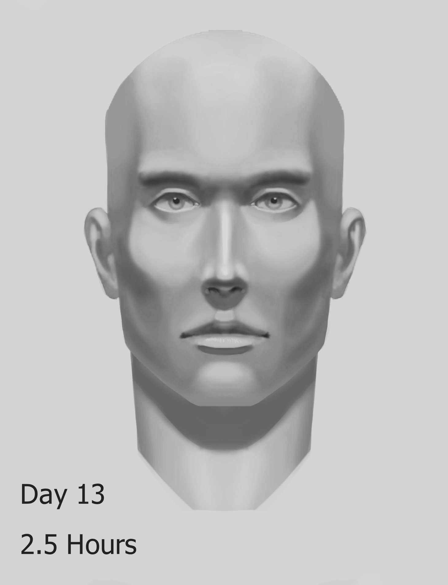 Ribcages, I've been trying for a good week now to start making one of those diagrams with the rib from every angle, I took way to long on these though this is the result of like 5 hours work more probably since I've restarted them a million times. Between this and the next picture I'm noticing I have a perfectionist problem, i'm going over the same lines and drawings over and over again or overmeasuring and wasting a lot of time, I'm currently redoing these being a bit more loose with them and not only have I got more of them done in 1 day then the entire week I spent on these but they look better imo as well, i'll post them once the diagram is finished.  Same for this here, took so long on this to the point of boredom and it still looks like a sketch to me, i'm gonna try and be more loose with this stuff or at the very least not dwell so much on mistakes in the drawings, it's time better spent studying if I can't figure it out rather then trying the break the wall with your head approach.  Did this after deciding to focus on perfection less, it's got issues but I had a lot of fun with it, I really need to spend more time on hands soon, those were a nightmare to draw. As for the weird clothing the character has, it's based on the show flip flappers and I really liked the goggles and hood clothing she had in an episode but I couldn't find ref online of the rest of the clothing so I just kinda mixed it with her regular clothing to make whatever this is haha. 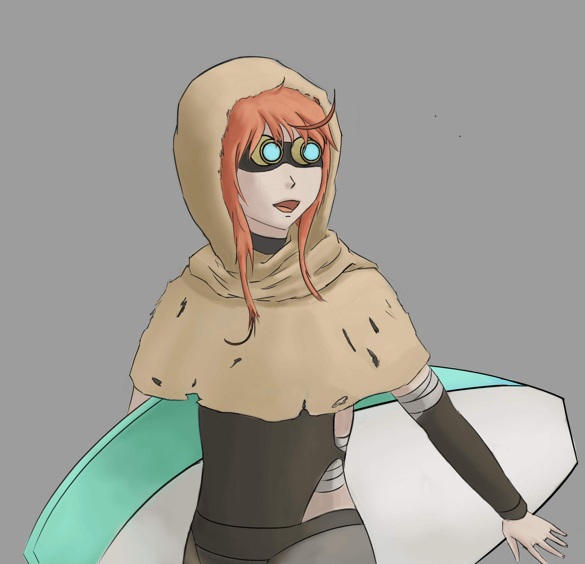
12-15-2016, 08:28 PM
hey, I noticed something on your ribcage diagram, the reason why you're struggling is because you don't simplify. Try to find corners, even in curved surfaces, they always have peaks. Find those and turn them into corner landmarks. Boxify. More corners = more structure
Also, it seems like you're just duplicating the left side ribcages and flipping / mirroring them to create the right side ribcages. Don't do that, you'll need all the practice you can get, so just try drawing all of them from scratch. Here are some notes: 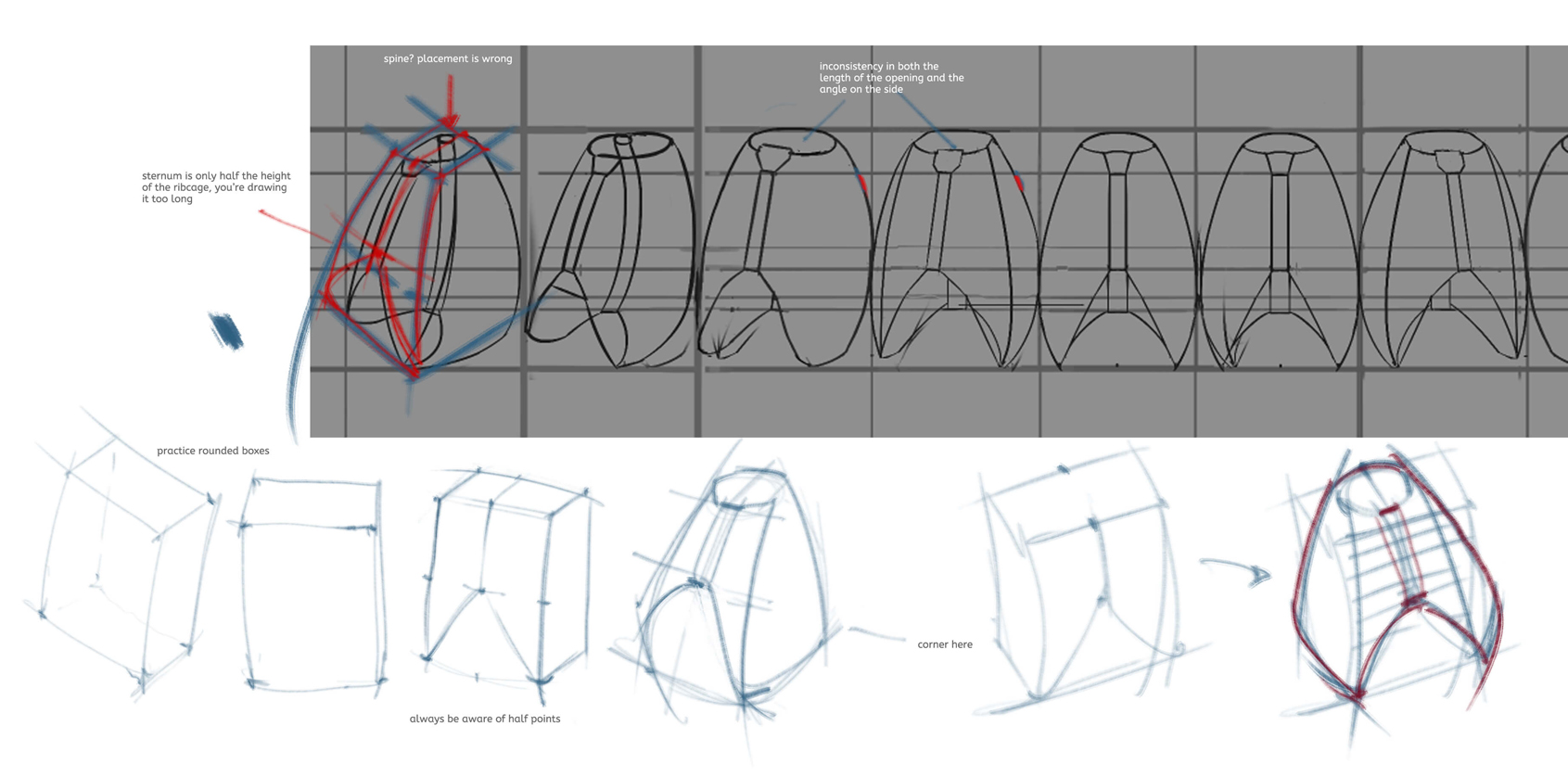 BE CAREFUL AT THOSE AXES AND MIDPOINTS - they're very important to placing stuff like sternum and spine. Of course, ribcages come in all sizes and shapes, some are even close to the box I'm starting with. It's important to gather some ref and do variations, not just stick to one shape. That's the beauty of anatomy, it varies so much that once you get the main idea, you can't really go wrong and you can play with the shapes all you want.
12-17-2016, 09:07 PM
Cheers for the help dude!
Well I was initially drawing them mirrored due to how long I was spending on each ribcage(which was like an hour, I know its ridiculous). About simplifying them into a box, I had been trying to do that but I hadn't been keeping in mind the proportion line changes, I didn't think proko was either(I've been doing these off a proko exercise) and was keeping them all on the same line which was throwing me off but thinking about it, his demonstration might've only shown a subtle tilt. https://youtu.be/wCHZ6eRMOu8?t=19m40s Anyway thanks again for the help, iI'll try and do them again with this in mind, one thing that is confusing me though is how to account for the ribcage of the tilt in the boxes, technically the neck hole and up isn't the top plane, it's a slightly diagonal one so i'm not sure how to approach it or if to just flatten it out to a top plane. ____________________ Quick update finished my 14 day challenge heads, and some fanart I did for a friend of a series I've never seen. Still working on it, i'm trying to change the proportions of the face to fit it more in line with the show it's based on, the face doesn't look cute enough yet, also trying to get rid of the line work and paint it more though i'm pretty happy with it as is, that suit was a nightmare to draw though XD. I also had some more ribcages but since they are all wrong I don't see the point in posting them lol.
12-31-2016, 08:21 AM
Quick update, hope you guys all had a good christmas!
01-08-2017, 04:58 AM
Update.
Messed up the proportions on this a bit especially around the ear area. Might do some more work on it but i'm not sure.  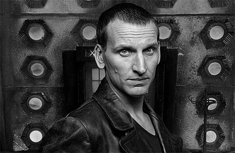
01-08-2017, 09:42 AM
Lots of work here, awesome sketchbook man!
Did you try using less soft brushwork? I think it would benefit your portraits, cause that much soft brush makes it look plastic. I'm also into Proko studies btw, you seem to be ahead of me :) As for shading simple shapes, seems like there's not enough contrast even for matte surface, did you check out Scott Robertson's How to render book? It's a great help for rendering simple forms in my opinion.
01-11-2017, 12:03 AM
Thanks Neo!
I'm a little confused on what to do with the portraits, are you referring to just the last one or both that one and the one before?. I agree the last one was too soft though I've revised it a bit and think it looks a bit better, but i'm having a difficult time trying to figure out how to balance the edges and soft area's, the portrait before that is a good example, I primarily used the hard brush for that and I was told it was too rough and rock like(which it is) but I softened it down a lot after that, i'm not sure if it's too much though.  As for the form shapes I think the issue might be more with how i'm spacing them out, i haven't been keeping the contrast in mind when spacing them between each other the ones farther away need to be less contrasted and the ones closer more. Like these ones http://img10.deviantart.net/1123/i/2015/...8pjiq0.jpg I did another set of studies though I only figured out what the issue might be halfway, gonna do another one properly this time.  Also trying to draw 100 rib cages. These are from the proko 3d model not from imagination. And I was advised by proko after giving in my other rib cages for critique, to try doing cylinder and organic cylinder studies like these, i'm gonna be doing these 15 mins a day as a warmup before I do any traditional work. 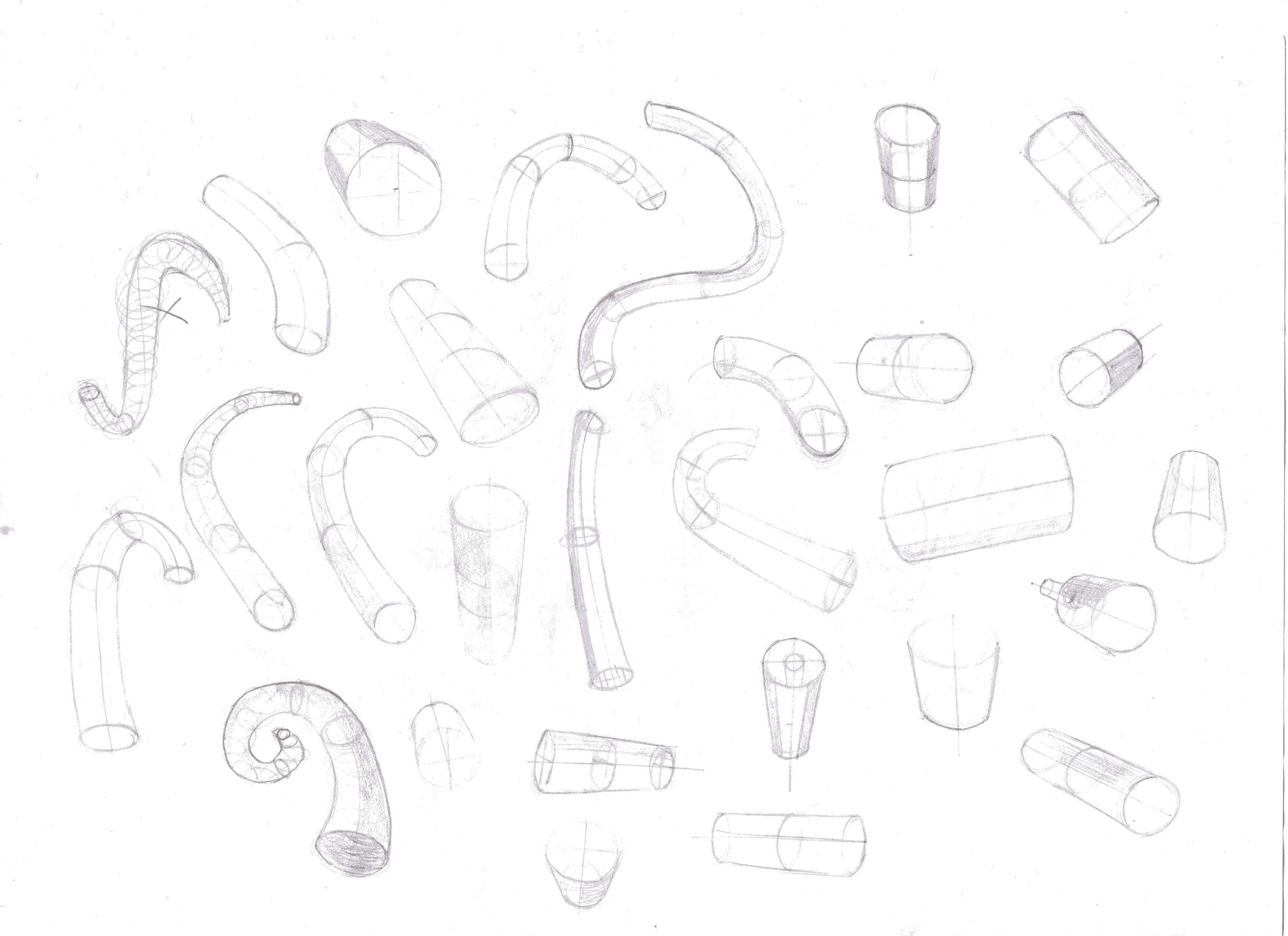  |
|
« Next Oldest | Next Newest »
|