08-20-2012, 01:51 PM
Ohhh, looks like you're pushin it man! Keep at it, some of these comin along pretty nice.
|
Dwalkerart's Loveboat
|
|
08-20-2012, 01:51 PM
Ohhh, looks like you're pushin it man! Keep at it, some of these comin along pretty nice.
08-20-2012, 02:46 PM
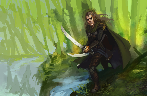
Here's an update on my elf dude, tried to get as much done as I could before work.
![[Image: stalkingelf2-1.jpg]](http://i34.photobucket.com/albums/d139/kohryusan/stalkingelf2-1.jpg)
08-20-2012, 07:35 PM
Hey the elf is looking good - gonna be cool to see it finished.
08-21-2012, 07:07 AM
Hey man. Stuff looks good. Didn't hear from ya for a while. What are you up to? ;3
08-21-2012, 07:09 AM
That newest color piece is comin out slick man!
08-22-2012, 11:17 PM
Thanks guys, very much appreciated.
@rama, I've just been busy working, been working out of my moleskin mostly. Here's a couple quick sketches, bout 20 mins each. ![[Image: daipon.jpg]](http://i34.photobucket.com/albums/d139/kohryusan/daipon.jpg) ![[Image: samu.jpg]](http://i34.photobucket.com/albums/d139/kohryusan/samu.jpg)
08-22-2012, 11:52 PM
Cool thumbs so far man.
08-23-2012, 07:59 AM
Thank you Dennis.
I started pushing one of them a little a bit and did a little bit more work on the elf. I really like where this one is headed, a little too dark right now. ![[Image: samu-1.jpg]](http://i34.photobucket.com/albums/d139/kohryusan/samu-1.jpg) ![[Image: stalkingelf2-4.jpg]](http://i34.photobucket.com/albums/d139/kohryusan/stalkingelf2-4.jpg)
08-24-2012, 04:06 PM
You new stuff looks good. Try to focus on materials. Right now everything on your character looks the same. Finish that shit! x3
08-26-2012, 06:37 AM
@ rama, I have a weird method, I always like flatten things out really hard and then build them up, after getting the basic shapes there, I'm trying to become more loose, my method is really hurting me, but it's where I'm most comfortable.
Here's something I'm working on in between the last two images. Experimenting with color light and the chalk brush like mad , still a long way to go, it's for my girlfriend she loves team fortress. ![[Image: scoutyboy-1.jpg]](http://i34.photobucket.com/albums/d139/kohryusan/scoutyboy-1.jpg)
08-26-2012, 09:34 AM
Gettin better every post. Keep it up!
08-27-2012, 11:58 AM
Thank you very much Dennis.
Here's the finished tf2 fan art. Phew! ![[Image: scoutyboy-2.jpg]](http://i34.photobucket.com/albums/d139/kohryusan/scoutyboy-2.jpg)
08-27-2012, 05:30 PM
Good stuff here, I really like the composition on the first b&w piece on this page. What I would try to do now is explore the ways to put characters somewhere other than middle of the page (like you did in that b&w). It will allow you to tell more story. I really like the colors on the elf guy but it needs more movement, his arms are parallel. So, here is what I meant, roughly, i hope it makes sense

08-29-2012, 12:40 AM
@thanks Rama
@iCi thank you for the crit, you are very correct about all of the things stated. I pretty much restarted my rendering process and after all of the stuff I learned doing the last TF2 piece I felt a lot better about approaching this one. Here's an update. Let me know what you guys think. Might need to resize this. ![[Image: stalkingelf3.jpg]](http://i34.photobucket.com/albums/d139/kohryusan/stalkingelf3.jpg)
08-29-2012, 03:53 AM
I personally love where that last one is goin, but try not to lose some of that texturing you have goin in it for smoothness. Right now it's working so well.
08-30-2012, 06:15 AM
@Dennis, Thanks, I'm going to try really hard, it's always a challenge for me to keep those natural textures.
40 min sketch, just goofin around, ![[Image: randodude.jpg]](http://i34.photobucket.com/albums/d139/kohryusan/randodude.jpg)
08-30-2012, 06:21 AM
Got some really nice stuff in here man. Really stepped it up with the second version of that elf illustration. Like your tf2 piece btw. Looks good :).
Website - www.ohbullocks.com
Blog - http://blog.ohbullocks.com Sketchbook - http://crimsondaggers.com/forum/thread-678.html Working towards 10000 hours at http://10000hourrule.com
08-30-2012, 09:04 AM
greaaaaaaaaaaaaaat colors on that forest piece. MOAR! :O
09-19-2012, 12:28 PM
I'm still working on the elf guy, but here's something else in the mean time.
|
|
« Next Oldest | Next Newest »
|