Posts: 485
Threads: 2
Joined: Feb 2017
Reputation:
5
(02-19-2019, 12:13 PM)beau Wrote: Cool stuff. I like the soft edges in the portraits and figures. Obviously, be careful not to fall into the rendering trap- falling back on the pretty and quick techniques and thinking everything's improving. I can see your improvement tough, and there's no reason to think you are doing this. Just a precaution from an overrenderer myself :)
Yo beau sorry for the late response. Thanks for the feedback and thanks for the precaution! I find that I get caught up in little value changes and not focusing enough on the big picture, I really need to spend some time rendering the basic shapes . Glad to know you think I am improving, been doubting myself recently tbh becuase I couldn't really tell myself.
Posts: 485
Threads: 2
Joined: Feb 2017
Reputation:
5
Works been brutal that past few weeks, we have finally moved into our new office but there are still tasks that need taking care of but once they are done I should finally be back to my regular schedule which hopefully should be by the end of this month so updates will most likely be irregular till then.
Haven't has as much time as usual recently as I've been working extra hours I've only really been able to work on my h/w's for the Watts live streaming classes and the 2 weekly classes that I attend which I'm not going to bother posting because I've been doing terrible recently. Finally got round to sorting out all of my critques from my instructors so I'm gonna post all
of them along with the h/w's for the last couple of weeks.
Watts Homework
Lucas
Week 6
Spent more time than I should have on these but I wanted to really push my focus and do the best I could.

Week 7
This one took me forever to complete, I was working from late afternoon till around 12.30am as I had to keep on erasing and altering things.

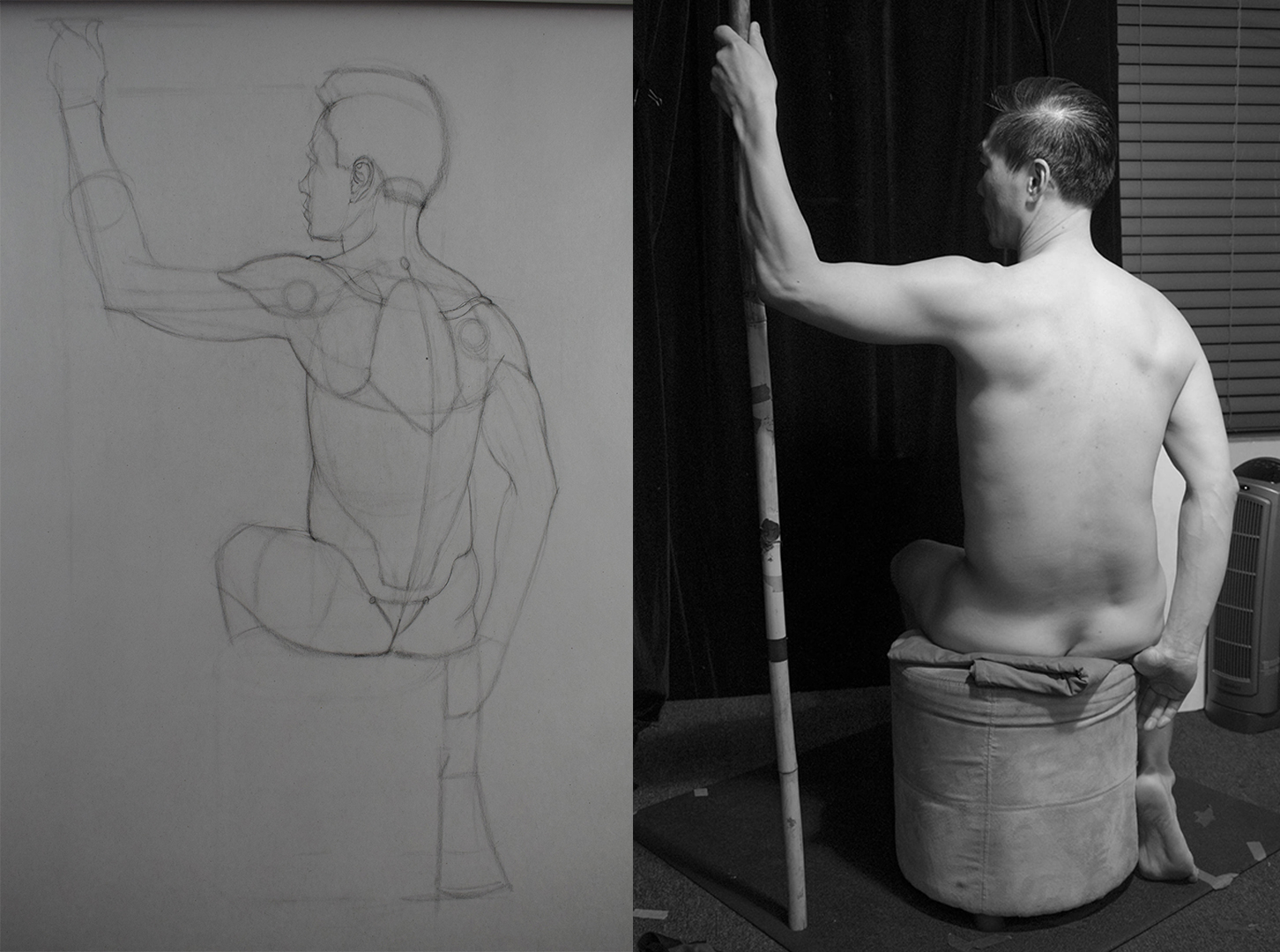
Erik
Week 6
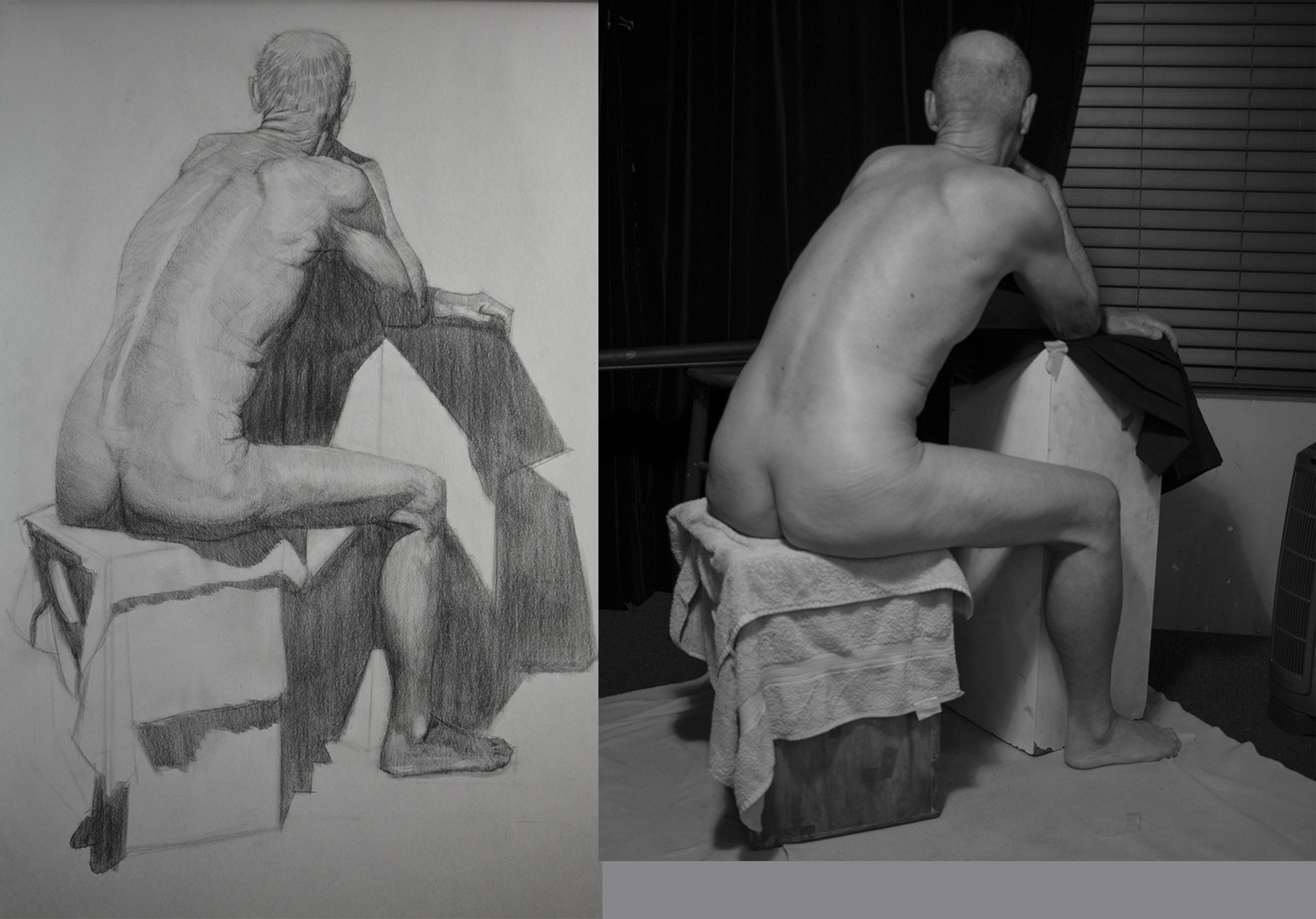
This one was probably the most challenging drawing for me this term as I don't have as much experience with drawing the back compared to the front. I was focusing mostly on the shoulder construction and understanding how it all worked.

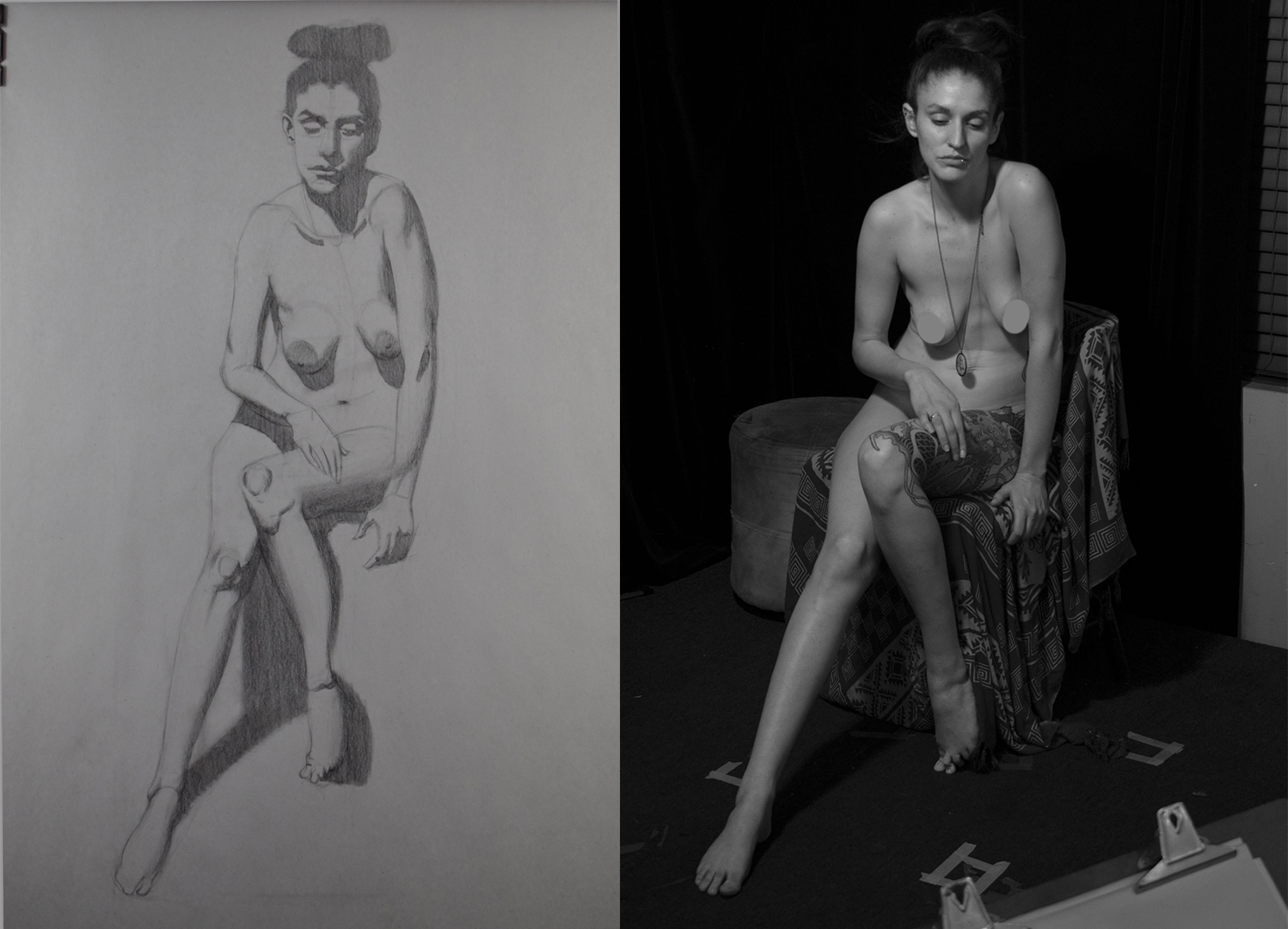
Week 7
This week we were focusing on the first 3 stages of a drawing which was gesture, proportion, and volume (tone). Took my time with this one trying to get it as accurate as possible, still find limbs tough to draw, I've been practicing their construction but I need to do alot more drawings.

Posts: 485
Threads: 2
Joined: Feb 2017
Reputation:
5
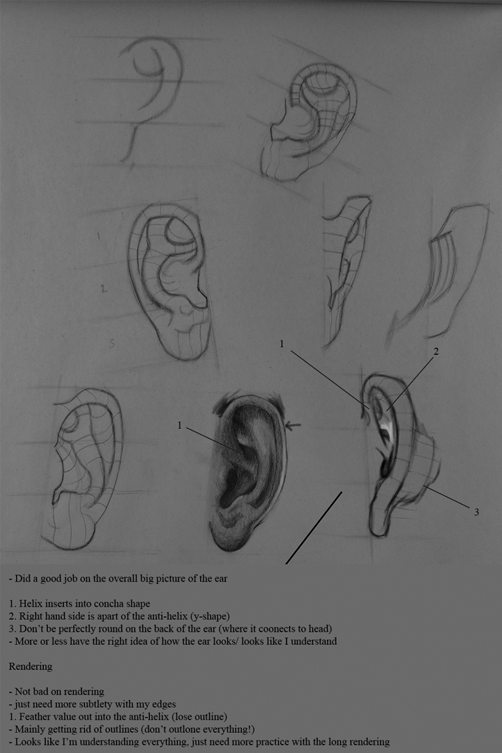
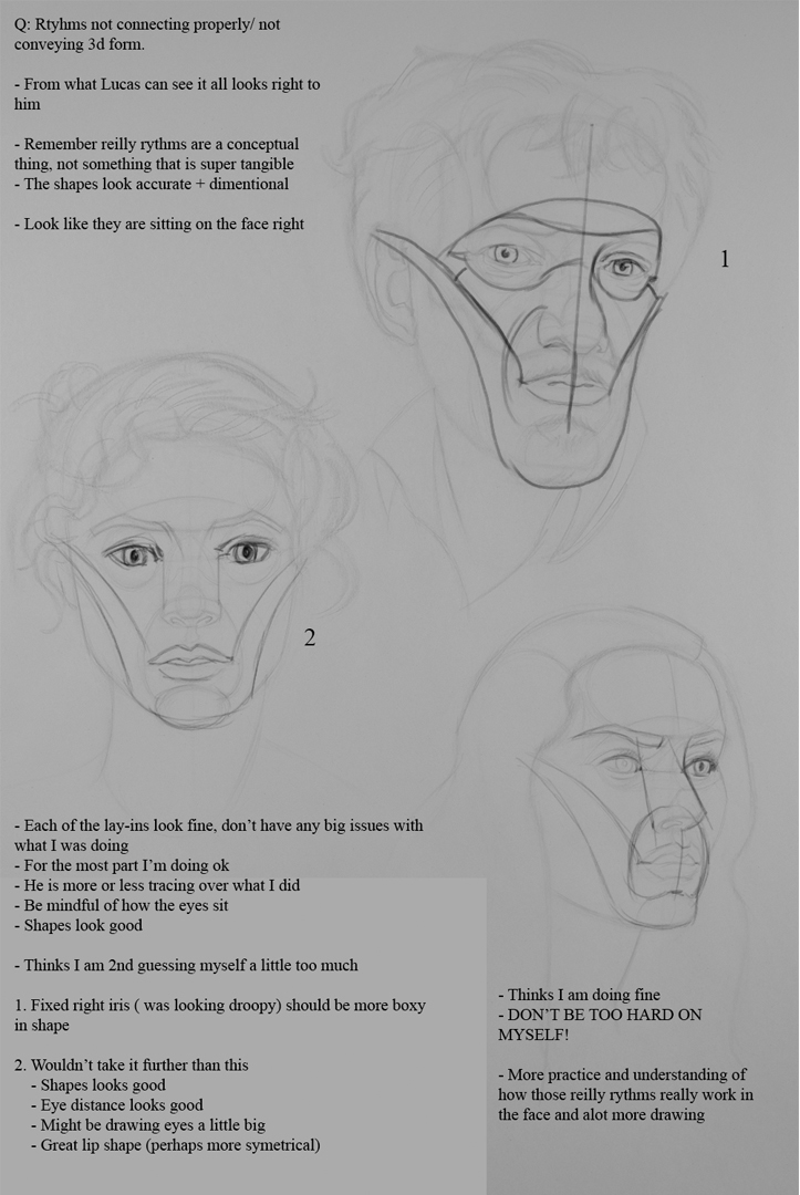
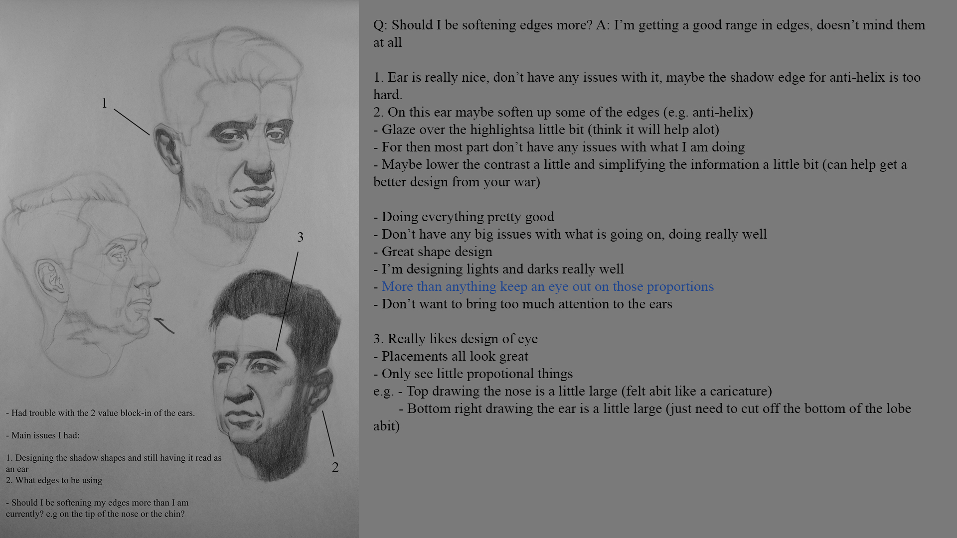
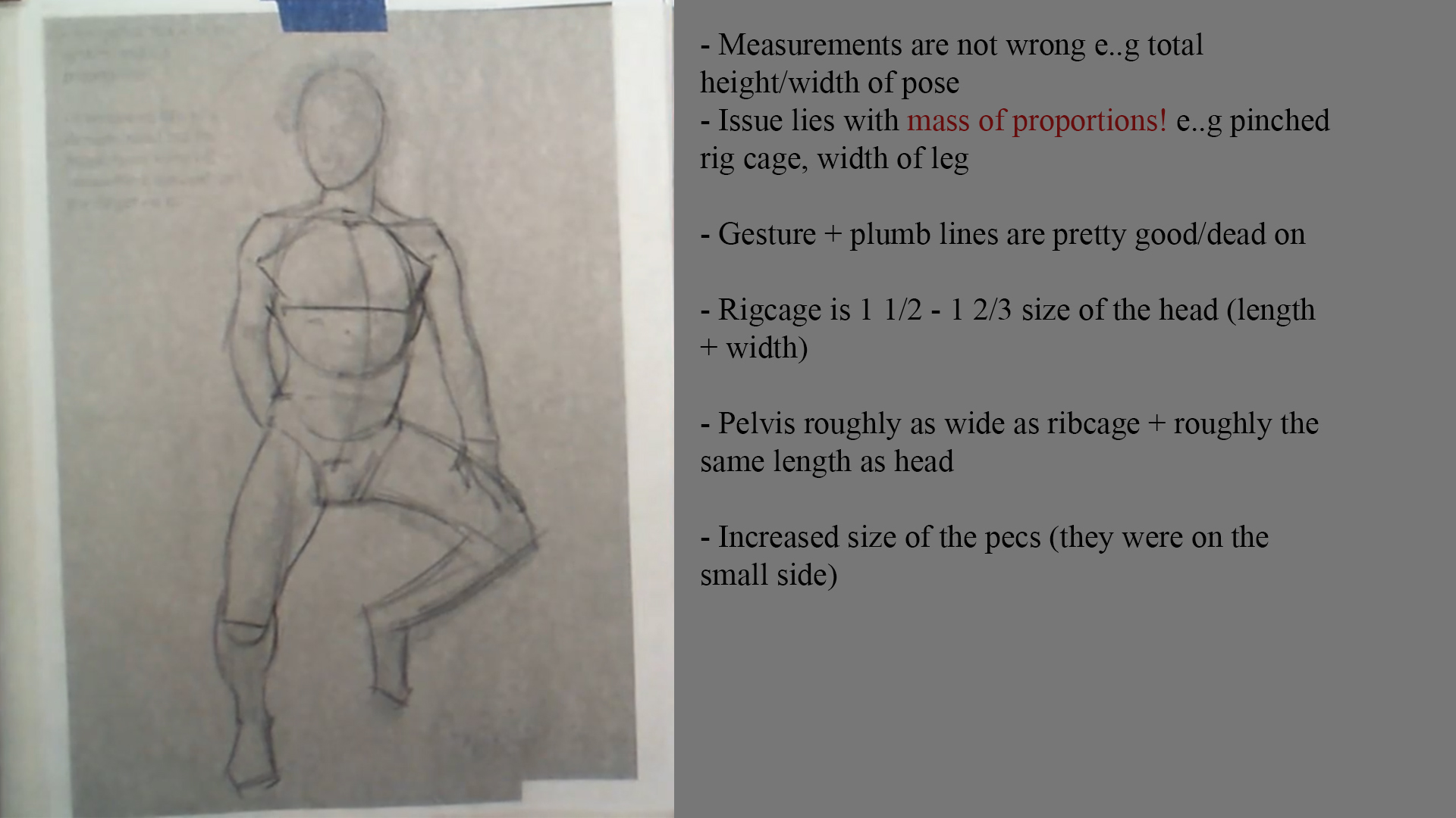
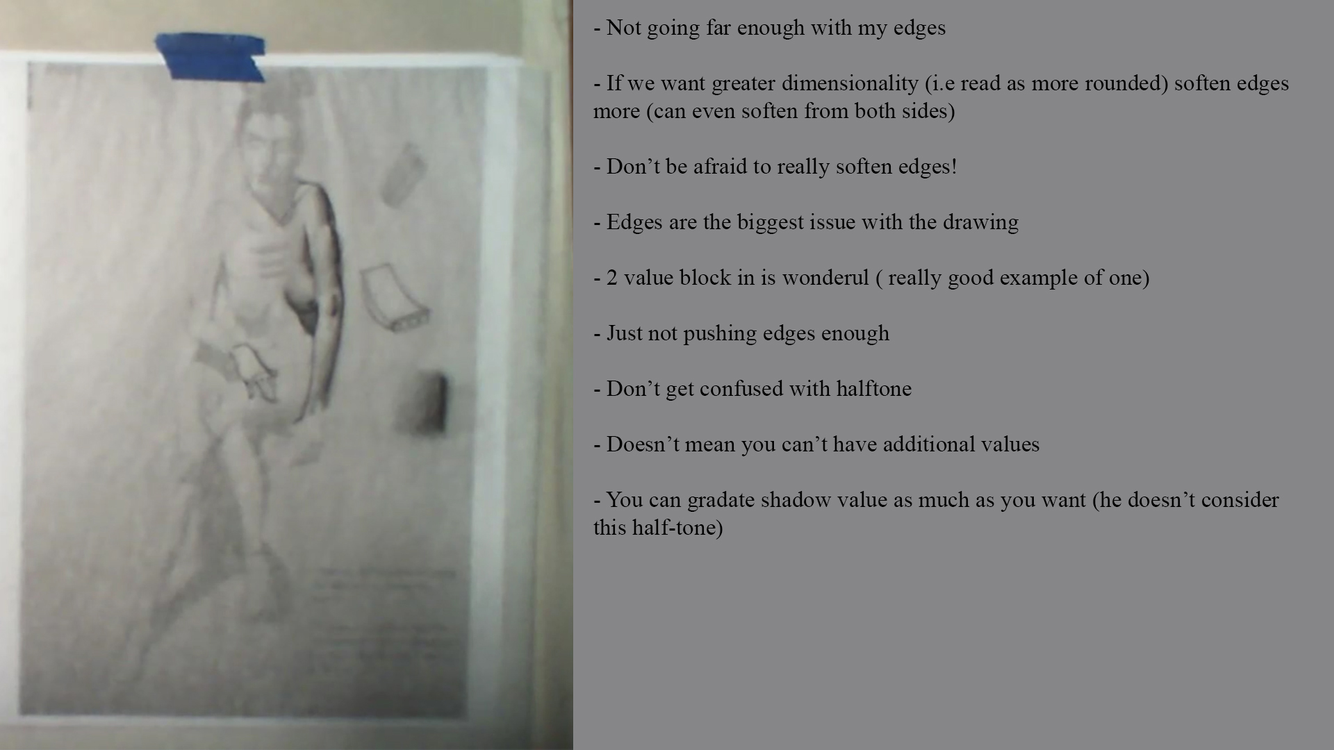
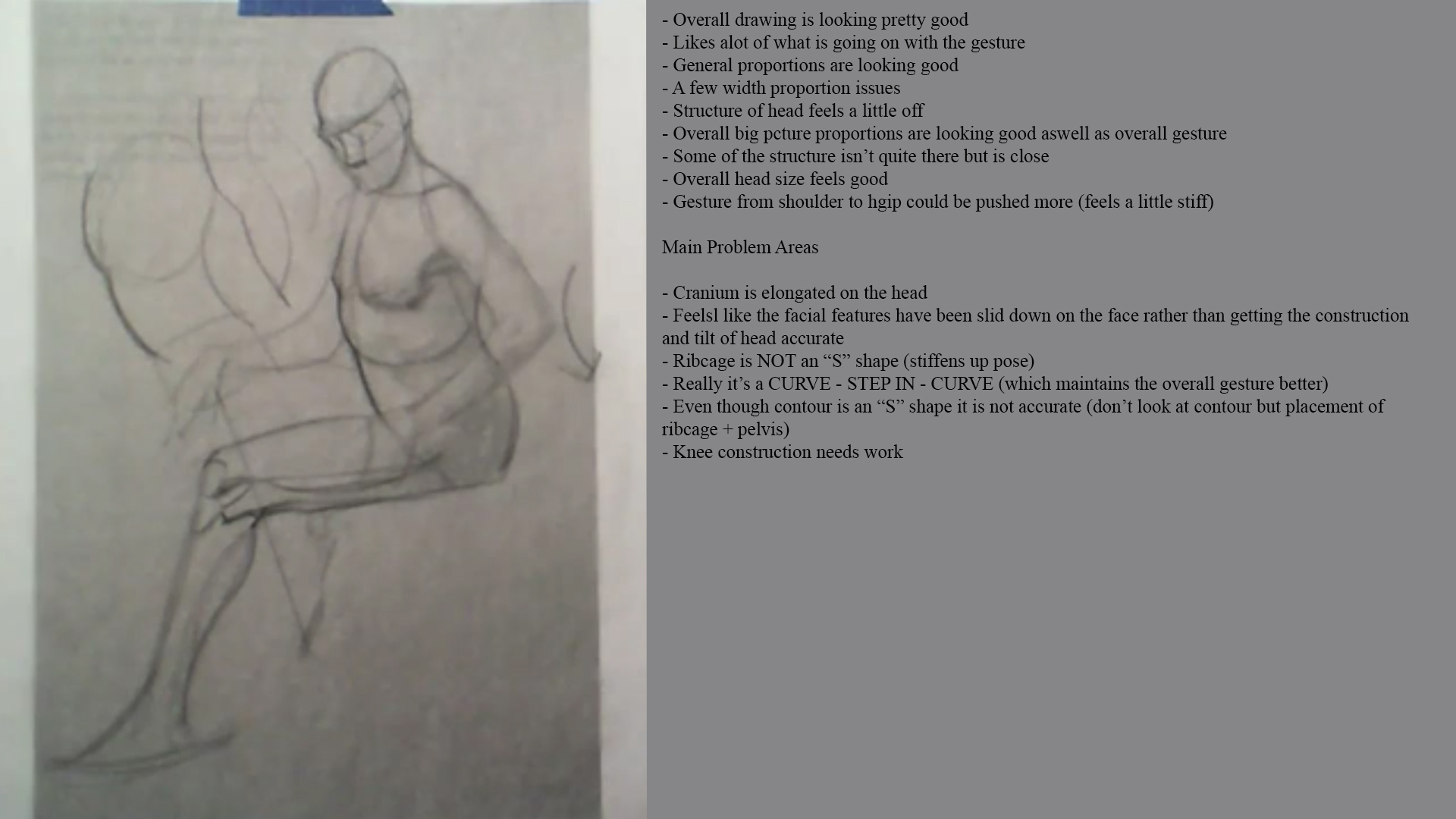
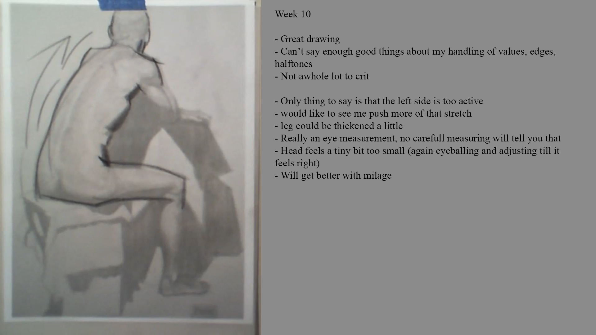
Here are all the critiques from the instructors
Lucas
Week 4

Week 5

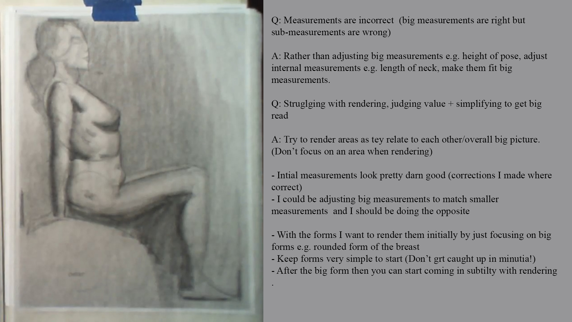
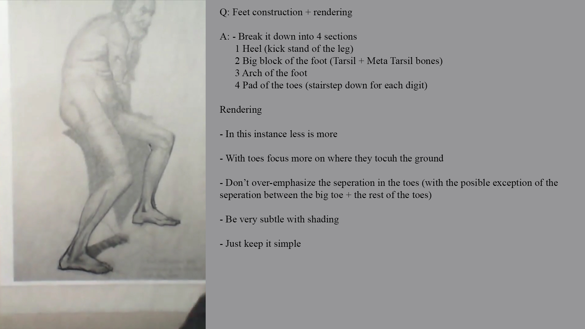
Week 6

Erik
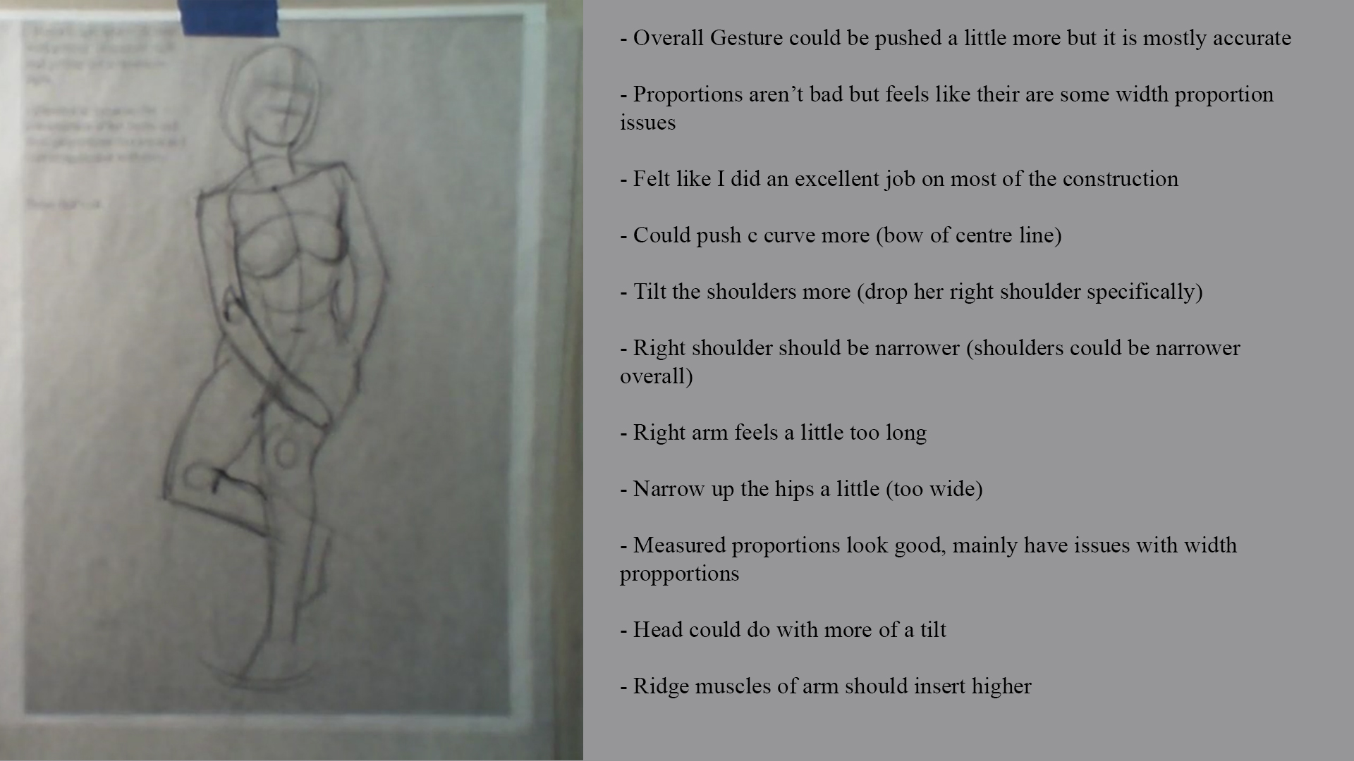
Week 2

Week 3

Week 4

Week 5

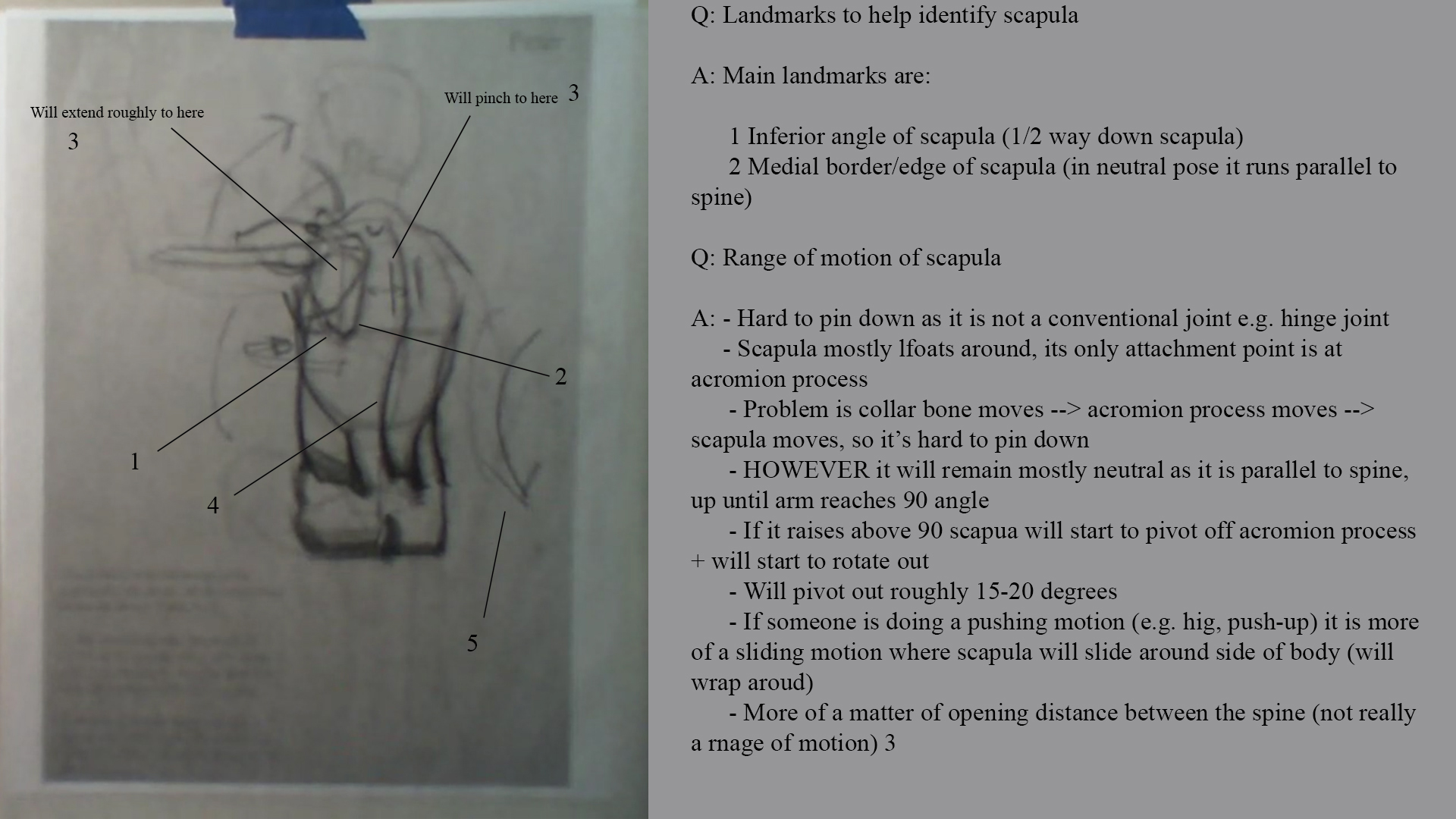
Week 6


Notes
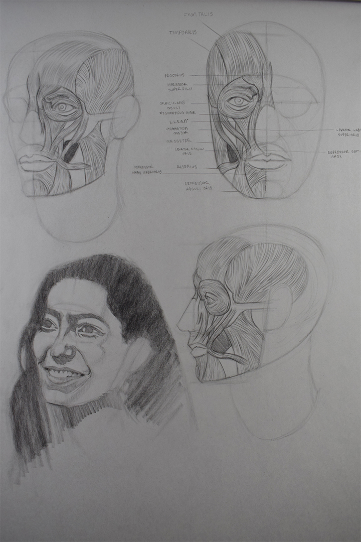
I've been thinking recently about what I want to focus on once these classes finish in a few weeks time. I believe what I have been working on is still important but I've been feeling rather stagnated recently, like I've gotten into a rut of just focuing on the same few things to improve and not improving as much or as quick as I should, almost as if there are other things that I can work on which will greatly improve my work such as studying anatomy to help me with my figure drawings as I'm having issues with limb proportions and design.
I guess what I am trying to say is that I fear I have fallen into a rut of just aimlessly drawing and making the same mistakes each day rather than identifying the issues I am having and actively working on fixing them.
I've roughly created a "next phase plan" of things that I feel I should work on next which are:
. Gesture drawing
. Anatomy
. Features (master studies)
. Painting
. Imagination work!!
I'll be giving this more thought over the next few weeks so that once my classes end I know exactly what to focus on next.
Posts: 2,817
Threads: 15
Joined: Jun 2013
Reputation:
109
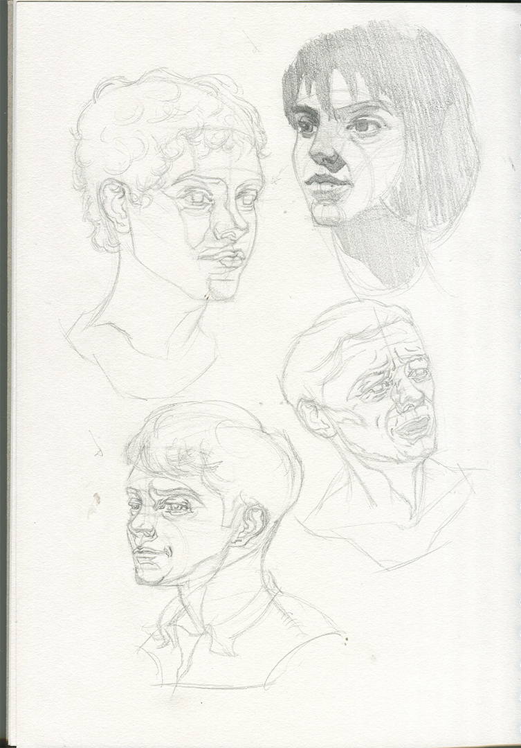
well those first male portraits are really gorgeous! I actually thought they were brians work at first, so definitely great job on those :)
This girl
http://crimsondaggers.com/forum/attachme...0W%207.jpg
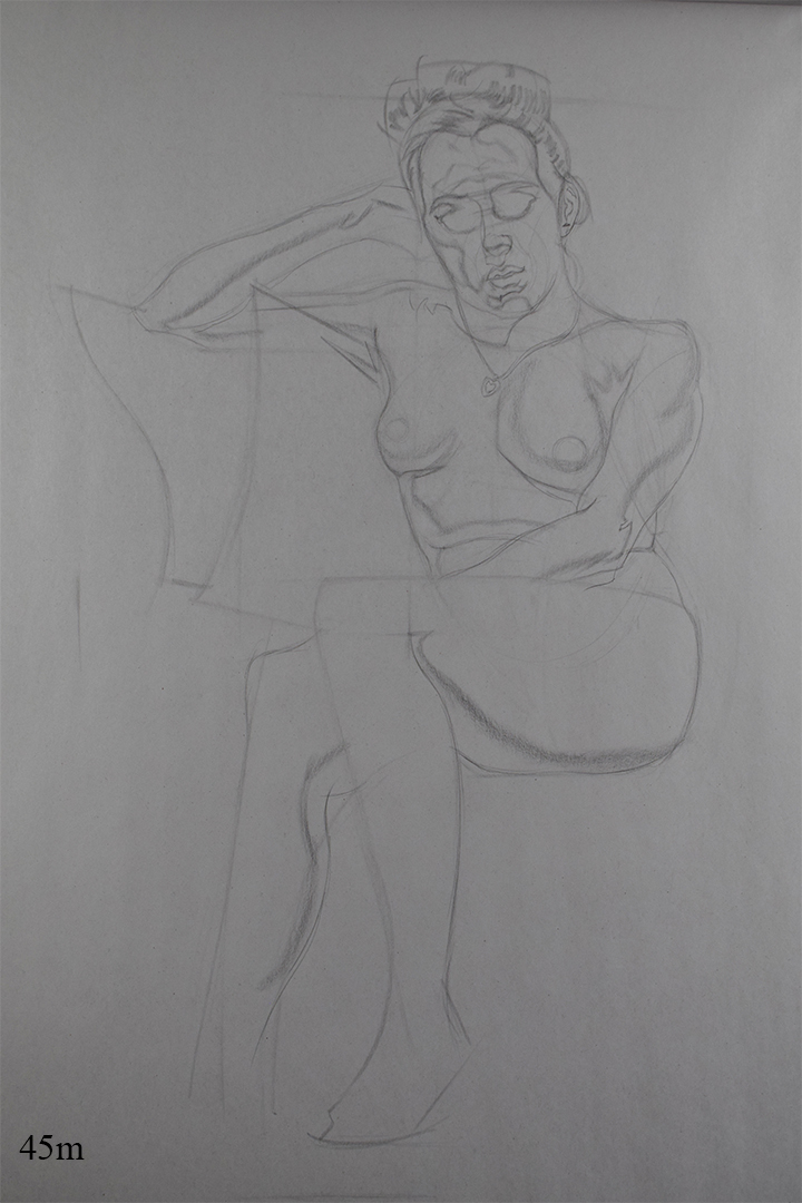
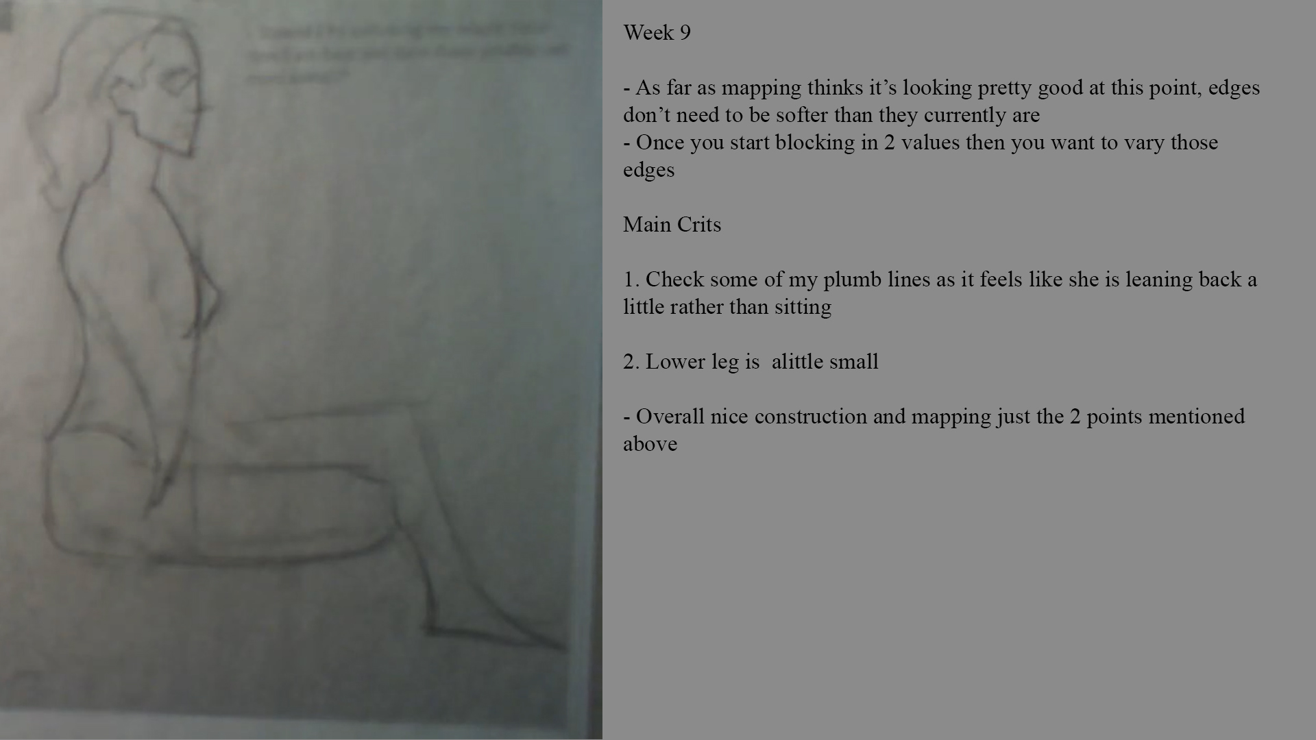
The shading and edges are very nice, youre a natural with that pencil whatever youre using on this. Her calves, hands are too short and the tilt on her torso is a little more pressure on the arm that carries the weight, but fantastic job on the face, and youre definitely leveling up on this.
I dont think youre in a rut after this post, just keep doing what youre doing, its working even if you are doubtful, just seeing your mentors comments on your head drawing ought to be proof of that
Posts: 485
Threads: 2
Joined: Feb 2017
Reputation:
5
(03-06-2019, 08:12 AM)Fedodika Wrote: well those first male portraits are really gorgeous! I actually thought they were brians work at first, so definitely great job on those :)
This girl
http://crimsondaggers.com/forum/attachme...0W%207.jpg
The shading and edges are very nice, youre a natural with that pencil whatever youre using on this. Her calves, hands are too short and the tilt on her torso is a little more pressure on the arm that carries the weight, but fantastic job on the face, and youre definitely leveling up on this.
I dont think youre in a rut after this post, just keep doing what youre doing, its working even if you are doubtful, just seeing your mentors comments on your head drawing ought to be proof of that
Thanks for the feedback :)
I'm happy that I fooled you! Brian actually ran the class that week as Lucas was away but I've been trying to understand how he simplifies shapes and incorporate it into my own work so it looks like it is paying off.
My head game has definitely improved over the last few months but my figures are definitely still shakey, like you pointed out it's proportional errors and gesture that I need to really work on.
I think I've just been stressed lately, been pretty much working my day job and then working on art till I go to bed the past few weeks I haven't had alot of time to relax a little, but I'm a natural worrier so there's that
Posts: 485
Threads: 2
Joined: Feb 2017
Reputation:
5
Still busy with work which looks like it will be another month atleast :( so updates will be informal till then.
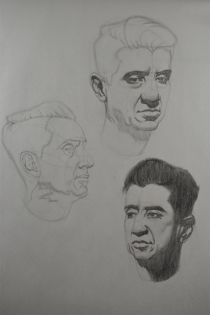
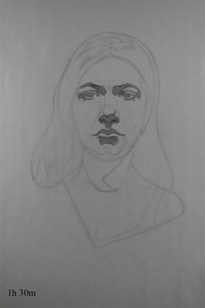
Portrait Class
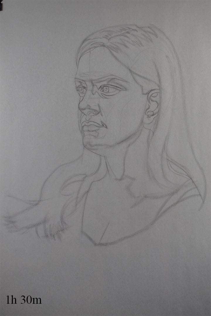
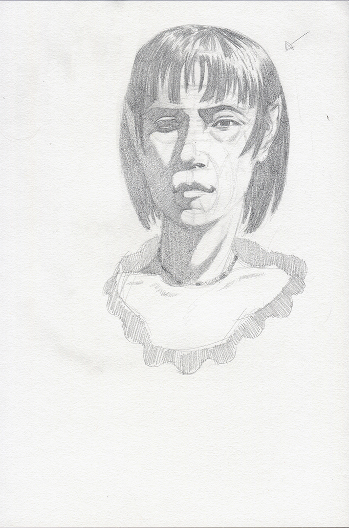
My head lay-ins have definitely improved recently, felt like I got a decent likeness on this one but still having trouble with the eye construction which I paln to work on when my live streaming classes end next week. My next goal is to work on shape design and trying to get quicker with the lay-ins so that I can start completing some rendered heads from life.

Life Drawing Class
Work from the last 2 weeks
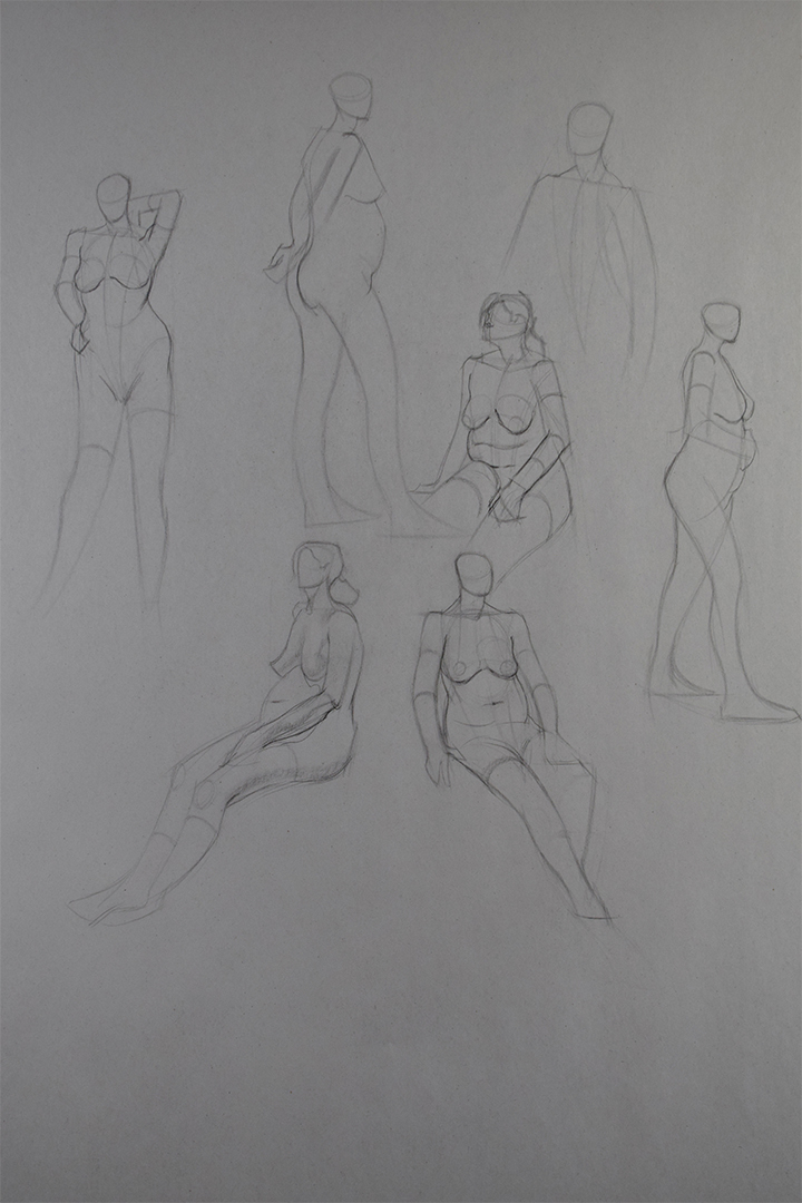
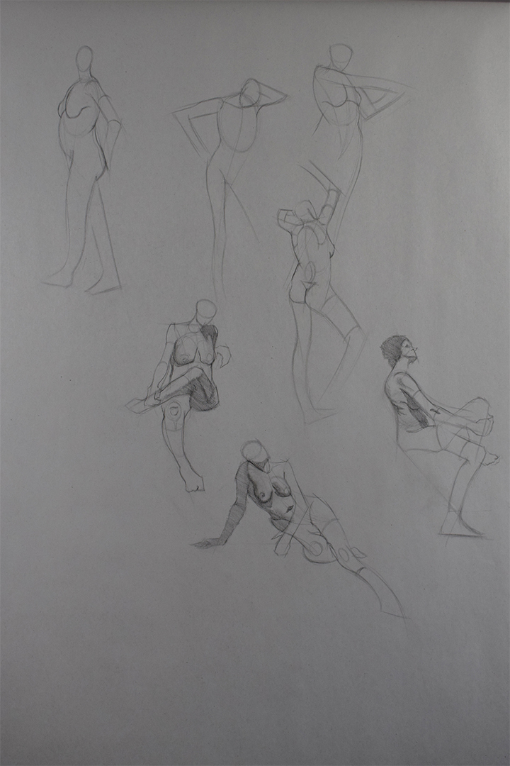
Gestures are 3, 10 mins each and I still struggle with 3 min poses, I usually do 5 mins at home but will start incorporating 2 and 3 min poses aswell.


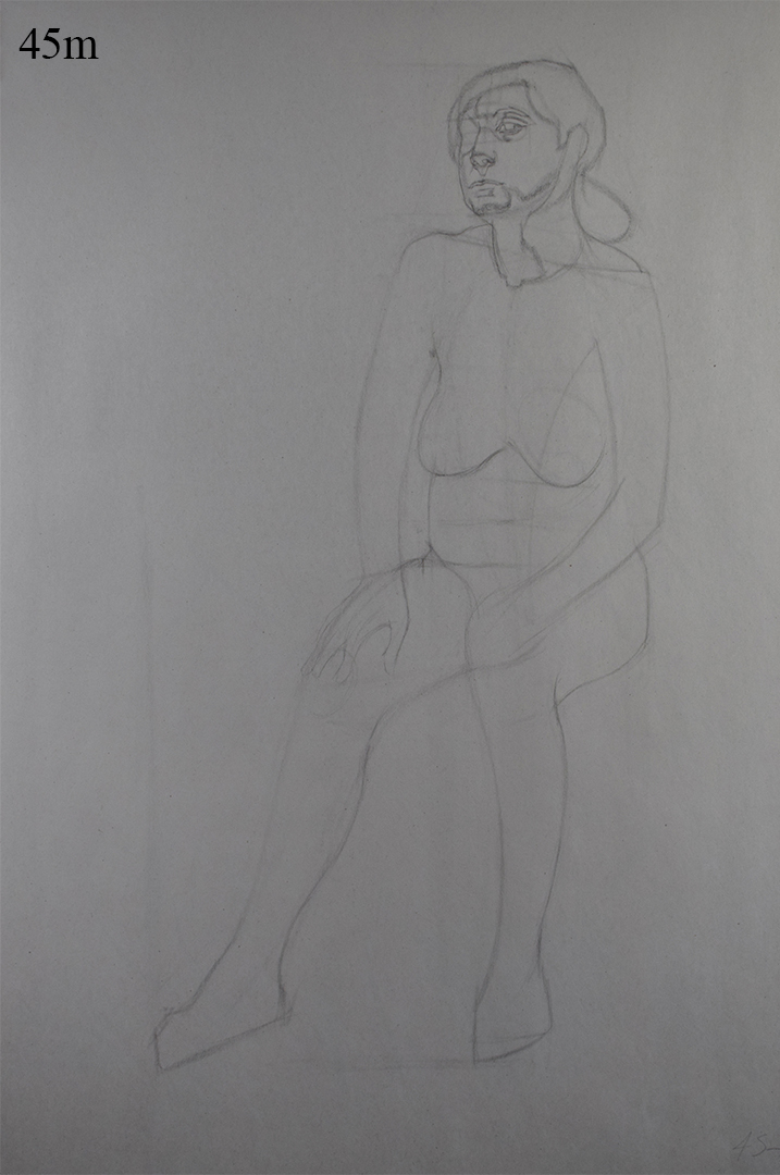
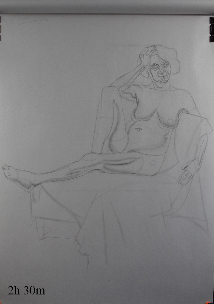
My sketching club also run Saturday life/portrait classes, thought they were the same layout as the ones I attend during the week but the Saturday life class is a single pose for 3 hours so I attended that yesterday. Gonna try and make that a regular class I attend aswell, just depends how tired I am when I wake up as it's a morning class.

Lucas's Class
Forgot to save the ref for Week 8, gonna ask on the Watts forums and see if anyone can send them to me.
Been working on rendering the past 2 weeks, Lucas liked what I achieved in week 8 and suggested that I spend longer on the rendering the following week which I did.
Week 8

Week 9

Erik's Class
Mainly worked on my gesture and mapping since I still struggle with them. Did a trace over of the pose to get a feleing for the gesture and referred to that whne doing the drawing as on my first attempt I was struggling alot with the gesture and his proportions.

Quick Sketch
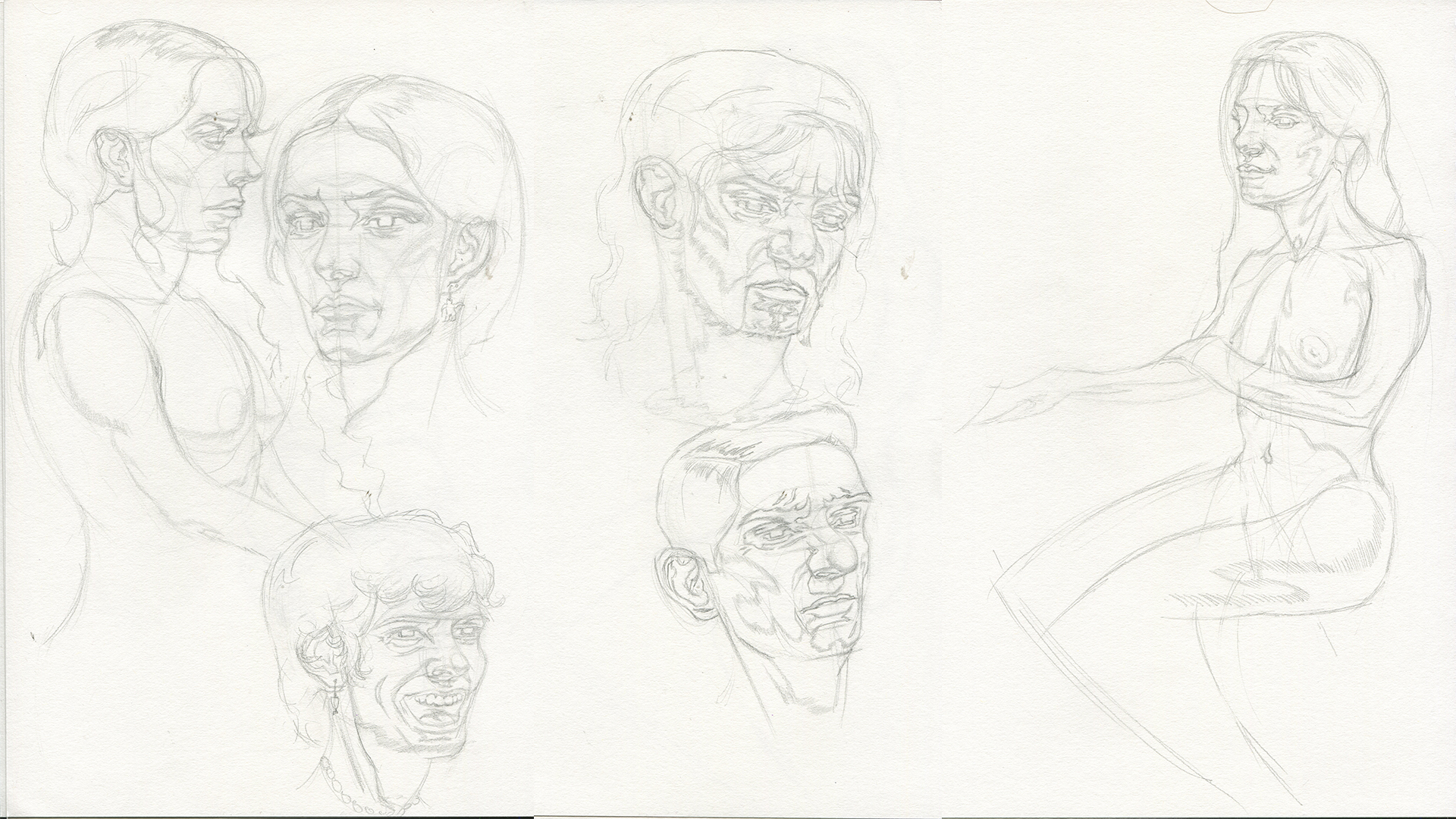
Some quick sketch of my female head model that I own. I really want to work on my timing as it still takes me awhile to do a lay-in or a rendered piece, I see Erik and Jeff etc achieving these beautiful head and figure indications in 5/20 mins which I also want to do!


Imagination
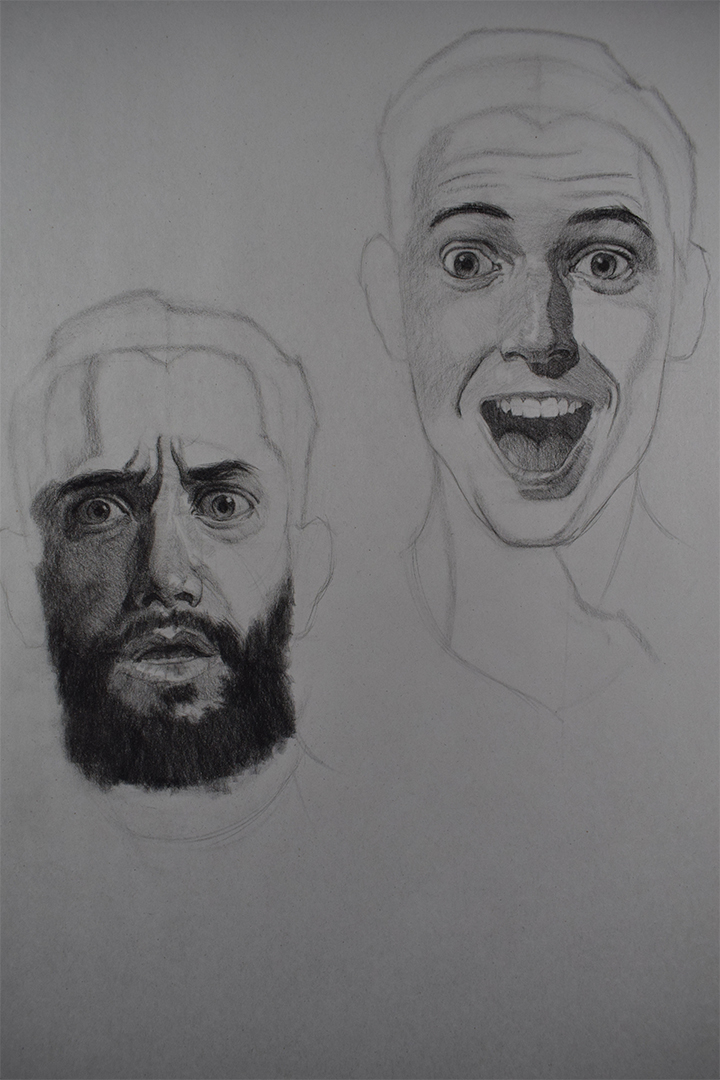
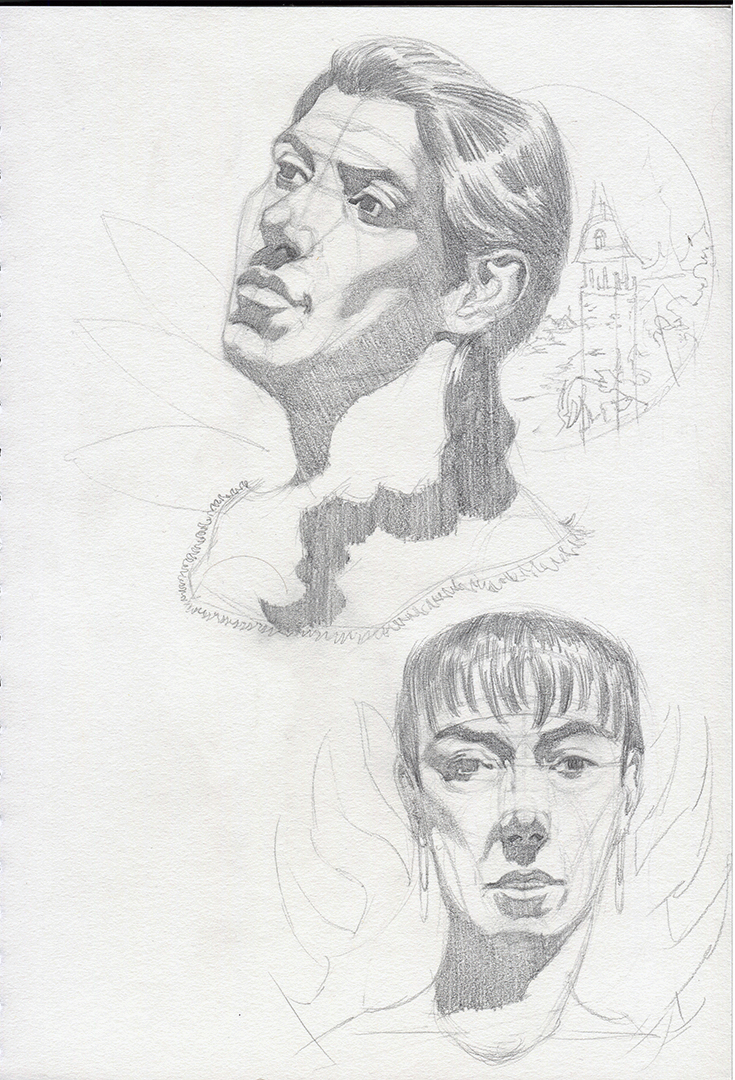
Some head indications from imagination. Rather than trying to construct the features first and then apply the mapping on top I tried combining the 2 like I would when working from life or photo ref.

Watts Crits
Don't have Lucas's crit from last week, he accidently painted on the wrong layer so he said he'd email me a new paint over.


Posts: 2,817
Threads: 15
Joined: Jun 2013
Reputation:
109
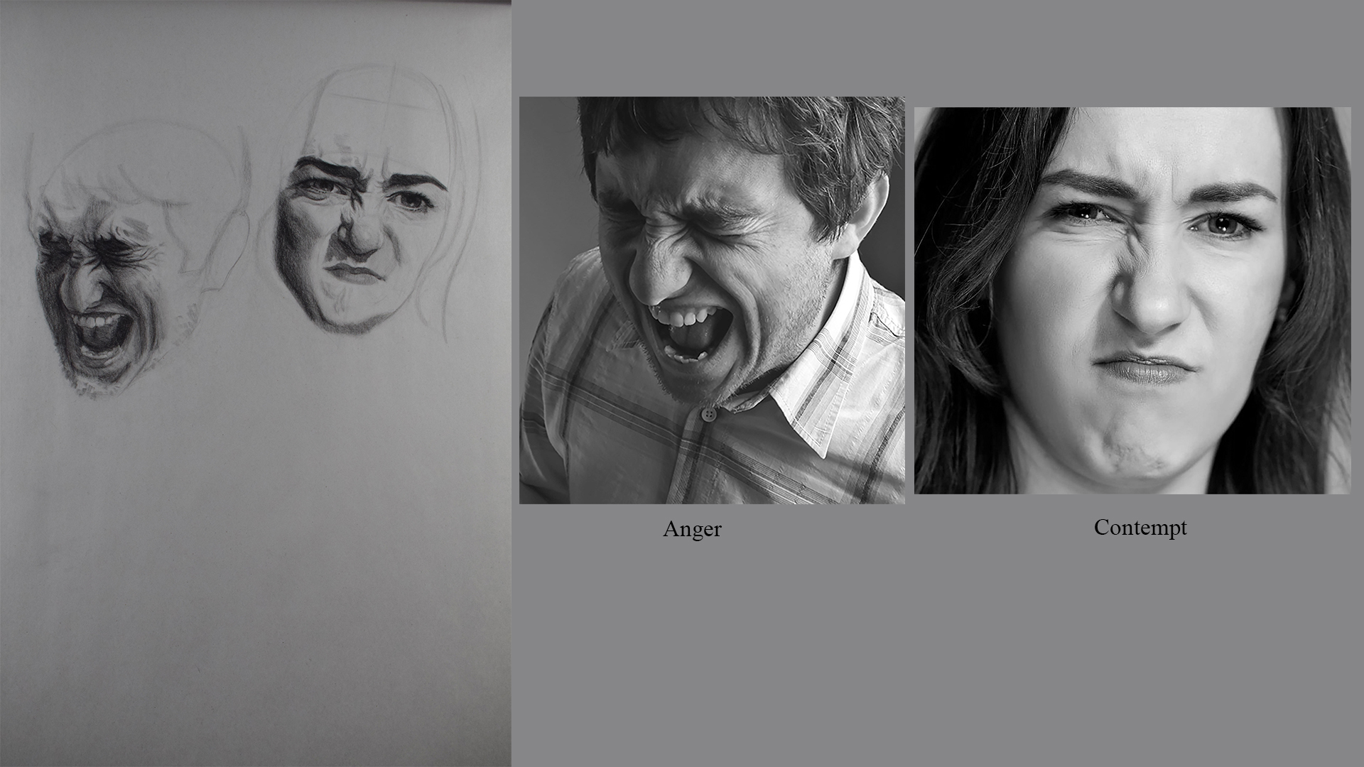
your expressions are pretty good!
Watch that eye on the inside, way too long
http://crimsondaggers.com/forum/attachme...e%2038.jpg
on these
http://crimsondaggers.com/forum/attachme...on%201.jpg
The proportions would work for children, big eyes, short nose, but look very odd with signs of age.
Also watch your head size on gestures, its important to pay attention to ;)
Posts: 485
Threads: 2
Joined: Feb 2017
Reputation:
5
(03-18-2019, 03:07 AM)Fedodika Wrote: your expressions are pretty good!
Watch that eye on the inside, way too long
http://crimsondaggers.com/forum/attachme...e%2038.jpg
on these
http://crimsondaggers.com/forum/attachme...on%201.jpg
The proportions would work for children, big eyes, short nose, but look very odd with signs of age.
Also watch your head size on gestures, its important to pay attention to ;)
Thanks Fedodika although they take me like 3 times as long as Lucas haha.
Yh I have no idea what's going on with my imaginary heads, seems like each time I do a new page a new issue seems to appear even though I feel like I know what the proportion sizes should be, maybe it's becuase they are from imagination I just need to work out a few kinks or something? Tried some more sketchbooking work so hopefully they are better.
Yep I've been trying to work on my proportions with my gesture drawings, I think it's becuase i keep drawing the shoulders too wide it throws off the rest of my proportions but I can't seem to measure the damn shoulders right.
Posts: 485
Threads: 2
Joined: Feb 2017
Reputation:
5
Had some personal stuff to take care of which I should of done awhile go so haven't had the time to post, haven't got awhole lot to post but I'm gonna dive back in this coming week and try and get alot done.
Portrait Class
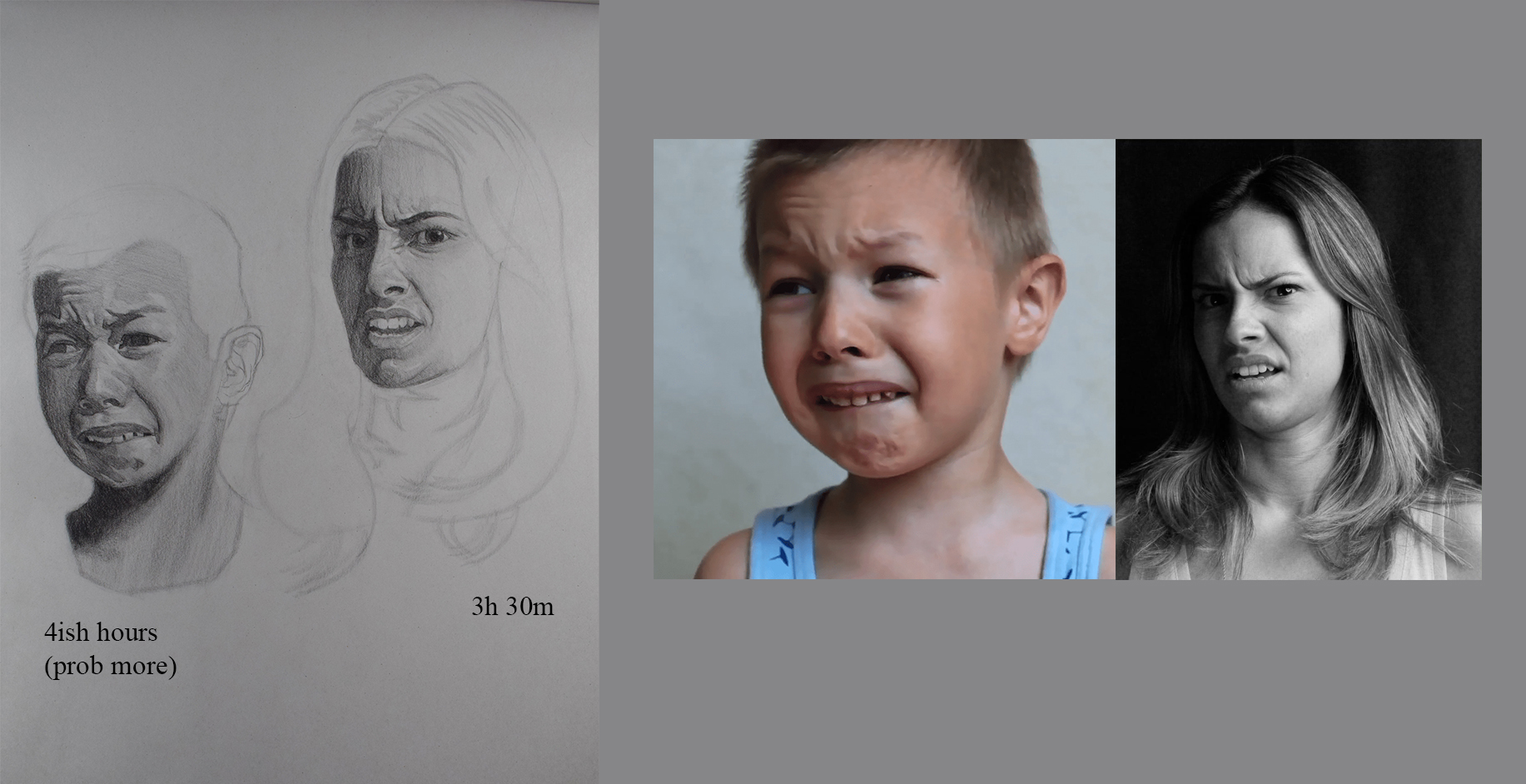
I've been getting abit quicker the past 2 weeks as I'm actually managing to get to the 2 value stage. I was pleased with how to first drawing came out as I was having difficultyies with it at the beginning, felt like my eyes weren't focused properly for the first 40 mins or so but definitely felt like this was an improvement.

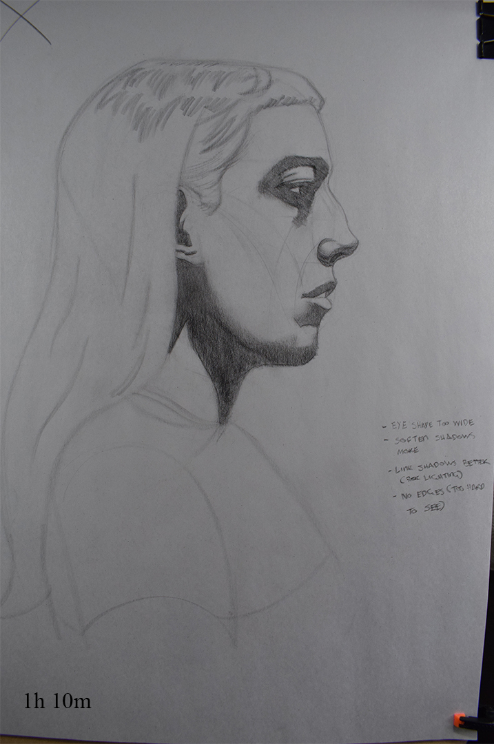
Second drawing came out rather bad....... Felt like I hadn;t drew a head from profile in awhile and thought it would be easier. I've mentioned before how the lighting at my classes is terrible but it's even worse from profile e.g. when my eyes were open there was a clear vlaue distinction between the underside of the chin and her cheek but when I squinted that entire area became one value till about half way up her cheek, things like that were I'm just not sure how to interpret it. Gonna mention the lighting issue again but I'm not going to hold my breath.

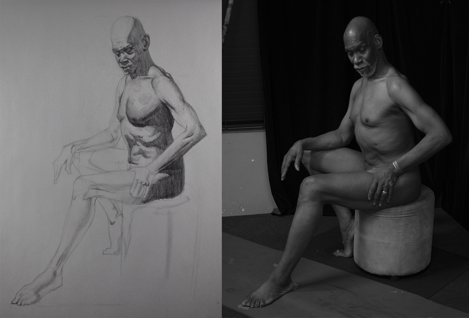
Life Class
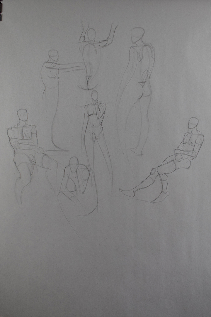
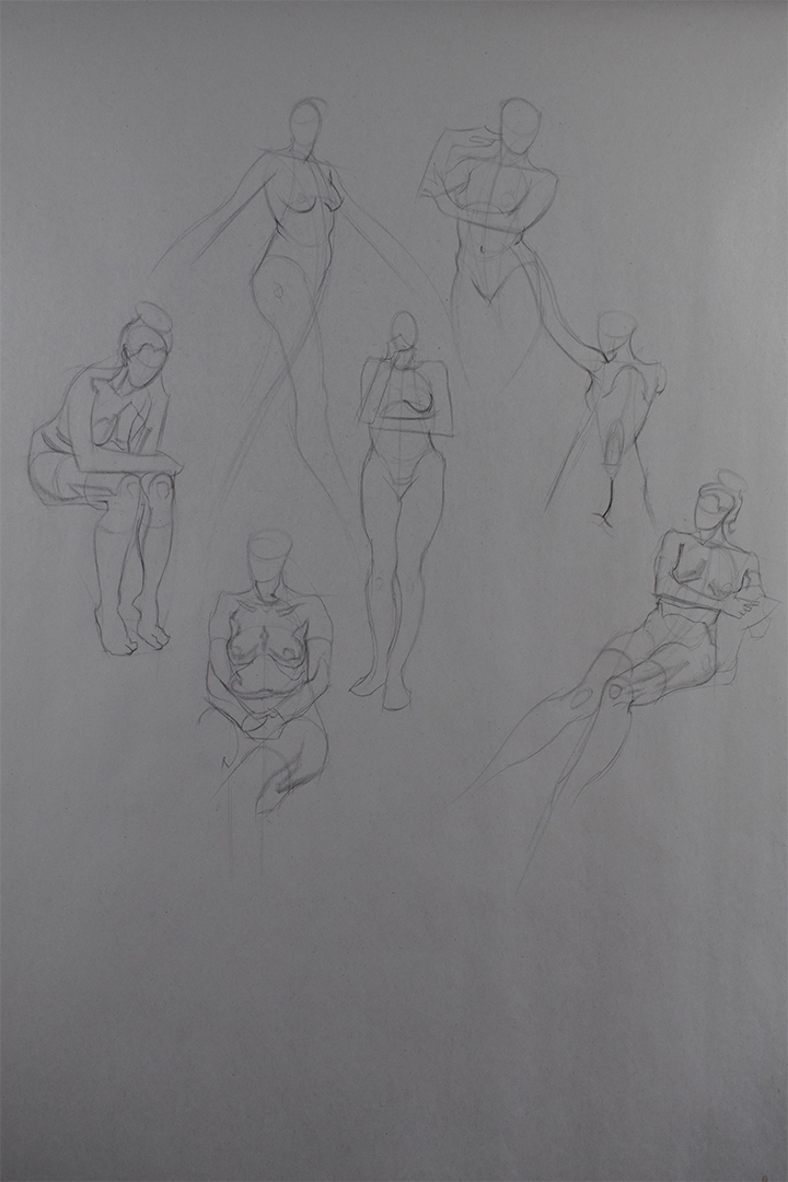
Gestures are 3 mins for the standing and 10 mins for seated. Still feel like I'm getting caught up in anatomical detail rather than focusing on the overall gesture. I'm going to study Brian Knox's gestures and beat it into me.


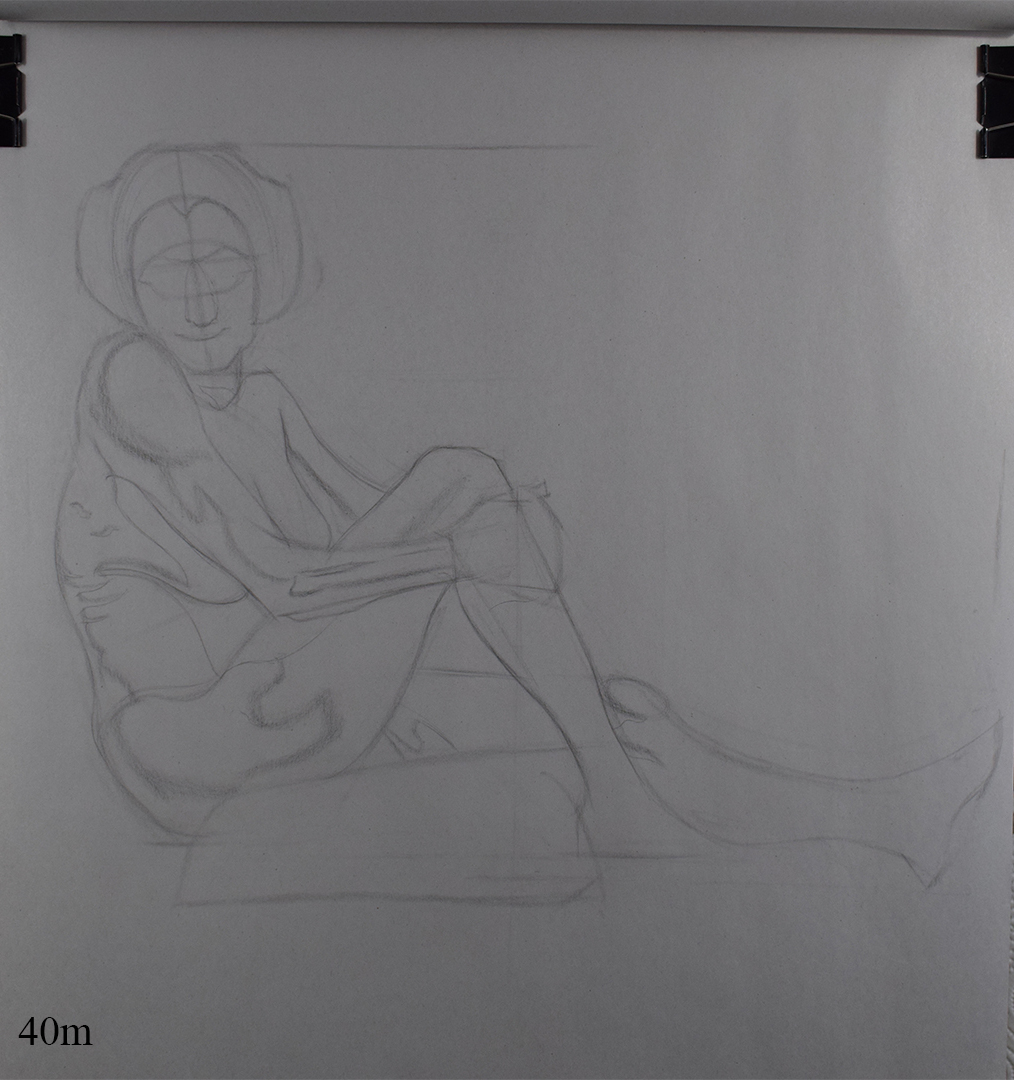
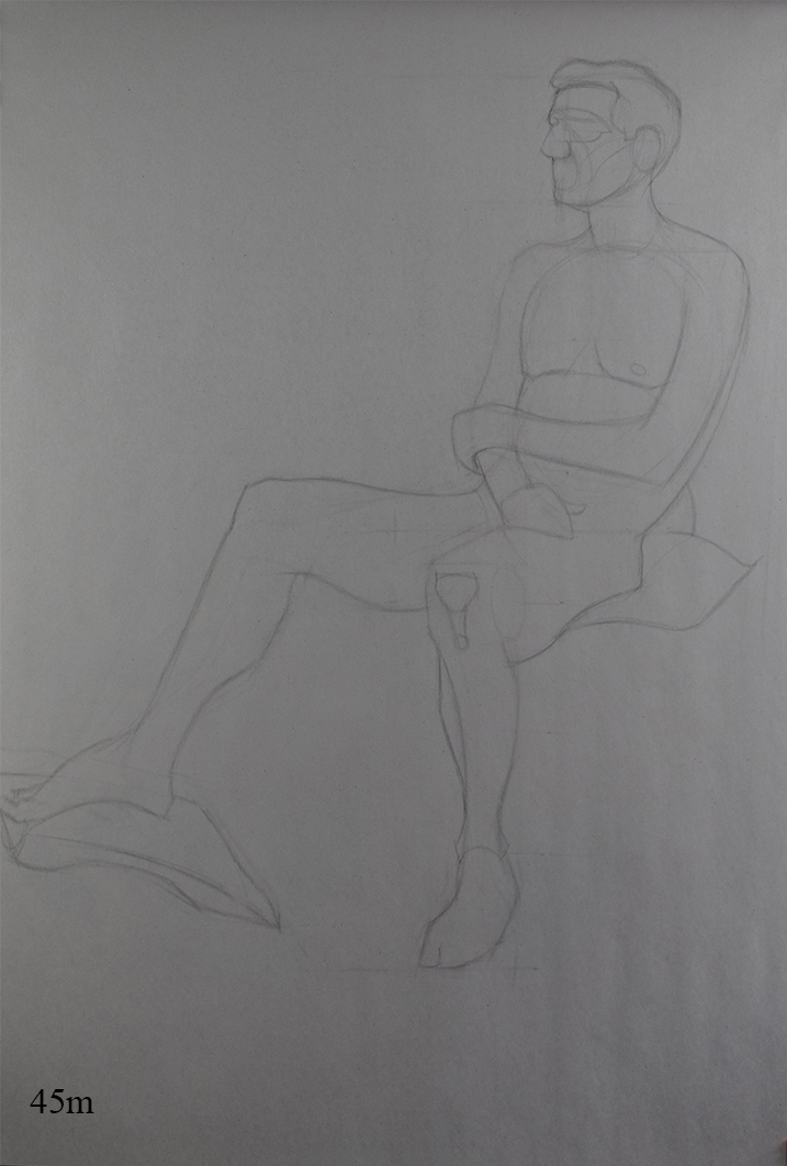
With the longer poses I've been focusing on getting the big envelope shape of the pose since 40 mins is still too quick for me to get into mapping and rendering. Tried measuring less this week and going more by my eye.


Live Streaming
Final week for the Live streaming classes and overall it's been another informative term.
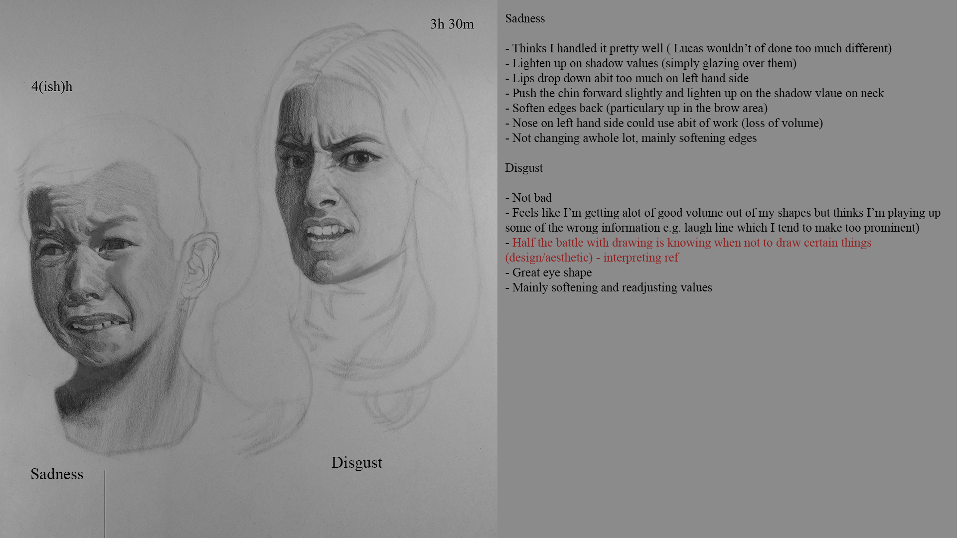
Lucas
Only just realized that I have not been labeling the expressions each week......my bad

Erik
Wanted to complete a fully rendered figure for my last week so spent abit longer than usual and didn't use a gesture trace over as ref aswell like I have been the past 2 weeks.

Sketchbook
Abit of imaginative drawing, I've been getting tired of studying the past few weeks and wanted a break from it all and I want to spend this coming week aswell just having some fun with drawing.

Notes
Been looking at the live streaming classes for next term, thinknig of only taking 1 class (fugre drawing) as the other 2 are head drawing and quite frankly i'm getting abit sick of heads hahaha. I was planning on stepping up my figure game for the next term anyway, dive back into anatomy and gesture and put heads on hold since I want to get my figures up to the same standards ans my heads.
Waiting on Erik's last crit so I'm gonna wait till tomorrow and post my crits for both classes.
Posts: 2,817
Threads: 15
Joined: Jun 2013
Reputation:
109
hey peter, id reccomend finding some more stylized artists you enjoy and trying to grab some appeal from that. Most of your faces are unnatractive and their proportions could benefit from some stylization/idealization. Now mainly the issue is just proportions, but i think if you stepped out of what youre used to and explored some stylized artists, jc leyendecker being a classic example, but even modern like anime/cartoon/conceptual artists to try and absorb some attractiveness.
However if you nail the proportions they'll look a lot better, but i think if you see first hand how strange your proportions look, it could help. thats why i did the morphs of the photos to highlight it to you but i understand its hard to engrain that into your subconcious.
Something you could try is to intimately imagine what your drawing would look like if it came to life right now, say on your last post here. The girl on the right, imagine how bizarre itd look if she had flesh on her with her body having a childs proportions and her head being that much larger. or the head to the left, with wrinkles and age, but has the proportions of a young child with big eyes and a short distance from nose to brow.
how well you draw from imagination will certainly play into your reference drawing so dont slack up on it, its a great skill to have :)
Posts: 485
Threads: 2
Joined: Feb 2017
Reputation:
5
(04-01-2019, 12:48 AM)Fedodika Wrote: hey peter, id reccomend finding some more stylized artists you enjoy and trying to grab some appeal from that. Most of your faces are unnatractive and their proportions could benefit from some stylization/idealization. Now mainly the issue is just proportions, but i think if you stepped out of what youre used to and explored some stylized artists, jc leyendecker being a classic example, but even modern like anime/cartoon/conceptual artists to try and absorb some attractiveness.
However if you nail the proportions they'll look a lot better, but i think if you see first hand how strange your proportions look, it could help. thats why i did the morphs of the photos to highlight it to you but i understand its hard to engrain that into your subconcious.
Something you could try is to intimately imagine what your drawing would look like if it came to life right now, say on your last post here. The girl on the right, imagine how bizarre itd look if she had flesh on her with her body having a childs proportions and her head being that much larger. or the head to the left, with wrinkles and age, but has the proportions of a young child with big eyes and a short distance from nose to brow.
how well you draw from imagination will certainly play into your reference drawing so dont slack up on it, its a great skill to have :)
As usual thanks for the feedback. I've been saying to myself for ages to work on some master studies and work on my sense of design but I've always found it hard to fit it into my schedule. I've got another few weeks till the new term at Watts begins so i was thinking of spending next week just studying artists I like and start ingraining their design senses.
Again as you said I'm still struggling with proportions but seeing as I'm still having a tough time with proportions using ref I shouldn't expect my imagination work to fair any better!
Posts: 485
Threads: 2
Joined: Feb 2017
Reputation:
5
Some sketchbook work from yesterday, got caught up init and forgot to do my crits so will force myself to complete them first thing tomorrow when I get home from work.
I referred back to one of Brian Knox's reilly construction drawings to help me with proportions and it was an eye opener, actually noticed that I'm drawing the eyes bigger than they should and how I've been drawing the position of the lips wrong aswell. Spent longer on them as I kept making sure my measurments were correct and trying to design my shapes as best as I can atm.

Will post my work from my portrait class tonight tomorrow if I can but had a really bad time with it tonight. It was only a simple head tilt but I just coudln't seem to get the construction down at all no matter how many attempts I made, it was so god damn fustrating as I thought I was past these kind of errors.
As I said in my last post about wokring on master studies next week, thinking that I might include a bunch of studies Brian's facial construction drawings aswell from different angles and just beat into me the proportions and third's of the features until I can memorize it. Atm I've only really been drawing the head from the basic angles but I want to get to the point where I can draw the head (and figure) from any angle I want.
Posts: 485
Threads: 2
Joined: Feb 2017
Reputation:
5
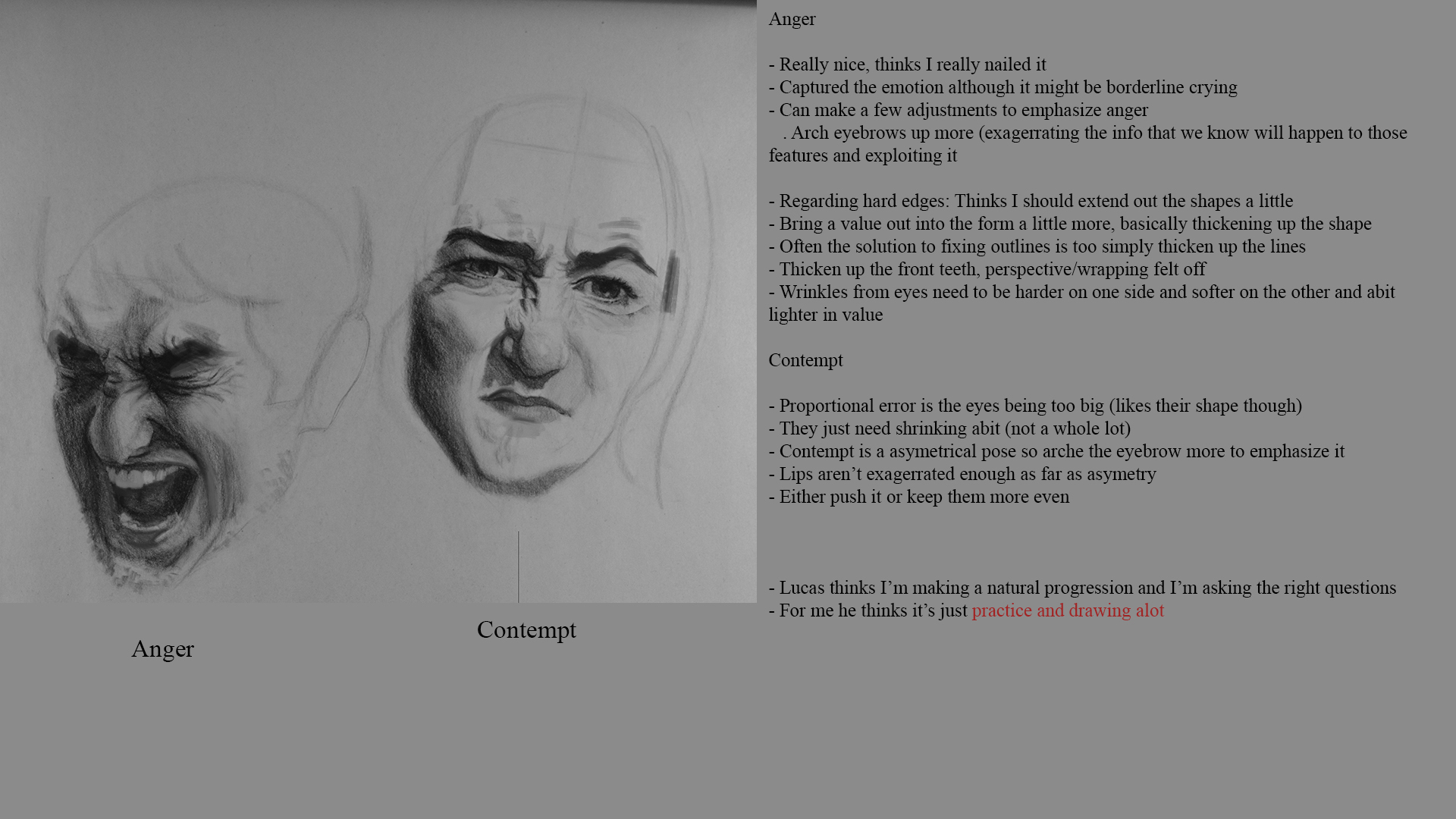
Here are the last few crits from the live streaming classes.
Lucas


Erik


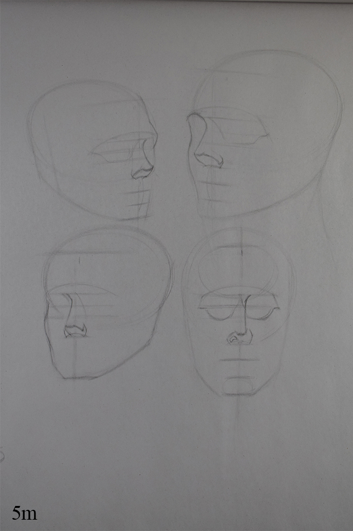
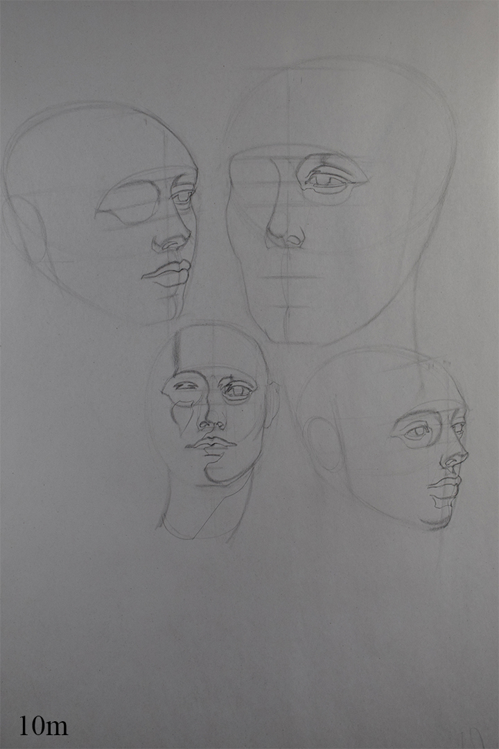
And a head from imagination tonight, was having a tough time focusing and picturing a head angle in my head that I wanted to practice. Tried recalling Loomis and constructing my head using his method. I really want to go back and ingrain his head lay-ins from as many different angles as possible as I still find tilts to be difficult depending on the degree of the tilt.

I've been looking through Donato Giancola's instagram lately and I love his sketches for possible illustrations as it's the type of work that I'd like to do, it's giving me an itch to do some figure invention but i'm still terrible at it. When the next Watts term starts I was just gonna work on the figure for the next 3 months or so, been watching a few of the moderndayjames videos on youtube and I really admire how he can effortlessly rotate an imaginary head or figure and would like to do the same.
Thinking I might purchase a few of his figure videos and practice his appraoch to drawing the figure during the next 3 months and work on my figure invention and start exploring ideas similar to Donato's sketches.
Posts: 2,817
Threads: 15
Joined: Jun 2013
Reputation:
109
Posts: 485
Threads: 2
Joined: Feb 2017
Reputation:
5
Some heads from tonight, made some proportioanl errors, especially on the bottom one, just need to draw more.

Thinking of buying some of those figure videos I mentioned yesterday and working on that for the next few days in my sketchbook and have some fun. :)
Posts: 485
Threads: 2
Joined: Feb 2017
Reputation:
5
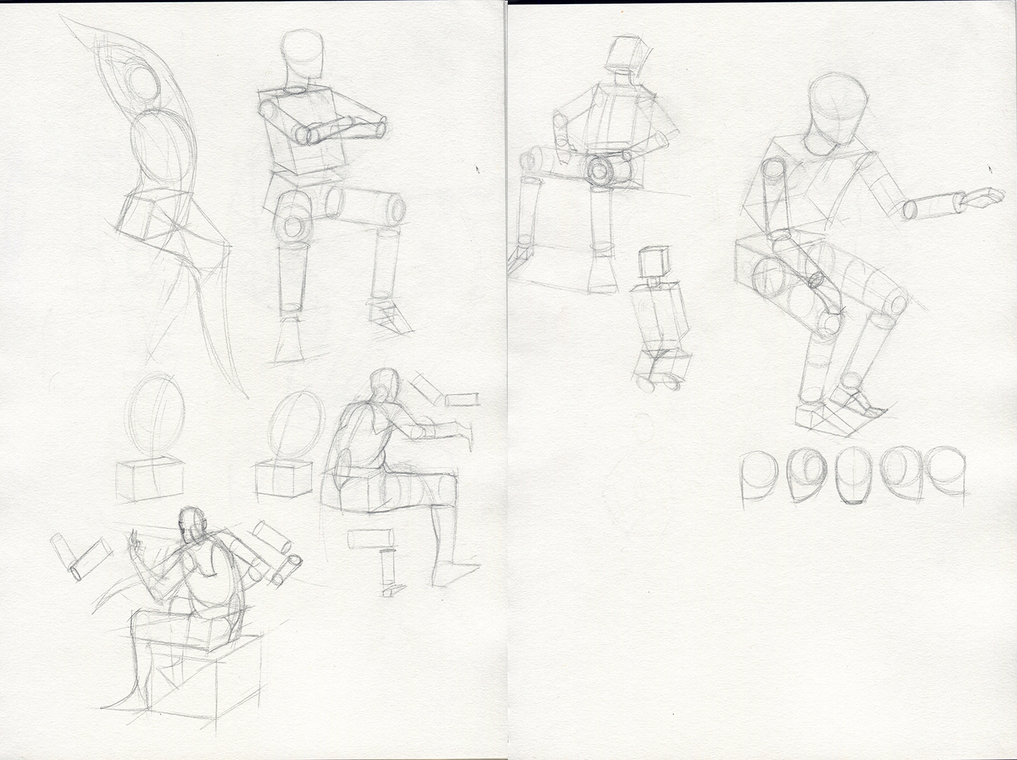
Bought some of moderndayjame's gumroad videos (the figure bundle to be exact), seems to be informed by Scott Robertson's book and uses alot of perspective knowledge when constructing his figures, would be lying if I said I wasn't confused by some of what he said.
I really like how he can easily rotate the figure and draw it from any angle so I'll have to go back through Scott's book and try and understand it. Still find foreshortening a problem and James seems to understand it well, again it appears to be perspective knowledge so I'll need to find time to really learn it!
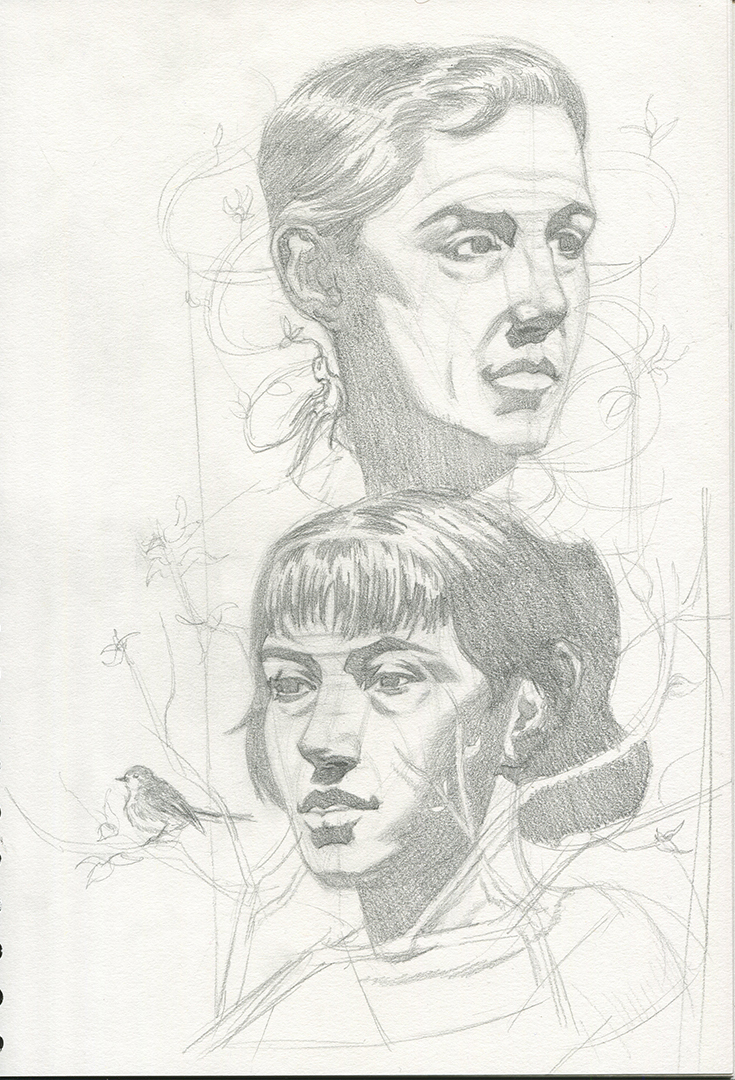
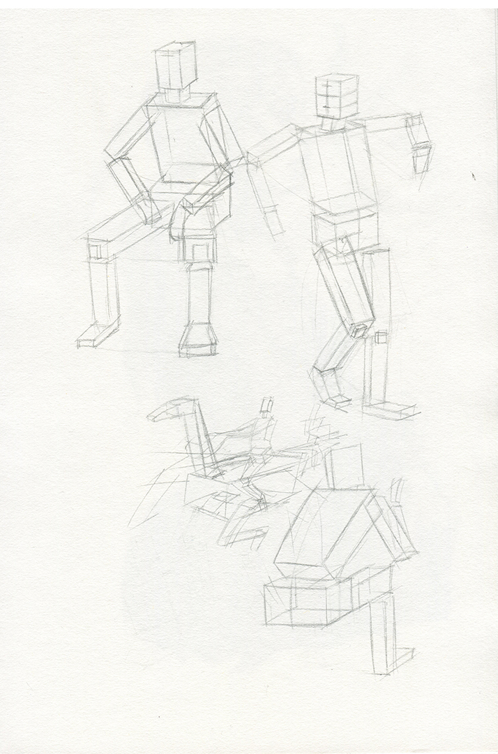
Here is some inventive work from the last 2 days. Been sticking to very basic construction to help me with posing the figures easier but still having trouble with coming up with interesting poses or trying to convey an action or emotion so I definitely need to work on my visual library. Rather crude drawings, most of the time I just struggled with thinking of an interesting pose rather than just static ones.


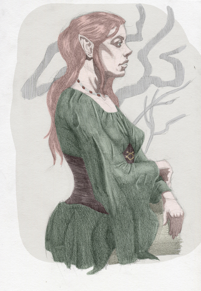
Here's a sketch that I developed more. Looked at an image of clothing to help me with the design since I was having difficulties and thre some colour on top of the sketch in photoshop. I was originally oging to leave it at that but I quite liked how it looked so I'm thinking of rendering it out digitally, well try atleast haha.


Posts: 2,817
Threads: 15
Joined: Jun 2013
Reputation:
109
for sketching dynamic poses, try to imagine flying or jumping poses like superman, that got my head outside the box :)
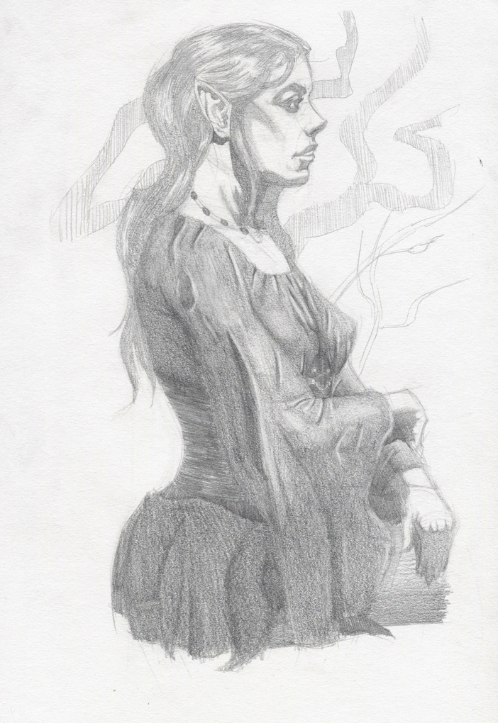
I think your elf chick is a solid effort, she has some things that really holds it back, for instance, i think the way youve indicated her cheekbone with the hard shadow makes her face look harsh, and un feminine, maybe shade in some more to make it softer below it or blend it into a soft edge.
I think her deltoid would hook further to the left on her back,youre showing the bicep compressing but not the deltoid, women of that body size youre drawing tend to have chunkier arms that really compress against the ribcage. Her breasts are... i mean theyre not placed terribly its just they seem really tight against the contour, whilist shes wearing this seemingly baggy dress.
And her hands are not really interesting, like they feel very stiff like if she had her hands in the pose youre going for theyd probabyl be relaxed at the fingers, not tight together. and the other hand may clasp the arm going underneath it. her face is okay, but she kind of has this plain jane look, her jaw isnt very feminine, the steep shadow under her lip isnt becoming, her nose seems a little pointy, and her eyes could be further back but they are probably the most attractive part.
and its odd like her necklace wraps her neck shape but her hair seems to just tangent on the end of her neck instead of reacting to the neck. women with long hair, seldom does it have that perfect contour against the neck, it can drape over their shoulder, or twist around from movement; love the effort though peter, its a step up :)
Posts: 485
Threads: 2
Joined: Feb 2017
Reputation:
5
(04-08-2019, 03:56 AM)Fedodika Wrote: for sketching dynamic poses, try to imagine flying or jumping poses like superman, that got my head outside the box :)
I think your elf chick is a solid effort, she has some things that really holds it back, for instance, i think the way youve indicated her cheekbone with the hard shadow makes her face look harsh, and un feminine, maybe shade in some more to make it softer below it or blend it into a soft edge.
I think her deltoid would hook further to the left on her back,youre showing the bicep compressing but not the deltoid, women of that body size youre drawing tend to have chunkier arms that really compress against the ribcage. Her breasts are... i mean theyre not placed terribly its just they seem really tight against the contour, whilist shes wearing this seemingly baggy dress.
And her hands are not really interesting, like they feel very stiff like if she had her hands in the pose youre going for theyd probabyl be relaxed at the fingers, not tight together. and the other hand may clasp the arm going underneath it. her face is okay, but she kind of has this plain jane look, her jaw isnt very feminine, the steep shadow under her lip isnt becoming, her nose seems a little pointy, and her eyes could be further back but they are probably the most attractive part.
and its odd like her necklace wraps her neck shape but her hair seems to just tangent on the end of her neck instead of reacting to the neck. women with long hair, seldom does it have that perfect contour against the neck, it can drape over their shoulder, or twist around from movement; love the effort though peter, its a step up :)
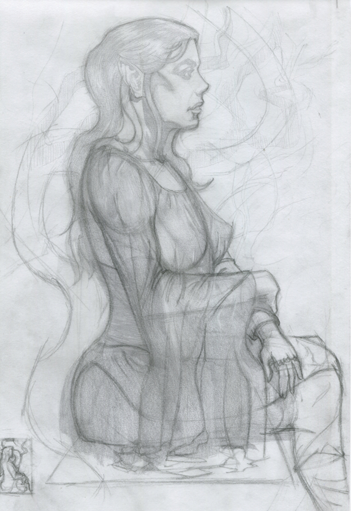
Thanks for such in-depth feedback :) wasn't aware of some of the issues until you pointed it out such as the placement of the deltoid!! I've taken what you said into account and did a trace over to try and fix those issues.
p.s. tried blending the shadow shape of the cheek quite a few times with my finger but my finger is roughly the size of her head so can't quite manage it, i'll just make a note of it when it comes to painting.
Posts: 485
Threads: 2
Joined: Feb 2017
Reputation:
5
Spent today re-working elements of the sketch I posted yesterday thanks to Fedodika's advice, I was hoping to spend hgalf my time fixing the sketch and the rest of my time working on master studies like I originally planned, might move that to next week and work on this illustration this week. Still not happy with her hand but no matter how many attempts I did I couldn't make it look nicer, used some photo ref to help so I might try and re-work it again tomorrow but might just leave it and accept that is the best I can do atm rather than agonizing over it.
just trying to figure out the background now, had the image of winding trees in the background but having a tough time composing it nicely. Thinking of positioning her on a tree branch just not sure if I should be concerned about perspective or not and working out if it's correct or not or if it even matters with this particular drawing or not?


Posts: 2,817
Threads: 15
Joined: Jun 2013
Reputation:
109
for the background just try a plain flat circle, keep it simple and dont get bogged down on other things while youre still trying to execute a nice figure. i also like the little tree or shape you have going behind her, just making that a flat graphic shape could look nice. you drew a nicer pose for the hand but now its too small, like a childs hand. Like if she were to put her hand on her chin, itd barely cover her nose. Put your own hand on your chin, it'll probably come up to your brow ridge.
the other resting hand looks weird, like it ends too abruptply like your hiding it intentionally. I didnt notice before she was sitting, i think it looks strange, itd probably be better if you just have her dress cut off and shes standing within the abstract shape. when someones sitting you have to like draw in other things in the scene to show they're sitting, but i feel that her doing that adds nothing to the scene but clutter. It wouldnt really affect the impact of the piece if she were doing either.
Its like i told chubby cat, dont hide those hands they are some of the biggest opportunities you have to show character. we as humans constantly look at hands, our own and others, they do everything we do, hiding them is nooby looking. her arm definitely looks better, her dress, its just too tight against the titties, if you google "medieval dress" you wont find one dress that is that tight against the breasts and shows a perfect outline of the nipple. Hell even Elviras dress isnt that tight! good job fixing the hair btw
If you even look at my raven piece i looked up body suits and found none of them perfectly outlined the breast, its quite unusual for that to happen unless the body suit has some kind of ringlet to split them like Taki from Soul Calibur (but even most cosplayers dont pull off that split.) theres always this wrinkle between the masses. you could probably get away with it in anime, but not in realism. I just cannot find a bodysuit or a dress that hugs bosoms that tight, its weird i know!
however! if your dress was like a really loose fabric, it might drape over like that if her arm was tucking under the middle its just the way youve drawn it, specially with the green the fabric looks thicker.
You did improve the image though, it is easier on the eyes, just has some goofy stuff, i believe in u!
|


