Posts: 99
Threads: 1
Joined: Aug 2016
Reputation:
2
(11-02-2019, 11:51 PM)Fedodika Wrote: wasup allen, it seems you have a lot of mileage already, i think you have an idea of an appealing style, i think youd benefit a lot from studying artists with a different shape language to your own, or at least a more refined one, like leyendecker for example. that, or some longer more sustained studies of a subject matter, like really drilling into how to draw and render a hand with all its planes in tact, showing a complete understanding of form.
I think your characters in the dragon sketch above are cool, but their poses are very stiff and i feel theres some story in the picture but i cant tell what it is. i guess the characters are afraid of the dragon? His pose isnt very aggressive, it kinda looks like he wants a hug but just has a neutral dragon expression. Theres a lot of angles one could play with to show the hostility, like making him dramatically bigger and more intimidating than the others. that and you are showing the characters all "cheating out" facing the audience, when you know, you are an artist and you can show the back of their head, and if they have those features we expect from them, they will still read as that character ;) Heya Fedodika!!
Been away from Crimson Daggers for quite a while, so I hope that even though I haven’t been active here that I still have hopefully improved! If not just a little bit ;)
I think the main reason why they are still is because I didn’t use a reference when I drew the poses, they felt less stiff during the sketching phase so I think that I potentially wasn’t fully able to capture the same kind of...fluidness??? (is that even a word? oh well)
But I do actually have a good explanation for the whole “danger who?” that you mentioned! Basically this drawing was mainly to illustrate a situation that happened in one of the many DnD sessions I’ve been in! Basically that dragon dude isn’t a threat here, instead what is suppose to be happening here is that everyone is surprised over the fact that the lad who is sitting on that gal in the drawn (which is also my character. the gal currently being sat upon) just teleported in basically.
However now that I look the drawing over I didn’t illustrate that at all, it just looks like the lad is sitting on her x’D. (and 100% I wanted to show my bud that I play DnD with all of their characters head on, so I basically scened this like a theatre) But.... I know this all sounds like excuses tbh so next time I’ll think more about the composition!
I could have angled this all in a way that could have show some of the characters faces more naturally than I am doing in that drawing. So you’ve given me something to think about at least!
And thank you a lot for the recommendation about studying different artists! I very recently did a study of Alphonse Mucha (at first for Uni, but then for fun) and I did a couple of drawings based upon what I gathered from studying his works a lil bit, so I will most definitely check out Leyendecker! So thank you for the tip!
Posts: 99
Threads: 1
Joined: Aug 2016
Reputation:
2
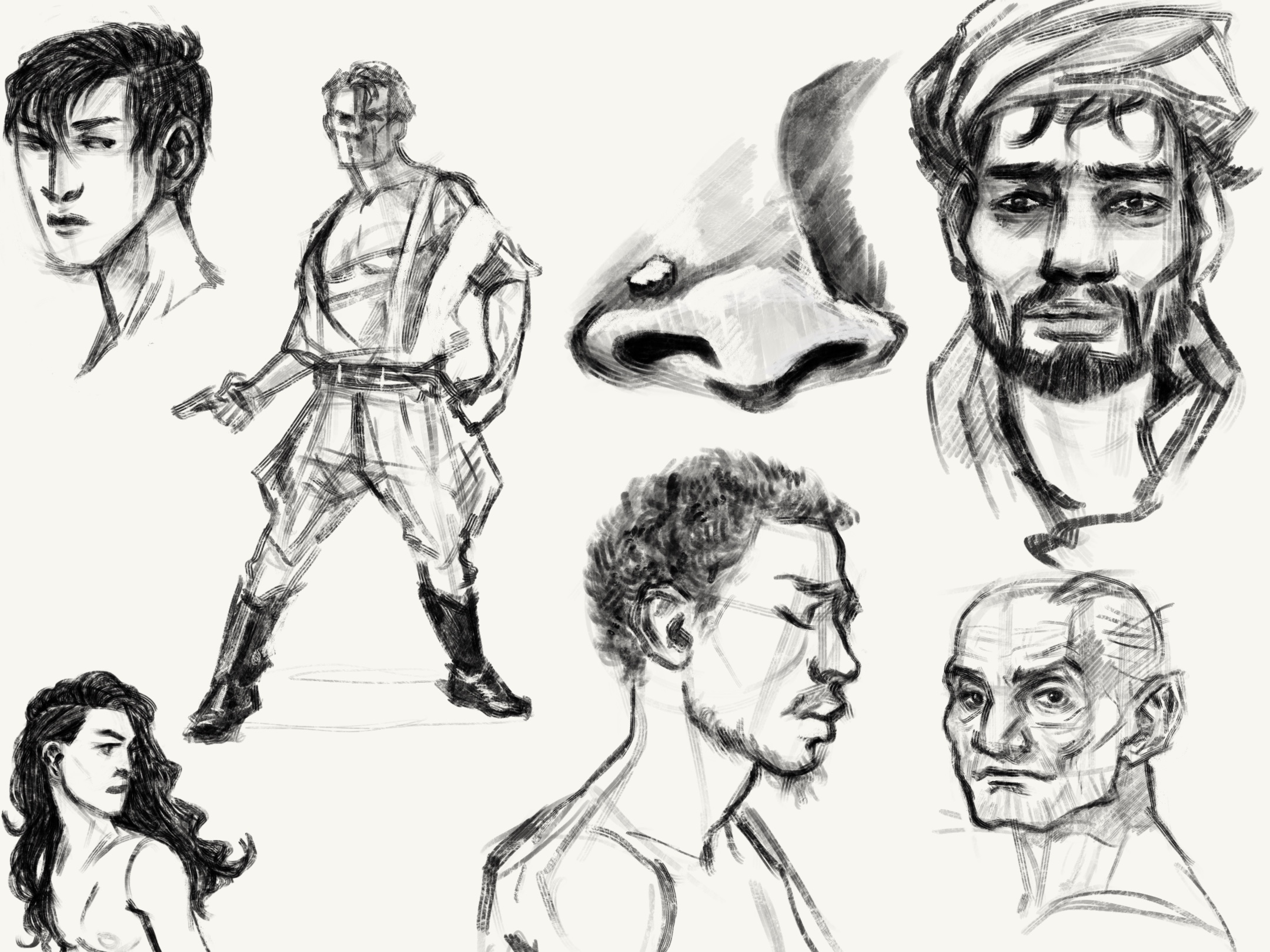
Did some late night face studies (and also a full body study because man I need to kick myself out of my comfy-zone x). )
Posts: 99
Threads: 1
Joined: Aug 2016
Reputation:
2
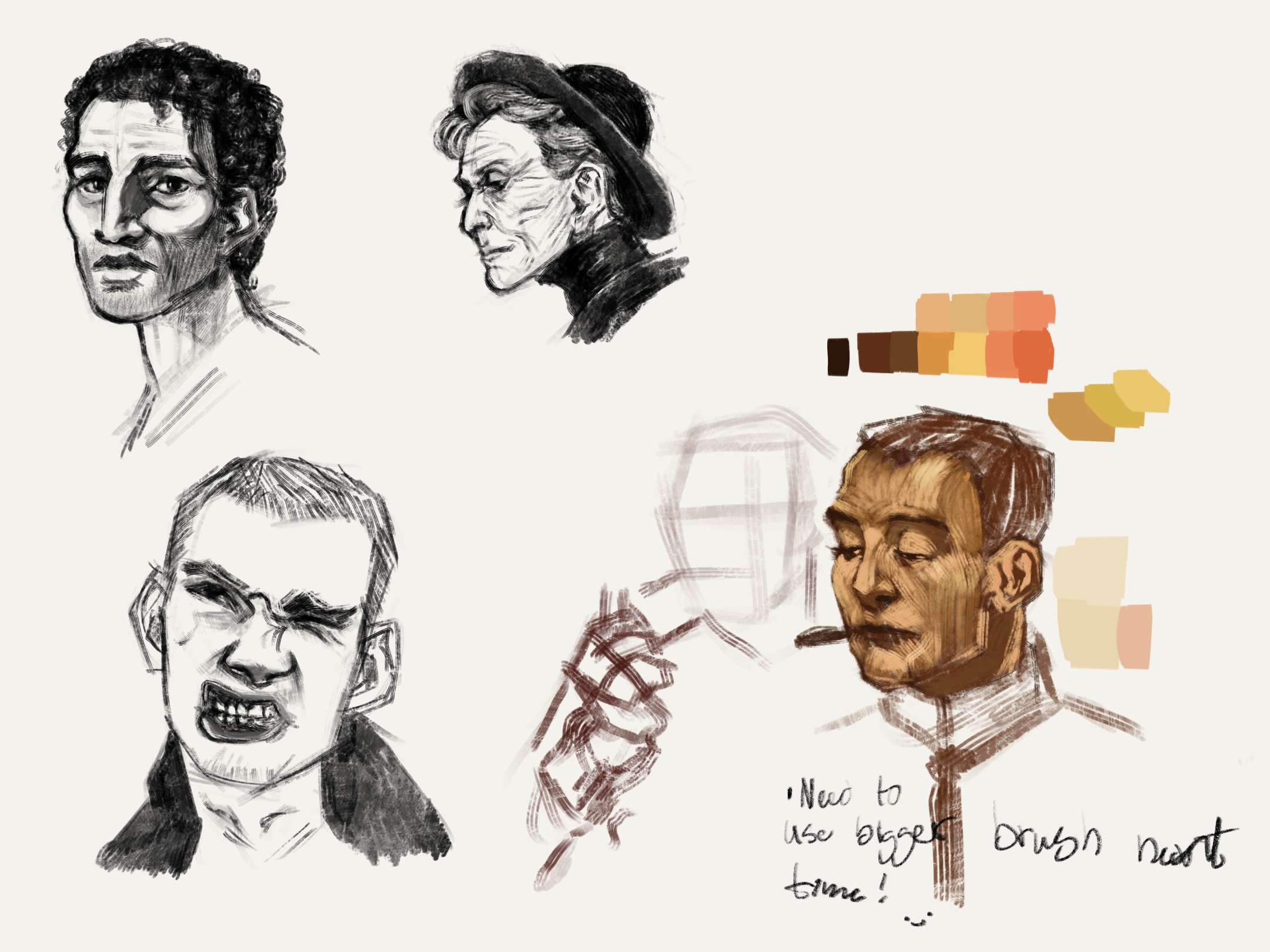
did some more portraits today, decided to step away from the normal mid 20ish ladies that I usually draw and instead focus on men and older people in general. Pretty fun and not something I usually do! So I want to keep doing it just so I can get a better visual library of peoples faces and such.
Also did some quick look over of one of Leyendeckers pieces, had a piece side by side as I was painting and it ended up being mostly be just looking over the brushstrokes he made and comparing that to whatever kind of brushstrokes I could get out of procreate. I need to spend some more time looking over his pieces and also use a bigger brush which is something I realised would probably have worked out better if I had just started with that in the first place, but you live and learn!
I did however enjoy just sitting back trying to pick the colours that I thought was the most similar to the pieces I was looking at, however I decided to do a mini challenge by basically not allowing myself to colour pick from the Actual piece, instead I made sure to have it on the side so I could only look at the colours but not pick to then use while I was doing a smaller study.
That was fun! gonna do this more and hopefully next time it might look a lil better than it does now x’D because right now it doesn’t look super great, but hey it’s just the start after all, not everything will look good at the start which is why it’s a start after all.
Will go back to some more drawing now, but I’ve been thinking about uploading some previous sketches that were 100% something that I made while looking at Alphonse Muchas stuff, so that might be fun! it’s also traditionally made, aka no digital stuff happening!
Posts: 374
Threads: 16
Joined: May 2013
Reputation:
59
If you want to get out of your comfort zone, what I would suggest is a more visual approach to drawing. What you've been doing is a lot more of a conceptual approach. You're trying to describe the forms and structure and the "things" of the subject. What I suggest is that instead of trying to draw the "thing", you draw what the "thing" looks like.
Hope you don't mind but I did this quick paint-over to suggest what it could possibly look like. This isn't to say "THIS IS HOW YOU DRAW" but rather just a way to show how the thing you did draw could be represented in a more visual approach. Now of course I didn't have the reference you did so I just sort of guessed and draw it from my imagination, the idea is the same. I tried to emulate your scratchy style of drawing to not make the difference so jarring.
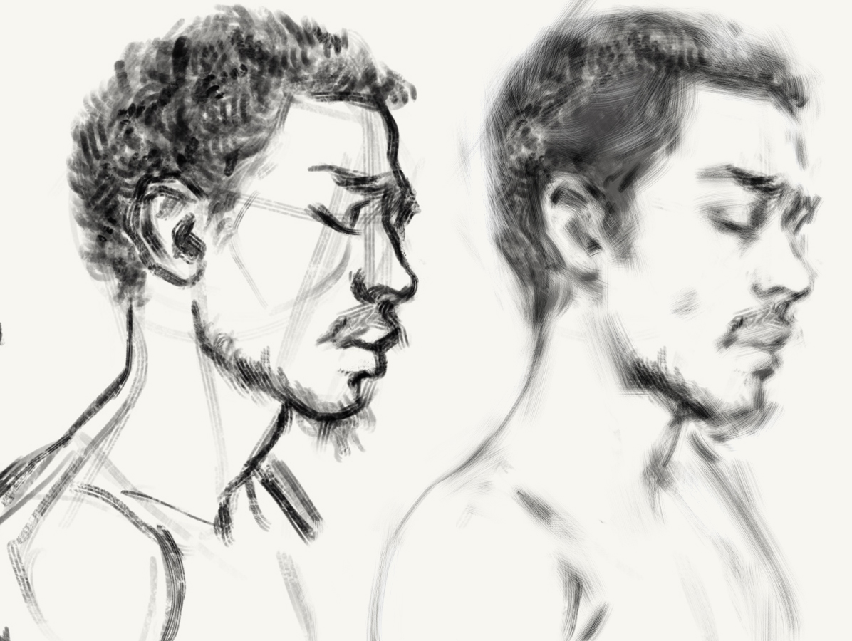
The idea being that our drawings in a sense reflect the visually relevant information and by doing this, convey the form and impression of the subject in a more naturalistic way.
So a way to study using this approach is to squint down real far and just look for the basic impression of what you see. Then you try to draw that impression, avoiding any and all details you see when you're looking at the subject with your eyes wide open. What this does is that it puts the visual information in a more clear order, telling you what is fundamental and hiding any details or half-tones that would distract you. It's a very old technique but it is very very effective.
What you then have to pay attention to when doing this is what things actually look like. It can be difficult because the mind has a tendency to impose an idea on top of what we see, and this can distract us from seeing the world accurately. We all have these tendencies and a good artistic education is largely about overcoming them to see the world more as it truly appears and be able to represent it accurately. It is of very big importance that the things we draw in paint are represented the way they actually appear, with the right contrast to its impression. The best way to see what the impression actually is without the details distracting you is to squint and follow that more fundamental big impression
When you have an organised drawing that is careful with what information it includes, it puts extra pressure and weight on that information. So if you have to block in a head in 10 lines, those lines become very important and you have to first select the important information fundamental to the impression and then draw them it correctly for it to read well. This is hard to do because you have little to hide behind and a great weight is put on your skills to see and draw accurately. However it is also easier because when you're working with a drawing, you don't have 100 different lines to keep track of, you have a handful of very important lines.
You do a lot of construction lines in your drawing and it's something I want to touch on. The thing with "construction" lines is that they don't exist. They exist in your head, they're a concept you're projecting on to a subject but they are not an inherent part of the subject itself. So with things in your head, I'd argue that they're best if they stay in your head, at least when they don't appear visually. This way you can keep your drawing or painting focused on looking like what it's supposed to look like and it frees you up to better be able to judge the image. Like when doing a "construction drawing" of a head or something and there are a bunch of boxes there, does it look like the thing you're drawing? not really. How do you know you're right in what you drew? you can kind of guess but it becomes harder to see it because your drawing is further away from the visual impression of the subject.
What you can however do is use these concepts of construction to help orient yourself in your drawing, to help you select the critical information and to help in designing a block in that is both visually appropriate and conveys some of the structural qualities in a "construction" method. The advantage of this is that you get the structure of a constructed drawing but you don't have all these ugly abstracted lines cluttering your drawing, so instead you can focus on the critical information for your drawing. I did a quick example of this just to illustrate the point.
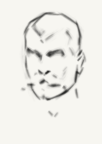
So in this drawing, there are no construction lines. What I did was I drew something from my imagination just focusing on what would be the visually important information but I used ideas about construction to aid me when simplifying and designing the block-in. I would really encourage this if you're interested in a structural approach to drawing because it lets you see what you're actually doing rather than working blindly as is done in pure "construction" techniques. So it keeps the theoretical stuff in your head, and it keeps the visual stuff on the paper/canvas/screen, and it keeps them from interfering with one another.
Now of course, if this doesn't resonate with you, that's perfectly fine. There are many ways of drawing and it's good to learn several to find which ones resonate with you and are effective.
Ps. I haven't gone back over and edited this post, going to bed as soon as I hit "post" so sorry if there are half-finished thoughts there (as I often leave).
Discord - JetJaguar#8954
Posts: 99
Threads: 1
Joined: Aug 2016
Reputation:
2
(11-05-2019, 07:48 AM)Tristan Berndt Wrote: If you want to get out of your comfort zone, what I would suggest is a more visual approach to drawing. What you've been doing is a lot more of a conceptual approach. You're trying to describe the forms and structure and the "things" of the subject. What I suggest is that instead of trying to draw the "thing", you draw what the "thing" looks like.
Hope you don't mind but I did this quick paint-over to suggest what it could possibly look like. This isn't to say "THIS IS HOW YOU DRAW" but rather just a way to show how the thing you did draw could be represented in a more visual approach. Now of course I didn't have the reference you did so I just sort of guessed and draw it from my imagination, the idea is the same. I tried to emulate your scratchy style of drawing to not make the difference so jarring.
The idea being that our drawings in a sense reflect the visually relevant information and by doing this, convey the form and impression of the subject in a more naturalistic way.
So a way to study using this approach is to squint down real far and just look for the basic impression of what you see. Then you try to draw that impression, avoiding any and all details you see when you're looking at the subject with your eyes wide open. What this does is that it puts the visual information in a more clear order, telling you what is fundamental and hiding any details or half-tones that would distract you. It's a very old technique but it is very very effective.
What you then have to pay attention to when doing this is what things actually look like. It can be difficult because the mind has a tendency to impose an idea on top of what we see, and this can distract us from seeing the world accurately. We all have these tendencies and a good artistic education is largely about overcoming them to see the world more as it truly appears and be able to represent it accurately. It is of very big importance that the things we draw in paint are represented the way they actually appear, with the right contrast to its impression. The best way to see what the impression actually is without the details distracting you is to squint and follow that more fundamental big impression
When you have an organised drawing that is careful with what information it includes, it puts extra pressure and weight on that information. So if you have to block in a head in 10 lines, those lines become very important and you have to first select the important information fundamental to the impression and then draw them it correctly for it to read well. This is hard to do because you have little to hide behind and a great weight is put on your skills to see and draw accurately. However it is also easier because when you're working with a drawing, you don't have 100 different lines to keep track of, you have a handful of very important lines.
You do a lot of construction lines in your drawing and it's something I want to touch on. The thing with "construction" lines is that they don't exist. They exist in your head, they're a concept you're projecting on to a subject but they are not an inherent part of the subject itself. So with things in your head, I'd argue that they're best if they stay in your head, at least when they don't appear visually. This way you can keep your drawing or painting focused on looking like what it's supposed to look like and it frees you up to better be able to judge the image. Like when doing a "construction drawing" of a head or something and there are a bunch of boxes there, does it look like the thing you're drawing? not really. How do you know you're right in what you drew? you can kind of guess but it becomes harder to see it because your drawing is further away from the visual impression of the subject.
What you can however do is use these concepts of construction to help orient yourself in your drawing, to help you select the critical information and to help in designing a block in that is both visually appropriate and conveys some of the structural qualities in a "construction" method. The advantage of this is that you get the structure of a constructed drawing but you don't have all these ugly abstracted lines cluttering your drawing, so instead you can focus on the critical information for your drawing. I did a quick example of this just to illustrate the point.
So in this drawing, there are no construction lines. What I did was I drew something from my imagination just focusing on what would be the visually important information but I used ideas about construction to aid me when simplifying and designing the block-in. I would really encourage this if you're interested in a structural approach to drawing because it lets you see what you're actually doing rather than working blindly as is done in pure "construction" techniques. So it keeps the theoretical stuff in your head, and it keeps the visual stuff on the paper/canvas/screen, and it keeps them from interfering with one another.
Now of course, if this doesn't resonate with you, that's perfectly fine. There are many ways of drawing and it's good to learn several to find which ones resonate with you and are effective.
Ps. I haven't gone back over and edited this post, going to bed as soon as I hit "post" so sorry if there are half-finished thoughts there (as I often leave).
Heya Tristan!
thank you so much for your comment! I’ve read through it a couple of times and I think I understand what you are talking about, I’ll admit that squinting while looking at a photo and drawing isn’t really...well the most comfortable thing I’ve done and while also not using any construction lines during the entire process made me very unsure if I drew things in the correct places.
I’ve always more or less used construction lines to figure out where everything is and where it should be, and usually when I make those portraits that I’ve done earlier I am sketching everything out on the same layer, so I don’t really bother to remove the lines at all, which I guess is kind of biting me in the ass depending on how you see things.
I have to tell you thought that I had a bit of a hard time fully understanding what you meant when you spoke of trying to take a more visual approach to drawing instead of a conceptual approach, so I apologise if I didn’t fully understand fully what you were talking about but I reread your comment a couple of times so I think I kind of understood.
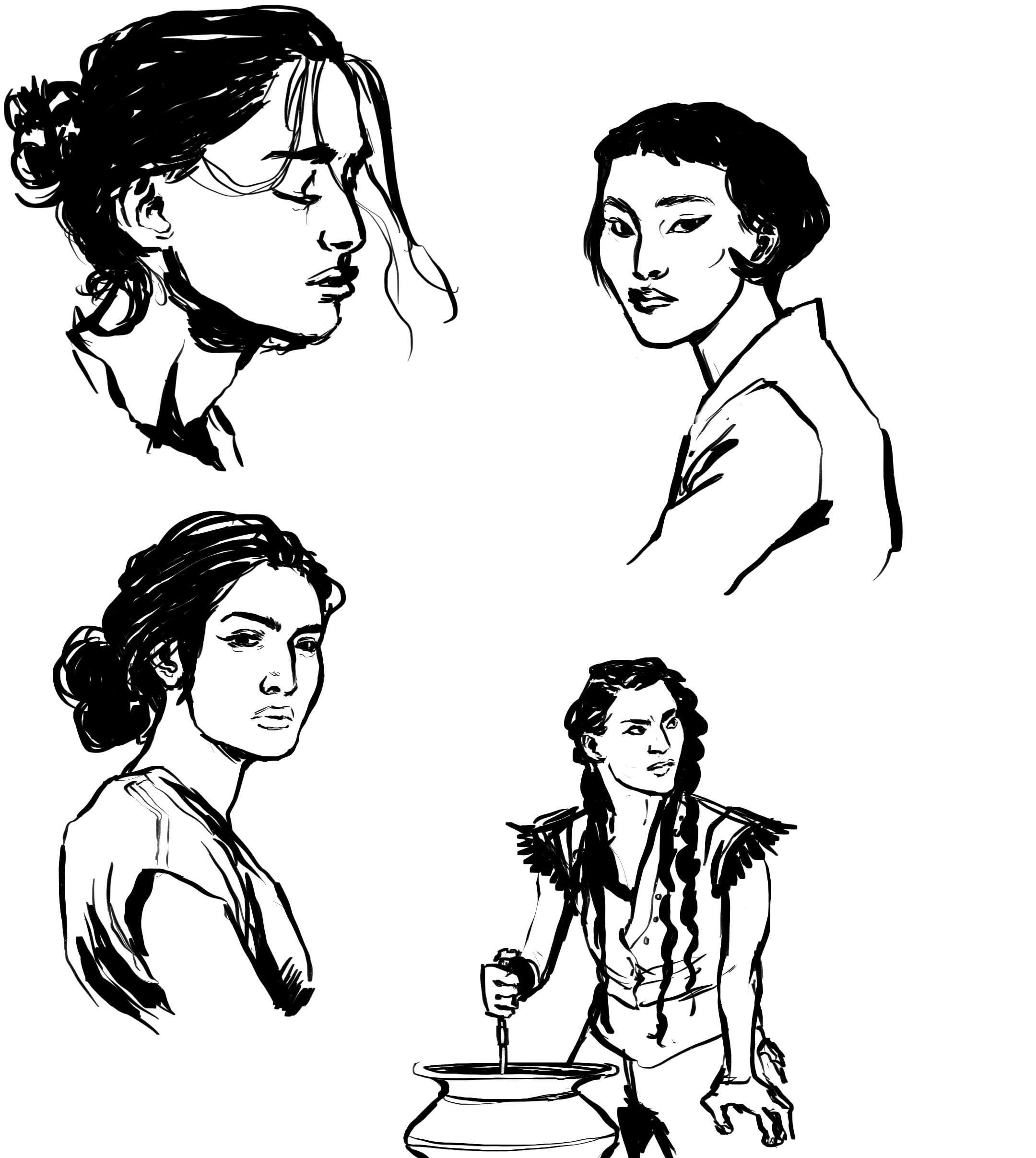
And so I decided to make a few portrait while squinting as you suggested and I also didn’t do any of the normal construction lines that I usually make when I’m drawing. I also decided to add the photos by the side so it’s easier to see where I possibly went wrong and where I did okay.
However, I do wonder if one is suppose to be squinting really hard? Because I can’t imagine that being super healthy for your eyes in the long run if one does it during long periods of time, currently I can feel my face being all weird, so I’ll probably not do anymore of this kind of study tonight.
Once again thank you for the comment, and I hope I didn’t completely misunderstand you!
(sorry I’m Swedish, so English is my second language x,). )
(I probably should start doing that so I can get help with this department more often tbh.)

Posts: 99
Threads: 1
Joined: Aug 2016
Reputation:
2
No construction lines again, did the half body ish right before heading to bed, so it’s not the best, probably gonna redo it when I wake up again.
Posts: 2,817
Threads: 15
Joined: Jun 2013
Reputation:
109
what tristan is talking about is building up the "essence" of a subject... he uses a lot of light lines to find the contours without construction. It seems like youre just using one thick line to show the contour, as if you have to nail the contour with just one line attempt.
http://crimsondaggers.com/forum/attachme...rthing.jpg
See how his lines have low opacity and break up or are even absent in some places on the nose and forehed? Its similar to drawing academically with charcoal on paper, you use light lines and carve them up with an eraser until you get the form youre going for.
or this http://crimsondaggers.com/forum/attachme...alhead.jpg
Hes showing form and structure with just well placed line weight and form. Like the shadow under the mustache, also showing some implied lines like around the hair. Youre kiiiinda doing this stuff, but to me it feels like youre getting a thick pen and making these heavy marks that you have to put a lot of faith in.
try to get a light opacity brush and copy the 2 drawings he left you and try to think through each line and gain that insight, i think it'll help more
Posts: 99
Threads: 1
Joined: Aug 2016
Reputation:
2
ahh okay, I understand it better now, I'll give your suggested practice a go and try out the stuff with a light opacity brush as well :)
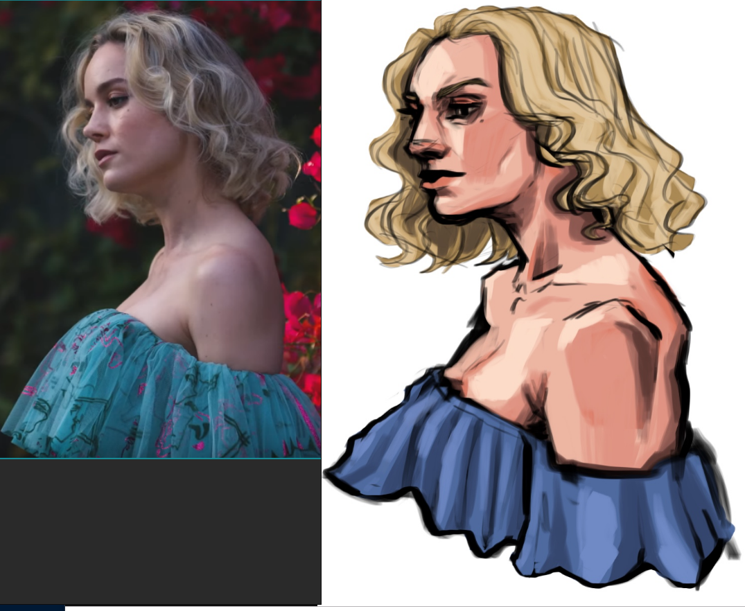
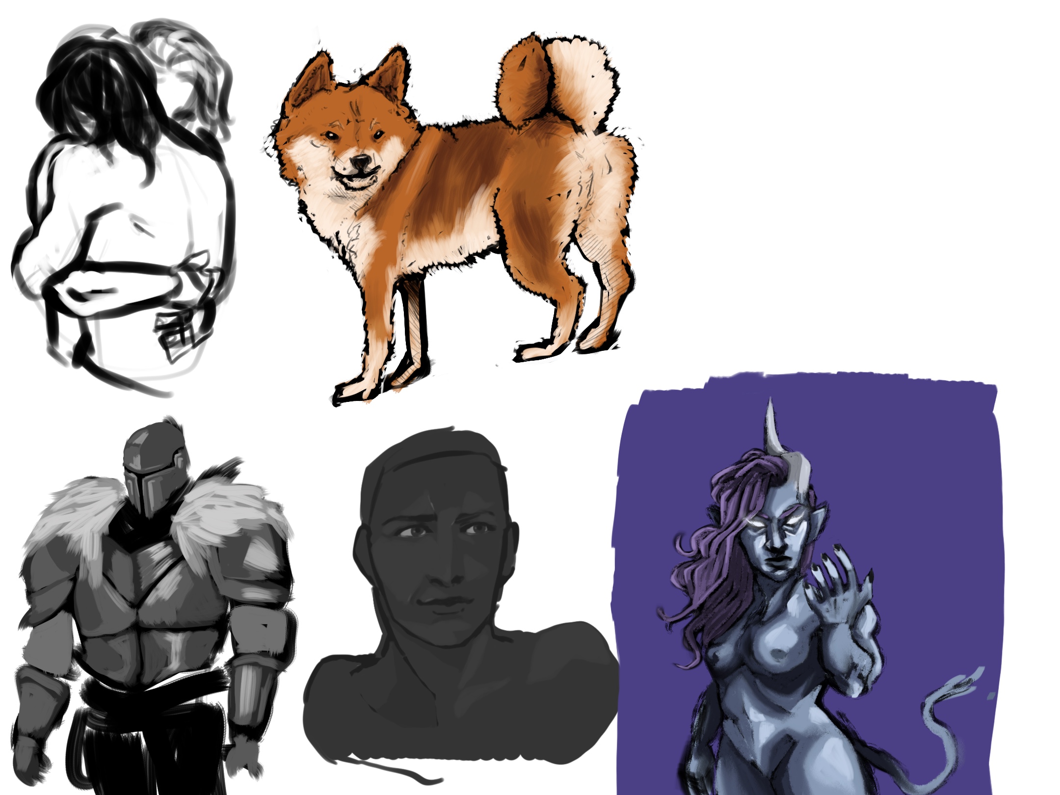
In the meantime, I've always been struggling with lineart and tbh never found enjoyment in doing them. not sure if it's because I'm not really good at them or I just don't enjoy the process of making lineart over sketches I make, so here I tried to go with thing in a different way.
The blue gal in the right corner for example I just had this really sloppy sketch (without a reference I know, should have had one when I was drawing but forgot) and I put colour under the sloppy sketch and then some colour over it.
I also drew a Shiba uni (?) because an npc in a dnd game was that kind of dog.
Posts: 38
Threads: 2
Joined: Oct 2019
Reputation:
0
Hi I like your sketches and was reading the advice others posted on here, thought it was really interesting to try to draw without construction lines (I think I never learned how to draw otherwise so it's a completely new idea to me). I don't really have any advice 'cause I don't think I'm qualified to give any but I'm definitely enjoying seeing what you draw and post on here :)
Posts: 99
Threads: 1
Joined: Aug 2016
Reputation:
2
(11-13-2019, 04:36 AM)drifter93 Wrote: Hi I like your sketches and was reading the advice others posted on here, thought it was really interesting to try to draw without construction lines (I think I never learned how to draw otherwise so it's a completely new idea to me). I don't really have any advice 'cause I don't think I'm qualified to give any but I'm definitely enjoying seeing what you draw and post on here :)
hey Drifter thank you! it was an odd feeling to draw without construction lines x'D if you wanna you can give it a go as well! And don't be worried about being "qualified" or not, if you see something that seems odd you can always point it out even if you are not sure why it looks odd, pointing things out things you notice for people that might not have noticed the same thing can always help. :)
And thank you, it means a lot to know that people enjoy seeing the stuff I post :D
Posts: 99
Threads: 1
Joined: Aug 2016
Reputation:
2
Posts: 2,817
Threads: 15
Joined: Jun 2013
Reputation:
109
why not push it further and try to make it look more like the reference?
Posts: 99
Threads: 1
Joined: Aug 2016
Reputation:
2
Tried to make the colours less shonky, didn’t really touch the lines at all, not sure if I’m shooting myself in the foot or not but honestly I’m losing interest in this drawing the more i fiddle with it x,)

Posts: 3,361
Threads: 37
Joined: Aug 2013
Reputation:
234
I think the line is to heavy it draw away from the femininity you could give to your character also she seem stiff and not graceful.But i guess your not gonna play more with it anymore so i won't bother you more than that.
Posts: 99
Threads: 1
Joined: Aug 2016
Reputation:
2
(11-13-2019, 09:02 PM)darktiste Wrote: I think the line is to heavy it draw away from the femininity you could give to your character also she seem stiff and not graceful.But i guess your not gonna play more with it anymore so i won't bother you more than that.
oh I meant I was getting bored with that drawing, basically (in less nice words) it started to feel like I was trying to put polish on a turd, what I'm going to do is to make another drawing of the same reference since I figure it's better to let a drawing go and try again by redoing everything from the start rather than starring myself blind on the same drawing for hours. That way you have a drawing you can look at where you went one way, while you are making a drawing where you are going another way.
Posts: 3,361
Threads: 37
Joined: Aug 2013
Reputation:
234
Here a few thing i felt when look at the last piece the line where more straight and this create a rigidity a boxy feeling you might want to avoid for certain reason try to focus on nice curve i think it ok to stylize but you need to understand what your line can do to your figure.On organic object it generally make object become more stylize but it can also drive away from femininity for example making a chin more angular will create a more masculine character.For the cloth you also did that stylistic thing but it change on the fabric read is no longer a thin and light fabric it become more stiff and thick and heavier.Lastly for the way you approached the light and shadow it really a sharp transition of value compare to the soft natural value gradation of the skin.Overall those artistic choose contribute to creating a more muscular and stiff looking character than you might have wanted.
Posts: 369
Threads: 6
Joined: Sep 2019
Reputation:
23
You removed the tilt of her head but kept the neck shape for the tilt, which creates some weird posture. Maybe that's what bothers you about it?
Squinting should be used sparingly to not harm your eyes indeed. Squint on the model, not your work, once in a while. Squinting blurs and desaturates the view - if you are studying from a picture you can process it by blurring and grayscaling it instead of squinting at it. Downscaling helps too to reduce the amount of detail.
|


.jpg)
