04-27-2020, 08:11 AM
More attempts, I'm finding it slightly more enjoyable even when I still get my wires crossed.
|
Rotohail's "Reclusive" SketchBook
|
|
04-27-2020, 08:11 AM
More attempts, I'm finding it slightly more enjoyable even when I still get my wires crossed.
04-27-2020, 11:03 AM
Nice dramatic lighting in those value practices. Looks convincingly metallic. What got you on a fantasy weapon kick?
I like that the designs are fairly restrained. That can be refreshing after too much of THUNDERFURY, BLESSED BLADE OF THE WINDSEEKER. The only thing I wanna comment on, design-wise, is that the pommels on some of the swords look a bit small, like they'd fly outta your hands if your grip slackened on them a bit. It's just a nitpick though, not sure if it's strictly incorrect or not.
05-01-2020, 10:22 AM
(04-27-2020, 11:03 AM)Pubic Enemy Wrote: Nice dramatic lighting in those value practices. Looks convincingly metallic. What got you on a fantasy weapon kick? I don't know but I've been craving Dark Souls ha ha, so there's that! I had to check that thunderfury thing, world of warcraft? lol, I had not seen anything since like a decade ago, I used to like a lot to watch the armors concepts back when I was on my teens. All in awe. Many thanks! Good catch, yeah I had not realized they should be wider to not let the hand slip. I honestly don't know anything about weapon design lol, gotta do some research. Some randomness from the last days, some thumbnails I'm not sure if pursue at least one of them. Characters I'm lukewarm about them, they have many issues (the brute has plenty), but I'm trying to from now on always do shading and/or quick color. The running one is a retry on an old one I did, back like 6 months ago? Still not hitting some things, trying to think a bit more on keeping the point of interest consistent between frames, but the double side view feels, not as punchy, better for silhouette tho. The last is a sort of Stalker influenced but with a happier tone? (sunnier lighting, more colorful) Thought might be funny to try. So, lot of hay, technically I was supposed to pursue something and finish it this week but I keep dancing around stuff. 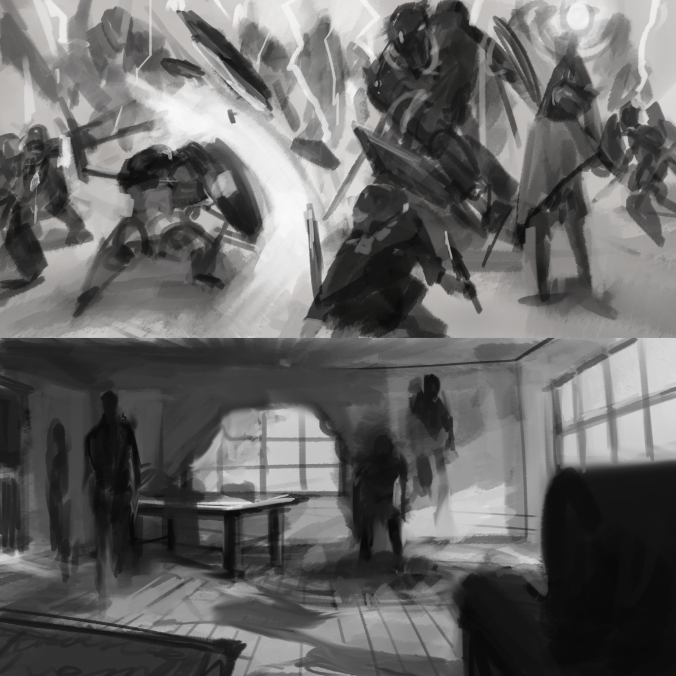 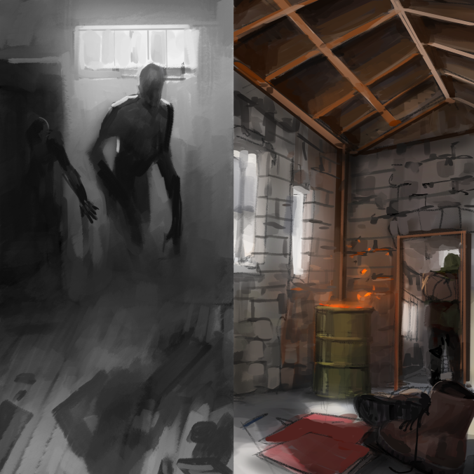 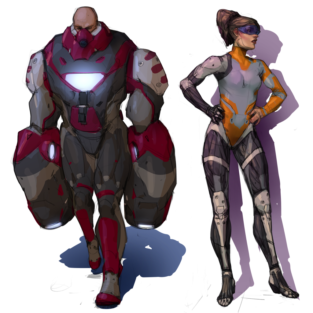 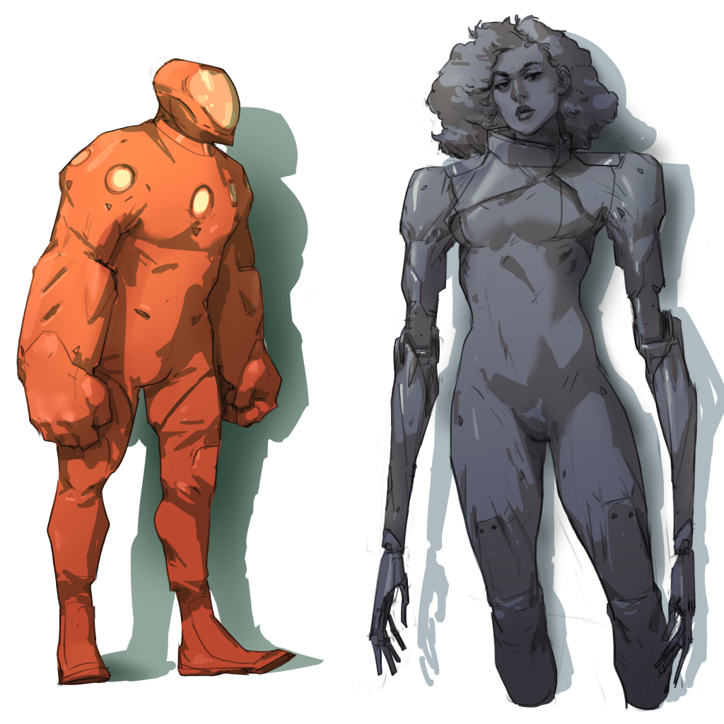 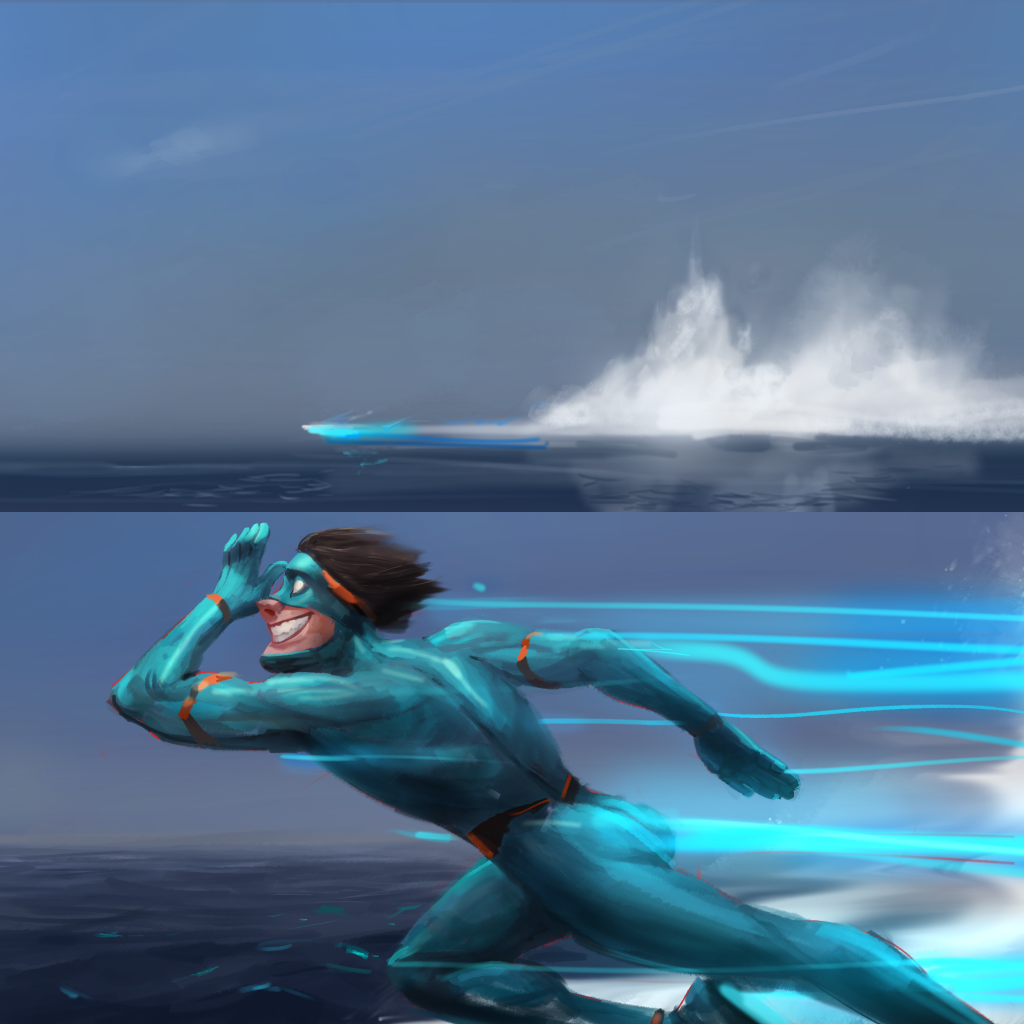 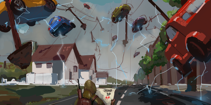
05-03-2020, 05:18 AM
I thought the last one looked like "happy STALKER" before I read your text, so good job!
Really nice stuff, as always; your sketches always look very appealing and expressive. The thumbnails with dark figures make me think of ghost stories about "shadow people". The perspective on things like the floating cars in the happy STALKER picture is very convincing; do you use 3D for those or freehand?
05-04-2020, 08:02 AM
(05-03-2020, 05:18 AM)Pubic Enemy Wrote: I thought the last one looked like "happy STALKER" before I read your text, so good job! Goal achieved! Ha. Expressiveness is something that I really strive for, I honestly lose sleep about it. I'm not familiar with those stories but I'm gonna go check them out now! I was probably thinking about Spectral, I honestly enjoyed that movie too much ha ha. So eerie and the gun/armor design rocks. All freehand for now (you can even still see some of the lines I used to ballpark the vanishing points lol), I gotta say there's plenty wrong with the perspective as of now, it's more a composition thumb (and light also). I would like to rework it wholesome, I ended up pursuing another painting instead. Leaving, a painting I found easier to approach for this week challenge (to do something lol), I would like to work it more now, details, define the creature actual scales/fur. I did play it safe with the creature when I would have liked to go crazy but creature design, I struggle as of now, need to do studies, but I was not getting any good ideas and had to finish it. Anime girl is a response to another's artist work, to welcome them back. Sketch is about me trying for consistency when changing a character expressions, I need to work on that, and then some random idea that I found funny at the time tho (mainly due to coronavirus lockdown spiking alcohol consumption over here like crazy, almost doubling sales ha ha (some people are gonna be quite happy, for all the wrong reasons lol). 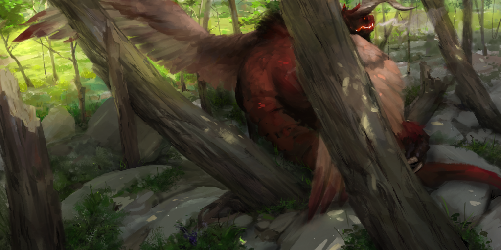 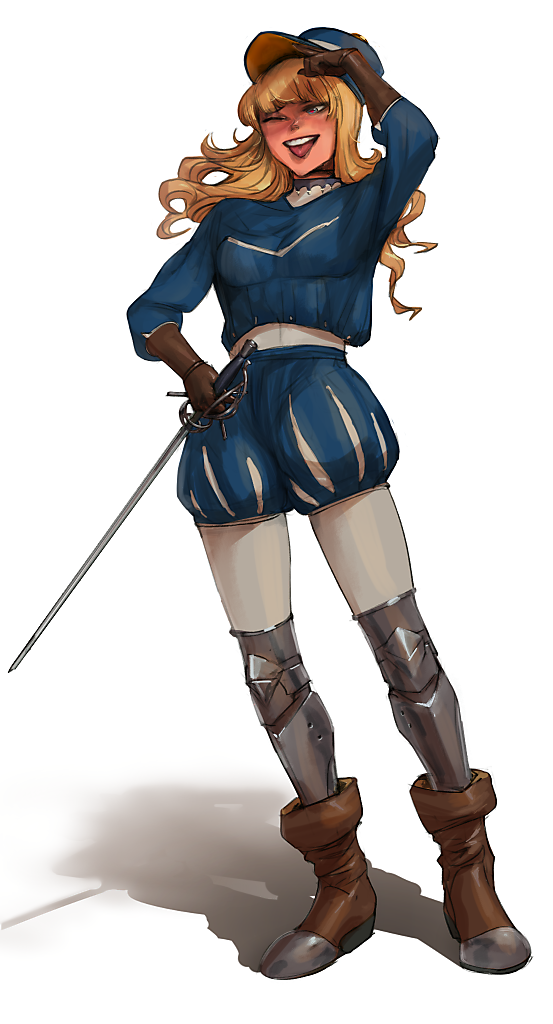 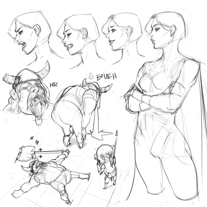
05-04-2020, 11:24 PM
Nice updates here, really enjoy your approach to your figures, the anatomy is quite strong! Keep it going!
05-05-2020, 03:28 AM
so im gonna go on a weird limb for my thoughts on the dragon painting, i dont know if this is a valid critique...
I feel like his head is forced into the composition, instead of embracing the ambiguity of his behind. to be honest, its difficult to tell what hes doing or how big his body is or what its true shape is. im enjoying how the trees are playing a counter rythm to his gesture, that looks very good. In my head, im seeing like a dragon prowling through the woods, doing his own thing, but you see his behind and that wing coming out to the side. It's just tough to see exactly what the action is... is he hurt? is he hunting? is he waking up from a nap? I can't really tell
70+Page Koala Sketchbook: http://crimsondaggers.com/forum/thread-3465.html SB
Paintover thread, submit for crits! http://crimsondaggers.com/forum/thread-7879.html [color=rgba(255, 255, 255, 0.882)]e owl sat on an oak. The more he saw, the less he spoke.[/color]
05-05-2020, 05:48 AM
(05-04-2020, 09:24 AM)Gliger Wrote: that dragon painting is gooooooooooooooooooooodlol! Thanks man, anything that you liked specifically or stood out to you? I'm a bit puzzled on how I feel about it at the mo. (On the side, I wish it looked less like a dragon ha ha, I wanted a sort of chimera but right now it has an identity crisis ha ha ha) (05-04-2020, 11:24 PM)cgmythology Wrote: Nice updates here, really enjoy your approach to your figures, the anatomy is quite strong! Keep it going!Ha! I've actually been trying to go over anatomy stuff recently because I was going weak on it, but I'm still not quite done, and is still gonna take a few more times over the years I think. (05-05-2020, 03:28 AM)Fedodika Wrote: so im gonna go on a weird limb for my thoughts on the dragon painting, i dont know if this is a valid critique...Why wouldn't it be! It's the ones I like the most. Well I had quite trouble putting a creature in, so you aren't wrong. I started doing the background forest first and just detailed a bit the foreground, then I tried like adding giant insects, a boar family a stroll, other strange creatures crawling, many attemps, was liking none. I mean is mostly due to me not having a clear goal and not knowing much about creature design. Someone suggested me to look up cryptids and I did so, but then I was not finding a composition I liked it, then it was the last hours of the day and I just stumbled upon that, the composition I found interesting at the time but the creature is a haphazard of things ha ha, so a chimera. I would say... resting! Ha. Nothing much else about it with this one. I would like to work the creature into something better but is beyond what I can do know, I would have to do studies (dogs, lizards, birds and boars mostly, those are the things I had in mind). I'll just save it to reattempt on the future, like I do with other stuff, to check progress, this week is guns studying time lol.
05-05-2020, 11:42 AM
Good job with that anime girl; you executed the V mouth perfectly, haha.
I can see why you had so much trouble with that chimera painting, it's a tough one. I wasn't sure what I was looking at until I saw the head, but that's sorta a good thing in this case. It's like when you're looking around innawoods and you think you might be seeing an animal, but they blend in so well that you're not sure if it's just some leaves getting blown around or not until you see a tell-tale sign.
05-16-2020, 12:12 PM
I think this is my favorite sketchbook here, super dope stuff man! insane amount of work too. Lovely.
PORTFOLIO http://www.artstation.com/artist/Jeso
Sketchbook: http://crimsondaggers.com/forum/thread-2586.html
05-18-2020, 07:21 AM
(05-05-2020, 11:42 AM)Pubic Enemy Wrote: Good job with that anime girl; you executed the V mouth perfectly, haha. V mouth? Ha, it's tongue out shouldn't that be P mouth? lol. Puns. Right! Ha, yeah exactly that feel! but I did not execute it well, for a while I was even thinking on having some dark monster shrouded in darkness or siphoning light ha, but yeah, still above my expertise to pull cool monsters. WIP goals for this year. (05-16-2020, 12:12 PM)Jeso Wrote: I think this is my favorite sketchbook here, super dope stuff man! insane amount of work too. Lovely.Well thank you for the lovely greeting! Back to you. So I've been slacking ultra-hard mode. I started really low last week doing studies of guns, rifles. I did learn a bunch but did not draw at all. I've mostly been watching youtube channel "ForgottenWeapons", very instructive. Then I stumbled upon a mod for the game Stalker released, some time ago but got an update like half a year or some? Stalker: Anomaly... Well, that snowballed into a youtube weapon binge and playing Anomaly nightmare blowout ha ha. Send help. I'll leave a bunch of unfinished stuff, another thing I've been trying lately is doing a bit more studies/paintings with assistance from references (usually 90-120min long tops). Goal for this week -> Getting back on track. Sort of.
05-18-2020, 08:32 AM
the guns look very nice! i think a further challenge you could do is build them in 3d, then youd really have something to work with :)
70+Page Koala Sketchbook: http://crimsondaggers.com/forum/thread-3465.html SB
Paintover thread, submit for crits! http://crimsondaggers.com/forum/thread-7879.html [color=rgba(255, 255, 255, 0.882)]e owl sat on an oak. The more he saw, the less he spoke.[/color]
05-18-2020, 09:56 AM
No real feedback. I really like this sketchbook though.
05-18-2020, 11:25 AM
Ahh, "ForgottenWeapons", also known as "Gun Jesus".
You did a good job of capturing the general character of the animals in those photo studies. That finch is precious. Nice simplification and sense of atmosphere in the environments too, and I enjoyed the "microwave-pls" filename.
05-19-2020, 08:50 PM
(05-18-2020, 08:32 AM)Fedodika Wrote: the guns look very nice! i think a further challenge you could do is build them in 3d, then youd really have something to work with :)I've been thinking about that! Next step is for me to draw them in 3/4 view or perspective of some kind, not as much plans. Still wrapping my head around how the guns must look like sometimes tho. (05-18-2020, 09:56 AM)Mochiman Wrote: No real feedback. I really like this sketchbook though.Maybe imaginary feedback then? Now for real (lol), any feedback is appreciated! What? Why are you turning around? Wait! Come back! Why do the always run away... sighs. (05-18-2020, 11:25 AM)Pubic Enemy Wrote: Ahh, "ForgottenWeapons", also known as "Gun Jesus".I don't even know what kind of bird it is but I'll take your word for it lol, it was strangely easier to do that one. I'm really burning about the wolf tho, need to do more fur ones. Ha ha! I'm glad you noticed the file-names, sometimes I like to leave puns there. Leaving this one, another semi-referenced one, 2hs long. I would like to go into finer detail, the building looks somewhat off to me so I guess studying castles is gonna be on the list soon, and general architecture. On another note for doing thumbnails this approach feels good to me, updating my workflow.
05-19-2020, 09:46 PM
I don't know the exact kind of bird either, but any bird with a short stout seed-cracking beak like that is usually called a finch. It's always great to draw fluffy little birds.
New picture looks good to me. I think the only possible problem area is that the roofs of the buildings are angled too steeply. It looks like the horizon line is around where the adventurer's eye level would be, and the buildings are very far away, so the roofs would be closer to (but not quite) being parallel to the horizon line, and the differences between their angles would be very small. I'm not sure though, thinking about perspective still makes me feel like a caveman. As usual, really nice colors and atmospheric perspective and everything. It reads very well. The reflections on the helmet are really nice too.
05-20-2020, 02:50 AM
I think the issue with the city is it is a very close size to the rocks right next to it, the levels arent varyting whereas the rocks on the right have a lot of size variation. maybe chop into one on the top left a bit and make the town not feature two nearly identical cube shapes, throw like a house shape or a triangular shape; the cyllindrical buildings dont have to be so far back.
Theres a lot of little details like an awning and some red coming from the city but i cant really read them at first, everything feels really clustered together so the silhouettes arent clear. You could also consider, since the figure is rendered pretty well, placing him much closer to the camera to vary the size relationships even more. I also feel like the rocks are leading the eye, as well as the clouds are leading the eye in this cone shape, but it ends at a very empty area, almost as if the town should be there instead of the left side of the canvas where there already is a lot of heavy subject matter, IE. figure and city. I havent done many landscapes, but those are the inuitions that come to me at least
70+Page Koala Sketchbook: http://crimsondaggers.com/forum/thread-3465.html SB
Paintover thread, submit for crits! http://crimsondaggers.com/forum/thread-7879.html [color=rgba(255, 255, 255, 0.882)]e owl sat on an oak. The more he saw, the less he spoke.[/color]
05-20-2020, 07:33 AM
Pubic Enemy
I see what you mean with the roof not going into perspective, at the mo I just would like to redo all that area into something more interesting. Thank you for pointing it out! Fedodika Well my take is that is boring, design wise and yeah! noticed the thing with the empty area being the center of attention, I think I would change the clouds to point back into the building but that would be when I decide what kind of building and layout I would like. Thanks for the other suggestions! I'm basically the same with landscapes, just started a few months back. I really need to make a lot. Leaving some extra thing from today for a challenge? I dunno, but I thought it would be nice to try before heading to sleep. Supposedly there's a frame from a sailor moon episode and you have to redo it on your style? I might have stretched it too far. Original ![[Image: 79qtWcA.jpg]](https://i.imgur.com/79qtWcA.jpg) My take  I think bringing the warms back into the shadows would had been nicer, sticking closer to the original palette. I might have toned it down too much. I wanted to go for a more teen/adult take.
05-20-2020, 07:55 AM
Not bad. It's like grimdark Sailor Moon. My personal preference is for the original palette, but I'm a sucker for the highly saturated anime of previous decades, painfully drawn and painted on cels (no animators were harmed in the making of this film).
Good job with the semi-realistic anime style though. It's hard to pull off. |
|
« Next Oldest | Next Newest »
|