Darius’s sketchbook
#1
Hello everyone! My name is Darius. I just joined Crimson Daggers and I’m really inspired with all the cool work on here. I’m hoping to improve my skills in illustration and concept art. I’d like to have more creative work and more painterly paintings.

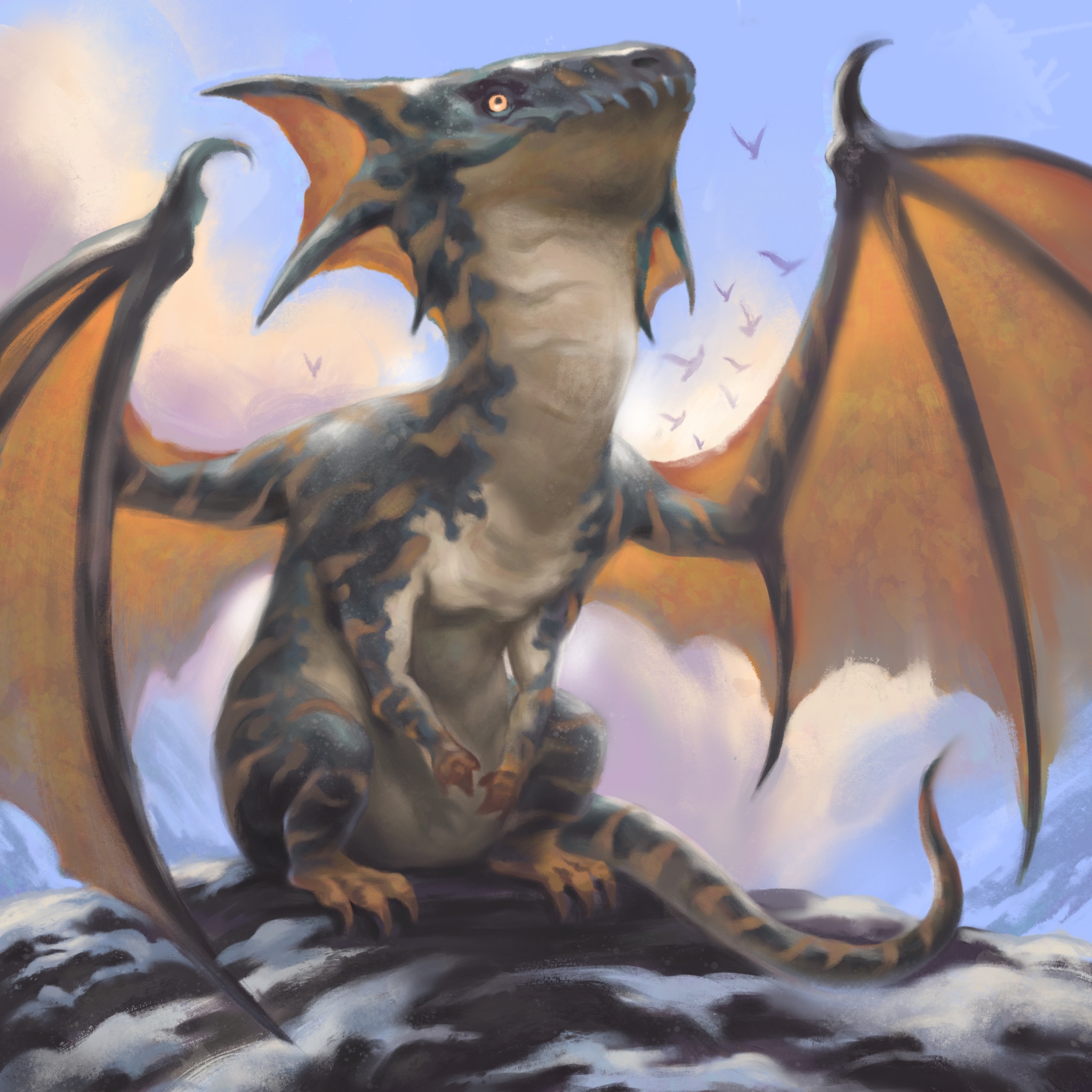
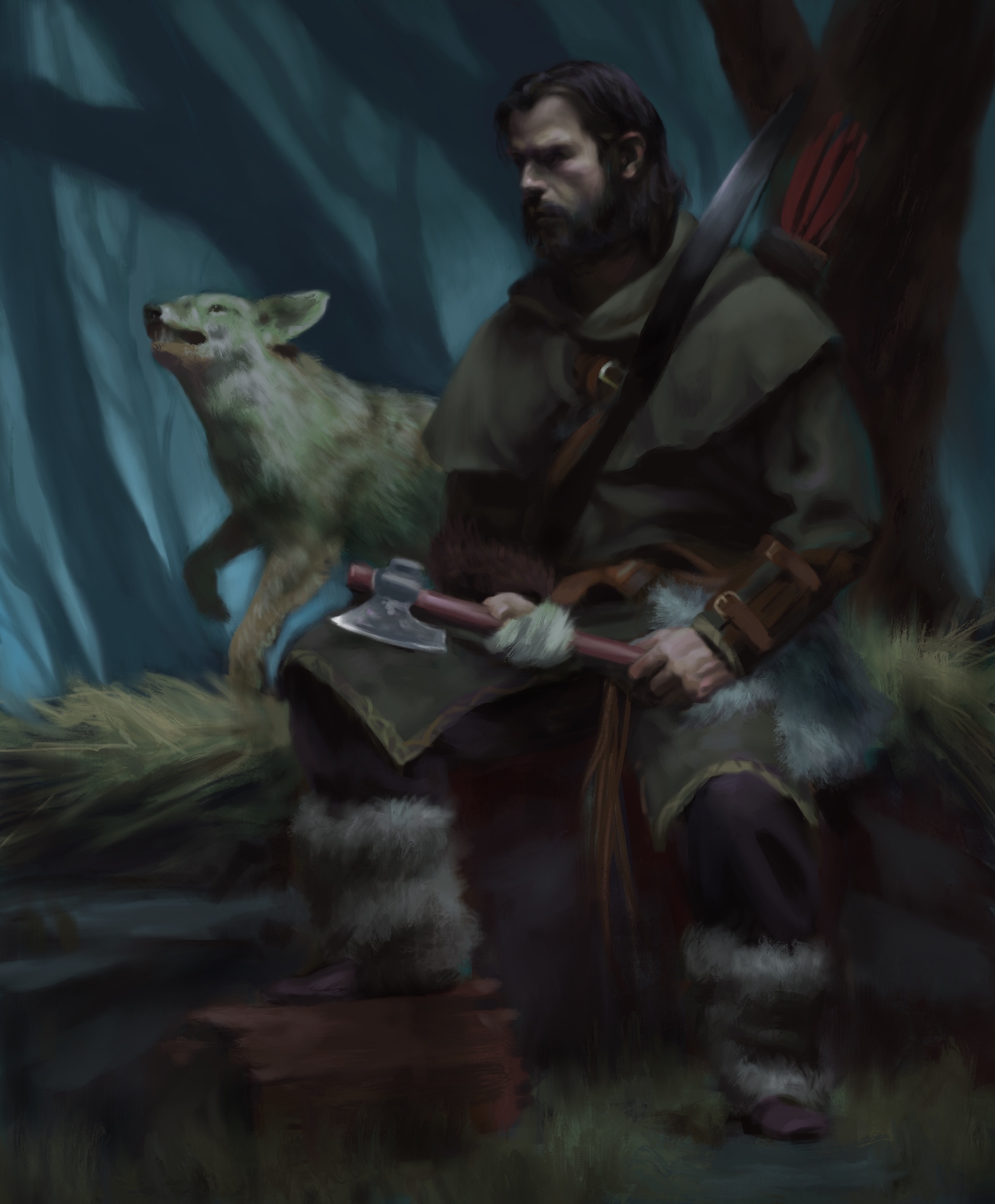
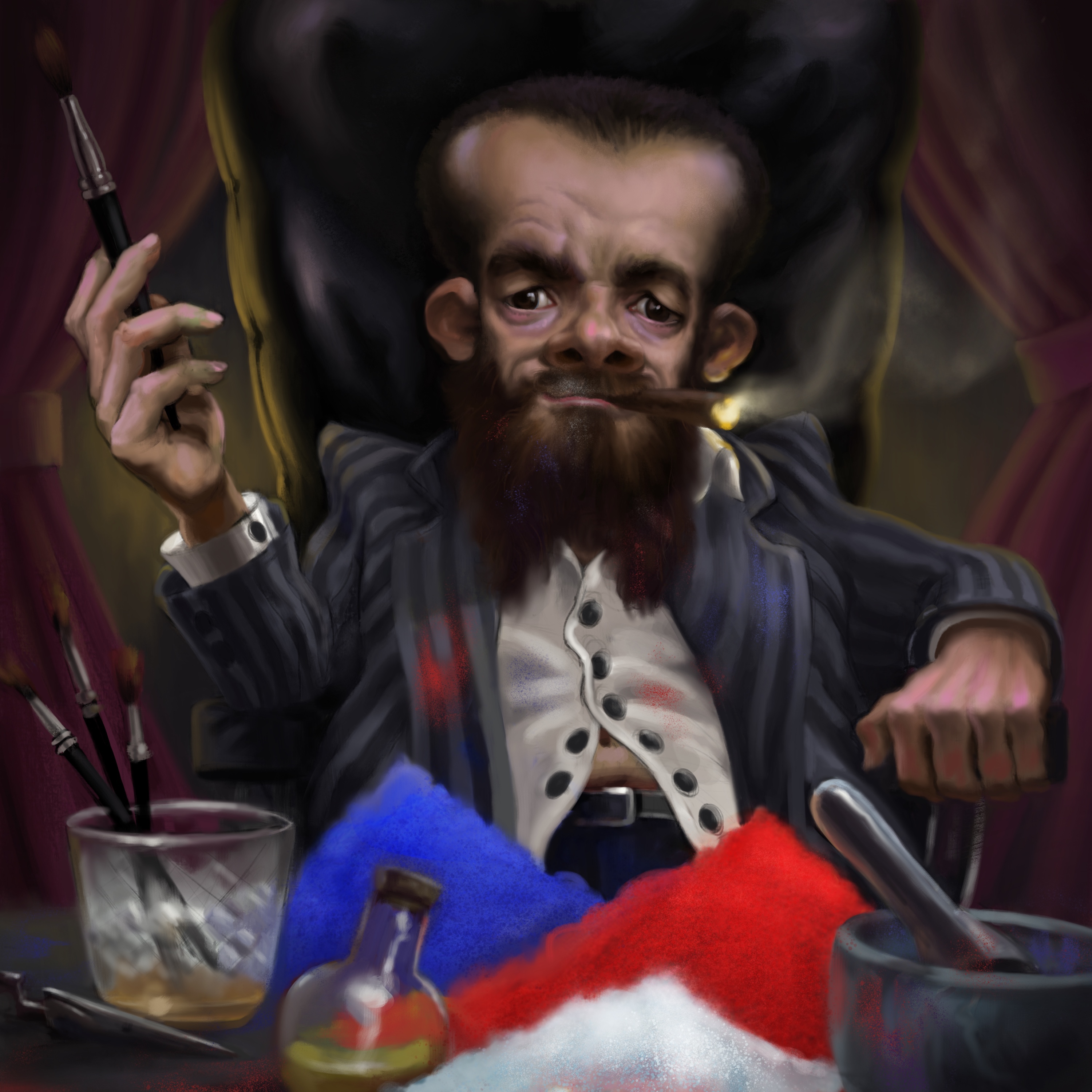
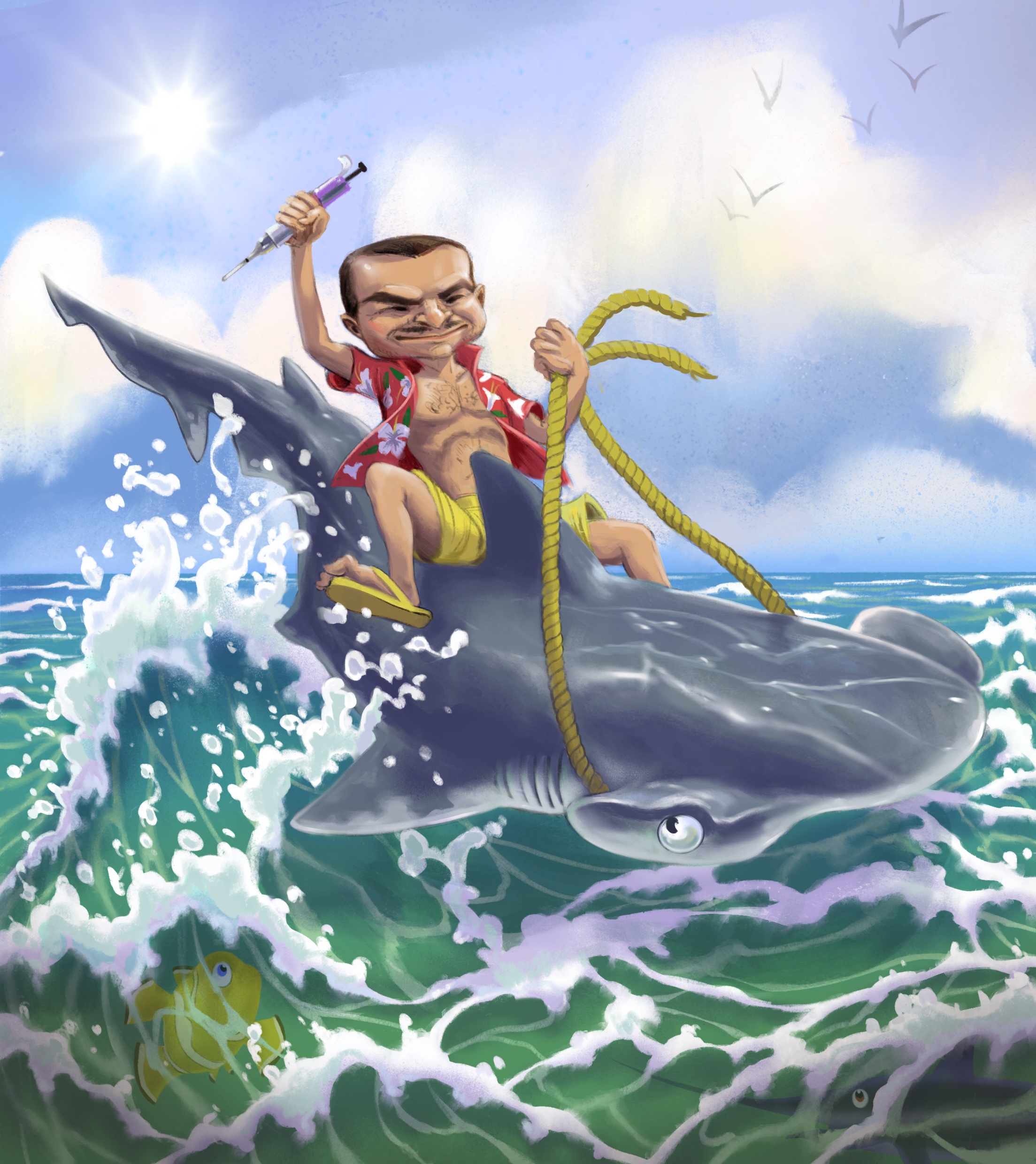
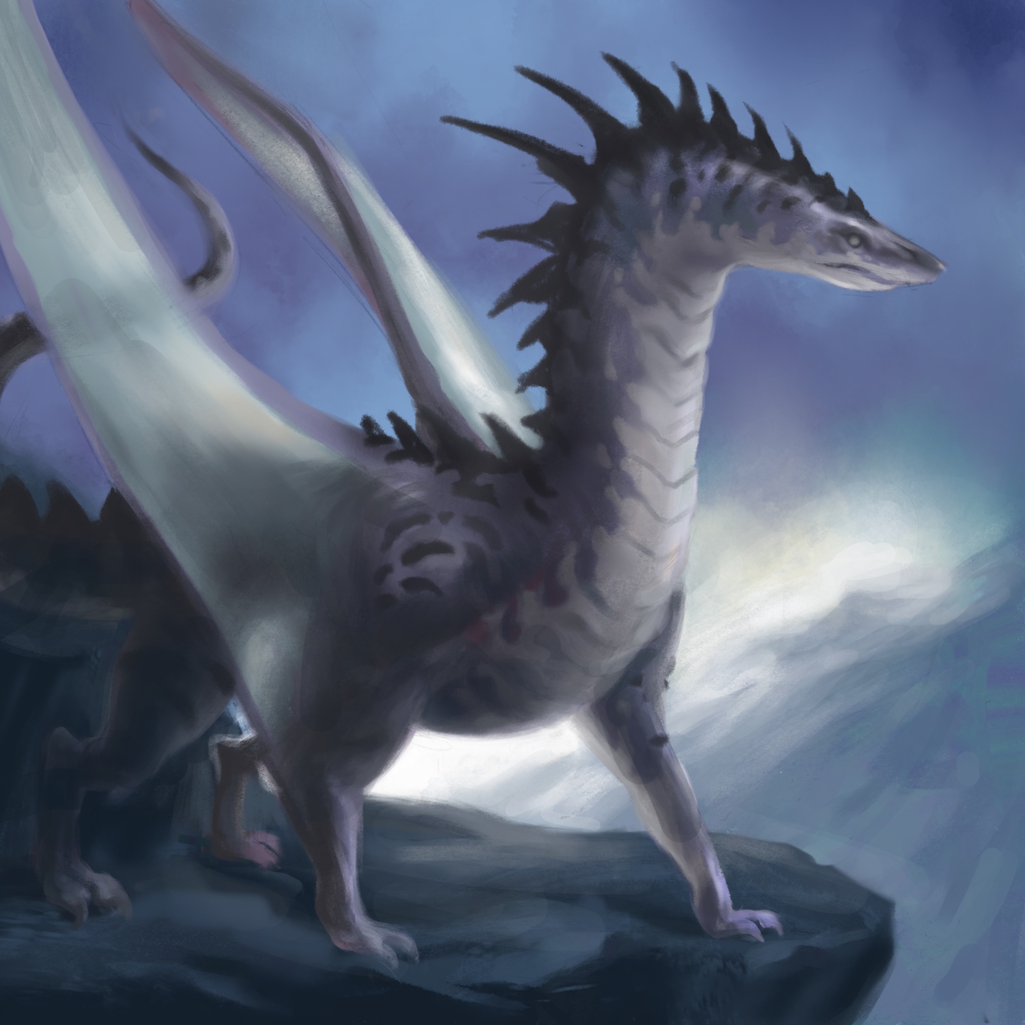
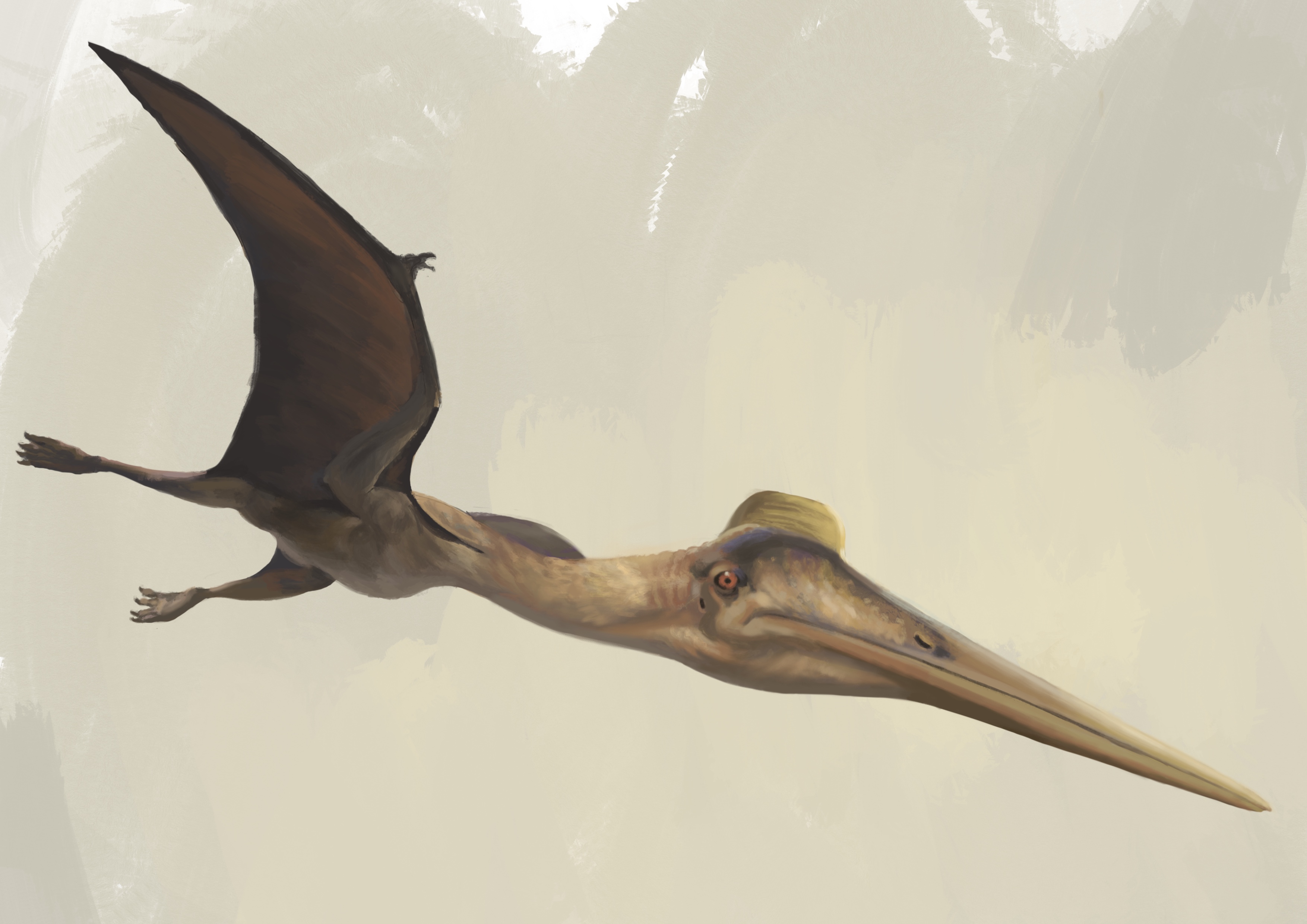
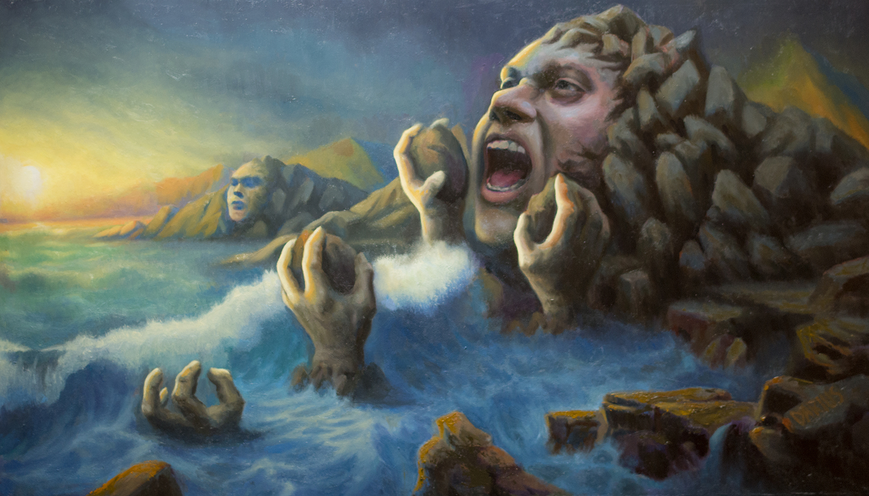
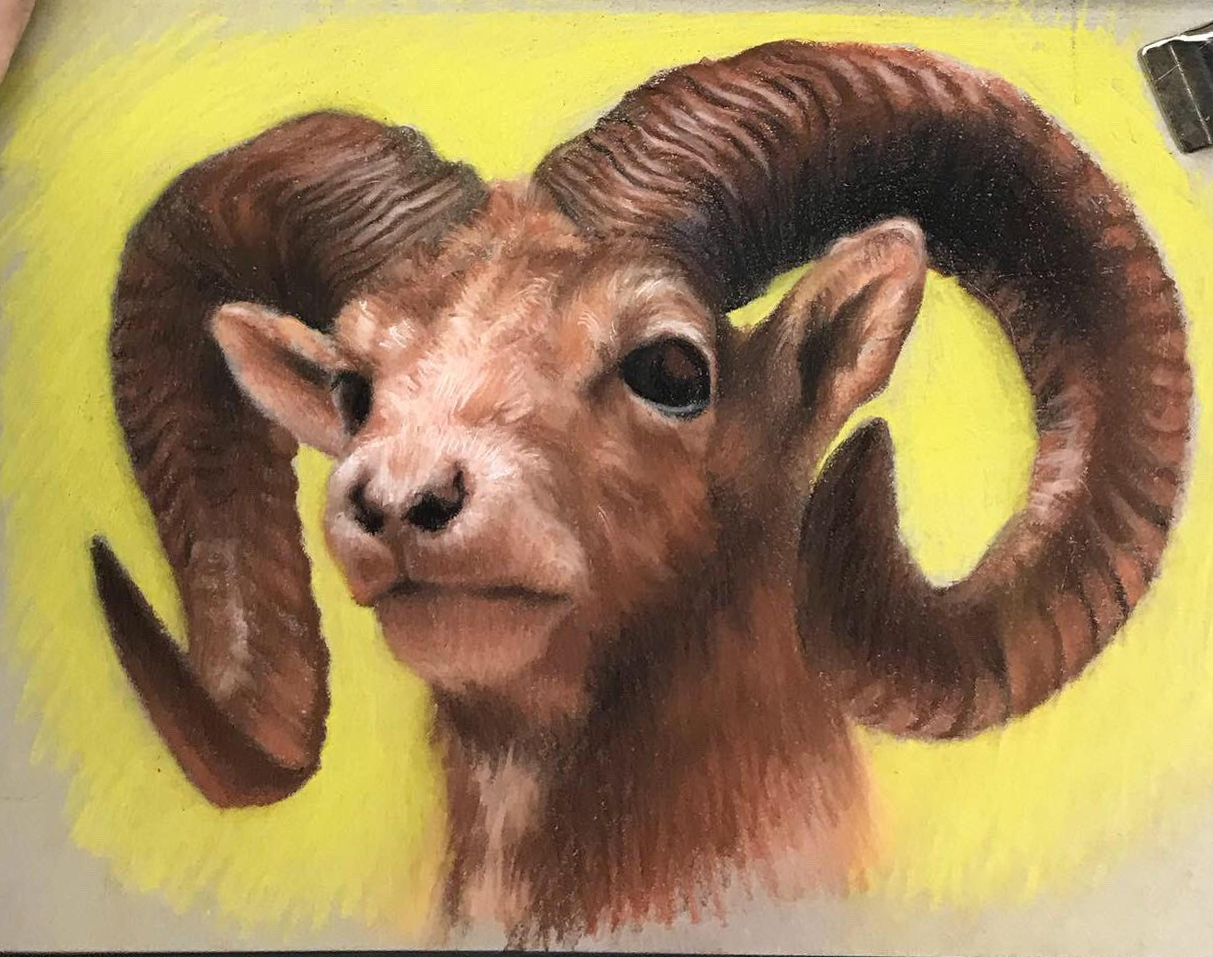
 Please feel free to give me any feedback or criticism at anytime.  Here are some paintings I have done. Most of them were done in procreate on my iPadpro with the exception of firs two which I painted using oils and the ram in pastels. 


Reply
#2
Interesting mix of subject.

My Sketchbook

Perfection is unmeasurable therefor it impossible to reach it.
Reply
#3
Welcome to the forum Darius - looks like you painted most of that stuff from imagination - really impressive!

“Today, give a stranger one of your smiles. It might be the only sunshine he sees all day.” -- H. Jackson Brown Jr.

CD Sketchbook


Reply
#4
On the one with the axe - the best imo - you've played a lot with edge softness. Try to increase the range of edge qualities you have even more by throwing back in some crisp edges in key areas. A sharp axe is more menacing. A clearly firm grip is more ready for whatever is coming. An unshifting and unblinking gaze makes the man appear more ready to pounce. A sharper demarcation between the top of the wolf's head and the background helps separate the planes even more.

Once you've tried all that, ask yourself "which is the sharpest edge on this area of an object? Surely one area has to be slightly sharper than the others?"

Anyway, looking good and good luck! I'm new here as well ^^
Reply
#5
(06-17-2020, 07:44 AM)Edges is something I have always struggled with.   I guess there is a lot of room to play with edges. Thanks for the advice. I\ll have to do some research on painters who really utilize the range of hard and soft in their paintings. Wrote: On the one with the axe - the best imo - you've played a lot with edge softness. Try to increase the range of edge qualities you have even more by throwing back in some crisp edges in key areas. A sharp axe is more menacing. A clearly firm grip is more ready for whatever is coming. An unshifting and unblinking gaze makes the man appear more ready to pounce. A sharper demarcation between the top of the wolf's head and the background helps separate the planes even more.

Once you've tried all that, ask yourself "which is the sharpest edge on this area of an object? Surely one area has to be slightly sharper than the others?"

Anyway, looking good and good luck! I'm new here as well ^^
Reply
#6
Welcome to CD Darius. Great start to your sketchbook so far. I like the broad range of subjects you have painted. If you are looking for artists to study their edges, you could check out Singer Sargent and J C Leyendecker - two very different approaches and styles, but both equally magnificent.

Keep up the good work and looking forward to seeing more updates from you.
Reply
#7
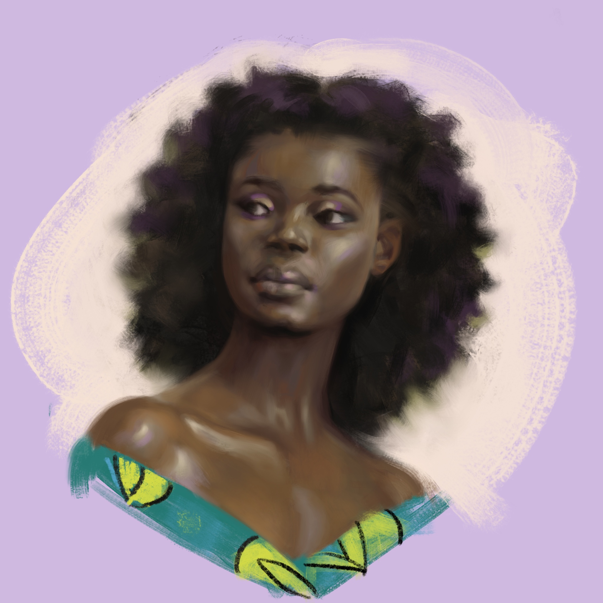
Study I painted this morning on the iPad. Tried to play with edges a bit more and played around with some new brushes. 

Reply
#8
More sharpness in the focal points!

This reminds me a bit of this old lady who drew completely blurred pictures in art school. It took the teachers a few months to realise she had terrible eyesight ^^

Anyway, just a humorous anecdote to motivate you back onto the right path xD
Reply
#9
(06-19-2020, 06:02 AM)Fickleflame Wrote: More sharpness in the focal points!

This reminds me a bit of this old lady who drew completely blurred pictures in art school. It took the teachers a few months to realise she had terrible eyesight ^^

Anyway, just a humorous anecdote to motivate you back onto the right path xD
 
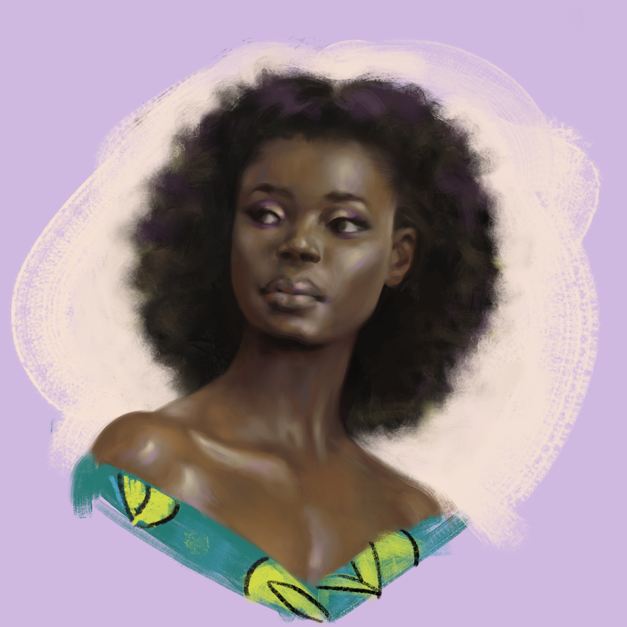
Thank you . How does this look? I sharpened up some of the features in the face and did the same for some areas in the shoulder. Also, I softened the hair a little more that way the face looks a little sharper as well.


Reply
#10
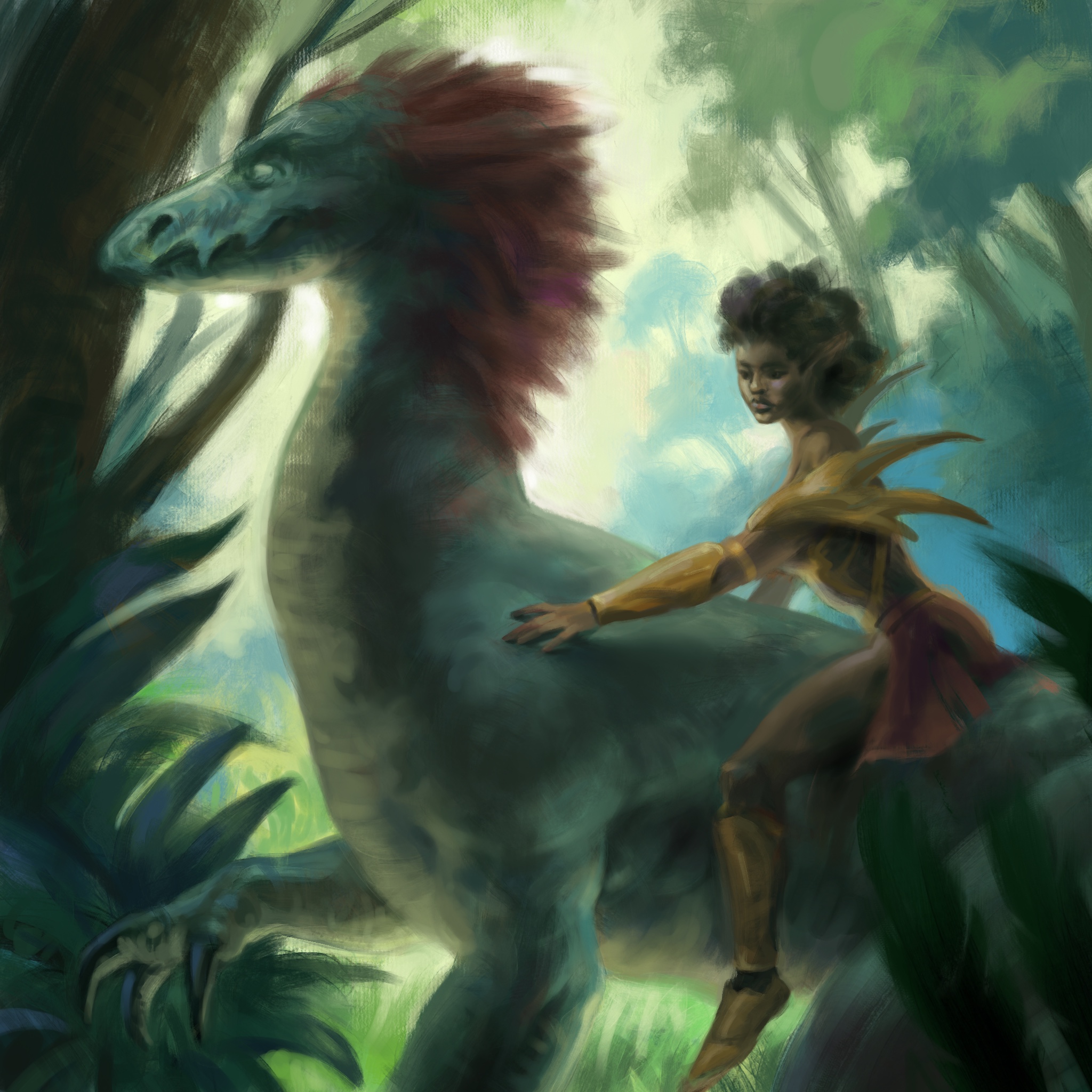
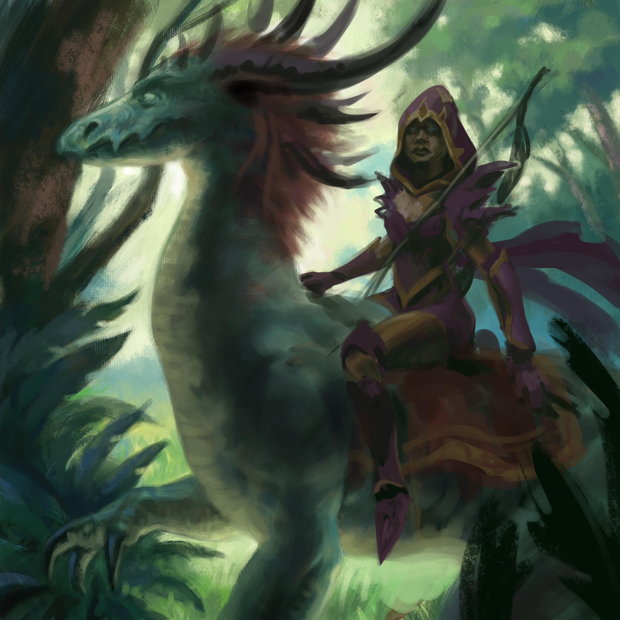
Something I started the other day on the ipad.  I tried working really small to get the overall feel down. Going to zoom in and work on cleaning some shapes up.


Reply
#11
Something about the first pose didn’t feel right. I made some design changes to make the composition a little more interesting... also she’s not falling off the dragon .


Reply
#12
Need even more sharpness on the eyes on the portrait ;) Window to the soul.
I like how you handled the wild ram's fur.
Reply


Forum Jump:


Users browsing this thread: 16 Guest(s)