08-28-2020, 12:31 AM
My name's Eugene.
I'll start with posting some older works.
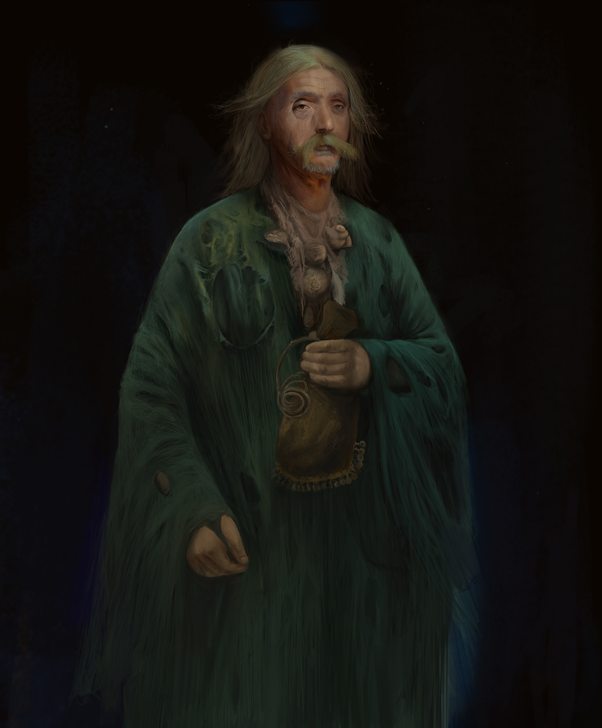
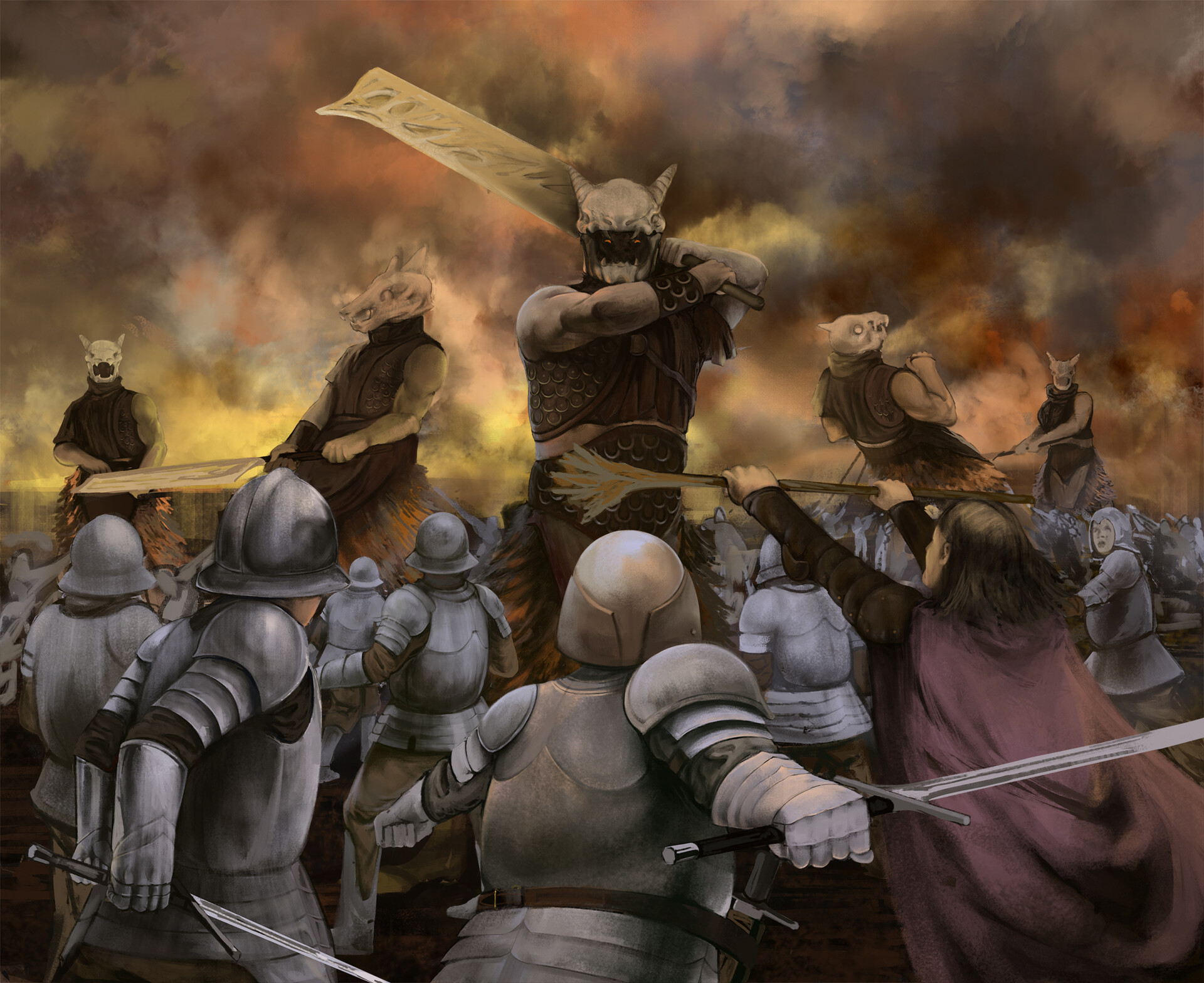
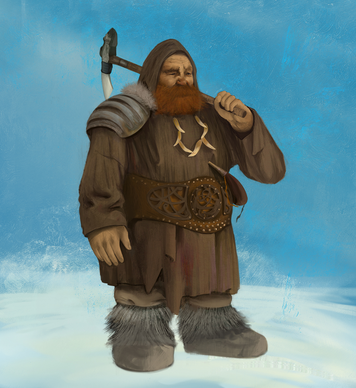
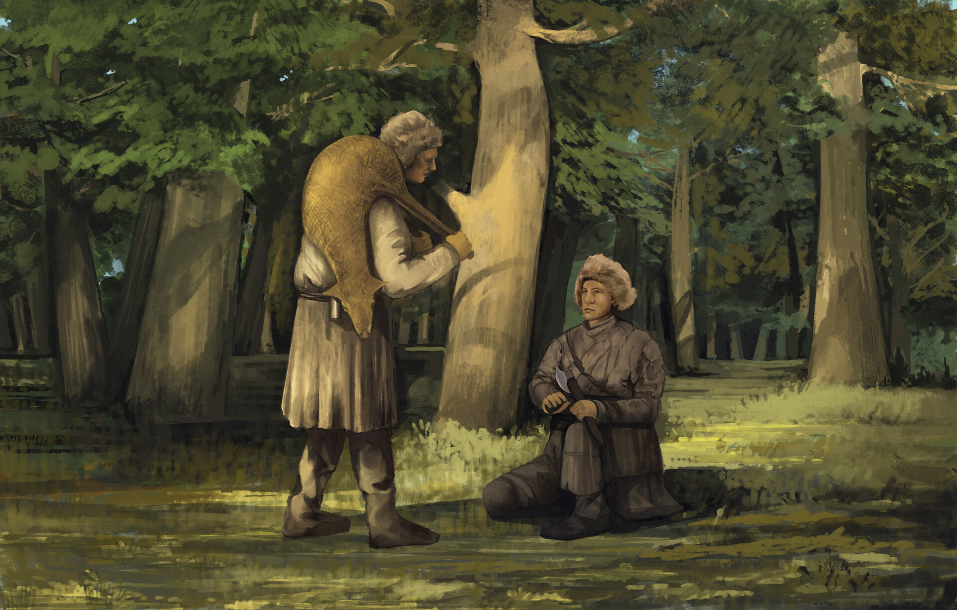
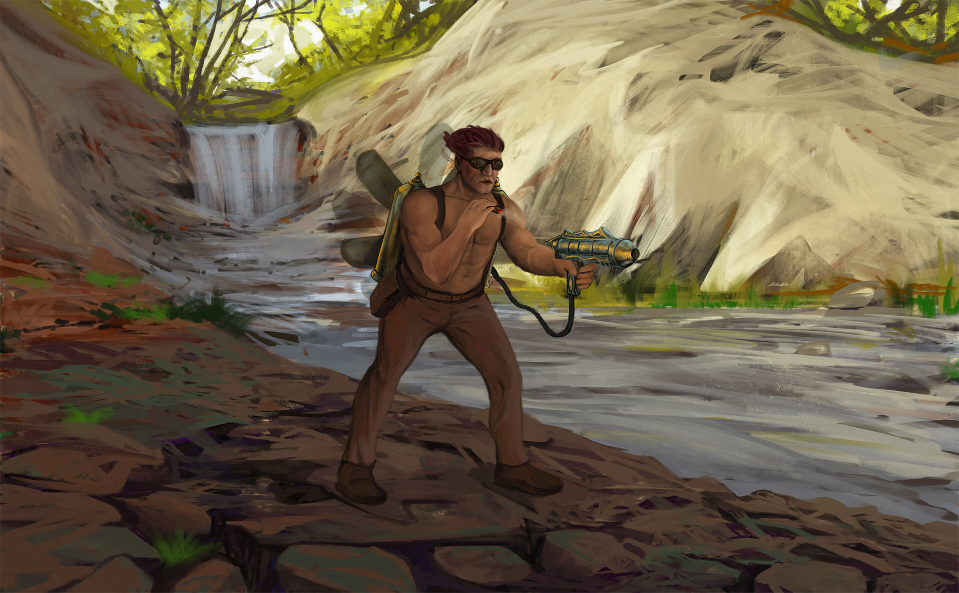
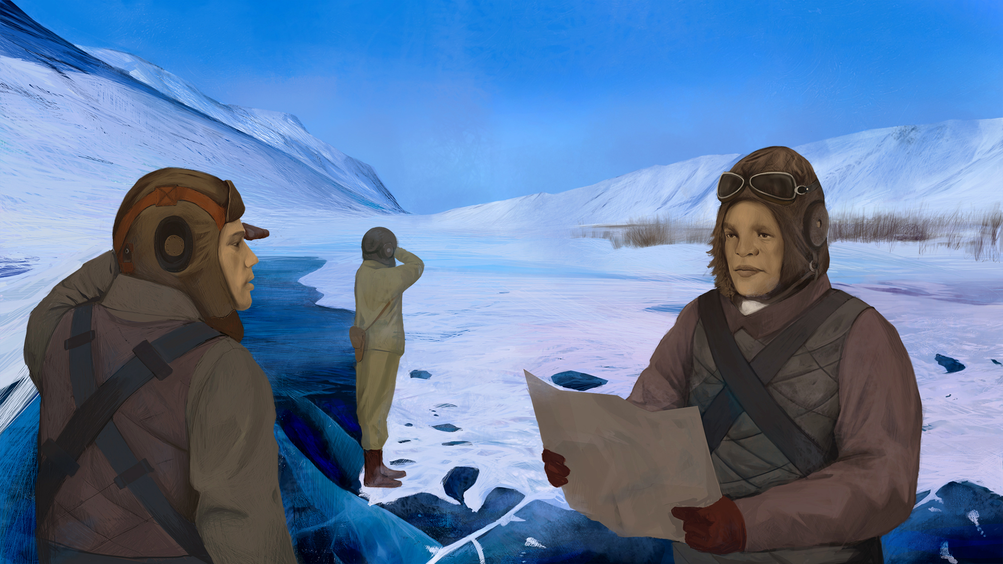
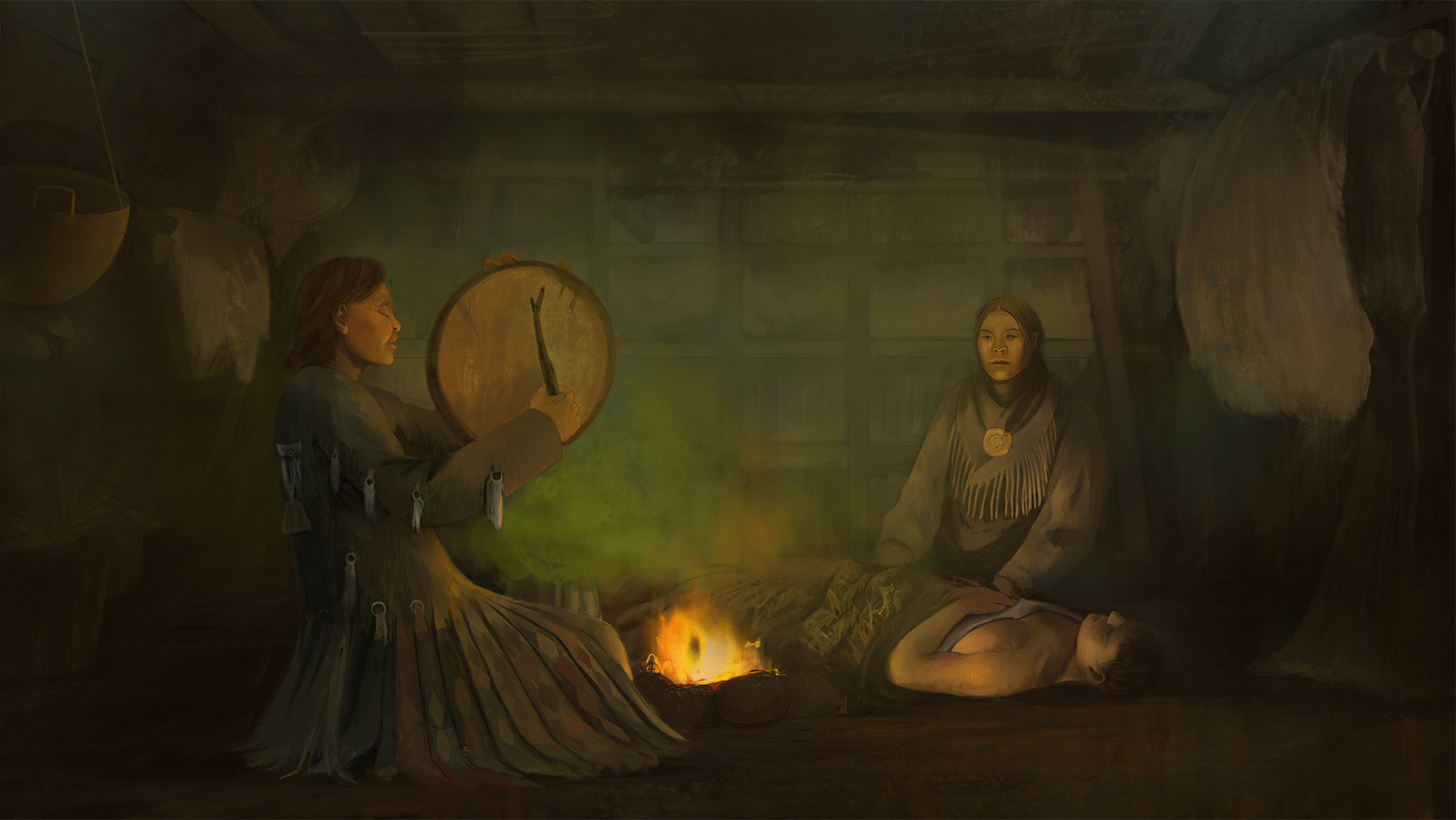
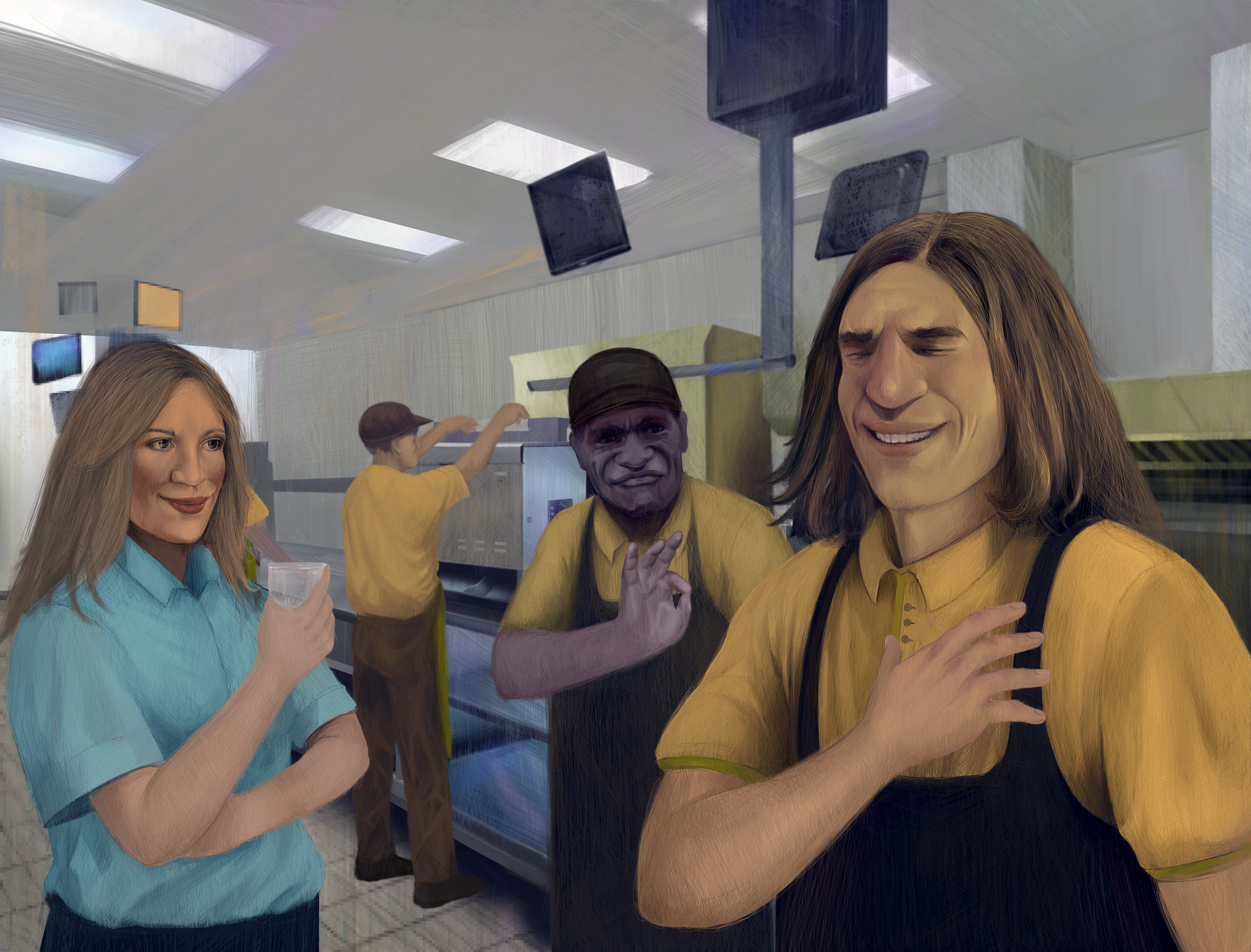
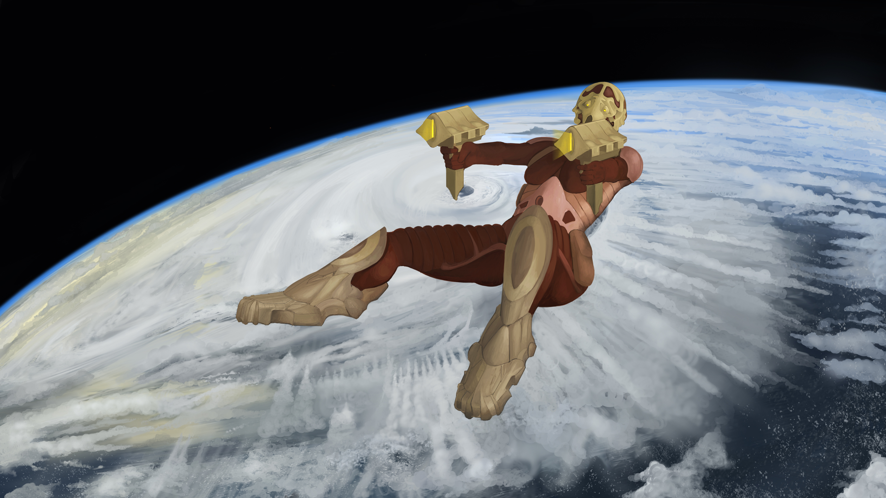
I'll start with posting some older works.


|
one_two's sketchbook
|
|
08-28-2020, 12:31 AM
My name's Eugene.
I'll start with posting some older works.         
08-31-2020, 04:16 AM
Wow, really impressed with your paintings. They have a very cool style to them that's kind of traditional but then combined with sci-fi and concept art stuff. The natural backgrounds you've done for your images are really pretty, especially the 5th image down.
A few of the people you've painted have slightly strange facial features/face proportions, but maybe that's a stylistic thing.
08-31-2020, 04:52 AM
(08-31-2020, 04:16 AM)JosephCow Wrote: Wow, really impressed with your paintings. They have a very cool style to them that's kind of traditional but then combined with sci-fi and concept art stuff. The natural backgrounds you've done for your images are really pretty, especially the 5th image down. Thanks for stopping by and leaving a comment, i really appreciate it. As for the facial features haha, that's probably my lack of skill :D
08-31-2020, 07:19 AM
Hey Eugene, welcome to the forum. Really nice paintings man. I love your suit drawings too - well constructed.
What kind of things do you bake in your bakery? Cakes or bread?
“Today, give a stranger one of your smiles. It might be the only sunshine he sees all day.” -- H. Jackson Brown Jr.
CD Sketchbook
08-31-2020, 11:46 PM
(08-31-2020, 07:19 AM)Artloader Wrote: Hey Eugene, welcome to the forum. Really nice paintings man. I love your suit drawings too - well constructed.Thanks, man. It's a bread factory mainly but we do bake buns with cinnamon, poppy seeds and apples. We also bake cakes, they come in three flavours (banana, chocolate and cinnamon) and muffins.
09-02-2020, 04:18 AM
Idk why but there alot of stroke mark is this part of a technic to create subtile plane change?Also for your eyelid i think you could go a lil bit softer with the line you did to indicate the fold.If you do portraiture or study from reference don't be shy to post the reference along with it the critic will be much richer.I think you really capture the likeness of that person
09-02-2020, 05:43 AM
(09-02-2020, 04:18 AM)darktiste Wrote: Idk why but there alot of stroke mark is this part of a technic to create subtile plane change?Also for your eyelid i thnik you could go a lil bit softer with the line you did to indicate the fold.If you do portraiture or study from reference don't be shy to post the reference along with it the critic will be much richer.I think you really capture the likeness of that personThanks for feedback, i just like to paint that way. The studies are studies, I see them as a learning material and i do like to experiment with edges and softness, these things are done on purpose.
09-02-2020, 07:16 AM
Nothing against experiementing it just an advice to atleast add a state of what you were trying to experiment with so we can atleast give ciritic that can be pertinent to that exploration.We as viewer are missing the intention behind those study which to me is something one should avoid.Being transparent about your exploration is to your advantage in my opinion.Of course i understand it time consuming but i think the reviewing part of the work is almost more important than the work itself.It the insight you gain from the doing that create a direction for the next study.I know your probably not mindlessly practicing but that not something the viewer can establish themselve it why i think a resume of the intent are necessary.
09-07-2020, 06:43 AM
I think you need to sketch your proportion before hand.Even by realistic standard he would still be a manlet by those standard unless that what you intended him to be.It a common issue to be out of proportion when wearing cloth over a figure as you can no longer clearly see your landmark but have to guess them in most case.You can always use the head as your measuring unit but you wil have to atleast draw it without help first to get it as your scale unit of reference.
Here a proportion sheet if you don't have one.
09-07-2020, 06:38 PM
(09-07-2020, 06:43 AM)darktiste Wrote: I think you need to sketch your proportion before hand.Even by realistic standard he would still be a manlet by those standard unless that what you intended him to be.It a common issue to be out of proportion when wearing cloth over a figure as you can no longer clearly see your landmark but have to guess them in most case.You can always use the head as your measuring unit but you wil have to atleast draw it without help first to get it as your scale unit of reference.Thanks for reminding me of proportions, take care! :)
09-08-2020, 10:36 PM
Hey man! Nice studies. One advice I could give you looking them is: go hard to understand how to draw first, I think the last problem you'll have is painting, go after drawing really hard! Good lucky and I hope to seee you here more often!
09-09-2020, 06:05 AM
(09-08-2020, 10:36 PM)Matheus Chastinet Wrote: Hey man! Nice studies. One advice I could give you looking them is: go hard to understand how to draw first, I think the last problem you'll have is painting, go after drawing really hard! Good lucky and I hope to seee you here more often!Thanks for stopping by, ok, good point! 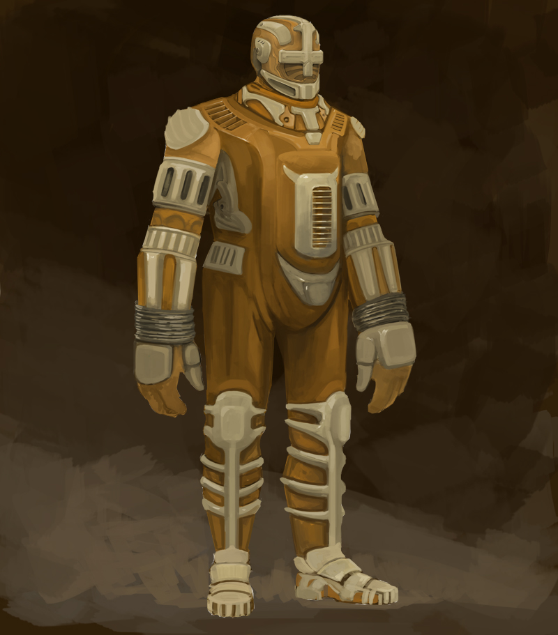
09-13-2020, 07:40 AM
hey man, nice sketchbook ! i agree with the previous comment, really need to improve at drawing ! it'll help you improve at making things more believable, it'll also improve your sense of design that can really be improved ! when designing an outfit or whatever, imagine yourself wearing it ! On the b&w painting of the "orc" warrior, it would be quite impossible for him to move with his armor, the hips are blocked, the shoulders are blocked, the wrists are blocked too and certainly the ankles. You have to be careful about those kind of things ! study a lot about that stuff to understand how it works, how it fits the body, etc ! Keep it up man !
|
|
« Next Oldest | Next Newest »
|